60 million fields and 27 crops. How we made a map of all fields in Europe and the USA
A few months ago, we launched the world's first free interactive map with which you can view information about any field in the United States and Europe. Dozens of publications have written about the map, and on Product Hunt, she collected 1,500 likes, unprecedented for the product from the agricultural sector (and eventually became AI & Machine Learning Product of the Year 2018). We designed the card for two months - that's how it was.
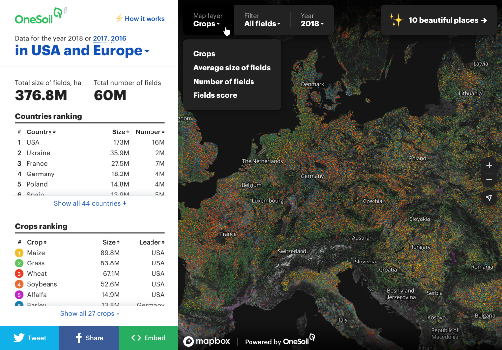
The interactive map is based on machine learning algorithms and satellite imagery. It contains information on 60 million fields and 27 cultures in 44 countries in Europe and the USA. Data - for three years. We recognized all the fields using ML from satellite images. Using the map, one can track trends at the level of countries and regions, as well as monitor the development of a specific field. For example, you can find out how much land was occupied by corn in the USA in 2016 (49.1 million hectares) or in which region of Belgium there are the most wheat fields (Wallonia).
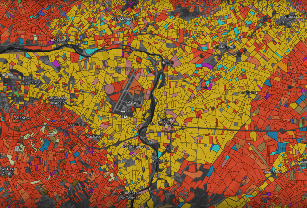
Europe at minimum zoom
')
With the help of the map, you can also find out information by a separate field: its size, culture, development schedule, and a comprehensive Field Score. It is calculated by the NDVI index, climatic indicators and relative field yield. At any time you can see how the beets are developing on your field or what area under the legumes was taken by your neighbor last year. Among other things, it is beautiful. We made the button “random beautiful fields”: it moves you to 35+ places around the world, each of which looks like a piece of abstract art.
The idea of creating such a card appeared in July last year. We lacked a tool that would allow us to visually demonstrate all our technological capabilities. In August, the whole team began to develop closely.
Data: collect, process, compress
In developing the map, we used pictures of the European Union's Copernicus Sentinel-2 satellite. In total, about 250 terabytes of information were processed for Europe and the USA. At the first stage, we did preprocessing of images: we cleaned the clouds, shadows, snow, compressed the data. Then, on the resulting 50 terabytes, we started the process of searching for field boundaries and classifying cultures on our machine learning models. At the output, we received about 250 gigabytes of vector maps containing field and culture geometries.
We used the PostgreSQL and PostGIS database to process data and calculate statistics. After exporting the initial vector data, we obtained a base in which there were about 180 million records about the geometry of the fields, as well as more than a billion records of additional attribute information about the fields themselves for three years. On this amount of data, we calculated statistics, ratings, determined the popularity of different cultures in regions of the world - everything that is displayed on the map in the left column and interactive prompts.
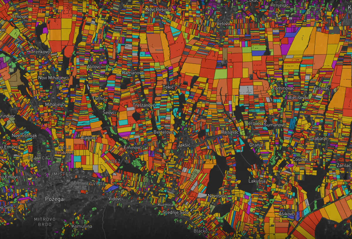
Fields of croatia
We wanted to quickly calculate and display agronomic indicators across the field, as well as visualize the schedule of plant development for the season. To do this, we used our own approach to caching and compression of satellite data. This made it possible to reduce the size of the data warehouse by 100–200 times, and reduce the speed of obtaining information on the field to 1 second.
We also added a comprehensive Field Score indicator to this version of the map, which allows you to quickly evaluate the field rating. Field Score is the first step towards yield forecasting, which our team is currently working on. The map was made in a short time, so I had to invent a lot of original solutions on the go. But all the new developments we use in the work on our main product.
Map: select format and prepare data
In order to visualize the data, we used Mapbox. There are two approaches to creating a map, we tried both. The first involves the creation of a raster map. In this case, we divide the map into squares, which we render into pictures and store on the server. The browser loads several images and moves them when the user moves around the map. This approach allows you to display all fields, no need to filter anything. This is beautiful, the disadvantage is that the map is static, plus raster images weigh a lot.
The second approach is to create a vector map. The browser loads vector data and already on the client side animates it. This is how modern Google and Yandex maps work. Data weighs less than pictures, and allows you to change the design of any element. This map allows you to make Mapbox service, in particular, their Mapbox GL library is an open source tool for displaying maps on the web. Among other things, Mapbox provides paid map data storage service. You can manually upload your data to their servers, and Mapbox will quickly distribute information, ensuring accurate map operation. This is a significant part of the work, and due to the fact that Mapbox takes it upon itself, the task of the team has become much simpler.
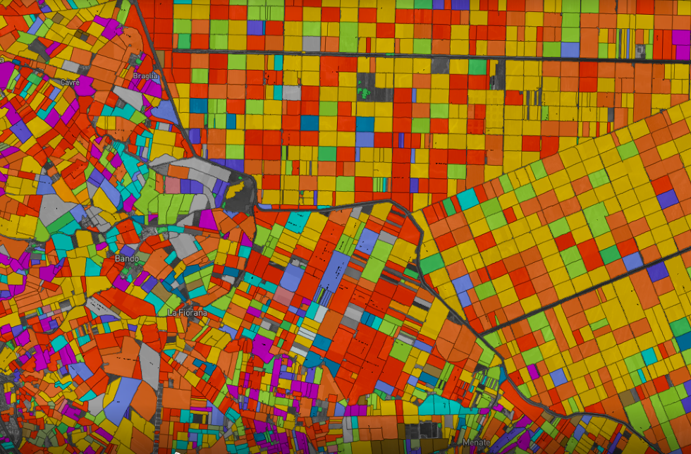
Emilia-Romagna, Italy
When working with vector data there is a conditional constraint: the more information you want to display on the map, the slower everything will work. To solve this problem, we used a utility from Mapbox called Tippecanoe. Based on the algorithms we chose, she determined in which zoom certain fields would be visible and which would not, and invisible vector objects would remove from the layer. In total, Tippecanoe has more than 20 filtering algorithms, we tried everything and selected a couple of basic ones. We compressed the data prepared in this way using Mapbox mbtiles technology to 50 gigabytes, and then uploaded to the company's servers.
The use of the Next JS framework, which performs server-side rendering of the page, allowed us to further accelerate the work of the map. Most applications in the modern world are rendered entirely on the client side: when opening a window in the browser, an empty hmtl page and a script that loads all the information is displayed. The Next JS framework renders everything on the server, and this makes the download of the application fast for the client.
Map: set up a visual and come up with a "magic button" the night before release
Mapbox was a pleasant discovery for our designer. The service simplified his task, because he was able to visualize the data without involving a front-end developer. From the side it may seem that it is easy to paint the fields in the finished interface, but there are many nuances. We have 27 cultures, and choosing colors for them was not easy. For popular cultures, contrasting colors are needed, for less popular ones, less contrasting ones are needed, and all of them should be clearly visible in different zooms. There are a lot of nestings and interactive hints in the map, because the most difficult was to think about the logic of transitions at different levels.
The night before the release, we realized that it’s interesting to watch the map and the numbers, but I don’t want to share this on social networks. Therefore, we decided to add a button “random beautiful fields”, which throws users between different places of the planet. With the whole office, we were looking for beautiful places, in an hour we drew a button and finished everything. In the morning they tested it and launched it. It seems that it was this function that gave us such a large coverage. Otherwise, no one would have noticed that the fields are similar to abstract paintings. Don't underestimate the power of last-minute decisions.
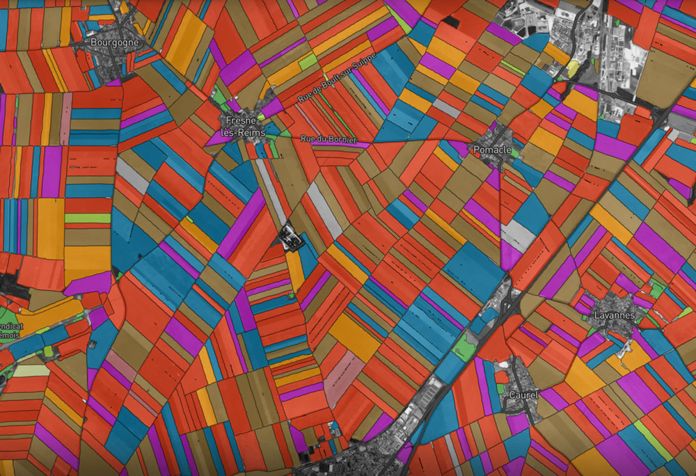
Fields of France
We added another function to the map after launch. We knew that sometimes we recognized the fields and cultures on the map is not entirely accurate, and the feedback from the users allows us to improve our algorithms. After the release, farmers began to send messages about inaccuracies in the recognition of crops: “I grow sunflower on the field, and you have specified corn.” To resolve this issue, we added a button to the field card that sends us error notifications. We use the information we collect to improve the accuracy of our crop recognition models.
Eventually
During its development, the concept of the map has become many times more complicated. If at first we planned to make simple visualization of fields and cultures around the world, then the final product turned out to be much more complex. But the card was worth the effort. After the release, hundreds of investors, funds and scientific researchers wrote to us. We will use some technological solutions, for example, the Next JS framework and the Tippecanoe utility, to work on our free web platform for precision farming OneSoil .
We were the first to map all the fields of the USA and Europe in three years. The data we received is unique. Already we know about the field more than any company or state. And the statistics we get using machine learning algorithms is often more accurate than the one that was compiled manually. We have taken the first step towards automatically recognizing fields throughout the world — this is our plan for the near future.
Source: https://habr.com/ru/post/450070/
All Articles