Schneiderman's eight golden rules will help you create a better interface.

Schneiderman's eight golden rules will help you create a better interface.
Follow Ben Schneiderman's Eight Golden Rules for Interface Design if you want to create great, productive and frustrating user interfaces. Apple, Google and Microsoft are among the most successful companies whose well-designed products reflect the Schneiderman rules. The characteristics derived from the Schneiderman golden rules can be recognized in various user interface guides developed by corporate giants such as the companies mentioned above. The visual implementation of these rules becomes even more apparent in the popular interfaces they create. This article will teach you how to improve your work by integrating the 8 golden rules.
8 golden rules of interface design
Ben Schneiderman (born August 21, 1947) is an American computer scientist and professor at the Laboratory of Human Computer Interaction at the University of Maryland. His works are comparable to other modern designers, such as Don Norman and Jacob Nielsen. In his popular book, Developing a User Interface: Strategies for Effective Human-Computer Interaction, Schneiderman reveals his eight golden rules for interface design:
- Aim for consistency using familiar icons, colors, menu hierarchy, a call to action, and custom scripts when designing similar situations. Standardizing the way information is transmitted ensures that users can apply knowledge from one click to another; without having to learn new insights for the same actions. Consistency plays an important role in helping users become familiar with the digital landscape of your product so that they can more easily achieve their goals.
- Allow regular users to use shortcut keys. With increasing use, there is a need for faster methods of performing tasks. For example, both Windows and Mac provide users with keyboard shortcuts for copying and pasting, therefore, as the user becomes more experienced, they can navigate and control the user interface faster and effortlessly.
- Offer informative feedback. The user must always know where he is and what is happening. Within a reasonable period of time for each action must be appropriate, readable feedback. A good example of this would be to indicate to the user where he is in the process when working with a multi-page questionnaire. A bad example that we often see is when an error message shows an error code instead of a clear and meaningful message.

Copyright / owner: Google, Inc. Copyright terms and license: fair use
')
Windows Media Player designers should have remembered Ben Schneiderman’s third golden rule: to offer informative feedback. Poorly designed error messages often show an error code that means nothing to the user. As a good designer, you should always strive to give readable and meaningful feedback.
- Create a dialog box at the end of the action. Do not make users guess. Tell them what their actions led to. For example, users will be grateful for the “Thank you” message and confirmation of receipt of a purchase after making an online purchase.
- Offer simple error handling. No one likes being told that they are wrong, especially your users. Systems should be designed to be as reliable as possible, but if unavoidable errors occur, make sure that users are provided with simple, intuitive, step-by-step instructions to solve the problem as quickly and painlessly as possible. For example, tick the text boxes in which users forgot to enter data in the online form.
- Allow easy change of actions. Designers should strive to offer users obvious ways to change their actions. These changes must be resolved at various points, regardless of whether it happens after one action, data entry, or the entire sequence of actions.
As Schneiderman argues in his book:
“This feature removes anxiety, as the user knows that errors can be undone; so it encourages exploring unfamiliar options. ”
- Maintain internal control boundaries. Let your users initiate action. Give them the feeling that they are in complete control of events taking place in the digital space. Earn their trust by creating a system that will behave as they expect
- Reduce short-term memory load. Human attention is limited, and we are able to store only about five elements in our short-term memory at a time. Consequently, the interfaces should be as simple as possible, with the correct information hierarchy and the choice of recognition, and not memories. Recognizing something is always easier than remembering, because recognition involves the perception of signals that help us penetrate our vast memory and allow us to pop up relevant information. For example, we often find the format of multiple-choice questions easier than short-answer questions on a test. because it only requires us to know the answer, and not to remember it from our memory. Jacob Nielsen, a user advocate who Bloomberg Businessweek called one of the “most influential designers in the world,” invented several usability methods, including heuristic evaluation. The predominance of recognition over memory is one of Nielsen’s ten heuristics for interface design.
Learn how Apple integrates the 8 Schneiderman Golden Rules
Apple Inc., a large North American technology company, is an excellent example of how a design that reflects the eight golden rules of Schneiderman can lead to successful products. The company has achieved great success in everything from Macintosh to mobile devices. They are proud of their consistent, intuitive and beautiful design. The Apple User Interface Guide for iOS, published in mid-2014, gives an idea of how their design team applies design principles similar to Schneiderman principles.
Consistency
“Consistency” and “perceived stability” are woven into Apple's Mac OS design. The Mac OS menu bar is designed to contain consistent graphic elements regardless of whether it is a version of the 1980s or 2010s.
Author / copyright holder: StockSnap.io Copyright terms and license: CC0
Author / copyright holder: StockSnap.io. Copyright Terms and License: CC0
Appearance Mac OS over time. The menu bar of Mac OS remains unchanged.Shortcut Keys
As mentioned earlier, Mac allows users to use various keyboard shortcuts, such as copying and pasting (Command-C and Command-V) and creating screenshots (Command-Shift-3) as an example.
Author / copyright holder: StockSnap.io. Copyright Terms and License: CC0
Mac allows users to give up mouse clicks by giving them keyboard shortcuts.Informative feedback
A great example of visual feedback can be seen when a file is “highlighted”, when a user clicks a file on a Mac desktop. Another example is when the user holds the mouse down, drags the folder through the desktop and sees how it is physically moved.
Author / copyright holder: Euphemia Wong. Copyright terms and license: fair use
The Training folder becomes highlighted on the Mac desktop when the user clicks on it.
Author / copyright holder: Euphemia Wong. Copyright terms and license: fair use
A folder is rendered as physically moveable when the user holds the mouse and drags it across the desktop.Dialogue
When a user installs software on Mac OS, the dialog box shows at what stage the user is in the process of installation.
Copyright / owner: Google, Inc. Copyright terms and license: fair use
When a user installs Parallels Desktop 9, it shows that at the moment it is “copying files”.Error processing
During software installation, users are unobtrusively notified of an error. It is important to determine when which warnings should be used depending on the severity of the error in order to alert the user. However, it is not permissible to punish the user for mistakes, so be careful and choose the right tone and the right language when writing an error message that will eventually be read by your users. So do not just leave the error code to deal with it!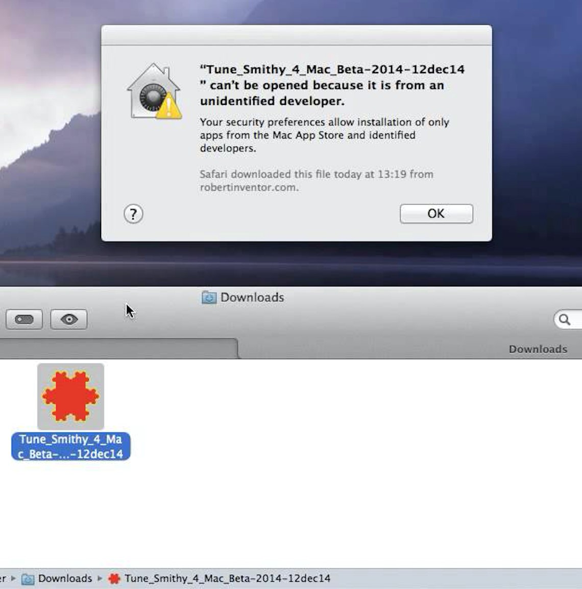
Copyright / owner: Google, Inc. Copyright terms and license: fair use
An unobtrusive error message appears explaining to the user what happened and why. Moreover, it provides support to the user, saying that his actions are under control and explaining that this is in the interests of his own safety.
Author / copyright holder: Manutencaonet Blogspot. Copyright Terms & License: CC BY 3.0
A bad example - in Windows, an error message is displayed that uses the words "fatal" and "terminated." Such negative, unfriendly words will most likely scare the majority of users!Permit Cancellation
When users make a mistake in providing information during the installation process, they are allowed to return to the previous step instead of “punishing” by having to start over.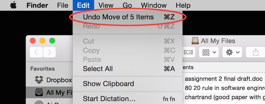
Author / copyright holder: Euphemia Wong. Copyright terms and license: fair use
The user can quickly and easily cancel the previous action.Support for internal control boundary
Give users the ability to choose whether to continue running the program, or exit it. Mac activity monitor allows the user to "force quit" in the event of an unexpected program failure.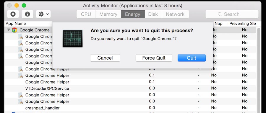
Author / copyright holder: Euphemia Wong. Copyright terms and license: fair use
The user can exit or forcibly exit the program if it falls.Reduced short term memory load
Since people are able to save only 5 items in our short-term memory at a time, the Apple iPhone allowed only 4 application icons to be in the main menu area at the bottom of the screen. This solution not only takes into account the load on the memory, but also takes into account consistency.
Author / copyright holder: Brian Voo. Copyright terms and license: fair use
Author / copyright: Pixabay. Copyright Terms and License: CC0
Excellent examples of how Apple implements the rules of consistency (the first rule), displaying the same bottom menu in different versions of iOS. This is also a great example of how Apple reduces short-term memory usage (the eighth rule). Since people are able to save only 5 items in our short-term memory at a time, the Apple iPhone allowed only 4 application icons to be in the main menu area at the bottom of the screen, regardless of whether it is iOS 4. or iOS 7.
Checklist: How can you apply the Schneiderman 8 Golden Rules to your interfaces?
Your job as a designer is to make your user’s life easier by creating an intuitive, well-designed, and user-friendly interface. Applying the eight golden rules of Schneiderman's interface design will help you do this. Here is a worksheet that you should learn by learning to apply these rules in your projects.

→ Download PDF here .
Conclusion:
By following Ben Schneiderman’s Eight Golden Rules for Interface Design, you will create great, productive and frustrating user interfaces, such as Apple, Google and Microsoft. From Mac and PC to mobile devices or virtual reality and any other interactive technologies that will be invented in the future, if your projects involve interaction between people and the interface, these eight golden rules are of paramount importance in the design process. To get started, use the attached worksheet to learn how to apply these rules in your work.
To learn more:
For more information on Ben Schneiderman's 8 Golden Rules, see .
For more information about 10 Jacob Nielsen heuristics, see .
For more information on the iOS User Interface Guide, see .
Recommendations
Copyright / copyright: Marc Smith. Copyright Terms & License: CC BY 2.0
Source: https://habr.com/ru/post/449994/
All Articles