History of one logo
I want to present a little story about how I worked for a week on my logo, the greatest pleasure was delivered to me by the process of work, and the rest is not important))
formazon identity week, step 1
I’ve almost finished working on my site , but there’s just one small thing left, a fairly standard element — my logo or more precisely the symbol. I’ve been fighting over this symbol for the last five years, I’m fighting because I cannot dwell on any particular idea, I cannot say this symbol and that’s all. But in connection with the renewal of the portfolio and other reasonable thoughts, I chose the idea, or rather I found the foundation on which I will build the idea.

Mandala (Sk. मण्डल, “circle”, “disk”) is a sacral symbol used in meditation in Buddhism, a ritual object. The mandala symbolizes the realm of the deities of the deities, the pure lands of the buddhas. In principle, the mandala is a geometric symbol of a complex structure, which is interpreted as a model of the universe, the "space map"
')
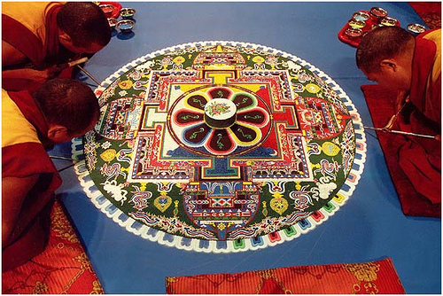
Personally, I would like to see as my symbol precisely thought-out geometric image, with specially selected colors, that is, such a symbol that would have a special impact on the beholder. At the moment I am studying this topic and making some sketches of my mandala:
formazon identity week, step 2
In search of a form, I made a bunch of sketches on paper, I will not upload them here, but I'd rather show drafts from an illustrator.
Drawing my mandala, I formulated the following principles:
1. Easy form without small elements.
2. Mandalas use many colors, which makes them look colorful and bright. I want to try using several colors, not more than three
3. Must be good recognition when scaling
4. On a large scale to work out the details.
formazon identity week, step 3
Hurray, I found, found! Found completely simplifying previous sketches. Having tried a bunch of complicated options, I randomly deleted many elements and caught this thing:

The color is so far, even scary that there is so much black, but purple is glowing - it really is glowing. Now I will try to play with the flowers, although I really like these and will experiment with the mandala in the entourage.
formazon identity week, step 4
My sign, I almost dreamed, so he penetrated deep into the consciousness. The sign is brilliant, in the sense that I just like to look at it and it looks great on light and dark backgrounds. But as a symbol which can "sign" works and which can be used as an icon of authorship on sites that I do it does not fit - on small sizes it loses its properties.
But I had a great set of colors, although it resembles an "Emo-style", I began to work with him in search of a more utilitarian mark.
I tried many options, looked for a light form but didn't catch anything, then I went back to the mandala structure and took the principle of the background from there, and then playing with flowers I found a very interesting design that hooked me:
While I can not decide on the direction of the black triangle, I will think, but this sign is terribly torkat me! The result was a pyramid.
Possibly someone will have associations with zhitlodub

The next stage - I'll see how the sign looks in the "environment"
Lastly, some experiments:
formazon identity week, step 5
I am pleased with the result. It all started with the Tibetan mandala and the result is this:

This image is very utilitarian as a means of visual identification. As a logo, this picture also has a number of advantages: recognizability, positive colors, luminescence, volume (pyramid, top view), light scalability, square shape. I called this symbol QdEX (derived from Quad Experiment )
Qdex organically looks on sites, in im-clients, as the signature of works.
deviantart.com
androidforums.ru
Now nothing prevents me from finishing and posting a new version of formazon.com , which I will do.
PS Draft:
Thank you all for your attention.
formazon identity week, step 1
I’ve almost finished working on my site , but there’s just one small thing left, a fairly standard element — my logo or more precisely the symbol. I’ve been fighting over this symbol for the last five years, I’m fighting because I cannot dwell on any particular idea, I cannot say this symbol and that’s all. But in connection with the renewal of the portfolio and other reasonable thoughts, I chose the idea, or rather I found the foundation on which I will build the idea.
Mandala (Sk. मण्डल, “circle”, “disk”) is a sacral symbol used in meditation in Buddhism, a ritual object. The mandala symbolizes the realm of the deities of the deities, the pure lands of the buddhas. In principle, the mandala is a geometric symbol of a complex structure, which is interpreted as a model of the universe, the "space map"
')
Personally, I would like to see as my symbol precisely thought-out geometric image, with specially selected colors, that is, such a symbol that would have a special impact on the beholder. At the moment I am studying this topic and making some sketches of my mandala:
formazon identity week, step 2
In search of a form, I made a bunch of sketches on paper, I will not upload them here, but I'd rather show drafts from an illustrator.
Drawing my mandala, I formulated the following principles:
1. Easy form without small elements.
2. Mandalas use many colors, which makes them look colorful and bright. I want to try using several colors, not more than three
3. Must be good recognition when scaling
4. On a large scale to work out the details.
formazon identity week, step 3
Hurray, I found, found! Found completely simplifying previous sketches. Having tried a bunch of complicated options, I randomly deleted many elements and caught this thing:
The color is so far, even scary that there is so much black, but purple is glowing - it really is glowing. Now I will try to play with the flowers, although I really like these and will experiment with the mandala in the entourage.
formazon identity week, step 4
My sign, I almost dreamed, so he penetrated deep into the consciousness. The sign is brilliant, in the sense that I just like to look at it and it looks great on light and dark backgrounds. But as a symbol which can "sign" works and which can be used as an icon of authorship on sites that I do it does not fit - on small sizes it loses its properties.
But I had a great set of colors, although it resembles an "Emo-style", I began to work with him in search of a more utilitarian mark.
I tried many options, looked for a light form but didn't catch anything, then I went back to the mandala structure and took the principle of the background from there, and then playing with flowers I found a very interesting design that hooked me:
While I can not decide on the direction of the black triangle, I will think, but this sign is terribly torkat me! The result was a pyramid.
Possibly someone will have associations with zhitlodub
The next stage - I'll see how the sign looks in the "environment"
Lastly, some experiments:
formazon identity week, step 5
I am pleased with the result. It all started with the Tibetan mandala and the result is this:
This image is very utilitarian as a means of visual identification. As a logo, this picture also has a number of advantages: recognizability, positive colors, luminescence, volume (pyramid, top view), light scalability, square shape. I called this symbol QdEX (derived from Quad Experiment )
Qdex organically looks on sites, in im-clients, as the signature of works.
deviantart.com
androidforums.ru
Now nothing prevents me from finishing and posting a new version of formazon.com , which I will do.PS Draft:
Thank you all for your attention.
Source: https://habr.com/ru/post/44995/
All Articles