How to ride a rainbow: the story of a dark theme

In September, we released the dark theme of the official VKontakte application for iOS, and a week ago the release took place on Android. Behind this launch is a big joint work of developers and designers. Together, we didn’t just translate VK to the dark side, but also seriously changed the approach to working with colors in our interfaces, simplifying their choice and reducing the likelihood of making mistakes and producing unnecessary styles.
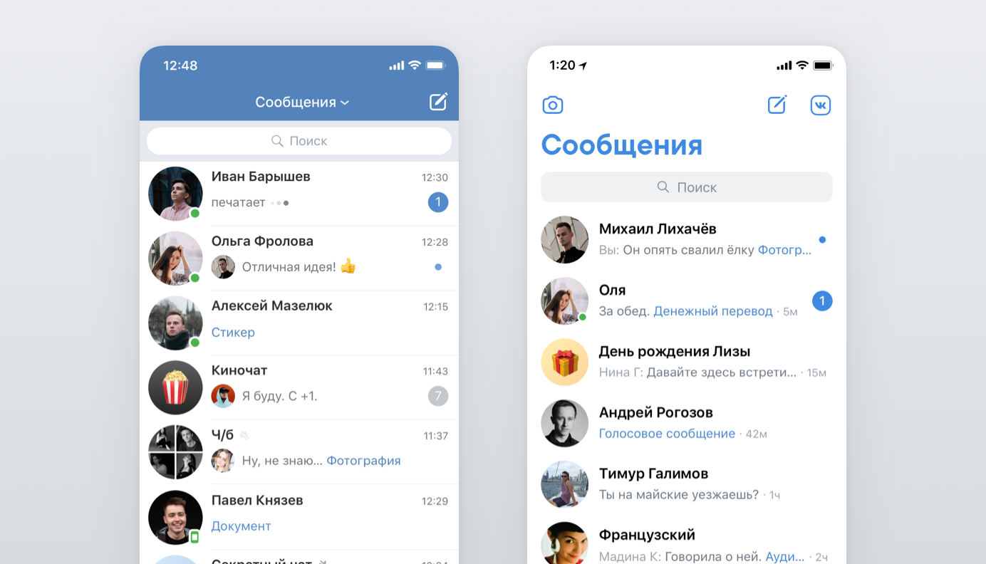
My name is Mikhail Likhachev, I am the leading designer of VK. I will tell you how a small team adapted 300 screens and systematized all the colors existing in mobile applications - for this we synchronized them between platforms and brought work with them into a single design system with tokens. I will share my impressions of how we now live with this and whether the design process has become more complicated.
Why do we need a dark theme
Low contrast and dark background help to use the application in low light without straining your eyes. Google confirms that when using a dark theme, devices with AMOLED screens work longer without recharging. And many more just like the black color or want a fresh theme of design (at the same time, of course, without redesign).
Now the dark theme is implemented not only in popular applications, but also in the macOS, tvOS operating systems, in Android launchers. And its appearance on all iOS and Android devices will not be long in coming.
For us, this was also a realization of the long-awaited function - the users asked for the dark theme most often. It turned out to be really popular - now more than 20% of the audience regularly uses a dark theme on iOS and Android.
Color system
Before making a dark theme, we needed to reorganize the color palette of our application. The goal was the following: both in the code and in the design there should not be colors that are not included in a fixed palette. For a small set of colors it will be easier to match in the dark theme.
When we checked the entire application and collected all the colors, we had more than 200 unique HEX values. Since the release of the first version of the VK App on iOS, more than 6 years have passed, the application has gone through several redesigns. Somewhere there are still pre-updated screens, and somewhere there were situations where the same color had a meaning that differs extremely insignificantly. For example, a single color in HSB could have different HEX values in Photoshop and Sketch.
Our application is very large. We can say that these are several applications in one: news, music, video, stories, broadcasts, a whole messenger and many other equally important sections and services. We counted 300-400 unique screens, each of which has many states. News alone has several types of displaying records and more than 15 types of attachments. For such an application, a more complex system is needed, where the colors would be broken down into contrast levels, so that it would be easier to select them not only for a dark theme, but also for new controls.
In terms of organizing the color system, we liked the material design approach the most . We prepared in the similar system three expanded palettes: gray, cold-gray and blue. At the same time, we divided the colors according to contrast levels with conditional values from 0 to 1000, where 0 is the lightest and 1000 is the darkest. These numbers became the identifiers of the colors along with the name of the palette — Gray 100, Blue 300, and so on.

The color model helps HSB. In it, Hue is a color tone, Saturation is saturation, and Brightness is brightness. Hue varies from 0 to 360 °, and we use a fixed value of 212 ° in our interfaces as our brand color tone. Saturation and Brightness is set from 0 to 100%.
As we divide the gray palette into 10 main shades, in Brightness we use a step of 10%. Then we mix the blue color with Saturation on a small curve, at the same time adjusting the Brightness values to keep the contrast gradation we need.
In the same way, we picked up cold-gray and blue palettes. Cold gray is used in places where a more intense hue is required for combination with blue, and several blue colors are needed for accents, different buttons, text, and links.
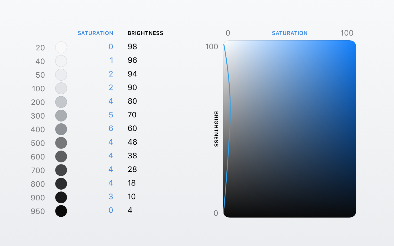
We use gray most often for the most different elements: backgrounds, substrates, dividers, icons, texts of different levels. Most of the gray shades we have already chosen with a similar difference in contrast, and when updating the palette, we slightly shifted the values in several colors to match the new logic. And also complemented the missing part of the colors in the dark spectrum to use them for a dark theme.
Absolutely all the colors used in the application, including denoting different events in notifications, and even the colors from the graffiti drawing mode in stories were added to the palette. Everything has become much more transparent: now all the colors of the application are collected in one place. And when adding a new color for a particular case, you need to think carefully and check whether the color from the existing ones will work.
Having prepared the predefined palette, it had to be applied in the application, replacing more than 200 existing HEX values with a new set of more than 50. And put all these colors in one file in the form of static variables, where each color from the palette has a unique name.
This was done by our developers from the infrastructure team on iOS and Android. The guys have prepared an algorithm that replaces the color with the closest one from the new palette, which significantly accelerated the process. Then we checked all the screens with testers so that the wrong color was not applied anywhere, and finally took up the dark theme.
Selection of flowers in the dark theme
We began to try on the colors of the dark theme on the layouts of the main screens to determine the main shades used. For the background, use Gray 900 — one tone brighter than black to reduce the contrast between the background and the text. The text for the same reason chose not White, but Gray 100.
All the main colors for the dark theme were determined by the same gradation as in the light one. Putting the styles that follow one after the other in brightness, we selected the corresponding values by inverting them and shifting the contrast level by one tone. Then we tested the colors on the layouts, making sure that all the elements have retained readability.
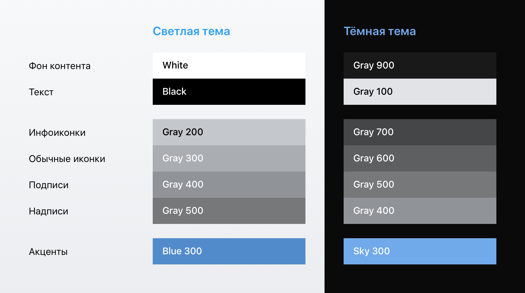
Table of main colors used
In the dark theme, we used fewer colors: the blue cap and blue buttons became monochrome, the range of gray shades used narrowed, and the cold-gray palette turned into ordinary gray, while maintaining contrast. The accent elements remained blue - for a dark theme a lighter and less saturated shade was chosen.

There were also problem areas, such as modal windows and cards. Blackout under them did not want to be inverted into white, and without additional measures in the dark theme, the usual background of the content would merge with the environment. To avoid this, for the modal cards, we picked up the background a tone lighter than usual, and also added a stroke (so far only on Android) in order to better separate them from the bottom layer.
Such examples have shown that we need a more flexible system when implementing a dark theme.
Technical implementation
Having selected the appropriate colors for the dark theme on the layouts, we began to transfer this matter to the code.
As we have seen on the layouts, it is not our option to simply add color matches from a light to a dark theme. White will not be replaced with black everywhere: elements of the same color in a light theme may have different colors in a dark one. We needed precise control over how each element or group of common styles is repainted in a dark theme. Elements must change color in accordance with the meaning embedded in the variable name.
We decided on the following approach, where the token is the unique name of an element or group of elements (for example, background_content), and its value can only be a color from a fixed palette (for example, White). We made a scheme in JSON-format, within which all the tokens are written with their values in each topic.
This scheme is very similar to the CSS file with the identifiers of elements and their styles, but in JSON format.

How the scheme with the tokens background_content and text_primary looks
All that we have is available on GitHub:
- palette with all colors and their unique names;
- scheme with all tokens and their values in light and dark themes.
From all JSON schemas, developers on all platforms generate code in the format they need. You can read about this with examples of iOS code on slides of Anton Spivak from his speech at CodeFest. Report on the implementation on Android with the speech of Arseny Vasiliev on AppConf can be viewed here .
Recall that we decided to make a strict system, where you can specify the color only from the internal palette, that is, you can’t specify an arbitrary HEX color code in the value of the token. You can add the alpha parameter to the value of the token to indicate additional color transparency. We plan to use this parameter to add the disabled state and the touch state of the controls, in order not to add the same colors to the palette with a different transparency.
At the moment, there are already more than 150 tokens in the scheme. There are both global variables and fully defined styles of each control, as well as unique cases that would not be amenable to a more logical combination, for example, bubble styles from messages.
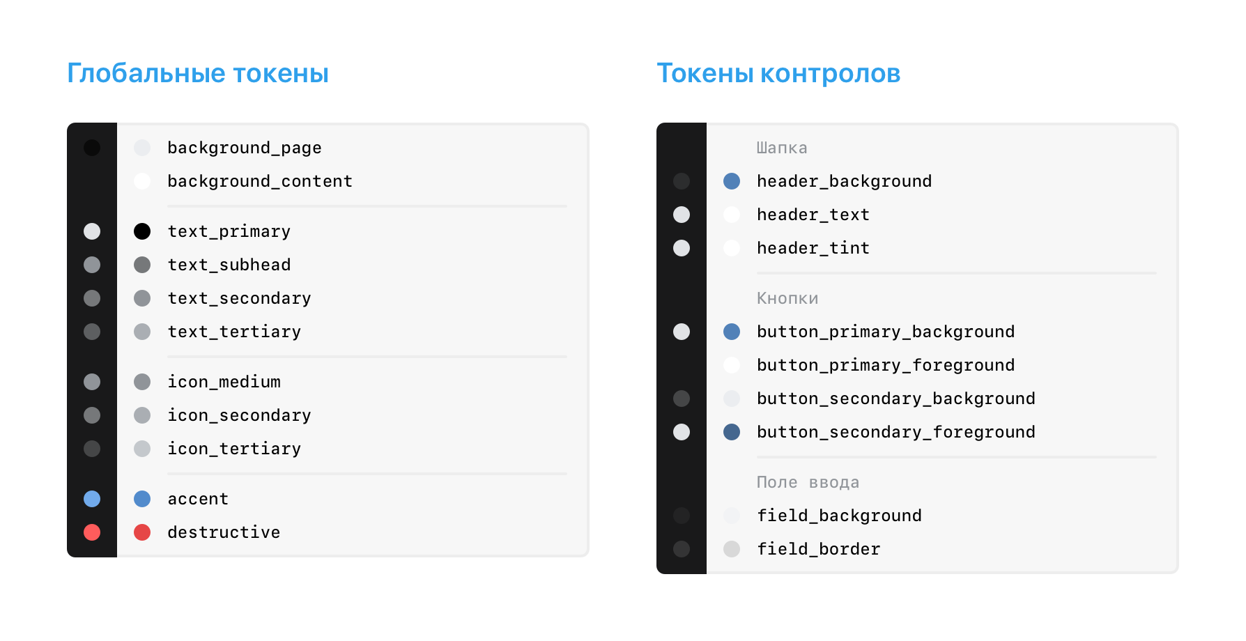
Examples of frequently used tokens
A rather important point is that it is necessary to clearly and briefly name tokens in order to easily and quickly find them. The principle of the name chosen is the following: from large to small. According to this logic in global styles, the general type is first indicated, and the components have the name, state, and at the end a specific element to be repainted. The token should, if possible, be universal - reflect the type and semantic meaning, and not its location and content in a particular case.
Further work with the scheme
Sketch and Zeplin
The next step: it is necessary to give the developers in an understandable form the information about tokens used in the layouts. To do this, we visualized the token as a symbol, where in addition to the name there is a preview of the color used in dark and light themes, as well as the names of the colors from the palette.
We generated such tokens in the form of symbols already after we made up most of the scheme, and even then there were quite a few tokens. In order not to compile them manually, we prepared a small plugin that pulled up the current version of the JSON scheme and generated tokens as symbols from the template, substituting colors from the general styles of the color library. Using the same plugin, we generate a library update: new tokens are added, and the values of existing ones are updated. The symbol from the library is updated in all layouts where it is used.
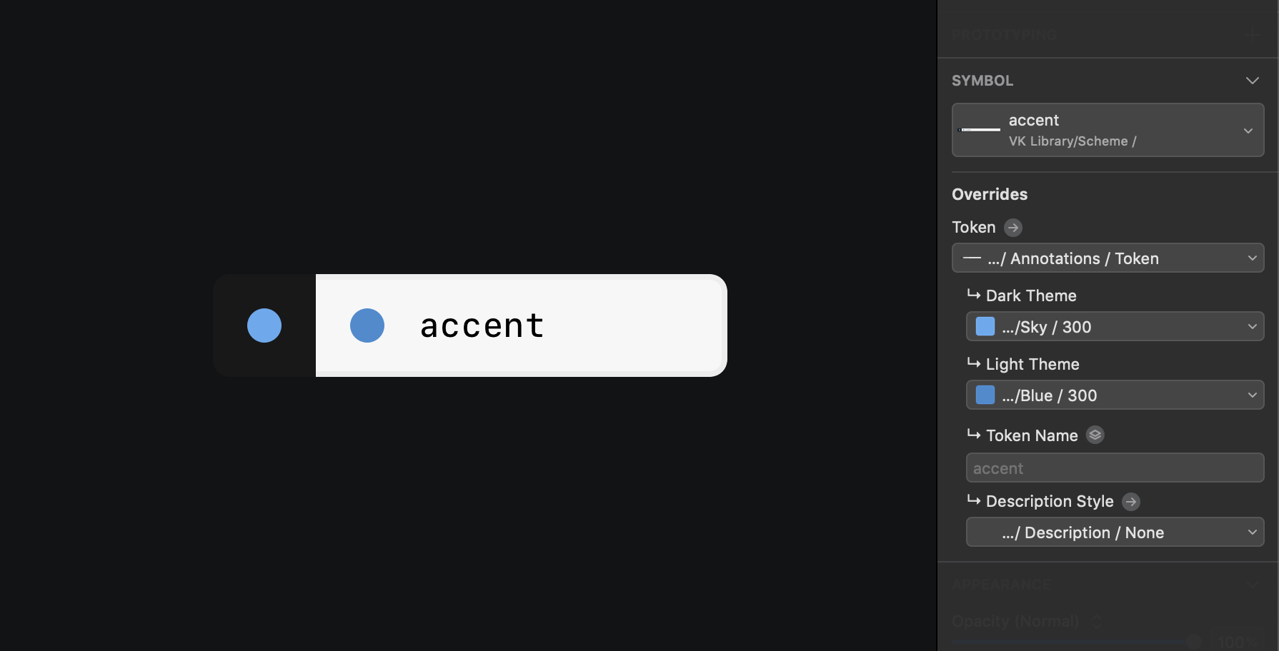
It looks like a token in the form of a symbol
We add such tokens next to the layouts and send everything together to Zeplin. If it is not immediately clear by the name or it is necessary to clarify to which element the tokens belong, add a description and divide the tokens into sections, describing specific elements. Using the Sketch Runner plugin to quickly search for the names of characters, we got our designer describing the dark theme in the form of annotations to the layouts.

Add description about used tokens
We did not find a more native, simple and visual solution of how to embed tokens into layouts with further sending to Zeplin. Although in Zeplin you can give names to unique colors, in our scheme one color can be used in several tokens at once.
Instead of drawing a dark version for each of the hundreds of screens, we simply describe everything in the form of tokens, thereby saving designers time. All existing values of tokens for components have already been tested, and you just need to substitute the correct ones. The single point of truth is the UI Kit - in it you can find not only the current state of the component, but also its used tokens.
Errors in the implementation of the dark theme can be found already at the testing stage when checking screenshots. Testers themselves may notice the obviously wrong color and ask for the help of the designer - to correct the defect, we need only the name of the correct token.
Schema Updates
When you need to update the scheme, replacing the values of existing tokens or creating new ones, you just need to edit the JSON file. To do this, we pull up the current version of the scheme and make changes in a text editor, not forgetting to add values for all topics when adding a token. The plans are to make an application for yourself that allows editing the scheme in a simpler way, but so far this is enough.
Having prepared the updated scheme, we send a pull-request to GitHub (file change request), which is checked and approved by the developers. After the changes have been merged, developers need to pull up the UI library update, and then new colors will appear in the next dev-build in 15 minutes.
To rename or delete tokens in the schema, we create a major update, raising its version in GitHub. This means that such a version will not be automatically applied, and before updating the version of the UI library, developers need to support all changes: update the names of tokens, and if the token to be deleted is used somewhere, follow the comment from the list of changes that indicates which token use instead.
We can release such updates when refactoring the schema: when there is an understanding of how best to call tokens, or if it turns out to combine several tokens into one, while maintaining the logic.
Cross-platform and VKUI
The colors in iOS and Android applications are almost completely identical, so the color scheme created by working with iOS came up for Android. If there were platform differences, you can always create tokens with the platform suffix.
In addition to native applications, we have VKUI . This is a set of React components, with which you can create interfaces that are externally indistinguishable from our applications. We use VKUI to create test products inside VK, as well as for screens that we would like to manage from the server without updating the application. In addition, this library is used to create VK Apps services by third-party developers.
VKUI is built on the same design and with the same set of components as the native applications, so the application of the scheme and the support of the dark theme did not require new layouts. For us, this is like another platform that we support, only it contains a switch between iOS and Android.
You can see the implementation of the VK design system in the form of React-components on VKUI Styleguide . And the most interesting thing is that on this page you can see the components we use live with the ability to switch the theme and platform.
In the near future, we will update the VKUI documentation and gather more information about the work of our design team - there will be a lot of interesting
Separate theme for the messenger
VK Me, which is currently being tested only in Kazakhstan, is a separate instant messenger with the ability to register by phone number. In it, we not only facilitated the functionality, leaving only communication, but also simplified the design.
The cap in the light theme became white to focus attention on communication, and the blue became brighter and more saturated.
The messenger is made on the basis of the message module from the main application, which means that it uses the same components and the same scheme to describe all the colors. For example, to repaint the header and search, it was necessary to replace the values of the corresponding tokens: header_background, header_tint, header_text, search_bar_background, search_bar_field_background, search_bar_field_tint, and others.
In a rather simple way, we were able to repaint the entire application in a short time by creating a new theme.
Work with graphics
The entire set of icons used in the applications is cut in white and can be easily repainted using the token from the scheme.
Difficulties arose with bicolor icons: icons that were superimposed on top of avatars in the form of badges and that needed a white stroke were cut in two colors. Repaint this would be difficult. We break similar icons into two layers, front and background, which is used as a mask and cuts the necessary shape.

Android also has 9-patch graphics, which is used, for example, to draw cards with shadows. The shadow in them is black, and the fill of the card is white. In order not to split the graphics here into two layers, the developers used the Multiply color blending mode - so the black shadow is not repainted, and the color is applied only on the white part of the pictures, which was necessary for us.
Results
When implementing a dark theme, we seriously pumped the processes, bringing the relationship between design and development to a new level.
The unified scheme, which absorbed all the work with colors in the application, has become a powerful but affordable tool for designers and simplifies future design updates. Increased level of responsibility and meaningfulness in creating styles and adding colors.
When clear names appeared reflecting the contrast of colors, it became much easier to navigate by them than by HEX values. Likewise with tokens - they are remembered due to the meaning embedded in them, and compliance with logic in the styles used on several platforms and applications becomes an indispensable part of the process.
The process was time consuming, not only for designers, but also for developers and testers. But it was worth it - the dark theme gathered positive feedback from users, and the “dark theme” comments that spread throughout VK and even went beyond its limits managed to become a meme.
')
Source: https://habr.com/ru/post/449720/
All Articles