Embedded Systems Interface Design
Embedded and industrial systems are my favorite design topic. When you make the software interface of any laser or yacht - this is pure thrill and creativity.
Last week I visited expoelectronica and embeddedday exactly as a UI developer. The goal was to look at the new items live, touch, gain experience.
As a result, I looked at more than 100 GUIs of various systems, but with a set of experiences, problems arose ...
Thinking that I could somehow help the development of the industry as a whole, I decided to examine specific examples from exhibitions in 2019, after analyzing the errors in the interfaces. Next, I will try to give recommendations that can be useful not only to developers of a specific system, but also to the rest. All logos are hidden so as not to offend anyone.
Attention! A lot of photos!
I apologize for the quality of some photos, they were made “for myself" in the process of conversations and tests. The idea of the article came after.
About design in general
Most of the systems presented at the exhibition are no different from those that I saw in the early 2000s, when very few people thought about the design of interfaces.
Anticipating the reaction of readers that "ryushechki and jewelry" are not needed by the industrial system, I answer:
The UI design is not just a beautiful picture, it is a way of presenting information to the user and interacting with it. The topic of the article is also a session of 8 or more hours per day.
The design may be out of date, without animation, based on a standard system GUI, but excellent in terms of convenience, speed and ease of use.
And, vice versa - you can draw a beautiful screen in expensive, dark colors, pleasing the eye of the inhabitant, but in practice it is inconvenient, with ill-conceived navigation and uninformative. Often this is also accompanied by the slow work of the visual part, since iron developers, as a rule, have little experience in such matters.
Beauty is a relative concept, but from experience, good design is always beautiful, fast and convenient.
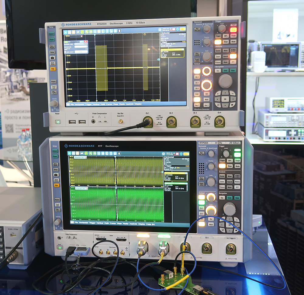
Look for good examples - look at oscilloscopes
All the oscilloscopes at the exhibition were good in everything regarding design. My colleague suggested that this type of device existed on the market a long time ago (in 1932 the first oscilloscope with a CRT screen was introduced), so it’s almost impossible to enter the market without a perfect case design and interface - one of the competitive advantages is lost.
This is confirmed by the number of exposed devices of this type, more than 2 dozen.
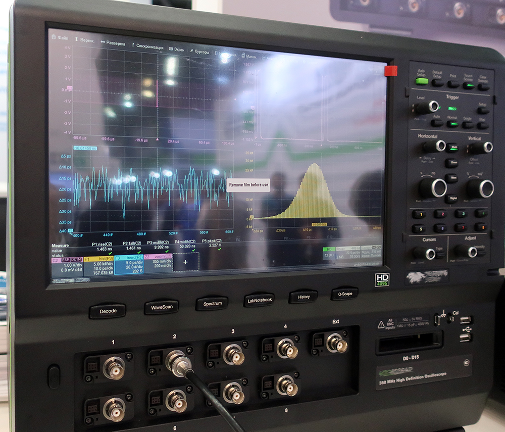
Unfortunately, oscilloscopes are the only exhibits that made me excited and have a sense of aesthetic pleasure.
Do not use popular guidelines
(Material Design, Windows Metro, etc.)

I cannot call such an error a mistake, it is rather a recommendation.
- By experience, guides can be used only by the designer (although they are often positioned quite differently)
- Any Guidelines are created for a specific platform (or product). Using, say, a flat style Win 10 in an application on QT, HTML and even WPF, you create a "fake" that does not reach the original in terms of the quality of the visual part (which, according to many, is not so good).
- You will not be able to use the main features of the base platform: animation, navigation, validation, notification, etc.
- All this is complemented by a simple hardware that is not capable of smoothly drawing home-made animations (which, by the way, will take a lot of time for your developers, or a 150 MB library downloaded from GitHub).
- Add here an industrial touchscreen, incapable of responsiveness like tablets on win10.
- In addition, this approach destroys the expectations of those who actually use the original.
Flat style Metro is only a UWP platform, iOS only on iOS, Material - Android / Flutter
The most reasonable thing in such cases (if you really want to) is to create a custom style, remotely based on some guides. Such an approach in the final estimate will be cheaper than, for example, Material Design on Windows.
Interface design should be one with iron design
Here, I think everything is clear.
This does not mean that if your corporate color is red, then you need to paint everything in red:
- On the manufacturer's website corporate color is bright red. Most likely, they used a proprietary RGB value, but due to the low brightness of the screen and inaccurate color transmission, it turned out dirty tomato. If the developer had spent half an hour picking up the color, it would still look bad, but at least in the right shade.
- This UI is not a readable flowchart, but for the diagrams below.
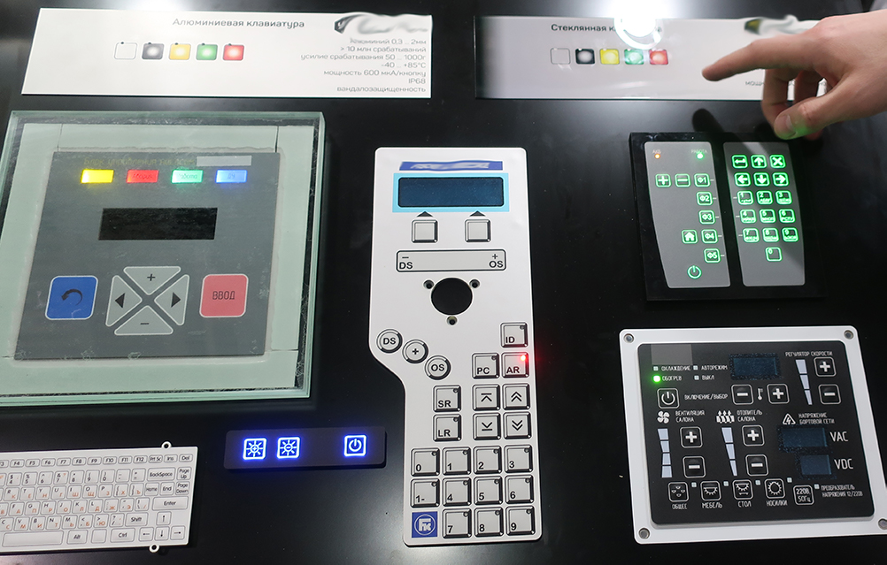
If the interface uses "physical" buttons (especially on the sides of the screen as in ATMs), a keyboard, trackball, joystick, or the like, this should be taken into account.
Here is a good example:
- At first glance, it is clear where to press, but the text on the pressed tab button is unreadable.
About logos
One of the most common mistakes is the manufacturer's logo in the software header, while the logo is already present on the device. Often it is located directly on the frame of the monitor:
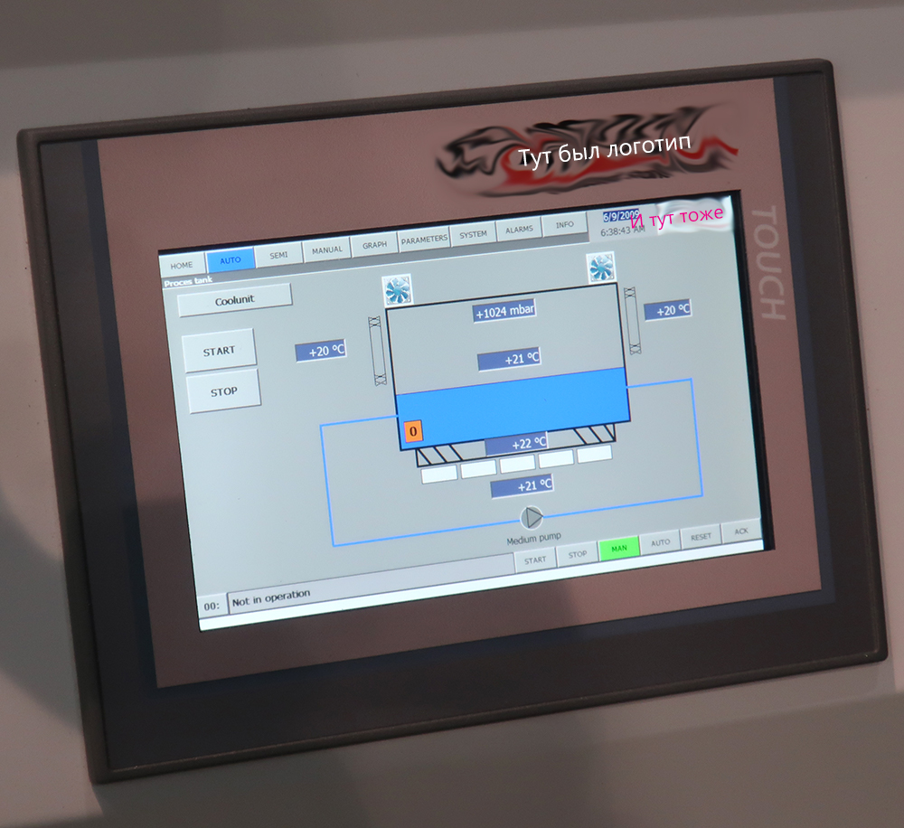
Duplicate is not necessary. You already have a great badge in the most prominent place, the user saw it even before the system was turned on.
The logo on the login screen or screensaver - yes, in the working mode - mindless use of valuable space.
- Again, poorly read flowcharts.
Use your development
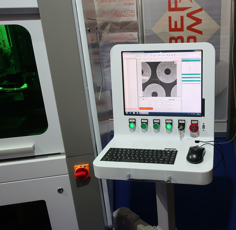
I love lasers. Lasers are cool. But the more you look at this photo, the less you want such a laser. Even the fashionable green light box does not save.
<sorry, I’ll scold lasers now, I can’t keep silent>
I do not know who designed it, but he clearly did not work at his “industrial” computer on wheels.
- Perhaps this is a very user-friendly interface, but the user will not appreciate this by moving a cheap mouse in a confined space over painted metal. Also a canopy arm.
- I am moved by the hole with the Num and Caps keyboards made with the care of a person. This is the most common (ie, non-industrial) keyboard, which will be in the mud for the most “do not spoil” after a month. It's not fun to work with a laser with a stuck "Escape". The only way to clean the keyboard is to disassemble the entire weighty design.
- The slot under the monitor control buttons ... Perhaps this is a very high-precision laser, but cut out 5 millimeters below so that the "Power" button fits completely - even the manufacturer failed. Yes, there is the most common desktop monitor inside the stick, and not the built-in screen.
- Green STOP button. I know for sure that such buttons are illuminated with orange and red colors. I wonder if anyone accidentally pressed the fungus, because it also has the inscription STOP, which is clearly more noticeable?
</ finish scold lasers>
What does this have to do with UI design? Direct. User interaction with the system begins with input-output devices. Absolutely any software will lose if it is installed on the problem hardware.
At 10 meters from the stand of this laser was a showcase with industrial keyboards.
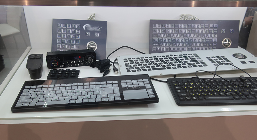
If you walk another 20 meters, you will see a stand with modern industrial buttons.
, .
In fact, there is no need for iron at all. The photo shows that the program works on Windows7 even without full-screen mode, there are no embedded technologies. What prevented the user from being able to directly connect his favorite laptop with this software to the laser? There were several such decisions at the exhibitions, I see nothing wrong with such a connection.
Consider the screen settings
The physical screen size and resolution, distance from the user's eyes and working angles are important.
As a rule, these parameters are known in advance. If not, then you need to do everything bigger, especially the touch interfaces.
When everything is very small:
,
After the first layout is drawn - load it with a picture on the device, if it is not possible to load it - cut out a full-size screen from cardboard and put the printed interface under the cardboard, press it on top with glass. Ideally, take into account the deepening of the screen in the device. This simple approach will provide an opportunity to see the UI in space, to assess the accuracy of the selected sizes for the buttons, to understand how to increase the accent, and how to reduce it. Walk around the future system, looking at it from the "working" angles. Check whether it is convenient for the hands to click on the elements.
This fairly simple technique will allow you to avoid size errors in the very early stages of design.
Software design is clearly for a specific screen:
,
Rational use of space

The smaller the monitor, the more attention must be paid to the physical dimensions of the UI elements.
The first thing that catches your eye is the inscription PASS, which is the result of the test (passed, all is well).
On small, low-resolution screens, this is clearly not very ergonomic.
Perhaps such gigantism is somehow justified. The inscription is clearly visible from 20 meters. A little googling and watching the video on how to use these devices, I came to the conclusion that it is hardly necessary to occupy this quarter of the screen.
Consider display color limitations
Simple loading pictures on the device allows you to understand whether the colors are not lost, how bad the "ladder" of the gradient is in the background.
Do not forget to look at different "working" angles. For example, a stylish dark blue background “on top” looks like this on TN matrices:
Perhaps, this UI accidentally came out on the photo with "lights". Live colors seemed better. From afar, I even liked it.
Let's analyze this interface a little more:
- Explicit problems with the grid. Somewhere closely, but somewhere huge gaps. The left side is too pressed to the frame of the monitor, the icons on it are generally with zero indent (although the margin on the right is made huge)
- On the bottom row of buttons designer is not enough. Left in the system view.
- Element Toggle Switch. It is better to paint the background in the on state, otherwise there is a problem with understanding the position of the switch. Look at the red Toggle “Setup”, is it on or off? Or it is validated because Is there something wrong with the settings?
- Signatures to elements of the same type should be made the same. Somewhere with a capital letter, somewhere with a small, different fonts and sizes.
- 2 buttons "Start", I can be mistaken, but it seems they are for different purposes, you can easily get confused.
- Button "Shutdown" is located unsuccessfully.
Often, the UI on a standard monitor (especially if the designer has Super IPS from Apple) looks different than on the display for which this design was made. Physics, merciless you ... The color characteristics of industrial monitors are very far from professional.
It is desirable to carry out all tests in the native habitat, the touch-screen kiosk on the street and in the shopping center are two different things.
Looking at the photo above, I will answer one more important question:
Dark VS light GUI
Practice shows that dark is better in the following ways.
- Displays for embedded systems are usually taken from cheap Chinese or expensive industrial ones. In terms of color and brightness, they are both weak, which means you will always have a problem with grayscale, close to white and black. Those. you will have to increase the contrast. If in the dark theme to separate the two panels from each other you can take for their background colors far enough located on the spectrum (so that your display displays them as clearly different), then with a light UI it is already more difficult, since With this approach, you will go to a dirty gray, everything will not look bright enough.
- An even light shade for the background is quite difficult to display due to the frequent uneven illumination of such displays, which can lead to dimming in the corners. Dark UIs will not have this flaw.
- Black background gives more freedom in "signal" colors. For embedded systems, this is important.
On a black background, you can easily display a light green, blue, purple, yellow and orange light bulb (LED), leaving it with a red light for errors. Light blur just make the effect of "glow". All colors will be clearly distinguishable by the user, even at a distance. Yellow color on a white background, and even with blur, is not at all noticeable.
In fact, all that you can put accents in a bright interface is blue, red and green. If you use, for example, blue as the primary color of the elements and red for validation, it turns out that you have only green at your disposal, and perhaps some shade of orange, which is clearly not enough. - The monitor is a light source. In a dark room with an 8-hour workday, a bright UI in a year will lead to points on the user's nose.
- It is fashionable. Look at the popularity of the current flash mob in social networks about the dark theme for VK. The same reddit made recently a dark scheme. Dark VisualStudio, Photoshop, 3D packages, etc. Users love.
Bright interfaces look great in a white case. With the proper skill of the designer, you can make a complete "WOW". But you need a good, bright display and a well-lit room.
Also, light UIs give odds to dark on e-ink displays.
Watch users
No need to reinvent the wheel, users themselves will tell you how they prefer.

Notice how the exhibitor put the upper ToolBar, taking up a third of the screen and turning them into a vertical toolbar.
Because it is more convenient to use this, it is more informative than the chaotic variation of parameters on a horizontal plane.
The developer needs only to make the user this panel in a normal form.
Docking window + MDI window + Ribbon + Tab Control
Developers of different editors like to combine incompatible.
Designing navigation in the application, the choice of the navigation structure of the window is comparable to the choice of the foundation for the house.
If you use a Ribbon, then you do not use a dozen side panels, because the Ribbon is a universal grouping of tools.
If you want the Docking window, then do Docking, not TabControl.
If you insert another TabControl into TabControl, and even immediately under each other, this is the first sign that you are not okay with navigation.
MDI window - the interface is morally obsolete as early as 2003. In modern development platforms, there is even no component for it, but many persist in building a project based on ancient technologies:
The support of such an architecture is becoming more and more complex every year. Modern UI on this principle is not possible.
Although, this does not mean that you can not do well.
Here is a good interface for old standard components:
- MDI + Docking, but I can't fault it
- Very similar to what is done on Delphi. They used to like this layout and this form of tabs.
- Proper use of MDI (only canvas and takeaway tools in docking)
- Good circuit views
- Laconic icon set
- Powered by Win10
The topic of this question is too broad, so perhaps I will stop.
Schemes and drawings
To make this flowchart look good, you just need to replace the dirty gray background with a white one and make the inscriptions dark.
This will be perceived as a color drawing on paper and will stop cutting eyes.
When you do not have a designer - do it generally.
If you want a flowchart on a dark background, then you need to work out all the components individually for your design (you can’t do this for the drawing).
It may look like this in the end:
WPF. 10-
Block diagrams are needed if there are really many of them in the system, or the line / equipment / process configuration can be very different and you cannot draw a UI design for a specific case.
I'm a designer, I see it
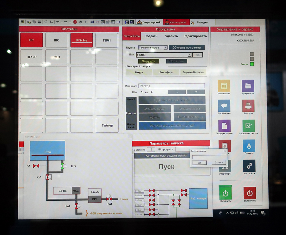
Remote Control nuclear reactor etching unit
This is the worst UI of all that I have met at exhibitions. It focuses all the bad things that I write about in this article. My unobtrusive questions about the appearance of the software, its convenience for a good and expensive hardware, were simply dismissed, saying: "We already have designers." Well, the taste and color, as they say.
Just a few important points when looking at the photo:
- Do not paint the usual layout panels in bright flashy colors.
- Do not show what is not (buttons for spare and bright Disabled elements).
- Clearly separate interactive button elements from simple headings and panels.
- Decide on a mouse or touch interface.
- Working with 10 windows at the same time on production systems is a problem, not a feature, as several exhibitors tried to present at the exhibition, opening the maximum possible number of them, and in a couple of cases also on 2 monitors.
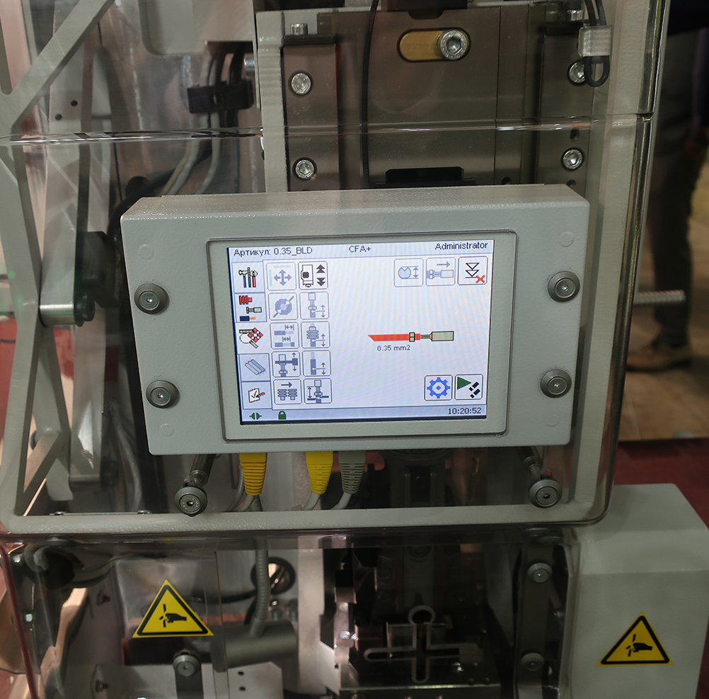
About icons
You can not just download any icons and use them. You violate copyrights.
Seriously, selling iron from several tens of thousands to millions of rubles per unit, spend 1 thousand rubles. on a typical set of icons (if there is no designer) it is quite rational.
,
It is also important that all the icons are in the same style. And it's not about the fact that all icons should be white. The fashion for monochrome icons is temporary, and your device will be used for the next 5-20 years.
The main purpose of the icon is to hook the user's gaze on a familiar (or sign) image in order to read information without reading the explanatory inscription. Those. - increase the speed of work.
, . UI .
Style unity

It is important to do the same type of elements in the same way.
I want to make out this interface:
- On this screen, the lower 2 groups "Start" and "Mode" are asked to make them in the style of the upper groups with icons.
- The interface is too scattered, there is no uniform grid and size. Buttons block "Options" unnecessarily small.
- Slider "duration" has a value, rounded to hundredths. Moving the slider is very difficult to catch such accuracy. You must add at least the "-0.01" and "+0.01" buttons.
- The "power twist" on the right has a maximum of 16.20. It is necessary to slightly push the buttons "<" and ">" to fit the number 18.88
- , .
GUI, .
, , AR, — . . , , , ( ).
UI . . , . , , .
90% GUI Windows. , . - WPF ( ), .
: “ — 40, ". , , 40 , Nokia. , UI , 8 5 .
,
13 3 . Hakko Electronics. . , , , , , , — . , " " . , UI 8- ( 12-15 ).
. , . . , , . , MS-DOS Logitech 100 .
, , - «Enter» ?
– , - .
10 , . , .
– . , , . "" . , ( , , , .)
Conclusion
— , , , , Dribble ( ), , 8-15 .
. , . , .
PS , - , . , .
')
Source: https://habr.com/ru/post/448670/
All Articles