Preparing a layout for the client. Part II: If ironing, how?
Preparing a layout for the client. Part II: If ironing, how?
Part I: Ironing or not?
Part II: If ironing, how?
So, in the first part, we looked at the pros and cons of screen smoothing. Now let's turn to practical examples and talk about some of the intricacies of preparing a layout for demonstration to the customer.
But, before we practice, I would like to again attract the attention of readers to the very fact of the need to smooth the text on the screen. We will discuss some details later, but for now just wander through the sites of leading Russian studios. You probably know the addresses of these sites. If not, you can find them here in the rating of companies .
I assure you, in most cases you will see layouts with smoothed text. For some reason, the studios include anti-aliasing? So, maybe try to follow their example?
')
By the way, in some places can still meet and layouts without smoothing, but in this case, they are almost always reduced in scale (up to 50-70% of the original size). They are easy to distinguish, since layouts with text without smoothing while decreasing by the bicubic interpolation method look much worse than the same layouts where smoothing was turned on. Compare the first (was without smoothing) and the second (anti-aliasing enabled) samples (reduced to 70%):

And even if you are not convinced by the experience of well-known studios, and you are still firmly convinced that the HTML text should remain without smoothing, it would still be useful to familiarize yourself with some of the examples below.
So, we decided that we need font smoothing. But either you, being a graphic designer, are not very well versed in the intricacies of typesetting, or you do not have the time and desire to create text blocks using HTML code, which will then be transferred to your layout from the browser screenshots.
In short, you need to do the layout immediately in a graphic editor. Despite the fact that there are now many good editors with various capabilities (GIMP, PhotoImpact, PhotoPaint, Fireworks, etc.), we will consider examples based on the most popular editor among web designers - Adobe Photoshop.
There is no ClearType-like smoothing imitation in this program, and the reason for this is detailed here in the “ClearType Restrictions” section . Therefore, we consume what they give.
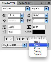
Working with this program, they know that there are five types of smoothing for the text: None (completely absent), Sharp (sharp), Crisp (hard), Strong (strong) and Smooth (soft):
For text, it looks like this:
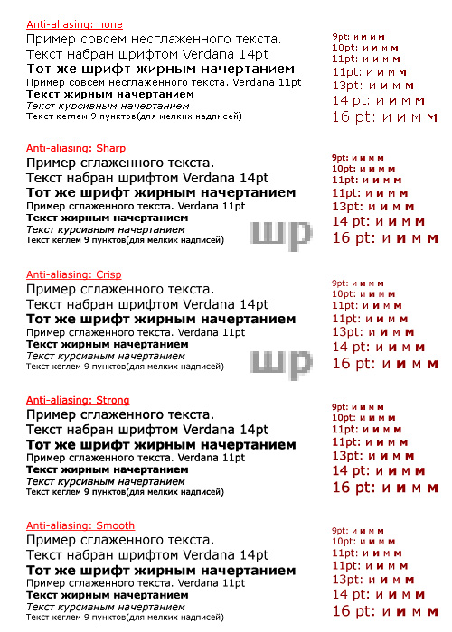
Immediately suggests several conclusions:
- Strong mode can hardly be useful to us, because it makes the text too rich, especially in bold. But in certain cases, you can use it.
- None mode we will also avoid. Just look at how the letters “i” and “m” are rasterized in plain and bold. In all types of anti-aliasing, these letters differ significantly in the thickness of the stroke, as it should be in realistic typography. In the absence of anti-aliasing on all pins, the letter “and” turns out to be almost the same in ordinary and bold outlines (the diagonal stroke becomes only slightly thicker), and not everything is fine with “m”. If you are satisfied with this option, continue to turn off anti-aliasing. However, if you prefer to expect on the screen from the font of adequate behavior (bold shapes more saturated in strokes, etc.) - choose for yourself the best type of smoothing.
- In Sharp mode, letters are rasterized in a slightly different way than in the other three anti-aliasing options. This is noticeable in the enlarged fragments of the letters "sh" and "p". In the case of Sharp with a total conditional thickness of 2 pixels in the bar, the lower bar on the “W” remains single-pixel, whereas, for example, in Crisp, all the bars tend to the same thickness. In Sharp mode, curvilinear sections are less rounded, as can be clearly seen in the example of the letter “p”. Also in Sharp mode, the text typed in large pins (14pt and above) does not look very good. But the text 11pt is readable more or less tolerably, and the fine print of 9 points looks the best. Also subjectively, it seems that the italic pattern at 11pt reads better than in other examples. In general, the text looks brighter and juicier than in other modes (not counting Strong ).
- In Crisp mode, large headlines look best, and the main text looks good. By the way, in this mode, the majority of letters consisting only of horizontal and vertical strokes (“g”, “n”, “t”, etc.) are not smoothed at all. True, small text and italics look worse than in the case of Sharp .
- Smooth mode is reminiscent of Crisp , but the letters get more "fluffy" around the edges. Incidentally, in earlier versions of Photoshop there were only two types of anti-aliasing - None and Smooth . And, perhaps, one of the reasons for the designers' dislike for smoothed texts lies precisely in this, since the letters in the Smooth mode often look the most blurred. Only in version 5.5 two more types of anti-aliasing were added (and Sharp appeared even later). However, in certain cases, Smooth mode can be useful to us.
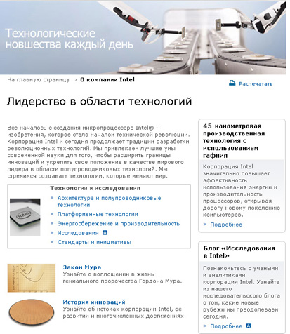
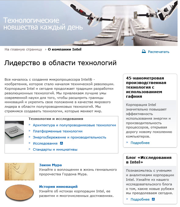
Now back to our example, look at the page on the Intel site . This will be our reference image:
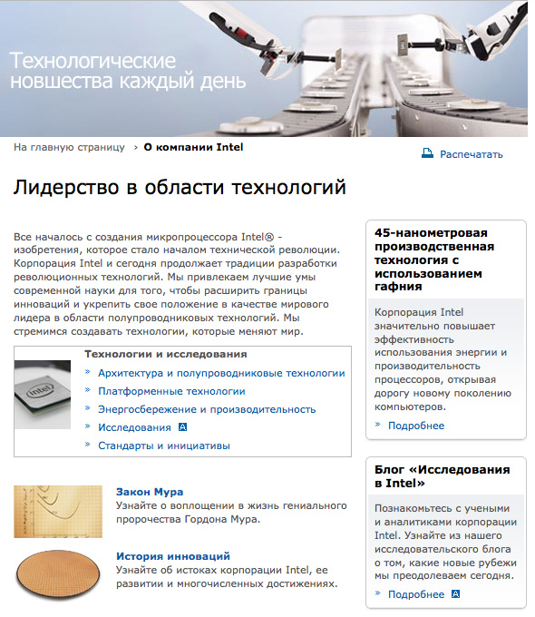
I put a screenshot of this page in Photoshop and tried to reproduce all the text blocks as accurately as possible. With proper skill it is not difficult. By the way, I highly recommend trying this method as an exercise. Firstly, it is great to train your visual apparatus, and you will learn how to accurately determine the typeface, size and font leading values on any sites. Secondly, using screenshots of the sites you like, you will build up your own methods for building text blocks, and also accumulate useful sets of font combinations.
So, using the Type Tool and the Character palette, I made several text layers of two types: linear for headings (just click the Type Tool on the layout) and block for paragraphs (click and, without releasing the buttons, select a rectangular area of the desired size for future text ).
Finally, I erased the texts on the source image layer. When you disable manually created text layers, it will look like this:

And now let's see what happens when various anti-aliasing modes are enabled.
Sharp mode:
Fine! Almost all the text is well read, the letters look clear, and the “fluffiness” is not striking. However, the headings in the side columns look too saturated and somehow not round enough.
Crisp mode:

The main text has become a little more zamylenny, but the headings, typed in bold, look much better.
Strong mode:

Although there is definitely something in it, the excessive saturation of the strokes reduces the level of realism in comparison with the original screenshot and is striking. Bold styles began to look altogether dirty. But in this mode the inscription looks like a large size most closely to the original (more than 18pt in the low-fat outline).
Smooth mode:

In this case, the text turned out to be the least saturated, and therefore it looks faded and somehow unconvincing. In addition, in many places, excessive closeness was revealed. Although, to someone exactly this option will seem the most acceptable.
So, there is no uniquely optimal and close to the original version. But what prevents us from making a combination of different methods?
Here's what I got:

The main text is in Sharp mode. Subtitles in bold in Crisp mode. And the big title “Technology Leadership” is in Strong mode.
Of course, it is unlikely to reproduce the look exactly as in a browser. But, using a similar technique, I got a more or less similar version. Compare the original and this combo version. Looking closer, you will find some minor inconsistencies. But when viewed with the naked eye, both layouts appear identical.
And what about the smoothing mode None ? Let's turn it on:
Stop. What happened to the two text blocks? In a strange way, they crawl to other places of the layout. Alas, this is an annoying feature of the Verdana font when rasterizing without smoothing. Other fonts do not have similar problems, or they are not so significant. Always remember this and take into account the fact that the text blocks that you create with Verdana without anti-aliasing may be lower in height on anti-aliasing monitors, and vice versa.
You can easily change the smoothing type, font type, and other attributes for all text objects in the layout with just three steps:
- Select any visible text layer in the Layers palette.
- Select the menu item Select > Select Silimal Layers . Now you have all the text layers selected.
- In the Character palette, select the desired parameter. For example, change smoothing from Sharp to None .
Isn't it convenient? Indeed, before you show the layout to the client, you should try various options. For example, replace Verdana with Arial, increase the size (will apply to all blocks, but you can evaluate the changes for a specific one). Experimenting in this way, you can make for yourself a list of fonts, sizes and types of rasterization in each case. In just a few tens of minutes, you will determine the best for you views of various blocks. It remains only to experimentally establish which of the appropriate methods most closely correspond to the fixed analogs. Rely on your own taste and intuition, and your layouts can significantly enrich themselves at the expense of more harmoniously selected font display attributes.
Suppose I decided in our example, instead of Verdana, to try using some other options. And that's what I got:

- A large header (“Technology Leadership”) was assigned Arial font and Smooth smoothing mode (it was the best in this particular case). I did the same with the side subtitles.
- The main text remained unchanged - Verdana 11pt, Sharp .
- For the list of links, Arial Italic 11pt, Sharp was used.
- For the text at the bottom right, the Corbel 11pt, Sharp headset was chosen.
I do not presume to say that from this layout began to look better or worse. To some extent, the sensations of the layout have changed. I just showed how you can adjust subtle nuances in the selection of fonts in a rather simple way.
Actually, improvements can be seen only after using all the measures in the complex (modify indents, select leading, etc.), but we'll talk about this a little later.
Thus, we figured out ways to get smoothed text, methods for finding display modes that are as close as possible to actual smoothing on sites, as well as a quick way to find the right headset for a particular case. Now you can easily determine for yourself the best combinations. And this will help you the next part of the article, where we consider in detail all possible variations for the most frequently used pins and draw up a kind of pivot table that will help any designer to quickly find a suitable option.
Do not switch! ;-)
NB. , . , , , - , IT-. , — , , — — , . , , . , . , . , — , . . , , HTML, — , — . , , , , . , «» , , Futuris. — , , , . , , ( ), -- HTML , Photoshop. , -?Source: https://habr.com/ru/post/44693/
All Articles