Incorrect charts: our experience
We at The Economist take the data visualization very seriously. Every week we publish about 40 graphs in print and online versions, as well as in applications. Everywhere we strive to accurately represent the numbers so that they best illustrate the topic. But sometimes we make mistakes. It is important to learn these lessons so as not to repeat mistakes in the future. Surely our experience will be useful for you.
Immersed in the archives, I found some instructive examples. Crimes against data visualization are grouped into three categories. These are graphics that:
For each one, a revised version is shown, which takes up the same amount of space - an important factor for printed publication.
(Note: most of the "original" graphs are published before the redesign. Improved charts are compiled in accordance with the new specifications. The data are the same).
')
Let's start with the worst of crimes: presenting data in such a way that they are misleading. We never do that on purpose! But sometimes it happens. Consider three examples from our archive.

( data in csv )
This graph shows the average number of Facebook likes on the pages of the left parties. The purpose of the chart was to show the difference in the likes of the posts of Mr. Corbin and others.
The original schedule not only understates the number of likes of Corbin, but also exaggerates the figures for other participants (here is another example of such an error). In the revised version, Mr. Corbin’s column is fully listed. All other columns are still visible.
Another oddity - the choice of color. In an attempt to imitate the colors of Labor, we used three shades of orange / red assigned to 1) Corbin, 2) other deputies, and 3) parties / groups. This is not explained anywhere. Although the logic may be obvious to many, but it makes little sense for those who are not very familiar with British politics.
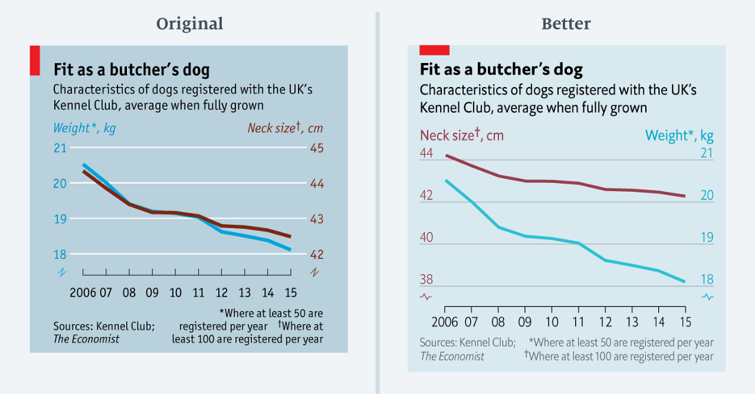
A rare example of a perfect correlation? Actually no ( data in csv )
The above chart is from a dog weight reduction article. At first glance it seems that the weight and circumference of the dog's neck perfectly correlate. But is it true? Only to some extent.
On the graph, both scales are reduced by three units (from 21 to 18 on the left; from 45 to 42 on the right). But in percentage terms, the left scale decreases by 14%, and the right scale decreases by 7%. In the redesigned chart, I retained a double scale, but adjusted the ranges to reflect a comparable proportional change.
Given the fun theme of this diagram, the error may seem relatively minor. In the end, the meaning is the same in both versions. But the conclusion is important: if the two graphs are too close to each other, you probably need to take a closer look at the scales.

Opinions about Brexit are almost as unstable as negotiations about it ( data in csv )
We published this chart with survey data in our Espresso news app. It shows the attitude towards the results of the EU referendum as a line graph. Judging by the data, the respondents strongly fluctuate in their views: the results jump by several percentage points.
Instead of a smoothed curve to display the trend, we indicated the actual values of each survey. This happened primarily because our graphing tool did not know how to build smooth lines. Only recently we have mastered more advanced programs for processing statistical data (for example, R) with more complex visualization methods. Today, anyone can build a smoothed curve for polls, as an improved option at the top.
Here you can also note a violation of the scale. The original chart spreads the data wider than it should. In the revised version, I added some space between the beginning of the scale and the minimum data point. Francis Gagnon offers a good formula for such situations: leave at least 33% of the area free under a linear graph that does not start from scratch.
Not such a serious crime as misleading, but if the schedule is difficult to understand, this is a sign of poorly performed visualization work.
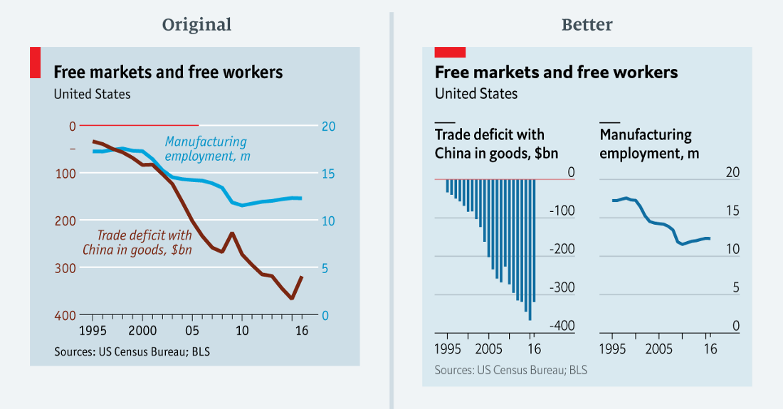
… what? ( data in csv )
Journalists of The Economist are trying to puzzle the reader in a good way. But sometimes we go too far. The chart above shows the US trade deficit in goods and the number of people employed in manufacturing.
This diagram is incredibly difficult to understand. She has two major problems. First, the values of one row (trade deficit) are completely negative, while the others (employment in the manufacturing industry) are positive. It is difficult to combine such different data in one chart. The obvious “solution” leads to the second problem: the two data series do not have a common baseline. The baseline of the trade deficit is located at the top of the chart (highlighted with a red line, it will run through half of the chart). The base line of the right scale is at the bottom.
The reworked chart shows that there was no need to merge the two data series. The relationship between trade deficit and employment in the manufacturing industry remains clear and takes only a little more space.
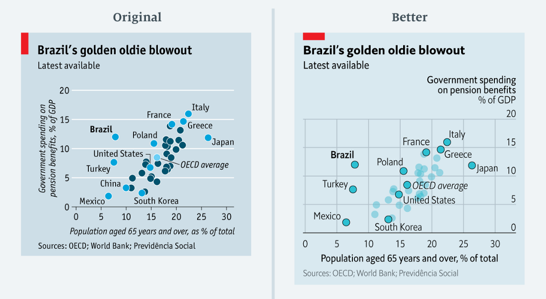
50 shades of blue ( data in csv )
This chart compares government spending on retirement benefits with the proportion of people over 65 in a number of countries, with a special focus on Brazil. In order not to inflate the diagram, the visualizer signed only some countries and highlighted them with blue. The OECD average is highlighted in light blue.
The visualizer (it was me!) Ignored the fact that a color change often implies a category change. Here, too, the reader may have the idea that all blue countries seem to belong to a different group than blue ones. This is not true. The only difference is that they are simply not signed.
In the recycled version, the color is the same for everyone. I only changed the intensity for the subscribed countries. The rest is done by typography: Brazil, the country of focus, is in bold, and the OECD average is in italics.
Errors in this latter category are less obvious. Such diagrams are not misleading and not very confusing. They simply can not justify their existence. Either they were built incorrectly, or we tried to squeeze too much information into too small a space.
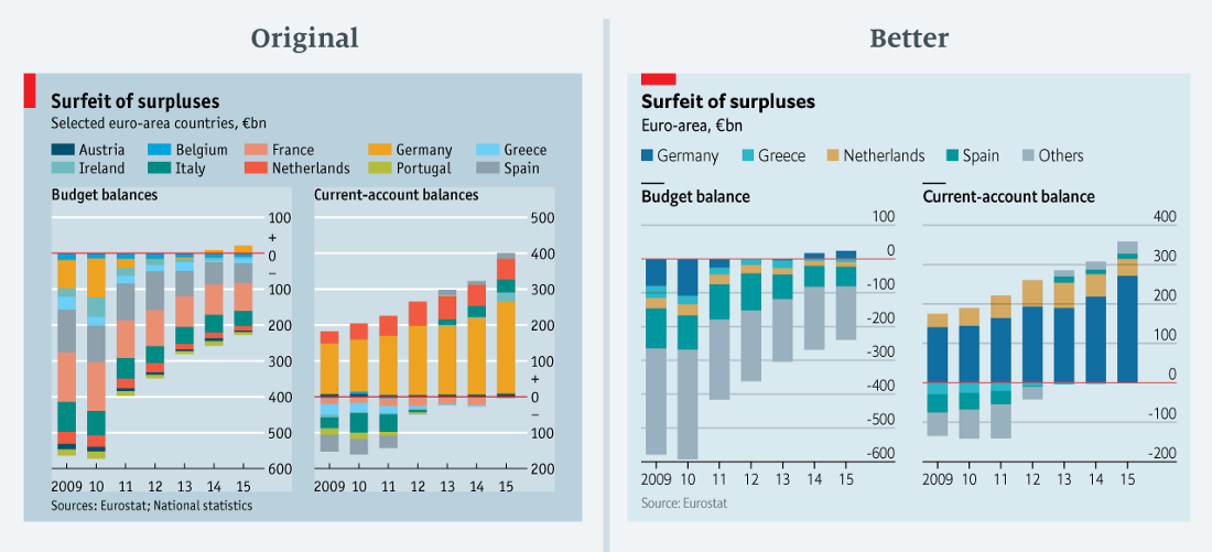
“The more colors, the better!” ( Data in csv )
This rainbow! We published this chart in the German budget surplus column. It shows the budget balance and the current balance of the ten euro area countries. With so many colors — some of which are quite difficult to discern or even see, because the values are too small — the meaning of the diagram is difficult to understand. It almost blocks the brain, forcing the reader to skip the graph and move on. And, more importantly, since we do not give figures for all the countries of the Eurozone, there is no point in adding data.
I re-read the article to find a simplified chart. The text mentions Germany, Greece, the Netherlands, Spain and the Eurozone. In the revised version of the diagram, I decided to select only them, and put the rest in the “Others” category (the total balance of the current account in the revised diagram is less than in the original diagram due to the revision of Eurostat data).
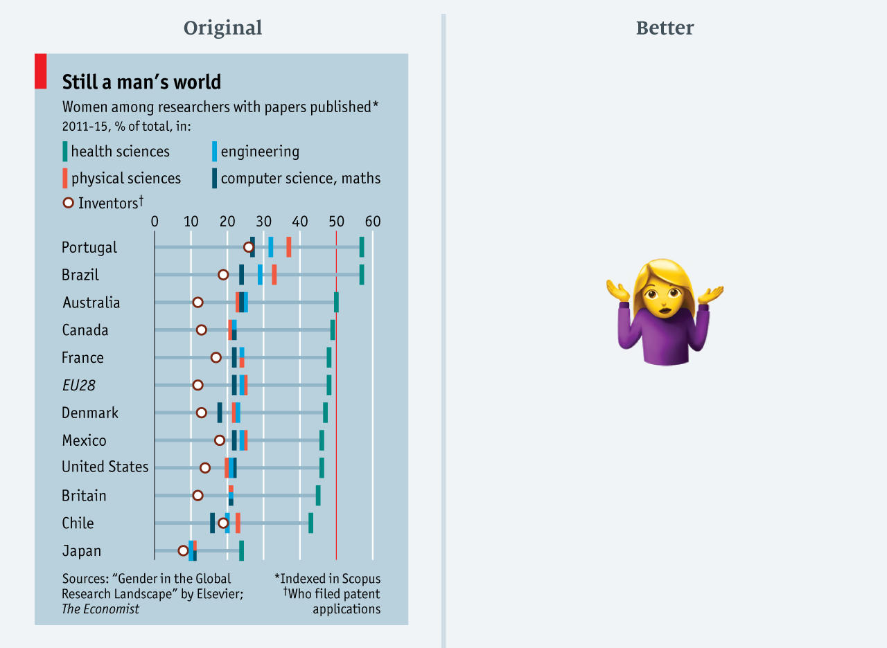
I give up ( data in csv )
Limited by space on the page, we are often tempted to drive all the data into a too small slot. Although this saves valuable space on the page, there are also implications, as seen in this March 2017 chart. This is a plot to an article that men dominate science. All positions are equally interesting and relevant to the article. But, this amount of data is difficult to assimilate: here are four categories of areas of research, as well as the share of patent authors in each country.
After thinking about it, I decided not to change this diagram. If you save all the data, the chart will be too big for a small article. In such cases, it is better to cut something. Alternatively, you can show a certain average: for example, the average proportion of women's articles in all areas. (Please let me know if you have an idea how to visualize this in a tight space!)
The best practices are developing rapidly: what is acceptable today will be condemned tomorrow. New and more advanced methods appear all the time. Have you ever committed an “infographic crime” that can be easily corrected?
Immersed in the archives, I found some instructive examples. Crimes against data visualization are grouped into three categories. These are graphics that:
- misleading;
- confusing;
- can not bring meaning.
For each one, a revised version is shown, which takes up the same amount of space - an important factor for printed publication.
(Note: most of the "original" graphs are published before the redesign. Improved charts are compiled in accordance with the new specifications. The data are the same).
')
Charts that are misleading
Let's start with the worst of crimes: presenting data in such a way that they are misleading. We never do that on purpose! But sometimes it happens. Consider three examples from our archive.
Error: truncation scale
( data in csv )
This graph shows the average number of Facebook likes on the pages of the left parties. The purpose of the chart was to show the difference in the likes of the posts of Mr. Corbin and others.
The original schedule not only understates the number of likes of Corbin, but also exaggerates the figures for other participants (here is another example of such an error). In the revised version, Mr. Corbin’s column is fully listed. All other columns are still visible.
Another oddity - the choice of color. In an attempt to imitate the colors of Labor, we used three shades of orange / red assigned to 1) Corbin, 2) other deputies, and 3) parties / groups. This is not explained anywhere. Although the logic may be obvious to many, but it makes little sense for those who are not very familiar with British politics.
Error: interconnection effect due to scale adjustment
A rare example of a perfect correlation? Actually no ( data in csv )
The above chart is from a dog weight reduction article. At first glance it seems that the weight and circumference of the dog's neck perfectly correlate. But is it true? Only to some extent.
On the graph, both scales are reduced by three units (from 21 to 18 on the left; from 45 to 42 on the right). But in percentage terms, the left scale decreases by 14%, and the right scale decreases by 7%. In the redesigned chart, I retained a double scale, but adjusted the ranges to reflect a comparable proportional change.
Given the fun theme of this diagram, the error may seem relatively minor. In the end, the meaning is the same in both versions. But the conclusion is important: if the two graphs are too close to each other, you probably need to take a closer look at the scales.
Error: invalid rendering method
Opinions about Brexit are almost as unstable as negotiations about it ( data in csv )
We published this chart with survey data in our Espresso news app. It shows the attitude towards the results of the EU referendum as a line graph. Judging by the data, the respondents strongly fluctuate in their views: the results jump by several percentage points.
Instead of a smoothed curve to display the trend, we indicated the actual values of each survey. This happened primarily because our graphing tool did not know how to build smooth lines. Only recently we have mastered more advanced programs for processing statistical data (for example, R) with more complex visualization methods. Today, anyone can build a smoothed curve for polls, as an improved option at the top.
Here you can also note a violation of the scale. The original chart spreads the data wider than it should. In the revised version, I added some space between the beginning of the scale and the minimum data point. Francis Gagnon offers a good formula for such situations: leave at least 33% of the area free under a linear graph that does not start from scratch.
Schedules that are confusing
Not such a serious crime as misleading, but if the schedule is difficult to understand, this is a sign of poorly performed visualization work.
Error: too abstruse diagrams
… what? ( data in csv )
Journalists of The Economist are trying to puzzle the reader in a good way. But sometimes we go too far. The chart above shows the US trade deficit in goods and the number of people employed in manufacturing.
This diagram is incredibly difficult to understand. She has two major problems. First, the values of one row (trade deficit) are completely negative, while the others (employment in the manufacturing industry) are positive. It is difficult to combine such different data in one chart. The obvious “solution” leads to the second problem: the two data series do not have a common baseline. The baseline of the trade deficit is located at the top of the chart (highlighted with a red line, it will run through half of the chart). The base line of the right scale is at the bottom.
The reworked chart shows that there was no need to merge the two data series. The relationship between trade deficit and employment in the manufacturing industry remains clear and takes only a little more space.
Error: tangled colors
50 shades of blue ( data in csv )
This chart compares government spending on retirement benefits with the proportion of people over 65 in a number of countries, with a special focus on Brazil. In order not to inflate the diagram, the visualizer signed only some countries and highlighted them with blue. The OECD average is highlighted in light blue.
The visualizer (it was me!) Ignored the fact that a color change often implies a category change. Here, too, the reader may have the idea that all blue countries seem to belong to a different group than blue ones. This is not true. The only difference is that they are simply not signed.
In the recycled version, the color is the same for everyone. I only changed the intensity for the subscribed countries. The rest is done by typography: Brazil, the country of focus, is in bold, and the OECD average is in italics.
Charts that can't bring meaning
Errors in this latter category are less obvious. Such diagrams are not misleading and not very confusing. They simply can not justify their existence. Either they were built incorrectly, or we tried to squeeze too much information into too small a space.
Error: too many details
“The more colors, the better!” ( Data in csv )
This rainbow! We published this chart in the German budget surplus column. It shows the budget balance and the current balance of the ten euro area countries. With so many colors — some of which are quite difficult to discern or even see, because the values are too small — the meaning of the diagram is difficult to understand. It almost blocks the brain, forcing the reader to skip the graph and move on. And, more importantly, since we do not give figures for all the countries of the Eurozone, there is no point in adding data.
I re-read the article to find a simplified chart. The text mentions Germany, Greece, the Netherlands, Spain and the Eurozone. In the revised version of the diagram, I decided to select only them, and put the rest in the “Others” category (the total balance of the current account in the revised diagram is less than in the original diagram due to the revision of Eurostat data).
Error: a lot of data, little space
I give up ( data in csv )
Limited by space on the page, we are often tempted to drive all the data into a too small slot. Although this saves valuable space on the page, there are also implications, as seen in this March 2017 chart. This is a plot to an article that men dominate science. All positions are equally interesting and relevant to the article. But, this amount of data is difficult to assimilate: here are four categories of areas of research, as well as the share of patent authors in each country.
After thinking about it, I decided not to change this diagram. If you save all the data, the chart will be too big for a small article. In such cases, it is better to cut something. Alternatively, you can show a certain average: for example, the average proportion of women's articles in all areas. (Please let me know if you have an idea how to visualize this in a tight space!)
The best practices are developing rapidly: what is acceptable today will be condemned tomorrow. New and more advanced methods appear all the time. Have you ever committed an “infographic crime” that can be easily corrected?
Source: https://habr.com/ru/post/446880/
All Articles