How to create a dark theme and do no harm. Experience team Yandex. Mail
My name is Vladimir, I am engaged in a mobile frontend in Yandex. Mail. Our application already had a dark theme, but not enough: we knew how to repaint the interface and simple letters. But the letters with formatting remained light and contrasted with the dark interface, because of which the eyes could get tired at night.
Today I will tell Habr's readers how we solved this problem. You will learn about two simple ways that did not suit us, then about our main way of adaptive repainting pages and, finally, about the direction for the next iteration: repainting pictures. Although the task itself is to repaint pages with arbitrary formatting — a specific one, I think our experience will be useful for you too.
Simple ways
Before we reach our magic “recolourer”, we tried two simple, like a cork, options: hang an additional dark style on the element or a CSS filter. They did not suit us, but perhaps for some cases it will be even better (because it is simply = cool).
Style override
The simplest way, which logically expands the dark theme of the application itself in CSS: hang dark styles on the letter box (in general, for someone else's content that needs to be repainted):
.message--dark { background-color: black; color: white; } But if the elements inside the letter have their own styles, they will override our root style. No !important will not help. The idea can be squeezed out by cutting off inheritance:
.message--dark * { background-color: black !important; color: white !important; border-color: #333 !important; } In this case, it is impossible to do without !important , because the selector itself is not very specific. Moreover, it will be necessary to redefine the inline styles (and inline styles with !important will still crawl, do nothing).
Our style is rather clumsy and paints everything the same, so another problem comes out: the designer probably wanted to say something by arranging colors (element priorities and other design pieces), but we took and threw out all this idea.
If you respect the designers less than I do, and still decide to use this method, do not forget to finish the non-obvious trivia:
box-shadow- only the color will not be redefined, all shadows will have to be removed or live with light ones.- Colors of semantic elements - links, input elements.
- Inline SVG - instead of
backgroundthey need to setfill, and instead ofcolor-stroke, but this is not exact, depending on which SVG - it may be the other way around.
Technically, the method is not bad: these are three lines of code (ok, thirty for production versions with corners), compatibility with all browsers in the world, processing dynamic pages out of the box and no binding to the method of connecting styles in the original document. A special bonus is that you can easily tweak the colors in the style so that they fit the main application (say, make the background #bbbbb8 instead of black).
By the way, we used to repaint letters in this way, but if we found any styles inside the letter, we were scared and left the letter light.
CSS filter
Very witty and elegant option. You can repaint the page with a CSS filter:
.message--dark { filter: invert(100) hue-rotate(180deg); /* hue-rotate */ } After that, the photos will become kripovye, but it does not matter - we will repaint them back:
.message-dark img { filter: invert(100) hue-rotate(180deg); } 
There are problems with content pictures tied through the background (we know, it is more convenient to adjust the aspect ratio, but what about the semantics?). Suppose that we can find all such elements, clearly mark them and repaint them back.
The method is good because it preserves the original ratio of brightness and contrasts. On the other hand, a lot of problems, and they rather outweigh the advantages:

- Dark pages are lightened.
- It is impossible to control the resulting colors - what filter should I apply to adjust the background to your brand
#bbbbb8? Riddle. - After two repaints pictures fade.
- Everything slows down (especially on phones) - it’s logical, now instead of simply rendering, the browser needs to drive image processing on each screen.
This method would be suitable for letters consisting of text in neutral tones, but who are the aesthetes who collect their full inbox of such peculiar content? But filters can repaint the elements to the contents of which there is no access - frames, web components, pictures.
Adaptive theme
It is time for magic! Of the shortcomings of the first two approaches, we collect the checklist:
- Make the background dark, text - light, borders - medium.
- Identify already dark pages and not repaint them.
- Maintain the original ratio of brightness and contrasts.
- Give the ability to customize colors.
- Leave the tones as they were at the beginning.
We need to change the colors of the styles so that the background is dark. And why not do it literally? Just take all the styles, look for rules related to colors ( color , background , border , box-shadow , their subproperties), and replace it with “darkened” - darken the background, lighten the text, darken the border less background, etc.
This method has one incredible virtue that will warm the soul of any developer. Each property can be customized (yes, right to describe the code!) Your own color conversion rules. If you have enough imagination, you can integrate with any external theme, do any color correction (for example, instead of a dark theme, make a light or gray-brown-crimson) and even add a bit of contextuality — say, process the wide and narrow borders differently.
The disadvantages are standard for everything-in-js. Yes, we are chasing the scripts, breaking the style encapsulation and parsing CSS with regexps. Well, unlike HTML, the latter is not that shameful, because the grammar (of the level we need) is still regular CSS.
The repainting plan is as follows:
- Normalize the legacy style properties (
bgcolorand friends), shift them tostyle="...". - Find all inline styles.
- In each style we find all the color rules (
background-color,color,box-shadow, etc.). - Of all the color rules, we get colors, find the correct transducer (dimmer for the background, brightener for the text).
- Call the converter.
- Putting the converted rules back into CSS.
The binding (normalization, search for styles, parsing) is quite simple. Let us understand how exactly our magic converter works.
HSL Transformations
“Darken the color” is not such a simple action as it may seem, especially if we want to keep the tone (blue becomes dark blue, not orange). To do this in normal RGB is possible, but problematic. Lovers of algorithmic design know that even gradients are crooked. But working with colors in HSL is pure pleasure: instead of Red, Green and Blue, with which it is not clear what to do, we have other three channels:
- Hue - just the tone that we want to keep.
- Saturaion - saturation, which is not very important to us now.
- Lightness - the brightness that we will change.
This space is convenient to represent in the form of a cylinder. And our task is to turn this cylinder upside down. Color correction functions do something like (h, s, l) => [h, s, 1 - l] .
The colors with which everything is fine
Sometimes the situation is successful: the exclusive design of the letter (or part of it) is already dark. In this case, you don’t need to change anything, it’s better to just be quietly glad - the designer probably picked up colors no worse than our algorithm. In HSL it is enough to look at L - brightness. If it is higher (for text) or lower (for background) threshold (which, of course, is configured) - do nothing.
Dynamic circus
Although we didn’t need it (thanks again, sanitizer, you saved me from madness!), But I’ll tell you what dopils are needed in an adaptive theme to darken full pages, not just stupid static letters from the nineties. More accurately, this is a task for those who love the smell of selectors in the morning.
Dynamic inline styles
The easiest case to break our darkened page is to change inline styles. The operation is frequent, but the fix is simple: we add MutationObserver and quickly repair inline-styles with changes.
Exterior styles
Working with styles from <link> from within the page is rather painful due to asynchrony and @import , and CORS is no fun. It seems that this problem could be quite elegantly solved through a web worker (proxy for *.css ).
Dynamic styles
Finally, collecting all our problems in a heap, we recall that the script generally can add, delete and rearrange (specificity! Cascade!) <style> and <link> , and also change the rules in <style> . It is solved by the same MutationObserver on style elements, but for each change - more processing.
CSS Variables
A completely new round of madness comes when CSS variables come into play. We cannot dim the variables themselves: even if we assume that we guess from the format that the color is in the variable (although I would not advise doing this), it is not known what role it will meet - background, text, border, all at once? Moreover, the values of variables are inherited, so we already need to take into account not only the styles, but also the elements to which they apply, and all of this quickly escalates and explodes.
If CSS variables reach the mainstream, we have problems. On the other hand, by that time they will start bringing up color() , with which it will be possible not to change colors in JS, but simply to replace colors with color(var(--bg) lightness(-50%)) .
Summary
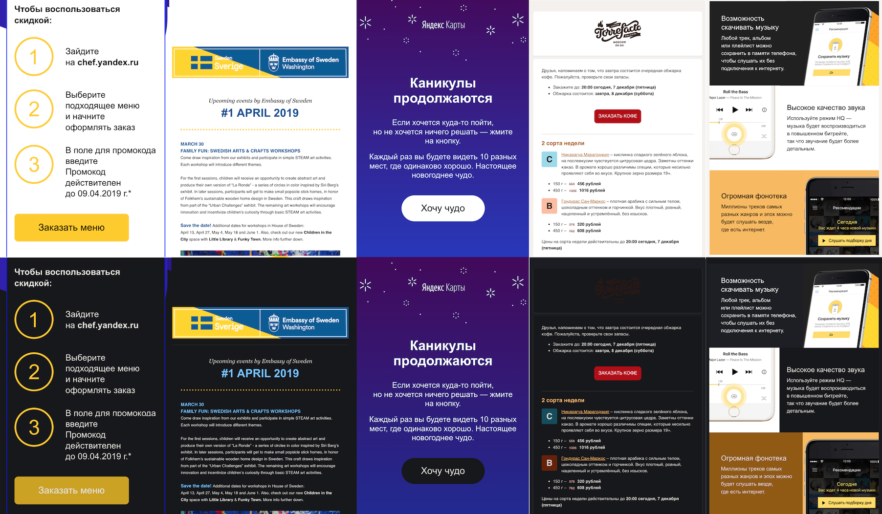
For our case, when the sanitizer leaves only inline-styles, adaptive blackout at the CSS level fits perfectly: it gives the best quality of blackout, does not break the letter and works relatively simply and quickly. Not sure what the option with all the stuffing for the dynamics is worth it. Fortunately, if you are working with user-generated content and are not writing a browser, your sanitizer should do the same.
In practice, adaptive mode should be used along with style redefinition: standard elements like <input> or <a> usually do not explicitly apply styles, but by default they are light.
How to dim pictures
Repainting pictures is a separate problem that worries me personally. This is interesting, and I finally have a chance to use the phrase "spectral analysis." With pictures in the dark theme there are several typical problems.
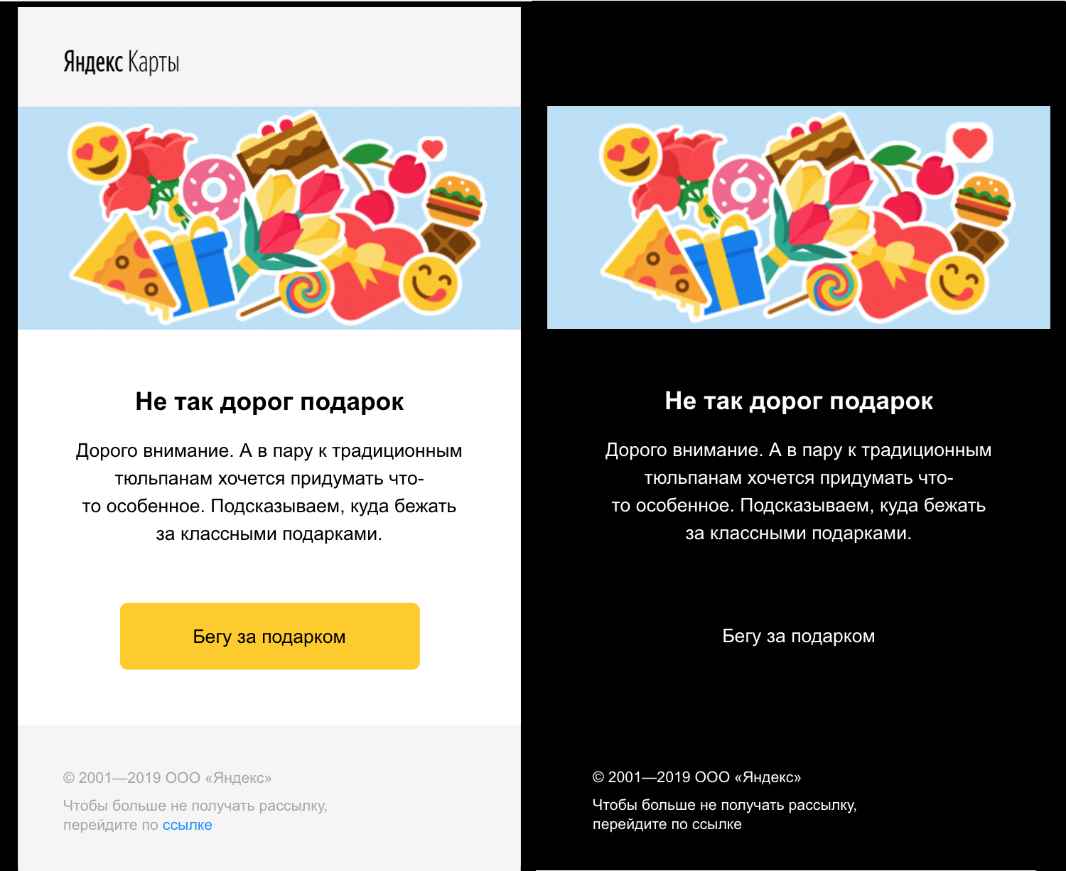
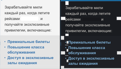
First, too light pictures. It works the same way as the unpainted letters with which it all started. Often (but not necessarily) these are ordinary photos. Since the layout is not very fun, many guys just export the complex part of the letter as a picture, it does not repaint and illuminates my perfectionism at night. Such pictures need to be darkened, but not inverted - otherwise a terrible negative will come out.

Secondly, dark images with true transparency. This problem is often found on logos - they are designed for a light background and, when we replace it with a dark one, merge with it. Such pictures need to be inverted.

Somewhere in the middle there are pictures for which white depicted a “transparent background”, but now they just stand in some kind of incomprehensible white rectangle. In a perfect world, we would change the white background to a transparent one, but if you have ever worked with a magic wand in a photo editor, you know that it is not so easy to do this automatically.

Interestingly, sometimes pictures do not carry any meaning at all - they are tracking pixels and “format holders” in a particularly perverted layout. Such can be safely made invisible (say, opacity: 0 ).
Introspection Heuristics
To decide what to do with the picture, we need to climb inside and analyze its contents - and in a simple and fast way. According to our set of problems, the first version of the algorithm emerges. Here she is.
We consider the dark, bright and transparent pixels in the picture, and not all, but selectively - the obvious optimization. We determine the overall brightness of the image (light, dark, medium) and the presence of transparency. We invert dark pictures with transparency, light ones without transparency - we muffle, the rest are not touched.
The joy of this wonderful heuristic ended when I came across a newsletter about charity with a photo of a lesson at an African school. Everything would be fine, but the designer centered it, adding transparent pixels along the edges. We didn’t want to be in the center of a new story about abusive image recognition, and we decided not to do image processing in the first version.
In the future, additional heuristics, which I call “spectral analysis”, should protect against such problems - we count the number of different colors in the picture and invert them only if there are few of them. The same criterion can search for graphic light pictures and repaint them too - it sounds tempting.

Total
For a complete dark theme in the mail, we lacked repainting letters with styles, and we figured out how to arrange this. Two simple options on pure CSS — style redefinition and a CSS filter — didn't work: the first one is too stern with the original design, the second just doesn't work well. As a result, we use adaptive dimming - we parse the styles, replace the colors with more appropriate ones and assemble them back. Now we are working on expanding the theme into pictures - for this we need to analyze their contents and repaint only a few.
If you ever need to repaint arbitrary custom HTML under a dark theme, keep in mind three methods:
- Style redefinition - you need in any case for your main application, cheap and cheerful, but it kills all the original colors.
- The CSS filter is cool, but it works so-so. Use only for opaque (in the sense of access) elements like frames or web components.
- Conversion of styles - darkens very high quality, but more difficult than other methods.
Even if you never do it, I hope you had an interesting time!
Useful links :
If you are interested in discussing this topic live and in the context of development for Android, then we invite you to April 18 in the St. Petersburg office of Yandex.
Recently, we talked about solving another problem for mail users - mailing problems.
')
Source: https://habr.com/ru/post/446780/
All Articles