Low poly characters design
A character is a personality. Without history there is no individuality. Every good character begins with a story, and the character design must tell the story.
In my previous article, How To Make Low Poly Look Good, I said that the main goal of low poly design is to get the message through the least amount of shapes.
This is especially true when you create a low poly character. You need to tell a story using as few forms as possible.
')
The following concept is suitable for character design of the game, film, illustration or any other personal project.
I will work in Blender . Maya, Max and other 3D editors have similar tools, so don't worry about it.
Character
Character design as a whole in itself deserves a separate article, so here we will not go into it, but at least consider some basic concepts that will help us in the future.
Before we start creating a character, we need to decide who and what will be the character.
It’s not necessary to write a whole story about him, just think about what defines your character.
But does it really have to be done if we just want to post some beautiful images on Artstation? Actually, no, but it is because of this that there are mainly models like “busty warrior” and “man in an epic cosmoscapandra” .
Of course, there is nothing bad in them, but we would like to avoid the stereotype of our characters.
Usually it is not necessary to go into details, but the more information you have about the character, the more support you will have in the design process.

What type of character are we creating? What happened to him, what will happen? What situation is he in? What is his social status? All these are fairly general questions, but they are easy to answer, and they will allow you to develop a character by asking more detailed questions.
Design
I treat low poly as removing as much detail as possible without losing the essence of what we are creating.
That is why I think it is important to first outline the character, and only then dive into the design process.
If we limit ourselves to the number of polygons and textures, then we need a very clear understanding of what we want to show.
Although we want to simplify the model as much as possible, we still need to save enough forms to convey its expressiveness. There are many ways to convey the expressiveness of the character. This does not necessarily mean that he needs eyes. Expressiveness can often be conveyed through movement, colors and shapes.
We want to add details only where they really matter. Let's take a look at a simple example:

As you can see, to show a character, we need very few features. We do not even need hands, feet, or even face, and yet we understand that this is a woman in the service. Perhaps it is a stewardess or a policeman?
Here is another example:
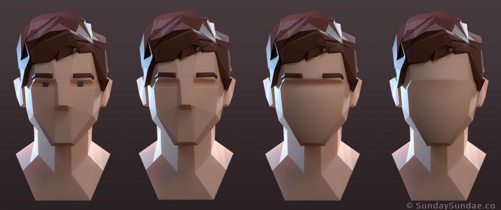
The figure shows 4 levels of difficulty - from the face with the nose, eyes and eyebrows to almost absent features.
And nevertheless, it is obvious that a young man is captured on each image. Here we need to make a decision: how much information is REQUIRED to convey our message.
Personally, I choose a person without a face here. If I do not need to create expressive facial expressions for him, then I will most likely stop on a faceless version. It allows the viewer to use their imagination and adds a sense of mystery.
Next, we will discuss the forms, but before proceeding to this, I would like to make a brief digression so that you understand what low poly is actually about.
Low Poly and cartoons
Do not worry, we will return to the low-poly design soon.
Low poly graphics usually go hand in hand with cartoons. In essence, I believe that the graphics are low poly and are a kind of cartoon, or at least its close relative.
I mean that cartoons usually use simplified forms, exaggerated and with bright attractive colors. There are more sad variations, but they are still based on these fundamental properties of the cartoon.
One studio made a special contribution to how almost all the cartoons look today. And you know what studio I mean ... of course, I'm talking about Disney.

Disney Studios has always been able to masterfully take the most absurd concepts and turn them into something that we love and believe in.
Let's take a look at this for a moment. Mickey Mouse is a talking mouse, wearing only forty-five shorts and boots. However, it does not seem strange to us, it just makes it fun and memorable.
His friend Goofy is a dog, and Mickey also has a pet dog named Pluto ... Hmm, why isn't Goofy a domestic dog? He's a dog, like Pluto, but why isn't this puzzling us?
Each talking character is given clothes that give him a social status, that is, they are intellectual and civilized. Pluto is considered a pet, and therefore he has no clothes, only a collar.
This is an excellent example of how artists define each character’s social status and embed it in a design.
I strongly recommend that you look at the work of Disney and other studios that you like, and learn how they display their characters.
Shapes and silhouette
I remembered Disney because this studio creates design of clear, readable forms very well.
It will be correct to begin with a silhouette. Having come up with the idea of a character, start throwing approximate forms and experiment with proportions and postures.
If you are not good at drawing by hand, then I can advise you to make drafts of forms in digital sculpturing software, for example, in Zbrush or Blender. It allows you to quickly outline basic forms.
Personally, I prefer sculpting, because it allows me to twist the model and look at it from different angles. After completing the model, we can use it as a model for character modeling.
A good trick is to identify the most important traits of a character and exaggerate them ( STRONGLY ).
In general, it is worth exaggerating so that the character does not look stupid. Then, if possible, downplay the less important features. This will create simplicity, but at the same time will add character complexity.
Take for example Jessica Rabbit from the movie Who Framed Roger Rabbit.

The process of creating a design
Let's take a break from lectures now and create a low poly character! After that, we will look at technical tips for modeling low-poly characters.
We will make a stone character.

He can be an enemy or a boss in a fantasy video game, most likely living in the mountains.
We can imagine that it was formed from a volcano filled with dark magic, but in this case I will have to add a bit of sparkling magma to the cracks.
You already see that we are starting to add details showing who and what the character is, based on his background. An idea with magma came to me when I finished the project!
Well, let's deal with our character. I wanted to create a stone monster made of cobblestones. As if almost all forms can be an arbitrary rock formation, randomly looking like a character.
I started with a very rough outline to at least have an idea of what I want to do.

Ugly, but useful concept art
As you can see, there is nothing special in it, and I would not show such a sketch to anyone. We just need it as a reference to use it in a 3D editor.
I started experimenting with this quick draft as a reference for ZBrush, until I got a result that can be used as a basis.
At this stage, you should experiment and try different forms to get a beautiful readable silhouette.
But be careful, it is very easy to get stuck on the details and forget about the big picture. Remember that we only use it as a reference for this model, so you can take care of the details later.
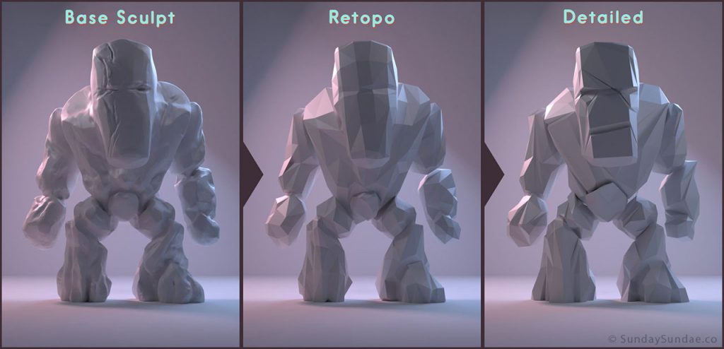
Stages of creating a stone monster
Having finished sculpting the base, you can start creating a base mesh with which you can work (the sculptor may be too high poly and inconvenient for work). In the future, we will consider techniques that allow to solve this problem. This process is called retopology .
Having created a clear low poly mesh, we begin to add details and remove unwanted elements. Of course, you can leave everything as it is, but personally I prefer to work and move a little and “mash” the vertices in order to get a more pleasant result. Below we will focus on this in more detail.
This is how my design process for low poly characters looks like. Sometimes I miss the base sculpture stage and just start with a cube or something like that; it's faster, albeit more difficult.
Heat shrink effect
This is a subjective topic, so if you do not agree with the foregoing, this is quite normal.
What do I mean by shrink wrap effect? Imagine that you have a region of uniformly distributed polygons, and you wrap it around your object.
This creates uniformly distributed polygons wrapped around the object.
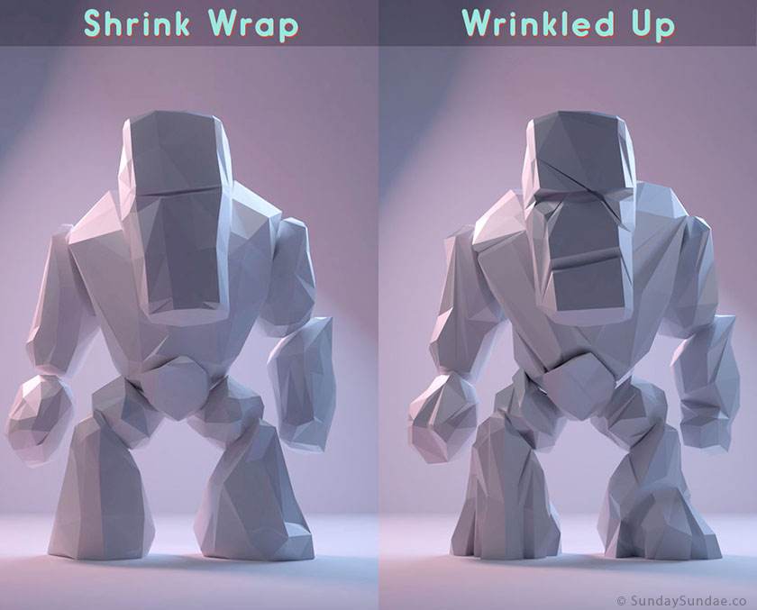
On the left, a model with the effect of “heat shrinkage,” on the right, wrinkles and wrinkles are added to the model.
Although sometimes it is suitable for creating a certain style, but such a model can easily seem rather unremarkable and flat.
To make your model stand out, it is better to avoid it and approach the character individually.
I usually start with the shrink wrap effect, and then go into the work and start removing edges that seem optional, or add edges where I need more detail. Look carefully at the images shown above and below and notice what I did.

By removing and adding details, you can help the viewer's eye move through the most important areas and filter out less important ones.
Materials
Many quite high-quality low-poly images fail during the creation of materials and lighting.
When creating simplified models, it is easy to be misled as the materials should be as simple as possible. With this, I strongly disagree.
By combining a low-poly model with realistic or semi-realistic materials and lighting, you can get a very interesting and deep image.
Here is an example with our woman. Only diffuse shader is used on the left. Compared to the final result, it looks pretty flat and boring.

For the skin in the final image, I used the shaders Diffuse , Glossy and Subsurface Scatter . The image below shows the shader graph. When working with the skin subsurface (subsurface scattering) is particularly important. It can also be applied to other objects, giving them a softer appearance.

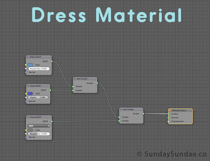
The dress consists of Diffuse , Glossy and Velvet . I used velvet (velvet) to add a deeper and cooler shade to give variability.
Lighting
Lighting is just as important as anything else. And it strongly depends on the scene, the necessary mood, the shape of objects, etc. When it comes to lighting, you need to try a lot of different options.
I usually start by adding a sphere of ambient lighting as base light. It can be inside, outside, as long as it matches the image. The sphere will create a good overall image base.
Then I add three simple point sources of illumination — the main light, the fill light, and the back light. Try experimenting with the colors of these sources, it is usually worth making the fill light warmer and the back light colder, we constantly see such a scheme in the films.
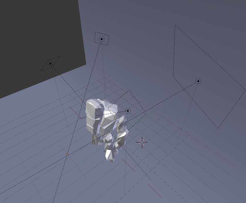
The location of the light sources for the stone monster
After that, I move the sources around the scene or add more if I need to fill in some areas.
I recommend studying the images you like with stylized lighting and trying to reproduce it in order to understand how to adjust the light.
To make your image look professional, you need to achieve a good balance between materials and lighting. Need to constantly practice.
Rotopology
Above, I said that we will look at the retopology of our character.
The idea is that we have as a base a high-poly model or a chaotic mesh fashioned by sculpture. We use this mesh as a support to start drawing geometry that you can work with.
Here are some of the tricks I use;
Retopo Flow:
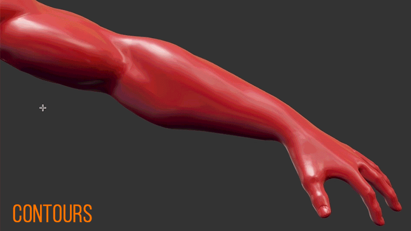
Contours tool in TopoFlow
Blender doesn't have a lot of good tools for creating geometry on top of another object, but there is a handy plugin called Retopoflow , which you can download for free from here .
Retopoflow has several great tools for creating a clean, sculptural-based topology.
Shrink Wrapping:
One more trick that is implemented even faster: we create a cube , divide it (subdivide) a couple of times, or until we get permission suitable for our object. We place the object so that it completely covers the mesh created by the sculpture and use the Shrinkwrap modifier, taking the sculpture as reference.
This will literally perform the “shrinking” of the cube around the sculptor, quickly giving us the desired shape, but with a suitable geometry.
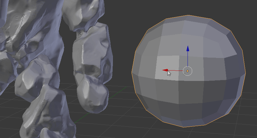
Subdivided cube wraps his arm.
Shrink wrapping works best if you use different shapes for a character, I do not recommend trying to “sit down” the cube entirely on the whole character, because it will distort it a little. For example, create one piece for each shoulder, arm, torso, etc.
If an object has more complex shapes, then you probably should not start with a cube, but instead simulate a rough shape that represents the finished object, but at the same time ensuring that the edges are correctly positioned. Then shrink wrap around the sculpture.
There are other ways to do this, but in my case these two methods cover all aspects necessary for the retopology of low poly objects.
Summarize
I hope this article has given you useful information and has become a source of inspiration for your low-poly character! I tried to make it brief, but informative, if I missed something, then let us know in the comments.
Source: https://habr.com/ru/post/446774/
All Articles