Recreating fonts from a CRT screen
The study of glyphs on the terminals DEC VT100 and VT220
Recently, I got a little carried away with analog media emulation: I wanted to recreate the raster graphics of CRTs, like on the “glass terminals” of the past, such as the cult VT series from Digital Equipment Corporation (DEC). In the process, a number of questions arose about the features of displaying fonts in pixel graphics of a CRT. I wonder how the fonts actually looked like and is it possible to reconstruct them according to specifications?
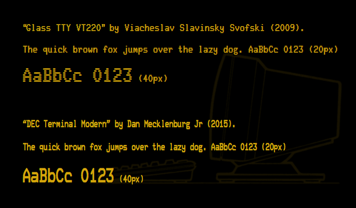
Modern TrueType fonts recreate the VT220 glyphs. Keep in mind that VT terminals supported two resolution modes: one for 132 characters per line and one for 80 characters (char-matrix 9 × 10 and 10 × 10, respectively), in the latter the interval is extended by one pixel
')
Due to the abundance of technical information on sites like vt100.net and bitsavers.org, you can easily determine the appearance of those fonts. For example, we can restore the glyphs from the firmware of the terminals. There are even TrueType fonts that repeat the VT220: Glass TTY VT220 with raster lines and DEC Terminal Modern with modern, smooth outlines (in the illustration above).
Upon closer inspection, these fonts are significantly different from each other, but none of them look right. Comparing with the photos of this VT100, there are noticeable differences not only in the font density, but also in the size and shape of the contours and in the overall “feel” of the font. However, the terminal photos also cannot convey the real feeling of font density, because it strongly depends on the shooting parameters:
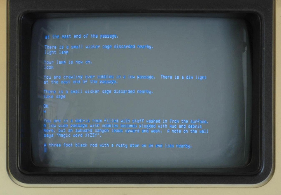
Adventure game Colossal CavePhoto on the VT100 screen. Photo: Wikipedia, Dave Fisher , 2008, Wikimedia Commons (edited NL).

Displays a list of directories on the VT100. Photo: Jason Scott , 2013. Creative Commons (edited NL).
Since the photos do not really help, it's time to look at the firmware.
There are copies of the ROM, you can simply extract from there real fonts that will perfectly match the original, right? .. What can go wrong?

The contents of the ROM from VT100 terminals (left) and VT220 (right). The VT200 division was performed by Paul Flo Williams, vt100.net (2008). VT100 supplemented by me, N. L.). The symbols 'a', 'c', 'g', '2', '6', '7', '9', '@', '%', '{', '}', '|' , '°' and the form of control characters (␉ ␍ ␊  ␋). In addition, VT220 more characters
It also looks wrong. Obviously, the glyphs stretch vertically to about double the height, but this is not the only distortion. The characters just don't look right. For example, look at the 'p' and 'q' or the offset of the points of the downward right stroke of the 'k', not to mention the funny outlines of the '6' and '9' on the VT100 or the distorted '2'! Moreover, upon closer inspection, the symbol matrix is only 8 × 10, while we expected at least 9 × 10 (and 10 × 10 for the mode with 80 columns), as described in the specifications. This is clearly not what is displayed on the screen.
Let's take another look at the manuals, in particular the VT100 Series Technical Manual (2nd edition, EK-VT100-TM-002; DEC, Maynard, Massachsetts, 1979). It indicates that the matter is in the delay of the phosphor (phosphorus):

Pulse duration and phosphorus activation profile for VT100 and VT200 (VT100 Series Technical Manual, EK-VT100-TM-002, p. 4-78). Keep in mind that the profiles of the signal pulses are highly idealized and in analog reality they are also oblique
The time of full activation of the phosphor is actually longer than the pulse duration for one pixel (40 nanoseconds). This means that if we try to display only one pixel, the phosphor at that particular place will never reach its full level of activation, which will lead to a blurred image of different brightness between the dimmer, thinner areas and the denser, thicker. Therefore, typography is forced to adjust, producing double-duration pulses (80 ns) in order to provide a clear image and legible text.

Single and double pulses and phosphor activation (from there, edited by NL)
For this purpose, VT terminals use a special dot stretching method: individual rows of the matrix of characters from ROM are modified on the fly, extending any active pixel pulses by another pixel. Where in the ROM one pixel, there will be two on the screen. Where two in a row, displays three.
Thus, our 8 × 10 matrix expands to the expected 9 × 10 (or 10 × 10 in the 80-column mode, where the last pixel for drawing lines is stretched by one more pulse).

Stretching points in VT100 and VT200 (VT100 Series Technical Manual, EK-VT100-TM-002, p. 4-78)
However, this results in different results for characters of regular size and double width! Thanks to the wonders of stretching points in one font, two fonts are contained, each of which has a detalization that depends on the screen size!
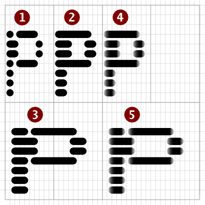
(1, 2, 3 according to Paul Flo Williams, vt100.net , 4 and 5 added by me, NL)
It is fundamentally important that the image (2) gives dotted strokes, which differ from clear lines in modern font reconstructions. But if we add sine and cosine graphs of the activation of the phosphor (Fig. 4 and 5, as well as a diagram with the activation graph above), we get a more accurate version of the actual display on the screen (remember that VT100 and VT220 show quite noticeable raster lines).

Samples of characters VT220 (mode 80 columns).
(1 and 23 according to Paul Flo Williams, vt100.net , 3, 4 and negative added by me, N. L.)
There is a rather extreme example of how the carrier dictates the appearance of a typographical form, or, on the other hand, how the design of glyphs is created taking into account the carrier and its specific technological limitations to achieve the desired typography. Looking at the effects of phosphor activation, delay and luminescence, it becomes clear why different photos of VT terminal screens show different font widths, depending on the shutter speed on the camera, while the overall font smoothness is maintained.
Here is another representation of the fonts in the ROM with the use of the described effects that better resemble the real image from the screen:

Visible VT100 glyphs (left) and VT220 (right)
Below are the VT100 double width characters compared to normal single width characters (black on white, as well as negative, as seen from the screen):
And, finally, two images from my desktop “workbench”, on which I try to recreate the screen of the analog terminal in a web browser using HTML5 and the canvas API. Maybe a bit of a retro-blur, but you get the idea:
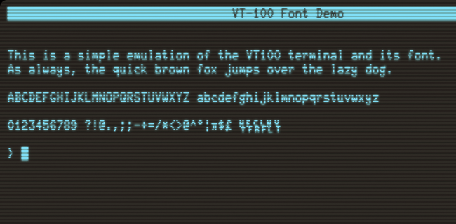
VT100 emulation (screenshot)

VT220 emulation (screenshot)
And that's all for today ...
Recently, I got a little carried away with analog media emulation: I wanted to recreate the raster graphics of CRTs, like on the “glass terminals” of the past, such as the cult VT series from Digital Equipment Corporation (DEC). In the process, a number of questions arose about the features of displaying fonts in pixel graphics of a CRT. I wonder how the fonts actually looked like and is it possible to reconstruct them according to specifications?
Modern TrueType fonts recreate the VT220 glyphs. Keep in mind that VT terminals supported two resolution modes: one for 132 characters per line and one for 80 characters (char-matrix 9 × 10 and 10 × 10, respectively), in the latter the interval is extended by one pixel
')
Due to the abundance of technical information on sites like vt100.net and bitsavers.org, you can easily determine the appearance of those fonts. For example, we can restore the glyphs from the firmware of the terminals. There are even TrueType fonts that repeat the VT220: Glass TTY VT220 with raster lines and DEC Terminal Modern with modern, smooth outlines (in the illustration above).
Upon closer inspection, these fonts are significantly different from each other, but none of them look right. Comparing with the photos of this VT100, there are noticeable differences not only in the font density, but also in the size and shape of the contours and in the overall “feel” of the font. However, the terminal photos also cannot convey the real feeling of font density, because it strongly depends on the shooting parameters:
Adventure game Colossal CavePhoto on the VT100 screen. Photo: Wikipedia, Dave Fisher , 2008, Wikimedia Commons (edited NL).
Displays a list of directories on the VT100. Photo: Jason Scott , 2013. Creative Commons (edited NL).
Since the photos do not really help, it's time to look at the firmware.
Firmware
There are copies of the ROM, you can simply extract from there real fonts that will perfectly match the original, right? .. What can go wrong?
The contents of the ROM from VT100 terminals (left) and VT220 (right). The VT200 division was performed by Paul Flo Williams, vt100.net (2008). VT100 supplemented by me, N. L.). The symbols 'a', 'c', 'g', '2', '6', '7', '9', '@', '%', '{', '}', '|' , '°' and the form of control characters (␉ ␍ ␊  ␋). In addition, VT220 more characters
It also looks wrong. Obviously, the glyphs stretch vertically to about double the height, but this is not the only distortion. The characters just don't look right. For example, look at the 'p' and 'q' or the offset of the points of the downward right stroke of the 'k', not to mention the funny outlines of the '6' and '9' on the VT100 or the distorted '2'! Moreover, upon closer inspection, the symbol matrix is only 8 × 10, while we expected at least 9 × 10 (and 10 × 10 for the mode with 80 columns), as described in the specifications. This is clearly not what is displayed on the screen.
Phosphorus
Let's take another look at the manuals, in particular the VT100 Series Technical Manual (2nd edition, EK-VT100-TM-002; DEC, Maynard, Massachsetts, 1979). It indicates that the matter is in the delay of the phosphor (phosphorus):
Pulse duration and phosphorus activation profile for VT100 and VT200 (VT100 Series Technical Manual, EK-VT100-TM-002, p. 4-78). Keep in mind that the profiles of the signal pulses are highly idealized and in analog reality they are also oblique
The time of full activation of the phosphor is actually longer than the pulse duration for one pixel (40 nanoseconds). This means that if we try to display only one pixel, the phosphor at that particular place will never reach its full level of activation, which will lead to a blurred image of different brightness between the dimmer, thinner areas and the denser, thicker. Therefore, typography is forced to adjust, producing double-duration pulses (80 ns) in order to provide a clear image and legible text.
Single and double pulses and phosphor activation (from there, edited by NL)
Point Stretching Scheme
For this purpose, VT terminals use a special dot stretching method: individual rows of the matrix of characters from ROM are modified on the fly, extending any active pixel pulses by another pixel. Where in the ROM one pixel, there will be two on the screen. Where two in a row, displays three.
Thus, our 8 × 10 matrix expands to the expected 9 × 10 (or 10 × 10 in the 80-column mode, where the last pixel for drawing lines is stretched by one more pulse).
Stretching points in VT100 and VT200 (VT100 Series Technical Manual, EK-VT100-TM-002, p. 4-78)
However, this results in different results for characters of regular size and double width! Thanks to the wonders of stretching points in one font, two fonts are contained, each of which has a detalization that depends on the screen size!
- As in rom
- Single width with dot stretching
- Double width with stretching points
- Single width with stretching points and delay (phosphor)
- Double width with stretching points and delay (phosphor)
(1, 2, 3 according to Paul Flo Williams, vt100.net , 4 and 5 added by me, NL)
It is fundamentally important that the image (2) gives dotted strokes, which differ from clear lines in modern font reconstructions. But if we add sine and cosine graphs of the activation of the phosphor (Fig. 4 and 5, as well as a diagram with the activation graph above), we get a more accurate version of the actual display on the screen (remember that VT100 and VT220 show quite noticeable raster lines).
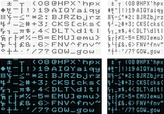
Samples of characters VT220 (mode 80 columns).
- As in rom
- Single width with dot stretching
- Added phosphor activation charts
- Added phosphor glow
(1 and 23 according to Paul Flo Williams, vt100.net , 3, 4 and negative added by me, N. L.)
There is a rather extreme example of how the carrier dictates the appearance of a typographical form, or, on the other hand, how the design of glyphs is created taking into account the carrier and its specific technological limitations to achieve the desired typography. Looking at the effects of phosphor activation, delay and luminescence, it becomes clear why different photos of VT terminal screens show different font widths, depending on the shutter speed on the camera, while the overall font smoothness is maintained.
Here is another representation of the fonts in the ROM with the use of the described effects that better resemble the real image from the screen:
Visible VT100 glyphs (left) and VT220 (right)
Below are the VT100 double width characters compared to normal single width characters (black on white, as well as negative, as seen from the screen):
Pictures from the workbench
And, finally, two images from my desktop “workbench”, on which I try to recreate the screen of the analog terminal in a web browser using HTML5 and the canvas API. Maybe a bit of a retro-blur, but you get the idea:
VT100 emulation (screenshot)
VT220 emulation (screenshot)
And that's all for today ...
Source: https://habr.com/ru/post/446598/
All Articles