Preparing a layout for the client. Part I: Ironing or not?
Preparing a layout for the client. Part I: Ironing or not?
Part I: Ironing or not?
Part II: If ironing, how?
Recently, looking through the portfolio of various designers on the popular freelance portal , I noticed one feature.
Many designers have mastered quite well with Photoshop, and learned to use a variety of tricks and tricks for the production of bright and rich images. Gloss and "caramel" captured the minds of many. Today it is considered that such a “licked” technical design is the most expensive and fashionable. Good or not - in this case it does not matter.
')
Another thing is important. The upper half with a cap of unreal blue sky, excessively green grass, brilliant chrome skyscrapers and plastic people with glued smiles - all this is very popular with customers, and the designers themselves are bubbling with pride, showing similar collages to their colleagues. But the lower half ... Here, in most cases, everything is just very, very sad.
I would like in several articles to talk about the preparation of layouts for display to clients, as well as the difficulties that await the designer in the way of the approval of the layout.
So, first of all, let's talk about the notorious smoothing of screen fonts, analyze the various situations and identify methods of dealing with the alleged difficulties.
Before starting a conversation, I would like to refer to my recent articles on web typography , since a number of important factors disclosed in those publications will help us to better understand the essence of the matter.
What is wrong with those wonderful layouts with beautiful collages?
Everything is very simple.
They are very sloppy text. All text blocks (news, introductory texts, announcements, quotes, polls, etc.) look dreary against the backdrop of a bright visual. There are several reasons for this problem, and we will try to consider them all.
After all, who is a web designer? And what is a website? Is his main task - to make a beautiful hat and cram cute icons? And we all go to sites for their sake?
Hardly anyone would argue with the fact that the content of 90% of the sites is text and again text. We all visit most of the pages to read something, find the information you need. In general, draw something useful. And the pictures in this case serve only to improve perception. Moreover, the images that make up the interface of the website. Of course, we can do almost without text at all. For example, considering the gallery on the photo site. But this is rather an exception to the rule.
The designer should always remember this. And first of all it is obliged to be able to draw up the text in the most digestible form. And then engage in decorations and bright collages.
Considering the design of the text, we first of all pay attention to how it looks. And there are two options: the font is smoothed or anti-aliasing (the term for screen smoothing algorithm) is disabled.
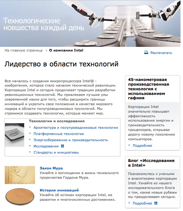
As an example for analysis, I decided to choose some simple and neutral from the point of view of design website, in which there are typical text blocks in two columns, with subtitles of different levels, with links and other elements. As well as possible the pages of the corporate site of the company Intel. I randomly chose the first page that came up , and we will consider it.
Suppose we have turned off screen antialiasing of fonts, as it was in earlier versions of Windows.
This page will look like this:

Not bad at all. Good rigorous corporate design. Without any frills, but well perceived. A little bit, however, the text in the cap, written in white - “Technological innovations every day” looks strange. It is flattened. And the heading “Technology Leadership” below doesn’t have anti-aliasing. Any designer will shrug his shoulders: so what’s the big deal, they say. The cap is a whole image in JPEG format, where it is customary to display text with smoothed fonts. And the second heading is HTML text. Because they look different.
However, I immediately want to ask a question to adherents of non-smoothed HTML-text: do you think such combinations seem strange and ridiculous to you? After all, both texts are typed in the same font of the same type, and they look so different? I also want to ask this question: which text do you like more? If white, then read on. If it is black, then here is another question for you: why then do you smooth all the texts that appear on the site as graphic files (for example, in logos)? Then turn off anti-aliasing on all fonts, even in pictures, manually erase the anti-aliasing from the logo - even if its letters are jagged, as in this header in black.
Ok, this, of course, I exaggerate.
Because in most modern operating systems, you can turn off anti-aliasing not on all pins, but only on those that are less than a certain. In MacOS X, it is generally impossible to completely disable anti-aliasing, and it is possible only not to smooth out fonts with size less than 14 points.
Suppose we just have a similar restriction: the whole text falling in the range of 9-13 points is not smoothed. Why the lower limit of 9 points? Because no existing font can be rasterized on modern monitors without loss of quality, if it is less than this value. Try to make up the text in 7 points and try to read it with anti-aliasing turned off.
So, our site fragment will look as follows with partial smoothing:

Well, that's better. Both large headlines look the same. But somehow the subtitles in the right column began to look too bold. When the text was unsmoothed, these lines did not catch the eye with their excessive density. Strange, isn't it? The same font behaves differently. Designers with experience will say: so this is the notorious Verdana! With her always like that. In ordinary skittles and especially in small texts, the font is good. And in the headlines it is better not to put it. Especially in bold. There, they say, the letters curves. But this moment we will touch a little later.
Now turn on the full smoothing method ClearType . Much has been written about this technology, and I mentioned it before . So it makes no sense to repeat what was said.
You will see something like the following:
Why did I say about? The fact is that ClearType is sub-pixel rendering. And it depends entirely on the order of the color signals (for example, RGB or RBG). Attempting to make a screenshot can be doomed to failure: on monitors with the same order of alternation of color signals, the text will look good, while on others - noticeably worse. And in the end you will get a set of colorful dots like this (on an enlarged scale):

As you can see, the above screenshot is one of the variants of text smoothed in the browser.
But even it looks disproportionately better than text that has not been smoothed out.
If you don’t think so, then I’m wrong, and you don’t need this whole article. And, perhaps, you just have an old monitor that smoothes smoothing strongly or is simply not capable of rendering subpixel rendering qualitatively. Among budget office and home displays, this is not uncommon. By the way, if you have Windows XP, try the “Normal anti-aliasing” mode. Perhaps on your monitor the text will look better with this mode. In addition, you can try various system tuning utilities (“tweakers”). Most of them provide the ability to change the order of alternation of color signals and the degree of clarity in ClearType. Often, a little tweak makes the text look better.
But I suppose that the material presented is of interest primarily to designers and IT-specialists who are not experiencing difficulties with the acquisition of modern monitors. Moreover, in our times they have become quite affordable.
In other words, suppose you are a progressive-minded designer, and in your arsenal modern technology, allowing you to focus on the creative process and not think about technical imperfections, mistakenly blaming all the blame on font rendering methods.
Now let's imagine a few situations.
Situation first.
Your client is waiting, do not wait for the layout. He has an ancient monitor, and he has an old version of Windows installed, in which anti-aliasing of fonts is completely disabled. He is used to seeing all sites with ordinary jagged letters, and does not have any problems with this. You are also a supporter of non-smoothed fonts. And show him a layout similar to the fragment that was presented in the first two screenshots. The client nods with satisfaction, offers minor amendments, and you, having received a fee, lay out the approved work in your portfolio in the same form, with unsmoothed fonts. Visitors like this client, visiting your portfolio, will not notice any oddities, and will write you a heap of flattering praises.
Situation two.
Now suppose you like working with smoothed fonts, and present the same client with the layout, where anti-aliasing is enabled on all text blocks. There may be two options. In the first case, the client “grates” the layout and does not ask any questions about anti-aliasing. From personal experience, I can say that most often it happens. The client does not want to go into the technical features, his mind assesses the integrity and interconnection of the blocks in the design, and not at all some inconsistencies in the visual representation of the letters. In rare cases, claims may arise. They say that I see such text on websites everywhere, and you show me here in this form. And here you can do differently. For example, try to explain to the client the essence of smoothing, let him read this article, or simply convince him that it will be better so far, and after cutting and imposition he will see everything as he wants. By the way, perhaps, after your arguments, the client becomes thoughtful and decides to forever refuse to turn off anti-aliasing. You can also quickly disable anti-aliasing in the layout and show the layout with jagged letters, and we'll talk about this a little later. Well, if no methods help, and persuasions do not work, and the client begins to act up, or even make a mess, my advice to you is: drop it. There will always be more adequate people.
In general, you get the long-awaited statement of the layout with smoothed fonts, and transfer the work to the typesetters (or start to type out yourself). And your layout is safely sent to the portfolio, blogs or anywhere else for all to see. If advocates of jagged fonts come to you, they will see just a good layout, where all the texts are smoothed out. None of them will have any questions about this. After all, your screenshot is a graphic file, not an HTML text, and the graphics should be just that. All have long been accustomed to this. Well, those who use screen smoothing themselves will not have any fabrications on this score at all: they will simply admire your creation. Of course, provided that you did everything correctly and nicely.
Situation three.
Now imagine that our client has at its disposal a modern computer, monitor and operating system (OS X, Vista / Vienna or Linux with the latest versions of graphical skins). And it has anti-aliasing enabled on almost all fonts without exception. Only less than 4 points the text can not be smoothed. This is done specifically for publishing systems, so as not to slow down the work of programs in cases where the page is presented in a greatly reduced form, and all text blocks receive the greek text attribute.
And if you, too, are of the opinion that the jaggedness on the letters is moveton and the century before last, then you will have complete harmony and mutual understanding with such a client. Why am I so sure that in this case this harmony comes? Let's talk about it a little later.
Your layout is accepted with minor amendments, and sent to the portfolio. Where, as in the previous case, visitors react to it, among which there are both colleagues and potential clients.
The fourth situation.
Your client - as in the previous situation. But you are categorically against the inclusion of antialiasing in pins less than 14-18 points. And send him a layout with jagged fonts.
Guess what the customer reaction will be?
It is good if he asks to change something in the text and modify it so that everything looks in its usual form, that is, with anti-aliasing. But it may happen that the client gets a young or recently acquainted with computers. And never before have I seen an unsmoothed text. Believe me, this can happen too. And every day the chance to meet such a person increases. And then, having seen the text unusually cutting the eye, the client will cry in anger: WHAT IS IT FOR? Where is the guarantee that he will not flare up (and clients are often - people are hot and unrestrained) and will not refuse to cooperate further with you?
But what if the client got tractable and accepted the job as you showed it. As a result, as in the first situation, you post a work in this very form in your portfolio. And your site gets another potential client who is used to anti-aliasing. After seeing the work with jagged letters, he may still appeal to you with a proposal. And it may be that he simply leaves your site, disappointed.
Remember that most people's perception is subjective and subconscious. Their eye is not armed with the arsenal that every experienced designer has. They may not be fully aware of why they do not like your work, but, as a rule, the reasons lie on the surface. The considered example is just one of such cases.
It is completely ridiculous to look at cases when graphic elements are intentionally inserted into the layout (signatures of logos, buttons or markers of the type "NEW" or "beta"), where the text is written without smoothing. When the site is viewed with anti-aliasing enabled, such inclusions can unpleasantly catch the eye, or even completely spoil the viewing experience. There is no need to go far for examples. On the above Free-lance.ru many buttons are made in this way. Try to enable anti-aliasing, and you will see these "aliens from the past."
It should also take into account the fact that the owners of good monitors and modern operating systems have now become significantly more. Another year or two, and you are unlikely to meet users who forcibly disable anti-aliasing. These are the trends. You can dispute them for as long as you wish, conduct “holivary” and develop worthless disputes. Only this makes no sense. It is enough to analyze the given situations.
A designer who turns off anti-aliasing only benefits in the first case. In the latter situation, he is clearly losing.
The supporter of smoothing in all cases is a winner.
Is this argument not enough? However, even if you are still looking for sites for some reason, with anti-aliasing turned off, it is useful to get acquainted with the second part of the article, where we will consider various anti-aliasing options and combinations for successful demonstration of the layout to the client.
You ask: why is all this necessary? I don’t say that I’m never showing this kind of sketches to a client, but at once I make everything up, in a graphic editor only by modifying the graphics: logos, icons, collages. If you really can, this article is not for you. And personally, I take off my hat to you. I can't do that. And all my friends design colleagues, too, can not. Before any work with the HTML code begins, the overwhelming majority of the client is shown a preliminary sketch. Sketch, Draft, Fish. Call it what you like, but without it - no way.
So what to do? Some designers use the following method: they write a simple code in the HTML editor, where they insert plates of the desired width and with a suitable background color, in which they place the text in the intended font and color. In the case when anti-aliasing is turned off, it is also convenient to cut all the text from a uniform background using a magic wand, so that later it can be easily manipulated by this block placed on a separate layer. But why complicate your work so much if all the same can be done in a graphic editor without resorting to the layout of temporary blocks. The overwhelming majority of designers do this. But more often - with the only type of smoothing: none.
If you have carefully read the article, you already know that this is not our way.
And how with the help of Photoshop to best prepare the layout for demonstration to the client, we will talk in the next section.
Do not switch! ;-)
NB - , . , , , , , . , . , - — . - .
Thanks for attention.
PS I am reproached with an excess of "water" in the stated material. I just try to write for all audiences, not only for professionals who already know all of the above. The second part is supposed to contain much more practical material.
Source: https://habr.com/ru/post/44657/
All Articles