Product Design Digest March 2019
The digest collects fresh articles on interface design, as well as tools, patterns, cases, trends and historical stories since 2009. I carefully filter a large stream of subscriptions so that you can upgrade your professional skills and better solve work tasks. Previous issues: April 2010-February 2019 .
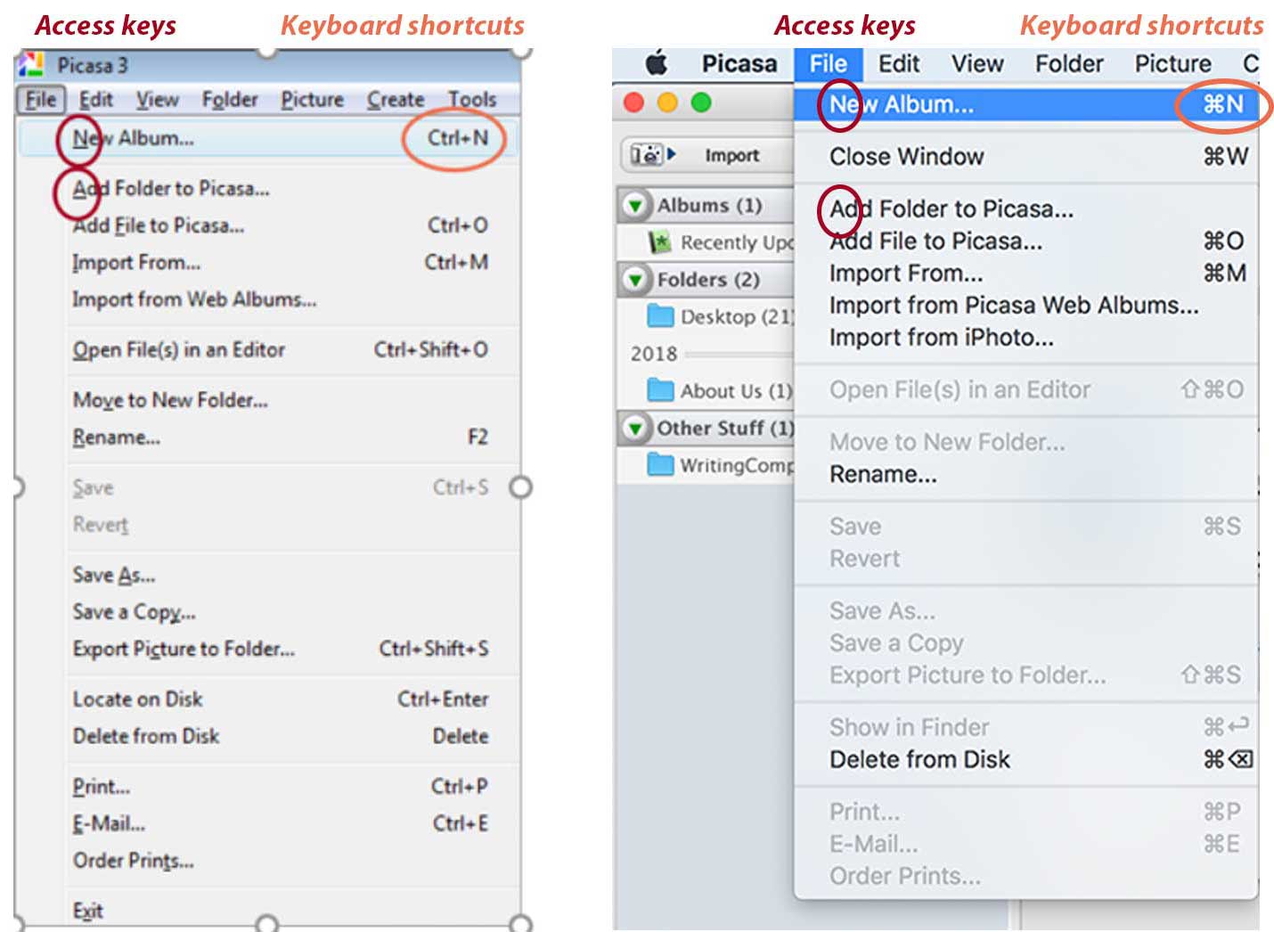
A great reminder of Anna Kaley from the Nielsen / Norman Group about the correct names of interactive elements and the choice of shortcut keys (desktop and web applications).
')
A collection of checklists on the design of typical interface patterns. What not to forget when using them.

Memo Kim Flaherty of Nielsen / Norman Group on how to properly show discounts and promotions in online stores. She made out a bunch of pages and scripts where mention is appropriate.
Excellent user error handling tool by Emanuel Serbanoiu. He examines their psychological causes and gives recipes on typical situations.

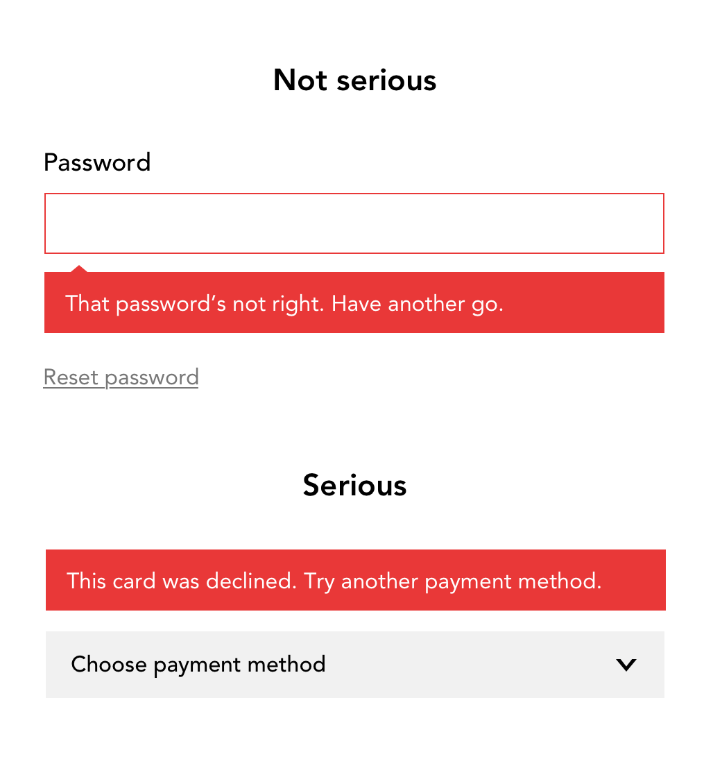
Checklist for understandable and capacious error messages in forms from Amy Leak.
Patterns of intelligent integration of the constraints and requirements of the Claire Barrett GDPR. How not to turn the Internet into another bureaucratic window, but to tell the user about the benefits and importance of these actions.
Anna Kaley from Nielsen / Norman Group analyzes the use of context menus in interfaces.
The fifth version of Storybook’s most popular live guide for components on React, Vue, Angular, React Native and Ember has been released. He finally began to look decent and he is built on the basis of the Storybook.
Design team BARS Group talks about creating a design system.
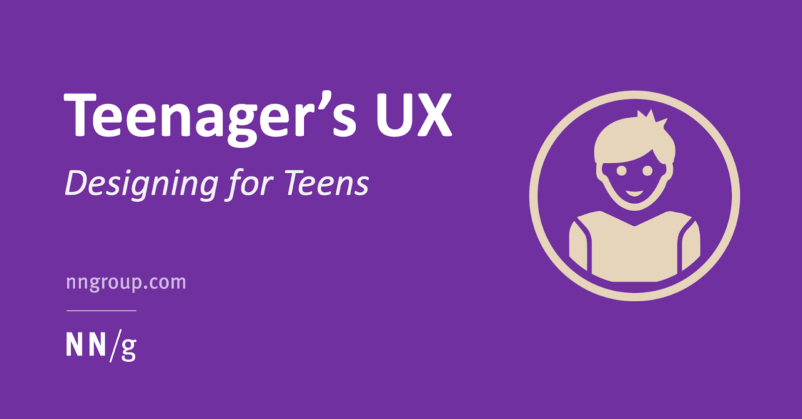
Alita Joyce and Jakob Nielsen of the Nielsen / Norman Group talk about teen user research and how they work with interfaces. Useful binding to the patterns at the end and comparison with other ages (children, students, adults).
Kim Flaherty and Kate Moran from the Nielsen / Norman Group write about gaps in users' knowledge of the subject area, which the interface should solve. And if it does not decide, people are forced to disassemble information from disparate sources.
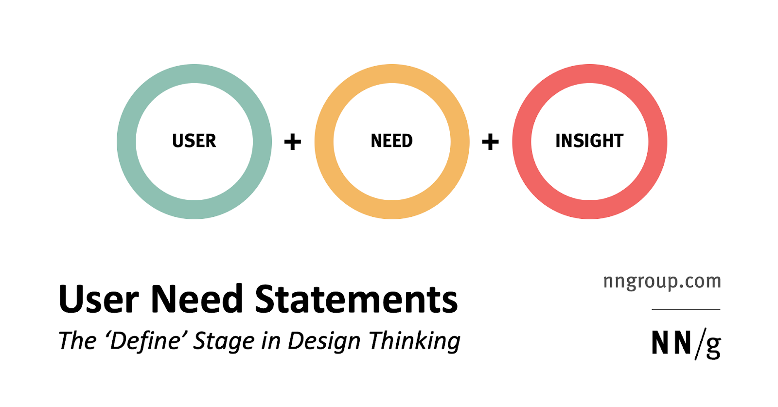
Sarah Gibbons from the Nielsen / Norman Group parses the format for describing user needs. She advises using verbs (goals and end states) rather than nouns (specific solutions).
We received $ 20 million from the investment fund Benchmark. Unlike all the others, the company has developed all these years with the founders' money. But it becomes clear how Figma with a total of $ 82.9 million bypasses them at the turn.

The guys teased plans for the year - a browser-based version with collaboration, transfer of layouts out of the box, command tariffs and space in the cloud. True, the pace is still not fire - the first version in the browser is promised only by the end of the year. During this time, Figma will make a lot of turns around the earth.
March update . Simplified use of developments in Adobe Illustrator, interface improvements, improved integration with Jira.
Thomas Lowry of Figma wrote a memo to create a library of items . Maxime Robinet got married with a Lottie tool .
A huge collection of semi-real data for layouts and prototypes. Names of people, nicknames of animals, addresses, colors, museums, artists - a total of 120 lists.
A collection of user avatar illustrations for your layouts.
Generator of illustrative user avatars for layouts.
Added the ability to custom test prototypes . They help with both recording the session and with recruiting. Also released is the second version of the Maze plugin for user prototype testing.
The service tells you how well the selected colors work well for users with disabilities in different contexts - background, fonts of different sizes, etc.
We received $ 30 million of investments (a total of $ 55 was invested in them). Strong for a relatively simple service that is not a standalone tool.
Another design tool focused on responsive sites. Based on the idea of "belts" that can be moved up and down the page - like the usual Tilda or Squarespace.
The tool focused on interface animation and renamed accordingly.
Seriously updated technical stuffing .
User analytics service. Focuses on the study of specific sessions using the site or application.
Tips Sam Yuan from Shopify for competent preparation, conduct and processing of the results of card sorting.
David Travis's Golden Words from Userfocus: stop asking the user what design they like. This gives false results that create the illusion of making decisions based on data.

Tool bought SurveyMonkey .
Jeff Sauro wonders whether the placement of questions in questionnaires on the same page or different influences the answers of users. In general, not much, although one page pages slightly worsen the ratings.
Jeff Sauro's useful reminder of why UX measurements are made at all, on what principles they work and what answers can be obtained with their help. How to choose the right metrics and how to associate interface changes with their improvement.
Jeff Sauro investigated the extent to which a clear indication of a neutral rating on the NPS scale affects the distribution of ratings. For active users or recent buyers there is no difference, but for those who have not used it for a long time, there is a shift.
Powerful interview instruction from Kurt Varner from Dropbox. Many clever advice on issues, format, portfolio, test, screening and other aspects of the process.
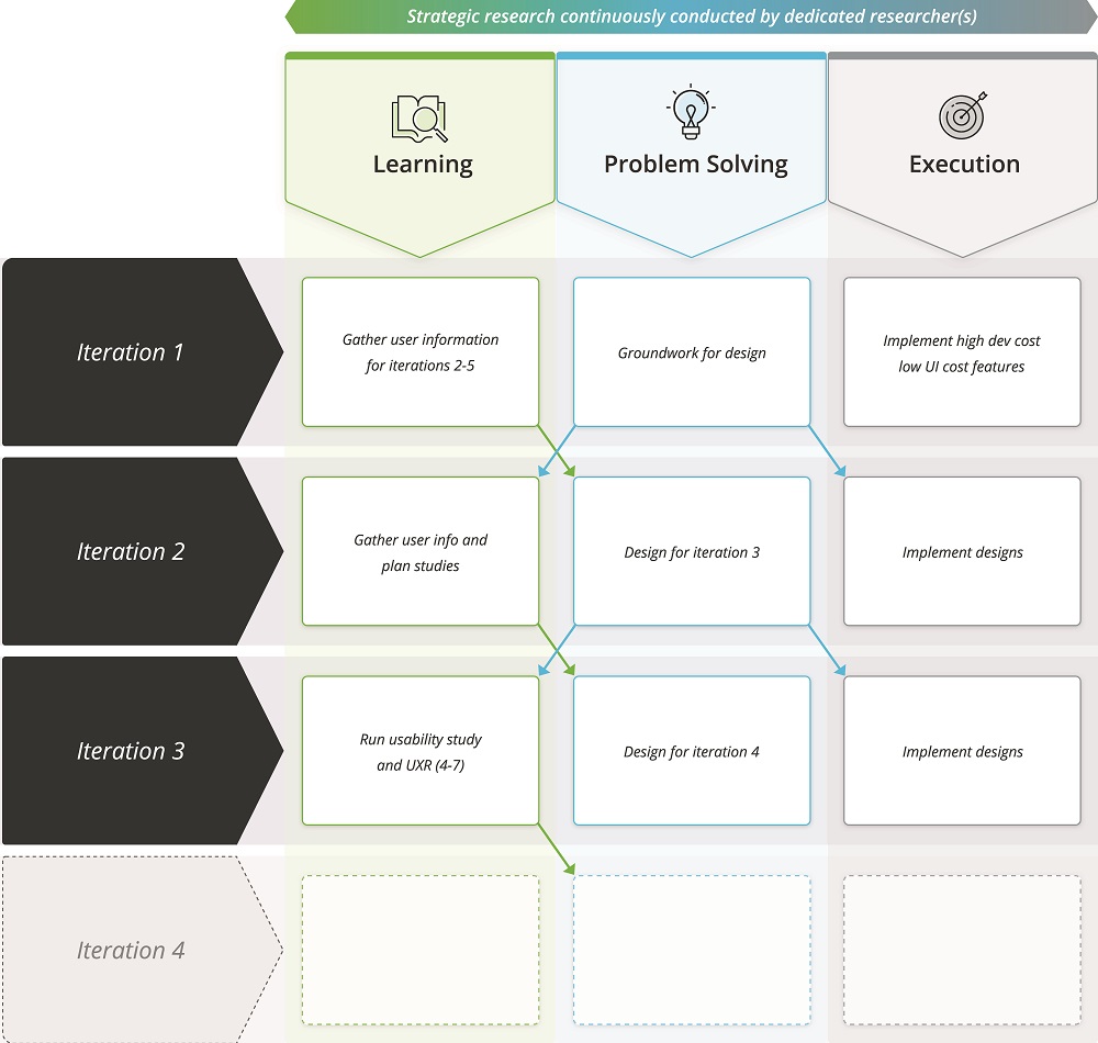
Carol J. Smith, Thyra Rauch and Hannah Moyers describe in detail the model for integrating user research into the canonical agile process. These are three types of work (learning, problem solving and execution), for each of which an example of real tasks is shown.
Jim Nieters writes about the difference between a leader and a manager. Why it is important to save creative professionals from fear and other aspects of the work of a good leader.
Jennifer Bullard and Carol Bergantino from Veracode talk about the creation of the UX-guild in the company, largely working on scalable agile (there are separate product groups by function, although the designers are in a centralized team). There are not enough designers at all, so they focused on training non-designers so that product groups are more independent and give a suitable result.
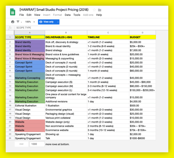
Hawraf Design Studio has made a noisy with its open approach in recent years. They decided to close the company, but published all the working documents . Design process, work with the client, etc.
Budi Tanrim has an interesting approach to design criticism. He divides the meeting into three parts (analysis, discussion, and suggestions) and proposes the right balance of time between them.
An example of a dialogue between a mentor and his client after internship. Interesting about the expectations of both parties.

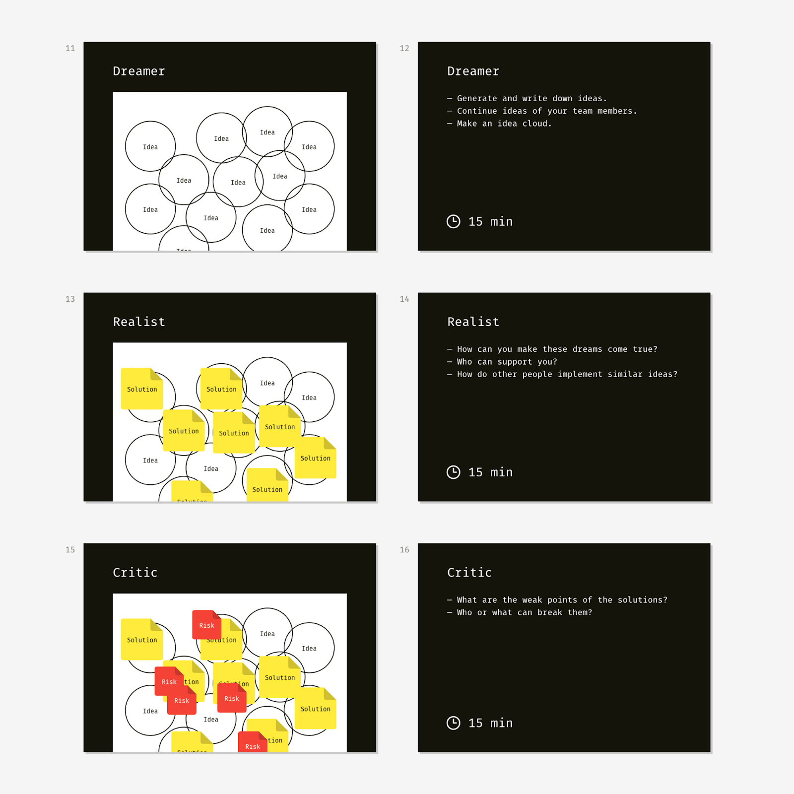
An explanatory memorandum of Slava Shestopalov from Eleks about popular methods-assistants when conducting brainstorms - six De Bono thinking hats, Disney's creative strategy and SCAMPER from BBDO.
Lev Solomadin from Sibur talks about the peculiarities of the work of the interface designer in a large and complex manufacturing company. Cool immersion in the real world.
Vicki Tan talks about the redesign of the process of meeting a new user in the Headspace meditation application. How they found the key metric and experimented around it.
drop in smartphone sales in China -20%
Wearable device sales in the world grew 31.4%
sold Playstation VR 4.2M helmets
John Maeda has released a fresh annual report Design in Tech Report . This year, a compilation of noticeable news in a professional community is more likely than an analysis of insights, as it was in the first years and what you usually expect from new issues. Well, the ntivka initiatives of its current company Automattic (creators of WordPress).
In general, I do not really believe in annual reviews of trends (although, of course, I review those that come out ( more )) - the industry is changing more slowly. Many of the trends are developing and live in ascending form for a couple of years, so you see them wandering into such reports from year to year (virtual and augmented reality, for example). Some like “animations”, “large typography” or “background videos” have already become cliché in the spirit of the gigs of Benny Hill and our grandchildren will probably have to read about them. Therefore, I divide design trends into three types: technological, interface and visual.
IBM guidelines on virtual and augmented reality interfaces.

Matthew Bennett, head of sound and touch design at Microsoft, talks about his vision of the role of sound in interfaces and digital products in general. An interesting wide perspective on the hot topic.
Nvidia's driving simulator, in which a completely realistic city is generated using an algorithmic design.

The first commercial algorithmic design tool from the Creative.ai team. Allows you to create posters, ads and other simple formats.
An interesting community where participants remix each other's work endlessly with an algorithmic design.

A group of Microsoft researchers collected guidelines on product design using artificial intelligence technologies. It turned out 18 heuristics, which are quite convenient to use in work. Announcement . How to use them in the creative process .

Another example of amazing magic is that Nvidia’s experimental solution turns a sketch into a photograph of a natural landscape.
The sensible presentation by Josh Clark about the role of algorithmic design and what works will be replaced by robots, and where people cope better.
Explanatory analysis of ethical and legislative problems of the works of algorithmic design. The author draws an analogy with a photograph, which was also initially challenged, as well as slippery situations with rights to the results of the algorithms.

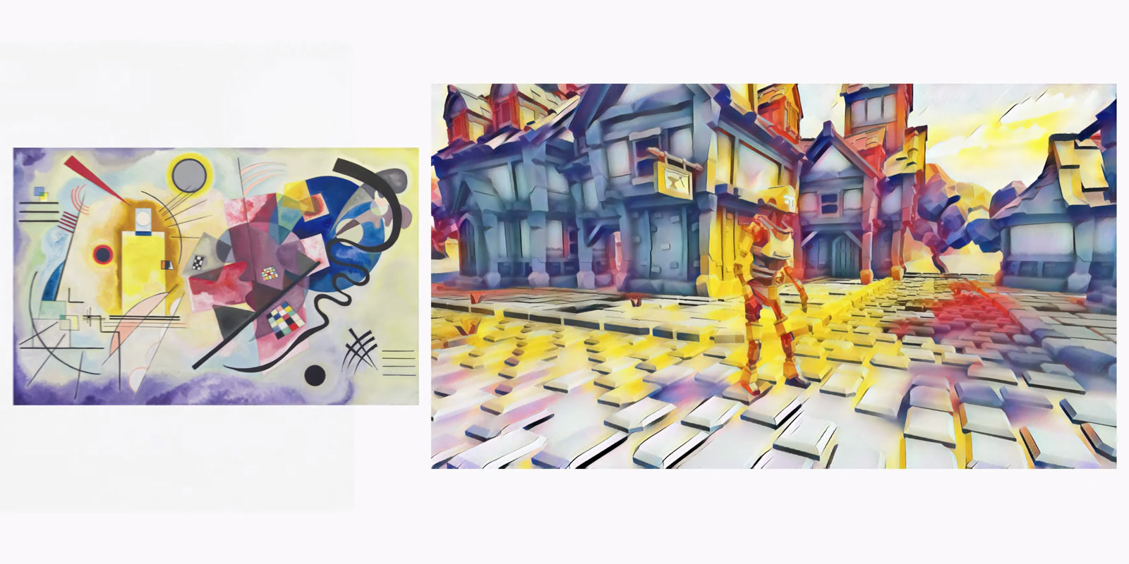
The Google Stadia gaming platform offers style overlaying in real time.
The service allows you to design a skill for Alexa and Google Assistant in a visual form, and then publish it.
In Britain, smart speakers are added to the consumer basket, which helps keep track of inflation and purchasing power. An interesting indicator of their demand.
Lexie Martin from the Nielsen / Norman Group provides user research advice on portfolio creation. Although they have no visual results, you can talk about research projects and their results quite well.

A collection of stupid titles of design posts in the spirit of useless HYIPs.
Blog design team of the Finnish telecom operator Elisa.
Patterns and best practices
UI Copy - UX Guidelines for Command Names and Keyboard Shortcuts
A great reminder of Anna Kaley from the Nielsen / Norman Group about the correct names of interactive elements and the choice of shortcut keys (desktop and web applications).
')
Checklist Design - Best UI elements for the best UX practice
A collection of checklists on the design of typical interface patterns. What not to forget when using them.
Communicating Ecommerce Discounts and Promotions
Memo Kim Flaherty of Nielsen / Norman Group on how to properly show discounts and promotions in online stores. She made out a bunch of pages and scripts where mention is appropriate.
Human error - An important ingredient in great designs
Excellent user error handling tool by Emanuel Serbanoiu. He examines their psychological causes and gives recipes on typical situations.
Writing clearer error messages
Checklist for understandable and capacious error messages in forms from Amy Leak.
What does GDPR mean for UX?
Patterns of intelligent integration of the constraints and requirements of the Claire Barrett GDPR. How not to turn the Internet into another bureaucratic window, but to tell the user about the benefits and importance of these actions.
Contextual Menus - Delivering Relevant Tools for Tasks
Anna Kaley from Nielsen / Norman Group analyzes the use of context menus in interfaces.
Baymard Institute Studies
- How to take into account search queries about the work of the online store, and not products .
- The correct user interface dropdown menu in online stores .
Design systems and guidelines
Storybook 5
The fifth version of Storybook’s most popular live guide for components on React, Vue, Angular, React Native and Ember has been released. He finally began to look decent and he is built on the basis of the Storybook.
Develop your design system. Experience "BARS Group"
Design team BARS Group talks about creating a design system.
Material design
- New rules for application icons in the Play Store . They become square with a rounding of 20% and a shadow (they overlap automatically).
Understanding the user
Teenager's UX - Designing for Teens
Alita Joyce and Jakob Nielsen of the Nielsen / Norman Group talk about teen user research and how they work with interfaces. Useful binding to the patterns at the end and comparison with other ages (children, students, adults).
Unbridged Knowledge Gaps Hurt UX
Kim Flaherty and Kate Moran from the Nielsen / Norman Group write about gaps in users' knowledge of the subject area, which the interface should solve. And if it does not decide, people are forced to disassemble information from disparate sources.
User Need Statements
Sarah Gibbons from the Nielsen / Norman Group parses the format for describing user needs. She advises using verbs (goals and end states) rather than nouns (specific solutions).
New interface design tools
Sketch in the browser
We received $ 20 million from the investment fund Benchmark. Unlike all the others, the company has developed all these years with the founders' money. But it becomes clear how Figma with a total of $ 82.9 million bypasses them at the turn.
The guys teased plans for the year - a browser-based version with collaboration, transfer of layouts out of the box, command tariffs and space in the cloud. True, the pace is still not fire - the first version in the browser is promised only by the end of the year. During this time, Figma will make a lot of turns around the earth.
Adobe XD
March update . Simplified use of developments in Adobe Illustrator, interface improvements, improved integration with Jira.
Figma
Thomas Lowry of Figma wrote a memo to create a library of items . Maxime Robinet got married with a Lottie tool .
Populate
A huge collection of semi-real data for layouts and prototypes. Names of people, nicknames of animals, addresses, colors, museums, artists - a total of 120 lists.
Joe schmoe
A collection of user avatar illustrations for your layouts.
Friendly faces
Generator of illustrative user avatars for layouts.
Marvel
Added the ability to custom test prototypes . They help with both recording the session and with recruiting. Also released is the second version of the Maze plugin for user prototype testing.
Accessible Brand Colors
The service tells you how well the selected colors work well for users with disabilities in different contexts - background, fonts of different sizes, etc.
Abstract
We received $ 30 million of investments (a total of $ 55 was invested in them). Strong for a relatively simple service that is not a standalone tool.
Blocs
Another design tool focused on responsive sites. Based on the idea of "belts" that can be moved up and down the page - like the usual Tilda or Squarespace.
Haiku animator
The tool focused on interface animation and renamed accordingly.
Supernova
Seriously updated technical stuffing .
User research and analytics
UXCam App Analytics - Deliver the perfect app experience
User analytics service. Focuses on the study of specific sessions using the site or application.
8 things I wish
Tips Sam Yuan from Shopify for competent preparation, conduct and processing of the results of card sorting.
Repeat after me - Preference testing
David Travis's Golden Words from Userfocus: stop asking the user what design they like. This gives false results that create the illusion of making decisions based on data.
Usabilla
Tool bought SurveyMonkey .
Do Survey Grids Affect Responses?
Jeff Sauro wonders whether the placement of questions in questionnaires on the same page or different influences the answers of users. In general, not much, although one page pages slightly worsen the ratings.
Visual programming and browser design
New scripts
- Simple kinetic typography effect .
- Effective image distortion on promotional sites .
- Manage the page in the browser using gestures . Instructions .
- Splitting 3D objects for promotional sites .
Metrics and ROI
What is the purpose of the UX Measurement?
Jeff Sauro's useful reminder of why UX measurements are made at all, on what principles they work and what answers can be obtained with their help. How to choose the right metrics and how to associate interface changes with their improvement.
Effects of Labeling the Neutral Response in the NPS
Jeff Sauro investigated the extent to which a clear indication of a neutral rating on the NPS scale affects the distribution of ratings. For active users or recent buyers there is no difference, but for those who have not used it for a long time, there is a shift.
Design Management and DesignOps
Design interviewing - Ask me anything
Powerful interview instruction from Kurt Varner from Dropbox. Many clever advice on issues, format, portfolio, test, screening and other aspects of the process.
AUX3 - Making the UX Research Track with Agile
Carol J. Smith, Thyra Rauch and Hannah Moyers describe in detail the model for integrating user research into the canonical agile process. These are three types of work (learning, problem solving and execution), for each of which an example of real tasks is shown.
Lead, Don't Manage, Part 1
Jim Nieters writes about the difference between a leader and a manager. Why it is important to save creative professionals from fear and other aspects of the work of a good leader.
Forge a Guild - Elevate Your UX Team to Superhero Status
Jennifer Bullard and Carol Bergantino from Veracode talk about the creation of the UX-guild in the company, largely working on scalable agile (there are separate product groups by function, although the designers are in a centralized team). There are not enough designers at all, so they focused on training non-designers so that product groups are more independent and give a suitable result.
A guide to starting your own design studio from Hawraf
Hawraf Design Studio has made a noisy with its open approach in recent years. They decided to close the company, but published all the working documents . Design process, work with the client, etc.
Analyze, Discuss, Suggest
Budi Tanrim has an interesting approach to design criticism. He divides the meeting into three parts (analysis, discussion, and suggestions) and proposes the right balance of time between them.
A dialogue between a mentor and mentee
An example of a dialogue between a mentor and his client after internship. Interesting about the expectations of both parties.
Team interaction
Organizing Brainstorming Workshops - A Designer's Guide
An explanatory memorandum of Slava Shestopalov from Eleks about popular methods-assistants when conducting brainstorms - six De Bono thinking hats, Disney's creative strategy and SCAMPER from BBDO.
Cases
Features of approaches to design in the real manufacturing sector
Lev Solomadin from Sibur talks about the peculiarities of the work of the interface designer in a large and complex manufacturing company. Cool immersion in the real world.
Designing with Intuition
Vicki Tan talks about the redesign of the process of meeting a new user in the Headspace meditation application. How they found the key metric and experimented around it.
Trends
Market statistics
drop in smartphone sales in China -20%
Wearable device sales in the world grew 31.4%
sold Playstation VR 4.2M helmets
Technological, interface and visual trends in design
John Maeda has released a fresh annual report Design in Tech Report . This year, a compilation of noticeable news in a professional community is more likely than an analysis of insights, as it was in the first years and what you usually expect from new issues. Well, the ntivka initiatives of its current company Automattic (creators of WordPress).
In general, I do not really believe in annual reviews of trends (although, of course, I review those that come out ( more )) - the industry is changing more slowly. Many of the trends are developing and live in ascending form for a couple of years, so you see them wandering into such reports from year to year (virtual and augmented reality, for example). Some like “animations”, “large typography” or “background videos” have already become cliché in the spirit of the gigs of Benny Hill and our grandchildren will probably have to read about them. Therefore, I divide design trends into three types: technological, interface and visual.
IBM AR / VR Design Language
IBM guidelines on virtual and augmented reality interfaces.
Beyond Vision - Sound Design as Sensory Design
Matthew Bennett, head of sound and touch design at Microsoft, talks about his vision of the role of sound in interfaces and digital products in general. An interesting wide perspective on the hot topic.
Algorithmic design
Watch AI conjure up anchors from scratch
Nvidia's driving simulator, in which a completely realistic city is generated using an algorithmic design.
Bloma
The first commercial algorithmic design tool from the Creative.ai team. Allows you to create posters, ads and other simple formats.
Ganbreeder
An interesting community where participants remix each other's work endlessly with an algorithmic design.
Microsoft Guidelines for Human-AI Interaction (PDF)
A group of Microsoft researchers collected guidelines on product design using artificial intelligence technologies. It turned out 18 heuristics, which are quite convenient to use in work. Announcement . How to use them in the creative process .
Nvidia AI turns sketches into photorealistic landscapes in seconds
Another example of amazing magic is that Nvidia’s experimental solution turns a sketch into a photograph of a natural landscape.
AI Is Your New Design Material
The sensible presentation by Josh Clark about the role of algorithmic design and what works will be replaced by robots, and where people cope better.
AI is bringing out the art of the worst instincts
Explanatory analysis of ethical and legislative problems of the works of algorithmic design. The author draws an analogy with a photograph, which was also initially challenged, as well as slippery situations with rights to the results of the algorithms.
Google Stadia can in real-time
The Google Stadia gaming platform offers style overlaying in real time.
Voice Interfaces
Voiceflow - Voice interfaces made easy
The service allows you to design a skill for Alexa and Google Assistant in a visual form, and then publish it.
Smart speakers are used in the UK
In Britain, smart speakers are added to the consumer basket, which helps keep track of inflation and purchasing power. An interesting indicator of their demand.
For general and professional development
Portfolios for UX Researchers - Top 10 Recommendations
Lexie Martin from the Nielsen / Norman Group provides user research advice on portfolio creation. Although they have no visual results, you can talk about research projects and their results quite well.
Pseudo design titles
A collection of stupid titles of design posts in the spirit of useless HYIPs.
People and companies in the industry
Elisa design
Blog design team of the Finnish telecom operator Elisa.
Subscribe to a digest on Facebook , VKontakte , Telegram or by mail - there fresh links appear every week. Thanks to everyone who shares the links in the group, especially Gennady Dragun, Pavel Skripkin, Dmitry Podluzhny, Anton Artyomov, Denis Efremov, Alexey Kopylov, Taras Brizitsky, Yevgeny Sokolov and Anton Oleynik.
Source: https://habr.com/ru/post/446460/
All Articles