React Training Course Part 25: Forms Workshop
In today's part of the translation of the training course on React, you are invited to perform a practical task on working with forms.

→ Part 1: Course Overview, React, ReactDOM, and JSX Reasons
→ Part 2: Functional Components
→ Part 3: Component Files, Project Structure
→ Part 4: Parent and Child Components
→ Part 5: Getting Started on a TODO Application, Basics of Styling
→ Part 6: Some of the features of the course, JSX and JavaScript
→ Part 7: Inline Styles
→ Part 8: continued work on the TODO application, familiarity with the properties of the components
→ Part 9: Component Properties
→ Part 10: Workshop on working with the properties of components and styling
→ Part 11: dynamic markup generation and the map array method
→ Part 12: workshop, the third stage of work on the TODO application
→ Part 13: Class Based Components
→ Part 14: Workshop on Class Based Components, Component State
→ Part 15: workshops on working with the state of components
→ Part 16: the fourth stage of work on a TODO application, event handling
→ Part 17: the fifth stage of working on a TODO application, modifying the state of components
→ Part 18: Sixth Stage of Work on a TODO Application
→ Part 19: Component Life Cycle Techniques
→ Part 20: The first lesson in conditional rendering.
→ Part 21: the second lesson and workshop on conditional rendering
→ Part 22: the seventh stage of work on a TODO application, loading data from external sources
→ Part 23: First Form Lesson
→ Part 24: Second Form Lesson
→ Part 25: Workshop on working with forms
→ Part 26: Application Architecture, Container / Component Pattern
→ Part 27: course project
→ Original
')
In this practical lesson, you are asked to bring the code for the
In general, your task is to ensure that the data that the user enters while working with form controls will immediately appear in the text below this form. In the course of the task, use the technology of controlled components . It should be noted that the task proposed to you is an adapted version of this task, so you may well take a look at it in order to better understand the features of the controls that you are invited to create and configure.
Here is what the component displays on the screen now.

Application in browser
The solution to the problem you are offered can be approached from various sides. We will start by adding everything we need to the state, after which we will tune the controls and other component mechanisms.
At the moment, the state of the component will look as shown below.
It is necessary to take into account that in the process of working on the program it may turn out that, for example, it will be more convenient to initialize the state otherwise. If we encounter something like this, we will change the state initialization code. In particular, now some doubts can be caused by the number 0 written in the
Now, after the initialization of the state, let's set up the controls. Since the code already has a description of the input fields, let's get down to working with them.
These controls will need to be named by adjusting their
The method used to handle
Here we extract the
Let's not forget about
In order to achieve the output at the bottom of the page, the data entered in the fields
Now take a look at what we did.

Application in browser
As you can see, there is no hint in the field for entering the age. Instead, it displays what is specified in the state property
As a result, we will need to replace the value of the state property
Now we will test the form. Immediately after opening, it will look the same as at the very beginning of work, that is, a hint will be returned in the

Application in browser
As you can see, at this stage of work, everything functions as expected.
Now we will deal with new elements. The next step in working on the form will be to add switches to it.
We wrap the switches in the
When working with switches, it is worth remembering that they are a kind of combination of flags that have the
As a result, the switch description code will look like this:
Now we rework the corresponding
After that the form can be tested. Immediately after launch, both switches are not selected, since the value is stored in the state, which does not allow any of the checks performed when setting their
Application in browser
Now let's do the work on the combo box. Its preparation looks like this:
From this code it is clear that we plan to describe a combo box containing four elements.
The
If we talk about the
Assign the field other attributes. In particular, the name corresponding to the name of the property in the state, and the
Now we’ll set up a description of the
If you look at the page in the browser right now, you can see that the first list item is automatically selected in the field, but this obviously does not lead to status updates, since nothing is displayed in the

Application in browser
In order to fall into the state of
Often, in order to take into account this feature of combo boxes, in their lists, as the first element, they put something like an element with a null value and with text like
We will focus on this option of setting the combo box.
Now let's deal with perhaps the most difficult part of our task, which is related to the flags. It is worth
As you can see, we are planning to create three flags. All of them, immediately after loading the page, will be reset.
We describe the flags in the code returned by the component, wrapping them in
The names of the properties of the
Please note that although the
Take a look at the app.
Application in browser
As you can see, the checkboxes are displayed on the page, but the component does not yet contain all the mechanisms necessary to ensure their proper operation. Let's deal with an event handler.
Here, to work with flags, we need to extract the
When updating the state, it is necessary to take into account that React is a sufficiently intelligent system, which, if only a part of the state is updated, automatically combines what has remained unchanged with what has changed. But at the same time it is impossible to be sure that the work with the properties of objects, which are the values of the properties of the state, will also be carried out. Check it out by bringing the
If you open the application page in the browser, then immediately after it is loaded, everything will look fine, if you try, for example, enter a name in the
In order to properly update the contents of the object
Now we change the settings of the attribute flags, getting rid of
And finally, edit the code of the element that displays information about the nutritional restrictions specified by the user:
After that, we check the performance of the application.

Application in browser
As you can see, everything works as expected.
Here is the complete
Today you have completed practical work on the forms. Here you repeated what you learned in previous classes, and, hopefully, learned something new. Next time we'll talk about the architecture of React applications.
Dear readers! Tell me, was it difficult to do this practical work?

→ Part 1: Course Overview, React, ReactDOM, and JSX Reasons
→ Part 2: Functional Components
→ Part 3: Component Files, Project Structure
→ Part 4: Parent and Child Components
→ Part 5: Getting Started on a TODO Application, Basics of Styling
→ Part 6: Some of the features of the course, JSX and JavaScript
→ Part 7: Inline Styles
→ Part 8: continued work on the TODO application, familiarity with the properties of the components
→ Part 9: Component Properties
→ Part 10: Workshop on working with the properties of components and styling
→ Part 11: dynamic markup generation and the map array method
→ Part 12: workshop, the third stage of work on the TODO application
→ Part 13: Class Based Components
→ Part 14: Workshop on Class Based Components, Component State
→ Part 15: workshops on working with the state of components
→ Part 16: the fourth stage of work on a TODO application, event handling
→ Part 17: the fifth stage of working on a TODO application, modifying the state of components
→ Part 18: Sixth Stage of Work on a TODO Application
→ Part 19: Component Life Cycle Techniques
→ Part 20: The first lesson in conditional rendering.
→ Part 21: the second lesson and workshop on conditional rendering
→ Part 22: the seventh stage of work on a TODO application, loading data from external sources
→ Part 23: First Form Lesson
→ Part 24: Second Form Lesson
→ Part 25: Workshop on working with forms
→ Part 26: Application Architecture, Container / Component Pattern
→ Part 27: course project
Lesson 43. Workshop. Working with forms
→ Original
')
▍Job
In this practical lesson, you are asked to bring the code for the
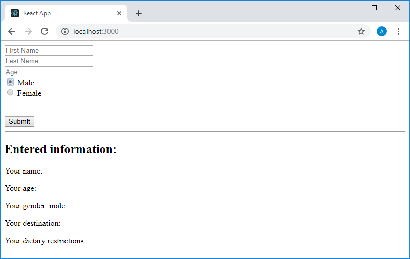
App component into a healthy state, which is located in the App.js file of the standard project created by create-react-app. Here is the code: import React, {Component} from "react" class App extends Component { constructor() { super() this.state = {} } render() { return ( <main> <form> <input placeholder="First Name" /><br /> <input placeholder="Last Name" /><br /> <input placeholder="Age" /><br /> {/* */} <br /> {/* */} <br /> {/* */} <br /> <button>Submit</button> </form> <hr /> <h2><font color="#3AC1EF">Entered information:</font></h2> <p>Your name: {/* */}</p> <p>Your age: {/* */}</p> <p>Your gender: {/* */}</p> <p>Your destination: {/* */}</p> <p> Your dietary restrictions: {/* */} </p> </main> ) } } export default App In general, your task is to ensure that the data that the user enters while working with form controls will immediately appear in the text below this form. In the course of the task, use the technology of controlled components . It should be noted that the task proposed to you is an adapted version of this task, so you may well take a look at it in order to better understand the features of the controls that you are invited to create and configure.
Here is what the component displays on the screen now.
Application in browser
▍Decision
The solution to the problem you are offered can be approached from various sides. We will start by adding everything we need to the state, after which we will tune the controls and other component mechanisms.
At the moment, the state of the component will look as shown below.
this.state = { firstName: "", lastName: "", age: 0, gender: "", destination: "", dietaryRestrictions: [] } It is necessary to take into account that in the process of working on the program it may turn out that, for example, it will be more convenient to initialize the state otherwise. If we encounter something like this, we will change the state initialization code. In particular, now some doubts can be caused by the number 0 written in the
age property, in which it is supposed to store the age entered by the user. Perhaps, otherwise you will need to do with the data storage system flags, which is now represented by the property dietaryRestrictions , initialized by an empty array.Now, after the initialization of the state, let's set up the controls. Since the code already has a description of the input fields, let's get down to working with them.
These controls will need to be named by adjusting their
name attributes so that they match the state property names in which the data entered into these fields will be stored. They must have a value attribute, the value of which is determined based on the data stored in the state. When entering data into each of these fields, you must pass the entered data to the component, which leads to the need for them to have an onChange event onChange . All these arguments lead to the fact that the description of the fields now looks like this: <input name="firstName" value={this.state.firstName} onChange={this.handleChange} placeholder="First Name" /> <br /> <input name="lastName" value={this.state.lastName} onChange={this.handleChange} placeholder="Last Name" /> <br /> <input name="age" value={this.state.age} onChange={this.handleChange} placeholder="Age" /> The method used to handle
onChange events of these fields is specified as non-existent while this.handleChange . Create this method: handleChange(event) { const {name, value} = event.target this.setState({ [name]: value }) } Here we extract the
name and value properties from the event.target object, and then use them to set the corresponding state property. At the moment, we are satisfied with such a code for a universal event handler, but later, when we get to working with flags, we will make changes to it.Let's not forget about
this binding, which is executed in the component's constructor: this.handleChange = this.handleChange.bind(this) In order to achieve the output at the bottom of the page, the data entered in the fields
firstName , secondName and age will work with the corresponding <p> elements, bringing them to the following form: <p>Your name: {this.state.firstName} {this.state.lastName}</p> <p>Your age: {this.state.age}</p> Now take a look at what we did.
Application in browser
As you can see, there is no hint in the field for entering the age. Instead, it displays what is specified in the state property
age , that is - 0. We also need a hint in the empty field. Let's try to replace the value of age in the state to null . After that, it turns out that the form looks as it should, but the console displays the following warning regarding the age field: Warning: `value` prop on `input` should not be null. Consider using an empty string to clear the component or `undefined` for uncontrolled components As a result, we will need to replace the value of the state property
age with an empty string, bringing the state initialization code to the following form: this.state = { firstName: "", lastName: "", age: "", gender: "", destination: "", dietaryRestrictions: [] } Now we will test the form. Immediately after opening, it will look the same as at the very beginning of work, that is, a hint will be returned in the
age field. When filling in the fields, the entered data will be displayed at the bottom of the page.Application in browser
As you can see, at this stage of work, everything functions as expected.
Now we will deal with new elements. The next step in working on the form will be to add switches to it.
We wrap the switches in the
<label> , which will not only sign the switch, but also make it so that clicking on this <label> , that is, on its parent element, would lead to its choice.When working with switches, it is worth remembering that they are a kind of combination of flags that have the
checked attribute and text fields that have a value attribute. The switches form a group in which each of the switches is assigned the same name, and the property of the checked switches is set according to the condition that is configured so that it would not be possible to turn on more than one switch that is included in the same group. onChange assign this.handleChange as the onChange event onChange switches.As a result, the switch description code will look like this:
<label> <input type="radio" name="gender" value="male" checked={this.state.gender === "male"} onChange={this.handleChange} /> Male </label> <br /> <label> <input type="radio" name="gender" value="female" checked={this.state.gender === "female"} onChange={this.handleChange} /> Female </label> Now we rework the corresponding
<p> element located at the bottom of the page as follows: <p>Your gender: {this.state.gender}</p> After that the form can be tested. Immediately after launch, both switches are not selected, since the value is stored in the state, which does not allow any of the checks performed when setting their
checked property to checked true . After clicking on one of them, the corresponding value (stored in the value attribute of the switch) is in the state, the switch is selected, the corresponding text is displayed in the lower part of the form.Application in browser
Now let's do the work on the combo box. Its preparation looks like this:
<select> <option></option> <option></option> <option></option> <option></option> </select> From this code it is clear that we plan to describe a combo box containing four elements.
The
<select> tag and the <option> tags in it have a value attribute. However, these attributes have different meanings. That value , which is assigned to the <option> element, indicates what the corresponding state property should be when this element is selected. These are the lines that should be in the drop-down list. In our case, these are certain destinations, for example, countries. Let us write their names with a small letter so that their appearance would correspond to the values of the value properties of other elements in the code. After that, the code of the combo box will look like this: <select value=> <option value="germany">Germany</option> <option value="norway">Norway</option> <option value="north pole">North Pole</option> <option value="south pole">South Pole</option> </select> If we talk about the
value attribute of the <select> , then there will be indicated not some rigidly specified value, but a link to the corresponding state property: <select value={this.state.destination}> <option value="germany">Germany</option> <option value="norway">Norway</option> <option value="north pole">North Pole</option> <option value="south pole">South Pole</option> </select> Assign the field other attributes. In particular, the name corresponding to the name of the property in the state, and the
onChange event onChange , this.handleChange . <select value={this.state.destination} name="destination" onChange={this.handleChange} > <option value="germany">Germany</option> <option value="norway">Norway</option> <option value="north pole">North Pole</option> <option value="south pole">South Pole</option> </select> Now we’ll set up a description of the
<p> element, which will display what is selected in the destination field: <p>Your destination: {this.state.destination}</p> If you look at the page in the browser right now, you can see that the first list item is automatically selected in the field, but this obviously does not lead to status updates, since nothing is displayed in the
Your destination: after the colon.Application in browser
In order to fall into the state of
germany , you need to open a list box, first select something else, and then - the point Germany .Often, in order to take into account this feature of combo boxes, in their lists, as the first element, they put something like an element with a null value and with text like
-- Please Choose a destination -- . In our case, it might look like this: <select value={this.state.destination} name="destination" onChange={this.handleChange} > <option value="">-- Please Choose a destination --</option> <option value="germany">Germany</option> <option value="norway">Norway</option> <option value="north pole">North Pole</option> <option value="south pole">South Pole</option> </select> We will focus on this option of setting the combo box.
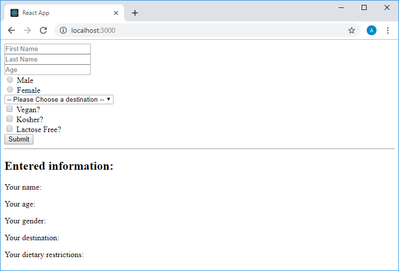
Now let's deal with perhaps the most difficult part of our task, which is related to the flags. It is worth
dietaryRestrictions that the state property dietaryRestrictions , which is planned to be used for working with flags, was initialized with an empty array. Now, when it came to working with controls, there is a feeling that it would be better to present this field as an object. It will be more convenient to work with entities that represent individual flags as properties of this object with clear names, and not as array elements. The properties of the object, which will now be represented by the state property of dietaryRestrictions , will contain Boolean values indicating whether the corresponding flag is cleared ( false ) or set ( true ). Now the state initialization code will look like this: this.state = { firstName: "", lastName: "", age: "", gender: "", destination: "", dietaryRestrictions: { isVegan: false, isKosher: false, isLactoseFree: false } } As you can see, we are planning to create three flags. All of them, immediately after loading the page, will be reset.
We describe the flags in the code returned by the component, wrapping them in
<label> tags and setting their attributes. Here is what their code will look like: <label> <input type="checkbox" name="isVegan" onChange={this.handleChange} checked={this.state.dietaryRestrictions.isVegan} /> Vegan? </label> <br /> <label> <input type="checkbox" name="isKosher" onChange={this.handleChange} checked={this.state.dietaryRestrictions.isKosher} /> Kosher? </label> <br /> <label> <input type="checkbox" name="isLactoseFree" onChange={this.handleChange} checked={this.state.dietaryRestrictions.isLactoseFree} /> Lactose Free? </label> The names of the properties of the
dietaryRestrictions object are used as the name of the dietaryRestrictions , and the constructions of the form this.state.dietaryRestrictions.isSomething as the values of their checked attributes.Please note that although the
this.handleChange handler that we have is specified as the this.handleChange event handler for the this.handleChange , we must make some changes to it in order for the program to work properly.Take a look at the app.
Application in browser
As you can see, the checkboxes are displayed on the page, but the component does not yet contain all the mechanisms necessary to ensure their proper operation. Let's deal with an event handler.
Here, to work with flags, we need to extract the
type and checked properties from the event.target object, in addition to those already extracted. The first is needed to check the type of the item (the check boxes are of the type represented by the checkbox line), the second is to find out if the checkbox is checked or cleared. If it turns out that the handler was called after the user interacts with the flag, we use a special procedure for setting the state. Events of other controls will be processed as before.When updating the state, it is necessary to take into account that React is a sufficiently intelligent system, which, if only a part of the state is updated, automatically combines what has remained unchanged with what has changed. But at the same time it is impossible to be sure that the work with the properties of objects, which are the values of the properties of the state, will also be carried out. Check it out by bringing the
handleChange code to the following form. Here we proceed from the assumption that the properties of the dietaryRestrictions object can be changed one by one: handleChange(event) { const {name, value, type, checked} = event.target type === "checkbox" ? this.setState({ dietaryRestrictions: { [name]: checked } }) : this.setState({ [name]: value }) } If you open the application page in the browser, then immediately after it is loaded, everything will look fine, if you try, for example, enter a name in the
First Name field, everything will also work as before, but when you try to install one of the check boxes, the following warning will be displayed :Warning: A component is a checkbox to be uncontrolled. Input elements should not switch from controlled to uncontrolled (or vice versa). Decide between the use of the component for the lifetime of the component. More info: fb.me/react-controlled-components
In order to properly update the contents of the object
dietaryRestrictions , you can use the functional form setState , independently creating a new version of the state. If we had to manage a large number of flags, then we probably would have done so. But here we will do otherwise. Namely, we will make the properties of the object dietaryRestrictions properties of the state, getting rid of this object: this.state = { firstName: "", lastName: "", age: "", gender: "", destination: "", isVegan: false, isKosher: false, isLactoseFree: false } Now we change the settings of the attribute flags, getting rid of
dietaryRestrictions : <label> <input type="checkbox" name="isVegan" onChange={this.handleChange} checked={this.state.isVegan} /> Vegan? </label> <br /> <label> <input type="checkbox" name="isKosher" onChange={this.handleChange} checked={this.state.isKosher} /> Kosher? </label> <br /> <label> <input type="checkbox" name="isLactoseFree" onChange={this.handleChange} checked={this.state.isLactoseFree} /> Lactose Free? </label> And finally, edit the code of the element that displays information about the nutritional restrictions specified by the user:
<p>Your dietary restrictions:</p> <p>Vegan: {this.state.isVegan ? "Yes" : "No"}</p> <p>Kosher: {this.state.isKosher ? "Yes" : "No"}</p> <p>Lactose Free: {this.state.isLactoseFree ? "Yes" : "No"}</p> After that, we check the performance of the application.
Application in browser
As you can see, everything works as expected.
Here is the complete
App component code: import React, {Component} from "react" class App extends Component { constructor() { super() this.state = { firstName: "", lastName: "", age: "", gender: "", destination: "", isVegan: false, isKosher: false, isLactoseFree: false } this.handleChange = this.handleChange.bind(this) } handleChange(event) { const {name, value, type, checked} = event.target type === "checkbox" ? this.setState({ [name]: checked }) : this.setState({ [name]: value }) } render() { return ( <main> <form> <input name="firstName" value={this.state.firstName} onChange={this.handleChange} placeholder="First Name" /> <br /> <input name="lastName" value={this.state.lastName} onChange={this.handleChange} placeholder="Last Name" /> <br /> <input name="age" value={this.state.age} onChange={this.handleChange} placeholder="Age" /> <br /> <label> <input type="radio" name="gender" value="male" checked={this.state.gender === "male"} onChange={this.handleChange} /> Male </label> <br /> <label> <input type="radio" name="gender" value="female" checked={this.state.gender === "female"} onChange={this.handleChange} /> Female </label> <br /> <select value={this.state.destination} name="destination" onChange={this.handleChange} > <option value="">-- Please Choose a destination --</option> <option value="germany">Germany</option> <option value="norway">Norway</option> <option value="north pole">North Pole</option> <option value="south pole">South Pole</option> </select> <br /> <label> <input type="checkbox" name="isVegan" onChange={this.handleChange} checked={this.state.isVegan} /> Vegan? </label> <br /> <label> <input type="checkbox" name="isKosher" onChange={this.handleChange} checked={this.state.isKosher} /> Kosher? </label> <br /> <label> <input type="checkbox" name="isLactoseFree" onChange={this.handleChange} checked={this.state.isLactoseFree} /> Lactose Free? </label> <br /> <button>Submit</button> </form> <hr /> <h2><font color="#3AC1EF">Entered information:</font></h2> <p>Your name: {this.state.firstName} {this.state.lastName}</p> <p>Your age: {this.state.age}</p> <p>Your gender: {this.state.gender}</p> <p>Your destination: {this.state.destination}</p> <p>Your dietary restrictions:</p> <p>Vegan: {this.state.isVegan ? "Yes" : "No"}</p> <p>Kosher: {this.state.isKosher ? "Yes" : "No"}</p> <p>Lactose Free: {this.state.isLactoseFree ? "Yes" : "No"}</p> </main> ) } } export default App Results
Today you have completed practical work on the forms. Here you repeated what you learned in previous classes, and, hopefully, learned something new. Next time we'll talk about the architecture of React applications.
Dear readers! Tell me, was it difficult to do this practical work?
Source: https://habr.com/ru/post/446208/
All Articles