What is wrong with Yandex.Music? UX / UI parsing

About Yandex.Music knows or heard vaguely everyone who reads this article. Since 2018, Yandex has not boasted about the growth of the user base of J.Music , when it reached 1 million paid users. At the same time, I did not enter into a million paid subscribers, despite the serious penetration of the service into the Russian market.
And the truth is, why don't I use Ya. Music? It costs from 100 rubles per month, the base contains tens of millions of tracks, the service was created with an understanding of the national characteristics of the audience of listeners. I asked myself a question - the answer arose immediately. For me, J.Music is inconvenient. You open the Ya.Muzyki website and immediately want to close. I'll try to find out why. The investigation will be conducted on a MacBook Pro 13.3 '' with a Retina screen, OS X Mojave v10.14.3. For nativeness, the service will be tested on a native Yandex browser. 19.3.0.2489 (64-bit).
start page
If you go to a page without logging in, the first page meets with a screen, more than half of which is occupied by advertising. The cap from behind the banner at the top crawled to the middle of the screen, the first impression was that the styles did not load and the layout floated, I would try to reset the cache. It did not help, but the ad unit was updated.
')

Figure 1. This is the starting point for an unregistered user.
The banner at the top of the screen contains no controls, I want to see what’s below and scroll the page. The result is distressing, the elements run over each other, the page twitches in convulsions. And for some reason, the coveted cross on the banner appears and disappears spontaneously. Usually I close such pages, because everything is there, except for the most important - music. But today you need to go to the end and test the service.

Figure 2. Scrolling main for unregistered user
I have access to the “full version” of J.Music within the PLUS subscription. Let's see what is offered to pay.
I will not go into details about the size of the music library, the list of content providers and other things, I can only say that when importing the music library from Spotify for testing, 63% of the content was synchronized. I listen to music mostly in English. Another 3% of the tracks are missing in the original and are found only in the form of remixes, remakes and covers.
Home page for a paid user
After authorization, it encounters the Music interface, the main difference of which is that the screen is not littered with banners. And thanks for that. On the right side, where Ya.Direct used to be, there was a quarter of a screen hollow. At the top of the void hanging promo banner of a playlist, I do not want to open the banner, the proposals are not interesting to me.
At the top of the screen is the search line inherent in other Yandex services. As well as the menu items, I will consider and label the interaction experience.
The main thing - in fact, the main page. In general, everything is clear, but it is difficult to read the information in order to understand the layout of the menu items, management and content.
Recommendations - music that appeals to people who match with me in musical tastes. It is usually advised that what I already listen to is essentially useless. Recommendations for the performers more interesting, tips are more similar to the truth. Tips on musical directions also often contain previously heard songs, but in general are suitable.
Genres - the section overlaps with the main content, is essentially useless, until you notice the translucent button. The entire list , and the button is useful, why not selected? We select the desired genre and work with collections of content by genre, and we can also launch J. Radio, corresponding to the selected genre. In addition to musical directions, meta-genres like Soundtrack or For lessons turned out to be useful.

Figure 3. From the abundance of eyes run up, but the section is useful
Radio - section will be useful to those who want to quickly learn music for themselves. Based on the previously listened and saved playlists, the service will issue recommended tracks on the mountain, with likes / dislikes improve the knowledge of the system about musical preferences.
In addition, there is a division by genre , mood , type of occupation , for which I include the soundtrack, as well as by time periods ( epochs ), whose music I want to listen to. I liked the result, but at first I often had to skip uninteresting tracks.
In the upper right corner is traditionally located avatar with the menu of a Yandex account. Let's return to the main content of the start page.
In the left part of the Screen we are met by a large heading of the section Main . The title, along with the emptiness around it, occupies about 20% of the horizontal section structure on the main screen. As a result, in addition to the title, only titles of subsections All , New releases , Chart , Non-music , Moods and Genres , which are essentially filters for the contents of the main page, as well as Smart playlists are placed on the screen.
The main content for the user Ya.Muzyka makes automatically created playlists. Visually made in the form of tiles. Formation I will consider a bit later, when we talk about the recommendations. Tile playlists are animated, the animation is turned on randomly, draws attention to the tiles. Visually it looks cheap due to the strong compression of the graphics of the animated cartoon; it looks poor on the retina. Fonts in the description of the playlist less, being gray, read poorly. Useful information - the date of formation of the playlist, you can navigate to it, choosing what to listen.
Playlist of the day - a green cover with a counter of how many days in a row the playlist was listened to without interruption. Not that gamification, not that counter, or just like that. The counter looks inappropriate and incomprehensible why there is only on the playlist of the day. Why are the weeks in Cache and Deja vu not counted? The playlist itself is assembled from popular songs among me, and it is also not clear from where the assumptions were taken, the styles are all mixed up, the daily musical porridge, I do not listen.
Cache - regularly updated un-listened tracks from the added playlists. Oddly enough, slips the tracks, which are already listening. My feeling is identical to the playlist of the day.
Déjà vu promises that I will like the unheard tracks from the library until this happens.
The premiere is filled with new releases of the performers of the songs you like. The playlist is useful for me, it allows you to keep track of new items.
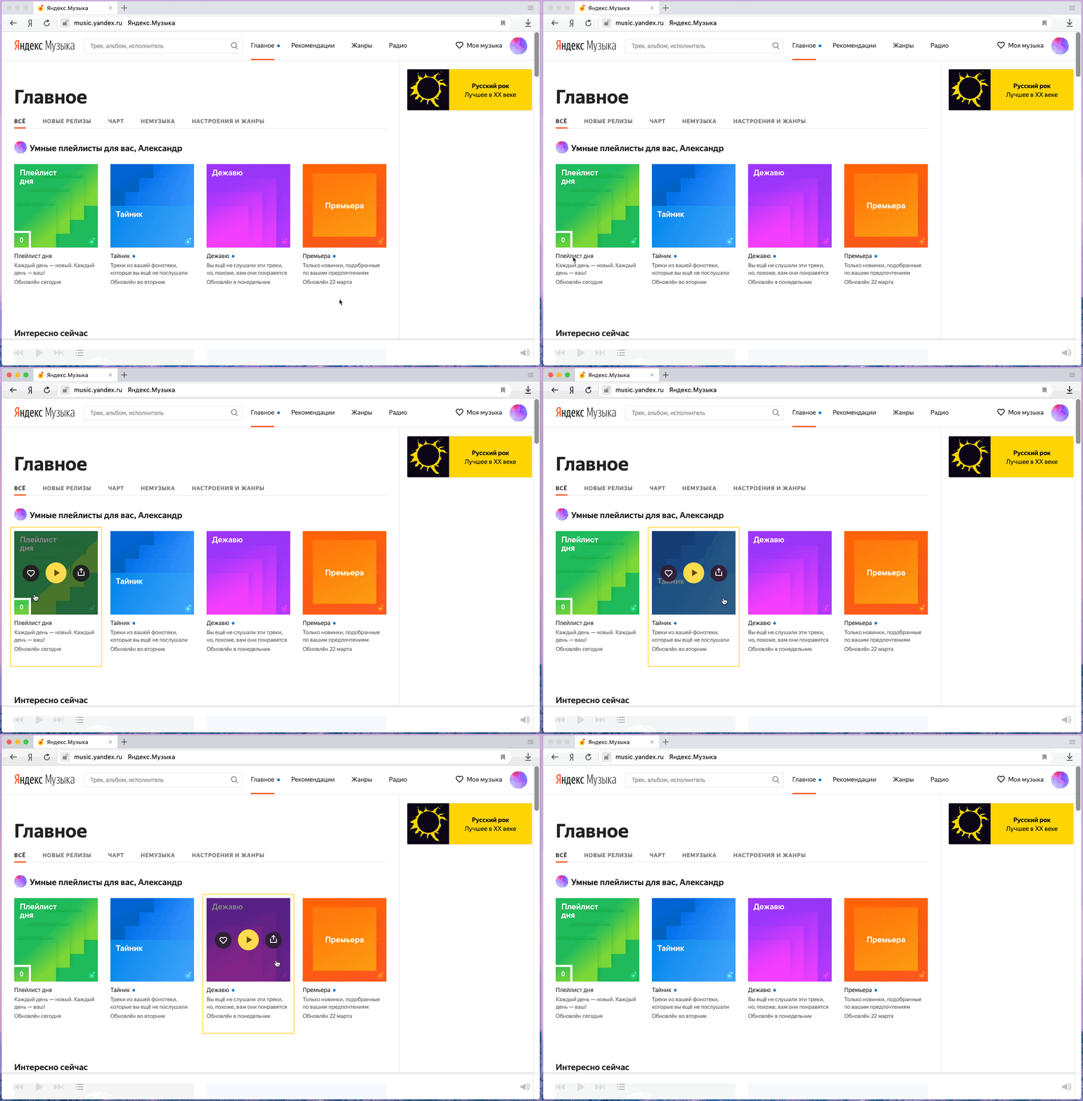
Figure 4. Playlists shuffled due to visual similarity.
Now on the page functionality. On the main page there is everything you need to surf through the music collection of the service, but the design solution with jumping fonts, unreadable and small controls and texts, bright covers of playlists and albums nullify usability.
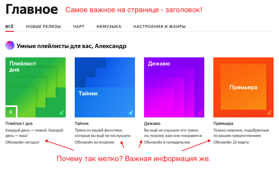
Figure 5. Important information is written finely and needs to be strained to read.
Let's go more. I open the page, see the music that the service offers, see the search bar and sections, but where is my music? Where are my likes? Where are my playlists? And they are carefully hidden in the menu item, which started next to the account. My music is no less important than the selection, and sometimes more important. The grains contain playlists for various cases, but they were casually pushed onto the mezzanine.

Figure 6. My music unfairly hidden
Tracks, Albums, Artists, Playlists, Concerts, Friends and Listening History are hidden in My music.
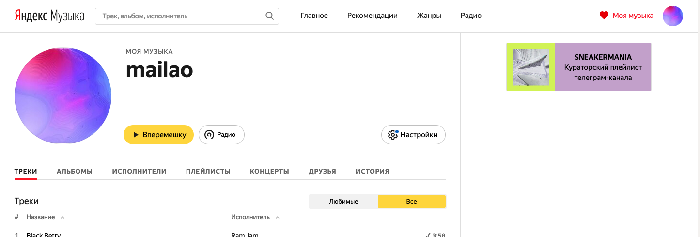
Figure 7. Suddenly in my music Settings!
In the tracks there is not enough column for the name of the album from which the track was added, all of a sudden it is an interesting collection, once in which, you will find a dozen more great tracks? Date added to favorites is also needed. It is great to be surprised that the song that you listen with pleasure, like the first time, was added to the library 5 years ago.
Wow! Useful side panel! It displays a bunch of seemingly useful information about the track being played from the Tracks section! To do this, click on the Play button on a specific track! Sorry to be so emotional, I already buried the emptiness on the side, but it fluttered, filled me up with the lyrics of the song, a video clip from Youtube, a large album cover and relevant tracks. Strange decision? I agree.
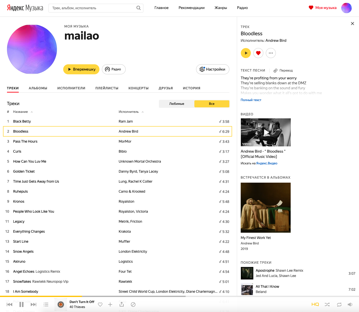
Figure 8. I would like a more informative media collection.
Subsections Albums , Artists and Playlists are unremarkable and correspond to the names. These are my albums, playlists and added artists. In Concerts there are events with the participation of the performers of the Artists section. Friends are filled with contacts that do not have a Music subscription. Why are they there is not clear. History contains previously heard.
In the section My music there are also Settings ! Section customizes? This was not the case, these are general settings in the subsections Account , Subscription and Notifications of nothing interesting. The most important is in the Other section.
Here we see the download switch only HTML-5 or Flash (why?) Player.
The logarithmic volume scale is enabled by default, it is better to leave it that way, the volume control by ear is perceived more adequately.
Adding new tracks to the beginning of the playlist, why not display the date of adding the track to the playlist and not letting it be sorted? It's more convenient.
The inclusion of the "Endless stream of music" mode - again, why hide it? The function should be available to turn off, like endless playback on YouTube. For example, before bedtime you can turn on a chill out album and doze off under it. As soon as the album is over, the playback will stop, and it will not be possible to play slow songs until the morning.
A couple of switches of social activity and access to the media library by the public, it is strange that they are here. They place in the Account section.
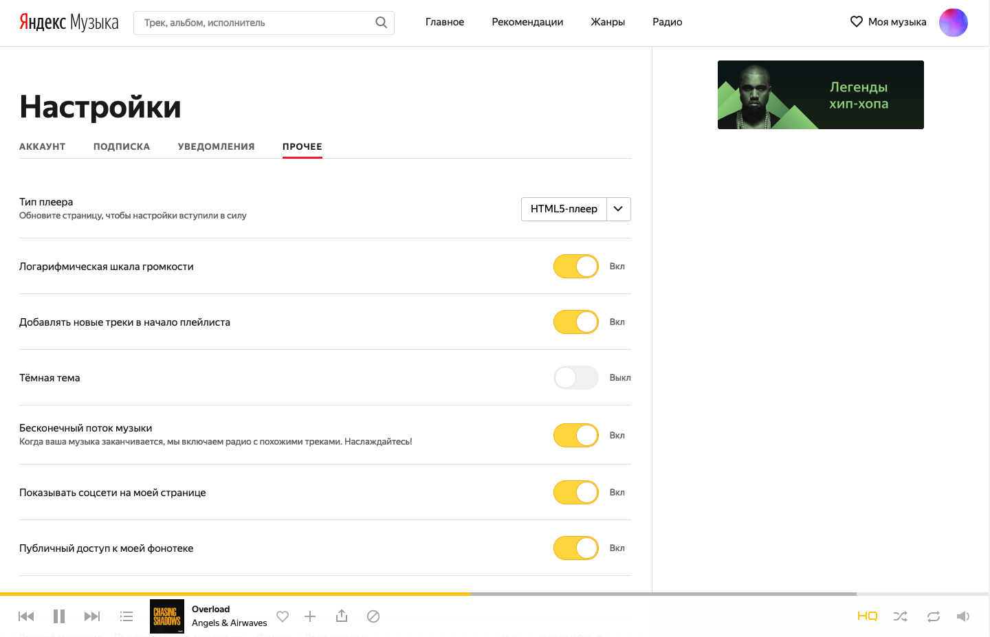
Figure 9. In Other, the important settings are hidden, which place on the front line
And the most important thing is that the dark theme switch is hidden here. Why so far? Why is the topic switching issue not automated in the end? Everyone can determine the time zone. The time of sunset / sunrise is known. Dark mode you want to switch quickly.
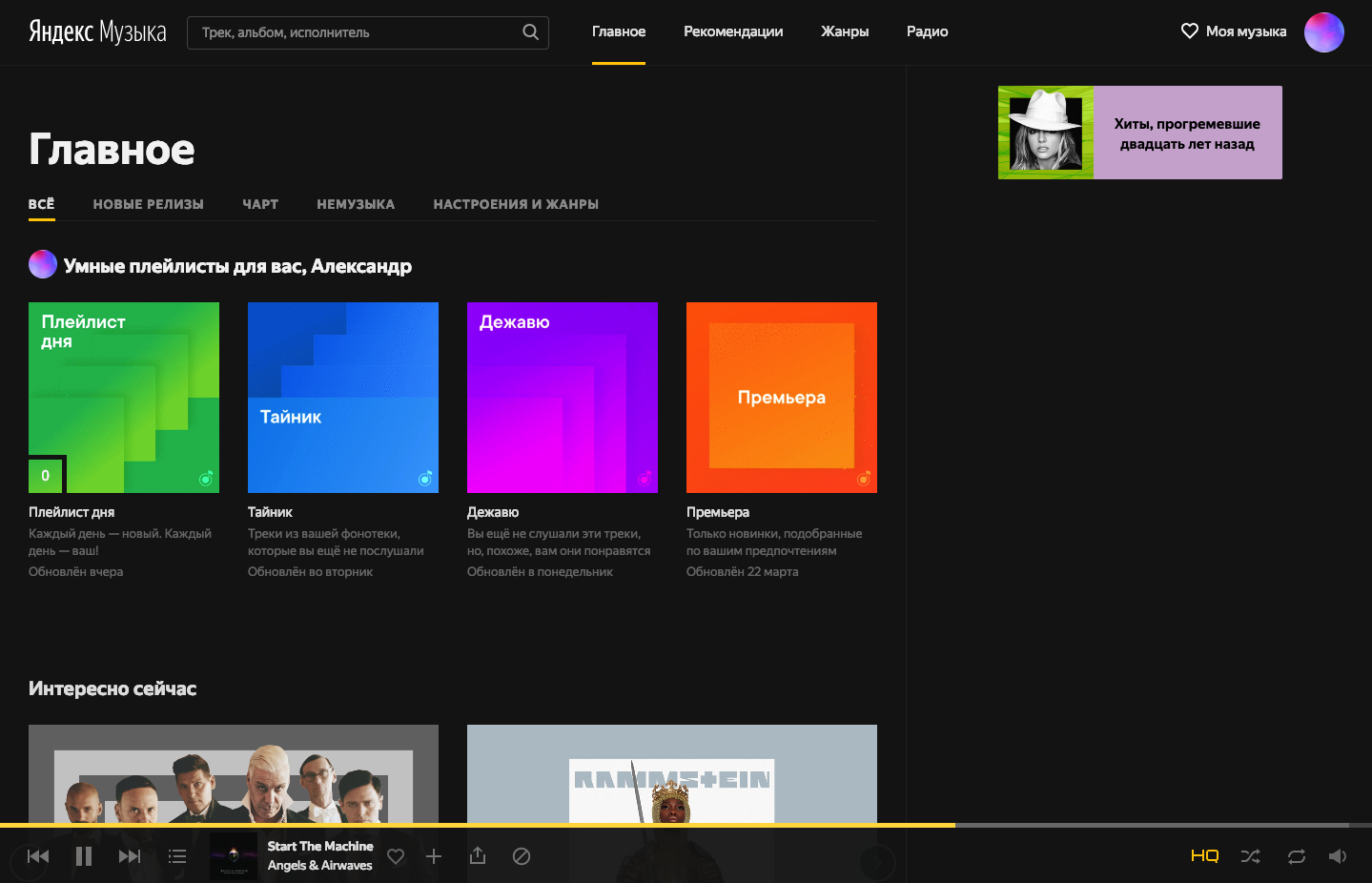
Figure 10. Dark theme reads better than light even during the day
So far everything I wanted to pay attention to.
Finally, another feint ears, which makes a playlist card. After about 10 minutes from the beginning of use, I accidentally clicked on the card past the controls, and again the side of the void comes in, the playlist starts to appear on the right! In Albums and Artists is the same.
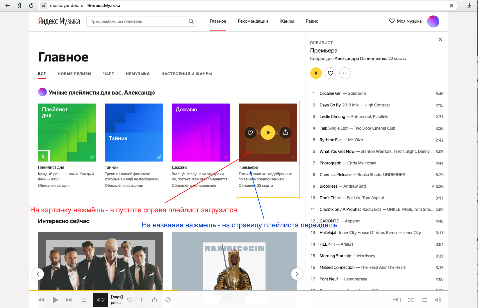
Figure 11. In the header on Yandex, click - you will go to the search engine, click on Music - you will go to Music. Here is the same "logic"
And if you click on the Play icon, then visually nothing changes, except for playing in the player at the bottom of the page. There are no questions to the player, besides why it is always necessary to reach into the lower left corner, the player elements in the center are more convenient . The controls are small, even for 13 inches of screen, less than the height of the header fonts. The volume level icon is minimized, to quickly turn it down, you need to point at the icon, then aim and get into the control in the pop-up. Calling the equalizer also became a discovery after accessing the volume level, the equalizer button in the volume slider triggers another pop-up element with a card with frequency slider.
For a start, that's enough, I think, summarizing the problems of the web version:
- A quarter of the screen vertically occupies the void and stupid promobanner of the playlist. The void is completely randomly filled with a playlist, or track information, if you know where to click.
- Horizontally one fifth of the screen takes the title. The page is clearly designed for 1080+ screens.
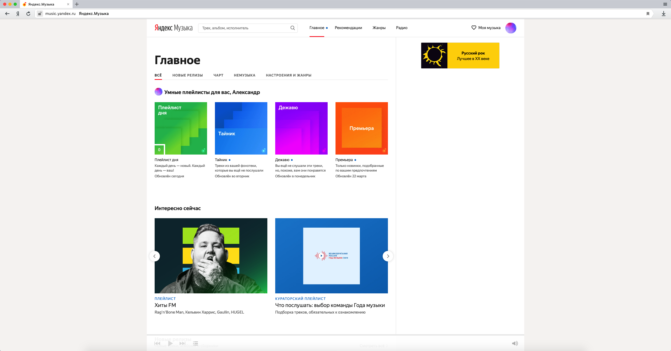
Figure12. It looks like the page on the monitor 1440p
A bunch of bright spots on a white background (the night theme reads better), visually looks coarse, without harmony and rhythm. - The logic of working with the interface does not come from the principles of intuitiveness; without experiments, utterly random, it will not be possible to work, it will not be clear.
- Fonts of 6 different types complicate screen reading. Somewhere an insane large elephant-sized headline, repeats the text on the cover, somewhere useful information flickers and makes your eyes strain.
- The Genres section can be easily dragged to Home without losing functionality.
- Section My music should be returned to the general structure of sections. He was lost, and the Settings were lost in him. And in Settings there was lost the Dark theme. Do you understand what I mean?
- The logic of the formation of playlists also suffers, the relevance of the proposals to my musical tastes is low. Streaming services should pleasantly surprise!
- The menu divides the service into sections, and there are subsections on the pages.
- Tin with advertising in the free version.
- The site is twitching, loading the processor - and this is on the Yandex Browser? For comparison, try scrolling Spotify and J.Music.
Results
There was a feeling that in an attempt to make Music unlike competitors, the team implemented solutions in the style of the notorious traditions of Soviet engineering thinking. They built the product “which has no analogues in the world” (although the night theme visually copies Spotify, the wife at first glance confused the applications and was surprised what happened to Spotify). The pursuit of uniqueness complicated the product for the end user, got a mash from sections with unclear functionality. Instead of a clear and intuitive interface, we got a combine with unobvious algorithms of actions.
I would like the service to develop into a cool product, which they will love, and not hopelessness for import substitution.
Source: https://habr.com/ru/post/446000/
All Articles