My way to create master components in Figum
I noticed that many product designers ask themselves the question “How to organize different states of components?”. The whole design world is divided into 2 parts. The first make one component, in which several folders for all states. The latter make for each state of the element a separate component.
First, I will analyze the advantages and disadvantages of each of them, and then I would venture to suggest another option. I talk about the implementation in Figm. Perhaps in other editors something is not applicable.
')
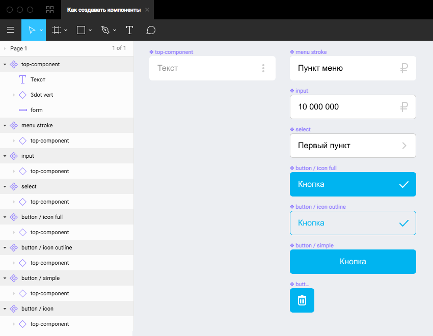
Everyone knows about atomic design , it makes no sense to talk about it. I will only pay attention to the fact that many interface elements are similar. For example, input, select, button, menu bar can be made on the same principle: rectangle + text + icon. In this case, we can make a component that consists of these basic elements and build the rest of the components on the basis of it: buttons, inputs and everything else. Just came up with a name for this element "Top Component". That is, the master components of the button, input, select and even the menu bar will consist of the top component.
My proposal closes the question raised at the beginning only partially. So how do you draw element states? It does not work for the input and the button to make the same states. Here I can offer the following:
First, I will analyze the advantages and disadvantages of each of them, and then I would venture to suggest another option. I talk about the implementation in Figm. Perhaps in other editors something is not applicable.
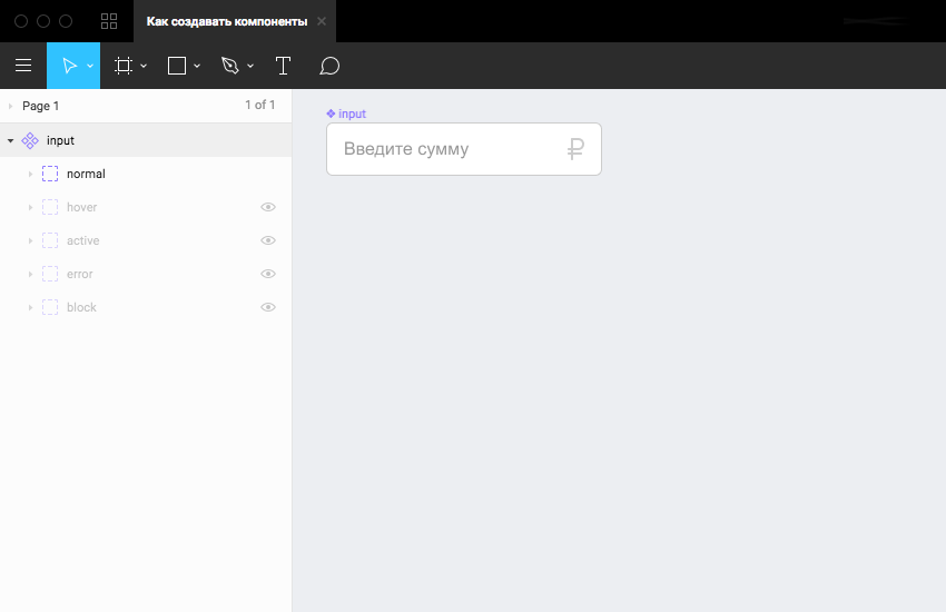
1. One component with multiple states
')
Benefits
- The library of components looks more compact.
- In the component panel there are fewer elements and therefore less scrolling in the search for the desired one. In this case, the search saves by name.
disadvantages
- Somewhere you still need to show the coder all possible states, because he does not see the hidden layers.
- You have to spend time searching for the desired state: showing it and hiding the unnecessary. This is especially tiring if the structure of the component is complex.
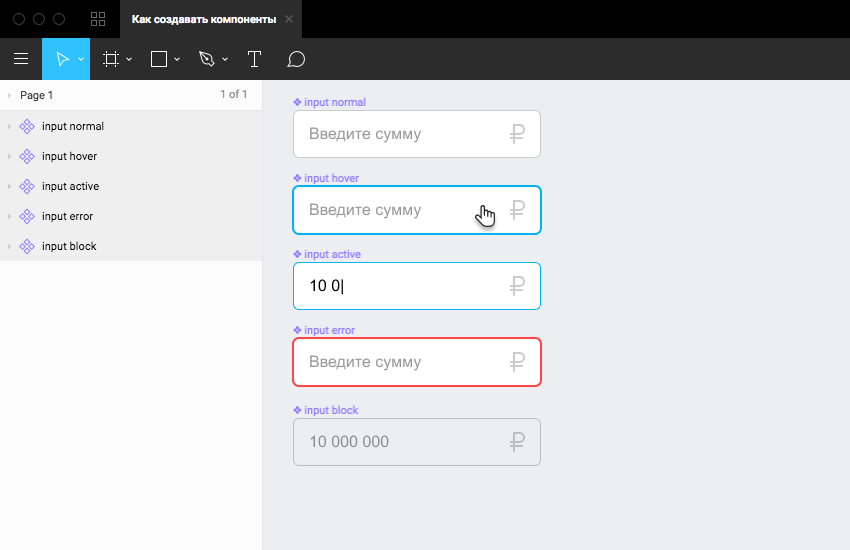
2. Many components for each of the states
Benefits
- For the maker-up, everything is immediately visible.
- All states are also visible for comparison with other components. This is useful when creating the following components.
- In Instance it is easy to find the necessary component, provided that everything is correctly named.
disadvantages
- The library is getting huge. However, some of the states in 99% of cases are not needed. The type of pointing and pressing is usually made up once and then it is no longer necessary to show it.
3. What I offer
Everyone knows about atomic design , it makes no sense to talk about it. I will only pay attention to the fact that many interface elements are similar. For example, input, select, button, menu bar can be made on the same principle: rectangle + text + icon. In this case, we can make a component that consists of these basic elements and build the rest of the components on the basis of it: buttons, inputs and everything else. Just came up with a name for this element "Top Component". That is, the master components of the button, input, select and even the menu bar will consist of the top component.
Benefits:
- All interface elements look the same: indents, sizes, fonts, and more.
- Editing the top component edited other components built on the basis of it.
- The design system is more holistic, more unified.
- It is made up faster and easier.
Features (I would not call it flaws):
- You need to be careful editing, because changing the top component, you can break the rest of the components.
- If you change the styles of the master components, editing the styles (and even if you rewrite the text) of the top component breaks nothing. Obviously, this is not about structural editing of the top component.
- Nesting is deeper. It gets more clicks to get to the lower layers. It is necessary to get used to this. This is the only thing that I would call a minus.
- During the page design process, the top component may get in the way of working components. This can be solved by inventing some name for him, thanks to which he will go to the end of the list. Perhaps it will also seem to someone a minus, does not bother me.
My proposal closes the question raised at the beginning only partially. So how do you draw element states? It does not work for the input and the button to make the same states. Here I can offer the following:
- Try to describe the state somewhere separately using styles. Well, why do you need the appearance of the pressed button on each layout?
- Think over the top components so that you can conveniently use them in subsequent master components.
- When a component is complex (for example, a card with a combination of pictures, texts, labels, etc.), use common sense. If you have a bunch of hidden folders, in which you ask to dig - make a separate component. If switching between states takes no more than 3-4 clicks, leave the folders in the component.
- If more than one designer is working on a project, then agree on how the master component will look in the state in which it should be published. In order to update the component does not break the finished layouts. For example, the default is the most basic state in the topmost folder, all the rest should be hidden. Or a very extreme measure: all folders are hidden by default.
- Everything else depends on your imagination and taste preferences.
Source: https://habr.com/ru/post/445764/
All Articles