UICollectionView around the head: Changing the view on the fly
Hi, Habr! I present to your attention the translation of the article " UICollectionView Tutorial: Changing presentation on the fly ".
In this article we will consider the use of various ways of displaying elements, as well as their reuse and dynamic change. Here we will not consider the basics of working with collections and autolayout.
As a result, we get an example:
')
When developing mobile applications, there are often situations when a table view is not enough and you need to show the list of elements more interesting and unique. In addition, the ability to change the way items are displayed can become a “trick” of your application.
All of the above features are fairly simple to implement using a UICollectionView and various implementations of the UICollectionViewDelegateFlowLayout protocol.
Full project code.
What we need first for implementation:
We will create the cell in a separate file with xib ohm to be reusable.
By design, we see that there are 2 possible cell options - with text below and text to the right of the image.


There can be completely different types of cells, in this case you need to create 2 separate classes and use the desired one. In our case, this is not necessary and 1 cell with a UIStackView is enough.

Steps for creating an interface for a cell:
This is necessary for correct display in horizontal mode.
Next, we will write the logic of displaying our cell in both horizontal and vertical mode.
The main criterion for displaying horizontally is the size of the cell itself. Those. if there is enough space, we display the horizontal mode. If not, vertical. We assume that there is enough space when the width is 2 times the height, since the image should be square.
Cell Code:
Let us turn to the main part - to the controller and the logic of displaying and switching the types of cells.
For all possible display states, create an enum PresentationStyle.
Also add a button to switch between the states in the navigation bar.
All that concerns the way of displaying elements in the collection is described in the UICollectionViewDelegateFlowLayout protocol. Therefore, to remove any implementations from the controller and create independent reusable elements, we will create a separate implementation of this protocol for each type of display.
However, there are 2 nuances:
Therefore, we will create the CollectionViewSelectableItemDelegate protocol, extend the standard UICollectionViewDelegateFlowLayout protocol, in which we define the cell selection closure and, if necessary, any additional properties and methods (for example, returning the cell type if different types are used for the views). This will solve the first problem.
To solve the second problem - with duplication of logic, we will create a base class with all the common logic:
In our case, the common logic is to call a closure when a cell is selected, as well as a change in the background of the cell when going to the highlighted state.
Next, we describe 3 implementations of the representations: tabular, with 3 elements in each row and a combination of the first two methods.
Tabular :
3 elements in each row:
The combination of tabular and 3 in a row.
The last step is to add these views to the controller and set up the necessary delegate collections.
Important point: since the delegate is a weak collection, it is necessary to have a strong link in the controller to the view object.
Let's create in the controller a dictionary of all available views regarding the type:
And in the updatePresentationStyle () method, add an animated change to the delegate collection:
That's all that is needed so that our elements animate from one type to another :)
Thus, we can now display elements on any screen in any way, dynamically switch between mappings and, most importantly, the code is independent, reusable, and scalable.
Full project code.
In this article we will consider the use of various ways of displaying elements, as well as their reuse and dynamic change. Here we will not consider the basics of working with collections and autolayout.
As a result, we get an example:
')
When developing mobile applications, there are often situations when a table view is not enough and you need to show the list of elements more interesting and unique. In addition, the ability to change the way items are displayed can become a “trick” of your application.
All of the above features are fairly simple to implement using a UICollectionView and various implementations of the UICollectionViewDelegateFlowLayout protocol.
Full project code.
What we need first for implementation:
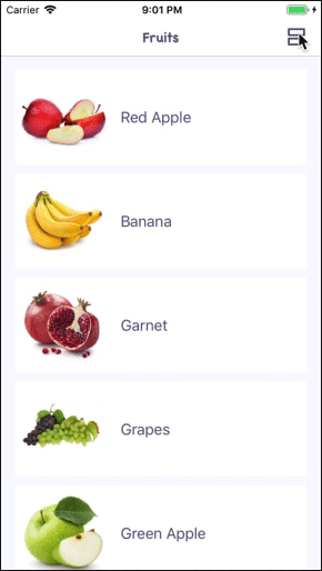
- class FruitsViewController: UICollectionViewController.
- Fruit Data Model
struct Fruit { let name: String let icon: UIImage } - class FruitCollectionViewCell: UICollectionViewCell
Cell with UIImageView and UILabel for fruit display
We will create the cell in a separate file with xib ohm to be reusable.
By design, we see that there are 2 possible cell options - with text below and text to the right of the image.
There can be completely different types of cells, in this case you need to create 2 separate classes and use the desired one. In our case, this is not necessary and 1 cell with a UIStackView is enough.
Steps for creating an interface for a cell:
- Add UIView
- Inside it we add UIStackView (horizontal)
- Next we add UIImageView and UILabel to UIStackView.
- For UILabel, set the Content Compression Resistance Priority = 1000 values for horizontal and vertical.
- Add for UIImageView Aspect Ratio 1: 1 and change the priority to 750.
This is necessary for correct display in horizontal mode.
Next, we will write the logic of displaying our cell in both horizontal and vertical mode.
The main criterion for displaying horizontally is the size of the cell itself. Those. if there is enough space, we display the horizontal mode. If not, vertical. We assume that there is enough space when the width is 2 times the height, since the image should be square.
Cell Code:
class FruitCollectionViewCell: UICollectionViewCell { static let reuseID = String(describing: FruitCollectionViewCell.self) static let nib = UINib(nibName: String(describing: FruitCollectionViewCell.self), bundle: nil) @IBOutlet private weak var stackView: UIStackView! @IBOutlet private weak var ibImageView: UIImageView! @IBOutlet private weak var ibLabel: UILabel! override func awakeFromNib() { super.awakeFromNib() backgroundColor = .white clipsToBounds = true layer.cornerRadius = 4 ibLabel.font = UIFont.systemFont(ofSize: 18) } override func layoutSubviews() { super.layoutSubviews() updateContentStyle() } func update(title: String, image: UIImage) { ibImageView.image = image ibLabel.text = title } private func updateContentStyle() { let isHorizontalStyle = bounds.width > 2 * bounds.height let oldAxis = stackView.axis let newAxis: NSLayoutConstraint.Axis = isHorizontalStyle ? .horizontal : .vertical guard oldAxis != newAxis else { return } stackView.axis = newAxis stackView.spacing = isHorizontalStyle ? 16 : 4 ibLabel.textAlignment = isHorizontalStyle ? .left : .center let fontTransform: CGAffineTransform = isHorizontalStyle ? .identity : CGAffineTransform(scaleX: 0.8, y: 0.8) UIView.animate(withDuration: 0.3) { self.ibLabel.transform = fontTransform self.layoutIfNeeded() } } } Let us turn to the main part - to the controller and the logic of displaying and switching the types of cells.
For all possible display states, create an enum PresentationStyle.
Also add a button to switch between the states in the navigation bar.
class FruitsViewController: UICollectionViewController { private enum PresentationStyle: String, CaseIterable { case table case defaultGrid case customGrid var buttonImage: UIImage { switch self { case .table: return imageLiteral(resourceName: "table") case .defaultGrid: return imageLiteral(resourceName: "default_grid") case .customGrid: return imageLiteral(resourceName: "custom_grid") } } } private var selectedStyle: PresentationStyle = .table { didSet { updatePresentationStyle() } } private var datasource: [Fruit] = FruitsProvider.get() override func viewDidLoad() { super.viewDidLoad() self.collectionView.register(FruitCollectionViewCell.nib, forCellWithReuseIdentifier: FruitCollectionViewCell.reuseID) collectionView.contentInset = .zero updatePresentationStyle() navigationItem.rightBarButtonItem = UIBarButtonItem(image: selectedStyle.buttonImage, style: .plain, target: self, action: #selector(changeContentLayout)) } private func updatePresentationStyle() { navigationItem.rightBarButtonItem?.image = selectedStyle.buttonImage } @objc private func changeContentLayout() { let allCases = PresentationStyle.allCases guard let index = allCases.firstIndex(of: selectedStyle) else { return } let nextIndex = (index + 1) % allCases.count selectedStyle = allCases[nextIndex] } } // MARK: UICollectionViewDataSource & UICollectionViewDelegate extension FruitsViewController { override func collectionView(_ collectionView: UICollectionView, numberOfItemsInSection section: Int) -> Int { return datasource.count } override func collectionView(_ collectionView: UICollectionView, cellForItemAt indexPath: IndexPath) -> UICollectionViewCell { guard let cell = collectionView.dequeueReusableCell(withReuseIdentifier: FruitCollectionViewCell.reuseID, for: indexPath) as? FruitCollectionViewCell else { fatalError("Wrong cell") } let fruit = datasource[indexPath.item] cell.update(title: fruit.name, image: fruit.icon) return cell } } All that concerns the way of displaying elements in the collection is described in the UICollectionViewDelegateFlowLayout protocol. Therefore, to remove any implementations from the controller and create independent reusable elements, we will create a separate implementation of this protocol for each type of display.
However, there are 2 nuances:
- This protocol also describes the cell selection method (didSelectItemAt :)
- Some methods and logic are the same for all N mapping methods (in our case N = 3).
Therefore, we will create the CollectionViewSelectableItemDelegate protocol, extend the standard UICollectionViewDelegateFlowLayout protocol, in which we define the cell selection closure and, if necessary, any additional properties and methods (for example, returning the cell type if different types are used for the views). This will solve the first problem.
protocol CollectionViewSelectableItemDelegate: class, UICollectionViewDelegateFlowLayout { var didSelectItem: ((_ indexPath: IndexPath) -> Void)? { get set } } To solve the second problem - with duplication of logic, we will create a base class with all the common logic:
class DefaultCollectionViewDelegate: NSObject, CollectionViewSelectableItemDelegate { var didSelectItem: ((_ indexPath: IndexPath) -> Void)? let sectionInsets = UIEdgeInsets(top: 16.0, left: 16.0, bottom: 20.0, right: 16.0) func collectionView(_ collectionView: UICollectionView, didSelectItemAt indexPath: IndexPath) { didSelectItem?(indexPath) } func collectionView(_ collectionView: UICollectionView, didHighlightItemAt indexPath: IndexPath) { let cell = collectionView.cellForItem(at: indexPath) cell?.backgroundColor = UIColor.clear } func collectionView(_ collectionView: UICollectionView, didUnhighlightItemAt indexPath: IndexPath) { let cell = collectionView.cellForItem(at: indexPath) cell?.backgroundColor = UIColor.white } } In our case, the common logic is to call a closure when a cell is selected, as well as a change in the background of the cell when going to the highlighted state.
Next, we describe 3 implementations of the representations: tabular, with 3 elements in each row and a combination of the first two methods.
Tabular :
class TabledContentCollectionViewDelegate: DefaultCollectionViewDelegate { // MARK: - UICollectionViewDelegateFlowLayout func collectionView(_ collectionView: UICollectionView, layout collectionViewLayout: UICollectionViewLayout, sizeForItemAt indexPath: IndexPath) -> CGSize { let paddingSpace = sectionInsets.left + sectionInsets.right let widthPerItem = collectionView.bounds.width - paddingSpace return CGSize(width: widthPerItem, height: 112) } func collectionView(_ collectionView: UICollectionView, layout collectionViewLayout: UICollectionViewLayout, insetForSectionAt section: Int) -> UIEdgeInsets { return sectionInsets } func collectionView(_ collectionView: UICollectionView, layout collectionViewLayout: UICollectionViewLayout, minimumLineSpacingForSectionAt section: Int) -> CGFloat { return 10 } } 3 elements in each row:
class DefaultGriddedContentCollectionViewDelegate: DefaultCollectionViewDelegate { private let itemsPerRow: CGFloat = 3 private let minimumItemSpacing: CGFloat = 8 // MARK: - UICollectionViewDelegateFlowLayout func collectionView(_ collectionView: UICollectionView, layout collectionViewLayout: UICollectionViewLayout, sizeForItemAt indexPath: IndexPath) -> CGSize { let paddingSpace = sectionInsets.left + sectionInsets.right + minimumItemSpacing * (itemsPerRow - 1) let availableWidth = collectionView.bounds.width - paddingSpace let widthPerItem = availableWidth / itemsPerRow return CGSize(width: widthPerItem, height: widthPerItem) } func collectionView(_ collectionView: UICollectionView, layout collectionViewLayout: UICollectionViewLayout, insetForSectionAt section: Int) -> UIEdgeInsets { return sectionInsets } func collectionView(_ collectionView: UICollectionView, layout collectionViewLayout: UICollectionViewLayout, minimumLineSpacingForSectionAt section: Int) -> CGFloat { return 20 } func collectionView(_ collectionView: UICollectionView, layout collectionViewLayout: UICollectionViewLayout, minimumInteritemSpacingForSectionAt section: Int) -> CGFloat { return minimumItemSpacing } } The combination of tabular and 3 in a row.
class CustomGriddedContentCollectionViewDelegate: DefaultCollectionViewDelegate { private let itemsPerRow: CGFloat = 3 private let minimumItemSpacing: CGFloat = 8 // MARK: - UICollectionViewDelegateFlowLayout func collectionView(_ collectionView: UICollectionView, layout collectionViewLayout: UICollectionViewLayout, sizeForItemAt indexPath: IndexPath) -> CGSize { let itemSize: CGSize if indexPath.item % 4 == 0 { let itemWidth = collectionView.bounds.width - (sectionInsets.left + sectionInsets.right) itemSize = CGSize(width: itemWidth, height: 112) } else { let paddingSpace = sectionInsets.left + sectionInsets.right + minimumItemSpacing * (itemsPerRow - 1) let availableWidth = collectionView.bounds.width - paddingSpace let widthPerItem = availableWidth / itemsPerRow itemSize = CGSize(width: widthPerItem, height: widthPerItem) } return itemSize } func collectionView(_ collectionView: UICollectionView, layout collectionViewLayout: UICollectionViewLayout, insetForSectionAt section: Int) -> UIEdgeInsets { return sectionInsets } func collectionView(_ collectionView: UICollectionView, layout collectionViewLayout: UICollectionViewLayout, minimumLineSpacingForSectionAt section: Int) -> CGFloat { return 20 } func collectionView(_ collectionView: UICollectionView, layout collectionViewLayout: UICollectionViewLayout, minimumInteritemSpacingForSectionAt section: Int) -> CGFloat { return minimumItemSpacing } } The last step is to add these views to the controller and set up the necessary delegate collections.
Important point: since the delegate is a weak collection, it is necessary to have a strong link in the controller to the view object.
Let's create in the controller a dictionary of all available views regarding the type:
private var styleDelegates: [PresentationStyle: CollectionViewSelectableItemDelegate] = { let result: [PresentationStyle: CollectionViewSelectableItemDelegate] = [ .table: TabledContentCollectionViewDelegate(), .defaultGrid: DefaultGriddedContentCollectionViewDelegate(), .customGrid: CustomGriddedContentCollectionViewDelegate(), ] result.values.forEach { $0.didSelectItem = { _ in print("Item selected") } } return result }() And in the updatePresentationStyle () method, add an animated change to the delegate collection:
collectionView.delegate = styleDelegates[selectedStyle] collectionView.performBatchUpdates({ collectionView.reloadData() }, completion: nil) That's all that is needed so that our elements animate from one type to another :)
Thus, we can now display elements on any screen in any way, dynamically switch between mappings and, most importantly, the code is independent, reusable, and scalable.
Full project code.
Source: https://habr.com/ru/post/445708/
All Articles