Tools for creating a responsive site without access to the site
There is a site that does not have a mobile version, and you need to make this site more pleasant to use for mobile users with minimal time.
I will talk about how to speed up the introduction of changes to the site, and consider the tools for quick layout on a live site without having access to edit it.
You can go the usual way - copy the site and modify it on your machine, or write everything directly to a working site (it is better not to do so).
')
This is where users scripts, livereload, sass or other preprocessors come to the rescue. With this set, the time to adapt the site is reduced several times.
I'll start with userscripts - for this you can use any browser plugin based on chromium, firefox.
For chromium fit tampermonkey , I show by example.
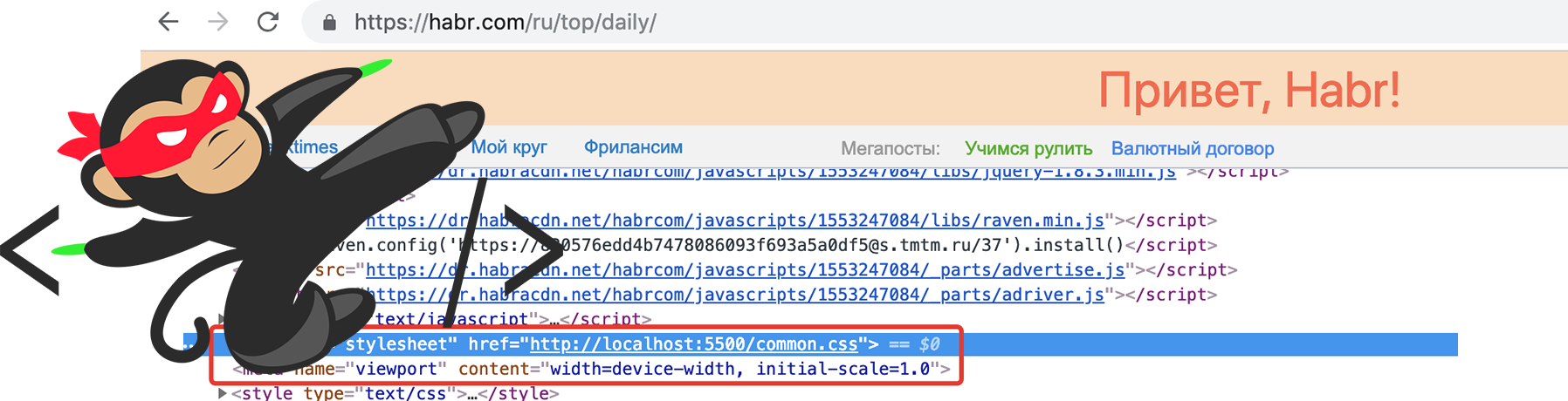
I go to the site of the victim and see what's in the head tag, in most cases you need to add a meta tag, viewport and styles that I will write at the end of the head tag.
If jQuery is connected to the site, then we use it, if not, then regular JavaScript.
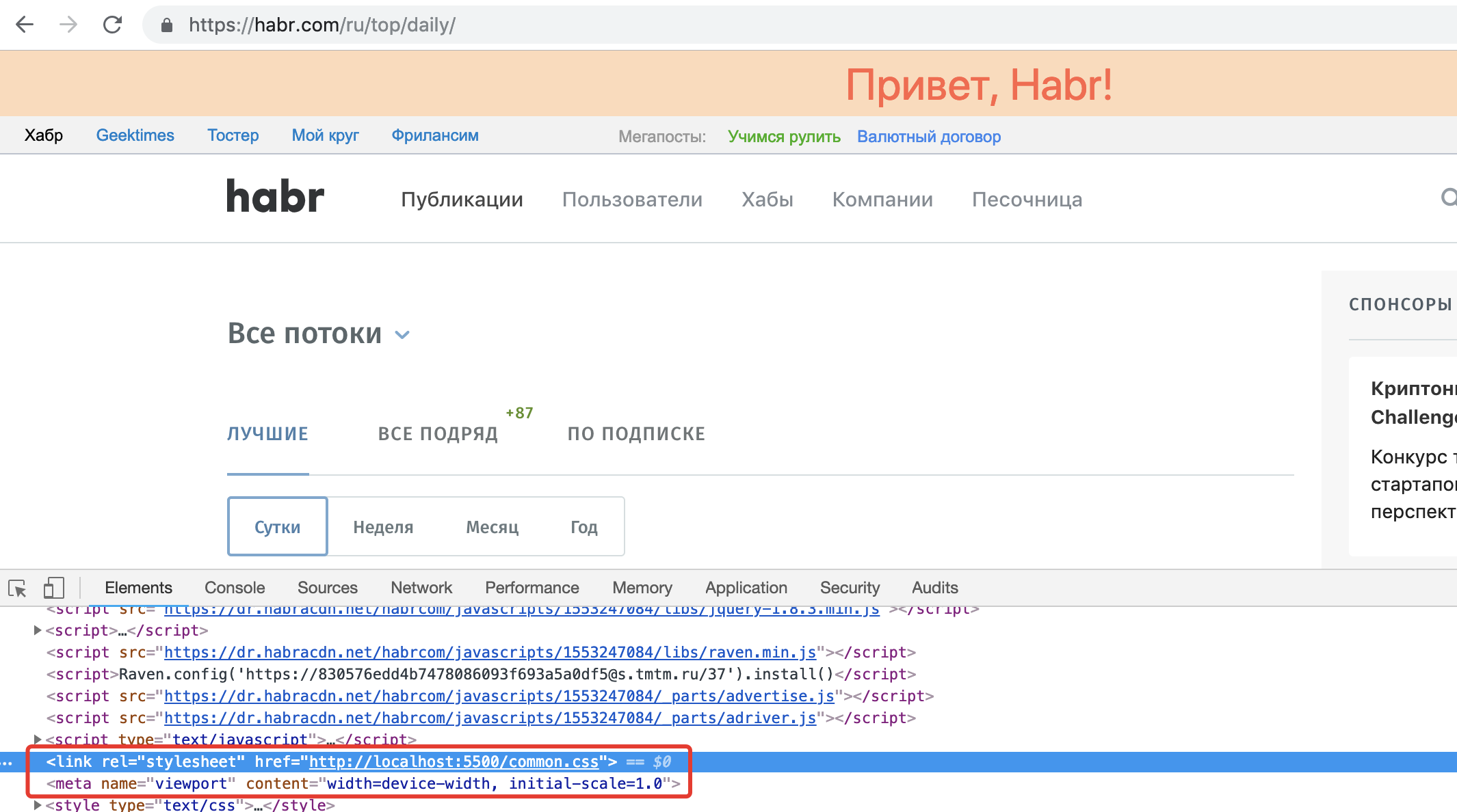
Is done. Now, when viewing, you can see that the tags have been added and you can already work by specifying the direct path to the file on the disk. I will go on turning on the server.
In order to run the server you can use one of the many or use the plugin in your editor.
If you have npm installed, use the static package, if php is installed, you can use its server and so on.
There is a way it's even easier to use the visual studio code and plug-ins to it, for example, the popular live server.
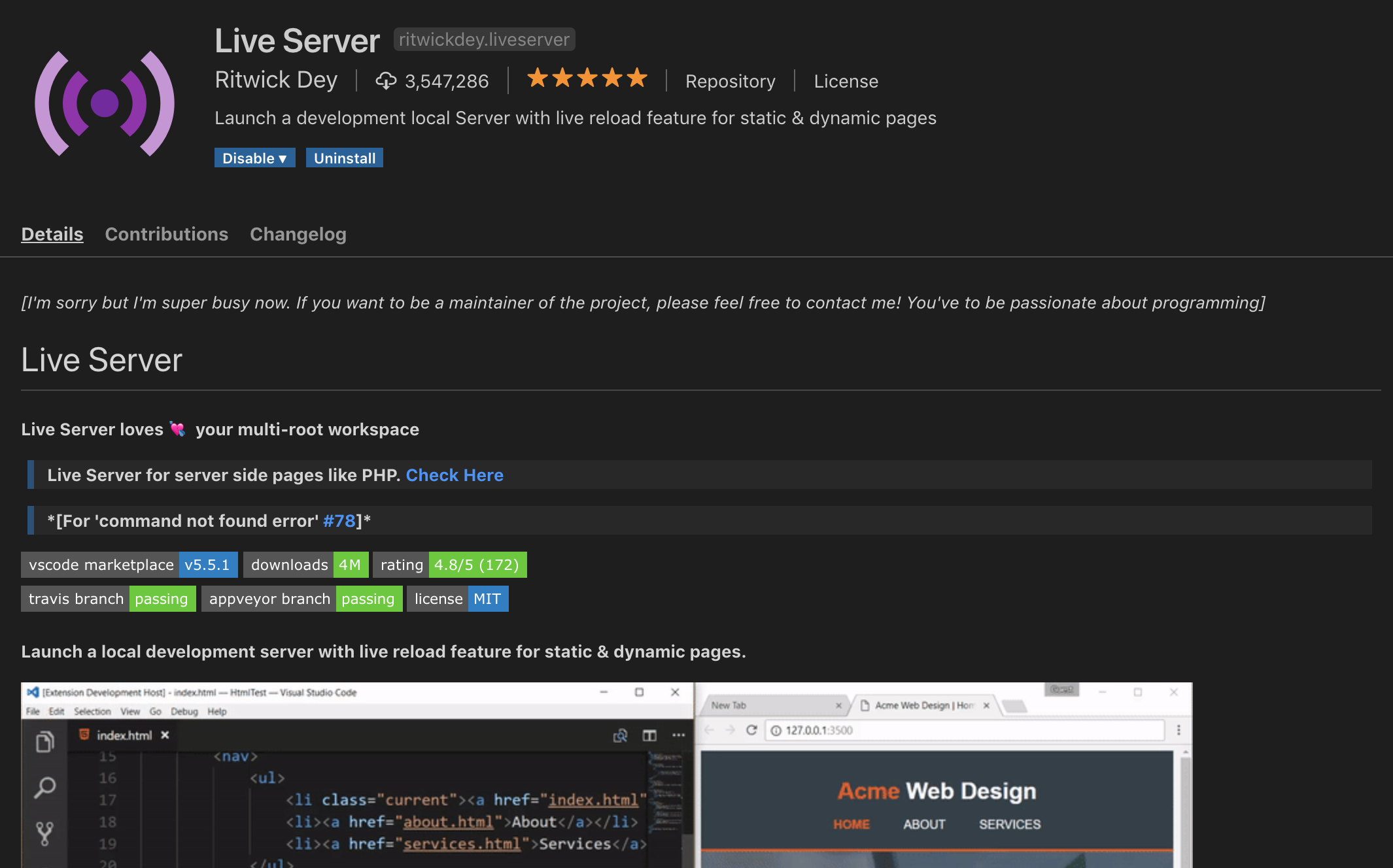
Open the directory with css files in vscode and just click the go live button in the bar - the localhost: 5500 server will start, so in the link tag I will simply indicate localhost : 5500 / common.css
I do not want to write on the bare css and I want to use sass, so I will also install the live sass compiler in vscode. If you are using another server, you can use the official sass program, specifying the sass watch server common.sass in the directory in the directory that the sass server distributes
Now I have the tools to write adaptive for any site, without having access to the code of this site.
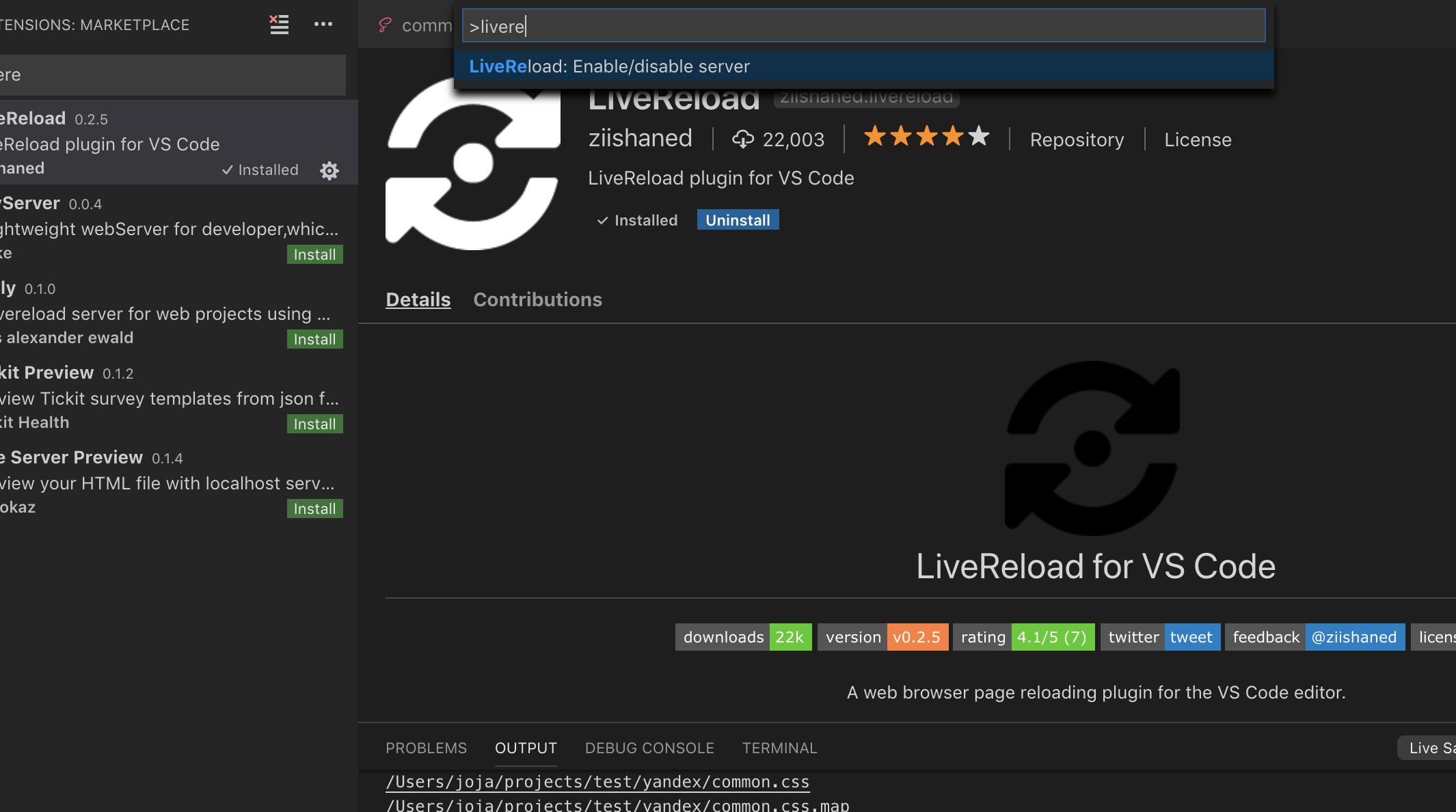
Additional convenience is the auto-refresh of the page when the css file is changed. For auto-update, I use livereload, livereload plug-ins are available for most popular editors and browsers based on chromium and firefox .
I put the extension in chrome and the extension in vscode. I launch the livereload server with a command in the command line vscode ctrl + shift + p> livereload start.
After that, in the browser, I click on the button that appears after installing the extension. All, when you change the style of css immediately visible changes on the site.
NPM and browser-sync. If you know these 2 words, it is likely to go better this way.
Update: I tried this approach, it turned out to be very convenient and most importantly - very easy! Later I will write a detailed article on this approach in the example of creating responsive styles for any site.
Thanks again to the monochromer
Advantages of this approach:
Now, if you already have enough skills in adaptive layout, you will be able to adapt the site for a mobile audience which now averages 50 percent and search engines directly write about the need for a mobile version and check its availability.
After you are done, all you have to do is upload the styles to the site and add a couple of tags to the head.
Update: In the comments below ivan386 wrote that it would be nice to give an example of styles. In this case, you will need to write a new article in which I will take some state site as a victim and adapt it, with the addition of a mobile menu.
I will talk about how to speed up the introduction of changes to the site, and consider the tools for quick layout on a live site without having access to edit it.
You can go the usual way - copy the site and modify it on your machine, or write everything directly to a working site (it is better not to do so).
')
This is where users scripts, livereload, sass or other preprocessors come to the rescue. With this set, the time to adapt the site is reduced several times.
1. Yuzerskript
I'll start with userscripts - for this you can use any browser plugin based on chromium, firefox.
For chromium fit tampermonkey , I show by example.
Adding css and viewport
I go to the site of the victim and see what's in the head tag, in most cases you need to add a meta tag, viewport and styles that I will write at the end of the head tag.
UserScript for tampermonkey
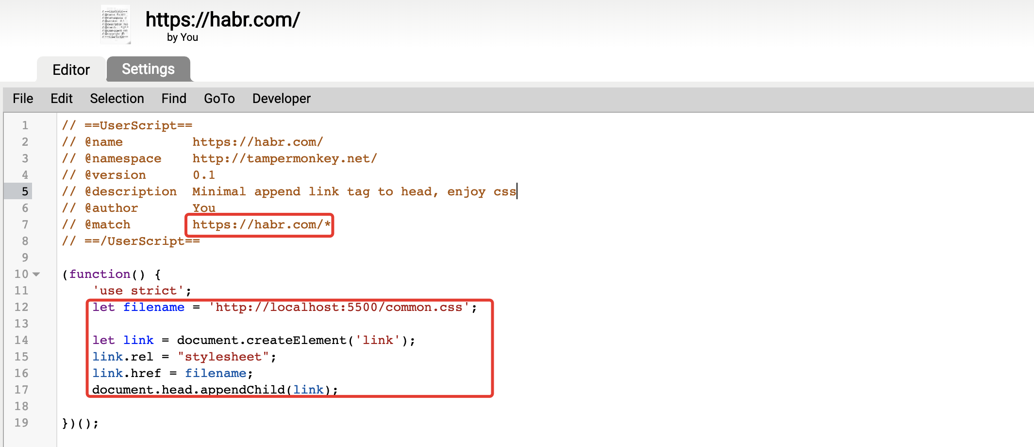
// ==UserScript== // @name https://habr.com/ // @namespace http://tampermonkey.net/ // @version 0.1 // @description Minimal append link tag to head, enjoy css // @author You // @match https://habr.com/* // ==/UserScript== (function() { 'use strict'; let filename = 'http://localhost:5500/common.css'; let link = document.createElement('link'); link.rel = "stylesheet"; link.href = filename; document.head.appendChild(link); // head let metaViewport = document.createElement('meta'); metaViewport.name = "viewport"; metaViewport.content = "width=device-width, initial-scale=1.0"; document.head.appendChild(metaViewport); })(); If jQuery is connected to the site, then we use it, if not, then regular JavaScript.
Is done. Now, when viewing, you can see that the tags have been added and you can already work by specifying the direct path to the file on the disk. I will go on turning on the server.
Css distribution server
In order to run the server you can use one of the many or use the plugin in your editor.
If you have npm installed, use the static package, if php is installed, you can use its server and so on.
There is a way it's even easier to use the visual studio code and plug-ins to it, for example, the popular live server.
Open the directory with css files in vscode and just click the go live button in the bar - the localhost: 5500 server will start, so in the link tag I will simply indicate localhost : 5500 / common.css
Preprocessors
I do not want to write on the bare css and I want to use sass, so I will also install the live sass compiler in vscode. If you are using another server, you can use the official sass program, specifying the sass watch server common.sass in the directory in the directory that the sass server distributes
Now I have the tools to write adaptive for any site, without having access to the code of this site.
Auto update
Additional convenience is the auto-refresh of the page when the css file is changed. For auto-update, I use livereload, livereload plug-ins are available for most popular editors and browsers based on chromium and firefox .
I put the extension in chrome and the extension in vscode. I launch the livereload server with a command in the command line vscode ctrl + shift + p> livereload start.
After that, in the browser, I click on the button that appears after installing the extension. All, when you change the style of css immediately visible changes on the site.
2. The second way is all in one, Browser-sync
NPM and browser-sync. If you know these 2 words, it is likely to go better this way.
Update: I tried this approach, it turned out to be very convenient and most importantly - very easy! Later I will write a detailed article on this approach in the example of creating responsive styles for any site.
Thanks again to the monochromer
Instruction
- Put nodejs (if you haven't installed yet)
- In the project folder, initialize the project in the npm init console (during initialization, just enter the project name)
- Install Browser-sync: type in console npm i browser-sync - save-dev
- Copy the config shown below and create a .js file with any name (for example, proxy.js) and do not forget to change the url with which you will work in the config
- Run in the node proxy.js console
- Done, the server is running. Browser-sync when changing files that you put in the static folder will automatically reload the page.
Config from habrauzera @ monochromer
let browserSync = require('browser-sync').create(); browserSync.init({ proxy: 'http://site.com', serveStatic: ['static'], files: ['static/**/*.*'], rewriteRules: [ { match: /<\/head>/i, fn: (req, res, match) => `<link rel="stylesheet" href="/custom.css" />` }, { match: /<\/body>/i, fn: (req, res, match) => `<script async src="/scripts.js"></script>` } ] }); Advantages of this approach:
- You work in your favorite editor and are not limited to the functionality of the browser extension.
- Versioning with git, for example
Total
Now, if you already have enough skills in adaptive layout, you will be able to adapt the site for a mobile audience which now averages 50 percent and search engines directly write about the need for a mobile version and check its availability.
After you are done, all you have to do is upload the styles to the site and add a couple of tags to the head.
Update: In the comments below ivan386 wrote that it would be nice to give an example of styles. In this case, you will need to write a new article in which I will take some state site as a victim and adapt it, with the addition of a mobile menu.
Source: https://habr.com/ru/post/445594/
All Articles