Introduction to lit-element and web components based on it
At one point, I had to urgently get acquainted with web components and find a way to conveniently develop with their help. I plan to write a series of articles that
somehow systematize knowledge of web components, lit-element and give a brief acquaintance with this technology for others. I am not an expert in this technology and will gladly accept any feedback.
lit-element is a wrapper (base template) for native web components. It implements many convenient methods that are not in the specification. Due to its proximity to the native implementation, the lit-element shows very good results in various benchmark relative to other approaches (as of 06.02.2019).
The bonuses that I see from using lit-element as the base class of web components:
- This technology implements the second version and “had children with childhood diseases” characteristic of the instruments that have just appeared.
- Assembly can be carried out both polymer, and webpack, typescript, rollup, etc., it allows you to embed the lit-element in any modern project without any problems.
- The lit-element has a very convenient system of working with property in terms of typing, initiating and converting values.
- The lit-element implements almost the same logic as the reactant, i.e. it provides the very minimum — a single template for building components and rendering it, and does not limit the developer in choosing an ecosystem and additional libraries.
Let's create a simple web component on lit-element. Refer to the documentation. We need the following:
- Add a lit-element package to our npm build
npm install --save lit-element - Create our component.
For example, we need to create a web component that is initialized in the my-component tag. To do this, create a js file my-component.js and define its basic template:
// lit-element import { } from ''; // class MyComponent { } // customElements.define(); First of all, import our basic template:
import { LitElement, html } from 'lit-element'; // LitElement - () - // html - lit-html, , // html Second, create the web component itself using LitElement
// , // LitElement HTMLElement class MyComponent extends LitElement { // LitElement // constructor connectedCallback // // , // shadowDOM {mode: 'open'} render() { return html`<p>Hello World!</p>` } } And the last thing is to register the web component in the browser.
customElements.define('my-component', MyComponent); As a result, we obtain the following:
import { LitElement, html } from 'lit-element'; class MyComponent extends LitElement { render() { return html`<p>Hello World!</p>` } } customElements.define('my-component', MyComponent); If you eliminate the need to connect my-component.js to html, then that's all. The simplest component is ready.
I suggest not to reinvent the wheel and take a ready-made assembly of the lit-element-build-rollup. Follow the instructions:
git clone https://github.com/PolymerLabs/lit-element-build-rollup.git cd lit-element-build-rollup npm install npm run build npm run start After executing all the commands, go to the page in the browser http: // localhost: 5000 / .
If you take a look at html, we see that before the closing tag is webcomponents-loader.js . This is a set of polyfills for web components, and for cross-browser web component, it is desirable that this polyfill be. Let's take a look at the table of browsers that implement all the standards for web components, it says that EDGE still doesn’t fully implement the standards (I’m not talking about IE11, which is still required to be supported).

Implemented 2 variants of this polyfill:
- webcomponents-bundle.js - this version contains all possible polyfilling options, all of them are initiated, but each polyfill will work only on the basis of the detected features.
- webcomponents-loader.js is a minimal downloader that, based on the detected features, loads the necessary polyfills
Also please pay attention to another polyfill - custom-elements-es5-adapter.js . According to the specification, only ES6 classes can be added to the native customElements.define. For better performance, the code on ES6 should be transferred only to those browsers that support it, and ES5 - to everyone else. It’s not always possible to do this, so for better cross-browser compatibility, it is recommended to transfer the entire ES6 code to ES5. But in this case, the web components on ES5 will not work in browsers. To solve this problem, there is a custom-elements-es5-adapter.js.
Now let's open the ./src/my-element.js file
import {html, LitElement, property} from 'lit-element'; class MyElement extends LitElement { // @property - , babel ts // // , @property({type: String}) myProp = 'stuff'; render() { return html` <p>Hello World</p> ${this.myProp} `; } } customElements.define('my-element', MyElement); The lit-html template engine can handle a string differently. I will give several options:
// : html`<div>Hi</div>` // : html`<div>${this.disabled ? 'Off' : 'On'}</div>` // : html`<x-foo .bar="${this.bar}"></x-foo>` // : html`<div class="${this.color} special"></div>` // boolean, checked === false, // HTML: html`<input type="checkbox" ?checked=${checked}>` // : html`<button @click="${this._clickHandler}"></button>` Tips for optimizing the render () function:
- must not change the state of the element
- should not have side effects
- should depend only on the properties of the element
- should return the same result when passing the same value.
Do not update the DOM outside the render () function.
The lit-element is responsible for rendering the lit-html - this is a declarative way of describing how the web component should be displayed. lit-html guarantees fast updates, changing only those parts of the DOM that need to be changed.
Almost all of this code was in a simple example, but the @property decorator was added to the myProp property. This decorator indicates that we are expecting an attribute named myprop in our my-element . If such an attribute is not specified, it defaults to the string value stuff .
<!-- myProp , - 'stuff' --> <my-element></my-element> <!-- myprop lowerCamelCase .. myProp - 'else' --> <my-element myprop="else"></my-element> lit-element provides 2 ways to work with property :
- Through the decorator.
- Through static getter
properties.
The first option allows you to specify each property separately:
@property({type: String}) prop1 = ''; @property({type: Number}) prop2 = 0; @property({type: Boolean}) prop3 = false; @property({type: Array}) prop4 = []; @property({type: Object}) prop5 = {}; The second is to specify everything in one place, but in this case, if the property has a default value, you must write it in the class constructor method:
static get properties() { return { prop1: {type: String}, prop2: {type: Number}, prop3: {type: Boolean}, prop4: {type: Array}, prop5: {type: Object} }; } constructor() { this.prop1 = ''; this.prop2 = 0; this.prop3 = false; this.prop4 = []; this.prop5 = {}; } The API for working with properties in the lit-element is quite extensive:
- attribute : whether a property can become an observable attribute. If the value is
false, then the attribute will be excluded from observation; a getter will not be created for it. Iftrueorattributemissing, then the property specified in the getter in the format lowerCamelCase will correspond to the attribute in the string format. If a string is specified, for examplemy-prop, it will correspond with the same name in the attributes. - converter : contains a description of how to convert a value from / to an attribute / property. A value can be a function that works to serialize and deserialize a value, or it can be an object with keys
fromAttributeandtoAttribute, these keys contain separate functions for converting values. By default, the property contains a conversion to the base typesBoolean,String,Number,ObjectandArray. Conversion rules are listed here . - type : indicates one of the base types that will contain this property. Used as a “hint” for the converter as to which type the property should contain.
- reflect : indicates whether the attribute should be associated with a property (
true) and changed according to the rules oftypeandconverter. - hasChanged : each property has one, contains a function that determines whether there is a change between the old and the new value, respectively, returns a
Boolean. Iftrue, it starts the item update. - noAccessor : this property takes
Booleanand defaults tofalse. It prohibits the generation of getters and setters for each property to access them from the class. This does not cancel the conversion.
Let's make a hypothetical example: write a web component that contains a parameter that contains a string, this word should be drawn on the screen, in which each letter is greater than the previous one.
<!-- index.html --> <ladder-of-letters letters=""></ladder-of-letters> //ladder-of-letters.js import {html, LitElement, property} from 'lit-element'; class LadderOfLetters extends LitElement { @property({ type: Array, converter: { fromAttribute: (val) => { // console.log('in fromAttribute', val); return val.split(''); } }, hasChanged: (value, oldValue) => { if(value === undefined || oldValue === undefined) { return false; } // console.log('in hasChanged', value, oldValue.join('')); return value !== oldValue; }, reflect: true }) letters = []; changeLetter() { this.letters = ['','','','','']; } render() { // console.log('in render', this.letters); // , // return html` <div>${this.letters.map((i, idx) => html`<span style="font-size: ${idx + 2}em">${i}</span>`)}</div> // @click , // 'click' <button @click=${this.changeLetter}> ''</button> `; } } customElements.define('ladder-of-letters', LadderOfLetters); as a result we get:

when you clicked on the button, the property was changed, which caused the check first, and then it was sent to redraw.

and using reflect we can also see changes in html
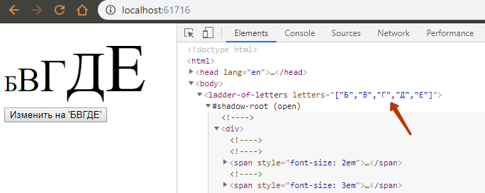
If this attribute is changed by code outside this web component, we will also cause the web component to be redrawn.
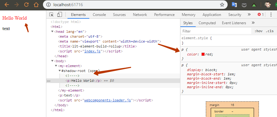
Now consider the styling component. We have 2 ways to style the lit-element:
- Styling by adding a style tag to the render method
render() { return html` <style> p { color: green; } </style> <p>Hello World</p> `; }
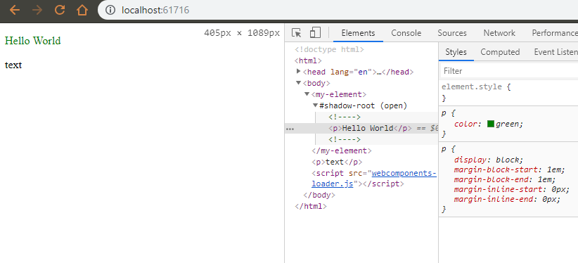
- Through static
stylesgetter
')import {html, LitElement, css} from 'lit-element'; class MyElement extends LitElement { static get styles() { return [ css` p { color: red; } ` ]; } render() { return html` <p>Hello World</p> `; } } customElements.define('my-element', MyElement);
As a result, we get that a tag with styles is not created, but is written ( >= Chrome 73 ) into the Shadow DOM element in accordance with the specification . Thus, performance improves with a large number of elements, since when registering a new component, he already knows what properties his styles define for him, they do not need to be registered every time and recalculated.
In this case, if this specification is not supported, then the usual style tag is created in the component.

Plus, do not forget that in this way we can also share which styles will be added and calculated on the page. For example, use media queries not in css, but in JS and implement only the necessary style, for example (this is wild, but it is the place to be):
static get styles() { const mobileStyle = css`p { color: red; }`; const desktopStyle = css`p { color: green; }`; return [ window.matchMedia("(min-width: 400px)").matches ? desktopStyle : mobileStyle ]; } Accordingly, we will see this if the user logged on to a device with a screen width of more than 400px.
And this is - if the user entered the site from a device with a width of less than 400px.

My opinion: there is practically no adequate case when the user, working on a mobile device, suddenly appears in front of a full-fledged monitor with a screen width of 1920px. Add to this the lazy loading of components. As a result, we get a very optimized front with fast rendering of components. The only problem is the difficulty of support.
Now I suggest to get acquainted with the life-cycle methods of the lit-element:
- render () : implements the description of the DOM element using
lit-html. Ideally, therenderfunction is a pure function that uses only the current properties of the element. Therender()method is called by theupdate()function. - shouldUpdate (changedProperties) : implemented if you need to control the update and rendering, when the properties were changed or when
requestUpdate()called. The argument of thechangedPropertiesfunction is aMapcontaining the keys of the changed properties. By default, this method always returnstrue, but the logic of the method can be changed to control the update component. - performUpdate () : implemented to control the update time, for example, to integrate with the scheduler.
- update (changedProperties) : this method calls
render(). It also updates the attributes of the element according to the value of the property. Setting properties inside this method will not trigger another update. - firstUpdated (changedProperties) : is called after the first DOM element is
updated()immediately before theupdated()call. This method can be useful for capturing links to rendered static nodes that you need to work with directly, for example, inupdated(). - updated (changedProperties) : called whenever the DOM element is updated and displayed. An implementation to perform tasks after an update through the DOM API, for example, focusing on an element.
- requestUpdate (name, oldValue) : Causes a request for an asynchronous update of the item. This should be called when the element needs to be updated based on some state that is not caused by setting the property.
- createRenderRoot () : by default creates a Shadow Root for the item. If the use of the Shadow DOM is not needed, then the method should return
this.
How the item is updated:
- The property is given a new value.
- If the
hasChanged(value, oldValue)returnsfalse, the item is not updated. Otherwise, an update is planned by callingrequestUpdate(). - requestUpdate () : updates the element after the microtask (at the end of the event loop and before the next redraw).
- performUpdate () : performs an update, and continues the rest of the update API.
- shouldUpdate (changedProperties) : the update continues if
truereturned. - firstUpdated (changedProperties) : called when the element is updated for the first time, immediately before the
updated()call. - update (changedProperties) : updates the item. Changing properties in this method does not trigger another update.
- render () : returns a
lit-htmltemplate for drawing an element in the DOM. Changing properties in this method does not trigger another update.
- render () : returns a
- updated (changedProperties) : called whenever an item is updated.
To understand all the nuances of the component life cycle, I advise you to refer to the documentation .
At work, I have a project on the adobe experience manager (AEM), in its authoring, the user can drag and drop components onto the page, and according to the AEM ideology, this component contains a script tag, which contains everything you need to implement the logic of this component. But in fact, such an approach gave rise to many blocking resources and difficulties with the implementation of the front in this system. For the implementation of the front, web components were chosen as a way not to change the server-side rendering (with which he did an excellent job), and also gently, element by element, to enrich the old implementation with a new approach. In my opinion, there are several options for implementing web component loading for this system: build a bundle (it can become very large) or split it into chunks (a lot of small files, dynamic loading is needed), or use the already current approach with embedding a script into each a component that is rendered on the server side (I really don't want to go back to this). In my opinion, the first and third options are not options. For the second, you need a dynamic loader, as in stencil. But for the lit-element in the "box" is not provided. From the side of the lit-element developers, there was an attempt to create a dynamic loader , but it is an experiment and it is not recommended to use it in production. Also from the lit-element developers there is an issue in the repository of the specification of web components with the proposal to add to the specification the ability to dynamically load the necessary js for the web component based on html markup on the page. And, in my opinion, this native tool is a very good idea that will allow you to create one initialization point for web components and simply add it to all pages of the site.
For dynamic loading of web components based on lit-element, guys from PolymerLabs developed a split-element . This is an experimental solution. It works in the following way:
- To create a SplitElement, you write two element definitions in two modules.
- One of them is a “stub” that defines the loaded parts of an element: usually this is the name and properties. Properties must be defined with a stub so that the lit-element can timely generate observable attributes to call
customElements.define(). - The stub should also have a static asynchronous loading method that returns an implementation class.
- Another class is an “implementation” that contains everything else.
- The
SplitElementconstructor loads the implementation class and executesupgrade().
Stub example:
import {SplitElement, property} from '../split-element.js'; export class MyElement extends SplitElement { // MyElement load // connectedCallback() static async load() { // // MyElement return (await import('./my-element-impl.js')).MyElementImpl; } // // - @property() message: string; } customElements.define('my-element', MyElement); Example of implementation:
import {MyElement} from './my-element.js'; import {html} from '../split-element.js'; // MyElementImpl render - export class MyElementImpl extends MyElement { render() { return html` <h1>I've been upgraded</h1> My message is ${this.message}. `; } } ES6 SplitElement Example:
import {LitElement, html} from 'lit-element'; export * from 'lit-element'; // LitElement SplitElement // export class SplitElement extends LitElement { static load; static _resolveLoaded; static _rejectLoaded; static _loadedPromise; static implClass; static loaded() { if (!this.hasOwnProperty('_loadedPromise')) { this._loadedPromise = new Promise((resolve, reject) => { this._resolveLoaded = resolve; this._rejectLoaded = reject; }); } return this._loadedPromise; } // - // static _upgrade(element, klass) { SplitElement._upgradingElement = element; Object.setPrototypeOf(element, klass.prototype); new klass(); SplitElement._upgradingElement = undefined; element.requestUpdate(); if (element.isConnected) { element.connectedCallback(); } } static _upgradingElement; constructor() { if (SplitElement._upgradingElement !== undefined) { return SplitElement._upgradingElement; } super(); const ctor = this.constructor; if (ctor.hasOwnProperty('implClass')) { // , ctor._upgrade(this, ctor.implClass); } else { // if (typeof ctor.load !== 'function') { throw new Error('A SplitElement must have a static `load` method'); } (async () => { ctor.implClass = await ctor.load(); ctor._upgrade(this, ctor.implClass); })(); } } // render() { return html``; } } If you are still using the build suggested above on Rollup, do not forget to set the babel to handle dynamic imports.
npm install @babel/plugin-syntax-dynamic-import And in the settings .babelrc add
{ "plugins": ["@babel/plugin-syntax-dynamic-import"] } Here I made a small example of the implementation of deferred web components: https://github.com/malay76a/elbrus-split-litelement-web-components
I tried to apply the approach of dynamic loading of web components, I came to the following conclusion: the tool is quite working, all the definitions of web components should be assembled into one file, and the description of the component itself should be connected via chunks separately. Without http2, this approach does not work, because a very large pool of small files describing the components is formed. If we proceed from the principle of atomic design , then the import of atoms must be determined in the body, but the body is already connected as a separate component. One of the “bottlenecks” is that the user will receive many definitions of user elements in the browser, which will be somehow initialized in the browser, and they will be determined by the initial state. This decision is redundant. One of the simple solutions for the component loader is the following algorithm:
- load the required utilities
- load polyfills,
- collect custom elements from light DOM:
- select all DOM elements that contain hyphens in the tag name,
- the list is filtered and the list of the first elements is formed.
- :
- Intersection Observer,
- +- 100px import.
- 3 shadowDOM,
- , shadowDOM , , import JS.
- lit-element open-wc.org . webpack rollup, - storybook, IDE.
Additional links:
- Let's Build Web Components! Part 5: LitElement
- Web Component Essentials
- A night experimenting with Lit-HTML…
- LitElement To Do App
- LitElement app tutorial part 1: Getting started
- LitElement tutorial part 2: Templating, properties, and events
- LitElement tutorial part 3: State management with Redux
- LitElement tutorial part 4: Navigation and code splitting
- LitElement tutorial part 5: PWA and offline
- Lit-html workshop
- Awesome lit-html
Source: https://habr.com/ru/post/445438/
All Articles