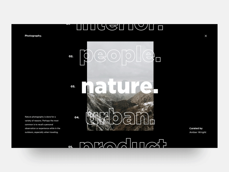
10 concepts for the designer in 2019
The work environment of UI / UX designers is rapidly expanding and growing: there are a lot of new products and tools for developing interfaces, cool opportunities thanks to the development of flexible programming languages and, of course, many new words and concepts are being introduced into the design ecosphere. The most relevant and should be analyzed carefully, not only to include a specialist in your vocabulary, but also to adopt them in practical application.
This trend has become a real trend in the vast Dribbble, which is based on the work of the Dutch artist Piet Mondrian. The essence of this style is that the content is presented in a grid of blocks of rectangular and square shapes, which are perfectly folded like Tetris and allow you to fit the maximum of functional blocks in a minimal area in an interesting, non-trivial form.

')
This word means any discovery made without intentional action. However, this is not just surprise, but conclusions drawn from a deep analysis of information. Serandipnost consists of two main components: sudden detection and correct interpretation.
In design, serendipity can be realized through personalization of content, component-based interaction (for example, after reading one article in a blog, the recommended material changes according to the topic of the article just read), as well as with affordants (the meaning of this concept is described below).
You ask: why sereny is needed? Everything is simple here. With it, you can make the user happier, and the site / application more efficiently, presenting the user the ability to consume more relevant content and feel at ease.

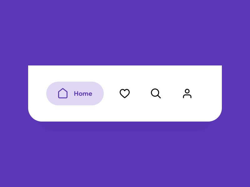
The term comes from the English. the words “Afford” (to give an opportunity) means the properties of an object / phenomenon, with the help of which one can interact with it in one way or another. The concept migrated to the IT area progressively: it was first used by psychologist James G. Gibson (James G. Gibson), and then - by Donald Norman in the book Psychology of Habitual Things.
Affordances may seem quite obvious to people who work in the field of Internet technologies, but in order to create better products, it is necessary to take into account all the deep meanings of the elements with which the user interacts in different ways: pressing buttons, dragging objects, scaling, moving ... Understanding Affordants significantly affects the conversion component, because without a sign on the door “On Yourself” the success of the fact that a person goes into the store is 50 to 50.
For a better understanding and organization of interfaces, Affordances can be divided into thematic groups:
Explicit: the appearance of the element speaks directly about the result of interaction with it. For example, a right arrow on a button means moving forward.
Template: based on the usual patterns of content research, the user expects to see one or another element in a certain place (icons of social networks on the article page for sharing, the “Buy” button in the item card and others).
Metaphors: an allegorical way of conveying the essence of functions, for example, through images of objects from the real world or contextual meanings. Such Affordants are best suited for complex or abstract functions, the meaning of which is difficult to convey using literal images.
Hidden: elements that allow you to clear a design from clutter and help give quick access to additional functions are more suitable for advanced users (the appearance of icons when an element is hover, opening a dropdown with new options, and so on).
False: Their appearance is contrary to the properties of the Affordans. Here are suitable elements that look clickable, but in fact are not, or, conversely, in nondescript elements there is no hint of interactivity. Despite the fact that this type looks quite non-conversion, it can be used to highlight key functions, for example, in complex interfaces.
Negative: Affordances of inactivity, which hint the user to the right choice or any action, before becoming available to interact. Take the state of the disabled button after filling in the contact information, which becomes active only after all fields are correctly filled.
How many techniques have been invented to expand the screen and deepen the perception of the user! In addition to multi-directional scrolls and 3D models, you should pay attention to the open composition, where elements go beyond the screen, giving an understanding of which direction more content is located, or just a feeling of lightness and lightness, space for imagination to the unfinished picture.
Let the elements smoothly spread, fly away or gallantly hide behind the frame of the monitor, visuals will be endless or open their components gradually - the user will be satisfied.
The concept is particularly concerned with branding and involves the acquisition of a more concise and clean, restrained and serious outlines. But you should not be upset. Strictness does not limit creativity: you can use color or animated accents to breathe freshness and new charm into the images.
Helvetization helps to focus the user's attention on the functionality of the site or application, to direct attention in the right direction and minimize the difficulty of reproducing images in the memory of users.
This trend in the art of the last century on the canvas of web products got a chance to play with new colors. The basic principles of Dada - irrationality, denial of the canons of art, unsystematic and random coincidences - can be used for the good when creating concepts with an entertaining presentation of information.
Here you can combine conflicting images in collages, disproportion, overlaying text layers on images, giving the project originality, brightness and uniqueness. It is important not to confuse Dadaism with brutalism in order to achieve the maximum effect of the integrity of the concept.

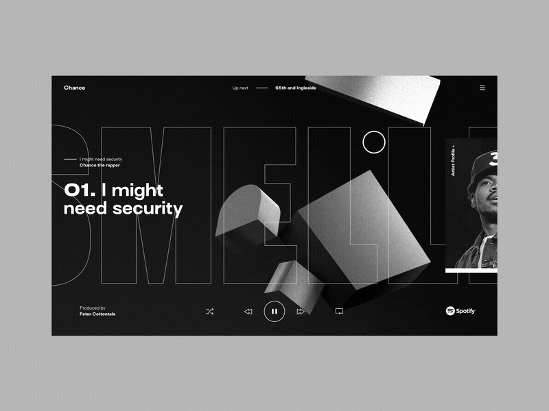
“No, of course, he is not flat”, - you will say and you will be right. This is an imitation of 3D with the help of using images of volumetric shapes, expressive underlining the color with a play of light and shadow. Adding reflections and refractions will add additional depth and realism to the elements of the site or application, and the desire of the user to touch.
More volume always means more space, more interaction and an interesting user experience. Therefore, you can safely experiment with the use of deep flat to various design elements, ranging from text and icons to background images.
Depths of flat images or text can also be added by moving along 3D trajectories, rotating along axes, changing the shape of the surface (swell, spraying), moving lighting - you can draw inspiration from real world.
This is a composition of complex, natural shades that are inherent in objects and phenomena of natural origin: shades of earth and sand, leaves and stems of plants, a slightly overcast sky and natural inflorescences.
Earth tones seem to be a more meaningful continuation of pastel colors. It is rapidly developing along with the trend towards environmental care and conscious consumption, bringing the design to the level of environmental friendliness and associative approximation to nature.
This graphic technique is very simple, and at the same time functional: what was previously filled with color, becomes hollow, and the vacated space can be used more functionally. Outline began to apply to text headers and buttons, to the navigation elements and the outlines of blocks and cards. Filling hollow space or filling with information, any element of content or interface can be easily transformed into Affordance, making user flow addictive.
Although geometry is now in fashion, it's time to replenish the arsenal of shapes with new symbiotic frames. Their brightest representatives are:
Skvirkl (from the English. Square and circle) - a rectangular shape with rounded corners, like an egg. This type of rounding is achieved by adding additional points on the corners. Mathematically, it is an epitrochoid (a figure based on a flat curve formed by a point rigidly connected with a circle rolling on the outer side of another circle), which can be formed not only on the basis of 4 angles.
The Ryoulot triangle is a figure formed from the intersection of three equal circles, whose centers are located at the vertices of a regular triangle, and their radii are equal to the side of this triangle.
Blob, shapeless jelly-like shape with streamlined shapes. It has become popular in the design of backgrounds a couple of years ago, and today it has been cultured and used more elegantly: in the details of the interface and animations.

Learn new aspects in everything, and get better!
01. Mondrianism
This trend has become a real trend in the vast Dribbble, which is based on the work of the Dutch artist Piet Mondrian. The essence of this style is that the content is presented in a grid of blocks of rectangular and square shapes, which are perfectly folded like Tetris and allow you to fit the maximum of functional blocks in a minimal area in an interesting, non-trivial form.
')
02. Serendipnost
This word means any discovery made without intentional action. However, this is not just surprise, but conclusions drawn from a deep analysis of information. Serandipnost consists of two main components: sudden detection and correct interpretation.
In design, serendipity can be realized through personalization of content, component-based interaction (for example, after reading one article in a blog, the recommended material changes according to the topic of the article just read), as well as with affordants (the meaning of this concept is described below).
You ask: why sereny is needed? Everything is simple here. With it, you can make the user happier, and the site / application more efficiently, presenting the user the ability to consume more relevant content and feel at ease.
03. Uffordans
The term comes from the English. the words “Afford” (to give an opportunity) means the properties of an object / phenomenon, with the help of which one can interact with it in one way or another. The concept migrated to the IT area progressively: it was first used by psychologist James G. Gibson (James G. Gibson), and then - by Donald Norman in the book Psychology of Habitual Things.
Affordances may seem quite obvious to people who work in the field of Internet technologies, but in order to create better products, it is necessary to take into account all the deep meanings of the elements with which the user interacts in different ways: pressing buttons, dragging objects, scaling, moving ... Understanding Affordants significantly affects the conversion component, because without a sign on the door “On Yourself” the success of the fact that a person goes into the store is 50 to 50.
For a better understanding and organization of interfaces, Affordances can be divided into thematic groups:
Explicit: the appearance of the element speaks directly about the result of interaction with it. For example, a right arrow on a button means moving forward.
Template: based on the usual patterns of content research, the user expects to see one or another element in a certain place (icons of social networks on the article page for sharing, the “Buy” button in the item card and others).
Metaphors: an allegorical way of conveying the essence of functions, for example, through images of objects from the real world or contextual meanings. Such Affordants are best suited for complex or abstract functions, the meaning of which is difficult to convey using literal images.
Hidden: elements that allow you to clear a design from clutter and help give quick access to additional functions are more suitable for advanced users (the appearance of icons when an element is hover, opening a dropdown with new options, and so on).
False: Their appearance is contrary to the properties of the Affordans. Here are suitable elements that look clickable, but in fact are not, or, conversely, in nondescript elements there is no hint of interactivity. Despite the fact that this type looks quite non-conversion, it can be used to highlight key functions, for example, in complex interfaces.
Negative: Affordances of inactivity, which hint the user to the right choice or any action, before becoming available to interact. Take the state of the disabled button after filling in the contact information, which becomes active only after all fields are correctly filled.
04. Open Composition
How many techniques have been invented to expand the screen and deepen the perception of the user! In addition to multi-directional scrolls and 3D models, you should pay attention to the open composition, where elements go beyond the screen, giving an understanding of which direction more content is located, or just a feeling of lightness and lightness, space for imagination to the unfinished picture.
Let the elements smoothly spread, fly away or gallantly hide behind the frame of the monitor, visuals will be endless or open their components gradually - the user will be satisfied.
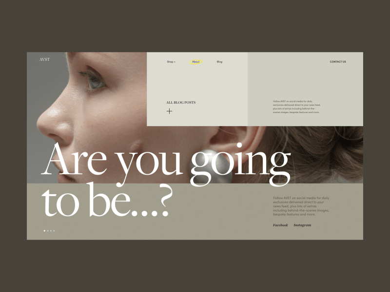
05. Helvetization
The concept is particularly concerned with branding and involves the acquisition of a more concise and clean, restrained and serious outlines. But you should not be upset. Strictness does not limit creativity: you can use color or animated accents to breathe freshness and new charm into the images.
Helvetization helps to focus the user's attention on the functionality of the site or application, to direct attention in the right direction and minimize the difficulty of reproducing images in the memory of users.
06. Dada
This trend in the art of the last century on the canvas of web products got a chance to play with new colors. The basic principles of Dada - irrationality, denial of the canons of art, unsystematic and random coincidences - can be used for the good when creating concepts with an entertaining presentation of information.
Here you can combine conflicting images in collages, disproportion, overlaying text layers on images, giving the project originality, brightness and uniqueness. It is important not to confuse Dadaism with brutalism in order to achieve the maximum effect of the integrity of the concept.
07. Deep flat
“No, of course, he is not flat”, - you will say and you will be right. This is an imitation of 3D with the help of using images of volumetric shapes, expressive underlining the color with a play of light and shadow. Adding reflections and refractions will add additional depth and realism to the elements of the site or application, and the desire of the user to touch.
More volume always means more space, more interaction and an interesting user experience. Therefore, you can safely experiment with the use of deep flat to various design elements, ranging from text and icons to background images.
Depths of flat images or text can also be added by moving along 3D trajectories, rotating along axes, changing the shape of the surface (swell, spraying), moving lighting - you can draw inspiration from real world.
08. Earth tones
This is a composition of complex, natural shades that are inherent in objects and phenomena of natural origin: shades of earth and sand, leaves and stems of plants, a slightly overcast sky and natural inflorescences.
Earth tones seem to be a more meaningful continuation of pastel colors. It is rapidly developing along with the trend towards environmental care and conscious consumption, bringing the design to the level of environmental friendliness and associative approximation to nature.
09. Outline
This graphic technique is very simple, and at the same time functional: what was previously filled with color, becomes hollow, and the vacated space can be used more functionally. Outline began to apply to text headers and buttons, to the navigation elements and the outlines of blocks and cards. Filling hollow space or filling with information, any element of content or interface can be easily transformed into Affordance, making user flow addictive.
10. Squircle, the triangle of Role and Blob
Although geometry is now in fashion, it's time to replenish the arsenal of shapes with new symbiotic frames. Their brightest representatives are:
Skvirkl (from the English. Square and circle) - a rectangular shape with rounded corners, like an egg. This type of rounding is achieved by adding additional points on the corners. Mathematically, it is an epitrochoid (a figure based on a flat curve formed by a point rigidly connected with a circle rolling on the outer side of another circle), which can be formed not only on the basis of 4 angles.
The Ryoulot triangle is a figure formed from the intersection of three equal circles, whose centers are located at the vertices of a regular triangle, and their radii are equal to the side of this triangle.
Blob, shapeless jelly-like shape with streamlined shapes. It has become popular in the design of backgrounds a couple of years ago, and today it has been cultured and used more elegantly: in the details of the interface and animations.
Learn new aspects in everything, and get better!
Source: https://habr.com/ru/post/445194/
All Articles