How to create a palette that is comfortable for everyone

Here is the palette of our Envoy service. Like many color schemes on the web, it includes a corporate color (red), an information color (blue), a successful operation color (green), a warning color (yellow), and various shades of gray.
Although these colors seem to be an excellent palette, over time we realized that they were not flexible enough for all the needs of our user interface. In the reviews, the same comment constantly popped up: "The text is not enough contrast."
')
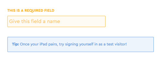
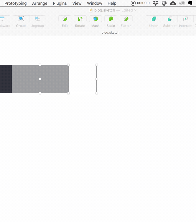
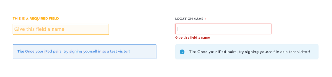
[ Low contrast: the text and background are too similar in color, making it difficult to read the text].
In the existing palette, the contrast of shades is too low, as a result of which many messages on the site are difficult to read. I decided to change the color scheme just for better readability. But I also wanted it to comply with the recommendations on web accessibility , that is, did not create difficulties for people with visual impairments.
Design based on web accessibility means that you need to take into account the perception of the site by all users, regardless of their visual, auditory, motor or cognitive abilities. Accessibility standards are developed by organizations such as the World Wide Web Consortium (W3C), each site can implement these standards.
Here are just a few reasons why we decided to invest in the development of a color scheme based on web accessibility, and why you can also consider the possibility of creating it:
- Many people have imperfect eyesight : according to the World Health Organization, around 1.3 billion people worldwide live with some form of visual impairment.
- Better readability helps everyone : human vision is not the only factor. Think about the different types of computers and devices with different levels of resolution and brightness. Improving readability is good for everyone.
- Today's recommendations may become requirements tomorrow : the number of lawsuits related to the poor availability of the site is growing. Compliance with existing guidelines may reduce risks for the company.
- Empathy for users : as a designer, you have the power to release good into the world. Use your empathy abilities to help a wide range of people, simply because you care about them.
I started developing a new color scheme with more contrasting, more accessible colors. To do everything right, it took some time and ideas that I want to share.
For starters, what colors are considered available?
The basic advice on color availability is the choice of colors that all people can distinguish . The ability to see the text is obviously necessary in order to read it and, therefore, to understand its meaning.
So how do we know what colors people distinguish? It's all about the contrast, which, as I mentioned earlier, is the difference between the foreground color and the background color.
In the example below, the text on the left is very similar to the background color (low contrast), and the text on the right is well different (high contrast) and much easier to read.

Web Content Accessibility Guidelines (WCAG), developed by the W3C, present a formula for calculating the contrast between two colors, with a calculation of the contrast ratio .
The contrast ratio ranges from 1: 1 (no difference) to 21: 1 (the maximum possible value). They are easy to calculate in many free tools: we like Tanaguru , Contrast and the Stark Sketch plugin.
WCAG accurately determines the contrast ratios for readable text:
AA level: minimum standard
The fine print should have a contrast ratio of 4.5: 1 or higher.
Large font 3: 1 or higher
AAA Level: Advanced Standard
The fine print should have a contrast ratio of 7: 1 or higher.
Large font 4.5: 1 or higher
Note: as “large”, a non-bold font size of 18pt (24px) or larger or bold of 14pt (~ 19px) size or more qualifies; otherwise it is a “small” font. W3C defines a point as 1/72 inch, and a pixel as 1/96 inch, so multiply the pixel value by 0.75 to convert pixels to points.

How we made a more accessible color scheme.
When we understand what standards are and why they are needed, let me tell you about how we implemented them in practice.
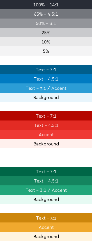
Calculation of contrast ratios of all existing colors
Check out all the colors in the existing color scheme using the convenient tools I mentioned above ( Tanaguru , Contrast , Stark ).
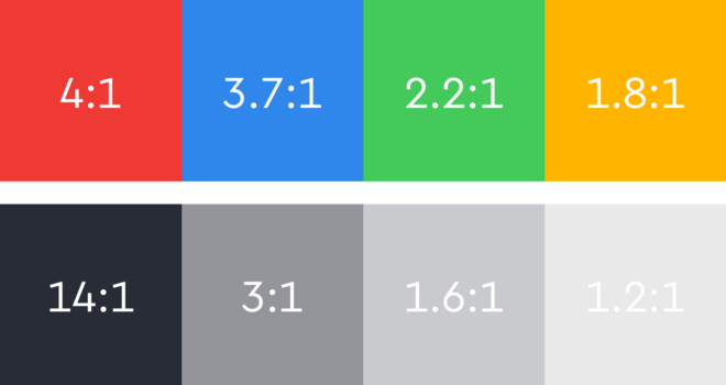
I found that none of our bright colors are 4.5: 1 for text, although we used them for text on my website. We also used some light gray shades for the text. It became clear that it would be necessary to adjust both colors and shades of gray.
Choice of shades of gray
I made a list of places where we have gray text on our site:
- The main text of the paragraph, usually in the darkest shade of gray.
- Additional text or subheadings, usually in the second darkest shade of gray
- Text of inactive functions and placeholders, usually in the third darkest shade of gray
Primary headers, secondary information 'host' and tertiary zero state
Such a pattern 1/2/3 is quite common on the Internet, so it is convenient to start from it if we are developing a palette from scratch.
Testing different shades of gray by reducing the opacity
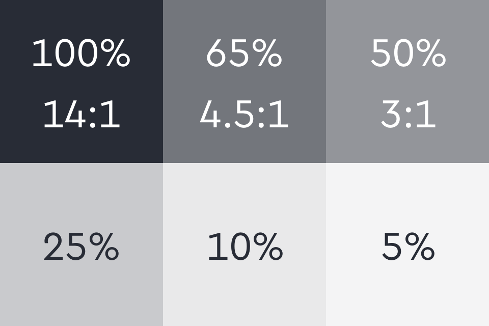
We need three shades of gray that are sufficiently different from each other to assign them primary, secondary and tertiary status, and that they meet the standards of accessibility.
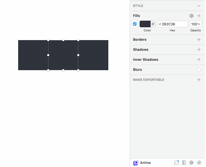
Calculation of contrast ratio using the Stark Sketch plugin
Using Sketch, I drew several squares filled with the darkest shade of gray. I reduced the opacity of one of the squares by 50% and looked at which pure color is closer in the hex code. (You can only use opacity to create different colors, but pure colors are more flexible, they can be reliably applied to all tools and projects).
Then he calculated the contrast ratio of this lighter shade using the Stark plugin. I randomly chose 50%, but it turned out that this exactly corresponds to a 3: 1 ratio on a white background. Therefore, I took it as a lower bound: it will be the lightest shade of gray, which we will use on the site. It passes AA level standards for large text, and it can be used for form field placeholders and other small text.

Now we need to find the value between 100% and 50% for the secondary text. Purely mathematically, 75% seems like a good option, but having experienced different shades, I stopped at 65%, because it corresponds exactly to the 4.5: 1 contrast ratio.
The process takes some time, but just keep calculating the contrast ratios until you find the exact color value that will match the ratio you are aiming for.
When I had three basic shades of gray, I used the same process to define several more shades for icons, borders, and background (not for text!).
Selection of bright colors
Honestly, grappling with gray was much easier. Selecting one base black and changing the opacity to search for new values is a fairly simple procedure. But when it comes to choosing the base colors, you can change anything , so there are plenty of options.
As a starting point, I took the current palette, because it is quite meaningful. Our corporate color does not change, and other colors belong to the color families commonly used for web states: blue for information, green for successful operations, and orange for warnings.
If Sketch shows RGB, click on the RGB label to enter HSB mode.
I started with the base color for each family, then adjusted the saturation and brightness values to create colors of the same hue , but with different contrast.
Again, long-term testing was required to find suitable colors that match the desired contrast values. The color palette is much more subjective; Sometimes it was necessary to tune the shades slightly so that they looked “correct” to the eye.
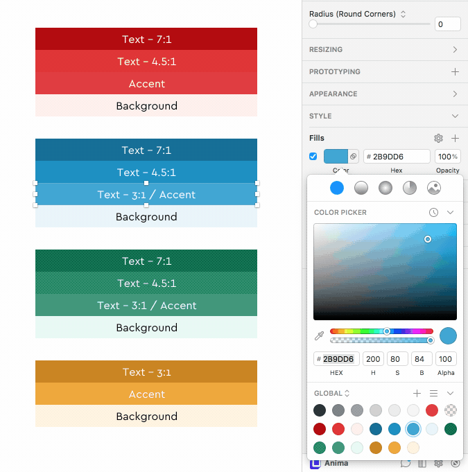
The result was three shades of blue and green, which can be used for text with different contrast points.
It was difficult to deal with orange: when darkening, it quickly turns brown, so we decided to take only the color with the lowest contrast level, with a beautiful mustard shade, and use it sparingly.
I did not change the base corporate color, but I made two darker versions that can be used for text.
I also noted some bright low-contrast shades that can only be used as color accents for icons or graphic design.
Finally, I created very pale shades of each color, which can be used as a background if necessary.
Summarizing
The result was a complete color scheme, which now meets the guidelines for accessibility and offers many options for all of our text and UI needs.

We have carefully laid out the new colors in CSS and are still very pleased with the results and improved readability.
Before and after
In the process of choosing colors, there was a lot of trial and error, but the result was a readable and accessible website for all our users.
Source: https://habr.com/ru/post/444868/
All Articles