Methods for processing physical experiment data
Despite the fact that in most educational institutions in Russia, laboratory work takes place in the old format (when a poor student, collecting data from prehistoric equipment, measuring the period of oscillations using a timer manually, painfully trying to find an explanation for the unrealistic data), some universities bought sensors, (main) computers for the convenience of students. Of course, good equipment improves the accuracy of the experiment. Nevertheless, your humble servant has many times encountered the nagging classmates: “Well, and what were these sensors given to us? It is easier to draw graphics with pens and time to measure than it suffers with programming on the computer. ”I confess that I also had a similar adaptation period, which, however, rather quickly passed. So, I share my experience.

Perhaps this is the simplest thing that we could show in the first place (with the exception, perhaps, of Word or Excel). Data processing with the help of the nest is extremely simple and does not require special knowledge in programming, the language is close to algorithmic. Ideal to start work on graphic data processing.
Suppose we have a data file - one column with the measurement values of some parameter. Let's call this file data.dat. We know that the data represent a normal distribution, let it be the mass distribution of a batch of screws. Our task is to determine the average mass of the screw. My solution is to build a histogram from the data and its further approximation by a curve . Below is a sample code for this construction:
The approximation will determine the values of a, b, and c with a fairly good accuracy. In our problem, it is not difficult to guess that the parameter c is the average value of the mass of the measured objects. Thus, using simple code and some considerations, you can quickly analyze the collected data.
')
In cases where you need fast, graphical processing of a large amount of data (large as part of a lab), GNUplot is ideal. However, sometimes there are bugs, the nature of which you have to think about. I recommend to use for beginners for some basic works, for example, statistical studies.
This monster is designed for real Labs! Purely visual platform for laboratory modeling. Itself collects data from ComPort, it processes it itself, it builds dynamic graphs itself. Opportunities - a lot. Most engineers work on Labview. BUT! Requires great effort to sort out.
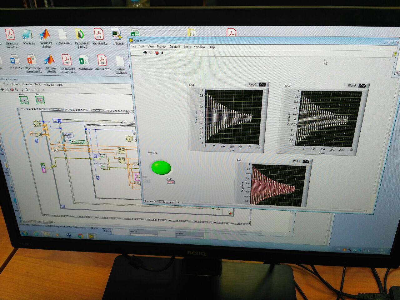
Certainly not for beginners! If there is a desire, you can sit for a couple of days and figure it out, after which the processing time of laboratory work will be significantly reduced, in which you can use microcontrollers with sensors (in my case it was laboratory work with all sorts of pendulums).
This language is a great find for physicists. Most often I use it for solving problems of computational physics, for example, the numerical solution of differential equations. As well as gnoplot, this language is good for graphical data processing, it has fewer bugs and syntax simplicity (although I don’t complain about gnoplot). Personally, I prefer Python, but everyone has his own.
As an example of working with Python, I cite interpolation on points by the Lagrange polynomial,because there was no more visual example of data analysis at hand . Interpolation is usually used to obtain an approximate formula for the dependence of two quantities.
For me, Python is a priority. Much more features than GNUplot, do not require much effort to sort out. Of course, using Labview is much more professional, but sinceI’m too lazy to master it takes an impressive amount of time, I prefer to learn all the advantages of Python.
In this short review I decided to share my experience using some data processing software. Hope it helps you in your research activities.
Successes!
GNUplot
Perhaps this is the simplest thing that we could show in the first place (with the exception, perhaps, of Word or Excel). Data processing with the help of the nest is extremely simple and does not require special knowledge in programming, the language is close to algorithmic. Ideal to start work on graphic data processing.
How to use
Suppose we have a data file - one column with the measurement values of some parameter. Let's call this file data.dat. We know that the data represent a normal distribution, let it be the mass distribution of a batch of screws. Our task is to determine the average mass of the screw. My solution is to build a histogram from the data and its further approximation by a curve . Below is a sample code for this construction:
bin_width=0.1 set boxwidth 0.9*bin_width absolute bin_num(x)=floor(x/bin_width) rounded(x)=bin_width*(bin_number(x)+0.5) plot 'data.dat' using (rounded($1)):(1) smooth frequency with boxes set table 'table.dat' replot # , unset table f(x)=a*exp(-(xc)**2/b) a=6# "" b=0.01 c=2 fit f(x) 'table.dat' using 1:2 via a, b, c plot f(x), 'data.dat' using (rounded($1)):(1) smooth frequency with boxes The approximation will determine the values of a, b, and c with a fairly good accuracy. In our problem, it is not difficult to guess that the parameter c is the average value of the mass of the measured objects. Thus, using simple code and some considerations, you can quickly analyze the collected data.
')
My findings on working with GNUplot
In cases where you need fast, graphical processing of a large amount of data (large as part of a lab), GNUplot is ideal. However, sometimes there are bugs, the nature of which you have to think about. I recommend to use for beginners for some basic works, for example, statistical studies.
LabVIEW
This monster is designed for real Labs! Purely visual platform for laboratory modeling. Itself collects data from ComPort, it processes it itself, it builds dynamic graphs itself. Opportunities - a lot. Most engineers work on Labview. BUT! Requires great effort to sort out.
My findings on working with LabVIEW
Certainly not for beginners! If there is a desire, you can sit for a couple of days and figure it out, after which the processing time of laboratory work will be significantly reduced, in which you can use microcontrollers with sensors (in my case it was laboratory work with all sorts of pendulums).
Python
This language is a great find for physicists. Most often I use it for solving problems of computational physics, for example, the numerical solution of differential equations. As well as gnoplot, this language is good for graphical data processing, it has fewer bugs and syntax simplicity (although I don’t complain about gnoplot). Personally, I prefer Python, but everyone has his own.
As an example of working with Python, I cite interpolation on points by the Lagrange polynomial,
import numpy as np import matplotlib.pyplot as plt def f(x, y, t): lag = 0 for j in range(len(y)): n = 1 dn = 1 for i in range(len(x)): # if i == j:# n = n * 1 dn = dn * 1 else: n = n * (t - x[i]) dn = dn * (x[j] - x[i]) lag = lag + y[j] * n / dn return lag xk = np.linspace(-1, 1, 11) yk = 1/(1+xk**2) xnew = np.linspace(-1, 1, 200) ynew = [f(xk, yk, i) for i in xnew] plt.title(u' ') plt.xlabel(u'x') plt.ylabel(u'y') plt.plot(xk, yk, '.', xnew, ynew) plt.grid() plt.show() My findings on working with Python
For me, Python is a priority. Much more features than GNUplot, do not require much effort to sort out. Of course, using Labview is much more professional, but since
Instead of conclusion
In this short review I decided to share my experience using some data processing software. Hope it helps you in your research activities.
Successes!
Source: https://habr.com/ru/post/444090/
All Articles