Google Play Store moves to standardize application icons
Google announced that application developers sending their applications to the Google Play Store will have to meet certain specifications when it comes to the design of the icon of their application. The specification will force developers to update the “store” icon of their app over the next few months to improve the performance of the Google Play Store.
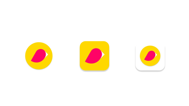 From left to right: original icon, new icon, original icon in outdated mode
According to the new scheme, the size of the icons will remain 512 x 512, but the transparent background will no longer be allowed. Google Play on Android and Chrome OS will automatically round the corners of the icon and add shadows; The company said that the angular radius will be 20% of the size of the icon to ensure consistency between versions of icons of different sizes. The change will not affect Google Play in other form factors, such as TV, Wear and Auto, and will not affect the APK launch icons on Android.
')
In early April, Google will allow developers to start downloading new icons to the Play console and confirm that they meet the new requirements. In early May, any new badges must comply with the new specifications before they can be used. From June 24, your original badges will be transferred to the “outdated mode”, and all new badges will have to meet the specifications.
The expected result of this change is that applications in the Google Play Store will look more uniform, which will help to increase professionalism (professionalism needs to be improved with icons, and not with adequate moderation of the store and normal technical support, so keep - comment of the translator) of the store. Google has created a special page for its new specifications if you want to learn more about them.
From left to right: original icon, new icon, original icon in outdated modeAccording to the new scheme, the size of the icons will remain 512 x 512, but the transparent background will no longer be allowed. Google Play on Android and Chrome OS will automatically round the corners of the icon and add shadows; The company said that the angular radius will be 20% of the size of the icon to ensure consistency between versions of icons of different sizes. The change will not affect Google Play in other form factors, such as TV, Wear and Auto, and will not affect the APK launch icons on Android.
')
In early April, Google will allow developers to start downloading new icons to the Play console and confirm that they meet the new requirements. In early May, any new badges must comply with the new specifications before they can be used. From June 24, your original badges will be transferred to the “outdated mode”, and all new badges will have to meet the specifications.
The expected result of this change is that applications in the Google Play Store will look more uniform, which will help to increase professionalism (professionalism needs to be improved with icons, and not with adequate moderation of the store and normal technical support, so keep - comment of the translator) of the store. Google has created a special page for its new specifications if you want to learn more about them.
On the one hand, it’s good that there will be some kind of unity in the badges, but the zoo has got it. On the other hand, originality is also good, and now your application can not be allowed to play, or even (theoretically, I hope that this is not so) removed from there.
Source: https://habr.com/ru/post/444008/
All Articles