User documentation: what makes it bad, and how to fix it
Software documentation is just a collection of articles. But even they can freak out. First, you are looking for the right instructions for a long time. Then you understand the obscure text. You do as it is written, but the problem is not solved. Looking for another article, nervous ... After an hour you spit on everything and leave. This is how bad documentation works. What makes it so, and how to fix it - read under the cut.
There are many flaws in our old documentation. For almost a year we have been processing it so that the scenario described above does not concern our customers. See how it was and how it became .
Problem 1. Incomprehensible, poorly written articles.
If the documentation can't figure out what's the point? But no one writes incomprehensible articles on purpose. They are obtained when the author does not think about the audience and the goal, pours water and does not check the text for errors.
- Audience Before writing an article, you need to think about the level of preparation of the reader. It is logical that in the article for a beginner you should not skip the basic steps and leave technical terms without decoding, and in the article on a rare feature needed only by pros, chew the meaning of the word PHP.
- Purpose One more thing to think about beforehand. The author must set a clear goal, determine the useful effect of the article, decide what the reader will do after reading it. If you do not do this, you get a description for the sake of description.
- Water and bugs . A lot of superfluous information and stationery, mistakes and typos interfere with perception. Even if the reader is not grammar-nazi, negligence in the text can push him away.
Consider the tips above, and the articles will become clearer - guaranteed. To make it even better, adopt our 50 questions when working on technical documentation .
')
Problem 2. Articles do not answer all questions.
It’s bad when the documentation doesn’t keep up with the development, doesn’t answer the real questions, errors in it have not been corrected for years. This problem is not so much the author, as the organization of processes within the company.
Documentation does not keep up with the development
The feature is already in release, the marketing plans to cover it, and it turns out that the new article or translation is still not in the documentation. Because of this, we even had to postpone the release. One may ask all the time to transfer the task to technical writers, but it will not work. If the process is not automated, the situation will be repeated.
We made changes to YouTrack. The task of writing an article about a new feature falls to a technical writer at the very moment when the opportunity begins to be tested. At the same time, marketing learns about it in order to prepare for promotion. Notifications also come in the corporate Mattermost messenger, so it’s impossible to miss the news from the developers.
Documentation does not reflect user requests
We used to work like this: the feature came out, we told about it. Described how to turn on, turn off, make fine settings. But what if the client uses our software as we did not expect? Or does he have errors that we have not thought of?
To make the documentation as complete as possible, we advise you to analyze requests for support, questions on thematic forums, queries in search engines. To transfer the most popular topics to technical writers so that they supplement existing articles or write new ones.
Documentation is not being improved.
It is difficult to make it perfect right away, there will still be mistakes. You can rely on feedback from customers, but they are unlikely to report every typo, inaccuracy, incomprehensible or unreadable article. In addition to customers, employees read the documentation, which means they see the same mistakes. It can be used! It is only necessary to create conditions in which it will be easy to report a problem.
We have a group on the internal portal where employees leave comments, suggestions and ideas on documentation. Support need an article, but it is not? The tester noticed an inaccuracy? Partner complained to development managers about mistakes? Everything in this group! Technical writers fix something right away, transfer something to YouTrack, take something to think about. So that the topic does not subside, from time to time we recall the existence of the group and the importance of feedback.
Problem 3. The necessary article has a long look
An article that cannot be found is no better than an article that does not exist. The motto of good documentation should be “Easy to search, easy to find.” How to achieve this?
To streamline the structure and determine the principle of choice of topics . The structure should be as transparent as possible, so that the reader does not think "Where can I find this article?". To summarize, there are two approaches: from the interface and from the tasks.
- From the interface. The content duplicates sections of the panel. So it was in the old ISPsystem documentation.
- From tasks. Titles of articles and sections reflect the tasks of users; headings almost always have verbs and answers to the question "how to do". Now we are moving to this format.
Whichever approach you choose, make sure that the topic matches the needs of users and is illuminated so that the user accurately solves his question.
Set up a centralized search . In an ideal world, the search should work, even when you are sad or miss your tongue. Our search in Confluence so far can not please. If you have a lot of products, and the documentation is general, adapt the search to the page where the user is located. In our case, the search on the main works on all products, and if you are already in a specific section, then only on articles in it.
Add content and bread crumbs . Well, when on each page there is a menu and breadcrumbs - the user's path to the current page with the ability to return to any level. In the old ISPsystem documentation, you had to leave the article to get into the content. It was inconvenient, so in the new we corrected it.
Place links in the product . If people come from time to time to support with the same question, it is reasonable to add a hint with its solution to the interface. If you have data or an understanding at which point a user encounters a problem, you can also notify him with a newsletter. And show care, and remove the burden of support.
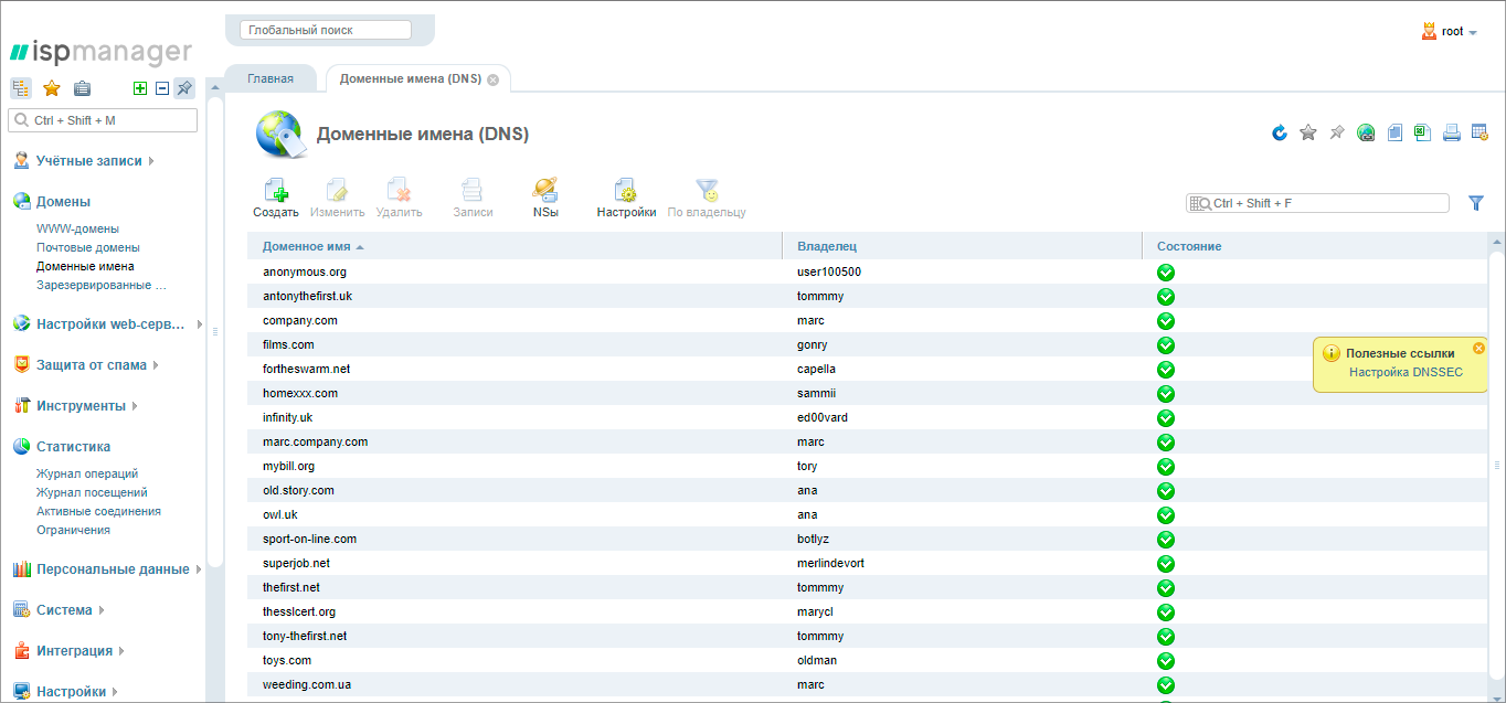
On the right in the pop-up window there is a link to the article about setting up DNSSEC in the domain management section ISPmanager
Configure cross-references inside the documentation . Articles that are related to each other should be “linked”. If the articles are a sequence, be sure to add an arrow forwards and backwards at the end of each text.
Most likely, the person will first go to look for the answer to your question not to you, but to a search engine. It's a shame if the links to the documentation will not be there for technical reasons. So take care of search engine optimization.
Problem 4. Outdated layout interferes with perception.
In addition to bad texts, the documentation can spoil the design. People are used to reading well-laid materials. Blogs, social networks, media - all content is served not just beautiful, but also easy to read, pleasing to the eye. Therefore, it is easy to understand the pain of a person who sees the text as in the screenshot below.
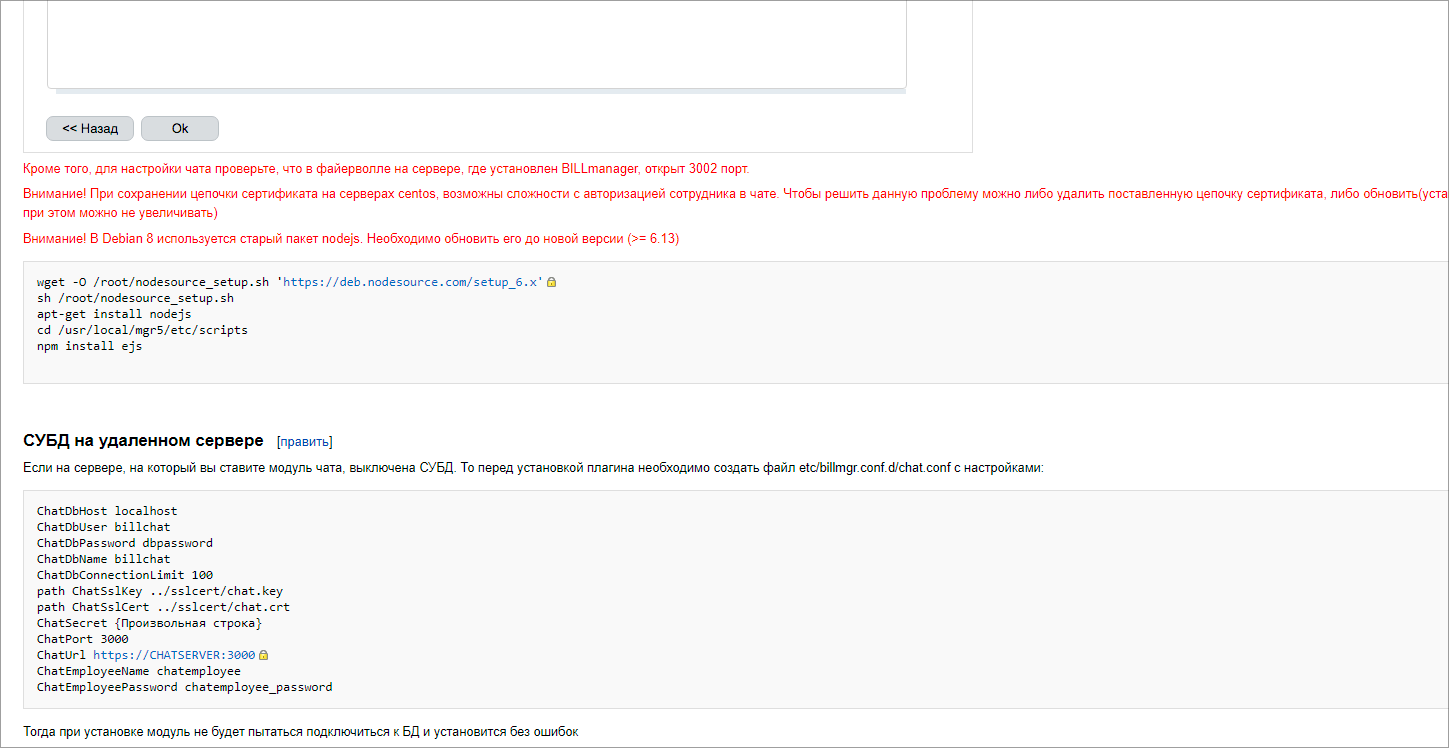
In this article, there are so many screenshots and selections that they do not help, but only interfere with perception (the image is clickable)
You should not do longrid with a bunch of effects from the documentation, but you need to take into account the basic rules.
Layout . Determine the width of the main text, font, size, headers and indents. Attract a designer, and to take work or to cope on your own, read Artyom Gorbunov’s book Typography and Layout. It presents only one of the views on the layout, but it is quite enough.
Highlight . Determine what requires accents in the text. Usually this is the path in the interface, buttons, code inserts, configuration files, “Pay attention” blocks. Set what will be the selection of these elements and fix in the regulations. Keep in mind that the smaller the discharge, the better. When there are a lot of them, the text “roars”. Noise even create quotes if used too often.
Screenshots Agree with the team when screenshots are needed. To illustrate each step is definitely not necessary. A large number of screenshots, incl. separate buttons, interfere with perception, spoil the layout. Determine the size, as well as the format of selections and signatures on the screenshots, fix in the regulations. Remember that illustrations must always correspond to what has been written and be relevant. Again, if the product is regularly updated, it will be difficult to keep track of everyone.
The length of the text . Avoid too long articles. Crush them into parts, and if not, add content with anchor links to the beginning of the article. A simple way to make an article visually shorter is to hide the technical details needed by a narrow circle of readers, under the spoiler.
Formats . Combine articles in several formats: text, video and images. This will improve perception.
Do not try to cover up the problems of a beautiful layout. Honestly, we ourselves hoped that the "wrapper" would save outdated documentation - did not work. There was so much visual noise and unnecessary details in the texts that the regulations and the new design were powerless.
Much of the above will be determined by the site you use for documentation. We have, for example, this confluence. With him, too, had to tinker. If interested, read the story of our web developer: Confluence for the public knowledge base: we change the design and customize the division by languages .
How to start improving and how to survive
If your documentation is as immense as that of the ISPsystem, and you don’t know what to grab, start with the most serious problems. Clients do not understand the dock - engage in the improvement of the texts, make the regulations, train the writers. Documentation irrelevant - take up the internal processes. Start with the most popular articles about the most requested products: ask for support, look at site analytics and search engine queries.
Let's say right away - it won't be easy. And quickly, too, is unlikely to succeed. Unless you just start and immediately do the right thing. We know one thing for sure - it will get better over time. But the process will never end :-).
Source: https://habr.com/ru/post/443648/
All Articles