Yellow muzzle
I didn’t add to the title “Habro-suicide”, so as not to get the highly respected admins, they don’t like it. Although it is clear that the publication together will sink into a minus.
Although, there is no holivar in it. It is simply told and shown the approach to the construction of adaptive interfaces. I use it from 2012 about.
If you think I'm preaching for 1C, then nothing. This approach and tools are equally far from both you and 1C. You will never do this because you don’t need to. They will never do this because they do not know how. They honestly wanted and want, but do not know how. Because 1Sniki know only three words: "market", "sell" and "monetization". And I have here - for the soul.
Consider that I am telling you my personal approach to building corporate information system interfaces. Just for example 1C. Now we are creating similar, in essence, tools on metadata.js, using recharts . The muzzle is no longer yellow, but the essence is the same.
So, the desktop is a tool for building adaptive interfaces. In any system on the 1C: Enterprise platform version 8.2 and higher.
Why and why
The 1C platform has created wonderful mechanisms for building interfaces. In a thick client, you can draw panels, buttons and submenus. In the thin client, you can break the functionality of the subsystems, and the interface will draw itself - there will be beautiful navigation links to all directories, documents and reports.
What is wrong then? Why make a desktop?
If not laziness, re-read the previous paragraph. What do you see? What do typical 1C interfaces draw? If laziness, then I just answer: they draw navigation .
At airports, for example, they also draw navigation, which they then take pride in - anyone who first appeared in the air harbor will find the check-in counter, the search area and the toilet without much difficulty. Navigation for new visitors is an important and necessary task, without a competent solution it will collapse. Both at the airport and in the information system on the 1C platform.
And if the person is not new? An accountant, for example, or a sales manager, PDO manager, etc. The program is worth a long time, users know everything they need, use a limited amount of functionality, and it is unlikely that something will change in the near future. How to be?
At the airport, such people - for example, often flying businessmen or travelers - do not look at navigation at all. Just go where they want to. You've been to the airport, and remember how long you have to go there ? This process is sometimes very depressing.
And in 1C what? The user knows where he wants. But, like the traveler at the airport, I have to go every time - to wade through the maze of the interface. See a bunch of superfluous, search for the right, generate a bunch of reports to see a few numbers he needs, infinitely filter and sort to get to the required data.
If we draw an analogy between 1C and the airport, then what happens? Having bought ERP or UPP, you have received the ownership of the airport . Well, that is not you, probably, but your company, but not the essence. This airport is designed for everyone , and only you and your colleagues use it. Just imagine - corporate airport!
Submitted? Good. Now the question is: do you like everything there? No desire, for example, to close most of the terminals, to leave one, so as not to run for half an hour? Toilet to place closer to the reception? Not close, but around the corner, of course. And in front of the stand, place sofas from the VIP lounge so as not to climb stairs.
And in general, instead of a huge cold building, put a small cozy house where everything will be at hand - check-in, baggage drop-off, a sofa for rest, a board with overhead flights, a nice restaurant, phone charging and wi-fi. Well, isn't it lovely?
Everything you need is already at the airport. Only located not the way you need, but as decided by the developers. At the same time pushed a bunch of what you do not need. Therefore inconvenient and uncomfortable.
So, the desktop - this is the very small cozy house that will make your “airport on the 1C platform” a pleasant, comfortable and pretty corner. And, most importantly - individually for each user . Let everyone have their own airport. Why not?
general review
It's time to draw some pictures. We have drawn a demo desktop in Enterprise Accounting 3.0, this is how it looks.
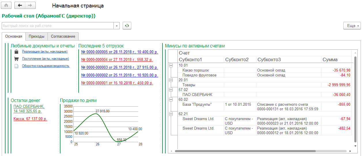
A person enters the program and immediately sees what he is interested in. First - links to documents and reports that he wants to use most often. Clicked on the link - went to the list of documents or report form.
Then the person, for some reason, wants to see the last few shipments. Well, he likes to follow the implementations, and that's it. And that they were painted - up to 10,000 rubles, let them be red, up to 100,000 rubles - blue, above - green. Today is not a very good day, there are no green shipments ... I clicked on the link - the document opened.
And the remnants of the money immediately see wants not to rummage through the reports. Let it be written on the desktop - separately for current accounts, grouped by banks, and the cash desk - in one line.
But you need to understand, not only the latest shipments, but also the dynamics? Let the sales by day be drawn in the form of beautiful graphics! From the beginning of the month, let's say. Then do not miss the negative trend.
And if the person is an intelligent chief accountant or deputy? It is necessary to look after the accountants so that they do not do the drawbacks in the revolving, otherwise I know them ... Let a simple, on active accounts, with all the necessary analytics, be drawn on the desktop. I will see a minus - I will punish ...
Let's go to the second tab of the desktop.
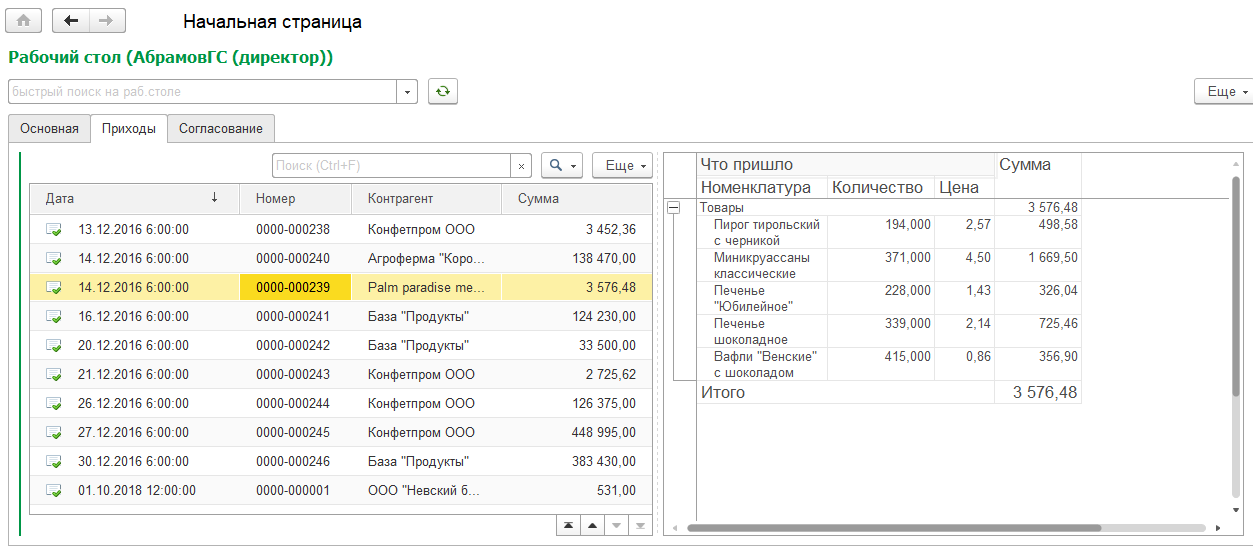
What do we have here? Quick view of receipts. On the left - the list of receipts, on the right - a small report that shows the contents of the document (goods, services, containers). You put the cursor on any document - otchetik redraws. No need to fall into the documents, scour the bookmarks and scroll tables.
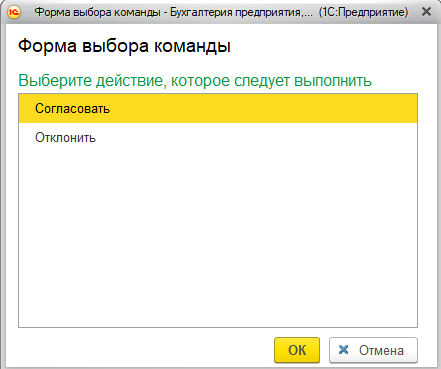
Let's go to the third tab.
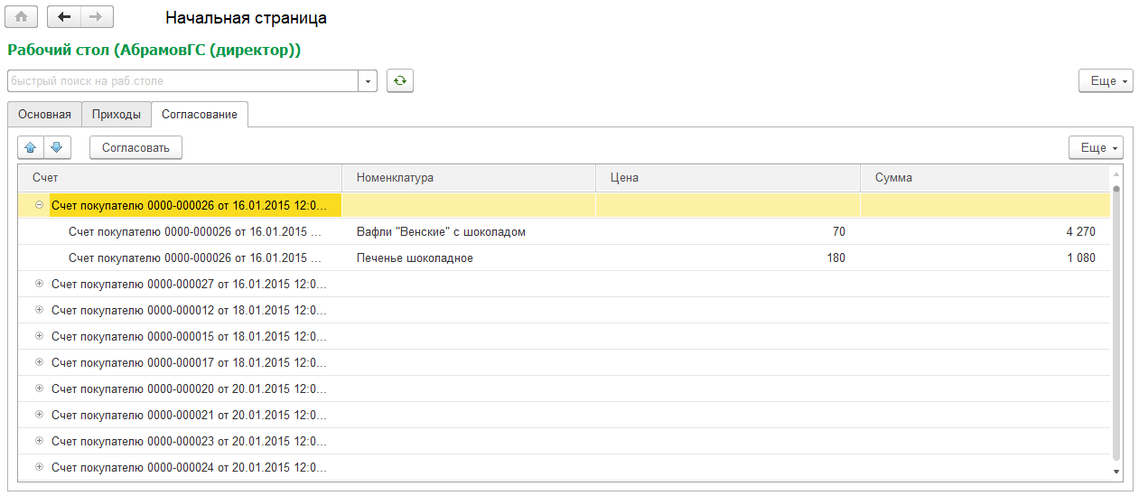
What we see? Accounts for payment, in the form of a tree. The first level is the invoice, the second is the nomenclature, price, amount. And just above the tree - the button "Agree". It so happens that in our company you need to coordinate invoices for payment. Why go somewhere, search and check? On the desktop we see the uncoordinated accounts, select the necessary ones, press the button - and voila! The reconciliation is done.
And what is the fourth tab?

Big button, what else. What she does? And what's the difference ... Let the secret be.
And what's the trick?
What is the trick, the reader will ask? Our programmers can also draw such bookmarks, with buttons, links, and reports. They only give access to the configurator, and in a couple of days it will be ready.
The point is that all the elements of the desktop are drawn without using the configurator . Do you know what the desktop looks like in the configurator? Like this:
The desktop does not know that it will have to draw a specific user. When 1C starts, then it finds out and draws.
All settings of the desktop and its elements are performed in the Enterprise mode. The demonstration table, the pictures from which you see in this material, is drawn in 2 hours.
Main features
Let's go over the main features that the desktop gives us. There are so many of them that the main problem is not to forget what. Well, new ideas - darkness.
Layout
Each user is assigned a desktop, i.e. in general there may be as many of them in the system. Settings of desktops are stored in the same directory. The layout of elements is performed according to the same principles as the drawing of controlled forms in the configurator.
You can draw an arbitrary number of groups, put them into each other, determine the orientation - vertical or horizontal, divide into pages, place elements.
This is how the desktop setup looks like:

Combining desktops
There are many users, and everyone wants an individual desktop. And what if five people need a pair of identical bookmarks? There is nothing easier - the user can be assigned several desktops at the same time . In the final form, a person will simply see bookmarks and items collected from all desktops.
Elements of the desktop
Elements of the desktop is such a reference. We painted it once, for example, a diagram or dynamic list, everything was set up, and you can use it in any number of desktops.
Basically, there are seven kinds of elements: a link to metadata, a report, a diagram, a set of links, a dynamic list, a tree, a button.
Metadata link
This is the easiest type of desktop item. Indicates the object of metadata - for example, the document “Sales of goods and services” or the report “T-balance sheet” - and that’s all, it will get to the desktop as a hyperlink.
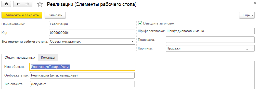
You can add a picture, override the title, change the font. When clicked, the corresponding form opens - a list of documents, a report form, etc.
Button
It is also a very simple element, but understandable only to programmers. Draws a button on the form, under which the command lies, and in it is the code you wrote. You can perform on the client, you can - on the server.
Commands are such a reference book. It is used not only for buttons, but also for handling clicks on elements of other types (more on this below).
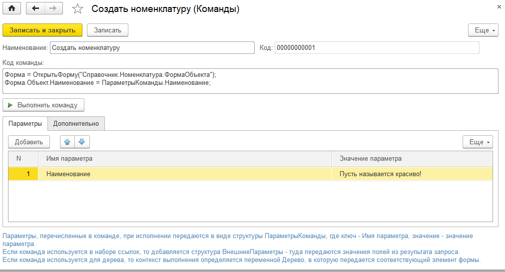
The code of desktop commands is usually associated with the information database data (as opposed to commands created in the configurator). For example, a button can create a reference item and fill in its details with specific values. Where to get these values?
In the configurator, you would have to either search by code, or fence specialized repositories of predefined references, or do constants in general. Here, the parameter table helps you (see the screenshot below) - specify the name of the parameter and value (primitives + any link), and use the command code.
Report
Usually, the hands immediately itch to bring to the desktop some typical report. But this is a bad thought.
There should not be long footcloths on the desktop, which then still need to be filtered, sorted and still long to dig into them. We need short, clear, focused reports for a specific user, showing a small amount of data or well-positioned problems.
Therefore, as a source of reports, the layout schemes used in the reference directory of the same name are used. Why throw out all revolving, if a person needs to see only the minuses? We call the programmer, he writes a request for 10 lines in 5 minutes, and we have only drawbacks.
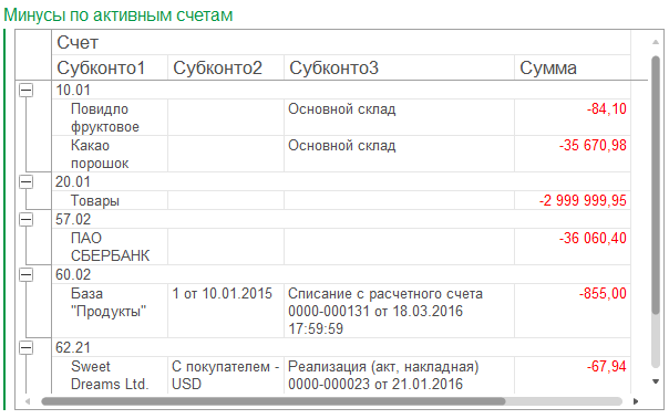
What is important - since you yourself write a small layout scheme, and even in the Enterprise mode, then you have the main thing at hand - the data and the context . You can make selections for specific organizations, departments or articles. You can filter by current user. And all this is in the layout itself, and not in the user's hands in the report version.
Diagram
Configured about the same as the report. Just write the layout, the result of which is displayed in the diagram. And then magic happens .
The usual diagram, formed by the layout in the form of a tabular document, looks scary. It does not adjust to the screen size, it does not fit into it at all, and nothing can be done about it - only by moving an object of the “Figure” type with a code after its formation. But living people do not.
The diagram drawn directly on the form looks much better. This is a normal control that can scale, does not look alien and, in general, is quite pleasant.
I will show in the picture to make it clearer. At the left - the standard chart in the tabular document, on the right - the chart on the form.
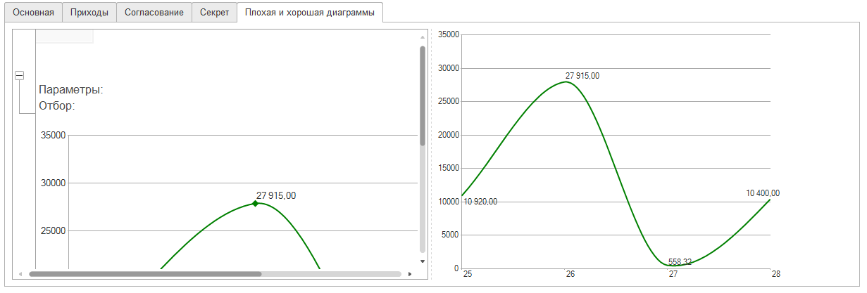
How can you afford to use the chart on the left? Of course not. Only normal, scalable and built into the form of the diagram on the right. On the first screenshot there was the same diagram - they saw how small it is there, but at the same time - quite readable?
And the magic mentioned is that the desktop itself pulls the chart out of the tabular document and transfers it to the form. Series, points, design - all drags that is bad. The programmer simply writes the layout, and gets a beautiful diagram. Without a desktop, this would have to draw code.
Dynamic list
The principle is the same as in reports and charts. The programmer writes the layout scheme - what he wants to see in the dynamic list. Fields selects, sorting, formatting, selections, etc. - everything you need for a comfortable presentation of data.
And the desktop takes a query, creates a dynamic list on the form, slips the query text, selections, sorting, conditional design, etc. into it. And that's it, the list is ready.
Also, you can control some properties of the list. For example, the main table - if it is specified, the element will behave like the usual form of a list. You can control the ability to add data, manage their order.
Tree
Almost one to one - a dynamic list. The same layout scheme, also copying selections and design, only a tree is drawn on the form, not a dynamic list. And you can display any data.
In the tree, respectively, you can do the grouping. The number of nesting levels is unlimited.
Commands can be connected to the tree (from the “Commands” directory mentioned above). Each team will draw a button on the tree pane (as in the screenshot of the “Negotiation” page). When you click on a button, the context is passed to its code - a tree. Accordingly, the programmer can do with it and his data everything that comes into his head. For example, change the details of the object, which the user indicated in the tree.
Link set
The most useful and interesting, in my opinion, element. It allows you to display on your desktop links to specific data - for example, on implementations, tasks, orders, etc.
For example, on the first screenshot we had the last 5 implementations:

So, this is a set of links. Under it lies the same layout scheme, which collects the necessary data for a particular person and displays on the screen. No tabular documents, transcripts, heaps of columns and double clicks of the mouse. Just a hyperlink to the desired object.
A set of links is especially useful when a person needs to display objects with which he has to do something. For example, agree on a contract or an application for the expenditure of money. The programmer writes a request that filters objects by the current user, and voila - no need to go anywhere, filter, search and understand anything. I clicked on the link, immediately hit the object, did what was necessary - and the object disappeared from the desktop.
You can display the link as is. You can override the view, as in the screenshot above - leave the number and date, add the amount. You can paint in any color, depending on the data - for example, highlight overdue with red. You can even change the font size.
You can connect an arbitrary number of commands to a set of links. If there are no commands, then by pressing the object under the link will simply open. If there are several commands, the choice of action will open:
What is important is that not only the link is transferred to the execution context of the command, but also all the fields that the request returned. There is only a link on the form, and the request could return the status of the mutual settlements, the reliability of the counterparty, and the availability of the necessary goods in the warehouse — anything. And all this can be used inside the team.
Other features
By default, the dimensions of all elements of the desktop are calculated automatically based on the amount of free space. But, if you really want, the width and height of each element can be controlled, as well as its stretching vertically and horizontally.
For each desktop, you can turn on auto-update with a certain frequency.
There is also an exotic mode - automatic switching of desktop tabs. Living people do not need this, but we had such an example - they included a thin client on the TV, there was a desktop with a bunch of diagrams, and the bookmarks switched automatically. The TV hung in the office, everyone looked at him and understood how well they work.
Layout options
Layout options - countless, how much fantasy. For example, you can turn your desktop into a dashboard:

The diagrams in platform 8.3 look very nice, so it's very nice to look at such a desktop, agree. On the desktop, they are also pleasant to the touch - watch the video .
And if someone says that all these diagrams are nonsense for managers, you can draw a simple, ascetic desktop consisting of only the necessary documents, reference books and reports.
Development
The desktop has a huge development potential. There is still so much you can and should do that is enough for several years. And internal optimization, and new features, and design chips.
We will develop the desktop, in the wake of the practice of its use, new features of the platform and our ideas about the beautiful.
')
Source: https://habr.com/ru/post/443334/
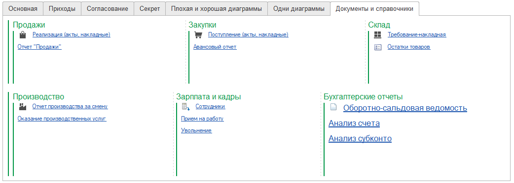
All Articles