Eight named laws in UX design (part 1)
In UX design, as in any other field of activity, has its own principles and laws. In this article I would like to make out eight of them, which are named after their creators.
general law relating to sensory-motor processes, which relates movement time to movement accuracy and distance of movement: the further or more precisely the movement is performed, the more correction is needed to perform it, and accordingly, more time is required to make this correction.
In other words, the larger the size of the object, the less time it takes the user to get through it.
')
Mathematically, the law is written as follows:
Source: wikipedia
This law has one curious nuance: the size of any screen is limited, and the elements that are on the borders have a conditionally infinite width - because the cursor, when trying to get into them, will simply rest on the edge of the screen. And this saves a lot of time to achieve the goal, including due to the lack of a phase of inhibition.
From this it follows that the corners are the most easily accessible places on the screen. We can instantly move the cursor to any angle, not paying attention to the actual dimensions of the element - and still get into it.
It is not by chance that in operating systems, important elements are in the corners: a Windows icon or an apple in MacOS.
Jeff Raskin, a computer interface specialist, usabilityist, in his book Interface, thought that it took an average of 0.6 seconds for a person to use the menu on MacOS, while on Windows this operation takes 1 second.
This is because the menu in Windows used to be located with some indentation from the top, because the name of the program was at the top, and you had to aim.
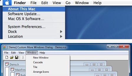
MacOS and Windows menus
If you calculate that a person clicks the menu 1000 times a day, he will save about 400 seconds if he uses a Mac. In a year it is about 2400 minutes, or 40 hours.
Paul Fitts law is widely used in the design of interfaces, including mobile ones. With it, the designer can determine the optimal size and location of buttons, links and other elements on the screen, depending on what action he wants to achieve from the user.
Here are a few recommendations to help improve your application now:

Sketch modal window
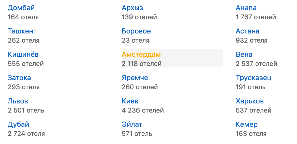
List of cities Booking.com
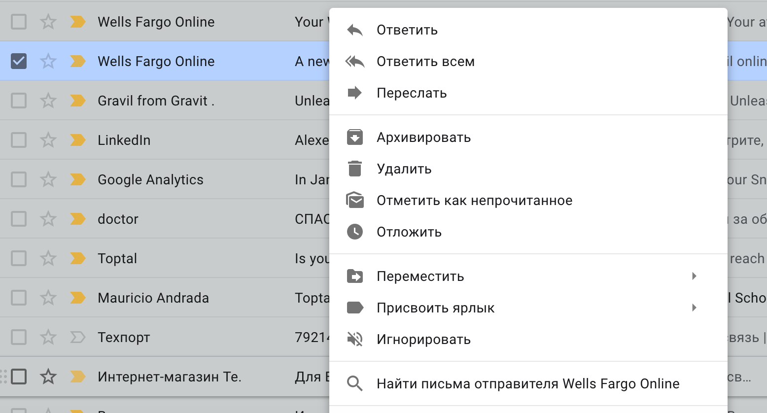
Gmail context menu
BJ Fogg is a scientist and writer, founder of the behavioral design laboratory at Stanford.
Based on his model:
An act is a consequence of three factors: motivation, opportunity, and incentive, which intersect at the same time.
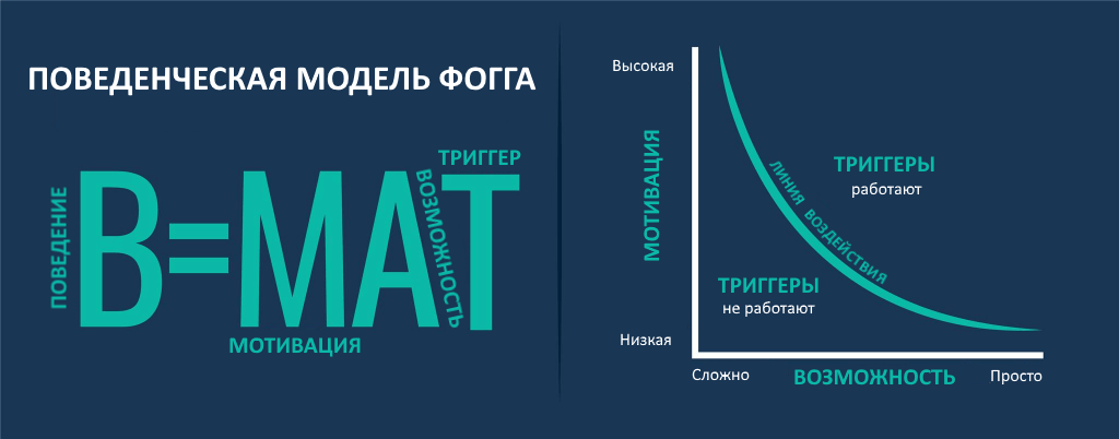
Source: seonews.ru
In the picture there are two axes: vertical - this is the axis of motivation, the higher it is, the greater the motivation to action. Horizontal is the axis of opportunity. And the diagonal arc is a line of influence, a kind of line, beyond which an action will be performed on the trigger. If any of the variables of the formula is missing or insufficiently expressed, the consumer will not cross this line, and the action will not be committed.
Fogg believes that motivation is built on three key points:
Opportunity is a person’s ability to perform an action.
Here you need to understand that opportunity is not a property of a product, but a property of a person and the context in which it is located.
For example, it will be much more difficult for an elderly person to enter meter readings into a mobile application than you and me.
Fogg describes several factors that make up the notion of possibility:
How can we increase opportunity?
A trigger is a kind of event that can change our behavior.
Anything can be an incentive for an action: an alarm clock, a notification, a phone call, a seen picture / image, a phrase heard, and much more.
Depending on what level of motivation and opportunity, different types of triggers are applied.
Thus, when the level of motivation and opportunity is above the line of influence, it is the trigger that forces the person to perform an action, but if the required level is not reached, then the stimulus will lead nowhere.
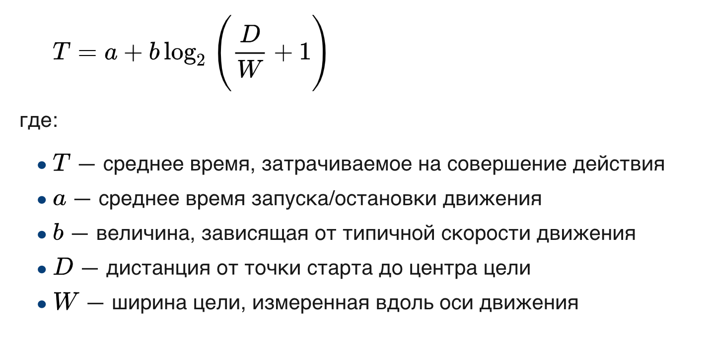
Hick-Heyman's law is a experimentally confirmed theory that the amount of information that enters the human brain affects the time it spends on making a decision.
In 1952, psychologists William Hick and Ray Hyman derived a formula that describes the logarithmic relationship between the reaction time and the number of options from which to make a choice.
T = a + b * log2 (n + 1)
Where:
For clarity, let's build a graph:
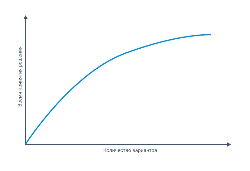
It follows from the graph that as the number of objects increases, the response time in logarithmic dependence also increases.
Thus, the smaller the objects, the faster and easier it is to select the desired one.
Hick's law is widely used in interface design, for example, when creating drop-down menus, registration forms, contact forms, navigation menus, and more.
Suppose your site has about 40 menu sections. The question is how to display them? Group menu items into categories. This will reduce the number of options, and, consequently, reduce the cognitive load on the user. As an example, almost any online store appliances or clothing.
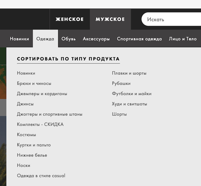
Asos.com menu sections
Another example is the use of a wizard for massive forms. Instead of showing all the form fields at once, divide the form into steps, and at each step ask only what is required.
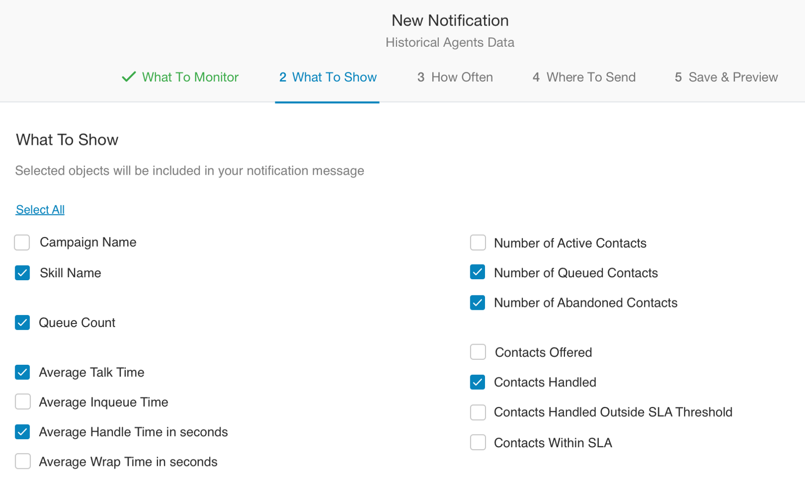
Ringcentral Pulse notification creation form
Also, the application of the Hick-Hyman law is justified in a situation where the time for the operation is critical. In a stressful situation, when the user turns on the tunnel vision.
Your users want your website / application to look and work the same way as others. Site navigation should leave a feeling of lightness and complete control.
Indeed, most of the time your users spend on other sites, use other applications.
Therefore, when familiar patterns are used, and various controls are in those places where the user expects to see them, he does not worry that something suddenly goes wrong. On the contrary, he can use the accumulated experience of Internet surfing, easily interacting with your product.
For example, an ordinary user is used to the fact that the menu navigation of a site or application is on top, less often on the left, that account information is in the upper right corner, and that by pressing the ESC key he can close the modal window or close the drop-down list.
The more your product meets the user's expectation, the more it feels control over it. Calm interaction with the system causes trust, the product begins to like the user, and he spends more time working with him.
Thus, even before they go to your site, people form certain expectations regarding their behavior based on their experience in using other sites. If you violate these principles, the site is difficult to use, users leave it.
To be continued…
Fitts Act
general law relating to sensory-motor processes, which relates movement time to movement accuracy and distance of movement: the further or more precisely the movement is performed, the more correction is needed to perform it, and accordingly, more time is required to make this correction.
In other words, the larger the size of the object, the less time it takes the user to get through it.
')
Mathematically, the law is written as follows:
Source: wikipedia
This law has one curious nuance: the size of any screen is limited, and the elements that are on the borders have a conditionally infinite width - because the cursor, when trying to get into them, will simply rest on the edge of the screen. And this saves a lot of time to achieve the goal, including due to the lack of a phase of inhibition.
From this it follows that the corners are the most easily accessible places on the screen. We can instantly move the cursor to any angle, not paying attention to the actual dimensions of the element - and still get into it.
It is not by chance that in operating systems, important elements are in the corners: a Windows icon or an apple in MacOS.
Jeff Raskin, a computer interface specialist, usabilityist, in his book Interface, thought that it took an average of 0.6 seconds for a person to use the menu on MacOS, while on Windows this operation takes 1 second.
This is because the menu in Windows used to be located with some indentation from the top, because the name of the program was at the top, and you had to aim.
MacOS and Windows menus
If you calculate that a person clicks the menu 1000 times a day, he will save about 400 seconds if he uses a Mac. In a year it is about 2400 minutes, or 40 hours.
Paul Fitts law is widely used in the design of interfaces, including mobile ones. With it, the designer can determine the optimal size and location of buttons, links and other elements on the screen, depending on what action he wants to achieve from the user.
Here are a few recommendations to help improve your application now:
- Increase the click area for checkboxes and switches. Make labels for these items clickable. This will reduce the number of user errors.
- Arrange the controls in your application so that they are all located along the main user scenarios.
- Make more indentation between mutually undesirable buttons, for example, “Save” and “Delete”
Sketch modal window
- For the list of links, make not only the labels, but all the lines, clickable.
List of cities Booking.com
- Use the popup menu at the cursor location. This will reduce the time spent moving the mouse.
Gmail context menu
Fogg's behavioral model
BJ Fogg is a scientist and writer, founder of the behavioral design laboratory at Stanford.
Based on his model:
An act is a consequence of three factors: motivation, opportunity, and incentive, which intersect at the same time.
Source: seonews.ru
In the picture there are two axes: vertical - this is the axis of motivation, the higher it is, the greater the motivation to action. Horizontal is the axis of opportunity. And the diagonal arc is a line of influence, a kind of line, beyond which an action will be performed on the trigger. If any of the variables of the formula is missing or insufficiently expressed, the consumer will not cross this line, and the action will not be committed.
Motivation
Fogg believes that motivation is built on three key points:
- people want to have fun and avoid pain;
- people want to have hope and avoid fear;
- people want social recognition and avoid social hostility.
Opportunity
Opportunity is a person’s ability to perform an action.
Here you need to understand that opportunity is not a property of a product, but a property of a person and the context in which it is located.
For example, it will be much more difficult for an elderly person to enter meter readings into a mobile application than you and me.
Fogg describes several factors that make up the notion of possibility:
- Time, time spent on the action;
- Money, financial costs of the action;
- Physical effort, the amount of labor that will require action;
- Mental effort, mental exertion, concentration, memory, and concentration needed to perform an action;
- Social acceptability, i.e. how much this action will be approved by society.
How can we increase opportunity?
- We can train a person so that he can perform the target action.
- We can give him a tool or resource to make the action easier.
- Or we can forgive the very purposeful action.
Stimulus or trigger
A trigger is a kind of event that can change our behavior.
Anything can be an incentive for an action: an alarm clock, a notification, a phone call, a seen picture / image, a phrase heard, and much more.
Depending on what level of motivation and opportunity, different types of triggers are applied.
Thus, when the level of motivation and opportunity is above the line of influence, it is the trigger that forces the person to perform an action, but if the required level is not reached, then the stimulus will lead nowhere.
Hick-Hyman Act
Hick-Heyman's law is a experimentally confirmed theory that the amount of information that enters the human brain affects the time it spends on making a decision.
In 1952, psychologists William Hick and Ray Hyman derived a formula that describes the logarithmic relationship between the reaction time and the number of options from which to make a choice.
T = a + b * log2 (n + 1)
Where:
- T is the total reaction time
- a - delay before the assignment
- b - individual rate of decision making
- n - the number of options from which to choose
For clarity, let's build a graph:
It follows from the graph that as the number of objects increases, the response time in logarithmic dependence also increases.
Thus, the smaller the objects, the faster and easier it is to select the desired one.
Hick's law is widely used in interface design, for example, when creating drop-down menus, registration forms, contact forms, navigation menus, and more.
Suppose your site has about 40 menu sections. The question is how to display them? Group menu items into categories. This will reduce the number of options, and, consequently, reduce the cognitive load on the user. As an example, almost any online store appliances or clothing.
Asos.com menu sections
Another example is the use of a wizard for massive forms. Instead of showing all the form fields at once, divide the form into steps, and at each step ask only what is required.
Ringcentral Pulse notification creation form
Also, the application of the Hick-Hyman law is justified in a situation where the time for the operation is critical. In a stressful situation, when the user turns on the tunnel vision.
Use Hick's law and Fitss's law together. Since these laws describe the actions that usually follow each other: to make a choice and get into the right element.
Jacob Nielsen's Law
Your users want your website / application to look and work the same way as others. Site navigation should leave a feeling of lightness and complete control.
Indeed, most of the time your users spend on other sites, use other applications.
Therefore, when familiar patterns are used, and various controls are in those places where the user expects to see them, he does not worry that something suddenly goes wrong. On the contrary, he can use the accumulated experience of Internet surfing, easily interacting with your product.
For example, an ordinary user is used to the fact that the menu navigation of a site or application is on top, less often on the left, that account information is in the upper right corner, and that by pressing the ESC key he can close the modal window or close the drop-down list.
The more your product meets the user's expectation, the more it feels control over it. Calm interaction with the system causes trust, the product begins to like the user, and he spends more time working with him.
Thus, even before they go to your site, people form certain expectations regarding their behavior based on their experience in using other sites. If you violate these principles, the site is difficult to use, users leave it.
To be continued…
Source: https://habr.com/ru/post/443306/
All Articles