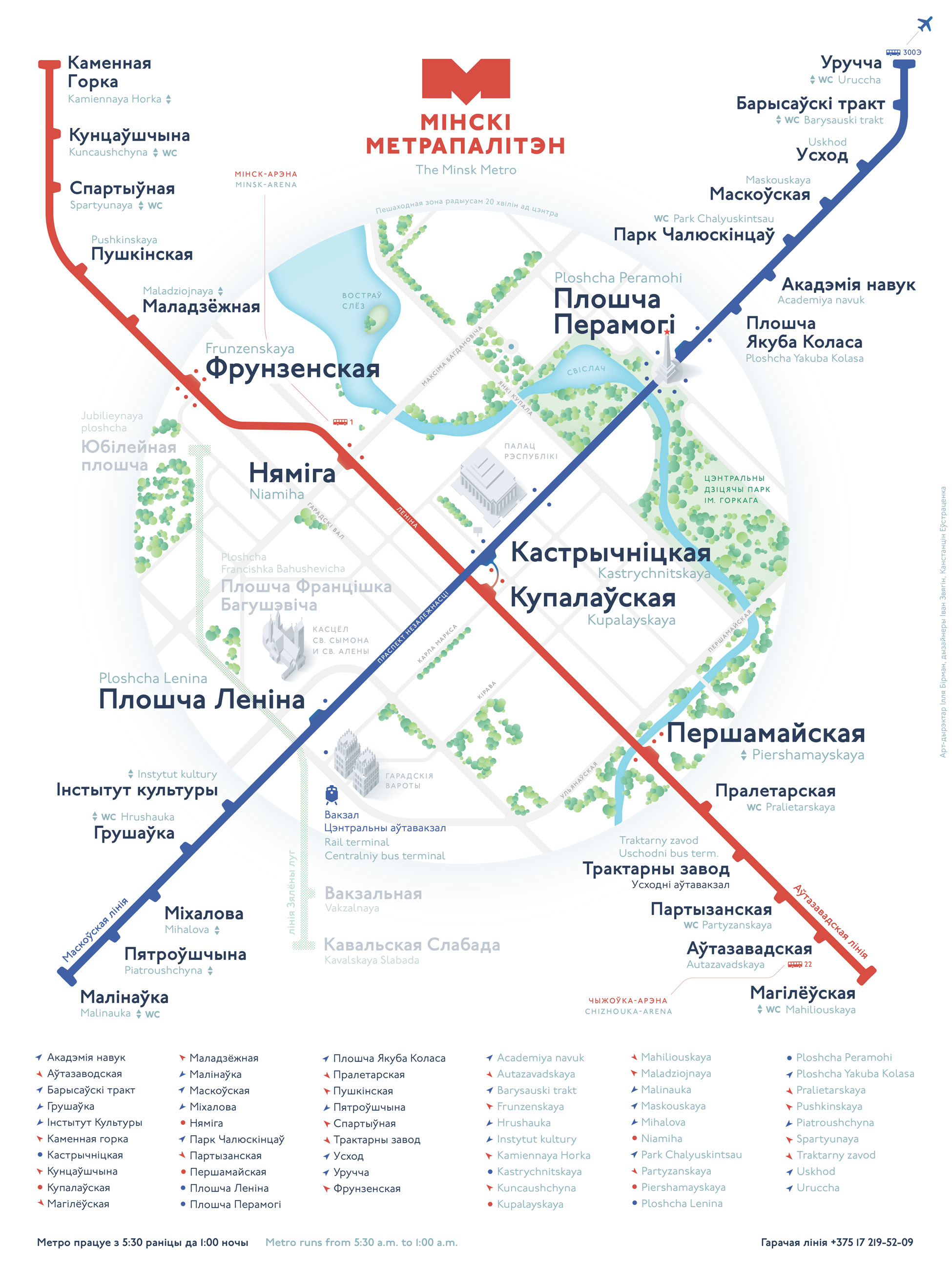
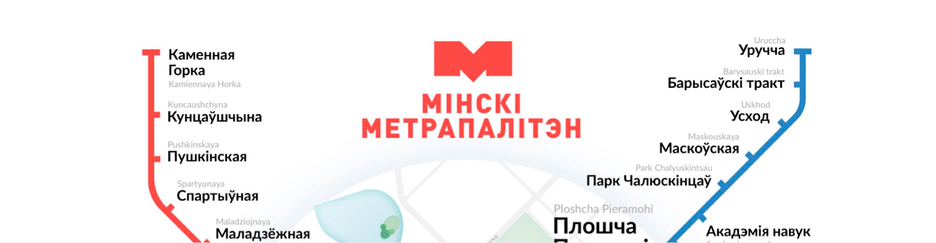
How did we make the metro scheme of Minsk
As promised, this post will discuss the process of creating the Minsk metro scheme.
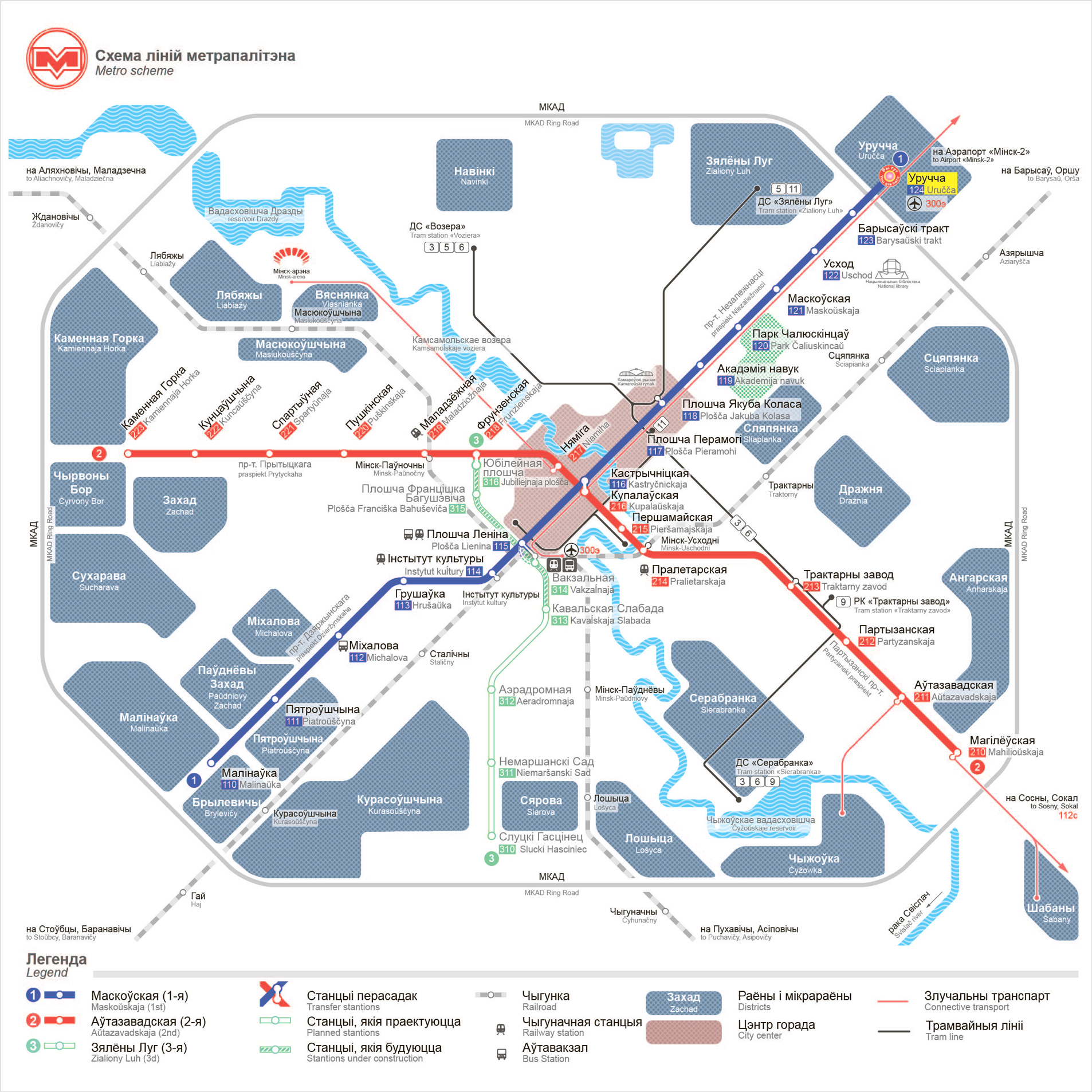
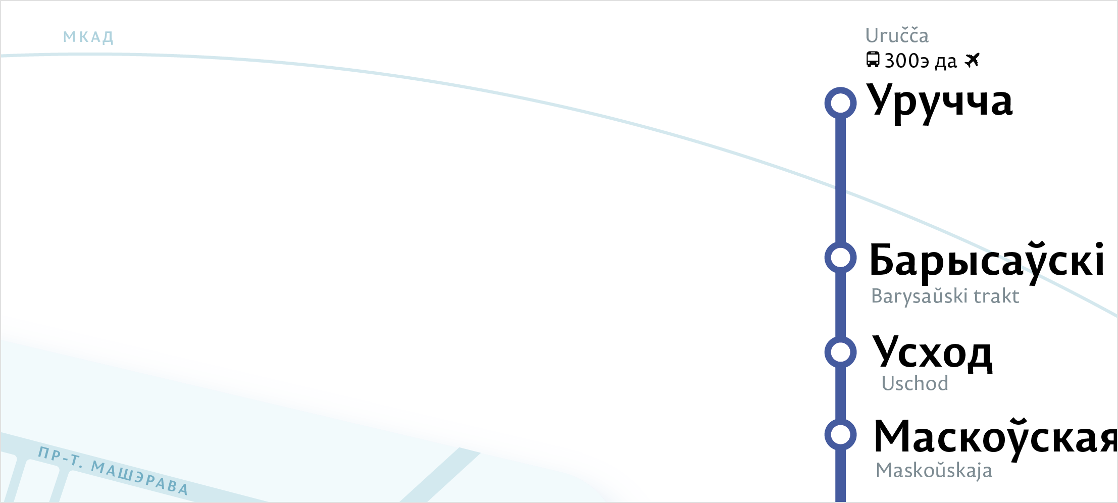
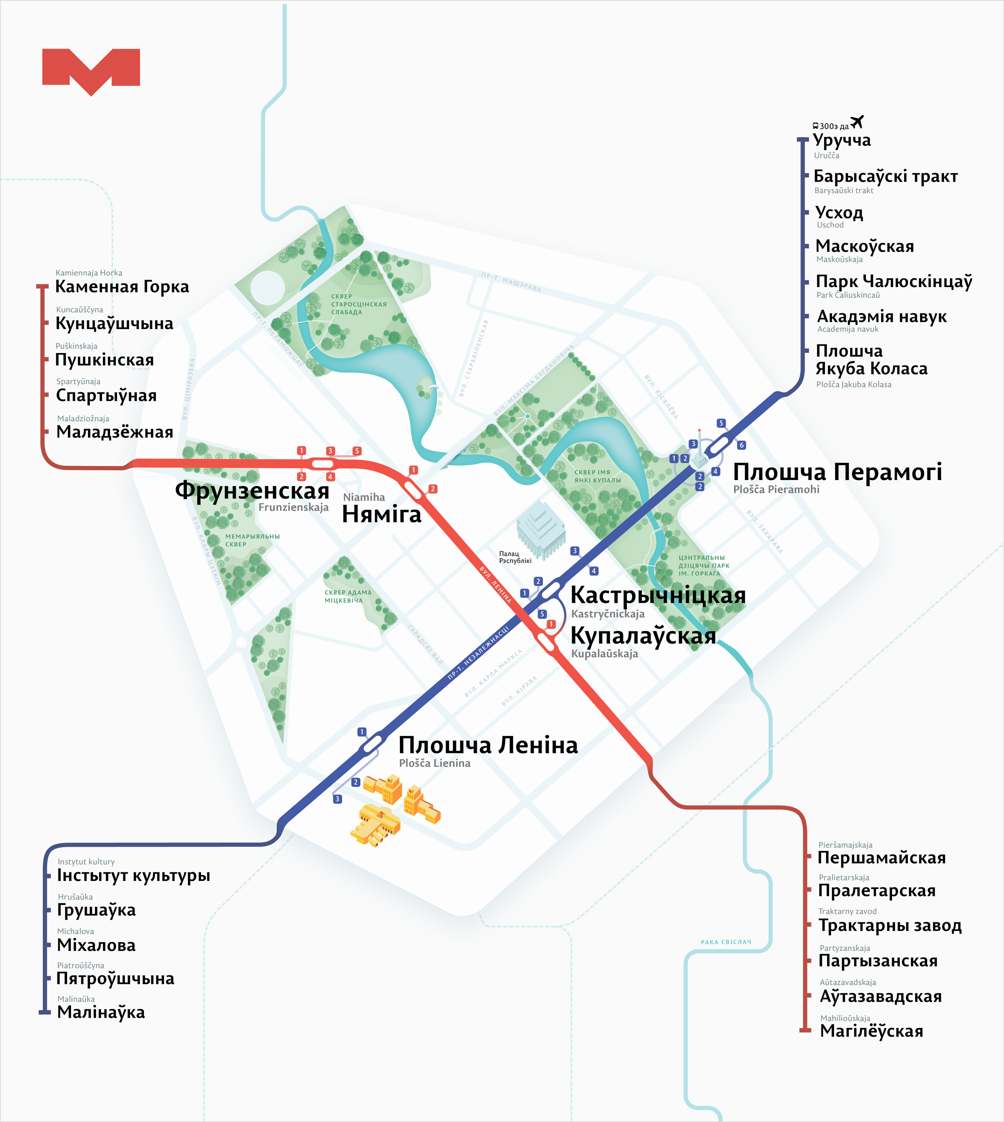
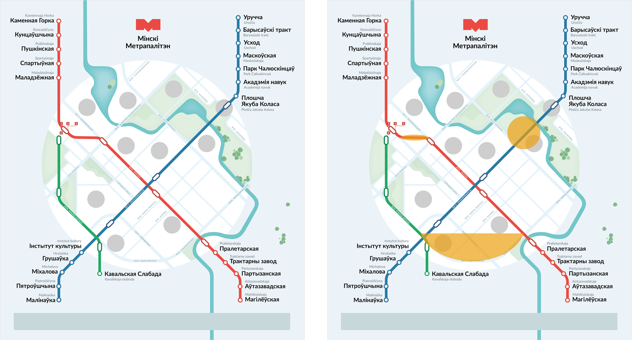
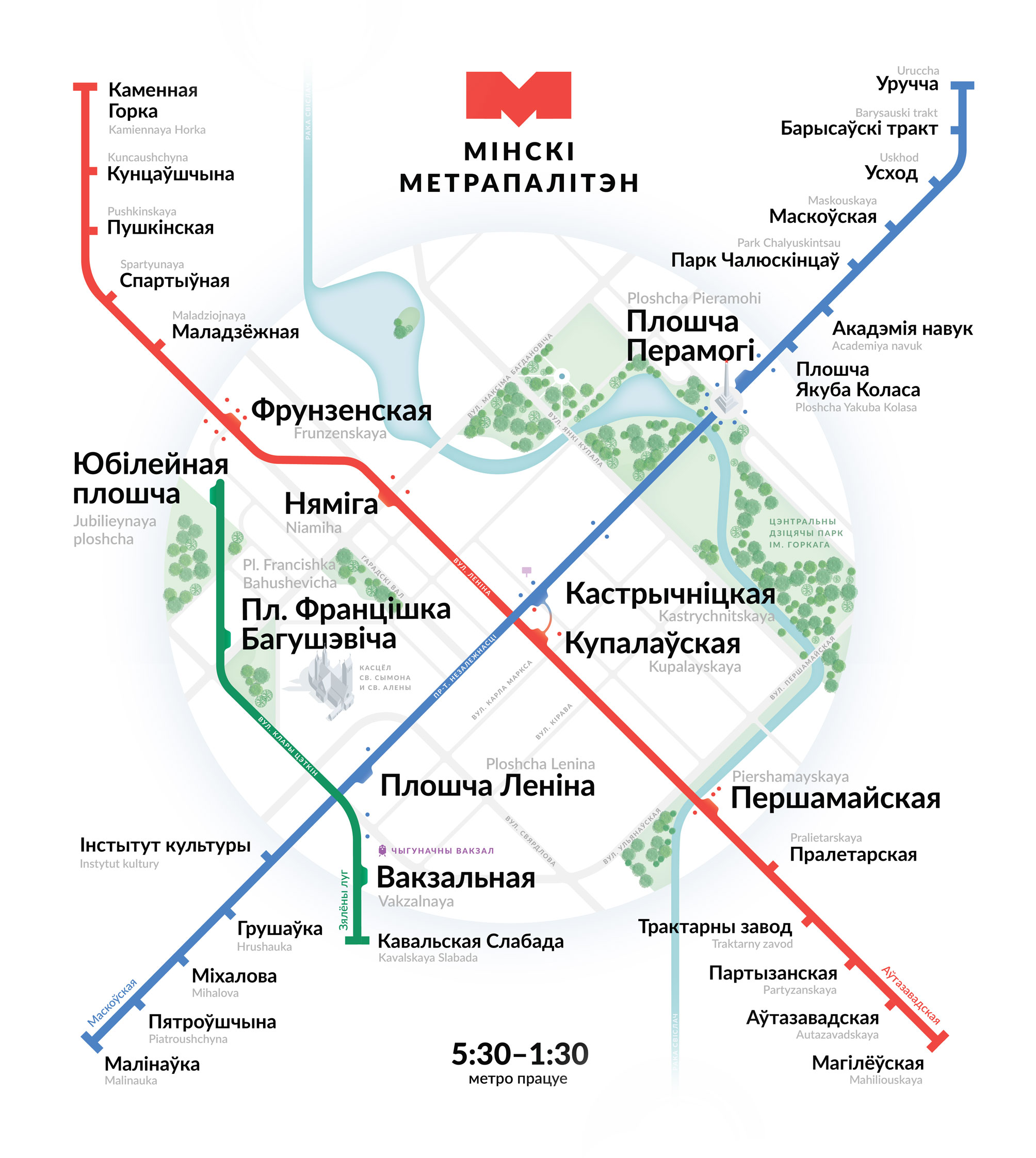
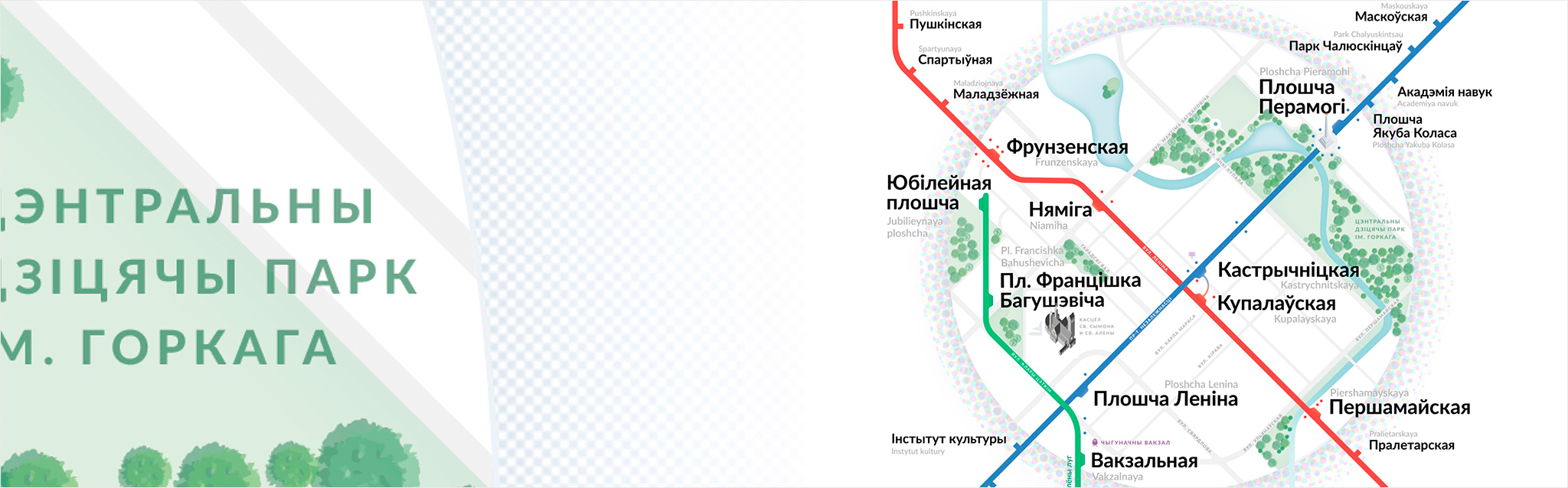
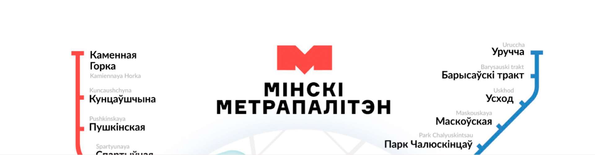
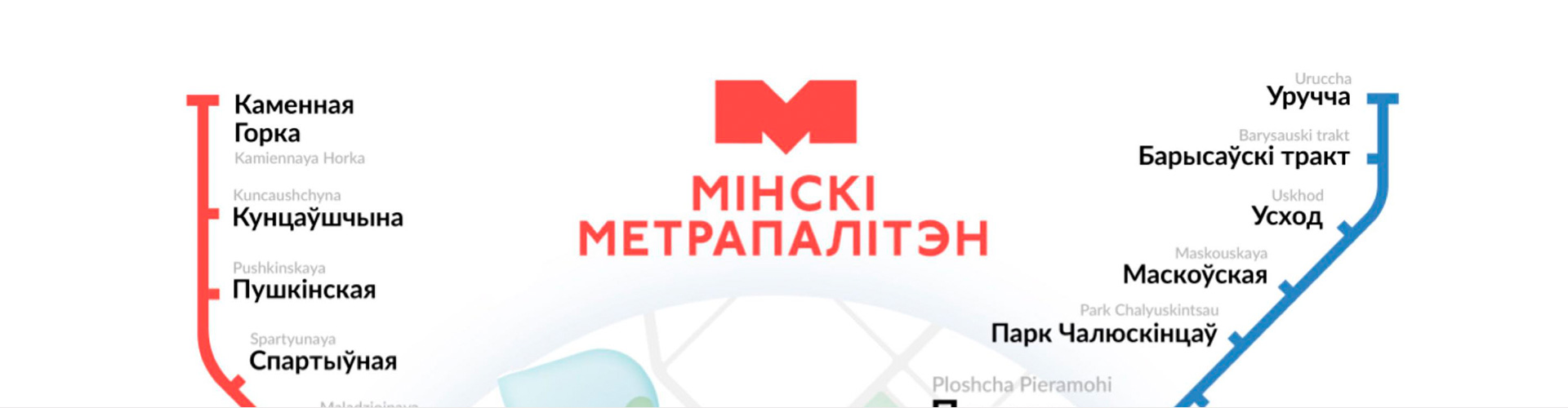
The idea to draw the Minsk metro scheme came to my mind when I saw an updated version from domestic designers. They are, in test mode, hanged at some stations. It so happened that we met her face to face on the platform of the Uruchye metro station. She looks like this:
I thought that you can make it much easier and more informative by throwing out the excess and placing the accents correctly.
')
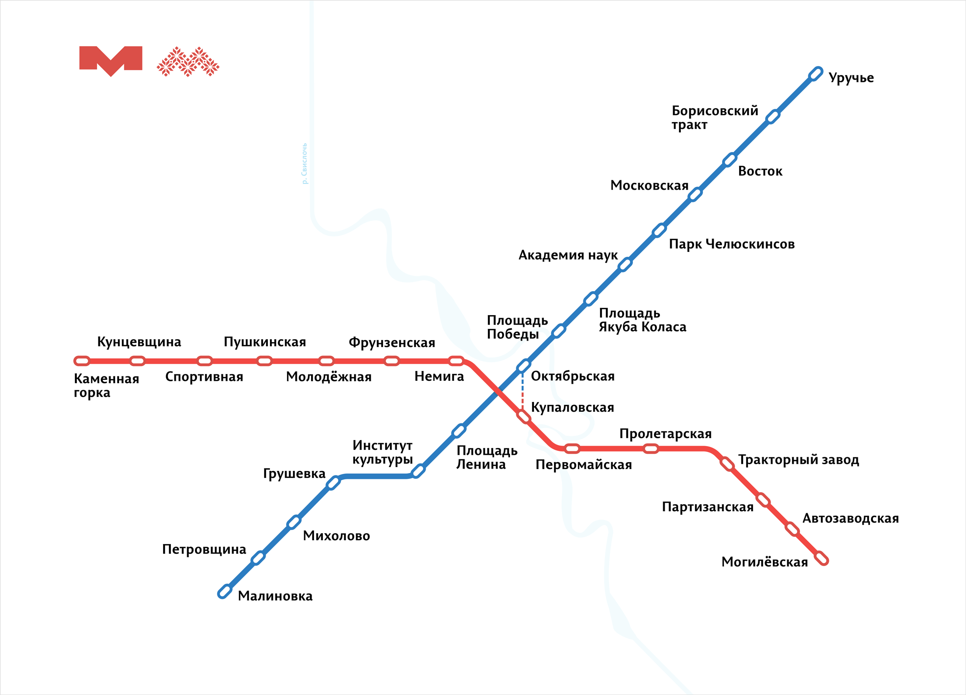
He began to collect a collection of good schemes and came across the cool tips of Ilya Birman. I looked at the schemes from the portfolio, I was impressed. After reading the description of the creation of the Ekaterinburg metro scheme, I realized that I could write a letter to Ilya, ask for advice. Quickly sketched the first version at the level of sufficiency and sent a letter. This is how the first version looked like:
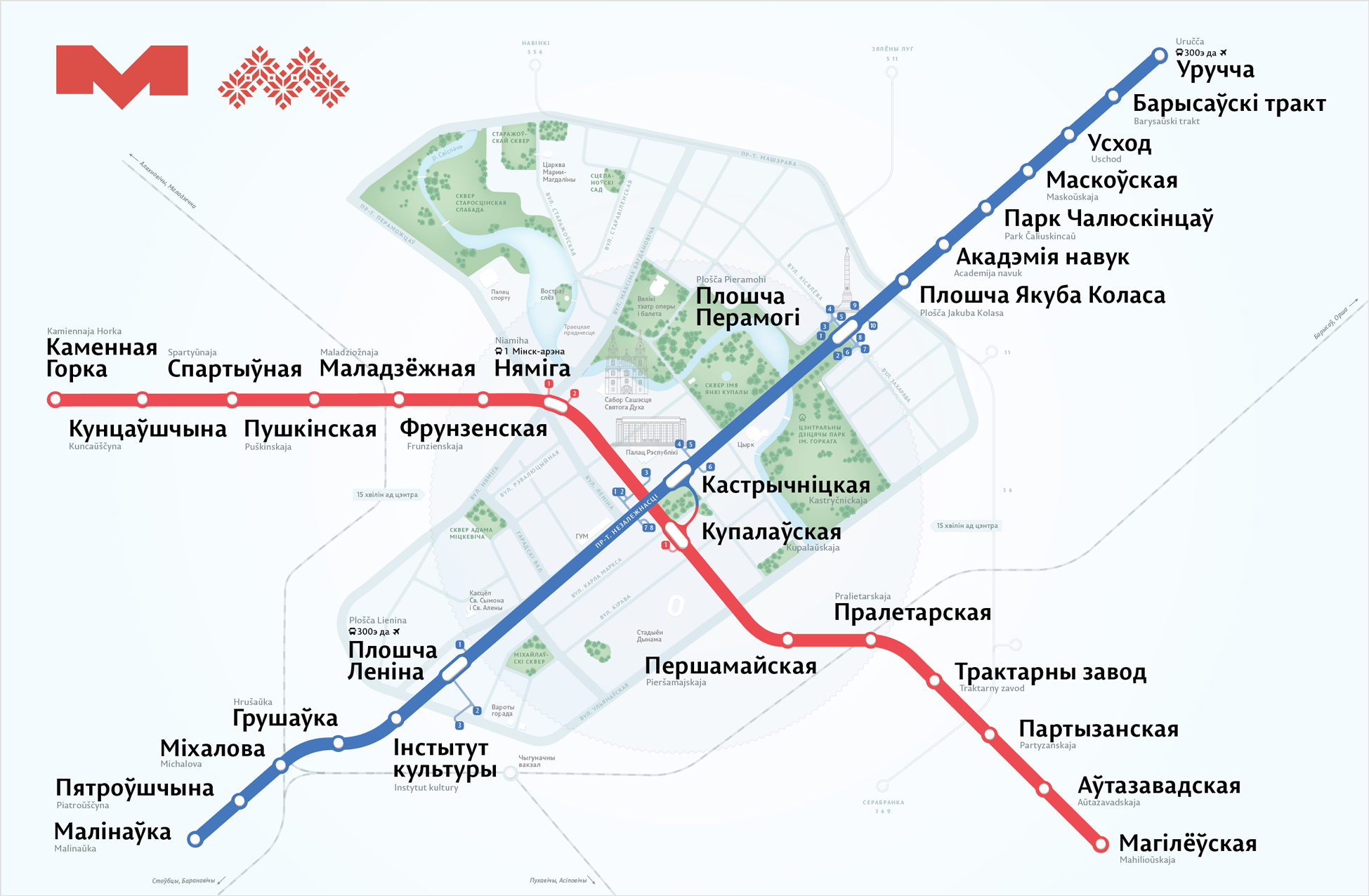
Ilya agreed to participate in the role of art director and productive work began. By the way, I knew the Illustrator very poorly and never did a subway map or something like that. A week later, Ilya suggested painting the city in detail:
At about this moment another designer Kostya Evstratenko joined us. We immediately divided the areas of responsibility and figured out how we will continue to work. Kostya took the isometric sights, and I do the rest. We also came to the conclusion that you need to show the national library, sports arenas, a new branch, railway and auto stations.
In order to understand even better the application of parks and rivers on maps, Kostya asked a few questions in the Bureau’s council heading. A few days later Ilya gave us detailed answers about rivers and parks. I went to an active joint development, so I will further divide the note by months. Such navigation will help to navigate the process.
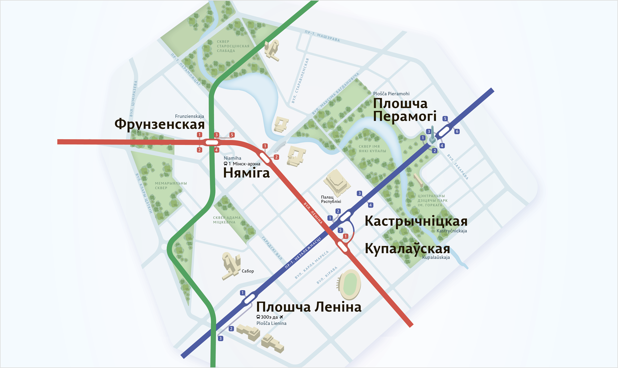
In February, we threw all our forces into the city center. Expand it, add a green branch. Made a list of streets that are included in it. I began to redraw lines and stations, chose a rounding radius of streets and lines, offered Ilya several options for stations in the center:

Kostya drew several drafts with different details, put everything together in a heap:
Added Moscow Ring Road, the line and the river behind the center. In the center, the stations were redone, four buildings were redrawn, a bridge was added. Prepared version on white background and on blue. Chose white, with him nicer:

Wrap and send Ilya. The next day we get a detailed response. Ilya does not like the overall colors, the buildings are too shiny, the shadow of the island is terrible.

Color schemes for buildings Ilya advised to look in the game Monument Valley. There are a lot of cool buildings.
Then I will talk about the process of work in March and April. Many people are surprised that we have done such work for 8 months. I want to clarify this point. Kostya and I gave the metro scheme no more than 7 hours a week. Overall, I spent a little more than 200 hours on this job. It doesn’t sound as powerful as 8 months.
In March, we were looking for a visual language. Having studied Ilya's edits, we remade the old version. First, the descents of lines from the island. They became smoother:
Next are the trees. We have collected a folder of files with different maps and schemes. Some of them were especially impressed:

Inspired and collected a new version. We tried different colors in the buildings and detailed them. Made new trees and the river. They added a gradient to the transition - it became better :) Smoothed the descents of the lines and the shadow of the central island. Outside the city, the stations were shown “hemp”. Used more native colors for the city:
We send to Ilya, we get the answer:
Ilya said that he liked the idea and asked to try to make the lines symmetrical. In Cubes, Kostya and I marked the buildings that we plan to draw. Another added green line for the test.
Here is a draft layout in the end:
Ilya's answer:
It became clear that the streets needed to be drawn at 45 °, breaking the geography. It looks more aesthetic and drawing has become easier. The hollow edges of the center decided to cut to increase the density.

In April, we tried to make friends with our Minsk circle in the center. They took a smaller part of the center as a basis so that it became denser. All streets at 45 °. Everything became a little bigger. Added a green branch. In the parks began to draw hills and trees. In the center there was a winking smile.
Ilya writes:
At the same time, I decided to try new station designations in the center and behind it. Behind the center are the usual hemp, in the center - more detailed.
Art director answer:
After a couple of days I collected the next version of the scheme and showed it to Ilya.
Ilya's answer:
In the font I wanted to somehow reflect Minsk. A little of the Soviet Union in modern packaging. We stopped at the font P22 Underground, we decided to try it on.
I tried the advice of Ilya. Took the colors of the lines from the London scheme. Stood like cool.
For the new shadow used a national ornament. The river remained only in the center, while the new font is only in the title. Plus, corrected trivia, which had not previously noticed: signatures, the location of translit and a dash.
It turned out a strong iteration. I collect the layout and send. Ilya replies:
Remarks are clear. Replaced the font everywhere and began to add icons near the stations. ATM, elevator for disabled people, toilet. It seems that this is important information.

It became clear that the icons are poorly visible. The pattern around the center begins to enrage, we remove it. The black signatures of the stations are under pressure; they need to be replaced with dark blue.
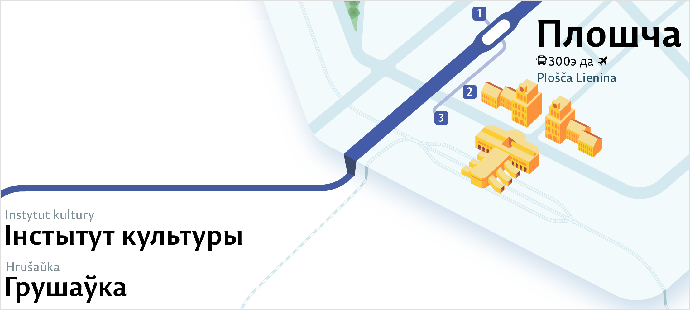
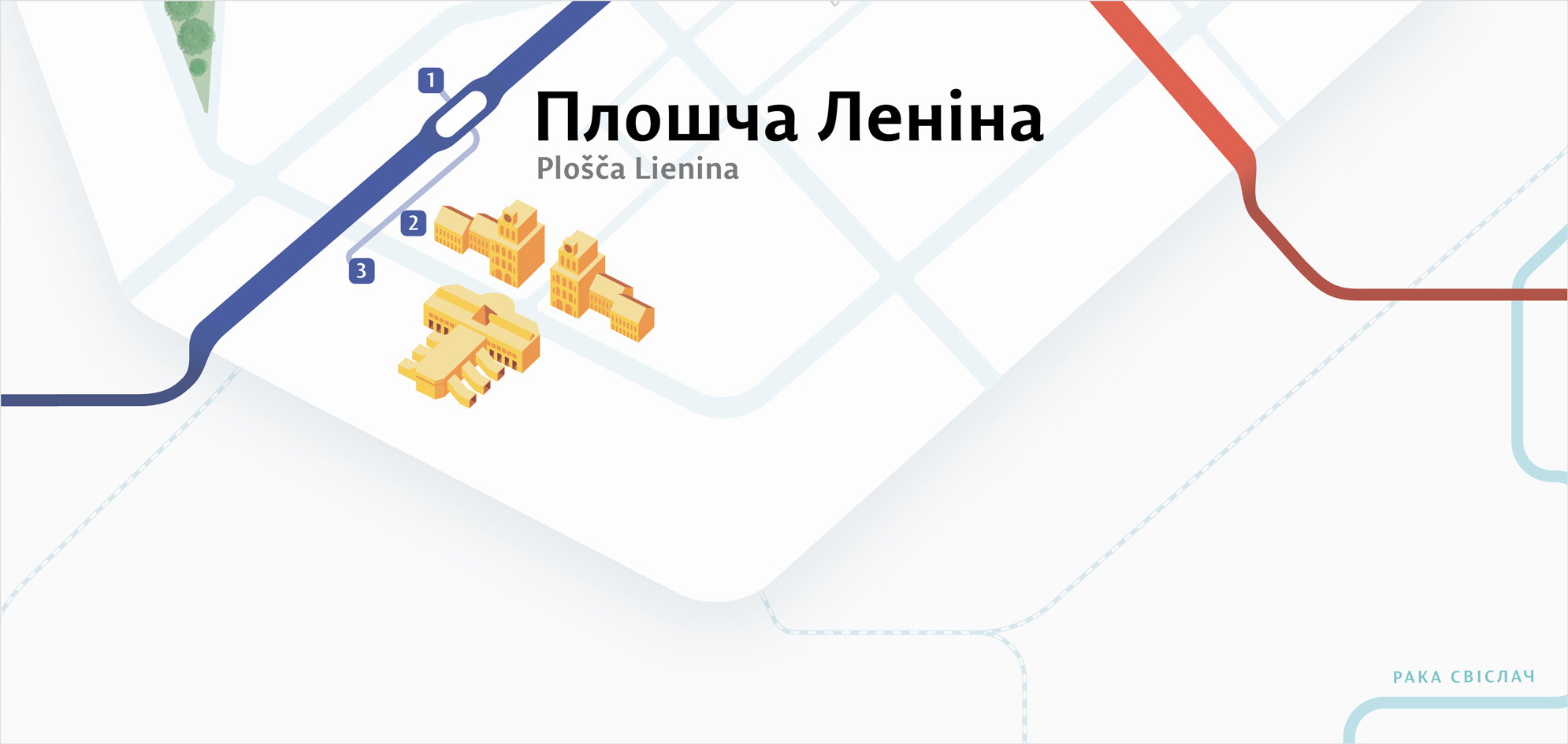
Signed how much to go on foot from the center, added the bus station and airport.

Then I realized that I did not like the way the river looked. Color and shape are weak. I also painted the arenas in more detail. Kostya was busy with buildings in the center, so I quickly sketched the arenas myself so that they were. Reversed the schedule.

By this time, Kostya painted the Towers near the station. Instead of one of the statues of the princess.
They added towers, drew a new island and all sorts of trivia.
Comments Ilya:
Remarks are clear, taken to work. On the way, Ilya and I had a dispute. We could not find a common solution for the direction of shadows in buildings and trees. Ilya offered to direct all the shadows down. We were behind the shadow on the side, it gave volume. Kostya in Cuba set an example.

We went to look for examples and measure different shadows on our buildings.

It turned out to convince Ilya that the shadow down looks not very. Agreed to throw a shadow to the right.
Collected the next version. The exit points are brighter. Signed island, river and bus station. They killed the train and removed the irregularities in the signatures.
Shadows did not have time to fix :-(
Signed stations and new shade trees. Replaced the squares on the circles at the exits from the stations and in the font. Made the elevator icons larger, drew a new one for the airport. Drew new bus routes. Collected a draft version of the alphabetical index.
Ilya:
Arenas decided to draw volume, but after the first release of the scheme.
Ilya:
I'm not sure I understood correctly, but I will show an interim solution.

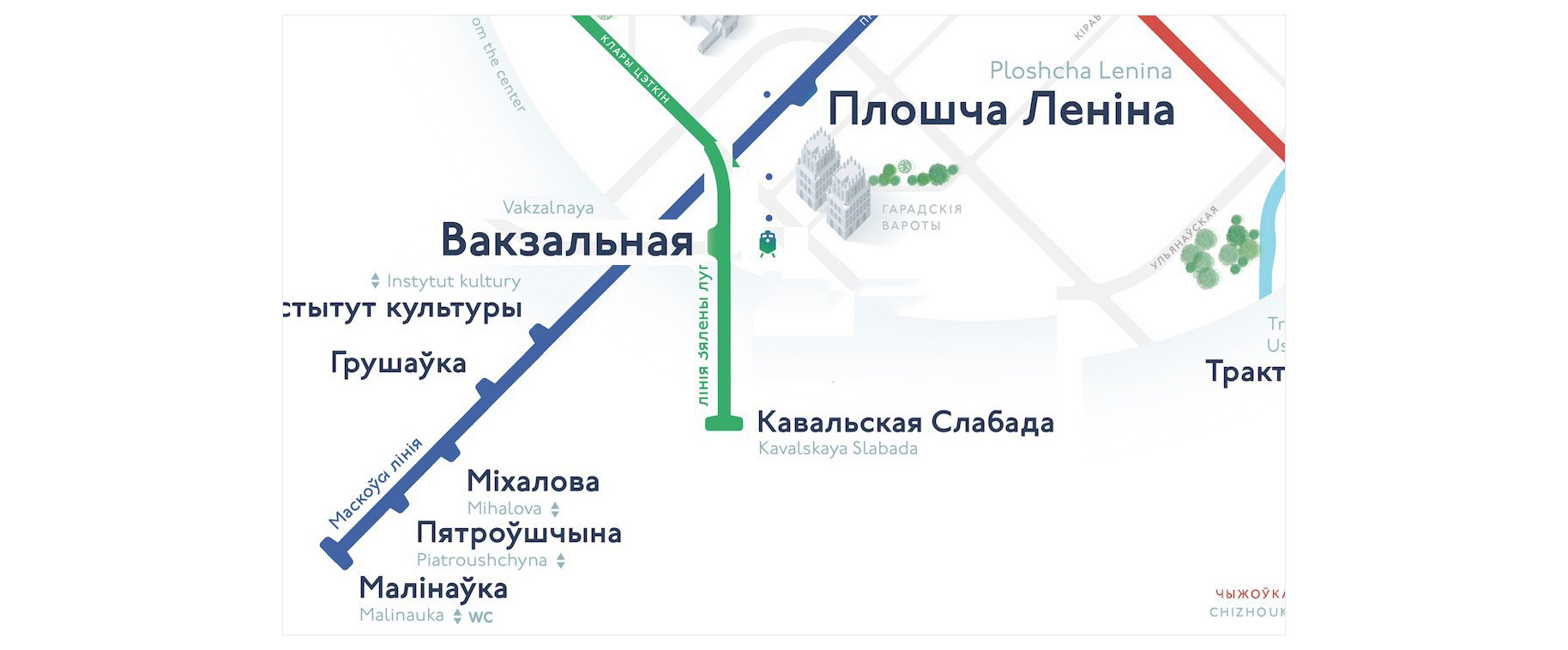
There is a small nuance. Now you can get to the station from the station "Lenin Square" without going outside. A "Vokzalnaya" is below the station and does not yet have a tunnel to it. And the train icon should be blue. Another station is right across the street from the "Gates of the City." This is all important to consider.
Ilya:
And then I had an idea. At first glance, it is obvious, but ... While the green line is being built, the “Vokzalnaya” station should generally be taken out of the center. Refined the comments and assembled the next version.
Ilya:
It seems that we have just come up with the coolest display of subway lines that are being built. Here is a draft.

I will show a clean copy after I tell about new trees. Yes, the trees. Ilya offered them to completely redraw them. Make them more modern graphic. I fought for the trees to the last, but now I am glad that we have changed them. I'll tell you a little about the process of their creation.
Ilya says:
My approach to trees:
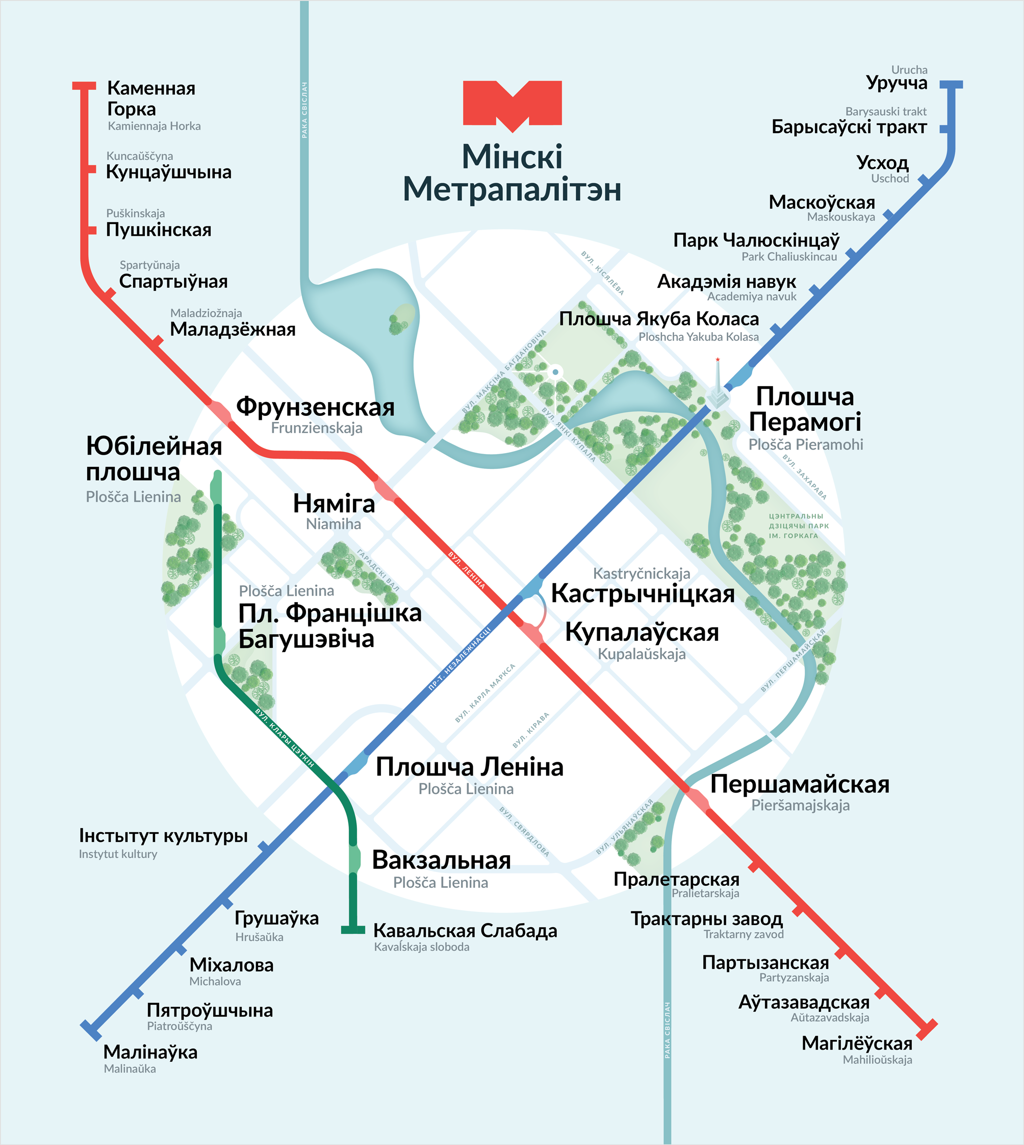
We stopped at the last version. Version with new trees and green line:
Ilya:
Kostya:
I sketched out several options for displaying signatures in English in narrow places.
And of course I won the first one. All Belarusian inscriptions should stand as if there are no English ones. Already after that, English are placed in a free place.
Temporarily killed elevators and toilets, but decided that we will do another approach in the second version. They also made a whole mountain of not very important trifles :-)
Ilya:
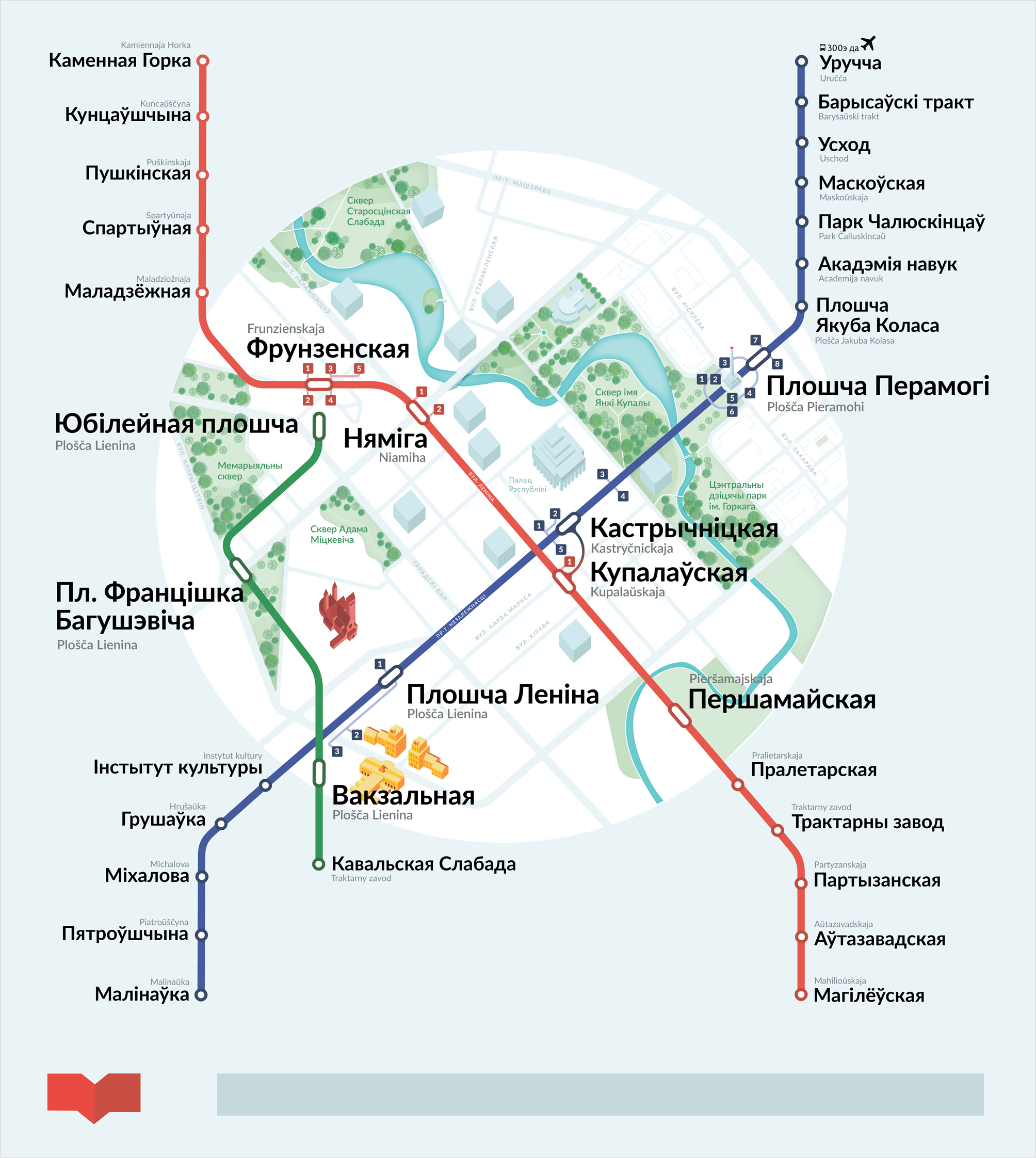
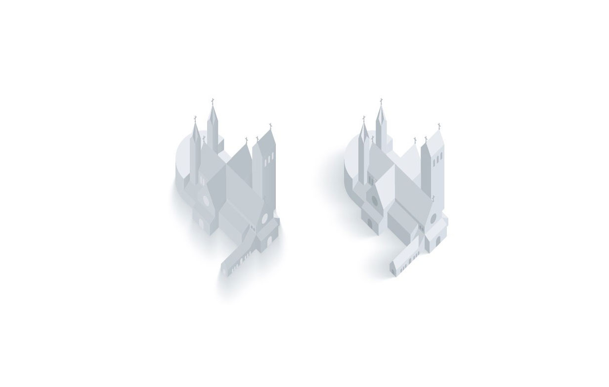
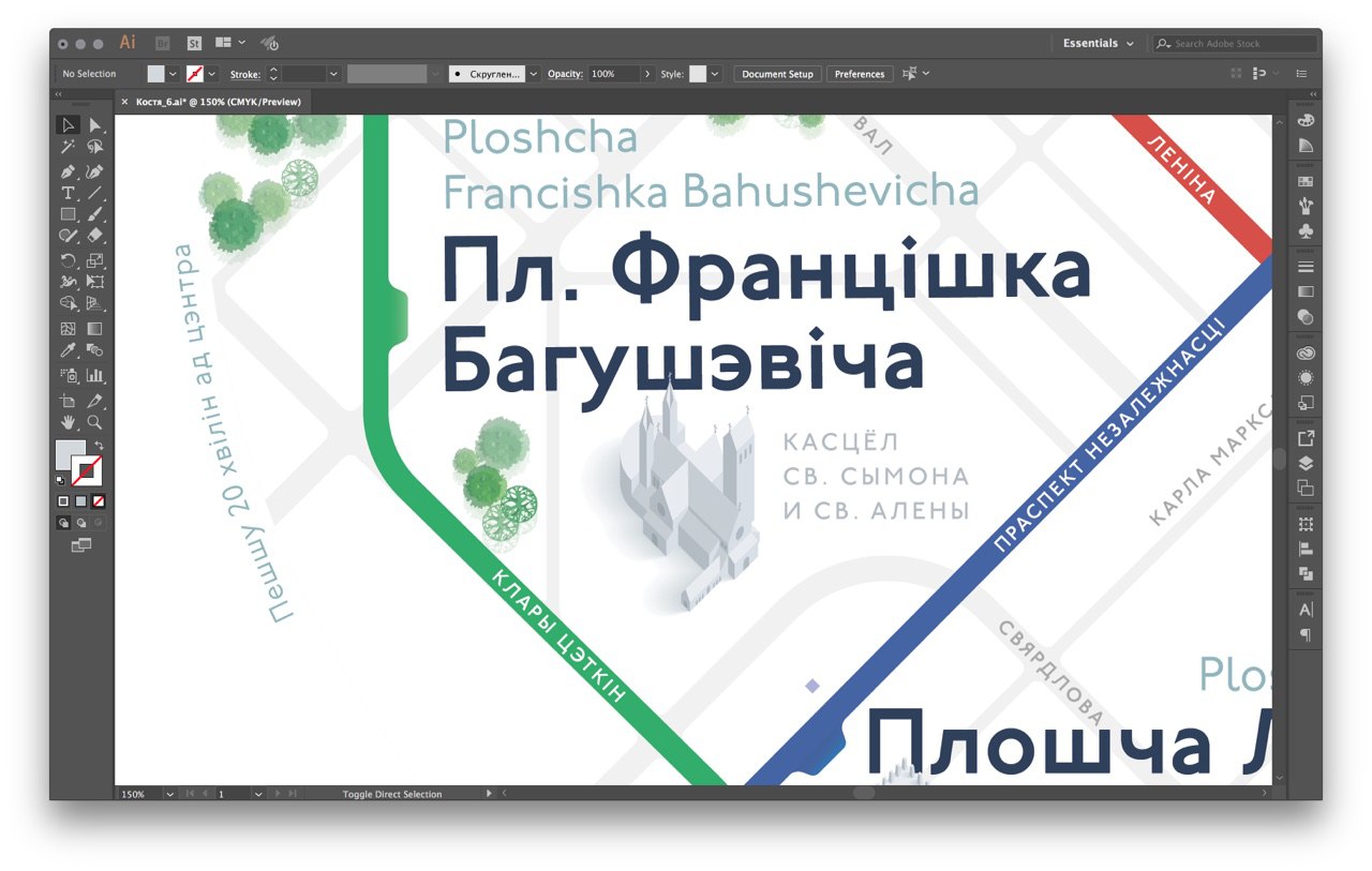
By this time Kostya painted the Cathedral of the Holy Spirit. Made edits and added a new building to the scheme. I put the scheme in A2 format, made bridges for the first version. Then Kostya draw cool.

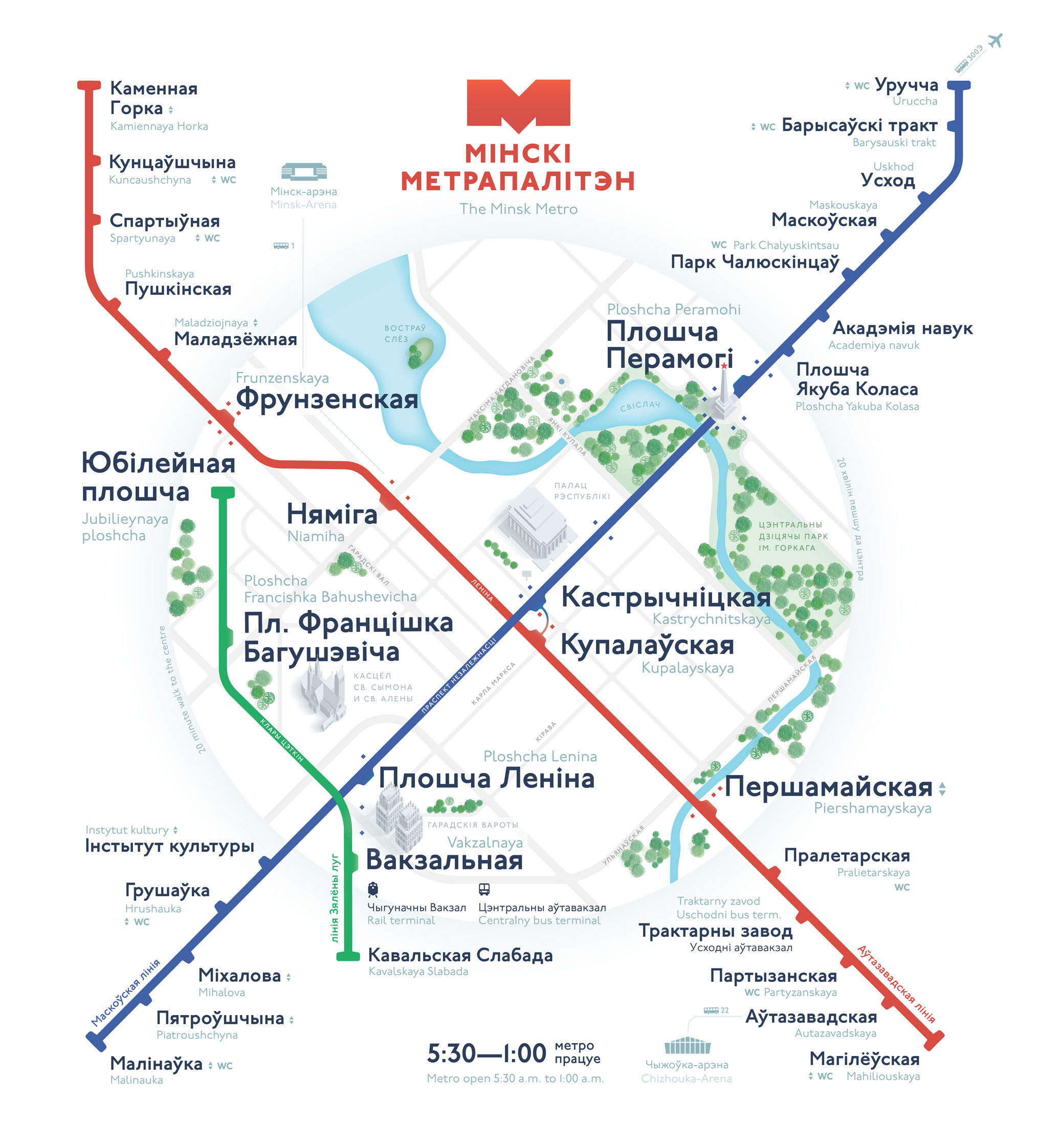
Here are all the work for two months in one picture:
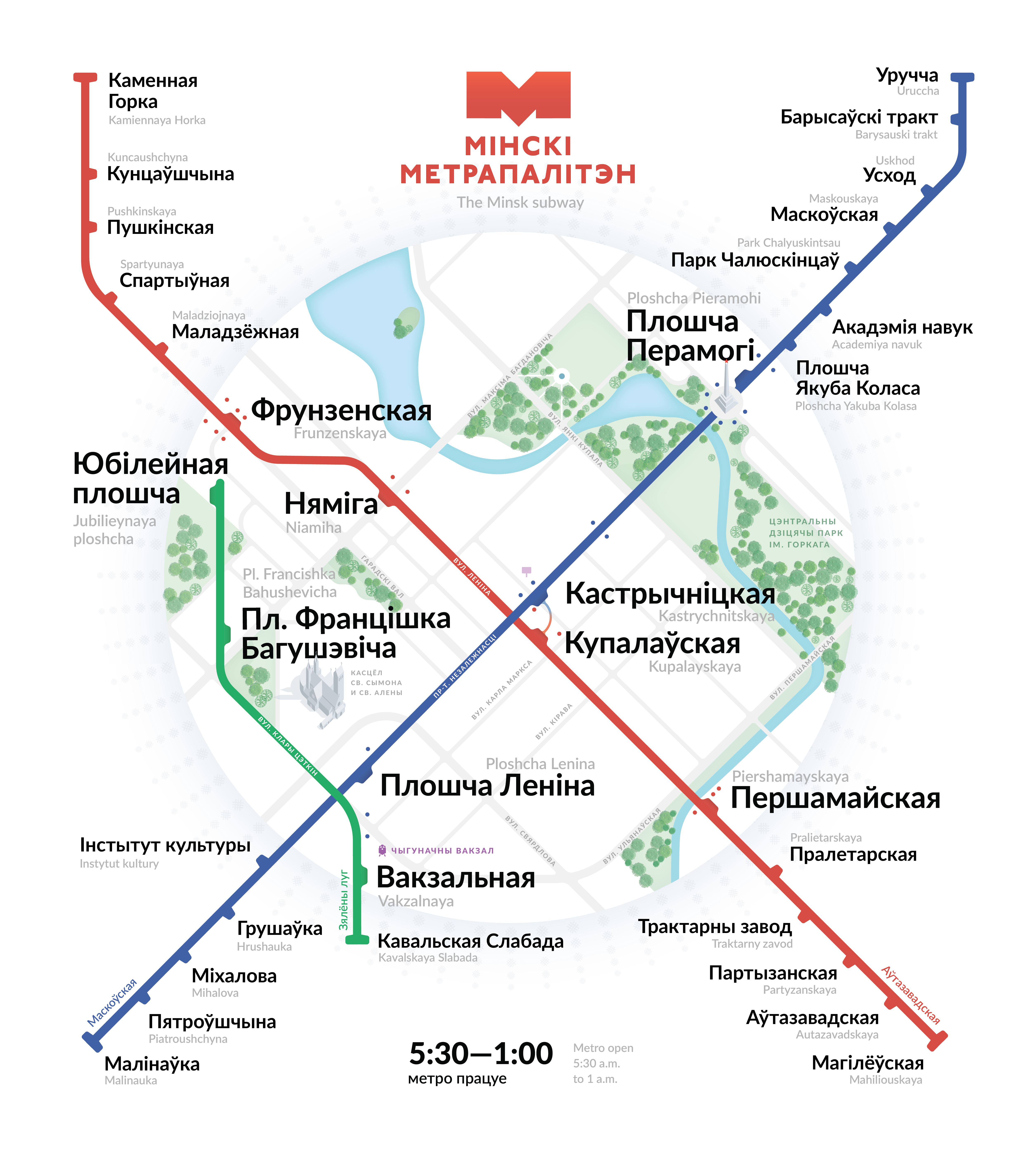
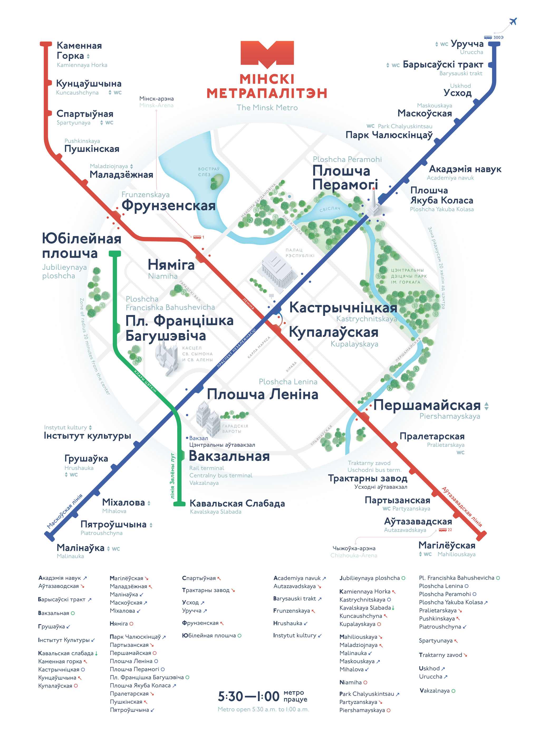
Continuing about work in July and launch read on my site. There is the most interesting.
Announcement of the project: the Minsk metro scheme.
Start
The idea to draw the Minsk metro scheme came to my mind when I saw an updated version from domestic designers. They are, in test mode, hanged at some stations. It so happened that we met her face to face on the platform of the Uruchye metro station. She looks like this:
I thought that you can make it much easier and more informative by throwing out the excess and placing the accents correctly.
')
He began to collect a collection of good schemes and came across the cool tips of Ilya Birman. I looked at the schemes from the portfolio, I was impressed. After reading the description of the creation of the Ekaterinburg metro scheme, I realized that I could write a letter to Ilya, ask for advice. Quickly sketched the first version at the level of sufficiency and sent a letter. This is how the first version looked like:
Ilya agreed to participate in the role of art director and productive work began. By the way, I knew the Illustrator very poorly and never did a subway map or something like that. A week later, Ilya suggested painting the city in detail:
If there are only two lines in the city, you need to draw the rest of the city too.It was necessary to evenly fill the entire free area, use it as much as possible. I first painted the central streets, parks, exits from the subway, the river, the railway, and even the tram tracks. Then they added buildings.
Let's show some piece of the center straight honestly, with all the stuffing, including the Palace of Soviets, or whatever it is called, let's sign Independence Avenue, a park, so that it is interesting. And outside the center we will leave only the remaining stations.
At about this moment another designer Kostya Evstratenko joined us. We immediately divided the areas of responsibility and figured out how we will continue to work. Kostya took the isometric sights, and I do the rest. We also came to the conclusion that you need to show the national library, sports arenas, a new branch, railway and auto stations.
In order to understand even better the application of parks and rivers on maps, Kostya asked a few questions in the Bureau’s council heading. A few days later Ilya gave us detailed answers about rivers and parks. I went to an active joint development, so I will further divide the note by months. Such navigation will help to navigate the process.
February
In February, we threw all our forces into the city center. Expand it, add a green branch. Made a list of streets that are included in it. I began to redraw lines and stations, chose a rounding radius of streets and lines, offered Ilya several options for stations in the center:
Kostya drew several drafts with different details, put everything together in a heap:
Added Moscow Ring Road, the line and the river behind the center. In the center, the stations were redone, four buildings were redrawn, a bridge was added. Prepared version on white background and on blue. Chose white, with him nicer:
Wrap and send Ilya. The next day we get a detailed response. Ilya does not like the overall colors, the buildings are too shiny, the shadow of the island is terrible.
Lines flow cool, but the meaning is not at all. People will stumble! Station need to sign large and clear railway to do.
At the transition you need a beautiful gradient.
The only round line of the Moscow Ring Road is knocked out. Poorly. Airplane is very small.
Color schemes for buildings Ilya advised to look in the game Monument Valley. There are a lot of cool buildings.
Then I will talk about the process of work in March and April. Many people are surprised that we have done such work for 8 months. I want to clarify this point. Kostya and I gave the metro scheme no more than 7 hours a week. Overall, I spent a little more than 200 hours on this job. It doesn’t sound as powerful as 8 months.
March
In March, we were looking for a visual language. Having studied Ilya's edits, we remade the old version. First, the descents of lines from the island. They became smoother:
Next are the trees. We have collected a folder of files with different maps and schemes. Some of them were especially impressed:
Inspired and collected a new version. We tried different colors in the buildings and detailed them. Made new trees and the river. They added a gradient to the transition - it became better :) Smoothed the descents of the lines and the shadow of the central island. Outside the city, the stations were shown “hemp”. Used more native colors for the city:
We send to Ilya, we get the answer:
Parks, trees, river - buzz.And then I had an idea that became meaningful. If the shape as a whole does not seem beautiful, then you need to use a circle. Therefore, you need to completely redraw the city center so that it fits into the shape. I quickly put on a prototype and sent it to Ilya.
But in general, everything is formless. Half the area is empty. It is worth now to throw the maximum force on it. On the central island, you can clearly lose some of the space. Parks are signed very small. Empty quarters must somehow be filled with something else. Too many kinks at the river behind the center.
Half red tail is not signed. It seems that it is a week to go from Kupalovskaya to Pervomayskaya. I still soars the shadow that the island casts on the scheme. Maybe somehow do without it? The runoffs of the lines themselves are cool, but there is no point in them, and they look like kinks.
In general, the form does not seem beautiful, and the whole is more important than the details. This does not mean that the details are not important. It only means that if everything is fine with the details, but in general it does not work very well, then it does not roll :-)
Ilya said that he liked the idea and asked to try to make the lines symmetrical. In Cubes, Kostya and I marked the buildings that we plan to draw. Another added green line for the test.
Here is a draft layout in the end:
Ilya's answer:
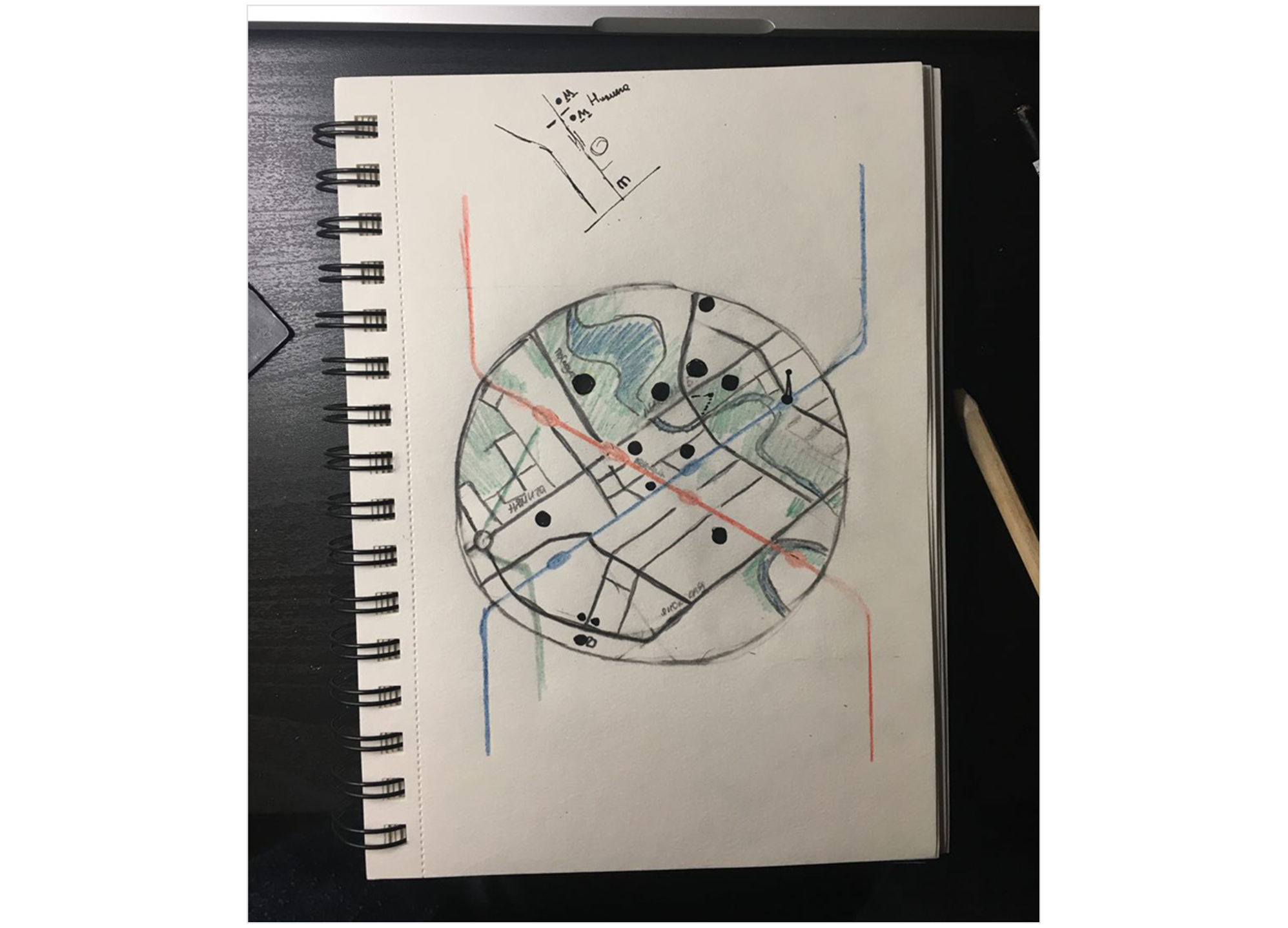
You need to somehow squeeze or fill empty quarters. The central circle should look more or less evenly dense.I realized that the old city center will not survive, you need to redraw everything from scratch. To distribute the weight tightly, I drew a diagram in a notebook.
Circles in vain darker lines. We need a new font, this one does not roll. This metro logo is not very much acting better.
Border the circle must be removed, and the background outside it to make darker.
It became clear that the streets needed to be drawn at 45 °, breaking the geography. It looks more aesthetic and drawing has become easier. The hollow edges of the center decided to cut to increase the density.
April
In April, we tried to make friends with our Minsk circle in the center. They took a smaller part of the center as a basis so that it became denser. All streets at 45 °. Everything became a little bigger. Added a green branch. In the parks began to draw hills and trees. In the center there was a winking smile.
Ilya writes:
We must somehow squeeze the distance between October and Victory Square. At the same time get the intersection of the red and blue lines in the center of the circle.The same distances between the central stations and the intersection are exactly in the center ... It is necessary to redraw the center again. I gathered my strength, drew and showed a new prototype to Ilya:
It is strange that the color of the stops is different from the color of the lines. I would return hemp outside the circle for now.
It is necessary to figure out how to sign all stations on the left to the right of the lines. Moreover, I would even look at how it would look if the stations on the right were signed on the left. This will allow a denser format to fill.
The green line is hard to see above the park.
At the same time, I decided to try new station designations in the center and behind it. Behind the center are the usual hemp, in the center - more detailed.
Art director answer:
Parks must be made calmer. Especially where the green line is. Let's just do without a legend. Let's try to sign everything at once on the scheme.
We must understand that we will have something useful from below. Mode of operation? Rates?
What about the station symbols in the center. Now they are not visible, lost. Let's look again ...
The upper stations of the blue line near the circle want to write on the right.
The river can definitely be paler, it is now arguing with the lines.
Font contrast between central and off-center stations should be slightly higher or, conversely, not done. Now almost but not quite.
May
After a couple of days I collected the next version of the scheme and showed it to Ilya.
Ilya's answer:
Oh, how dramatically better. Straight much better and cleaner. For the first time the feeling that “almost ready” :-) It usually leaves 50% of the time. Only the river should be lighter. The color of the buildings is weak. Can it somehow make black, not white? It can look spectacular.
By the way, we have to figure out where to put the princess from Monument Valley.
Inscriptions with transliteration recheck, everything jumps a little. The stops are now very pleasant in the center, and beyond it are completely different. In the schedule you need a long dash.
Can we try such a thing for fun? Only points are larger. Right so, of course, sucks, but I would look for the effect in this direction. I do not want a gradient, but something more graphical:
About fonts:
Dean Font
Font "Stem"
Font "Victory"
Font "Form"
Font P22 Underground
In the font I wanted to somehow reflect Minsk. A little of the Soviet Union in modern packaging. We stopped at the font P22 Underground, we decided to try it on.
I tried the advice of Ilya. Took the colors of the lines from the London scheme. Stood like cool.
For the new shadow used a national ornament. The river remained only in the center, while the new font is only in the title. Plus, corrected trivia, which had not previously noticed: signatures, the location of translit and a dash.
It turned out a strong iteration. I collect the layout and send. Ilya replies:
It is not obvious that "Square Yubileinaya" - the final station.
In translating it is not necessary to reduce Ploshcha. And replace subway with metro.
In the line captions, the word "line" is missing.
The star on Victory Square unpleasantly concerns the signature. It is necessary that nalezal stronger. And the bottom line is badly broken. Perhaps the circle should be made more transparent.
Purple color at the station is not the topic. It is better to make black, but larger.
Remarks are clear. Replaced the font everywhere and began to add icons near the stations. ATM, elevator for disabled people, toilet. It seems that this is important information.
It became clear that the icons are poorly visible. The pattern around the center begins to enrage, we remove it. The black signatures of the stations are under pressure; they need to be replaced with dark blue.
Signed how much to go on foot from the center, added the bus station and airport.
Then I realized that I did not like the way the river looked. Color and shape are weak. I also painted the arenas in more detail. Kostya was busy with buildings in the center, so I quickly sketched the arenas myself so that they were. Reversed the schedule.
By this time, Kostya painted the Towers near the station. Instead of one of the statues of the princess.
They added towers, drew a new island and all sorts of trivia.
Comments Ilya:
It was cooler when the exit points were without “danger”.
Bus lines are invisible, they should be blacker.
"Lenin Square" move to the right, above, so as not to interfere with the towers.
Chizhovka Arena ... It seems from afar that this is a tank.
Does it seem like a shadow falls from the trees or something? It is not the same and it does not fall there like in 3D buildings. Need to make friends.
The island wants to sign somehow. And the river is somehow crooked, cartographically.
Remarks are clear, taken to work. On the way, Ilya and I had a dispute. We could not find a common solution for the direction of shadows in buildings and trees. Ilya offered to direct all the shadows down. We were behind the shadow on the side, it gave volume. Kostya in Cuba set an example.
Ilya: Right to left, in any case, strange. In addition, you can deceive: cast a shadow down, and the left sides still make a bit lighter than the right.
We went to look for examples and measure different shadows on our buildings.
It turned out to convince Ilya that the shadow down looks not very. Agreed to throw a shadow to the right.
Collected the next version. The exit points are brighter. Signed island, river and bus station. They killed the train and removed the irregularities in the signatures.
Shadows did not have time to fix :-(
Ilya: Tiny dots near the exits were more fun. Let's remove the icons at train stations. They are not beautiful. And the place around “Vokzalnaya” is the dirtiest. Something needs to be done there. Stations also belong to the same place where "Vokzalnaya".
Me: They really are so worth it!
Ilya: Maybe it’s somehow necessary at all to break a table that has arisen:
I: And do not sign the station?
Ilya: Vokzalnaya is already written, what is there to sign? You can make this icon green station. And near the station "Uruchye", the same blue big plane. And under it just a text to sign: “bus 300E to the airport”.
Me: But the metro station "Vokzalnaya" to the left of the station itself ...
Ilya: Hmm, and maybe somehow I can turn the signature to the left?
I: Immediately there is a blue line ... if only it is curved or directly on it to sign. Let's just sign it with words, it will be cleaner now. Then back to this issue.

Signed stations and new shade trees. Replaced the squares on the circles at the exits from the stations and in the font. Made the elevator icons larger, drew a new one for the airport. Drew new bus routes. Collected a draft version of the alphabetical index.
June
Ilya:
In the alphabetical index, I would remove both indents and fatness of the first letters. And I want to use the "birds" as in my 2013 Moscow scheme. And for stations in the center, you can use the same circles as the designation of the outputs. Although ... fatness can survive, try. It is also better to endure it so that it is equal to the words in the group. It makes no sense to leave groups indivisible on one letter. This is an official piece, it is used by one passenger out of 1000. It should look like a background.
Think about where you can insert the signature of our names.
What decided the arenas?
Arenas decided to draw volume, but after the first release of the scheme.
Ilya:
Like pointer for now.
Let's throw all the forces now on the layout of the station names and the elevator and toilet icons. First, the right-justification of the next line is something forced. There should be a clear principle of alignment of icons. Secondly, it is not clear why they sometimes refer to Russian, sometimes to English inscription.
Furious area near the "Frunze". There and without dies everything is normally read.
The bus lines circle seems unjustified. You can just stump double. In two directions, as at the end stations of the metro line.
Let's go back to the piece around the "Vokzalnaya". All text about the station should be under the "Vokzalnaya". Need a green train icon, like an airport. Obviously, you need the place where the green line bends, move to the right-below. Then the station from it will stick out closer to the place where the station.
I'm not sure I understood correctly, but I will show an interim solution.
There is a small nuance. Now you can get to the station from the station "Lenin Square" without going outside. A "Vokzalnaya" is below the station and does not yet have a tunnel to it. And the train icon should be blue. Another station is right across the street from the "Gates of the City." This is all important to consider.
Ilya:
I would still look at this version again.
And then I had an idea. At first glance, it is obvious, but ... While the green line is being built, the “Vokzalnaya” station should generally be taken out of the center. Refined the comments and assembled the next version.
Ilya:
There are a few thoughts about the new branch. First, you can try to fill it with all the dots, it can be beautiful. Secondly, I would have made her a station of small size. So as not to interfere with us yet.
Signatures with our names I want to verticalize, reduce and put to the right of the circle, pressing to the edge of the format.
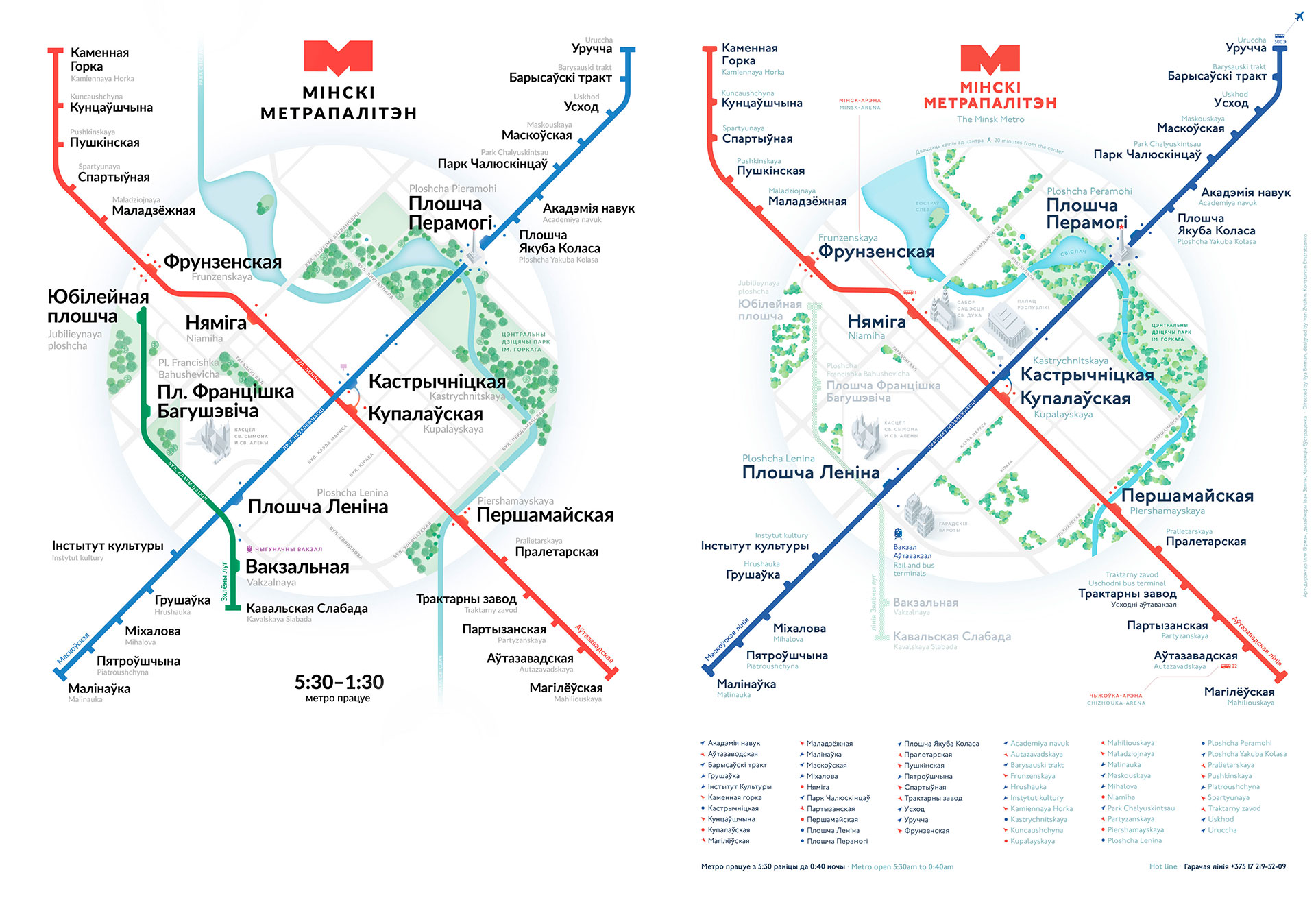
It seems that we have just come up with the coolest display of subway lines that are being built. Here is a draft.
I will show a clean copy after I tell about new trees. Yes, the trees. Ilya offered them to completely redraw them. Make them more modern graphic. I fought for the trees to the last, but now I am glad that we have changed them. I'll tell you a little about the process of their creation.
Ilya says:
I want to be inspired by the valley of monuments more. We have cool houses and cool graphics for the scheme as a whole, and the trees are knocked out of it. It is possible to try generally to draw stupidly translucent spheres such as if it were air balloons. Look here:
My approach to trees:
We stopped at the last version. Version with new trees and green line:
Ilya:
"20 min from the center · 20 min from the center". Instead of "·" you need a man icon.
It's not very clear where the number 1 bus is coming from
Linear arrangement of trees on the street. Karl Marx and Bogdanovich infuriates.
"October" and "Kupalovskaya." That sucks aligned translit, want more to his left. Check out the rest.
Let's set the time in the schedule in a taftiansky way of writing. 5:30 am to 1:00 am
And what a thing in the center near the Palace of the Republic? Rectangle on the stick.
Kostya:
This is a screen in the square. A popular meeting place, local will understand.
I sketched out several options for displaying signatures in English in narrow places.
And of course I won the first one. All Belarusian inscriptions should stand as if there are no English ones. Already after that, English are placed in a free place.
Temporarily killed elevators and toilets, but decided that we will do another approach in the second version. They also made a whole mountain of not very important trifles :-)
Ilya:
There is a fear that the railway station icon looks like a steamer. Although graphically it is normal.
Trees have become steep, in my opinion.
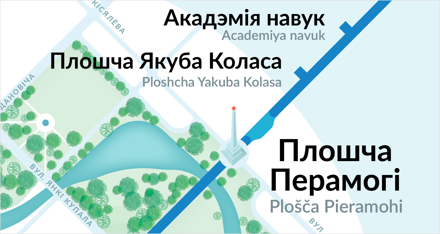
A star near the obelisk on Victory Square wants a bit bigger.
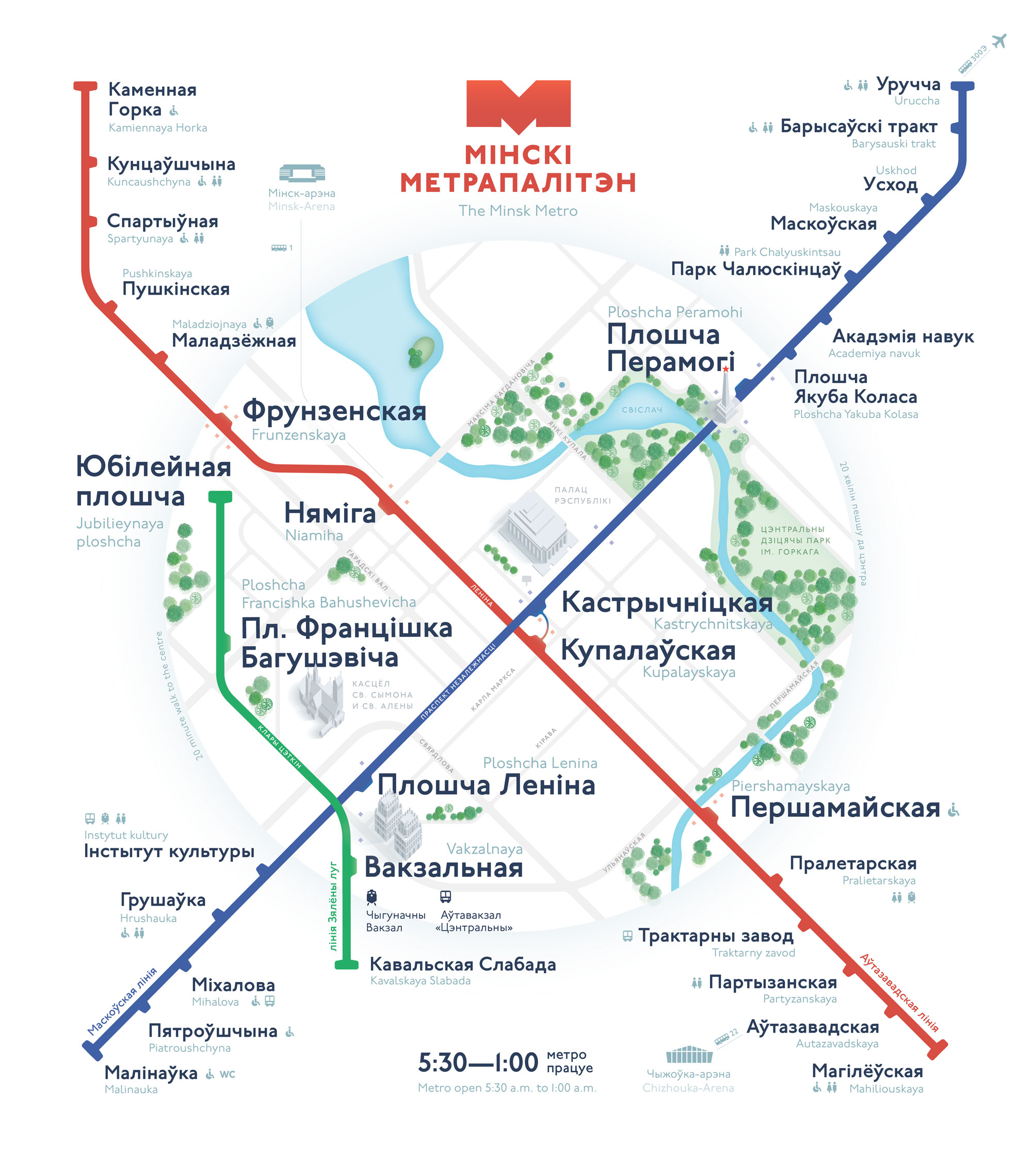
By this time Kostya painted the Cathedral of the Holy Spirit. Made edits and added a new building to the scheme. I put the scheme in A2 format, made bridges for the first version. Then Kostya draw cool.
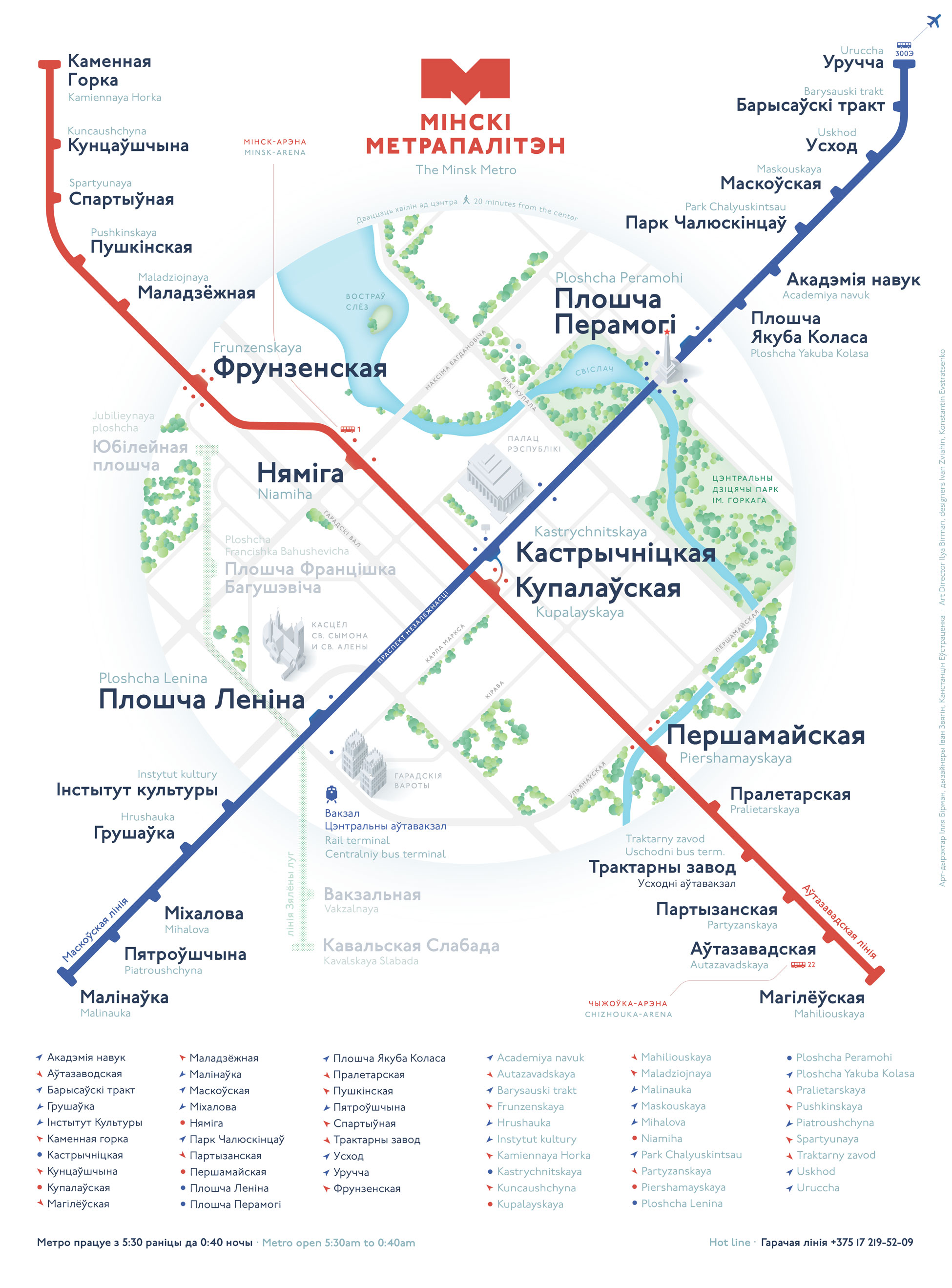
Here are all the work for two months in one picture:
Continuing about work in July and launch read on my site. There is the most interesting.
Announcement of the project: the Minsk metro scheme.
Source: https://habr.com/ru/post/442854/
All Articles