Is data analysis on Scala a harsh necessity or a pleasant opportunity?

Traditional tools in the field of Data Science are languages such as R and Python - a relaxed syntax and a large number of libraries for machine learning and data processing allows you to quickly get some working solutions. However, there are situations when the limitations of these tools become a significant hindrance - first of all, if you need to achieve high processing speed and / or work with really large data arrays. In this case, the specialist must, reluctantly, turn to the help of the "dark side" and connect the tools in the "industrial" programming languages: Scala , Java and C ++ .
But is this side really dark? Over the years of development, the tools of the "industrial" Data Science have come a long way and today are quite different from their own versions 2-3 years ago. Let's try using the example of the SNA Hackathon 2019 task to find out how the Scala + Spark ecosystem can correspond to Python Data Science.
In the framework of SNA Hackathon 2019, participants solve the problem of sorting the news feed of a social network user in one of three "disciplines": using data from texts, images, or logs of signs. In this publication, we will understand how Spark can solve a problem based on the log of features by means of classical machine learning.
In solving the problem, we will follow the standard path that any data analyst goes through when developing a model:
- We will conduct a research analysis of the data, construct graphs.
- Let us analyze the statistical properties of features in the data, look at their differences between the training and test sets.
- We will carry out the initial selection of signs based on statistical properties.
- We calculate the correlations between the signs and the target variable, as well as the cross-correlation between the signs.
- Let's form the final set of features, train the model and check its quality.
- Let us analyze the internal structure of the model to identify growth points.
In the course of our "journey" we will get acquainted with such tools as the Zeppelin interactive notebook, the Spark ML machine learning library and its extension PravdaML , the GraphX graph package, the Vegas visualization library, and, of course, Apache Spark in all its glory: ). All code and experiment results are available on the Zepl collaborative notebooks platform .
Data loading
The peculiarity of data laid out on SNA Hackathon 2019 is that it is possible to process them directly using Python, but it is difficult: the source data is efficiently packed due to the capabilities of the Apache Parquet column format and when reading in the forehead memory is unpacked into several dozen gigabytes. When working with Apache Spark, it is not necessary to completely load data into memory, the Spark architecture is designed to process data in chunks, loading from disk as necessary.
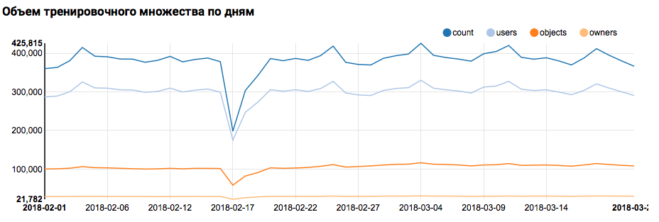
Therefore, the first step - checking the distribution of data by day - is easily performed by boxed tools:
val train = sqlContext.read.parquet("/events/hackatons/SNAHackathon/2019/collabTrain") z.show(train.groupBy($"date").agg( functions.count($"instanceId_userId").as("count"), functions.countDistinct($"instanceId_userId").as("users"), functions.countDistinct($"instanceId_objectId").as("objects"), functions.countDistinct($"metadata_ownerId").as("owners")) .orderBy("date")) What the corresponding graph will display in Zeppelin:
I must say that the Scala syntax is quite flexible, and the same code might look, for example, like this:
val train = sqlContext.read.parquet("/events/hackatons/SNAHackathon/2019/collabTrain") z.show( train groupBy $"date" agg( count($"instanceId_userId") as "count", countDistinct($"instanceId_userId") as "users", countDistinct($"instanceId_objectId") as "objects", countDistinct($"metadata_ownerId") as "owners") orderBy "date" ) Here you need to make an important warning: when working in a large team, where everyone approaches the writing of the Scala code exclusively from the point of view of their own taste, communication is significantly hampered. So it is better to develop a unified concept of code style.
But back to our task. A simple analysis by day showed the presence of anomalous points on February 17 and 18; it is likely that incomplete data is collected on these days, and the distribution of signs may be shifted. This should be taken into account in further analysis. In addition, the fact that the number of unique users is very close to the number of objects is striking, so it makes sense to study the distribution of users with different numbers of objects:
z.show(filteredTrain .groupBy($"instanceId_userId").count .groupBy("count").agg(functions.log(functions.count("count")).as("withCount")) .orderBy($"withCount".desc) .limit(100) .orderBy($"count")) 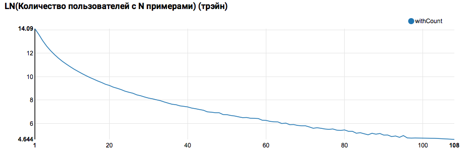
Expectedly we see the distribution, close to a power, with a very long tail. In such tasks, as a rule, it is possible to achieve improvement in the quality of work by segmenting models for users with different levels of activity. In order to check whether it is worth doing this, let's compare the distribution of the number of objects per user in the test set:
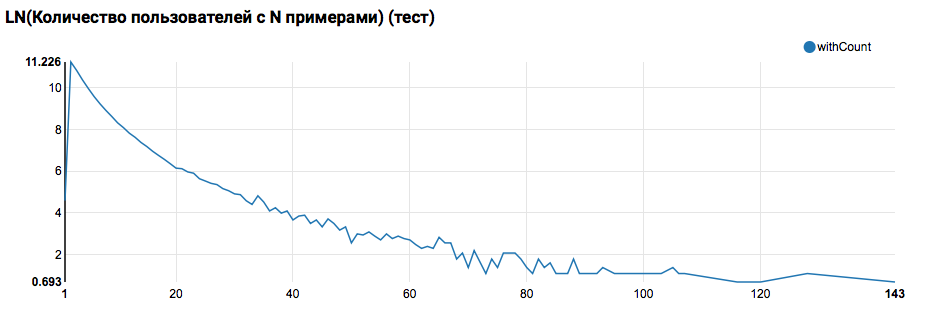
Comparison with the test shows that test users have at least two objects in the logs (since the ranking task is solved on the hackathon, this is a necessary condition for assessing quality). In the future, I recommend looking more closely at the users in the training set, for which we will declare the User Defined Function with a filter:
// , "", , // val testSimilar = sc.broadcast(filteredTrain.groupBy($"instanceId_userId") .agg( functions.count("feedback").as("count"), functions.sum(functions.expr("IF(array_contains(feedback, 'Liked'), 1.0, 0.0)")).as("sum") ) .where("count > sum AND sum > 0") .select("instanceId_userId").rdd.map(_.getInt(0)).collect.sorted) // // User Defined Function val isTestSimilar = sqlContext.udf.register("isTestSimilar", (x: Int) => java.util.Arrays.binarySearch(testSimilar.value, x) >= 0) Here you also need to make an important remark: it is precisely in terms of the definition of UDF that the use of Spark from under Scala / Java and from under Python is strikingly different. While the PySpark code uses the basic functionality, everything works almost as fast, but when the redefined functions appear, the PySpark performance degrades by an order of magnitude.
First ML conveyor
In the next step, we will try to calculate the main statistics on actions and grounds. But for this we need the capabilities of SparkML, so first consider its overall architecture:

SparkML is based on the following concepts:
- Transformer - takes as input a data set and returns a modified set (transform). As a rule, it is used to implement pre- and post-processing algorithms, extract features, and can also represent final ML-models.
- Estimator - takes a data set as input, and returns a Transformer (fit). In a natural way, the Estimator can represent the ML algorithm.
- Pipeline is a special case of Estimator, consisting of a chain of transformers and estimators. When the fit method is called, it goes through the chain, and if it sees a transformer, then it applies it to the data, and if it sees the estimator, it teaches the transformer with it, applies it to the data and goes further.
- PipelineModel - the result of the work Pipeline also contains within the chain, but consisting exclusively of transformers. Accordingly, the PipelineModel itself is also a transformer.
A similar approach to the formation of ML-algorithms helps to achieve a clear modular structure and good reproducibility - and the model and the conveyors can be saved.
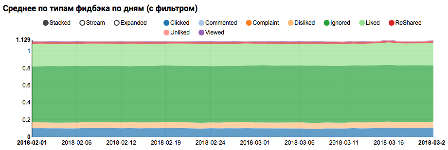
To begin with, we will build a simple pipeline with which we can calculate the statistics of the distribution of actions (feedback field) of users in the training set:
val feedbackAggregator = new Pipeline().setStages(Array( // (feedback) one-hot new MultinominalExtractor().setInputCol("feedback").setOutputCol("feedback"), // new VectorStatCollector() .setGroupByColumns("date").setInputCol("feedback") .setPercentiles(Array(0.1,0.5,0.9)), // new VectorExplode().setValueCol("feedback") )).fit(train) z.show(feedbackAggregator .transform(filteredTrain) .orderBy($"date", $"feedback")) In this pipeline, PravdaML functionality is actively used - libraries with extended useful blocks for SparkML, namely:
- MultinominalExtractor is used to encode the character of the type "array of strings" into a vector on the one-hot principle. This is the only estimator in the pipeline (to build the encoding, you need to collect unique strings from the dataset).
- VectorStatCollector is used to calculate vector statistics.
- VectorExplode is used to convert the result into a format that is easy to visualize.
The result will be a graph showing that the classes in the dataset are not balanced, but the imbalance for the target class Liked is not extreme:

An analysis of a similar distribution among users similar to test ones (having both “positive” and “negative” in the logs) shows that it is biased towards a positive class:
Statistical analysis of signs
At the next stage we will conduct a detailed analysis of the statistical properties of the signs. This time we need a bigger conveyor:
val statsAggregator = new Pipeline().setStages(Array( new NullToDefaultReplacer(), // new AutoAssembler() .setColumnsToExclude( (Seq("date", "feedback") ++ train.schema.fieldNames.filter(_.endsWith("Id")) : _*)) .setOutputCol("features"), new VectorStatCollector() .setGroupByColumns("date").setInputCol("features") .setPercentiles(Array(0.1,0.5,0.9)), new VectorExplode().setValueCol("features") )) Since now we need to work not with a separate field, but with all the signs at once, we will use two more useful utilities PravdaML :
- NullToDefaultReplacer allows you to replace missing elements in the data with their default values (0 for numbers, false for logic variables, etc.). If you do not do this conversion, then NaN values will appear in the final vectors, which is fatal for many algorithms (although, for example, XGBoost can survive this). An alternative to replacing with zeros can be replacing with mean values, this is implemented in NaNToMeanReplacerEstimator.
- AutoAssembler is a very powerful utility that analyzes the table layout and for each column chooses a vectorization scheme corresponding to the type of the column.
Using the resulting pipeline, we calculate the statistics for three sets (a trainer, a trainer with a user filter and a test one) and save into separate files:
// ( AutoAssembler ) val trained = statsAggregator.fit(filteredTrain) // - , . trained .transform(filteredTrain .withColumn("date", // , , , // All functions.explode(functions.array(functions.lit("All"), $"date")))) .coalesce(7).write.mode("overwrite").parquet("sna2019/featuresStat") trained .transform(filteredTrain .where(isTestSimilar($"instanceId_userId")) .withColumn("date", functions.explode(functions.array(functions.lit("All"), $"date")))) .coalesce(7).write.mode("overwrite").parquet("sna2019/filteredFeaturesStat") trained .transform(filteredTest.withColumn("date", functions.explode(functions.array(functions.lit("All"), $"date")))) .coalesce(3).write.mode("overwrite").parquet("sna2019/testFeaturesStat") Having received three datasets with statistics of signs, let's analyze the following things:
- Do we have signs for which there are large emissions.
- Such signs should be limited, or filtered records emissions. - Do we have signs with a large offset of the average relative to the median.
- Such an offset often occurs when there is a power distribution; it makes sense to log these logs. - Is there a shift in the mean distributions between the training and test sets?
- How densely filled our matrix of signs.
To clarify these aspects will help us such a request:
def compareWithTest(data: DataFrame) : DataFrame = { data.where("date = 'All'") .select( $"features", // // ( ) functions.log($"features_mean" / $"features_p50").as("skewenes"), // 90- // 90- — functions.log( ($"features_max" - $"features_p90") / ($"features_p90" - $"features_p50")).as("outlieres"), // , // ($"features_nonZeros" / $"features_count").as("train_fill"), $"features_mean".as("train_mean")) .join(testStat.where("date = 'All'") .select($"features", $"features_mean".as("test_mean"), ($"features_nonZeros" / $"features_count").as("test_fill")), Seq("features")) // .withColumn("meanDrift", (($"train_mean" - $"test_mean" ) / ($"train_mean" + $"test_mean"))) // .withColumn("fillDrift", ($"train_fill" - $"test_fill") / ($"train_fill" + $"test_fill")) } // val comparison = compareWithTest(trainStat).withColumn("mode", functions.lit("raw")) .unionByName(compareWithTest(filteredStat).withColumn("mode", functions.lit("filtered"))) At this stage, the issue of visualization is acute: using Zeppelin’s standard tools to immediately display all aspects is difficult, and notebooks with a large number of graphs start to slow down significantly due to swelling of the DOM. This problem can be solved with the Vegas -DSL library on Scala to build vega-lite specifications. Vegas not only provides richer rendering capabilities (comparable to matplotlib), but also draws them on Canvas without inflating the DOM :).
The specification of the graphics we are interested in will look like this:
vegas.Vegas(width = 1024, height = 648) // .withDataFrame(comparison.na.fill(0.0)) // .encodeX("meanDrift", Quant, scale = Scale(domainValues = List(-1.0, 1.0), clamp = true)) // - .encodeY("train_fill", Quant) // .encodeColor("outlieres", Quant, scale=Scale( rangeNominals=List("#00FF00", "#FF0000"), domainValues = List(0.0, 5), clamp = true)) // .encodeSize("skewenes", Quant) // - ( ) .encodeShape("mode", Nom) .mark(vegas.Point) .show The chart below should read this:
- The x-axis represents the shift of the distribution centers between the test and training sets (the closer to 0, the more stable the feature).
- On the Y axis, the percentage of non-zero elements is plotted (the higher, the more data are available for a sign for a greater number of points).
- The size shows the shift of the average relative to the median (the larger the point, the more likely the power law of distribution for it).
- The color indicates the presence of emissions (the redder, the more emissions).
- Well, the form distinguishes the comparison mode: with a user filter in the training set or without a filter.
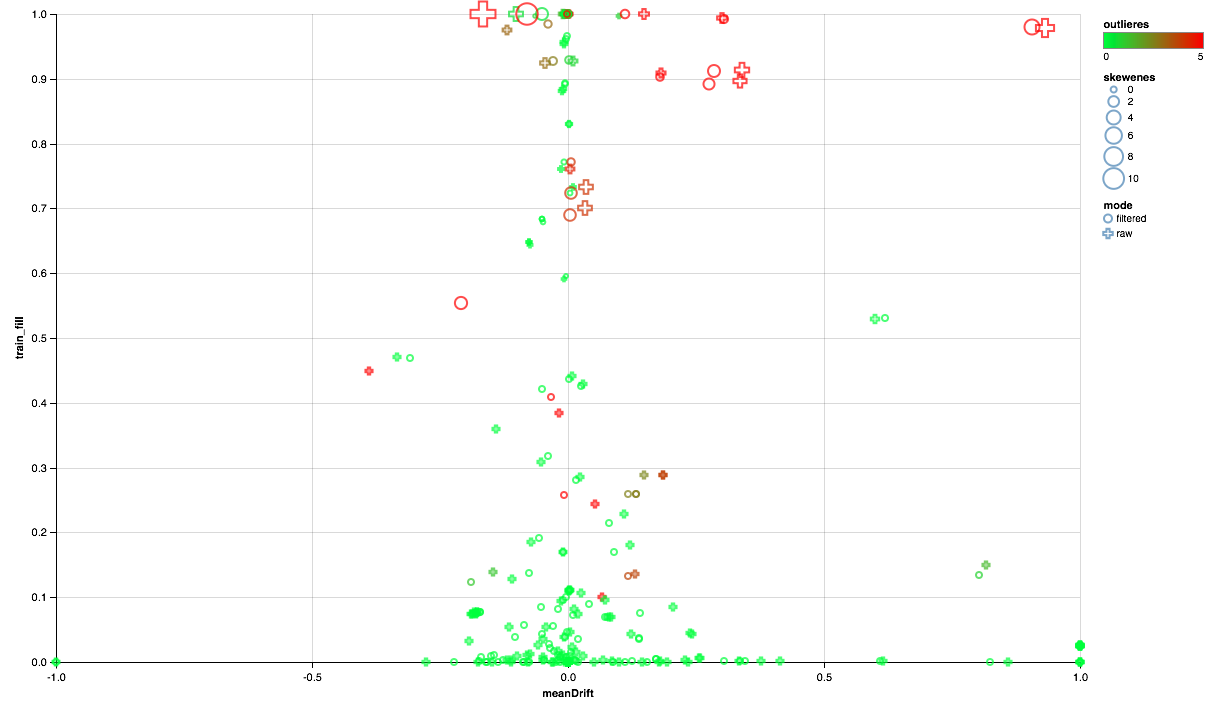
So, we can draw the following conclusions:
- Some signs need an emission filter - we will limit the maximum values for the 90th percentile.
- Part of the signs shows the distribution close to exponential - we will take the logarithm.
- Part of the signs in the test is not presented - we exclude them from training.
Correlation analysis
After getting a general idea of how the signs are distributed and how they relate between the training and test sets, let us try to analyze the correlations. To do this, set up a feature extractor based on previous observations:
// val expressions = filteredTrain.schema.fieldNames // .filterNot(x => x == "date" || x == "audit_experiment" || idsColumns(x) || x.contains("vd_")) .map(x => if(skewedFeautres(x)) { // s"log($x) AS $x" } else { // cappedFeatures.get(x).map(capping => s"IF($x < $capping, $x, $capping) AS $x").getOrElse(x) }) val rawFeaturesExtractor = new Pipeline().setStages(Array( new SQLTransformer().setStatement(s"SELECT ${expressions.mkString(", ")} FROM __THIS__"), new NullToDefaultReplacer(), new AutoAssembler().setOutputCol("features") )) // val raw = rawFeaturesExtractor.fit(filteredTrain).transform( filteredTrain.where(isTestSimilar($"instanceId_userId"))) From the new machinery in this pipeline, the SQLTransformer utility, which allows for arbitrary SQL transformations of the input table, is noteworthy.
When analyzing correlations, it is important to filter out the noise created by the natural correlation of one-hot features. For this, I would like to understand which elements of the vector correspond to which source columns. This task in Spark is solved with the help of column metadata (stored with the data) and attribute groups. The following code block is used to filter pairs of attribute names that originate from the same column of type String:
val attributes = AttributeGroup.fromStructField(raw.schema("features")).attributes.get val originMap = filteredTrain .schema.filter(_.dataType == StringType) .flatMap(x => attributes.map(_.name.get).filter(_.startsWith(x.name + "_")).map(_ -> x.name)) .toMap // , val isNonTrivialCorrelation = sqlContext.udf.register("isNonTrivialCorrelation", (x: String, y : String) => // Scala-quiz Option originMap.get(x).map(_ != originMap.getOrElse(y, "")).getOrElse(true)) Having a dataset with a vector column, it is quite simple to calculate cross-correlations using Spark tools, but the result will be a matrix, for unfolding of which you will need to podshamanit a little into a set of pairs:
val pearsonCorrelation = // Pearson Spearman Correlation.corr(raw, "features", "pearson").rdd.flatMap( // _.getAs[Matrix](0).rowIter.zipWithIndex.flatMap(x => { // , ( , // ) val name = attributes(x._2).name.get // , x._1.toArray.zip(attributes).map(y => (name, y._2.name.get, y._1)) } // DataFrame )).toDF("feature1", "feature2", "corr") .na.drop // .where(isNonTrivialCorrelation($"feature1", $"feature2")) // . pearsonCorrelation.coalesce(1).write.mode("overwrite") .parquet("sna2019/pearsonCorrelation") And, of course, visualization: we will again need the help of Vegas to draw a heat map:
vegas.Vegas("Pearson correlation heatmap") .withDataFrame(pearsonCorrelation .withColumn("isPositive", $"corr" > 0) .withColumn("abs_corr", functions.abs($"corr")) .where("feature1 < feature2 AND abs_corr > 0.05") .orderBy("feature1", "feature2")) .encodeX("feature1", Nom) .encodeY("feature2", Nom) .encodeColor("abs_corr", Quant, scale=Scale(rangeNominals=List("#FFFFFF", "#FF0000"))) .encodeShape("isPositive", Nom) .mark(vegas.Point) .show The result is better to look at Zepl-e . For a common understanding:
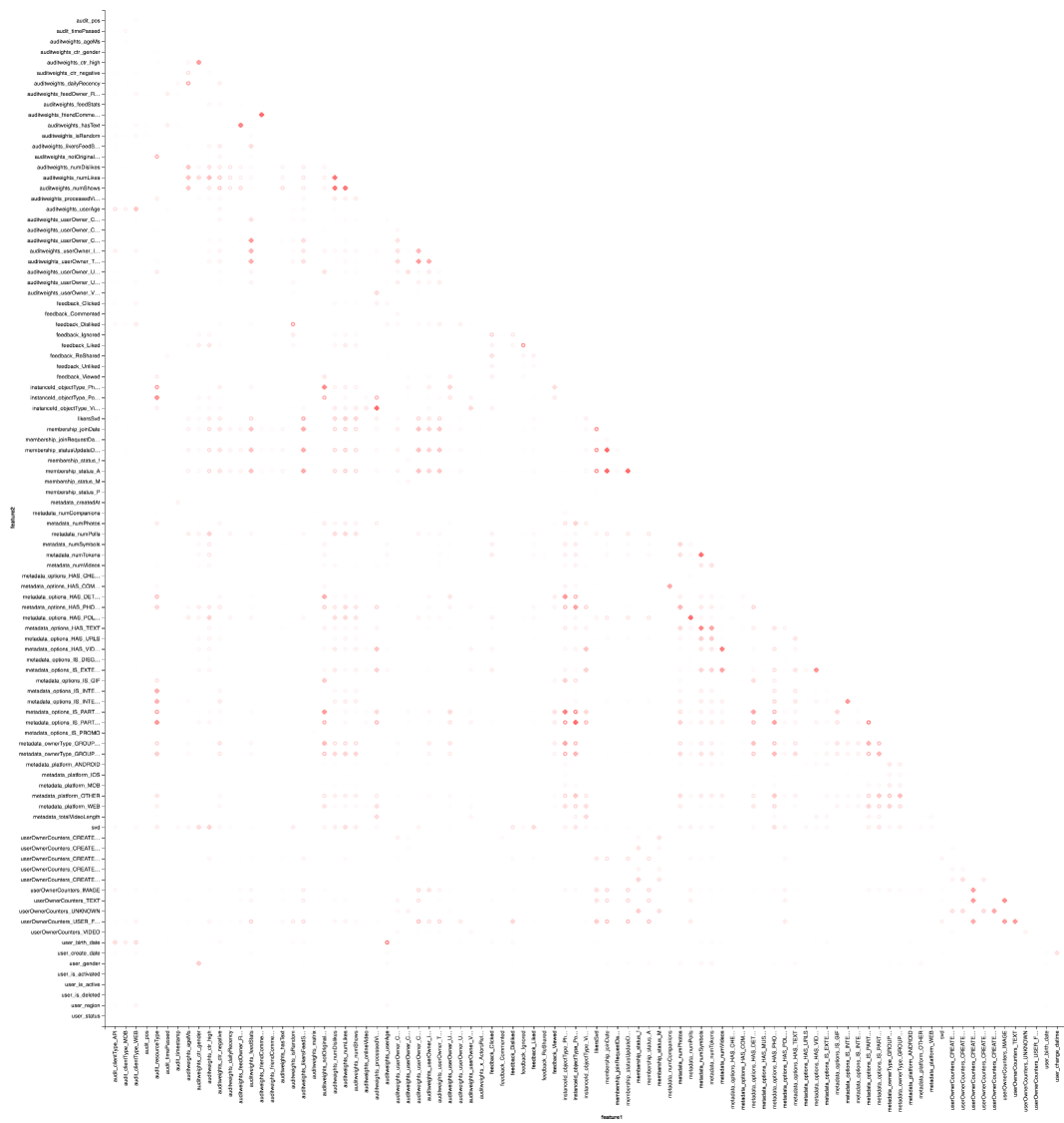
The heat map shows that there are clearly some correlations. Let us try to isolate the blocks of the most highly correlated features, for this we use the GraphX library: we turn the correlation matrix into a graph, filter the edges by weight, then we find the connectedness components and leave only nondegenerate (from more than one element). This procedure is inherently similar to the application of the DBSCAN algorithm and is as follows:
// (GrpahX ID) val featureIndexMap = spearmanCorrelation.select("feature1").distinct.rdd.map( _.getString(0)).collect.zipWithIndex.toMap val featureIndex = sqlContext.udf.register("featureIndex", (x: String) => featureIndexMap(x)) // val vertices = sc.parallelize(featureIndexMap.map(x => x._2.toLong -> x._1).toSeq, 1) // val edges = spearmanCorrelation.select(featureIndex($"feature1"), featureIndex($"feature2"), $"corr") // .where("ABS(corr) > 0.7") .rdd.map(r => Edge(r.getInt(0), r.getInt(1), r.getDouble(2))) // val components = Graph(vertices, edges).connectedComponents() val reversedMap = featureIndexMap.map(_.swap) // , , // val clusters = components .vertices.map(x => reversedMap(x._2.toInt) -> reversedMap(x._1.toInt)) .groupByKey().map(x => x._2.toSeq) .filter(_.size > 1) .sortBy(-_.size) .collect The result is presented in the form of a table:
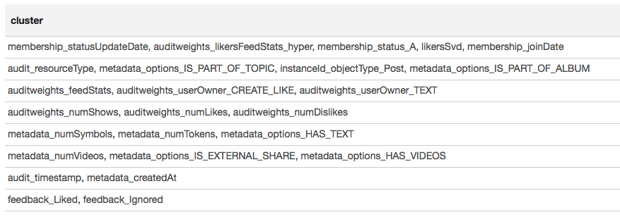
Based on the results of clustering, we can conclude that the most correlated groups were formed around features related to the user's membership in the group (membership_status_A), as well as around the object type (instanceId_objectType). To better simulate the interaction of features, it makes sense to apply model segmentation — to train different models for different types of objects, separately for groups in which the user is and is not.
Machine learning
We approach the most interesting thing - machine learning. The pipeline for training the simplest model (logistic regression) using SparkML and PravdaML extensions is as follows:
new Pipeline().setStages(Array( new SQLTransformer().setStatement( """SELECT *, IF(array_contains(feedback, 'Liked'), 1.0, 0.0) AS label FROM __THIS__"""), new NullToDefaultReplacer(), new AutoAssembler() .setColumnsToExclude("date", "instanceId_userId", "instanceId_objectId", "feedback", "label") .setOutputCol("features"), Scaler.scale(Interceptor.intercept(UnwrappedStage.repartition( new LogisticRegressionLBFSG(), numPartitions = 127))) Here we see not only many familiar elements, but also several new ones:
- LogisticRegressionLBFSG is a distributed logistic regression estimator.
- In order to achieve maximum performance from distributed ML-algorithms. data should be optimally distributed by partition. The utility UnwrappedStage.repartition will help with this, adding to the conveyor a repartitioning operation in such a way that it is used only at the training stage (after all, it is no longer necessary to make predictions in it).
- So that the linear model can give a good result. the data must be scaled, for which the utility Scaler.scale is responsible. However, the presence of two consecutive linear transformations (scaling and multiplying by the regression weights) leads to unnecessary costs, and it is desirable to collapse these operations. When using PravdaML, the output will be a pure model with one conversion :).
- And, of course, for such models you need a free member, which we add using the Interceptor.intercept operation.
The resulting pipeline, applied to all data, gives per-user AUC 0.6889 (the validation code is available on Zepl ). It now remains to apply all of our research: filter the data, transform features and segment the model. The final pipeline will look like this:
new Pipeline().setStages(Array( new SQLTransformer().setStatement(s"SELECT instanceId_userId, instanceId_objectId, ${expressions.mkString(", ")} FROM __THIS__"), new SQLTransformer().setStatement("""SELECT *, IF(array_contains(feedback, 'Liked'), 1.0, 0.0) AS label, concat(IF(membership_status = 'A', 'OwnGroup_', 'NonUser_'), instanceId_objectType) AS type FROM __THIS__"""), new NullToDefaultReplacer(), new AutoAssembler() .setColumnsToExclude("date", "instanceId_userId", "instanceId_objectId", "feedback", "label", "type","instanceId_objectType") .setOutputCol("features"), CombinedModel.perType( Scaler.scale(Interceptor.intercept(UnwrappedStage.repartition( new LogisticRegressionLBFSG(), numPartitions = 127))), numThreads = 6) )) PravdaML — CombinedModel.perType. , numThreads = 6. .
, , per-user AUC 0.7004. ? , " " XGBoost :
new Pipeline().setStages(Array( new SQLTransformer().setStatement("""SELECT *, IF(array_contains(feedback, 'Liked'), 1.0, 0.0) AS label FROM __THIS__"""), new NullToDefaultReplacer(), new AutoAssembler() .setColumnsToExclude("date", "instanceId_userId", "instanceId_objectId", "feedback", "label") .setOutputCol("features"), new XGBoostRegressor() .setNumRounds(100) .setMaxDepth(15) .setObjective("reg:logistic") .setNumWorkers(17) .setNthread(4) .setTrackerConf(600000L, "scala") )) , — XGBoost Spark ! DLMC , PravdaML , ( ). XGboost " " 10 per-user AUC 0.6981.
, , , . SparkML , . PravdaML : Parquet Spark:
// val perTypeWeights = sqlContext.read.parquet("sna2019/perType/stages/*/weights") // 20 ( // ) val topFeatures = new TopKTransformer[Double]() .setGroupByColumns("type") .setColumnToOrderGroupsBy("abs_weight") .setTopK(20) .transform(perTypeWeights.withColumn("abs_weight", functions.abs($"unscaled_weight"))) .orderBy("type", "unscaled_weight") Parquet, PravdaML — TopKTransformer, .
Vegas ( Zepl ):
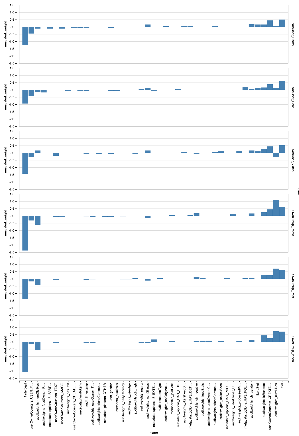
, - . XGBoost?
val significance = sqlContext.read.parquet( "sna2019/xgBoost15_100_raw/stages/*/featuresSignificance" vegas.Vegas() .withDataFrame(significance.na.drop.orderBy($"significance".desc).limit(40)) .encodeX("name", Nom, sortField = Sort("significance", AggOps.Mean)) .encodeY("significance", Quant) .mark(vegas.Bar) .show 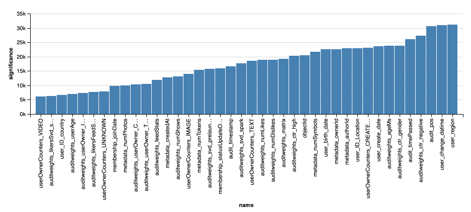
, , XGBoost, , . . , XGBoost , , .
findings
, :). :
, , , , -. , , " Scala " Newprolab.
, , — SNA Hackathon 2019 .
')
Source: https://habr.com/ru/post/442688/
All Articles