Figma component and organization of instances on the example of Userpic
A quality design system in the FIG always takes into account the possible states of certain components. If before the appearance of Global Styles there was only one option - always create a new component for each state (for example, the text field can be default, and can be focused), then after the introduction of styles, many UI elements could be unified only to one in their category, and the variety create instances, appending only new styles and colors.
This allowed to reduce the number of elements to the minimum necessary. The search has become easier, the system has become cleaner. But what if one project often uses several styles for one component? In addition, you often need to switch between two or three.
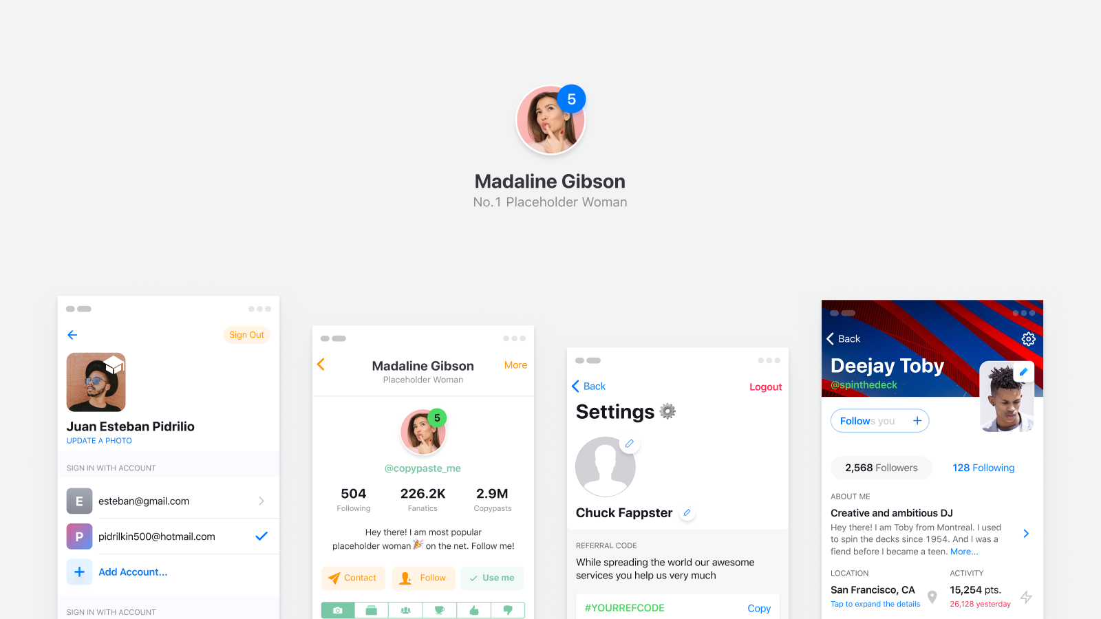
Userpic
This is the simplest example of a component that can be used in several states in a design project. If you think that this is just a round photo with a pretty girl, then you are not looking far enough, because in fact, a userpic can be:
')
- no photo uploaded
- with initials instead of a photo
- with online / offline status indicator
- with badge notifications
- containing an additional action icon
- containing several persons for prototyping
- used in different dimensions on different screens without disconnecting

Obviously, in a good Figma system for hi-end prototyping, we want to get all these states quickly and conveniently. In addition, we want to stay with a minimum of necessary components. Therefore, the question arises: should all the states be stored as hidden layers in the wizard or should each state be declared as an independent component?
Creating a component from an instance
This method has retained its advantages after the arrival of Global Styles. Instance switching is optimal when there are quite a few differences from the parent component. For example, a different color, stroke thickness, shadow, image, and so on. For example, input states are faster to switch through instances. Especially in a large project with many pages. And, for example, the icon inside the button is better to invest at the master level and disable. So much faster to copy a button from a neighboring artboard and just make a Visible layer with an icon.
Pros: allows you to quickly switch the states of instances with many differences
Cons: obviously more components, it takes time to organize them

Hidden layers inside the master component
Nowadays, Figma perfectly copes with hundreds of copies that contain 5-10 hidden groups with dozens of layers and are scattered over many pages. So do not worry about performance, although once upon a time 10 such pages literally hung the project. Indeed, in the case of using this method, in addition to the photo, the Userpic master component will need to be crammed and immediately hidden:
- layer or group with vector objects for empty userpic
- initialized text layer centered
- badge notifications in the upper right corner
- online / offline status indicator, to the bottom
- icon in the center of the component or the corner, for mobile scenarios (for example, a call to edit a photo, delete)
- several face images (in Figma iOS design toolkit made 5 men, 5 women and everything is grouped)
- Place Constraints for each element so that Userpic can be used in several sizes.
- what else have i forgot? :)
Pros: fast getting the desired state of the instance by switching the visible layers
Cons: if you switch 3+ layers and add new styles in addition, there are too many actions

Oh, it seems simple Userpic was not so simple. The tools give us a simplification of the design of processes, but the complexity suddenly comes from a completely different side. We must learn to work with components, to understand their logic and the essence of reusability.
Less unnecessary actions
Creating a new rule, you may improve your algorithm. I stopped at this for myself: if creating a new state requires 3 or more switching layers in “Visible”, then it is better to predetermine this state into a separate component, which was first an instance. Remember that it will take time to organize, check the naming of each layer (so that text elements do not lose content when they are connected), orders, order ... and much more!
After the doctors had diagnosed me with a component of the brain, I began to use this approach in my templates for Figma . So if you are a freelancer, organization, developer or novice Figma-designer, pay attention to the fact that it is much faster to deploy a design system within your organization based on ready-made solutions.
By the way, if you are a good designer, like parts, work in Figme and understand the architecture and principles of working with components, I suggest you earn money together: you make a good design system, I publish it in my marketplace, 70% of your sales. High quality - high prices. I’m looking for talents, minds, ideas and those who are ready to cut out “components from the near future.” Write to Telegram.
By the way, quite often during the working process I am covered with conclusions about design trends, observations of Western products, and simply UI-philosophy, which I immediately issue to my Telegram channel “Useful to the Designer”. Join now!
Source: https://habr.com/ru/post/442494/
All Articles