Alternative metro scheme of Minsk
My name is Zvyagin Ivan and I am a designer from Minsk. At the end of July, my city had a beautiful metro scheme, which we painstakingly drew in the evenings of 8 months. The task of the art director sounded like this: you need to design such a metro scheme so that other cities envy.
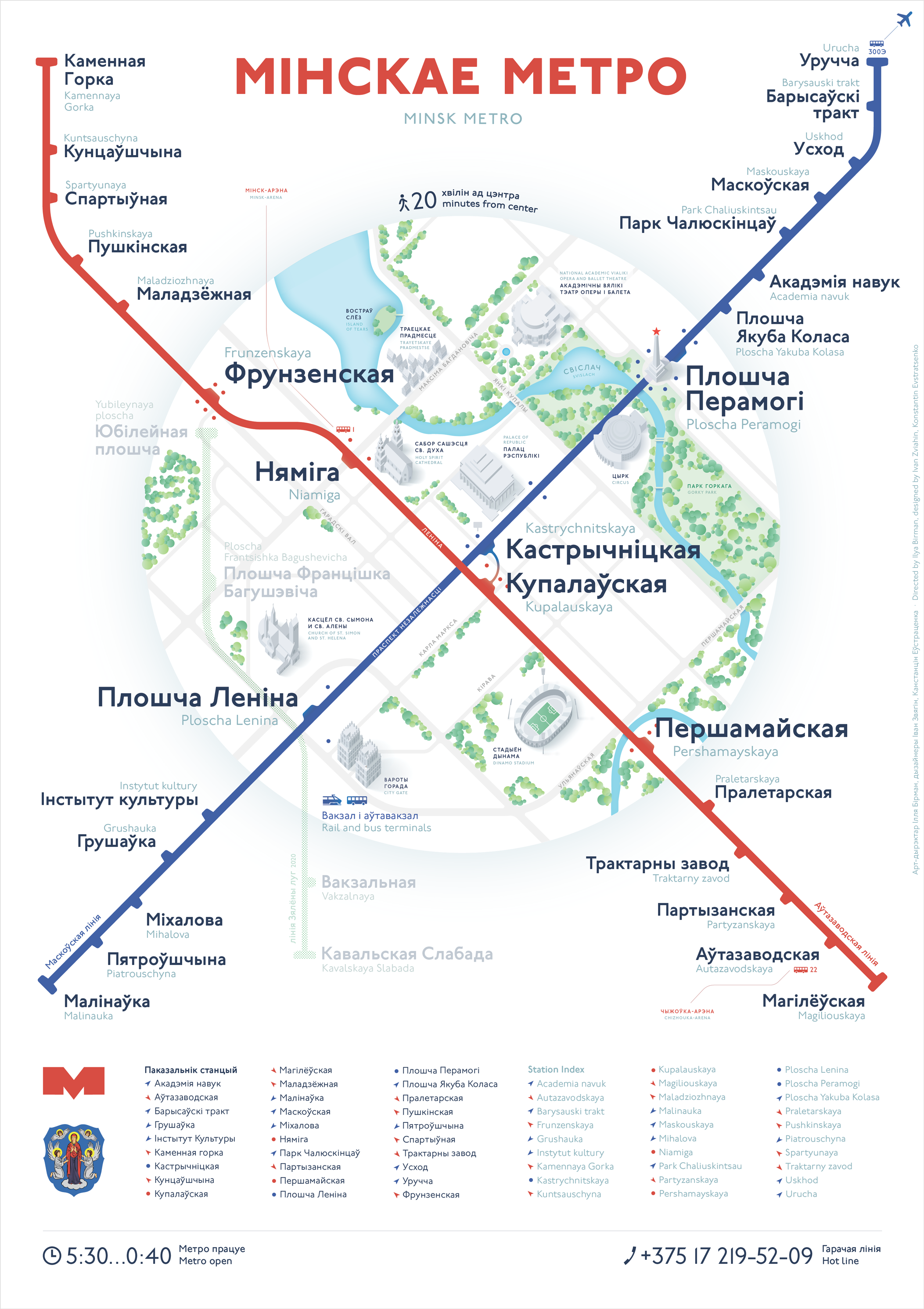
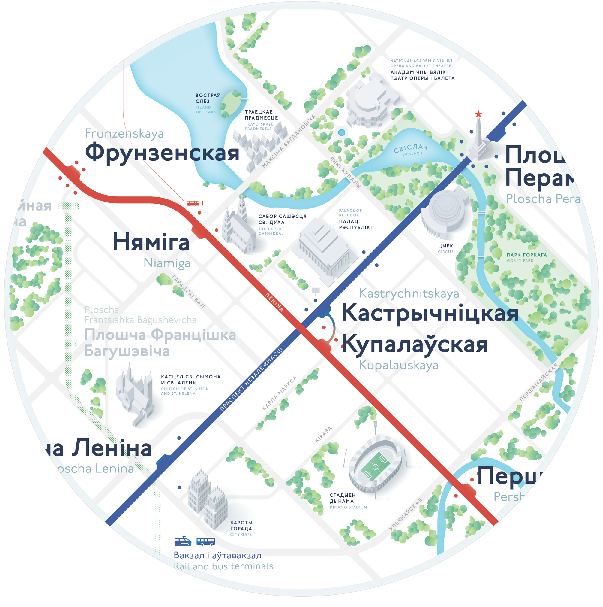
Showed in detail, used the main landmarks: street names, parks, river and attractions. Refused the numbering of stations, allocated exits. Inside maintained a uniform density of inscriptions and objects. Stations outside the center are located horizontally and without geographic details. Particular attention is paid to trees and buildings that do not interfere with reading information.
')

Marked by a pleasant raster. Indicated the year of the planned opening.
We do not show stations that are only in the plan.
Now the historical guest acts on transliteration, according to which the letters w and h are transmitted as š and č. Unfortunately, most of the world will never guess how to read it. Instead of Gostovsky transliteration, we use an understandable Latin alphabet.
She is not. We signed everything directly on the scheme.
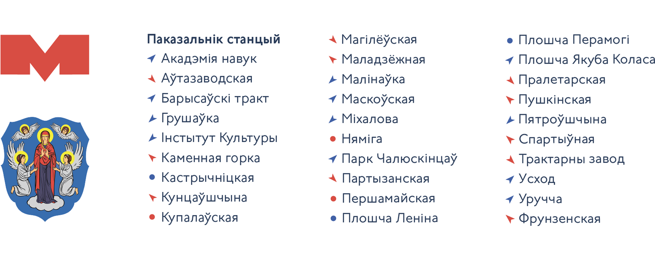
In order not to litter the grid and accelerate the search for stations, the “Compass” type indicator used for the first time in the 2013 Moscow metro scheme is used . To find a station, just look at the diagram in the direction indicated by the arrow:
I think that the scheme will look great on the platforms of central stations and in Minsk subway cars. Art director of the project Ilya Birman. Designers Vanya Zvyagin and Kostya Evstratenko.

Later I will publish four parts about the creation process.
Centre
Showed in detail, used the main landmarks: street names, parks, river and attractions. Refused the numbering of stations, allocated exits. Inside maintained a uniform density of inscriptions and objects. Stations outside the center are located horizontally and without geographic details. Particular attention is paid to trees and buildings that do not interfere with reading information.
')
Line being built
Marked by a pleasant raster. Indicated the year of the planned opening.
We do not show stations that are only in the plan.
Transliteration
Now the historical guest acts on transliteration, according to which the letters w and h are transmitted as š and č. Unfortunately, most of the world will never guess how to read it. Instead of Gostovsky transliteration, we use an understandable Latin alphabet.
Legend
She is not. We signed everything directly on the scheme.
Pointer
In order not to litter the grid and accelerate the search for stations, the “Compass” type indicator used for the first time in the 2013 Moscow metro scheme is used . To find a station, just look at the diagram in the direction indicated by the arrow:
I think that the scheme will look great on the platforms of central stations and in Minsk subway cars. Art director of the project Ilya Birman. Designers Vanya Zvyagin and Kostya Evstratenko.
Later I will publish four parts about the creation process.
Source: https://habr.com/ru/post/442166/
All Articles