Clustering wireless access points using the k-means method
Data visualization and analysis is now widely used in the telecommunications industry. In particular, the analysis is largely dependent on the use of geospatial data. Perhaps this is due to the fact that telecommunications networks themselves are geographically scattered. Accordingly, the analysis of such dispersions can be of great value.
To illustrate the k-means clustering algorithm, we will use a geographic database for free public WiFi in New York. The dataset is available at the NYC Open Data. In particular, the k-means clustering algorithm is used to form WiFi use clusters based on latitude and longitude data.
From the dataset itself, latitude and longitude data is extracted using the R programming language:
Here is a piece of data:
')
Next, we determine the number of clusters using the below attached code, which shows the result in the form of a graph.
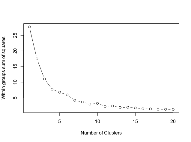
The graph shows how the curve aligns approximately at the level of 11. Therefore, this is the number of clusters that will be used in the k-means model.
The K-means analysis itself is carried out:
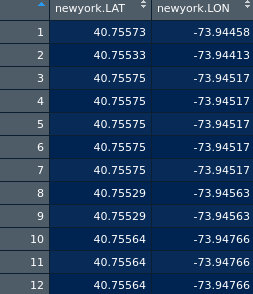
In the newyorkdf dataset there is information about the latitude, longitude and cluster label:
> newyorkdf
newyork.LAT newyork.LON fit.cluster
1 40.75573 -73.94458 1
2 40.75533 -73.94413 1
3 40.75575 -73.94517 1
4 40.75575 -73.94517 1
5 40.75575 -73.94517 1
6 40.75575 -73.94517 1
...
80 40.84832 -73.82075 11
Here is an illustration:
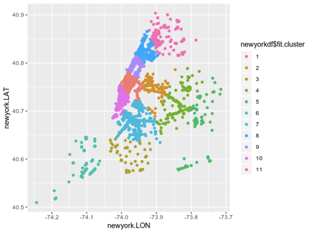
This illustration is useful, but the visualization will be even more valuable if you put it on the map of New York itself.

This type of clustering gives an excellent idea of the structure of the WiFi network in the city. This indicates that the geographic region marked by cluster 1 shows a lot of WiFi traffic. On the other hand, fewer connections in cluster 6 may indicate low WiFi traffic.
K-Means clustering alone does not tell us why traffic for a particular cluster is high or low. For example, when cluster 6 has a high population density, but low Internet speed leads to fewer connections.
However, this clustering algorithm provides an excellent starting point for further analysis and facilitates the collection of additional information. For example, using this map as an example, one can build hypotheses regarding individual geographic clusters. The original article is here .
Data
To illustrate the k-means clustering algorithm, we will use a geographic database for free public WiFi in New York. The dataset is available at the NYC Open Data. In particular, the k-means clustering algorithm is used to form WiFi use clusters based on latitude and longitude data.
From the dataset itself, latitude and longitude data is extracted using the R programming language:
#1. Prepare data newyork<-read.csv("NYC_Free_Public_WiFi_03292017.csv") attach(newyork) newyorkdf<-data.frame(newyork$LAT,newyork$LON) Here is a piece of data:
')
Determine the number of clusters
Next, we determine the number of clusters using the below attached code, which shows the result in the form of a graph.
#2. Determine number of clusters wss <- (nrow(newyorkdf)-1)*sum(apply(newyorkdf,2,var)) for (i in 2:20) wss[i] <- sum(kmeans(newyorkdf, centers=i)$withinss) plot(1:20, wss, type="b", xlab="Number of Clusters", ylab="Within groups sum of squares") The graph shows how the curve aligns approximately at the level of 11. Therefore, this is the number of clusters that will be used in the k-means model.
K-average analysis
The K-means analysis itself is carried out:
#3. K-Means Cluster Analysis set.seed(20) fit <- kmeans(newyorkdf, 11) # 11 cluster solution # get cluster means aggregate(newyorkdf,by=list(fit$cluster),FUN=mean) # append cluster assignment newyorkdf <- data.frame(newyorkdf, fit$cluster) newyorkdf newyorkdf$fit.cluster <- as.factor(newyorkdf$fit.cluster) library(ggplot2) ggplot(newyorkdf, aes(x=newyork.LON, y=newyork.LAT, color = newyorkdf$fit.cluster)) + geom_point() In the newyorkdf dataset there is information about the latitude, longitude and cluster label:
> newyorkdf
newyork.LAT newyork.LON fit.cluster
1 40.75573 -73.94458 1
2 40.75533 -73.94413 1
3 40.75575 -73.94517 1
4 40.75575 -73.94517 1
5 40.75575 -73.94517 1
6 40.75575 -73.94517 1
...
80 40.84832 -73.82075 11
Here is an illustration:
This illustration is useful, but the visualization will be even more valuable if you put it on the map of New York itself.
# devtools::install_github("zachcp/nycmaps") library(nycmaps) map(database="nyc") #this should also work with ggplot and ggalt nyc <- map_data("nyc") gg <- ggplot() gg <- gg + geom_map( data=nyc, map=nyc, aes(x=long, y=lat, map_id=region)) gg + geom_point(data = newyorkdf, aes(x = newyork.LON, y = newyork.LAT), colour = newyorkdf$fit.cluster, alpha = .5) + ggtitle("New York Public WiFi") This type of clustering gives an excellent idea of the structure of the WiFi network in the city. This indicates that the geographic region marked by cluster 1 shows a lot of WiFi traffic. On the other hand, fewer connections in cluster 6 may indicate low WiFi traffic.
K-Means clustering alone does not tell us why traffic for a particular cluster is high or low. For example, when cluster 6 has a high population density, but low Internet speed leads to fewer connections.
However, this clustering algorithm provides an excellent starting point for further analysis and facilitates the collection of additional information. For example, using this map as an example, one can build hypotheses regarding individual geographic clusters. The original article is here .
Source: https://habr.com/ru/post/442094/
All Articles