Kibana User Guide. Visualization. Part 4
The fourth part of the translation of official documentation on data visualization in Kibana.
Link to original material: Kibana User Guide [6.6] "Visualize
Link to 1 part: Kibana User Guide. Visualization. Part 1
Link to part 2: Kibana User Guide. Visualization. Part 2
Link to part 3: Kibana User Guide. Visualization. Part 3
Region maps
Regional maps are thematic maps in which vector shapes with borders are colored using a gradient: high color intensity indicates larger values and low color intensity corresponds to lower values. This is also known as cartogram.

Configuration
By creating a region map, you configure an incoming connection that links the result of the aggregation of Elasticsearch values and a link to a vector file based on a shared key.
Data
Metrics
Select any of the supported metrics or related source aggregations.
Segments
Setting aggregation of values. The value is the key that is used to link the results and vector data on the map.
Options
Layer settings
- Vector map: select from the list of vector maps. This list includes maps that are hosted on Elastic Maps Service , as well as your own, specified in the config / kibana.yml file . To learn more about customizing Kibana for user-defined layers, see the regional map settings documentation. You can also explore and view the vector layers available on the Elastic Maps Service .
- Join field: this is a property from the selected vector map that will be used to combine the values in your aggregation of values. When the values cannot be combined with any shape in the vector layer due to the lack of exact match, Kibana will display a warning. To disable these warnings, go to Management / Kibana / Advanced Settings and set false to the
visualization:regionmap:showWarnings.
Style settings
- Color Schema: a range of colors used for coloring shapes.
Basic settings
- Legend Position: A position on the map legend screen.
- Show Tooltip: determines whether the tooltip should hover when hovering over the shape.
Time Series Visual Builder
The visual time series designer is a time series data visualizer with a focus on allowing you to use all the features of the Elasticsearch aggregation platform. The visual designer of time series allows to combine the infinity of aggregations and aggregations of a related source to display a complex of data in an expressive form.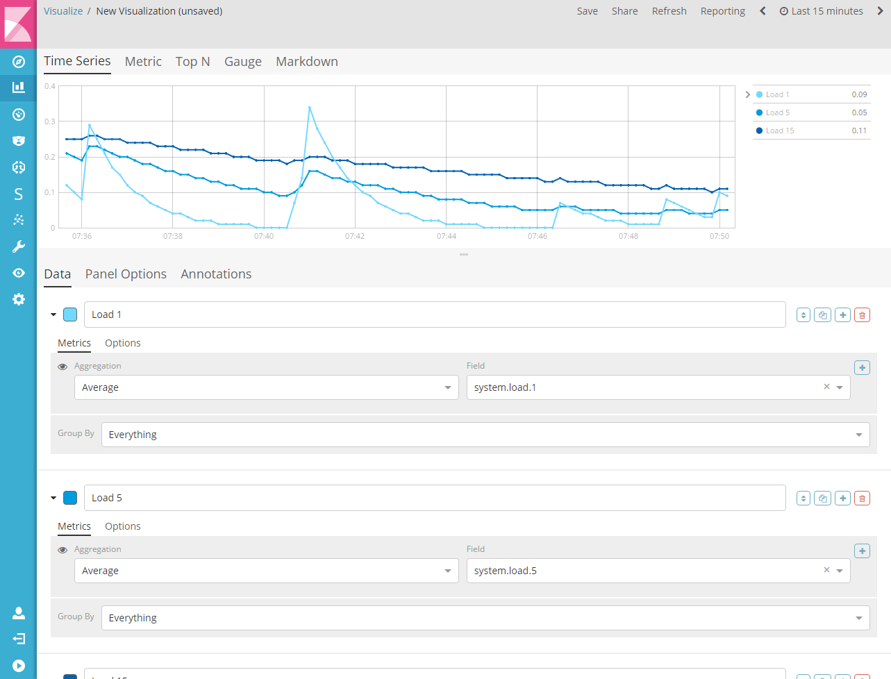
Final renderings
The visual time series designer comes with 6 different types of visualization. You can choose between each type of visualization using the tabbed picker at the top of the interface.
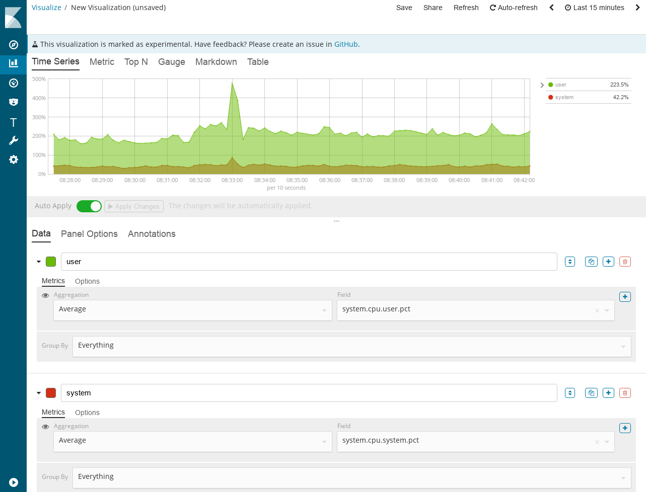
Time series
Histogram visualization supports area, graph, chart, and steps along with several Y axes. You can completely change the colors, points, line widths, and fill transparency. This visualization also supports a time shift for comparing two time periods. It also supports annotations that can be loaded from a separate index based on the query.
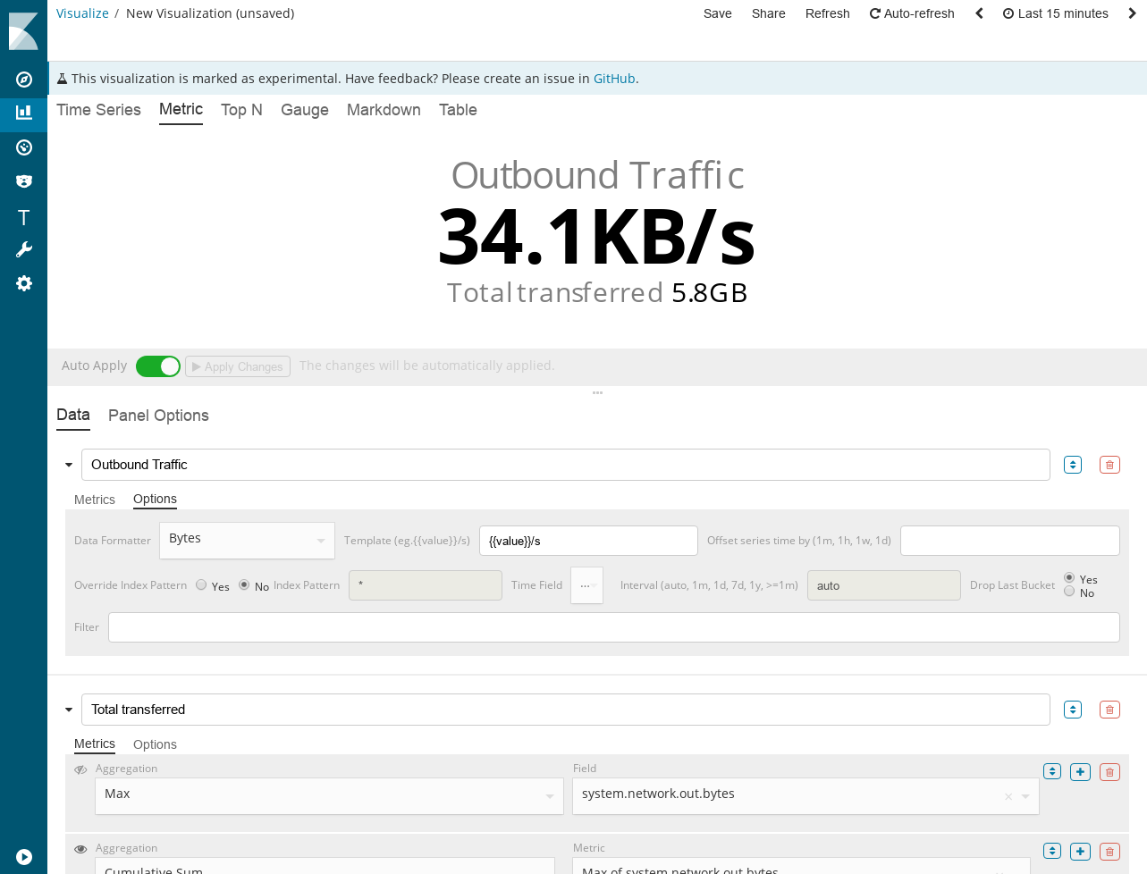
Metrics
Visualization to display the last numbers in the series. This visualization supports 2 metrics: primary and second. Signatures and backgrounds can be completely changed based on a set of rules.
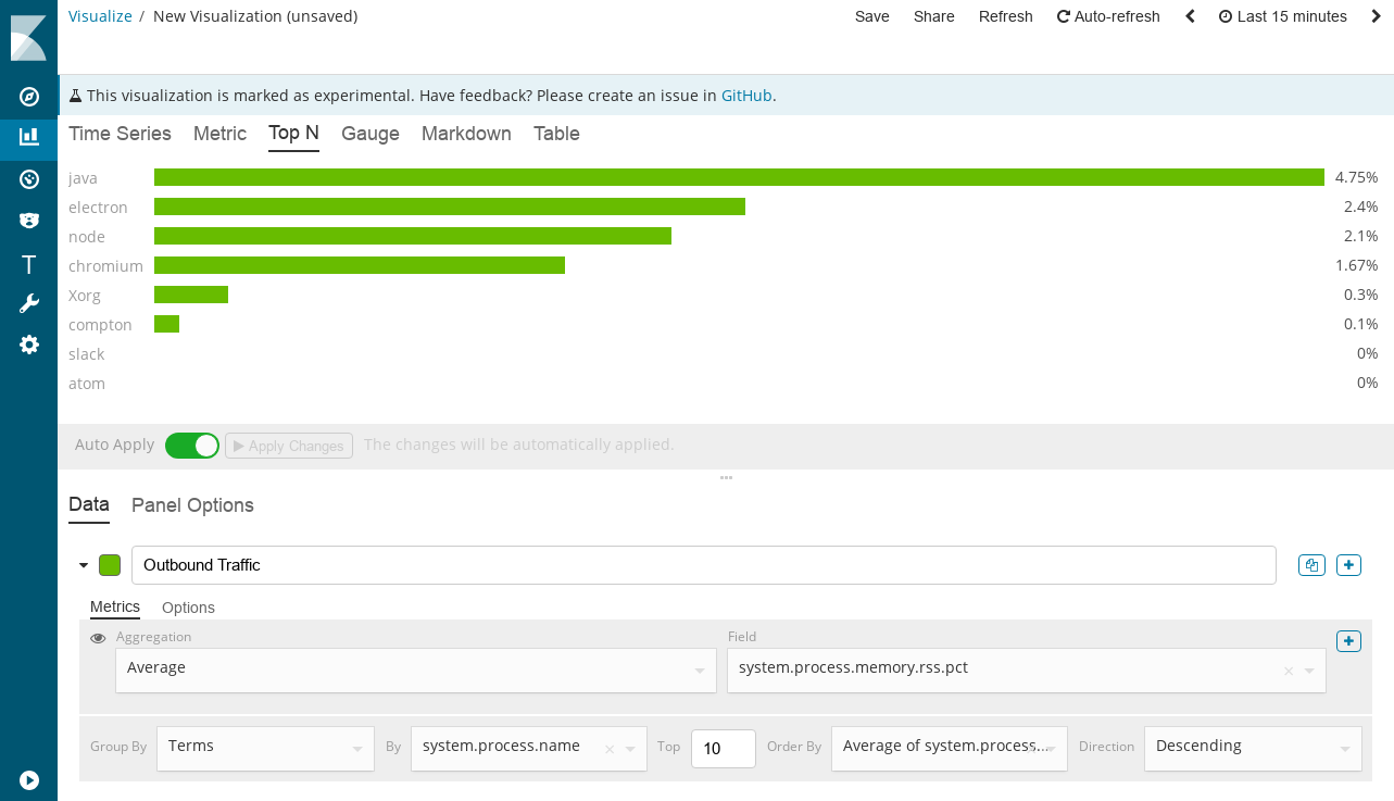
Top n
This is a horizontal bar where the Y axis is based on a set of metrics and the X axis displays the last value in this set; sorted in descending order. The color of these bands is fully customizable by a set of rules.
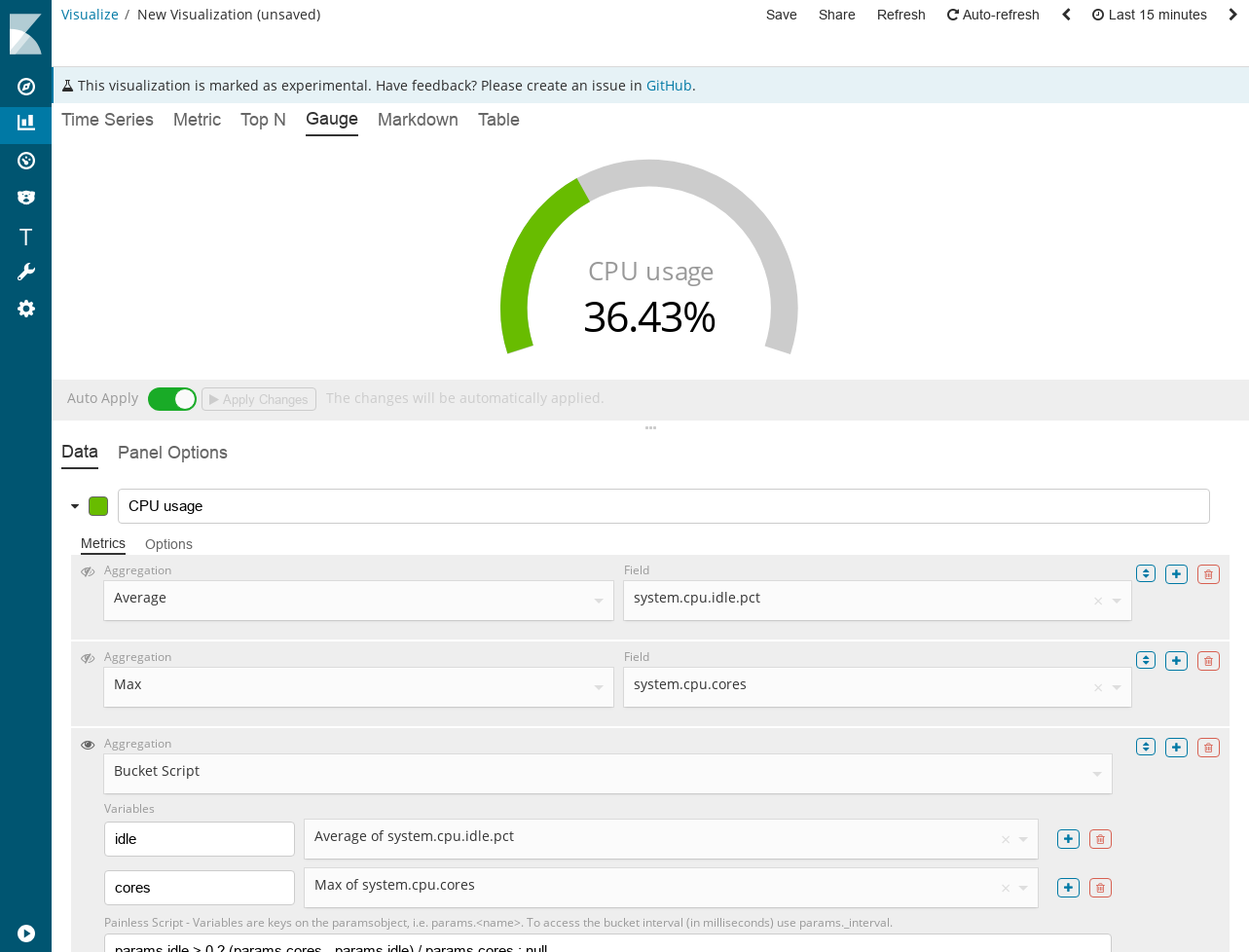
Gauge
This visualization of a scale with a single value is based on the last value in the set. Scale display can be a semicircle or a circle. You can customize the thickness of the internal and external lines to achieve the desired design aesthetics. Scale color and text are fully customizable based on a set of rules.
Markdown
This visualization allows you to enter the mark text and embed the Mustache template syntax to customize the mark with data based on a set of rows.

Table
Table visualization allows you to display data from several time series. You determine which field group is displayed in rows and which data columns.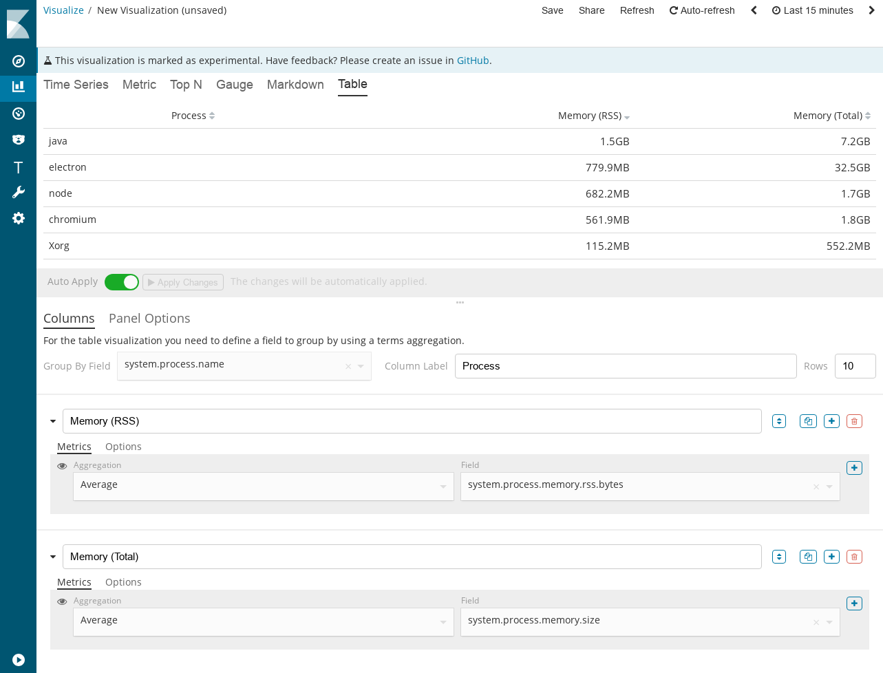
Interface overview
The user interface for each visualization is the composition of the Data tab and the Options Panel. The only exception is the Time Series and the Mark; The time series has a third tab for annotations, the mark has a tab for the editor.
Data tab
The data tab is used to set up rows for each visualization. This tab allows you to add multiple rows, depending on visualization support, with several aggregations combined together to create a single metric. Here is a breakdown of the important components of the user interface data tab.
Series Label and Color
Each row supports a caption that will be used for legends and captions, depending on the choice of the type of visualization. For rows grouped by value, you can define the Mustache {{key}} variable to replace the value. For most visualizations, you can also choose a color by clicking on a sample, this will display a palette of colors.

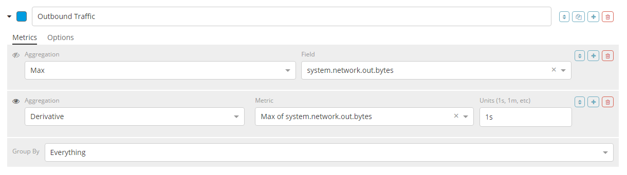
Metrics
Each row supports several metrics (aggregations); The last metric (aggregation) is the value that will be displayed for the rows, this is indicated by the "eye" icon to the left of the metric. Metrics can be compiled using related source aggregations. A common use case is to create a metric with "maximum" aggregation, then create a "derivative" metric and select the previous "maximum" metric as the source; it will create speed.
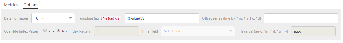
Row Options
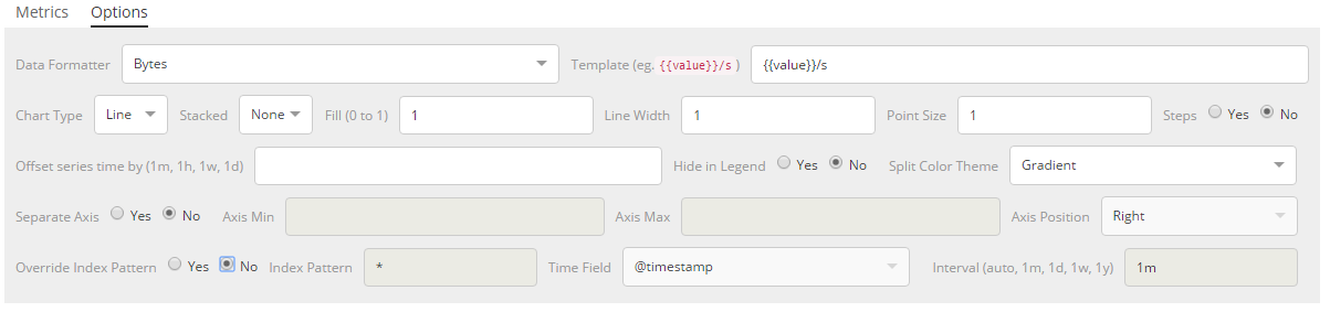
Each row also supports a set of options that depend on the type of visualizations selected. Universally for each type of visualization you can configure:
- date format
- time range offset
- index pattern, time stamp and interval definition
For time series visualizations, you can also configure:
- type of circuit
- options for each type of circuit
- appearance of a legend
- Y axis options
- color theme splitting
Control Grouping
At the bottom of the metric is a set of grouped controls, which allows you to specify how the series should be grouped or divided. There are 4 options:
- everything
- filter (one)
- filters (several, with customized colors)
- values
By default, rows are grouped around.
Panel Options Tab
The options panel tab was used to configure the entire panel; a set of options is available depending on the selected visualization. Below is a list of options available for visualization:
Time series
- index pattern, time stamp, interval
- minimum and maximum of the y-axis
- Y axis position
- background color
- appearance of a legend
- legend position
- panel filter
Metric
- index pattern, time stamp, interval
- panel filter
- color rules for background and primary value
Top n
- index pattern, time stamp, interval
- panel filter
- background color
- Item URL
- color rules for color stripes
Gauge
- index pattern, time stamp, interval
- panel filter
- background color
- scale maximum
- scale style
- outer scale color
- outer scale thickness
- scale line thickness
- color rules for scale line colors
Markdown
- index pattern, time stamp, interval
- panel filter
- background color
- scroll visibility
- vertical content alignment
- Less CSS syntax custom panel
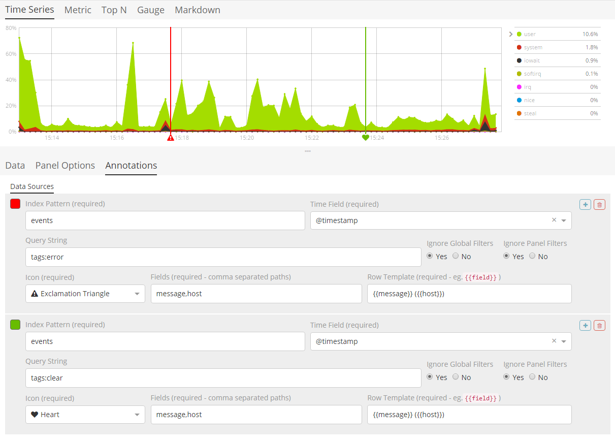
Annotations Tab
The annotations tab is used to add an annotation data source to the time series visualization. You can configure the following options:
- index template and time field
- color annotation
- annotation icon
- fields included in the message
- message format
- filtering options on the panel and globally
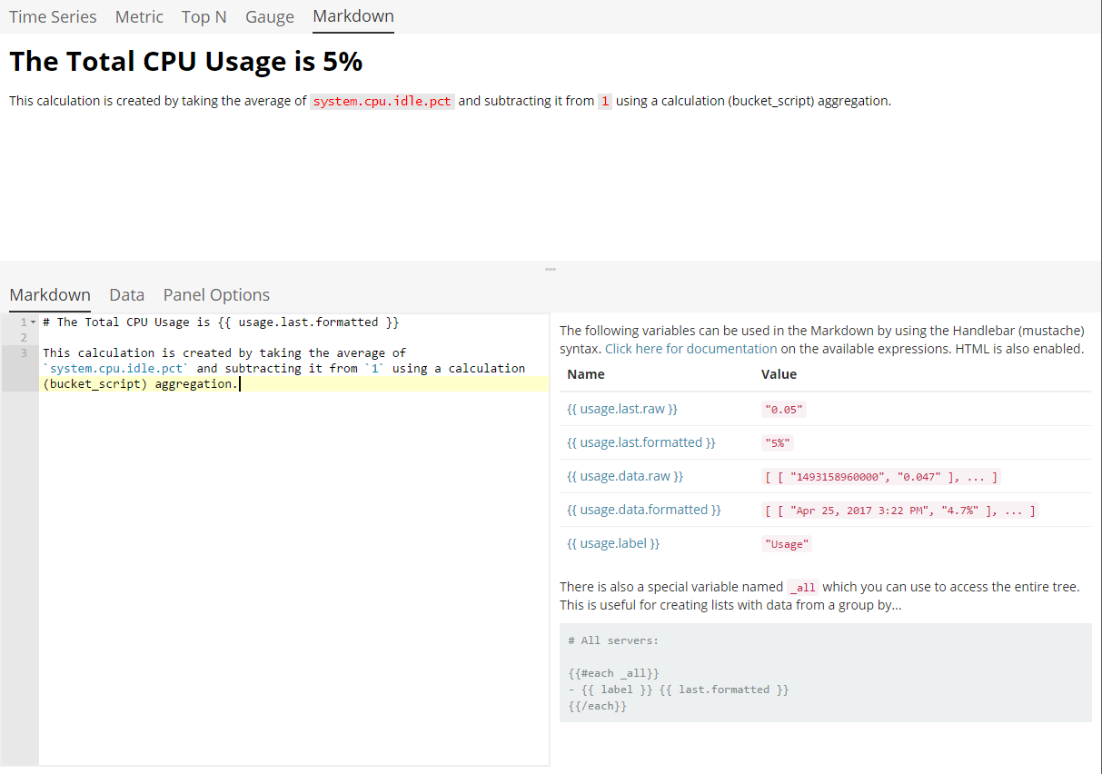
Markdown tab
The tab of the mark is used to edit the source of the visualization of the mark. The user interface contains an editor in the left pane and the available variables from the data table on the right. You can click on the variable names to insert the Mustache template variable into the mark at the cursor location. The Mustache syntax uses the Handlebar.js processor, which is an extended version of the Mustache template language.
')
Source: https://habr.com/ru/post/441830/
All Articles