How to create a beautiful color palette

Despite the fact that the selection of good colors is an art, there are several tricks to simplify the selection of beautiful colors. This article consists of two parts: in the first I will tell you what makes a palette good, and in the second I will derive a formula that can be used to select a beautiful palette.
Note: this is not the only way to choose good colors, rather, a set of heuristics that I have mastered on my own. Hope this helps you select the right colors for your website / application / game.
Color palettes and contrast
First we need to say that colors do not exist in isolation. When we talk about a beautiful color, it does not mean that it is light or dark, saturated or faded. When we talk about the selection of colors, we should think not so much about individual colors, but about sets of colors, or color palettes.

From left to right: Super Mario Run, Monument Valley, Alto's Odyssey, Lara Croft Go
')
When we think about color sets, we should think about their interaction: should any of them stand out or mix with each other? This is called contrast.
The process of choosing beautiful colors often comes down to choosing the right contrasts for your design.
Beautiful colors depend on how they work with each other in your design. But when it comes to color contrast, it can be formed in various ways:
Brightness (light / dark)
Brightness is a type of contrast that is easy to visualize. On the HSB color selector, this corresponds to the movement along the vertical axis:
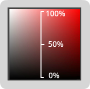
Brightness
In general, we can simply increase the amount of contrast between two colors, simply by increasing the difference in their brightness.
Brightness contrast
Although this is easy to do, it is not enough to create high-quality palettes. Colors vary only in size of black and white and are simply not as interesting as colors interacting in more dimensions. Which leads us to ...
Tonal contrast
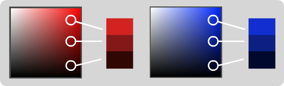
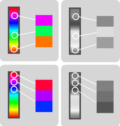
We perceive tonal contrast in terms of hues of colors and saturation levels. Almost as in the case of brightness, increasing the hue difference or saturation generally increases the amount of contrast between colors.
Contrast colors
Saturation (horizontal axis HSB) and saturation contrast
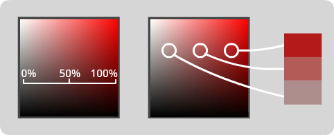
But even so, these values separately cannot draw the whole picture. We can still choose colors that, despite differences in hues or saturation, still have a bad contrast.
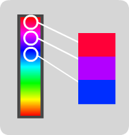
Different shades and poor contrast
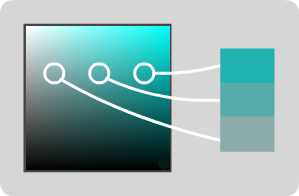
Different saturation and poor contrast
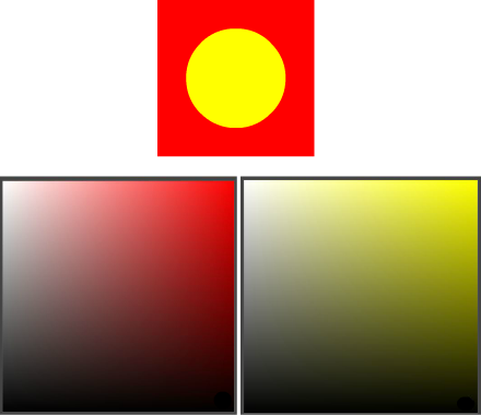
What's going on here? The answer is that different shades have different internal tonal values. Many people (including me) find it hard to imagine what tonal values can take on different shades. And that brings us to my favorite trick ...
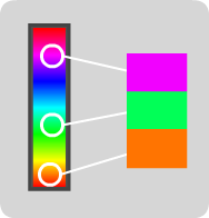
Grayscale Hack
If you display colors in shades of gray, then the brightness of the resulting gray can serve as a good indicator of the value of tones of different colors. But it is not only useful for this: it’s important if you create a design to meet the needs of people with disabilities. This is a simple way to visualize the amount of contrast that exists in a design, regardless of hue.
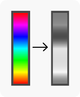
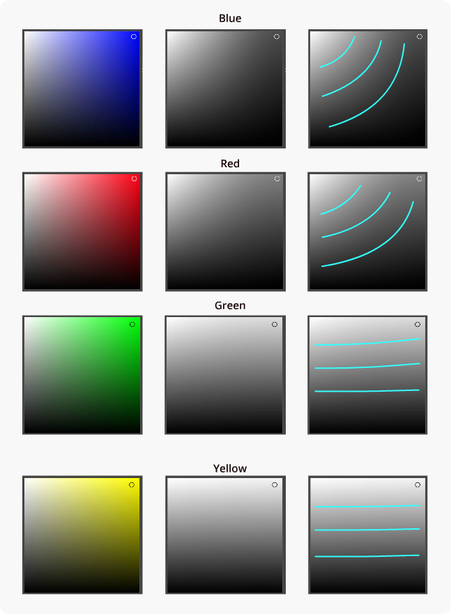
Internal tonal values for different hues
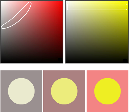
Let's see how these tonal values look in the HSB color selector. Also note how changes in tonal values change in the spectrum for each hue (shown in the rightmost column):
If we look at the previous examples, but now in shades of gray, then we can much easier say which colors have high and low contrast.

Contrast saturation: high contrast at the top, poor - at the bottom.
Contrast shades: high contrast at the top, poor - at the bottom.
Let's take another look at the games shown above, but now in grayscale.

You can easily notice that the foreground stands out well against the background, the interactive elements strongly contrast with non-interactive ones, and that if the game were in grayscale, it would still remain playable. The most important conclusion from this is:
Often and deliberately use hacks with gradations of gray to visualize the contrasts that exist in your design.
Beautiful contrasts lead to the creation of beautiful color palettes, so I present to you ...
Formula for choosing beautiful color palettes
Let's apply the above analysis, but in the reverse order: let's start with the design in grayscale, and then proceed to the selection of appropriate colors.
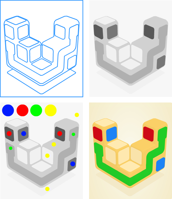
1: Determine where we need contrast
Create a frame for your design, and then decide in which areas of the frame you need more contrast, and in which areas you need less.
2: Colorize the design with grayscale
Try to paint the frame design only shades of gray. Make sure that areas requiring more contrast have the greatest difference in brightness. This step must be done in the final design resolution. Small design elements (such as logos and application icons) require particularly high contrast to highlight small elements.
3: Choose base colors
Choose the basic shades of colors you want to work with. This is a subjective stage, and you can use tools like ShapeFactory's Pigment or Adobe Color CC to select it. Funny fact: some combinations of colors are so popular that they got the status of a trail .
4: Adjust colors to have matching tonal values.
Selecting shades, find the interval of tonal values at which the hue roughly corresponds to the value of the gray tone from the previously drawn sketch. Experimenting with the values of brightness and saturation, switch between the modes of real colors and shades of gray. Your task is to get a color palette that, when displayed in shades, corresponds to the design from step 2.
Example 1

(1) The frame and (2) the preferred contrasts in shades of gray
(3) Selected base colors
If we wanted to come to the color palette shown above, we would have to find which areas of each color roughly correspond to the design in grayscale.

Corresponding areas of tonal values for base colors
Now we can select color combinations from any part of these areas:
(4) Multiple color palette options
Example 2
Here is what this process looked like when developing my Overlink application:
The process from left to right, top to bottom: frame, grayscale, base colors, final design
Congratulations! I hope this helps you to choose sets of colors that contrast with where you need it, blend where you don’t need it, and generally look beautiful.
Contrast in itself is not the most crucial aspect for creating great design, but it plays an important role in choosing beautiful palettes.
Source: https://habr.com/ru/post/441278/
All Articles