Kibana User Guide. Visualization. Part 1
Good day. All ElasticStack users need to visualize data sooner or later. Most use Kibana. Under the cut translation of official documentation for version 6.6.
Link to original material: Kibana User Guide [6.6] "Visualize
The Visualize tab allows you to create data visualization in your Elasticsearch indexes. You can then build information panels (dashboards) that display the associated visualizations.
Kibana visualizations are based on Elasticsearch queries. Using a series of aggregations (samples, approx. Lane) to extract and process your data, you can create charts that display trends, bursts and drops, you need.
')
You can create visualizations of a search saved in the Discover tab or start with a new search query.
To create a visualization:
Line, Area and Bar charts . (Charts, areas and histograms, approx. Lane.) Compare different data sets in X / Y charts.
Heat maps . (Temperature maps, approx. Lane.) Darkening of the elements in the matrix.
Pie chart . (Diagrams, lane comment) Shows the share of each source in the total amount.
Data table . (Data table, note lane.) Displays the raw data of the aggregation.
Metric . (Metric, approx. Lane.) Displays a single number.
Goal and Gauge . (Aim and sensor, approx. Lane.) Displays the scale of the sensor.
Coordinate map . (Coordinate map, lane comment.) It maps aggregation data and geographic location.
Region map. (Map of regions, note of the lane.) Thematic maps, where the intensity of the color of the form corresponds to the metric value.
Timelion Computes and combines data from multiple time series data sets.
Time Series Visual Builder. (Visual time series designer, approx. Lane.) Visualizes time series data using an aggregation source.
Controls . (Management, approx. Lane.) Provides the ability to add interactive input forms to Kibana dashboards.
Markdown widget . (Discount widget, lane comment.) Displays arbitrary information or instructions.
Tag cloud . (Tag cloud, note lane.) Shows words as a cloud, in which their size corresponds to importance.
Vega graph . (Vega graph, lane comment.) Supports user-defined graphs of external data sources, images, and user-defined interactivity.
4. Specify the search query from which data will be received for your visualization:
Note. When you build a visualization based on a saved search, any subsequent changes to the saved search are automatically displayed in the visualization. To disable automatic updating, you can disconnect the visualization and the saved search.
5. In the visualization designer, select the aggregation metric for the visualization Y-axis:
6. To visualize the X axis, select segment aggregation:
For example, if you indexed the Apache server logs, you can build a histogram that shows the distribution of incoming requests by geographic location, based on the specification of the aggregation expressions for the
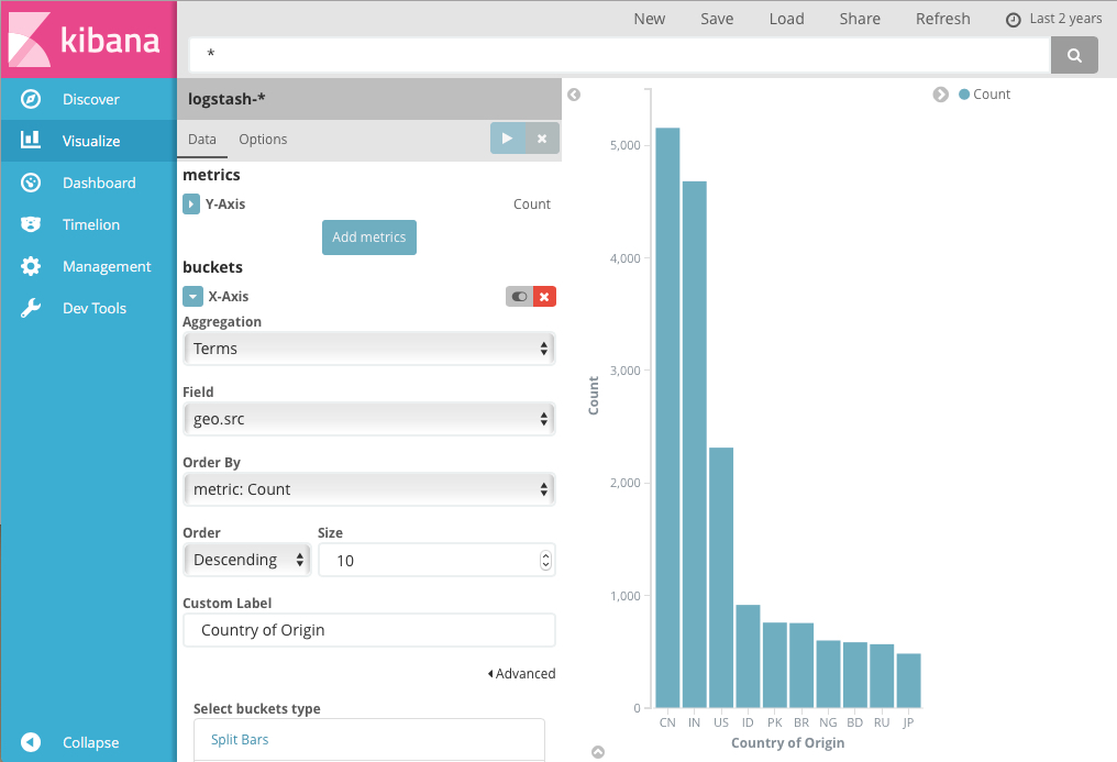
The y-axis shows the number of requests that came from different countries, and the countries signed the x-axis.
The histogram, graph, or area visualization uses metrics for the Y axis and segments for the X axis. Segments are similar to SQL
You can optionally split the data by specifying subgroups. The first aggregation sets the data set for any subsequent aggregations. The subgroups are applied in order — you can drag the aggregations to change the order of use.
For example, you can add a subgroup of expressions for the

For more information on working with subgroups of aggregations, see Kibana, Aggregation Execution Order, and You .
Line, Area and Bar allow you to plot data on the X / Y axis.
First you need to select the metrics that define the axis values.
Metric aggregations:
Count. Counting aggregation returns the net count of the elements in the selected index pattern.
Average. This aggregation returns the average of a number field. Select a field from the drop-down list.
Sum. Returns the total amount of a numeric field. Select a field from the drop-down list.
Min. Returns the minimum value in a numeric field. Select a field from the drop-down list.
Max. Returns the maximum value in a numeric field. Select a field from the drop-down list.
Unique Count. Cardinal aggregation returns the number of unique values in a field. Select a field from the drop-down list.
Standard Deviation. Aggregation of general statistics returns the standard deviation of data in a numeric field. Select a field from the drop-down list.
Top hit. Aggregation of top values returns one or more top values from a special field in your document. Choose the field from the drop-down list, the type of document sorting, the number of values to be returned.
Percentiles. Percent Aggregation divides numeric field values into specified ranges. Select a field from the drop-down list, then define one or more areas in the Percentiles fields. Click the X to remove the percent field. Click Add to add a percentage field.
Percentile Rank. Percentage rank aggregation returns percent ranking by selected numeric field. Select a field from the drop-down list, then define one or more percentage rank values in the Values fields. Click the X to remove the value field. Click + Add to add a value field.
Aggregations of parent data sources:
For each aggregation of the parent information source, it is necessary to determine the metric for which the aggregation is calculated. This may be one of the existing metrics or a new one. You can also invest these aggregations (for example, to obtain a third derivative).
Derivative. Derivative aggregation counts the derivative of certain metrics.
Cumulative Sum. The aggregation of the cumulative sum counts the cumulative sum of certain metrics in the parent histogram.
Moving average. Moving average aggregation will insert a window through the data and write the average value of this window.
Serial Diff. Sequential differentiation is a method where values in a time series are subtracted from themselves in another time period or delay.
Related Source Aggregations:
As in the case of aggregation of parent sources, you need to specify the metric for which the aggregation of the related source will be calculated. In addition, you need to provide for the aggregation of segments, which will determine on which segments the aggregation will run.
Average Bucket. The segment average calculates the average value of certain metrics in the aggregation of related sources.
Sum Bucket. Calculates the sum of the values of a specific metric in the aggregation of a related source.
Min Bucket. Returns the minimum value of a specific metric in a relative source aggregation.
Max Bucket. Returns the maximum value of a specific metric in a related source aggregation.
You can create an aggregation by clicking on the + Add Metrics button.
Enter a string in the Custom Label field to change the label.
Segment aggregations determine which information will be retrieved from your data.
Before you select aggregation of a segment, indicate whether you divide the slices within the same schema or split them into several schemas. The division into several schemes should be performed before any other aggregations. When you divide a chart, you can change if splits are displayed in a row or column by clicking the Rows | Columns .
The X axis of this diagram is the segment axis. You can define segments for the x-axis for a specific region of the circuit or for individual circuits.
This X-axis of the schema supports the following aggregations. Click the associated name of this aggregation to go to the Elasticsearch documentation for this aggregation.
Date Histogram. The time histogram is based on a numerical field and is organized by date. You can define time frames for intervals in seconds, minutes, hours, days, weeks, months, or years. You can also define a default interval by selecting Custom as the interval and specifying the number and unit of time in the text field. The default time interval units are: s for seconds, m for minutes, h for hours, d for days, w for weeks, y for years. Different units support different levels of accuracy, up to one second. Intervals are signed at the beginning of the interval using the key-date, which is returned from Elasticsearch. For example, the first day of the month will be displayed in the tooltip for the monthly interval.
Histogram. The standard histogram is based on a numeric field. Determine the integer interval for this field. Check the Show empty buckets box to include empty intervals in the histogram.
Range. Using rank aggregation, you can determine the ranks for the numeric field values. Click Add Range to add a set of rank endpoints. Click the red symbol (x) to remove the rank.
Date Range. Time rank aggregation reports values that are in the specified date range. You can specify date ranges using mathematical date expressions. Click Add Range to add a set of rank endpoints. Click the red symbol (x) to remove the rank.
IPv4 Range. IPv4 rank aggregation allows you to define IPv4 address ranges. Click Add Range to add a set of rank endpoints. Click the red symbol (x) to remove the rank.
Terms. Aggregation of values allows you to define the top or bottom n elements of this field for display, ordered by number or custom metric.
Filters. You can define a set of filters for data. It is possible to specify a filter as a query string or in JSON format, as well as in the Discover search tab. Click Add Filter to add another filter. Click the label button to open the label field where you can type the name to display on the visualization.
Significant Terms. Displays the results of experimental aggregation of signed values.
Once you have defined the X axis aggregation, you can define aggregation subgroups to improve visualization. Click + Add Sub Aggregation to create a nested aggregation, then select Split Area or Split Chart , then select the nested aggregation from the list of types.
When complex aggregations are defined on the schema axes, you can use the up or down arrows to the right of the aggregation type to change the aggregation priority.
Enter a string in the Custom Label field to change the label.
You can customize the colors of your visualization by clicking the colored dot next to each caption to display the color palette.
Enter a string in the Custom Label field to change the label.
You can click on the Advanced link to display more options for your metrics or segment aggregation:
Exclude Pattern. Specify a template in this field to exclude from the results.
Include Pattern. Specify a template in this field to include in the results.
JSON Input. A text field where you can add specific properties in JSON format to merge with a specific aggregation, as in the following example:
Note. In Elasticsearch 1.4.3 and later, this functionality needs Groovy dynamic scripting enabled .
The availability of these parameters depends on the aggregation you choose.
Select the Metrics & Axes tab to change the way the individual metric is displayed in the diagram. The data sets are styled in the Metrics section, while the axes are styled in the X and Y axes section.
Change the way each metric is displayed in the Data pane.
Chart type. Choose between Chart, Area and Histogram.
Mode. Stack various metrics or display them next to each other.
Value Axis. Select the axis for which you want to build data (the properties of each of them are configured under the Y axis).
Line mode. Should the contour of the graphs or histograms be smooth, straight or stepped.
The style of all y-axis scheme.
Position. The position of the Y axis (left or right for vertical layout and top or bottom for horizontal layout).
Scale type. Scaling values (linear, logarithmic or quadratic).
Advanced Options:
Labels - Show Labels. Allows you to hide axis signatures.
Labels - Filter Labels. If the signature filter is enabled, some signatures will be hidden if there is not enough space to display them.
Labels - Rotate. You can enter the number of degrees by which you want to wrap signatures.
Labels - Truncate. You can enter the number of pixels to which the captions fit.
Scale to Data Bounds. By default, the bounds of the Y axis are zero and the maximum value that is returned from the data. Check this box to change both the upper and lower bounds according to the values returned from the data.
Custom Extents. You can define your own maximum and minimum values for each axis.
Position. The position of the X axis (left or right for the horizontal layout and above or below for the vertical layout).
Advanced Options:
Labels - Show Labels. Allows you to hide axis signatures.
Labels - Filter Labels. If the signature filter is enabled, some signatures will be hidden if there is not enough space to display them.
Labels - Rotate. You can enter the number of degrees by which you want to wrap signatures.
Labels - Truncate. You can enter the number of pixels to which the captions fit.
Here are the parameters that apply to the entire schema, and not just to individual data series.
Legend Position. Move the legend left, right, up or down.
Show Tooltip. Turn on or off the display of a tooltip when hovering over a schematic object.
Current Time Marker. Show current time line.
You can turn on the grid in the diagram. By default, the grid is displayed only on category axes.
X axis. You can disable the category axis grid.
Y axis. You can choose on which value axes you will display the grid lines.
The second part of.
Link to original material: Kibana User Guide [6.6] "Visualize
The Visualize tab allows you to create data visualization in your Elasticsearch indexes. You can then build information panels (dashboards) that display the associated visualizations.
Kibana visualizations are based on Elasticsearch queries. Using a series of aggregations (samples, approx. Lane) to extract and process your data, you can create charts that display trends, bursts and drops, you need.
')
You can create visualizations of a search saved in the Discover tab or start with a new search query.
Creating a visualization
To create a visualization:
- Click on the Visualize tab in the side navigation.
- Click the Create new visualization button or the + button.
- Select the type of visualization.
- Basic schemes
Line, Area and Bar charts . (Charts, areas and histograms, approx. Lane.) Compare different data sets in X / Y charts.
Heat maps . (Temperature maps, approx. Lane.) Darkening of the elements in the matrix.
Pie chart . (Diagrams, lane comment) Shows the share of each source in the total amount.
- Data
Data table . (Data table, note lane.) Displays the raw data of the aggregation.
Metric . (Metric, approx. Lane.) Displays a single number.
Goal and Gauge . (Aim and sensor, approx. Lane.) Displays the scale of the sensor.
- Cards
Coordinate map . (Coordinate map, lane comment.) It maps aggregation data and geographic location.
Region map. (Map of regions, note of the lane.) Thematic maps, where the intensity of the color of the form corresponds to the metric value.
- Time series
Timelion Computes and combines data from multiple time series data sets.
Time Series Visual Builder. (Visual time series designer, approx. Lane.) Visualizes time series data using an aggregation source.
- Rest
Controls . (Management, approx. Lane.) Provides the ability to add interactive input forms to Kibana dashboards.
Markdown widget . (Discount widget, lane comment.) Displays arbitrary information or instructions.
Tag cloud . (Tag cloud, note lane.) Shows words as a cloud, in which their size corresponds to importance.
Vega graph . (Vega graph, lane comment.) Supports user-defined graphs of external data sources, images, and user-defined interactivity.
4. Specify the search query from which data will be received for your visualization:
- To enter a new search criteria, select an index template for indexes that contain data that you want to visualize. This will open the visualization constructor with an undefined query that matches all documents in the selected indexes.
- To build a visualization based on a saved search, click on the name of the saved search that you need. This will open the visualization designer and load the selected query.
Note. When you build a visualization based on a saved search, any subsequent changes to the saved search are automatically displayed in the visualization. To disable automatic updating, you can disconnect the visualization and the saved search.
5. In the visualization designer, select the aggregation metric for the visualization Y-axis:
- Metric aggregations: calculation, average number, amount, minimum, maximum, standard deviation, calculation of unique values, median (50 percent), percentages, percentage series, top values, geo center
- Aggregations of parent information sources: derivative, accumulative sum, moving average, sequential differential
- Related source aggregations: average for a segment, amount for a segment, minimum for a segment, maximum for a segment
6. To visualize the X axis, select segment aggregation:
- Temporal histogram, spectrum, expressions, filters, sign expressions
For example, if you indexed the Apache server logs, you can build a histogram that shows the distribution of incoming requests by geographic location, based on the specification of the aggregation expressions for the
geo.src field :The y-axis shows the number of requests that came from different countries, and the countries signed the x-axis.
The histogram, graph, or area visualization uses metrics for the Y axis and segments for the X axis. Segments are similar to SQL
GROUP BY statements. Charts use metrics for share size and segments for the number of shares.You can optionally split the data by specifying subgroups. The first aggregation sets the data set for any subsequent aggregations. The subgroups are applied in order — you can drag the aggregations to change the order of use.
For example, you can add a subgroup of expressions for the
geo.dest field to the Histogram Country of request sources to see the destination of the queries.For more information on working with subgroups of aggregations, see Kibana, Aggregation Execution Order, and You .
Charts, areas and histograms
Line, Area and Bar allow you to plot data on the X / Y axis.
First you need to select the metrics that define the axis values.
Metric aggregations:
Count. Counting aggregation returns the net count of the elements in the selected index pattern.
Average. This aggregation returns the average of a number field. Select a field from the drop-down list.
Sum. Returns the total amount of a numeric field. Select a field from the drop-down list.
Min. Returns the minimum value in a numeric field. Select a field from the drop-down list.
Max. Returns the maximum value in a numeric field. Select a field from the drop-down list.
Unique Count. Cardinal aggregation returns the number of unique values in a field. Select a field from the drop-down list.
Standard Deviation. Aggregation of general statistics returns the standard deviation of data in a numeric field. Select a field from the drop-down list.
Top hit. Aggregation of top values returns one or more top values from a special field in your document. Choose the field from the drop-down list, the type of document sorting, the number of values to be returned.
Percentiles. Percent Aggregation divides numeric field values into specified ranges. Select a field from the drop-down list, then define one or more areas in the Percentiles fields. Click the X to remove the percent field. Click Add to add a percentage field.
Percentile Rank. Percentage rank aggregation returns percent ranking by selected numeric field. Select a field from the drop-down list, then define one or more percentage rank values in the Values fields. Click the X to remove the value field. Click + Add to add a value field.
Aggregations of parent data sources:
For each aggregation of the parent information source, it is necessary to determine the metric for which the aggregation is calculated. This may be one of the existing metrics or a new one. You can also invest these aggregations (for example, to obtain a third derivative).
Derivative. Derivative aggregation counts the derivative of certain metrics.
Cumulative Sum. The aggregation of the cumulative sum counts the cumulative sum of certain metrics in the parent histogram.
Moving average. Moving average aggregation will insert a window through the data and write the average value of this window.
Serial Diff. Sequential differentiation is a method where values in a time series are subtracted from themselves in another time period or delay.
Related Source Aggregations:
As in the case of aggregation of parent sources, you need to specify the metric for which the aggregation of the related source will be calculated. In addition, you need to provide for the aggregation of segments, which will determine on which segments the aggregation will run.
Average Bucket. The segment average calculates the average value of certain metrics in the aggregation of related sources.
Sum Bucket. Calculates the sum of the values of a specific metric in the aggregation of a related source.
Min Bucket. Returns the minimum value of a specific metric in a relative source aggregation.
Max Bucket. Returns the maximum value of a specific metric in a related source aggregation.
You can create an aggregation by clicking on the + Add Metrics button.
Enter a string in the Custom Label field to change the label.
Segment aggregations determine which information will be retrieved from your data.
Before you select aggregation of a segment, indicate whether you divide the slices within the same schema or split them into several schemas. The division into several schemes should be performed before any other aggregations. When you divide a chart, you can change if splits are displayed in a row or column by clicking the Rows | Columns .
The X axis of this diagram is the segment axis. You can define segments for the x-axis for a specific region of the circuit or for individual circuits.
This X-axis of the schema supports the following aggregations. Click the associated name of this aggregation to go to the Elasticsearch documentation for this aggregation.
Date Histogram. The time histogram is based on a numerical field and is organized by date. You can define time frames for intervals in seconds, minutes, hours, days, weeks, months, or years. You can also define a default interval by selecting Custom as the interval and specifying the number and unit of time in the text field. The default time interval units are: s for seconds, m for minutes, h for hours, d for days, w for weeks, y for years. Different units support different levels of accuracy, up to one second. Intervals are signed at the beginning of the interval using the key-date, which is returned from Elasticsearch. For example, the first day of the month will be displayed in the tooltip for the monthly interval.
Histogram. The standard histogram is based on a numeric field. Determine the integer interval for this field. Check the Show empty buckets box to include empty intervals in the histogram.
Range. Using rank aggregation, you can determine the ranks for the numeric field values. Click Add Range to add a set of rank endpoints. Click the red symbol (x) to remove the rank.
Date Range. Time rank aggregation reports values that are in the specified date range. You can specify date ranges using mathematical date expressions. Click Add Range to add a set of rank endpoints. Click the red symbol (x) to remove the rank.
IPv4 Range. IPv4 rank aggregation allows you to define IPv4 address ranges. Click Add Range to add a set of rank endpoints. Click the red symbol (x) to remove the rank.
Terms. Aggregation of values allows you to define the top or bottom n elements of this field for display, ordered by number or custom metric.
Filters. You can define a set of filters for data. It is possible to specify a filter as a query string or in JSON format, as well as in the Discover search tab. Click Add Filter to add another filter. Click the label button to open the label field where you can type the name to display on the visualization.
Significant Terms. Displays the results of experimental aggregation of signed values.
Once you have defined the X axis aggregation, you can define aggregation subgroups to improve visualization. Click + Add Sub Aggregation to create a nested aggregation, then select Split Area or Split Chart , then select the nested aggregation from the list of types.
When complex aggregations are defined on the schema axes, you can use the up or down arrows to the right of the aggregation type to change the aggregation priority.
Enter a string in the Custom Label field to change the label.
You can customize the colors of your visualization by clicking the colored dot next to each caption to display the color palette.
Enter a string in the Custom Label field to change the label.
You can click on the Advanced link to display more options for your metrics or segment aggregation:
Exclude Pattern. Specify a template in this field to exclude from the results.
Include Pattern. Specify a template in this field to include in the results.
JSON Input. A text field where you can add specific properties in JSON format to merge with a specific aggregation, as in the following example:
{ "script" : "doc['grade'].value * 1.2" }Note. In Elasticsearch 1.4.3 and later, this functionality needs Groovy dynamic scripting enabled .
The availability of these parameters depends on the aggregation you choose.
Metrics and axes
Select the Metrics & Axes tab to change the way the individual metric is displayed in the diagram. The data sets are styled in the Metrics section, while the axes are styled in the X and Y axes section.
Metrics
Change the way each metric is displayed in the Data pane.
Chart type. Choose between Chart, Area and Histogram.
Mode. Stack various metrics or display them next to each other.
Value Axis. Select the axis for which you want to build data (the properties of each of them are configured under the Y axis).
Line mode. Should the contour of the graphs or histograms be smooth, straight or stepped.
Y axis
The style of all y-axis scheme.
Position. The position of the Y axis (left or right for vertical layout and top or bottom for horizontal layout).
Scale type. Scaling values (linear, logarithmic or quadratic).
Advanced Options:
Labels - Show Labels. Allows you to hide axis signatures.
Labels - Filter Labels. If the signature filter is enabled, some signatures will be hidden if there is not enough space to display them.
Labels - Rotate. You can enter the number of degrees by which you want to wrap signatures.
Labels - Truncate. You can enter the number of pixels to which the captions fit.
Scale to Data Bounds. By default, the bounds of the Y axis are zero and the maximum value that is returned from the data. Check this box to change both the upper and lower bounds according to the values returned from the data.
Custom Extents. You can define your own maximum and minimum values for each axis.
X axis
Position. The position of the X axis (left or right for the horizontal layout and above or below for the vertical layout).
Advanced Options:
Labels - Show Labels. Allows you to hide axis signatures.
Labels - Filter Labels. If the signature filter is enabled, some signatures will be hidden if there is not enough space to display them.
Labels - Rotate. You can enter the number of degrees by which you want to wrap signatures.
Labels - Truncate. You can enter the number of pixels to which the captions fit.
Settings Panel
Here are the parameters that apply to the entire schema, and not just to individual data series.
Common parameters
Legend Position. Move the legend left, right, up or down.
Show Tooltip. Turn on or off the display of a tooltip when hovering over a schematic object.
Current Time Marker. Show current time line.
Grid options
You can turn on the grid in the diagram. By default, the grid is displayed only on category axes.
X axis. You can disable the category axis grid.
Y axis. You can choose on which value axes you will display the grid lines.
The second part of.
Source: https://habr.com/ru/post/441214/
All Articles