Trends in the design of UI and UX 2019

Illustration by J.HUA
A year ago, we made a forecast of trends in mobile UI design. This year we decided to go beyond the mobile interfaces, because the trend number 1 in modern design is the context. No more generalizations - now everything is tied to context.
It seems that we have made some progress with the development of technology and a growing understanding of how the products offered to the user should work.Sooner or later we will develop a universal design philosophy that will be used to create everything that we produce, and not only what we sell. Everything around requires good design decisions, even the images of our countries. But let's not talk about the future; Let's look at the main trends in interface design 2019.
Not a single trend can do without a fly in the ointment: remember that everything is good in moderation.
Powerful browsers
The browser is not just a vehicle for traveling on the Internet, it is a means of influencing the user. Browsers are becoming even faster, more powerful and more attractive.
')
- Benchmarks and performance tests show a significant increase in the performance of most popular browsers.
- Increasing speed has a huge impact on design through streaming compilation . According to Mozilla, the new compiler runs 10-15 times faster than its predecessor.
- All modern browsers support WebGL 2 technology, which allows you to bring 3D textures, object rendering, fragment depth, and vertex arrays to a new level.
The capabilities of browsers, both on mobile devices and on PCs, make it possible to bridge the gap between conceptual design and reality.
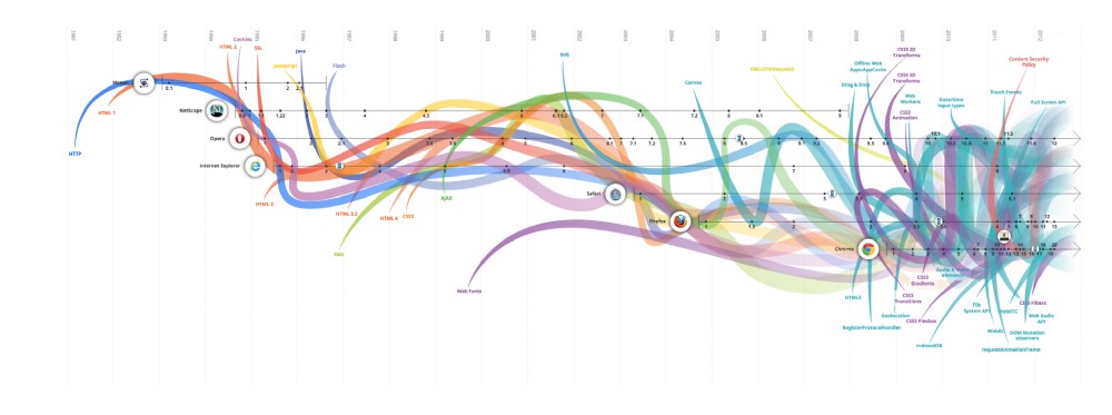
It is a pity that evolutionoftheweb.com stopped in 2012. This scheme is simply gorgeous.
Yes, but all these bells and whistles in browsers are still aimed at promoting individual products, and not at developing the industry as a whole. So much is happening on the Internet that it’s difficult for browser developers to come up with universal solutions for all problems.
No matter how cool the browser, if you go to a poorly written site, a talentless UX will spoil it. To unlock the potential of browsers, we should demand better design solutions.
Because of the disgusting design of many sites, browsers look like bad software.
Animations with meaning
Thanks to the new possibilities of browsers, animations have become a full-fledged design resource, ceasing to be a simple movement of objects. The discipline, known as interactive design , includes many aspects of design, as well as elements of psychology and biology.
We have no doubt that this direction will be further developed in 2019. Complexity will be the main feature of animations in design. It is the movement of elements and transitions that carry a huge amount of information that would otherwise be lost.
The place between the screens used to be abandoned. Now it belongs to you.
Zhenya Rynzhuk Blog Design
Involving a client at a deeper level means accompanying him at the moment of interacting with the interface and not losing a second. Designers enthusiastically take up the possibility of using empty spaces until they are spoiled by bad marketing.
But the interests of interactive design extend much further. Today it has become an integral part of branding. Logos - the same totems that are formed in our imagination under the influence of experience. Why not give free rein to this imagination, sending it in the right direction?

Animation by Eduard Mykhailov
If you have never wondered what the logo consists of, what it tastes like, what it smells like and sounds like, now is the time.Animations are more eloquent than the lighting, the materials and the arrangement of the elements: one single animation tells the whole story. If you can make the logo part of your personal story, go for it.

Lakko company logo from Zlatko Kelemenić
Yes, but the animation must also be considered in context. What you see as a designer is not the same as what the customer sees. If the product has a purely practical application or deals with emergency situations, the animation should not be used. When contradictions arise, always choose neutrality.
Do not create animations impulsively.
Interfaces with 3D and the plane with the effect of depth
Changing video and images using computer graphics and 3D rendering have been around for quite some time. Previously, designers sought to avoid complex 3D-models in the UI for the sake of speed and performance, as well as for convenience. With new 3D browsers, it's no longer a luxury, and now you can create cinematic scenes for websites.
3D graphics in the interface blurs the line between reality and digital animation.This trend will be especially useful for companies working with complex processes that were previously difficult to visualize. Using 3D visualization, you can look inside any technological process and achieve a higher level of understanding.

Render for Baker Hughes by Sanu Sagar
It looks spectacular in movies and games, because 3D images take only short periods of time: they should be designed to create a superficial impression, and not to look at. Coupled with well-designed 3D animation becomes a powerful design tool.
In the mobile industry, new chips have made possible not only the rendering of 3D objects, but also their use in interfaces. Small screens are perfect for this.
3D transition of cards from Gleb Kuznetsov

3D menu rotation from Minh Pham
The flat design of the UI has been the main trend of the last 5 years, and since then little has changed. Recently, we have seen a clear shift towards adding depth to a flat design, which, however, did not affect the basic concept.
It is the presence of depth that caused the appearance of a flat design, and the reason is simple: to understand the world around us, we need symbolism. The plane is symbolic in the highest degree.
The plane with the effect of depth is a rethinking of the plane in the design.Users liked the combination of Real 3D and computer graphics, which allowed them to interact with realistic objects. A flat design is capable of this, but he does it in his own way, with the help of so-called pseudo-three-dimensional or pseudo-3D. In fact, it is a layering of planes, creating a sense of three-dimensionality. The effect of volume in a flat design creates shadow, lighting and reflections.

Mike's logo for ARTA | Creative mints
The pseudo-3D effect, which can be created using Principle or After Effects, is now gaining popularity.
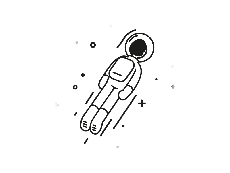
"Astronaut" by Markus Magnusson
In 2019 we can even see the triumphant return of skeuomorphism. If the plane is able to have a depth effect, it might as well be isometric. The combination of realism and symbolism of the plane is a trend that is yet to be explored.
Yes, but sooner or later we will have nothing to offer the user. Already, 3D-interfaces do not have a clear direction of development. They move at the same time to simplify and to complicate. In order to impress us, more and more technological efforts are required, and remarkable bravery is needed to produce a crazy - and elegant in its simplicity - concept. At the same time, if in the most complex interface there is no meaningfulness or at least an original idea, no one will need it.
We can create awesome images. It is time to add humanity and address more serious problems. How do we do this?
Surreal design
All these new features of 3D and interactive design do not cost a penny if they are not capable of evoking an emotional response. The irony is that the user is not impressed with the complexity of the product. But people are peculiar to nonconformity due to its natural attractiveness.
We always need something as opposed to the mainstream, a sort of devil sitting on his shoulder. And sometimes we just want to fool around.Designs and illustrations of some services, who decided to redesign, came out as bold as possible:

Joe Montefusco 's Shop Small for Mailchimp
Cartoon style illustrations and UI has a clear goal - to emphasize their originality. If your brand is popular, this way you can create even more excitement around it. No matter who the design is aimed at, let it be strange - this is the case when the “uglier” the better. Rest assured, 2019 will bring us even more avant-garde design.
Yes, but not all companies can afford such courage. The larger the audience, the more neutral the design should be. Even if well-established brands are lucky, small companies will have to act cautiously and adhere to conventions.
First build a fan base, then surprise them with your new product vision.
Gradient 2.0, bright colors and dark background
New screens have stunning color reproduction, marketers demonstrate it even with the help of default wallpaper. Designers are exploring the use of spectacular gradients in the UI and the availability of such interfaces.
Gradients no longer serve to attract attention: they now give the interface a volume effect.
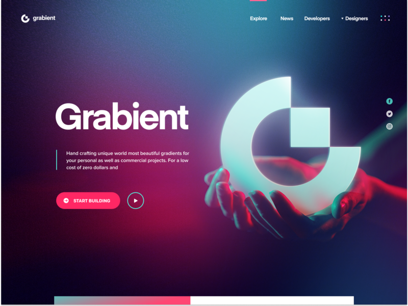
Grabient 2.0 by Eddie Lobanovskiy
Gradient 2.0 is very simple. It uses matching colors, has a specific light source and creates a depth effect in combination with shapes.
Vivid colors are also in place. This trend will bring more combinations of colors and different layers. Moreover, even a monochrome palette can become more aesthetic, if you add to it the effect of volume.

“Valley” by J. HUA for Tunan
We became suspicious and pessimistic, and rich colors set up in a positive way. Would you trust this cryptocurrency application?
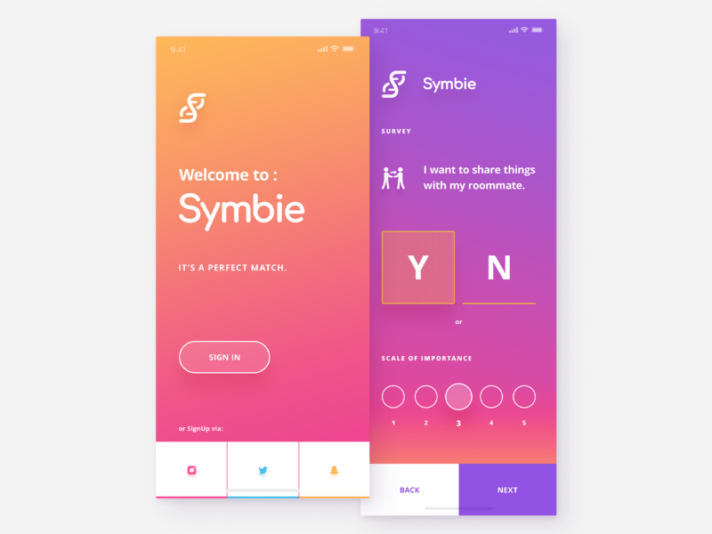
Application for cryptocurrency from uixNinja
Even more spectacular bright colors and gradients look on a dark background. Dark themes are all long and short, and they will become even more beautiful. Here we wrote about the dark themes of design and the secret of their success in terms of anthropology.
So, in 2019, those who manage to find a balance between accessibility and the aesthetic appeal of a dark UI will be especially successful.
The plane with the effect of depth, bright colors and 3D - all against a dark background.

Information panel from uixNinja
Yes, but accessibility is not the only problem with gradients, color palettes and dark themes. Bright colors are traditionally accent. If all elements are colored, how do you single out one thing? Not all users have access to OLED screens, and some gradients may get lost, and too much contrast may interfere with the focus of view. And dark themes are not suitable for sunny weather. Although it may be a plus ...
Variable fonts
A font is traditionally perceived as a static element with a limited number of variable parameters. Designers and writers should consider readability in the context of the height of lowercase characters, strokes, and character widths.
To create a refined font design of the product you need to think everything through to the smallest detail. If the project uses multiple fonts, it must provide files with all the styles used. In the case of variable fonts, you only need one file that contains an infinite number of styles.
Variable fonts can fill any text space.
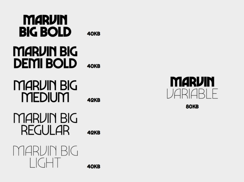
Font Marvin Visions
Variable fonts thrive in adaptive design and localizations - where designers used to wrestle with how to cram text into small screens or, on the contrary, how to stretch it if less characters were translated into another language.
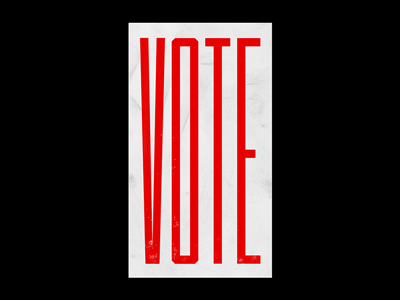
“VOTE” by Josh Rinard
When web fonts first appeared, they had problems with rendering. This led to problems with legibility and skewing markup. Variable fonts load faster, and their application generally speeds up the design development process.
And this is just the beginning. The artistic application of variable fonts is yet to be explored in 2019.
Typography.Guru
Yes, but how long does it take for this smart font of yours to begin to bring economic benefits? And, if your text is like all existing digital content, what protects the reader from manipulation? For the first time the text with the given parameters appeared in typography. This forced humanity to abandon manuscripts as an unreliable method of storing information and made reading one of the most important engines of progress.
Figma
It is time to ask the perennial question: "Do designers also need to program?" And also: "Should developers understand UX?" Everything is simple: it is important for us to avoid disagreements during the design implementation. So, if you are focused on the result, you need to think about how to achieve it.
Learning to program would be most logical. When implementing your own design, you can avoid many problems. However, to be a good designer and at the same time a capable developer, you need a huge amount of knowledge. Can you pull it? Glad for you. And for those who can not afford it, there should be other options.
The point is not to bring a universal designer, but to create quality products and enjoy the process.Another way to achieve this goal is to use and promote effective tools. Figma is just such a tool. Previously, designers had to take into account many factors: OS, builds, plug-ins, synchronization, co-editing and, finally, how to collect everything in one place. Those who have managed to set up such a complex workflow deserve respect. But we need something simpler.
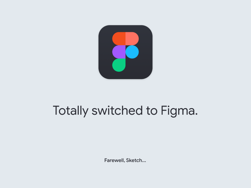
“Fully switched to Figma” by Alexey Kolpikov
Figma is a tool created by designers for designers. Encountered with a wave of skepticism, it exceeded all expectations.
Figma destroyed Sketch.It can do everything that Sketch and Adobe XD do, only bigger and better. Most importantly, Figma aims to create projects that are easy to implement. Each Figma component can be converted to a React component using an API, and implemented in the front end. Now Figma wins in cost, performance, ease of implementation, ease of collaboration and sharing, support and other parameters. But this is not the limit, because Figma will continue to develop in 2019.
Yes, but when we create an excellent product and do not prescribe the ethical principles of its use, we contribute to our own collapse. Look at Twitter, which can not restore its good name. 2018 was generally remembered by a large number of IT-company managers who testified in court. It turns out that it is not enough to give the community tools, you need to monitor their use. Can Figma protect users from the "dark patterns" in the UX, poor design and fakes?
Voice UI
Spectacular design does not have to be catchy or even visible. Through trial and error, we found that when creating non-tactical sensations, the toolkit does not play a big role. The logic of this design is based on human psychology and the recognition of natural speech by the machine.
Voice UI is sensual and elegant.It implements the concept of zero UI at its best. This is a purely internal process, more like writing, building context, and summarizing data than the design itself. And yet, designers are obsessed with finding ways to represent the voice UI. Usually they are inspired by the interfaces and animations from the movie “ Minority Report ” ( Minority Report , 2002).
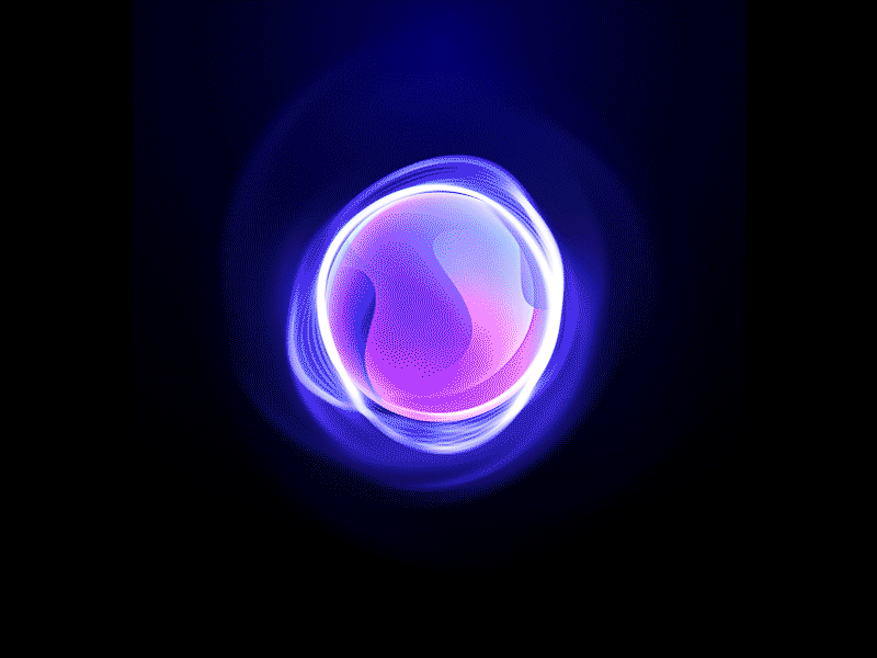
Organic Artificial Intelligence Design by Gleb Kuznetsov
As a rule, such futuristic UIs do not reflect the real structure of voice interfaces; their task is to warn the user about the absence of controls and to teach how to work with technology, in which they are completely unnecessary.
In 2019, we hope to see the development of voice UI, along with the rejection of simple visual aesthetics in favor of creating a full-fledged experience of interaction with design.
Yes, but the most difficult thing about voice UIs is not even the interaction between man and machine, but man-to-person communication. The global community is unusually unbalanced. It is hard for us to reach an understanding on a huge number of issues, including technology. Voice-controlled telephones, cars and homes can contribute to widening the gap.
We as designers should always put human well-being in the first place. If technology, no matter how elegant it is, serves someone at the expense of others, it must be fought.
UX Copywriting and Editing
Last year, designers seriously thought about the meaning of the words they put on fonts. Science-fiction writers and technical writers, journalists and just amateurs got a new space for the development of their talents. We were able to formulate the role of writing in design as follows:
You need to control how your business interacts with customers.Previously, marketing looked like an automaton line of technical terms generously decorated with ponts. The company's activities were mistakenly measured as benefits that it had for consumers. Even successful businesses suffered from a lack of simple, clear and convincing language in communicating with the audience.
UX copywriting is based on two simple principles: be respectful to the user and be useful. Everything else flows from them. So, being concise means respecting people and appreciating their time more than their own; it is you who must suffer your text, not the user. To be frank is to avoid hypocrisy and to protect the user from unpleasant experience - therefore, to be useful. Being clear means being honest and not hiding flaws. Always focus on helping the user, not to show off his eloquence, and do not use marketing cliches. Everything is good in moderation.
UX copywriting is easy. Aim to be polite and helpful to the user.No one wants to watch you show off and praise yourself. It is important for people to know if you can help them. Let your service speak for itself.
In 2018, we observed significant progress in the rhetoric of large companies. They stopped chasing the complexity of the products and focused on their customer value. It is worth expecting that in 2019 UX-editing will evolve and become a full direction in design.
The difference between UX copywriting and editing is in the amount of work. Copywriters create text that the user sees, while editors analyze and transform the text, making it simple and understandable to humans. Express courses on editing UX simply does not exist. To master this craft, you need experience, observation and, of course, love for people.
In 2019, every major redesign project will need a UX editor.
Yes, but each new trend goes through several stages: distrust, admiration and oblivion. Unfortunately, any, even a good, idea can become a laughing stock and fail. UX copywriting is no exception. So, the simplicity of the wording may seem primitive to someone, and honesty can be interpreted as immodesty.
Yet in the development of products and services there is a place for literary creativity, even outside the landing pages. For example, Nike and Boeing companies are paying hard science-fiction writers to predict their future.
Design as a profession
The design of the UX includes a lot of things. It belongs to the design of services and is used in a variety of industries. As a result, designers and design firms assemble huge portfolios, where there is a place both for very simple applications and complex financial platforms.
The scope of service design covers all industries and offers them universal solutions.Service designers can have their own unique style, which they bring to the new product. That's what makes them famous, and companies - willing to pay them. This is the same as purchasing parts from a trusted supplier.
However, manufacturing companies may need a deeper level of designer involvement. Such firms need a designer who is fully integrated into the team and has the data and tools to influence the entire production system.
Product development has a significant advantage over service development - access to analytics and the ability to test design solutions in real time.Designers in such projects can focus on a particular product without being distracted by anything else. They have detailed information about the target audience of the product and proceed from real data, unlike service designers, whose work is based on assumptions.
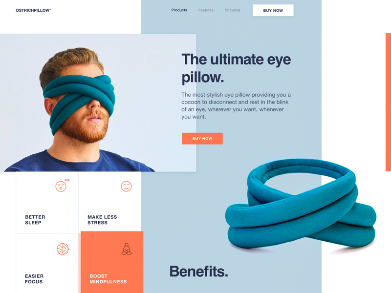
Sasha Turischev Innovative Eye Dressing Landing Page
Yes, but the transition to product design requires a lot of effort. At the risk of devoting ourselves to a certain niche, we often make a fateful choice. Therefore, the decision must be balanced, taking into account both the viability of this sphere and the prospects for professional development in it.
Good luck accompanies the brave, and in 2019 we will still see talented designers who donate everything for a career as a niche specialist. Time will tell.
Finally, the most significant emerging trend is a request for sincerity . The user does not like to feel cheated. As in life, there is nothing better than good intentions, and they are at the origin of good design.
Source: https://habr.com/ru/post/436374/
All Articles