Neat financial information
Update: On the advice of habrachelovek maxshopen , the topic has been moved to the newly created blog “Finance for All” . This decision is based on the fact that now (especially now) it is impossible to live in isolation from the world, and whether we like it or not - but the world is not limited to information technology and clean Computer Science, and the seemingly parallel world of finance affects us, often - directly . In addition, IT and finance is a completely separate, quite interesting topic, and there is something to tell about it. So here's your touchstone :-)
(The topic is aimed at those who are interested in finances, but not at professional financiers - yet the review is more amateur, and even knowledge of financial terminology is not required)
So ... how does financial analysis begin? In the simplest case - with the assessment of the prices of the company's shares now, yesterday, a week, a month or a year ago. But companies - like people - do not live in an isolated environment, they exist on the market, communicate with other companies, and all these factors influence each other. Therefore, one of the most useful tools for a quick assessment of the state of affairs of a company can be a comparative schedule of stock quotes. It reflects how the value of the shares of one company changed relative to the value of shares of another company over time. An additional convenience of this chart is that you can add market indices to it (about them just below).
')
Many companies present their versions of free financial services, and even advertise that they display real-time data. Of course, you shouldn’t believe this: if it were so, Reuters and Bloomberg - the largest providers of financial information - would have been ruined long ago. However, the products of the last two companies are very expensive software, and in the case of Bloomberg, they are also software and hardware complexes that cost well for wild mortals. For the rest (mere mortals), there are two products from the ever-competing brothers in Internet weapons - namely, Yahoo! and google finance.
The functionality they provide is generally the same, but everyone is likely to find something of their own. In this topic, I will not give conclusions, but just give a number of pictures and a brief description of the functionality of each module.
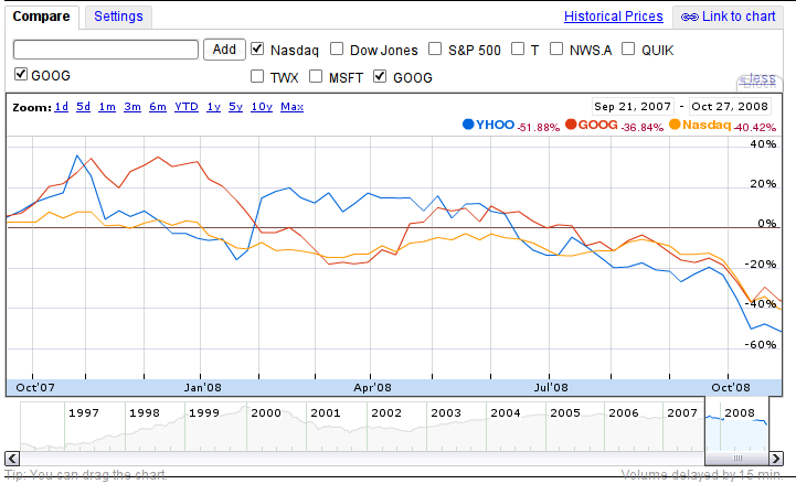
So, here is a chart of the stock price change from Google:
But Yahoo!
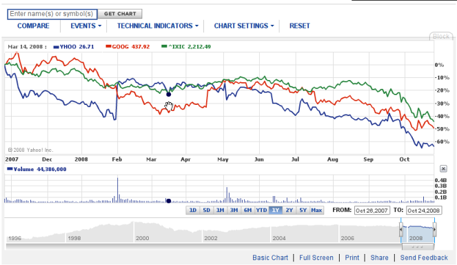
As you can see, the displayed information is almost the same in terms of content: both graphs display the stock prices of two companies (GOOG & YHOO tickers) against the ^ IXIS index - in other words, the NASDAQ index on which both companies are listed (and the index shows how much good "feels" specific market). We see that the NASDAQ index and the courses GOOG, YHOO (and if you add more tickers, it turns out that both MSFT - Microsoft and AAPL - Apple Inc.) are very strongly correlated with the index value. This is not strange - an index and consists of the value of shares of such large companies; However, shares of smaller companies that do not enter the index will still repeat the movement of the index to varying degrees, since the change in the market situation (which reflects the index) will greatly influence them. On the other hand, if we add the ^ DJA (Dow-Jones Industrial Average) index or ^ FTSE (Futsi, index of British stock exchanges and companies), we see that the correlation, although present, is less pronounced - that is, the market of industrial companies Of course, it affects the shares of IT companies, but not to the same extent as large IT players influence each other.
The set of options is about the same - you can show the change in value in both linear and logarithmic scales, add a number of other indices. The Google chart looks a bit “lighter” visually; however, on the Yahoo! You can add additional information in the form of technical indicators (for example, SMA, EMA and some others). Similarly, on both graphs, you can change the period for which the stock prices are displayed.
Please note that both graphs do not show absolute prices, but changes in these prices - among other things, with the presence of an index graph, it is possible to judge on the screen how “synchronously” the value of assets changes with the entire industry. Look at the significant jump in stocks Y! at the end of January - you can immediately notice that the value of the index changed slightly, while the stocks made a big jump; ceteris paribus, this means any major changes either in the company itself or in its immediate vicinity (this is the way it is, at this time MS filed a bid to buy YHOO, if you add the Microsoft ticker to the chart, we will see a sharp drop in MSFT) .
However, since May, the situation has leveled off and further graphs almost repeat each other - which indicates that no special sharp domestic changes occur, and the value of companies changes along with the market (however, YHOO drops significantly stronger, why is the topic of another article).
However, graphics are not everything. Often you need to look at the “momentary” picture. This is where the Portfolio tool comes in:
From Google:

And from Y !:
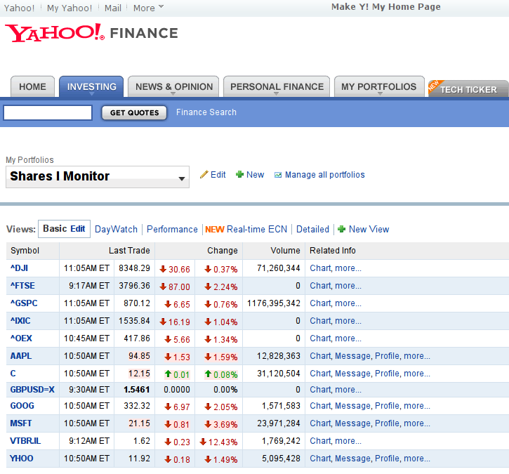
Again, a similar situation - the GOOG portfolio looks much easier, while the YHOO is more customizable and contains more useful information: while the Google panel can be adjusted only slightly, on the Yahoo! portfolio. You can add a lot of useful indicators - ranging from popular P / E , PEG and Market Capitalization , to very exotic ones like Shares Owned or Commission. Pink values are marked that have changed in the last second.
In particular, right now the graph shows the values of large indices - including Dow John, Footsy and Nasdak, their changes in numerical terms and as percentages, as well as stock prices of companies - respectively, on a specific date and a specific time (the delay time is usually depends on which stock exchange this or that company is selling at). Additional parameters can be added to the schedule - for example, the already mentioned Market Capitalization (often reduced to mktcap) - shows the "instant" value of the company. The specific set of parameters mainly depends on what you need to evaluate.
In fact, it is possible to talk about these products a lot and for a long time, but it will be much better to see for yourself. Fortunately, it’s not difficult to come to the address finance.yahoo.com or finance.google.com . My brief summary will be like this: Google’s product is more suitable for a quick review of “what is happening in the markets at all”, while Yahoo’s product is more useful for people affiliated with the financial industry. This is indirectly confirmed by the fact that if the information provided by the free service becomes suddenly insufficient, the user unobtrusively is offered to upgrade to a paid service, which, although inferior both in price and in information coverage, to products from Bloomberg and Reuters, still stands at two heads above all free services. In the end, it’s up to you to decide what to use, but perhaps a reasonable solution would be to use both services - Google to quickly view charts, Yahoo! - for continuous monitoring or thoughtful analysis of market information. Both that, and another - at all superfluous in our difficult, but interesting time! :-)
(The topic is aimed at those who are interested in finances, but not at professional financiers - yet the review is more amateur, and even knowledge of financial terminology is not required)
So ... how does financial analysis begin? In the simplest case - with the assessment of the prices of the company's shares now, yesterday, a week, a month or a year ago. But companies - like people - do not live in an isolated environment, they exist on the market, communicate with other companies, and all these factors influence each other. Therefore, one of the most useful tools for a quick assessment of the state of affairs of a company can be a comparative schedule of stock quotes. It reflects how the value of the shares of one company changed relative to the value of shares of another company over time. An additional convenience of this chart is that you can add market indices to it (about them just below).
')
Many companies present their versions of free financial services, and even advertise that they display real-time data. Of course, you shouldn’t believe this: if it were so, Reuters and Bloomberg - the largest providers of financial information - would have been ruined long ago. However, the products of the last two companies are very expensive software, and in the case of Bloomberg, they are also software and hardware complexes that cost well for wild mortals. For the rest (mere mortals), there are two products from the ever-competing brothers in Internet weapons - namely, Yahoo! and google finance.
The functionality they provide is generally the same, but everyone is likely to find something of their own. In this topic, I will not give conclusions, but just give a number of pictures and a brief description of the functionality of each module.
So, here is a chart of the stock price change from Google:
But Yahoo!
As you can see, the displayed information is almost the same in terms of content: both graphs display the stock prices of two companies (GOOG & YHOO tickers) against the ^ IXIS index - in other words, the NASDAQ index on which both companies are listed (and the index shows how much good "feels" specific market). We see that the NASDAQ index and the courses GOOG, YHOO (and if you add more tickers, it turns out that both MSFT - Microsoft and AAPL - Apple Inc.) are very strongly correlated with the index value. This is not strange - an index and consists of the value of shares of such large companies; However, shares of smaller companies that do not enter the index will still repeat the movement of the index to varying degrees, since the change in the market situation (which reflects the index) will greatly influence them. On the other hand, if we add the ^ DJA (Dow-Jones Industrial Average) index or ^ FTSE (Futsi, index of British stock exchanges and companies), we see that the correlation, although present, is less pronounced - that is, the market of industrial companies Of course, it affects the shares of IT companies, but not to the same extent as large IT players influence each other.
The set of options is about the same - you can show the change in value in both linear and logarithmic scales, add a number of other indices. The Google chart looks a bit “lighter” visually; however, on the Yahoo! You can add additional information in the form of technical indicators (for example, SMA, EMA and some others). Similarly, on both graphs, you can change the period for which the stock prices are displayed.
Please note that both graphs do not show absolute prices, but changes in these prices - among other things, with the presence of an index graph, it is possible to judge on the screen how “synchronously” the value of assets changes with the entire industry. Look at the significant jump in stocks Y! at the end of January - you can immediately notice that the value of the index changed slightly, while the stocks made a big jump; ceteris paribus, this means any major changes either in the company itself or in its immediate vicinity (this is the way it is, at this time MS filed a bid to buy YHOO, if you add the Microsoft ticker to the chart, we will see a sharp drop in MSFT) .
However, since May, the situation has leveled off and further graphs almost repeat each other - which indicates that no special sharp domestic changes occur, and the value of companies changes along with the market (however, YHOO drops significantly stronger, why is the topic of another article).
However, graphics are not everything. Often you need to look at the “momentary” picture. This is where the Portfolio tool comes in:
From Google:
And from Y !:
Again, a similar situation - the GOOG portfolio looks much easier, while the YHOO is more customizable and contains more useful information: while the Google panel can be adjusted only slightly, on the Yahoo! portfolio. You can add a lot of useful indicators - ranging from popular P / E , PEG and Market Capitalization , to very exotic ones like Shares Owned or Commission. Pink values are marked that have changed in the last second.
In particular, right now the graph shows the values of large indices - including Dow John, Footsy and Nasdak, their changes in numerical terms and as percentages, as well as stock prices of companies - respectively, on a specific date and a specific time (the delay time is usually depends on which stock exchange this or that company is selling at). Additional parameters can be added to the schedule - for example, the already mentioned Market Capitalization (often reduced to mktcap) - shows the "instant" value of the company. The specific set of parameters mainly depends on what you need to evaluate.
In fact, it is possible to talk about these products a lot and for a long time, but it will be much better to see for yourself. Fortunately, it’s not difficult to come to the address finance.yahoo.com or finance.google.com . My brief summary will be like this: Google’s product is more suitable for a quick review of “what is happening in the markets at all”, while Yahoo’s product is more useful for people affiliated with the financial industry. This is indirectly confirmed by the fact that if the information provided by the free service becomes suddenly insufficient, the user unobtrusively is offered to upgrade to a paid service, which, although inferior both in price and in information coverage, to products from Bloomberg and Reuters, still stands at two heads above all free services. In the end, it’s up to you to decide what to use, but perhaps a reasonable solution would be to use both services - Google to quickly view charts, Yahoo! - for continuous monitoring or thoughtful analysis of market information. Both that, and another - at all superfluous in our difficult, but interesting time! :-)
Source: https://habr.com/ru/post/43341/
All Articles