Grid Layout as the basis of modern layouts
In the dark ages, web designers built sites on tables. Then they mastered the float and flexbox, and the darkness receded. In 2017, the Enlightenment came with the arrival of CSS Grid Layout.
Grid takes into account the horizontal and vertical space, you can change the layout with it, without touching the markup, and all this without media queries. With Grid, you can forget about magic numbers, hacks, workarounds and CSS frameworks.

')
Despite all the power, there is a small nuance that spoils the picture - it is still rarely used by layout designers. There is a Grid specification, browsers are supported, but there are few real projects.
This is the decoding of the report of Sergey Popov on Frontend Conf : about the specification, about why the designers are afraid of the Grid and how to decide to use the grid in their projects to “Make your website great again!”.
About the speaker : Sergey Popov ( popovsergey ) - Director of outsourcing outsource development League A. from HTML Academy, front-end developer, organizer of the moscowcss community, co-organizer of WSD and pitercss_conf . Until he became the head of the company, he worked on layout for many years.
Over the past year there have been many courses and reports about the Grid, about how to use and write them. If you are tired of technical reports, then add one more to your list. Joke - let's talk about comics. Or not?
Note : instead of a long “CSS Grid Layout,” there will be just a “Grid”.
What is now with CSS Grid Layout?
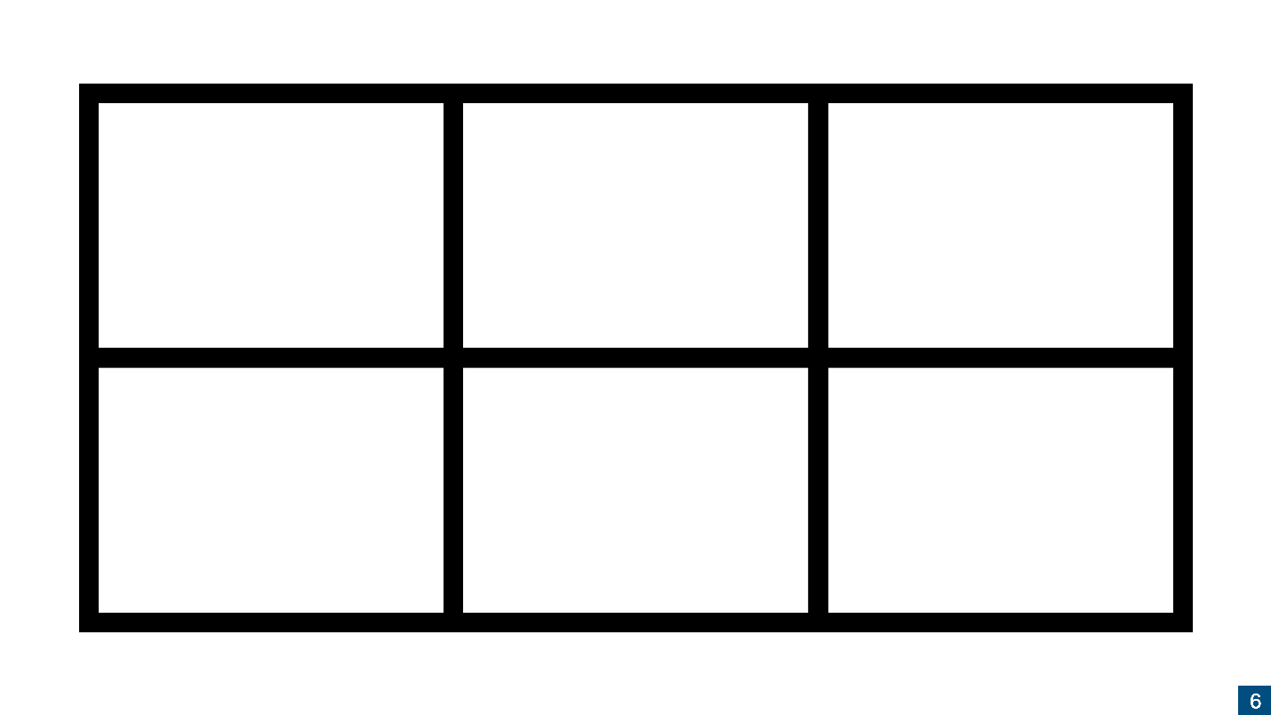
Technically, a grid is a simple two-dimensional grid.
It's easy to draw and use a Grid, but developers are still avoiding it. I see two reasons for this.
Let's start the analysis from the first item.
Specification
The first version of the specification came out in 2012, changed a lot, corresponded, and, five years later, began to be actively implemented. In 2017, the same boom happened when, in half a year, the Grid from the state of the first published draft came to the conclusion that Chrome first introduced it without a flag, and then all other browsers. Due to the fact that the implementation took place in a hurry, the specification did not settle down and some controversial points had to be left so that browsers would not have to rewrite half of the engine.
The specification is stable, although it is still in the status of Candidate Recommendation. If I could, I would have been releasing it long ago, but the developers of the specification are not in a hurry yet, but complement and change the wording.
The second incorrect statement is that the Grid does not make sense without a second level.
Second specification level
When they wrote the specification, it turned out to be too large, so some part was allocated to the second level. For 2018, the second-level specification in the First Public Working Draft state is the first publication of a working draft.
The specification is actively working and in the near future it will switch to the Working Draft state - a working draft. The developers are waiting for the Grid to be released, but this is a long process that can take 5 years.
According to legend, the specification of the second level solves the problems of the first level. In fact, it adds features that you can do without, and nothing prevents you from using the first level without the second.
display: subgrid;
We did not have time to understand what a grid is, as a subgrid appeared. Let's figure out what it is.
Imagine this markup.

Everything is quite simple: we have a grid, three non-semantic and one semantic element are embedded in it. Grid works like a flexbox: when you apply a
In example 1, 2 and 3
If you want these elements to remain part of your grid, then there are two options:


If you apply
One problem - the subgrid is not supported , it is somewhere behind the flags, and the release can be expected for a long time.
display: contents;
In general, it is not necessary to wait , because there is a
There is a nuance -

CSS Subgrid Emulation
While
The slide is an example of Pasha Lovtsevich .

In the example above, there is a subgrid behavior, but its behavior is not emulated by
Properties with a hyphen are custom properties in CSS.
The second level is not needed
If someone tells you not to use the Grid until the second level is released - do not listen to it. The second level solves certain problems that have already been solved in other ways.
Therefore, do not wait for the second level, feel free to engage in the first. Especially since it is already there.
Grid support in browsers
This picture can be shown if someone tells you that the Grid is not supported.

Globally supported 87% of browsers , except Opera Mini - it does not support anything. I wrote in CanIuse , asked to remove it from the column, so as not to spoil the picture, but so far to no avail;)
If you add
There is a problem with IE. As always, he is here with us, and he has not gone anywhere.
IE and Grid
If your application supports IE, you might say that you cannot use the Grid. This is not so - the Grid works in IE , since the specification was born in Microsoft, and first appeared in IE. It's just that nobody used it until normal people arrived and rewrote the specification.
IE is coping with the Grid, but it needs to explain how to do it. IE supports the Grid in the old version of the specification , in which not all properties are supported, and the part is called differently.
There is no need to teach the version of specifications for IE, because Autoprefixer , a plugin that translates the new version of the specification into the old one, will do most of the work for you. Therefore, to provide Grid support in IE, it is enough to use Autoprefixer.
The rest you just need to know and remember. Just open the article “Supporting CSS Grid in Internet Explorer” , read which properties are supported in IE and which are not, and decide which of them you will use.
Remember about the "graceful degradation", when in the old versions of the browser the elements from the new ones disappear. For example, in browsers that do not support border-radius, forms will have square corners. The web designers were forced to cut out pictures of forms, instead of CSS, and in some situations it was considered normal.
Internet Explorer works well with Grid, you just need a little practice. If you do not use the Grid, because you are afraid of IE, then I have to surprise you - it will not work.
Bugs and grid
You can say that there are many bugs in the Grid, but this is not true. Rachel Andrew found all the errors in the CSS Grid - there are 14 of them , and that's all there is. Nobody does Grid Layout CSS more than Rachel, so she can be trusted.
The bugs are quite specific. We remember when the flexbox arrived, there were bugs in them too, but this did not stop us. Bugs in the Grid also do not stop us, especially such.
"Some HTML elements cannot be a Grid container." Immediately there is a clarification that the button can not be a Grid-container, but we did not want this .
"Textarea, when it is a Grid element, collapses." The problem is easily solved if you put the width and height in percent.
These bugs are quite specific and do not appear in all browsers. If you know that a bug can manifest itself, then just take it and fix it - it's easy.
Theory, or a small educational program
Grid is here! We can talk for a long time why we do not use the Grid, but while you are reading the article, the Grid is already closed to production.
Sites are already using the Grid. For example, I went to the site of Russian Internet Week, and this is the last place where I expected to see a Grid. Typically, business conference sites are collected on Tilde.

And they more or less correctly use the grid. RIW tried, and they did it, and without fallbacks. They are clearly oriented to the users of modern browsers.

Conferences that talk about CSS, in any case, try to use new tools. We made badges on pitercss_conf, and the guys from Minsk have half of the site on the Grid.
Russian Internet Week is a rather narrow audience of visitors. The New York Times reads more people.
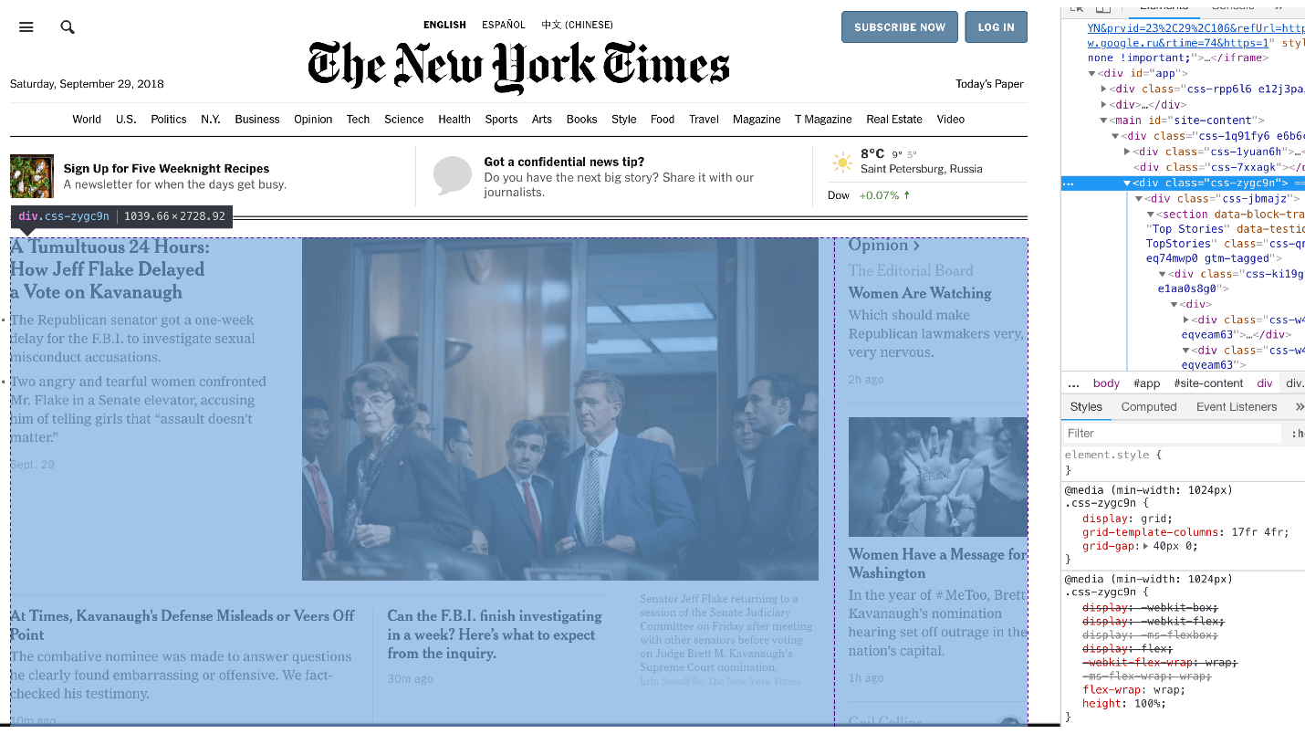
I am sure that among the readers there are device owners even with IE 9, 10, 11, but half of the site on the Grid.
I was surprised when I saw that such large projects are using a Grid.
Why Grid is not used everywhere?
We understood that there is a specification, it can be used and no excuses will work. So what's the deal?
There are certain reasons for not applying grids:
In terms of design
Now I will protect the designers.
The design develops slowly, according to its trends, which are not related to the development of web technologies. Quite the contrary - web technologists have to adapt to design trends. It is unlikely that the maker-ups would say: “Designers, and we have a Grid, you can work with him,” and they would answer: “Oh, yes!” And started drawing layouts for them.
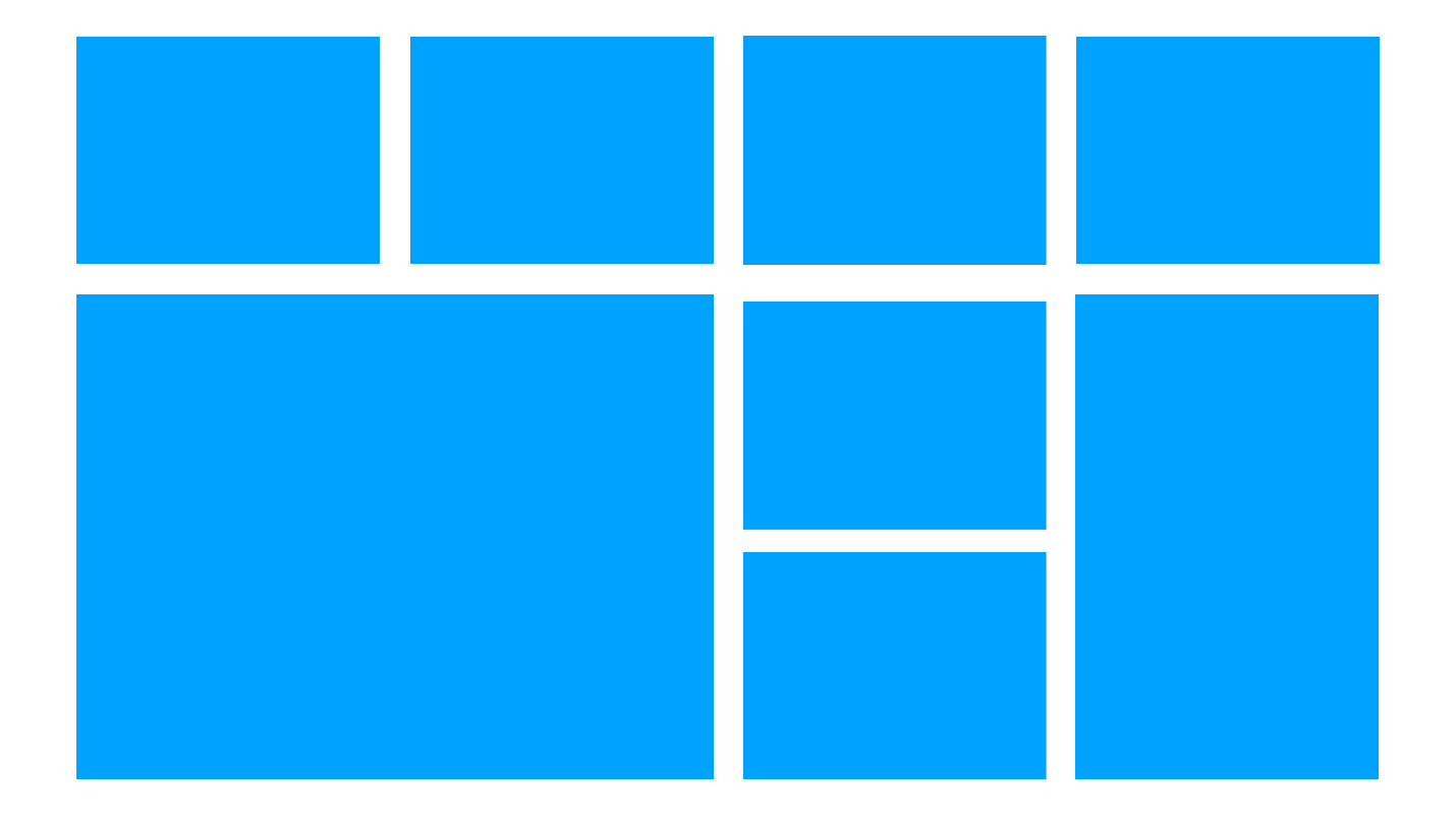
Therefore, most sites look like this.

Abstract example with a simple grid and columns, nothing unusual. The site is easily assembled without flexbox, on float, you can even do a tabular layout.
Designers stopped putting complex tasks in front of the designers, because once we ourselves had driven them into a corner by not doing what they wanted.
A designer comes to us and says:
- I want a complicated grid!
- I can not. She is complicated .
- No, do it .
- I can not!
Then we go to the manager, complain, and the designer gets in the head.
All, the designer no longer draws complex grids. Previously, we really could not build complex interfaces, but now we can - we have a lot of tools. Now the designer does not want, he stopped asking for complex layouts. The designer draws the interface so that the layout designer can implement it, and often as primitively as possible.
Blog
I will give a common example from our outsource. The designer received the task to draw a blog and gives free rein to all his grid impulses. Draws a large block, wide, 3 small, medium, fantasizes. Looks cool and modern.
The typesetter sees the layout, writes one wrapper on the flexbox, a second, third one and gets this picture.
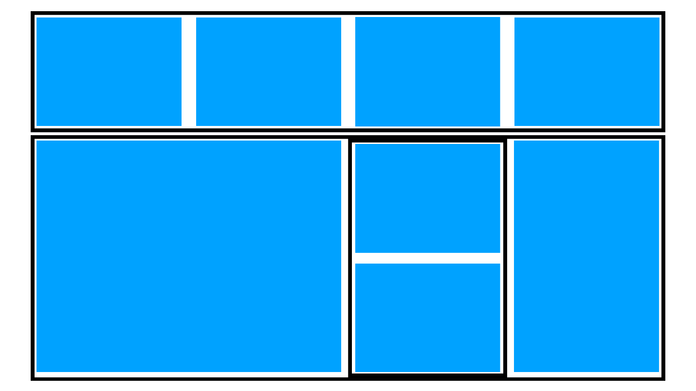
Layout goes to the backend. Backender tells the coder that he has a conclusion from the database, and there the cards go one after the other, they will not work out.
At this happy story ends and we return to the designer.
When the designer painted the layout, he presented other options. In variants there was a flight of fancy, and backender broke the impulses at one moment. The plan to make a beautiful blog failed.
There are different exit options:
Real case
On the main page of The Village magazine a complex grid. It is made intentionally for different types of materials. I know about it since I worked in the publication.

The Village wrote a huge algorithm that generates a grid on the back end. This is a mixture of float, absolute positioning and other scary things, but it works!
Sometimes it breaks, but when this happens, the blocks are simply swapped and everything works again.
I can not imagine how many hours it took to design this system, debug it and ensure that it worked with almost no errors. How much time would be spent on the implementation of the same grid, if you use
At the time of the creation of the algorithm, this technology was not yet available, but when it came to redesign, I suggested using Grid immediately.
“The Village” got confused to do what they wanted, but most do not. Therefore, we see an ordinary web, standardization, it all comes down to one Layout. We used to have Bootstrap, which describes most of the code. Now designers have their own tools, like Bootstrap, with which they build websites. What kind of nonsense - where is the creative ?!
My dream is to speak at a design conference and say, “Hi! We are better! We are now smart again, ”but the layout designer is not allowed to attend design conferences. To tell the designers that we have become better is not so difficult. You received a simple grid, you ask: “Why is it simple and not complicated? I can do any! ”
In terms of implementation
It seems that the Grid is hard to find. When they say to me: “I have 3 columns and I can do it on flexbox. Why do I need a Grid? ", Then I answer:" Indeed, it is not necessary. " Therefore, there are difficulties with where to apply the Grid at all.
Grid is not only a complex grid.

This is also a simple layout that can be done on the grid, and it is simpler than on flexbox, because no additional wrapper is needed. Below there is one example on the Grid, it can also be done on the flexbox, but you need a lot of additional wrappers or flow, and you get a real mess.
Grid - not for small elements : either for very complex small ones, or for large ones.
Grid for layout
I don’t know of a single site where you can’t rewrite the layout on the Grid and save a lot of useless additional wrappers.
This badge is pitercss_conf-2, it is placed on the grid.

The hardest part of the Grid Layout is to draw the grid that suits you. In this case, it is not just 6 * 6, but 5 * 8, but each block has a different height and width.
We see the task and compose the content, very similar to the guides in Photoshop. The designer drew, and we transferred the layout to the grid. There is not a single additional wrapper here - only semantic elements that are lined up with a grid.
Boarding pass can be done on flexbox.

And it is possible on the Grid, and in the mobile version the coupon looks different.

Grid for structure
The second important thing to remember is: using a grid to simply change the structure .
There is an order in flexbox that allows you to change the order of all elements. This is a complex technology, and you can shoot yourself in the leg with Z-indices, if you don’t know how to use it.
With a grid, it's simple. In this example, if there were no grid, we would have to bring the right part with the QR code to absolute positioning. And on the Grid it is 13 lines of code in the mobile version.

To start using a Grid, you need to start using a Grid . Try to impose on the grid some elements of your interface. You can start with small things, you can - with global ones, in order to understand how much it makes life easier.
Nobody will tell you: “Use the Grid here, but not here!” You have to understand and learn yourself, but for this you need to stuff the bumps. If the implementation of the task on the Grid took twice as long as on the flexbox, then such tasks should not be solved on the Grid.
Here for Grid comics is perfect.
Consider a non-trivial task.

If you dig into the code, it becomes clear how everything works. The guys are programming in CSS and are building grid areas. Depending on the role of the player, he automatically gets into the desired Area. Vertical and horizontal alignment creates a build. This is whole CSS programming. The problem is solved by 50 lines of CSS-code, which is much easier than through the backend or JS.
I want the designs and layouts to be fun, such as this one.

This is too complex layout on the Grid, because the task was difficult. The coder could not draw the layout on a simple flexbox, only the Grid. It was possible to make fewer cells, but given that the cell builds repeat, this did not take long. The main thing is that they did it.
Imposedly complicated, but the interface is very cool rebuilt in the future.
What's next?
Let's stop telling ourselves: “I can't” in terms of the Grid . You can - just do not want. There is no objective reason not to use the grid, except for laziness and unwillingness to try.
Grid is such a universal system that it is not even possible for it to make a framework . If you see that some kind of framework is using a Grid Layout, this is nonsense, because the Grid itself is a framework for building grids. Bootstrap is unlikely to switch to the Grid. Imagine that there will be 20 million classes - a perversion!
Therefore, you will never have a ready-made solution. Perhaps there will be templates, but there will be no rules on where to apply the Grid, and where not to.
Learn, see examples, develop . There is nothing wrong with looking at other people's examples. I, for example, do just that.
Bring knowledge to the team . Say you know the Grid, suggest using it.
Go to the designer and say: "Let us draw more interesting, and I will realize your ideas!"
Tell the manager: “We can now do more with the Grid!”
Share knowledge within the team and move the web forward. Ultimately, we have a simple goal - to make the web better and cooler !

If at some point we all went into simplification, now there are new technologies. Not only the Grid is SVG masks, animations, transformations. The problem is not in technology, but in the fact that the majority still do not use the full and half of them. We do not know everything or do not want to use, and designers do not realize that we can.
Contacts of Sergey Popov: e-mail , Fb , twitter
Grid takes into account the horizontal and vertical space, you can change the layout with it, without touching the markup, and all this without media queries. With Grid, you can forget about magic numbers, hacks, workarounds and CSS frameworks.
')
Despite all the power, there is a small nuance that spoils the picture - it is still rarely used by layout designers. There is a Grid specification, browsers are supported, but there are few real projects.
This is the decoding of the report of Sergey Popov on Frontend Conf : about the specification, about why the designers are afraid of the Grid and how to decide to use the grid in their projects to “Make your website great again!”.
About the speaker : Sergey Popov ( popovsergey ) - Director of outsourcing outsource development League A. from HTML Academy, front-end developer, organizer of the moscowcss community, co-organizer of WSD and pitercss_conf . Until he became the head of the company, he worked on layout for many years.
Over the past year there have been many courses and reports about the Grid, about how to use and write them. If you are tired of technical reports, then add one more to your list. Joke - let's talk about comics. Or not?
Note : instead of a long “CSS Grid Layout,” there will be just a “Grid”.
What is now with CSS Grid Layout?
Technically, a grid is a simple two-dimensional grid.
It's easy to draw and use a Grid, but developers are still avoiding it. I see two reasons for this.
- Many simply do not understand what is happening with the Grid. A large number of myths about this tool prevent to understand it.
- We, as designers and front-tenders, do not understand how and where to use the Grid in everyday tasks.
Let's start the analysis from the first item.
Specification
The first version of the specification came out in 2012, changed a lot, corresponded, and, five years later, began to be actively implemented. In 2017, the same boom happened when, in half a year, the Grid from the state of the first published draft came to the conclusion that Chrome first introduced it without a flag, and then all other browsers. Due to the fact that the implementation took place in a hurry, the specification did not settle down and some controversial points had to be left so that browsers would not have to rewrite half of the engine.
The specification is stable, although it is still in the status of Candidate Recommendation. If I could, I would have been releasing it long ago, but the developers of the specification are not in a hurry yet, but complement and change the wording.
Let's apply the non-recommended Grid Layout specification - there is no contradiction in this, because the Grid was first implemented and then described.
The second incorrect statement is that the Grid does not make sense without a second level.
Second specification level
When they wrote the specification, it turned out to be too large, so some part was allocated to the second level. For 2018, the second-level specification in the First Public Working Draft state is the first publication of a working draft.
The specification is actively working and in the near future it will switch to the Working Draft state - a working draft. The developers are waiting for the Grid to be released, but this is a long process that can take 5 years.
According to legend, the specification of the second level solves the problems of the first level. In fact, it adds features that you can do without, and nothing prevents you from using the first level without the second.
display: subgrid;
We did not have time to understand what a grid is, as a subgrid appeared. Let's figure out what it is.
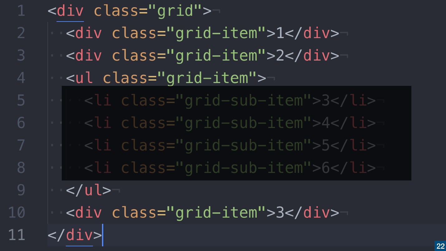
Imagine this markup.
Everything is quite simple: we have a grid, three non-semantic and one semantic element are embedded in it. Grid works like a flexbox: when you apply a
display: grid; to the wrapper, it applies only to elements at the first nesting level.In example 1, 2 and 3
<div> will take place in the grid, and everything that is inside the list collapses. You will lose all these elements because the Grid works this way.If you want these elements to remain part of your grid, then there are two options:
- The first option is to get rid of the wrapper . Remove
<ul>and replace<li>with<div>. We kill the semantics, but leave the grid.
- The second option is to use
display: subgrid;.
If you apply
display: subgrid; to the list, the <li> elements will become part of this grid, <ul> , like a wrapper, will be ignored. You will get a complete grid and the full semantics will remain - both HTML is good and CSS is good.One problem - the subgrid is not supported , it is somewhere behind the flags, and the release can be expected for a long time.
display: contents;
In general, it is not necessary to wait , because there is a
display: contents; - a great property that works the same way as display: subgrid; . If for the list items apply display: contents; , the <li> elements will become part of the grid.There is a nuance -
display: contents; not supported in all browsers.CSS Subgrid Emulation
While
display: contents; solve the problem of support, layout designers come up with a way out - made a subgrid emulation.The slide is an example of Pasha Lovtsevich .
In the example above, there is a subgrid behavior, but its behavior is not emulated by
display: subgrid; or display: contents; , and at the expense of custom expressions that are converted to variables.Properties with a hyphen are custom properties in CSS.
The second level is not needed
If someone tells you not to use the Grid until the second level is released - do not listen to it. The second level solves certain problems that have already been solved in other ways.
Not always need a subgrid. Grid in conjunction with Flexbox sometimes turns out much cooler than with a subgrid.
Therefore, do not wait for the second level, feel free to engage in the first. Especially since it is already there.
Grid support in browsers
This picture can be shown if someone tells you that the Grid is not supported.
Globally supported 87% of browsers , except Opera Mini - it does not support anything. I wrote in CanIuse , asked to remove it from the column, so as not to spoil the picture, but so far to no avail;)
If you add
@supports , then everything works, even Opera Mini. I don't know if Opera Mini flexbox supports, but there you can make a fallback.There is a problem with IE. As always, he is here with us, and he has not gone anywhere.
IE and Grid
If your application supports IE, you might say that you cannot use the Grid. This is not so - the Grid works in IE , since the specification was born in Microsoft, and first appeared in IE. It's just that nobody used it until normal people arrived and rewrote the specification.
IE is coping with the Grid, but it needs to explain how to do it. IE supports the Grid in the old version of the specification , in which not all properties are supported, and the part is called differently.
There is no need to teach the version of specifications for IE, because Autoprefixer , a plugin that translates the new version of the specification into the old one, will do most of the work for you. Therefore, to provide Grid support in IE, it is enough to use Autoprefixer.
The rest you just need to know and remember. Just open the article “Supporting CSS Grid in Internet Explorer” , read which properties are supported in IE and which are not, and decide which of them you will use.
Remember about the "graceful degradation", when in the old versions of the browser the elements from the new ones disappear. For example, in browsers that do not support border-radius, forms will have square corners. The web designers were forced to cut out pictures of forms, instead of CSS, and in some situations it was considered normal.
Why in older versions of browsers not to translate the Grid in the usual columns? If you are developing under the old browser, either do not use modern technologies, or accept the fact that the content in them will look different.
Internet Explorer works well with Grid, you just need a little practice. If you do not use the Grid, because you are afraid of IE, then I have to surprise you - it will not work.
Bugs and grid
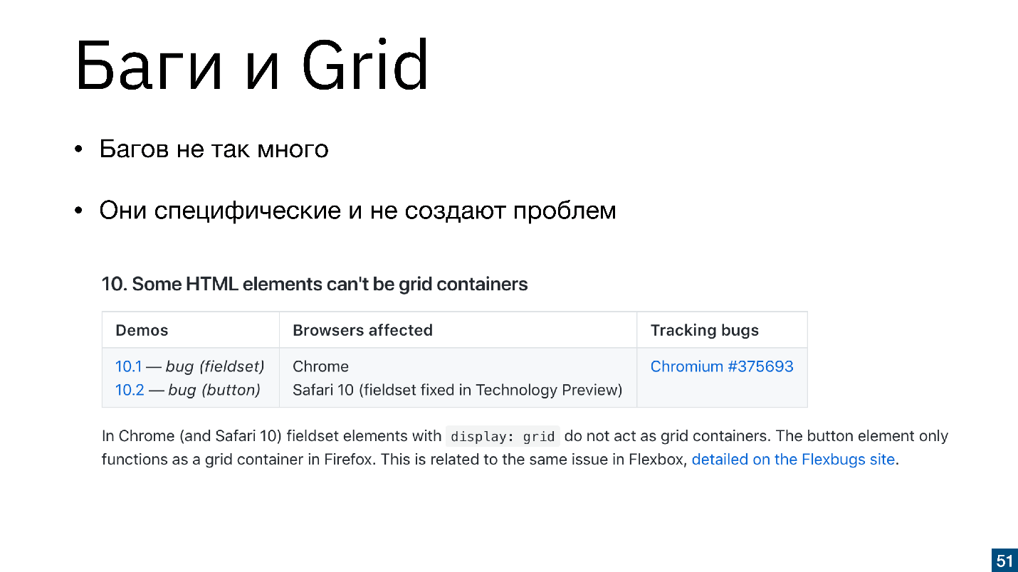
You can say that there are many bugs in the Grid, but this is not true. Rachel Andrew found all the errors in the CSS Grid - there are 14 of them , and that's all there is. Nobody does Grid Layout CSS more than Rachel, so she can be trusted.
The bugs are quite specific. We remember when the flexbox arrived, there were bugs in them too, but this did not stop us. Bugs in the Grid also do not stop us, especially such.
"Some HTML elements cannot be a Grid container." Immediately there is a clarification that the button can not be a Grid-container, but we did not want this .
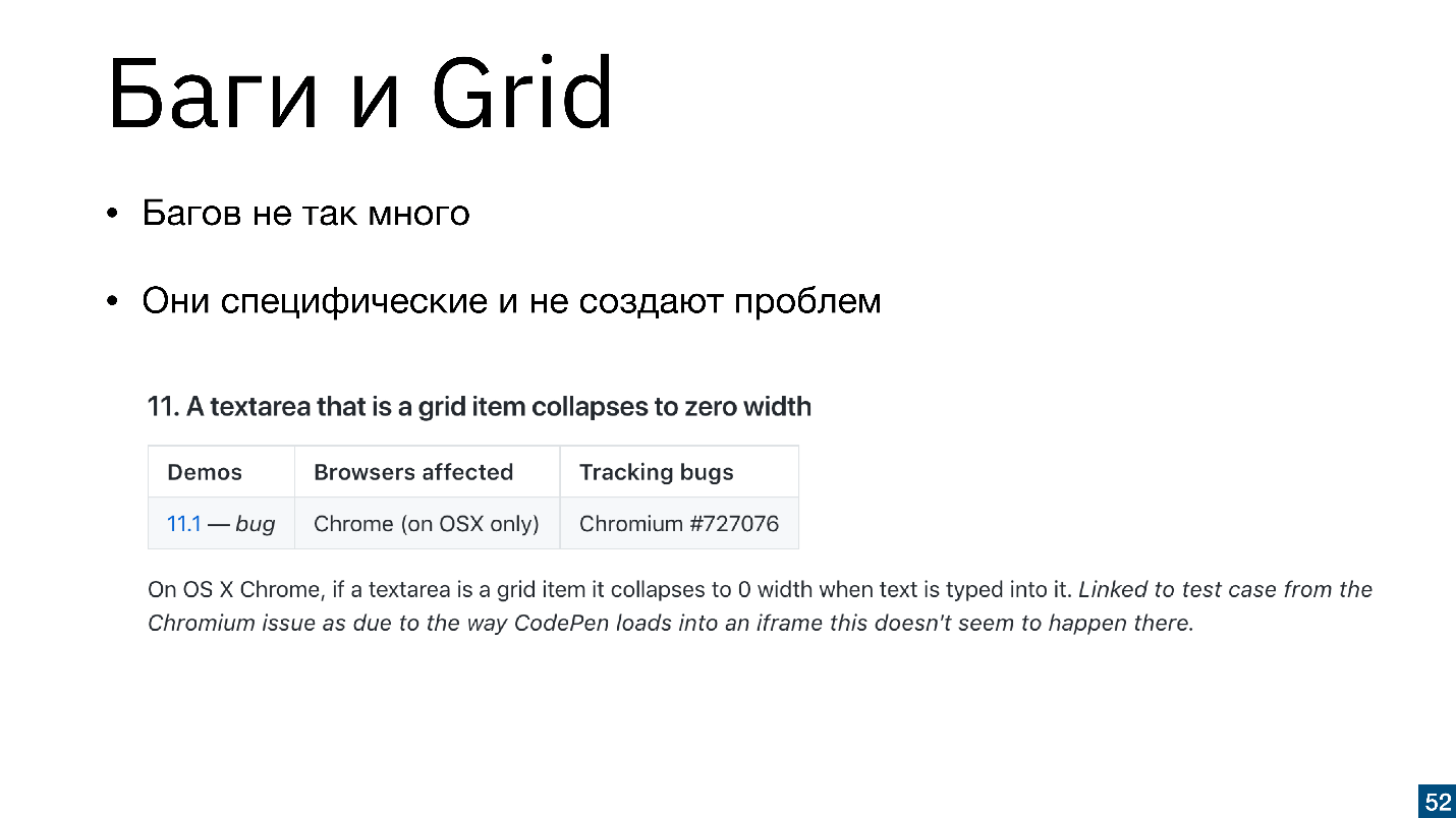
"Textarea, when it is a Grid element, collapses." The problem is easily solved if you put the width and height in percent.
These bugs are quite specific and do not appear in all browsers. If you know that a bug can manifest itself, then just take it and fix it - it's easy.
There are not many technical reasons for not using a Grid. Browsers support, and in older browsers use “graceful degradation”. There are also few theoretical reasons, because there are more materials than flexbox.
Theory, or a small educational program
- The squeeze specification - “A complete guide to Grid” from CSS-Tricks is as good as with flexbox .
- Learn CSS Grid course or video courses, for example, from Wes Bos , recorded and sponsored by Mozilla.
- Full immersion on the site Gridbvexample.com : the site itself is written on the Grid, there is information on all specifications, examples, code snippets.
- Playing with carrots is a complete gamification, even children will understand.
- Interactive course HTML Academy . The Academy introduced the Grid into the educational process.
Grid is here! We can talk for a long time why we do not use the Grid, but while you are reading the article, the Grid is already closed to production.
Sites are already using the Grid. For example, I went to the site of Russian Internet Week, and this is the last place where I expected to see a Grid. Typically, business conference sites are collected on Tilde.
And they more or less correctly use the grid. RIW tried, and they did it, and without fallbacks. They are clearly oriented to the users of modern browsers.
Conferences that talk about CSS, in any case, try to use new tools. We made badges on pitercss_conf, and the guys from Minsk have half of the site on the Grid.
Russian Internet Week is a rather narrow audience of visitors. The New York Times reads more people.
I am sure that among the readers there are device owners even with IE 9, 10, 11, but half of the site on the Grid.
I was surprised when I saw that such large projects are using a Grid.
Why Grid is not used everywhere?
We understood that there is a specification, it can be used and no excuses will work. So what's the deal?
There are certain reasons for not applying grids:
- Designers do not put in front of designers intractable problems.
- The makers do not understand how to attach the Grid to real projects. Most likely, your designer did not draw a complex grid, and you do not understand how to attach a Grid to the layout.
In terms of design
Now I will protect the designers.
The design develops slowly, according to its trends, which are not related to the development of web technologies. Quite the contrary - web technologists have to adapt to design trends. It is unlikely that the maker-ups would say: “Designers, and we have a Grid, you can work with him,” and they would answer: “Oh, yes!” And started drawing layouts for them.
Therefore, most sites look like this.
Abstract example with a simple grid and columns, nothing unusual. The site is easily assembled without flexbox, on float, you can even do a tabular layout.
Designers stopped putting complex tasks in front of the designers, because once we ourselves had driven them into a corner by not doing what they wanted.
A designer comes to us and says:
- I want a complicated grid!
- I can not. She is complicated .
- No, do it .
- I can not!
Then we go to the manager, complain, and the designer gets in the head.
All, the designer no longer draws complex grids. Previously, we really could not build complex interfaces, but now we can - we have a lot of tools. Now the designer does not want, he stopped asking for complex layouts. The designer draws the interface so that the layout designer can implement it, and often as primitively as possible.
Blog
I will give a common example from our outsource. The designer received the task to draw a blog and gives free rein to all his grid impulses. Draws a large block, wide, 3 small, medium, fantasizes. Looks cool and modern.
The typesetter sees the layout, writes one wrapper on the flexbox, a second, third one and gets this picture.
Layout goes to the backend. Backender tells the coder that he has a conclusion from the database, and there the cards go one after the other, they will not work out.
At this happy story ends and we return to the designer.
When the designer painted the layout, he presented other options. In variants there was a flight of fancy, and backender broke the impulses at one moment. The plan to make a beautiful blog failed.
There are different exit options:
- The designer is sent to the far corner and they say: "We will have everything just one after another, we can do without your show offs, do something that can be implemented on the flexbox." The designer will suffer , but he will lay out a portfolio with a beautiful grid on Behance. In the layout there will be a link to the production, and there it’s just squares.
- A coder hangs up a jQuery plugin that automatically puts elements on the grid with absolute positioning - everything is fine! In addition, the plugin will additionally load the page and shamelessly lag in IE. However, the designer and backender will be pleased .
- The designer and layout designer will agree and implement an incredible story and will lead to a compromise design, backend and layout .
Real case
On the main page of The Village magazine a complex grid. It is made intentionally for different types of materials. I know about it since I worked in the publication.
The Village wrote a huge algorithm that generates a grid on the back end. This is a mixture of float, absolute positioning and other scary things, but it works!
Sometimes it breaks, but when this happens, the blocks are simply swapped and everything works again.
I can not imagine how many hours it took to design this system, debug it and ensure that it worked with almost no errors. How much time would be spent on the implementation of the same grid, if you use
display: grid; or grid-auto-flow: dense; ? Inside the Grid there is a separate specification, which automatically arranges the elements on the page, clogs the empty places and implements a similar grid. No ten thousand lines of backend code are needed - everything works with only one property.At the time of the creation of the algorithm, this technology was not yet available, but when it came to redesign, I suggested using Grid immediately.
“The Village” got confused to do what they wanted, but most do not. Therefore, we see an ordinary web, standardization, it all comes down to one Layout. We used to have Bootstrap, which describes most of the code. Now designers have their own tools, like Bootstrap, with which they build websites. What kind of nonsense - where is the creative ?!
Our task is not to agree to use the Grid within the community, but to tell the designers about it.
My dream is to speak at a design conference and say, “Hi! We are better! We are now smart again, ”but the layout designer is not allowed to attend design conferences. To tell the designers that we have become better is not so difficult. You received a simple grid, you ask: “Why is it simple and not complicated? I can do any! ”
In terms of implementation
It seems that the Grid is hard to find. When they say to me: “I have 3 columns and I can do it on flexbox. Why do I need a Grid? ", Then I answer:" Indeed, it is not necessary. " Therefore, there are difficulties with where to apply the Grid at all.
Grid is not only a complex grid.
This is also a simple layout that can be done on the grid, and it is simpler than on flexbox, because no additional wrapper is needed. Below there is one example on the Grid, it can also be done on the flexbox, but you need a lot of additional wrappers or flow, and you get a real mess.
Grid - not for small elements : either for very complex small ones, or for large ones.
Grid for layout
I don’t know of a single site where you can’t rewrite the layout on the Grid and save a lot of useless additional wrappers.
- Grid can be applied to global layout.
- Grid can be applied to interface elements.
This badge is pitercss_conf-2, it is placed on the grid.
The hardest part of the Grid Layout is to draw the grid that suits you. In this case, it is not just 6 * 6, but 5 * 8, but each block has a different height and width.
We see the task and compose the content, very similar to the guides in Photoshop. The designer drew, and we transferred the layout to the grid. There is not a single additional wrapper here - only semantic elements that are lined up with a grid.
Boarding pass can be done on flexbox.
And it is possible on the Grid, and in the mobile version the coupon looks different.
Grid for structure
The second important thing to remember is: using a grid to simply change the structure .
There is an order in flexbox that allows you to change the order of all elements. This is a complex technology, and you can shoot yourself in the leg with Z-indices, if you don’t know how to use it.
With a grid, it's simple. In this example, if there were no grid, we would have to bring the right part with the QR code to absolute positioning. And on the Grid it is 13 lines of code in the mobile version.
To start using a Grid, you need to start using a Grid . Try to impose on the grid some elements of your interface. You can start with small things, you can - with global ones, in order to understand how much it makes life easier.
Nobody will tell you: “Use the Grid here, but not here!” You have to understand and learn yourself, but for this you need to stuff the bumps. If the implementation of the task on the Grid took twice as long as on the flexbox, then such tasks should not be solved on the Grid.
Here for Grid comics is perfect.
Consider a non-trivial task.
If you dig into the code, it becomes clear how everything works. The guys are programming in CSS and are building grid areas. Depending on the role of the player, he automatically gets into the desired Area. Vertical and horizontal alignment creates a build. This is whole CSS programming. The problem is solved by 50 lines of CSS-code, which is much easier than through the backend or JS.
I want the designs and layouts to be fun, such as this one.
This is too complex layout on the Grid, because the task was difficult. The coder could not draw the layout on a simple flexbox, only the Grid. It was possible to make fewer cells, but given that the cell builds repeat, this did not take long. The main thing is that they did it.
Imposedly complicated, but the interface is very cool rebuilt in the future.
What's next?
Let's stop telling ourselves: “I can't” in terms of the Grid . You can - just do not want. There is no objective reason not to use the grid, except for laziness and unwillingness to try.
Grid is such a universal system that it is not even possible for it to make a framework . If you see that some kind of framework is using a Grid Layout, this is nonsense, because the Grid itself is a framework for building grids. Bootstrap is unlikely to switch to the Grid. Imagine that there will be 20 million classes - a perversion!
Therefore, you will never have a ready-made solution. Perhaps there will be templates, but there will be no rules on where to apply the Grid, and where not to.
Learn, see examples, develop . There is nothing wrong with looking at other people's examples. I, for example, do just that.
Bring knowledge to the team . Say you know the Grid, suggest using it.
Go to the designer and say: "Let us draw more interesting, and I will realize your ideas!"
Tell the manager: “We can now do more with the Grid!”
Share knowledge within the team and move the web forward. Ultimately, we have a simple goal - to make the web better and cooler !
If at some point we all went into simplification, now there are new technologies. Not only the Grid is SVG masks, animations, transformations. The problem is not in technology, but in the fact that the majority still do not use the full and half of them. We do not know everything or do not want to use, and designers do not realize that we can.
Contacts of Sergey Popov: e-mail , Fb , twitter
This report is one of the best on Frontend Conf . I liked it and want more - subscribe to the newsletter in which we collect new materials and give access to the video, and come to Frontend Conf RIT ++ in May.
You know more and are ready to share experiences - great! Send abstracts , the reception of reports is already open and will continue until February 27.
Source: https://habr.com/ru/post/433320/
All Articles