How to write an excellent VKontakte news feed in 20 hours
Hello! Recently I passed a contest from VKontakte Mobile Challenge, and my work won a prize. According to the instructions of the second stage, it was necessary to develop a news line for mobile devices, and the main evaluation criteria were smooth scrolling and loading of posts. When I participated, I decided that regardless of the final result, I would try to write an article about the approach to the implementation of the tape and about my emotions and experiences during the competition. What I did. Under the cat tips and tricks for the development of news feed in storytelling mode.
First of all it is worth telling a little about competition. As I know, the VKontakte company annually organizes such events for mobile developers. I myself participated in 2012 and 2013. Tasks were respectively the development of chat and filters for images. In 2013 I managed to reach the final round and win 100,000 rubles, which seemed to me a very good amount for 4 days of interesting work.
And, having seen an advertisement in a social network, I decided that I should try, because the coolest thing is to prove to myself that you are still able to write high-quality code in a very short time).
There were 2 stages in the competition: in the first it was proposed to pass a test of 30 questions, to solve 2 olympiad puzzles and one quality one (that is, the solution is a set of your thoughts, drawn up as text). In the second round, out of 1000+ people, only 112 went through (we are talking only about iOS, with slightly lower values on Android) and the main stage began - application development.
')
According to the assignment, it was necessary to make a news feed, integration with the VC API to write independently, the tape had to be very smooth on all devices, there were certain requirements for displaying content (posts with images and carousel, likes, counters, number of views, and the ability to minimize and expand the post under certain conditions).
Layouts were laid out in Figma. This is a good choice for the competition, because competition is immediately felt by the number of active users (and even knocked out on Saturday, since the simultaneous limit of 50 connections was exceeded).
In general, the organization of the competition was smooth with the exception of a few moments: immediately after the publication of the assignment, the link to the layouts turned out to be broken, then as I said above - on Saturday the entrance to Figma was blocked (this problem was very quickly fixed), well, after the end of the event it took a long time expect results. But the whole negative smoothes a similar post:

Very important and interesting block, if you participate in competitions, or would like to try. Before participating, I recommend everyone to think about what goal you are pursuing and what result you want to get at the exit. For myself, I decided before proceeding to the contest that I want to win it (i.e. take a prize). And in order to do this a strategy is needed:

Below is the winning strategy formula (it seems to me, universal and simple, but I am sure that it should not be followed by the majority of participants):
The assignment was open on the night from Thursday to Friday. Friday is a working day and there was no opportunity and desire to compete at work. Therefore, after returning from work on Friday night, I first and foremost took up planning, estimating, and calculating how much real time I could spend.
The original plan was as follows:
Hooray! Gentlemen, you have found the block you need. Here we will talk about the implementation of the main part of the task - the news feed.
In general, if we abstract, then the news feed is only an application implementation, in general we will talk about creating a list of disparate entities (i.e., each can have its own display, requiring additional calculations and its own height, which can change dynamically even after displaying the post) , plus the list is able to be updated via pull-to-refresh and endlessly load data from below.
I decided to solve the common problem in the first place. The first step is to analyze existing solutions. I need to focus on the strongest, so I chose 3 applications for comparison: Vkontakte, Facebook, Instagram.
So I wanted to conduct a study of the 6 most acute and critical problems:

In general, all applications behave well, but I still noticed a few problems.
Look, for example, how pull-to-refresh on VKontakte behaves, if you do not release your finger when updating and gently pull the ribbon up (see the gif on the left).
Do you see this jump too?
Instagram and Facebook haven't detected this behavior.
And there is a noticeable difference when opening a post. On Facebook and Instagram, this happens with smooth animation, and VKontakte simply updates the size by pressing.


So our task is to make a smooth scrolling, loading posts, as well as opening with animation.
The first step is to choose a concept and create a prototype on the red squares (I wonder why I always intuitively choose the red color for the prototypes. Is that the case for everyone?).
My main idea in improving performance was to abandon all the bells and whistles that Apple introduced for many years and a literal rollback to development for iOS 3. And this means:
As a result, the following concept was chosen:
Let's get a little more detail.
In the main thread, we update the interface, process user actions (scroll down and pull-to-refresh, click on the post to increase it), and trigger the service model for receiving and preparing data.
Appeal to API . Everything is simple here - NSURLSession with configured NSURLCache. At the same time it is important that when downloading the history down, we use the cache, and when pull-to-refresh we disable it. Exactly this behavior I spied on VK and Facebook.
Parsing and creating models . Here is the logic for processing a particular request, throwing errors and returning transport models with data.
Calculation of models of representation . The most important step to optimize performance. Here, the transport models are converted to an entity with a postfix ViewModel. ViewModel stores in itself fully prepared data for display - AttributedString, calculated cell height (for 2 states: minimized and expanded), full name as a string, string with date (already converted from DateFormatter).
Only after that the data is returned to the main stream. Implementing similar logic on Swift is very convenient and simple. Make the ViewModel a structure. Structures are copied when sent to a new stream.
Excellent concept is ready, now let's talk about the output mechanism itself.
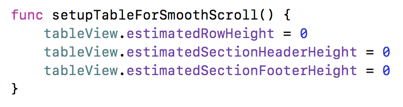
First, it was necessary to choose on what to implement the tape - UITableView or UICollectionView (for its implementation, it would definitely not be enough for the allotted time). Obviously, UITableView is suitable for displaying a list, but I was very worried if there would be problems with increasing the list above, below, and also increasing the content cell. Therefore, I decided to go from simple to complex - i.e. if the problems with UITableView are not found, we leave it.
First of all, I decided to decide on a pull-to-refresh. To implement this pattern, there is a UIRefreshControl. Sometime 5-6 years ago I wrote my implementation using UIActivityIndicator and changing the contentInset of the table. So, please do not do it now! UIRefreshControl has a convenient compact interface and takes away a cloud of crutches, which will certainly have to do. Using it is very simple:
However, when using it, it becomes clear where the problems shown above for the VK client are growing from. It seems that they exist in the component itself. I quickly tried to look for what could be the reason and what are the solutions.
Internet tips say ( such or such ):
I tried this and that - no positive effect appeared to me. I was upset, but decided not to waste time and move on. By the way, if someone knows how to overcome this problem, please write in the comments.
The next step is the implementation of data loading from below.
At first I didn’t get very cool - when loading from the bottom, there was a terrible lag (the contentSize table jumped apparently):
And this is hell :-) With this result you won’t win. But the quick search gave me a terrific hint, which I forgot:
And voila:

It remains to decide how to animate the height of the cell.
The first idea that came to mind is to run along visibleCells and increase the height in the animation block. But even at the stage of analysis, this idea should be discarded - the problem is that it will be necessary to synchronize the height specified in the UITableViewDataSource and something to do with contentSize (which is not recommended by Apple).
The second thought that came to mind turned out to be correct - UITableView has insert / reload / delete methods that can be executed in the animation block:
Do not forget that in heightForRowAt we also need to add a new height:
It seems that everything, but not quite! In the animation of the unfolding of the post, there remains one subtle point. Look behind the text in Intagram or Facebook - it appears smoothly as you increase the height. What to do? Render it line by line? If you reach the level of NSTextContainer, then it is possible and there will be a similar opportunity. But it seemed to me that it was not such a bad idea (for such and such a time) to print the entire text at once. Just set the clipToBounds of the superView, which will contain a UILabel that displays our text. And the approach worked! Oh, this animation greatly inspired me and opened a second wind. After all, this animation is not in the native client VK. So the chance of winning it should add :-)
The remaining parts in the implementation of the tape are not so interesting. But you can ask them in the comments. And there's nothing wrong with posting code. Here it is - github.com/katleta3000/vkmobilechallenge . Forgive that, but not combed and there are places Magic Numbers (but this is a competition for speed, something had to be sacrificed). By the way, there you can jump on commits (the names are quite understandable).
The result can be seen here - www.youtube.com/watch?v=Md8YiJxSW1M&feature=youtu.be (the quality is of course greatly lost, but better than in the gif for the demonstration of smooth scroll)
All the time the competition worked on a timer. It turned out 20 and a half hours of net coding time. Time tracking helped in 2 things: as you remember, there were estimates in abstract units, so by the middle of the last day there was already quite good tracking statistics and it was possible to plan the remaining final tasks much more accurately. And, secondly, it was possible to identify and prove the pattern of “concentration in one sitting”. Each dimension is a new iteration, so it turned out that I had 68 iterations of writing code. If averaged, it would be 18.5 minutes. But in fact, on the first day, the iterations were on average 25 minutes each, but by the end of the second day, by 7 :-) You start to go crazy, get very nervous, you get tired and the performance drops. Similar data will help well the next time.
Personally, I used the Hourly program (you can download and try) - it is simple and solves the necessary problem (and I also develop it myself):
From pleasant bonuses - for each closed puzzle you are shown some kind of very pleasant exhilarating screen like these:
It's funny that it was exactly at the completion of the “VK Mobile Challenge” problem that the following screen seemed to me:

And yes! So it happened :-) We turn to the results.
Let's not pull peach for plush. Peach, who did not know, is the name of the cat - the main character of VK. Very cool gift merch:

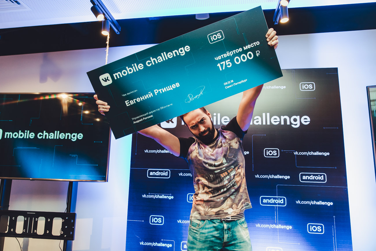
I took 4th place and received 175k rubles. (Yes, and you, for sure, already burned the picture on the Habra-Kat). And yes, I am of course pleased. I reached my goal :-) And this is undoubtedly incredibly pleasant.
Finally, I would like to say thanks to vkontakte - after all, the competition was cool and well organized. And I recommend all readers to take part in challenges and hackathons - this is a great way to challenge yourself and compete with top developers around the world (or at least the Russian-speaking community).
About competition
First of all it is worth telling a little about competition. As I know, the VKontakte company annually organizes such events for mobile developers. I myself participated in 2012 and 2013. Tasks were respectively the development of chat and filters for images. In 2013 I managed to reach the final round and win 100,000 rubles, which seemed to me a very good amount for 4 days of interesting work.
And, having seen an advertisement in a social network, I decided that I should try, because the coolest thing is to prove to myself that you are still able to write high-quality code in a very short time).
There were 2 stages in the competition: in the first it was proposed to pass a test of 30 questions, to solve 2 olympiad puzzles and one quality one (that is, the solution is a set of your thoughts, drawn up as text). In the second round, out of 1000+ people, only 112 went through (we are talking only about iOS, with slightly lower values on Android) and the main stage began - application development.
')
According to the assignment, it was necessary to make a news feed, integration with the VC API to write independently, the tape had to be very smooth on all devices, there were certain requirements for displaying content (posts with images and carousel, likes, counters, number of views, and the ability to minimize and expand the post under certain conditions).
Layouts were laid out in Figma. This is a good choice for the competition, because competition is immediately felt by the number of active users (and even knocked out on Saturday, since the simultaneous limit of 50 connections was exceeded).
In general, the organization of the competition was smooth with the exception of a few moments: immediately after the publication of the assignment, the link to the layouts turned out to be broken, then as I said above - on Saturday the entrance to Figma was blocked (this problem was very quickly fixed), well, after the end of the event it took a long time expect results. But the whole negative smoothes a similar post:
Winning plan and strategy
Very important and interesting block, if you participate in competitions, or would like to try. Before participating, I recommend everyone to think about what goal you are pursuing and what result you want to get at the exit. For myself, I decided before proceeding to the contest that I want to win it (i.e. take a prize). And in order to do this a strategy is needed:
Below is the winning strategy formula (it seems to me, universal and simple, but I am sure that it should not be followed by the majority of participants):
- Read the assignment very carefully . After a few hours, read it again (several times I got into a situation where I did not perceive the tasks from the first time). And a couple of hours before putting it just one more time just in case.
- Make questions and ask them to the organizers (usually the requirements for the task do not take into account many situations, or they are set up very superficially). I did so, getting answers in the style of "at your discretion."
- Make a project plan. Yes, participation in a contest or a hackathon is the execution of a project. The project has a goal, timeline, resources and budget. Time is strictly limited, and it is impossible to move the end of the change. Additional people can not be invited - the competition is not a team. All you have is your own people. / clock. Immediately decide how much you are willing to spend (think well how much it will take to sleep, food, procustination, breaks, and yes, your performance will fall due to fatigue and nerves from feeling helpless before inexorably approaching deadlines).
- The plan should have tasks, their priorities and weights (I used estimates of the form 1, 2, 4, 8). Evaluation includes duration, unwillingness to perform it, and potential risks (complexity, incomprehensible conditions, no experience of similar development, etc.). Next, you make a detailed plan (or roadmap of tasks) - first, the most important and complex (leave light and clear at the end).
- Choose a few large intervals or milestones (perfect days - we had 3 days). And when passing through each of them, look at your work plan, decompose the tasks, sort them, and most importantly, with pleasure, cross out those that have already been done.
Now the advice (I did just that): carefully look at how the task was formulated, whether the words “required” and “optional” are in it. And what evaluation criteria will items from “extra”, i.e. whether they will overlap with their advantage the lack of implemented requirements from the section "necessarily". I doubt. Therefore, concentrate on the “required” section. For myself, I consciously crossed out the “extra” section at all and did not even intend to start it. - When implementing, be attentive to details . For example, if there are many interface forms in the task, then make them the way they are displayed on the layouts. Pay attention to indents, fonts, shadows, line spacing, etc. This will undoubtedly add you points for accuracy and consistency. By the way, in Figma, in contrast to Zeplin, there is a very wide export of settings, for example, you can get a good NSAttributedString.
The assignment was open on the night from Thursday to Friday. Friday is a working day and there was no opportunity and desire to compete at work. Therefore, after returning from work on Friday night, I first and foremost took up planning, estimating, and calculating how much real time I could spend.
The original plan was as follows:
| Day | Time | Tasks |
| Friday | 4 hours | Authorization, data acquisition for a profile and a tape. |
| Saturday | 9 hours | The prototype of the tape with the display of red squares of different heights, loading them from above by pull-to-refresh and endless loading into the depth of history, preparation of all models and services (working with API, query caching, image caching). |
| Sunday | 9 hours | The output of real data (text, single images and merry-go-rounds), counters likes, views and final tuning according to layouts. |
Tape implementation technique
Hooray! Gentlemen, you have found the block you need. Here we will talk about the implementation of the main part of the task - the news feed.
In general, if we abstract, then the news feed is only an application implementation, in general we will talk about creating a list of disparate entities (i.e., each can have its own display, requiring additional calculations and its own height, which can change dynamically even after displaying the post) , plus the list is able to be updated via pull-to-refresh and endlessly load data from below.
I decided to solve the common problem in the first place. The first step is to analyze existing solutions. I need to focus on the strongest, so I chose 3 applications for comparison: Vkontakte, Facebook, Instagram.
So I wanted to conduct a study of the 6 most acute and critical problems:
- Pull-to-refresh (add to the top of the list)
- Smooth loading history (adding to the end of the list)
- Fast scrolling (alternately using your fingers, accelerate the tape as much as the friction force allows)
- Scroll to top (we accumulate a big story and click on the status bar)
- Is there a dynamic disclosure (increase) of the post and what is the animation
- How the tape works in the mode of almost complete packet loss (Developer -> Network Link Conditioner -> Very Bad Network)
In general, all applications behave well, but I still noticed a few problems.
Look, for example, how pull-to-refresh on VKontakte behaves, if you do not release your finger when updating and gently pull the ribbon up (see the gif on the left).
Do you see this jump too?
Instagram and Facebook haven't detected this behavior.
And there is a noticeable difference when opening a post. On Facebook and Instagram, this happens with smooth animation, and VKontakte simply updates the size by pressing.
So our task is to make a smooth scrolling, loading posts, as well as opening with animation.
The first step is to choose a concept and create a prototype on the red squares (I wonder why I always intuitively choose the red color for the prototypes. Is that the case for everyone?).
My main idea in improving performance was to abandon all the bells and whistles that Apple introduced for many years and a literal rollback to development for iOS 3. And this means:
- Refusal of AutoLayout (yes, it is slow, if you don’t believe it - I can prove it in the comments)
- Refusal to automatically calculate the height of table cells
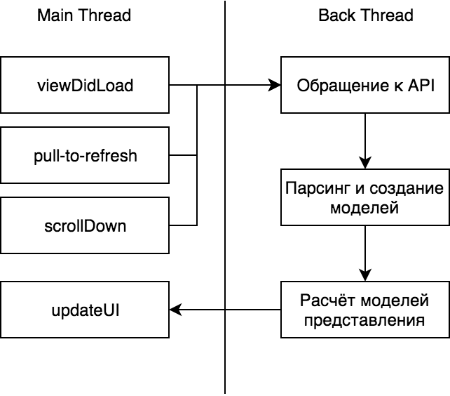
As a result, the following concept was chosen:
Let's get a little more detail.
In the main thread, we update the interface, process user actions (scroll down and pull-to-refresh, click on the post to increase it), and trigger the service model for receiving and preparing data.
Appeal to API . Everything is simple here - NSURLSession with configured NSURLCache. At the same time it is important that when downloading the history down, we use the cache, and when pull-to-refresh we disable it. Exactly this behavior I spied on VK and Facebook.
Parsing and creating models . Here is the logic for processing a particular request, throwing errors and returning transport models with data.
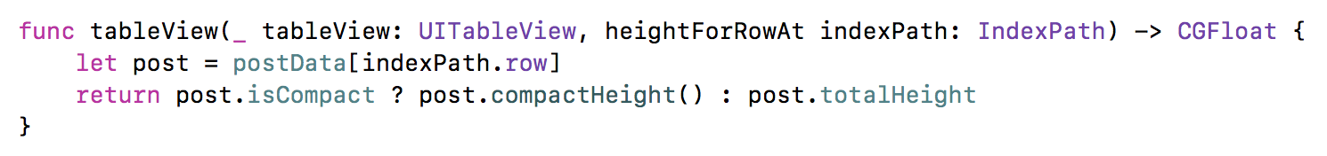
Calculation of models of representation . The most important step to optimize performance. Here, the transport models are converted to an entity with a postfix ViewModel. ViewModel stores in itself fully prepared data for display - AttributedString, calculated cell height (for 2 states: minimized and expanded), full name as a string, string with date (already converted from DateFormatter).
Only after that the data is returned to the main stream. Implementing similar logic on Swift is very convenient and simple. Make the ViewModel a structure. Structures are copied when sent to a new stream.
Excellent concept is ready, now let's talk about the output mechanism itself.
First, it was necessary to choose on what to implement the tape - UITableView or UICollectionView (for its implementation, it would definitely not be enough for the allotted time). Obviously, UITableView is suitable for displaying a list, but I was very worried if there would be problems with increasing the list above, below, and also increasing the content cell. Therefore, I decided to go from simple to complex - i.e. if the problems with UITableView are not found, we leave it.
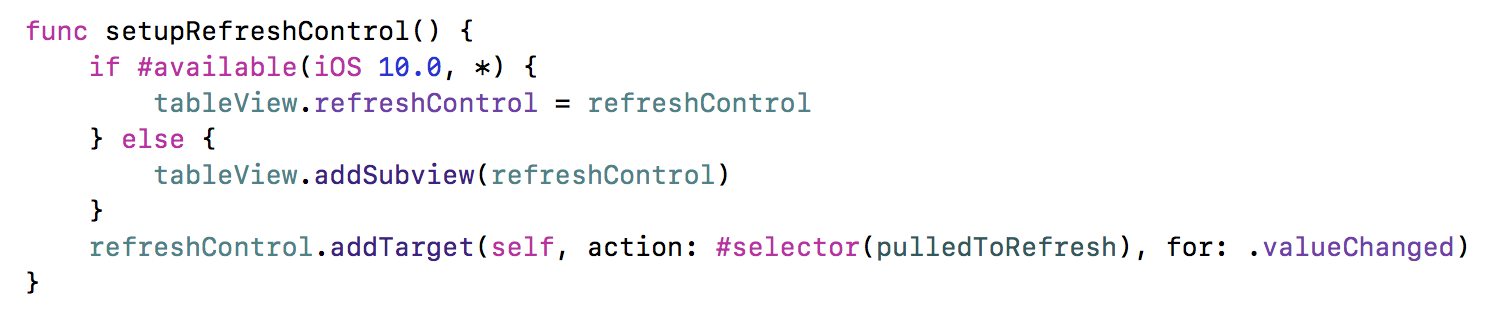
First of all, I decided to decide on a pull-to-refresh. To implement this pattern, there is a UIRefreshControl. Sometime 5-6 years ago I wrote my implementation using UIActivityIndicator and changing the contentInset of the table. So, please do not do it now! UIRefreshControl has a convenient compact interface and takes away a cloud of crutches, which will certainly have to do. Using it is very simple:
However, when using it, it becomes clear where the problems shown above for the VK client are growing from. It seems that they exist in the component itself. I quickly tried to look for what could be the reason and what are the solutions.
Internet tips say ( such or such ):
- check if endRefreshing is called is updated now control (isRefreshing)
- use exactly UITableViewController (because in this case the magic private method is called)
I tried this and that - no positive effect appeared to me. I was upset, but decided not to waste time and move on. By the way, if someone knows how to overcome this problem, please write in the comments.
The next step is the implementation of data loading from below.
At first I didn’t get very cool - when loading from the bottom, there was a terrible lag (the contentSize table jumped apparently):
And this is hell :-) With this result you won’t win. But the quick search gave me a terrific hint, which I forgot:
And voila:
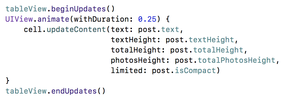
It remains to decide how to animate the height of the cell.
The first idea that came to mind is to run along visibleCells and increase the height in the animation block. But even at the stage of analysis, this idea should be discarded - the problem is that it will be necessary to synchronize the height specified in the UITableViewDataSource and something to do with contentSize (which is not recommended by Apple).
The second thought that came to mind turned out to be correct - UITableView has insert / reload / delete methods that can be executed in the animation block:
Do not forget that in heightForRowAt we also need to add a new height:
It seems that everything, but not quite! In the animation of the unfolding of the post, there remains one subtle point. Look behind the text in Intagram or Facebook - it appears smoothly as you increase the height. What to do? Render it line by line? If you reach the level of NSTextContainer, then it is possible and there will be a similar opportunity. But it seemed to me that it was not such a bad idea (for such and such a time) to print the entire text at once. Just set the clipToBounds of the superView, which will contain a UILabel that displays our text. And the approach worked! Oh, this animation greatly inspired me and opened a second wind. After all, this animation is not in the native client VK. So the chance of winning it should add :-)
The remaining parts in the implementation of the tape are not so interesting. But you can ask them in the comments. And there's nothing wrong with posting code. Here it is - github.com/katleta3000/vkmobilechallenge . Forgive that, but not combed and there are places Magic Numbers (but this is a competition for speed, something had to be sacrificed). By the way, there you can jump on commits (the names are quite understandable).
The result can be seen here - www.youtube.com/watch?v=Md8YiJxSW1M&feature=youtu.be (the quality is of course greatly lost, but better than in the gif for the demonstration of smooth scroll)
Statistics, results, conclusions
All the time the competition worked on a timer. It turned out 20 and a half hours of net coding time. Time tracking helped in 2 things: as you remember, there were estimates in abstract units, so by the middle of the last day there was already quite good tracking statistics and it was possible to plan the remaining final tasks much more accurately. And, secondly, it was possible to identify and prove the pattern of “concentration in one sitting”. Each dimension is a new iteration, so it turned out that I had 68 iterations of writing code. If averaged, it would be 18.5 minutes. But in fact, on the first day, the iterations were on average 25 minutes each, but by the end of the second day, by 7 :-) You start to go crazy, get very nervous, you get tired and the performance drops. Similar data will help well the next time.
Personally, I used the Hourly program (you can download and try) - it is simple and solves the necessary problem (and I also develop it myself):
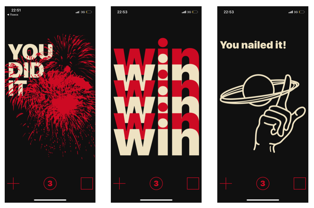
From pleasant bonuses - for each closed puzzle you are shown some kind of very pleasant exhilarating screen like these:
It's funny that it was exactly at the completion of the “VK Mobile Challenge” problem that the following screen seemed to me:
And yes! So it happened :-) We turn to the results.
Let's not pull peach for plush. Peach, who did not know, is the name of the cat - the main character of VK. Very cool gift merch:
I took 4th place and received 175k rubles. (Yes, and you, for sure, already burned the picture on the Habra-Kat). And yes, I am of course pleased. I reached my goal :-) And this is undoubtedly incredibly pleasant.
Finally, I would like to say thanks to vkontakte - after all, the competition was cool and well organized. And I recommend all readers to take part in challenges and hackathons - this is a great way to challenge yourself and compete with top developers around the world (or at least the Russian-speaking community).
Source: https://habr.com/ru/post/432356/
All Articles