We finish the nailed Google search box
 Over the decade of development, Google has long since ceased to lay out search pages with a primitive layout, and there was a lack of time and money for the search page design. Recently (in fact, in different parts of the world, he has been experimenting for 2 months), he laid out a new search results design, which are still being finalized - an oval input field appeared (in the search for pictures, still rectangular), nailed to the top (when scrolling through the page) search. The remaining functions, basically, remain the same, for which the user script (browser extension) Google Search Extra Buttons was made for a long time. In connection with the changes in the page layout, improvements were made, and at the same time they touched upon new elements of the user interface, which we are discussing now, showing working modifications.
Everything, in general, is good for Google, and the modifications made do not speak about any strong flaws, but small things add a bit of convenience, which makes up the general UI (user interface). We list what will be discussed. At the beginning - the duty, already existing functions of the script, and below - what recently appeared new with the design of Google.
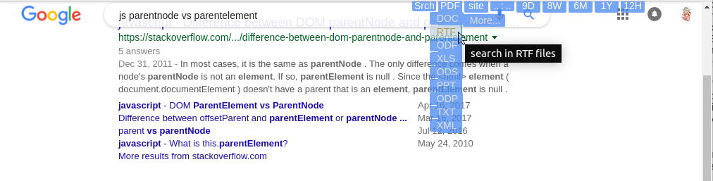
- Additional buttons - they form the basis of the user script, for which it is installed. So that they are just a click away, some functions (search by dates, by file types and sites) are rendered closer to the user, to the free space of the page. This has already existed for several years, so it has already been discussed, including in a couple of articles on Habré;
- storage settings additional buttons;
- a falling list of file extensions (about 30), in the general search and search by pictures;
- tips that close when the search results appear - how the partial closure was resolved;
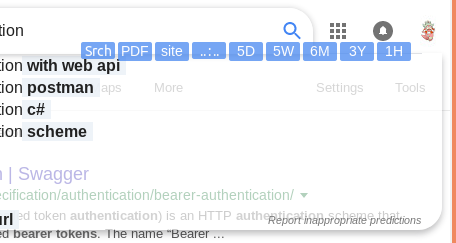
- the search field was beaten up - it was at Yandex about 7 years ago; there is a script that “fought” with it, and now it solves similar problems in the style of aikido and google user scripts;
- The required Google wide page (wants 1100) is somewhat trimmed (up to 800px with a relatively convenient header).
Additional buttons
They have not changed in recent days, but there was a refinement about a year ago, which improves transitions (CSS transitions) for the disappearance of date columns by mouse assignment. Initially, a programmatic disappearance of columns was made in the script, on JS, so that if the mouse was accidentally moved away, they did not disappear instantly and in a split second could be corrected if the column was still needed. This is a common technique that is used in the menu with the same goals. Now it can be completely done on CSS, and earlier more complete browser support was required. Now the software disappearance is saved, but slightly smoothed by the presence of CSS transitions. Not everyone likes the presence of transitions and smooth fading of transparency in general, but this is a matter of settings and improvements of the script. It provides for storing settings in localStorage, but there are no “themes”.
Storage settings
With the storage of localStorage, Google, Yandex and Facebook have long been not easy - they periodically clean their memory (each user's browser of a local computer). Therefore, in order to store the domains of sites in which the user often searches, the number of days and weeks for which he conducts groups of searches, we had to make a difficult decision (this was described somewhere on Habré, as far as I remember, for Facebook) - to store settings on another domain . But now you can extend the script, for example, while retaining the very “themes” that could be written long ago. The number of days, weeks, or years that the user chooses during the last search appears and is stored in the drop-down list header. (Another little bit of convenience.)
')
File Extension List
To conveniently display 23 file types and 7 types of pictures, file types are divided into 3 columns, but the last 2 appear when you click the “More ...” button. Also, in the search for pictures in the additional buttons, the checkbox "Show image sizes" (or not show) is duplicated.
For files, it remains an open question how it is more convenient, and whether it is necessary to set a search for several types of files. You can write a request for it manually in the search field (filetype: pdf OR filetype: doc), but you can somehow in the button interface. Yandex has a similar opportunity.
Search Tips and Transparency
We turn to the most interesting - the plot of the designers Google. However, in Yandex, the sheet of prompts covering the half of the screen is not solved, and also had to be corrected. In Google, we will do it more comprehensively, since it highlights various endings of words and phrases in order to make it easier to navigate. Let us make sure that this entire banquet still does not interfere much with the search - the main occupation of the search engine.
In Yandex, transparency was made simple - barely noticeable (with the Yandex No Float Field script), so that the headings and the column shape under the hint could be guessed. It almost does not interfere with looking not always desired hints and does not completely kill the visibility of search results.
In Google, a new script made more radical - more transparency. Through the solid white fields you can even read. But to make the clues visible, use the bold text tags from the clues to create dense colored underlays for these important parts.

Split search field
(Or the string-stuck - © 2011 ya - struggled here: userstyles.org/styles/51117/yandex-ru-no-float-field . A couple of years later it was canceled, then after 2-3 years they entered it again and now it is in the interface Yandex is available.)
That Google stepped on this curve track. Obviously, this decision is fundamentally flawed, if you don’t have a monitor more than 1600 pixels high. The search field with its borders and baubles hides part of the height of the window, which is necessary to display the search results - the main one, for which you came to the site. If on a regular page scrolling removes the field from the window, then with a “good service” nailing it at the top, this simple possibility is also lost. And if, like Yandex now, there are more links, the amount of gratitude grows proportionally. (However, the moneylenders also take 3%, 7% of the commission, so the majority is familiar, but does it make sense? Why, if not even three are needed?) However, both of them probably invested in high-resolution monitor manufacturers on time, so and google now profits will start to drip). But until you bought a new monitor, let's remove this stuck line.
Google eats up a little in its nailed field - only 72px (72/1080 = 6.7% of the commission for monitor manufacturers), Yandex - 94 (8.7%). Although both could show the window if necessary - by hovering the mouse over the top of the screen.

Let us fulfill the dreams of beggars who don’t want to spend money on (the hardware they don’t need), especially since Google has automatically managed to show our additional buttons in its nailed field. If the field is brought under the top of the window, the buttons “hang”, and hovering the mouse over them allows you to open the input field.
The commission percentage was the height of the buttons - 22/1080 = 2%, and even then we divide by 3, because width occupy a third of the screen. (There was a grumble of indignation among the monitoring capitalists.)
We direct something in the middle of the page to something - we see not only the falling buttons, but also an accessible input field.
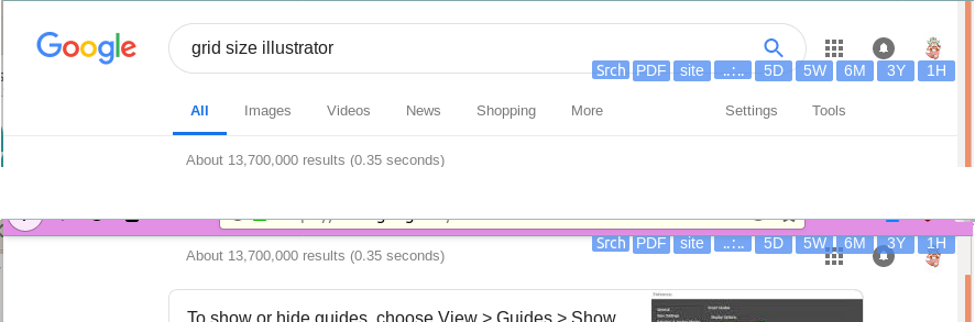
Google wide page
They still produce not too widescreen monitors, so the styles have set the page width limit to 1100 pixels - quite modest yet. (Why do they need these people with 1100 pixels?) But when we look at the search results not in the whole window, it may be necessary less. And the search field is inconvenient to look at a smaller width.
We make a revision so that from 800 pixels you can use all the functions in the title without twisting the page horizontally.

Bottom scrolling remains horizontally, but this is already Google's corporate style, which depends heavily on the content of the page. Let's leave this job to him, and we, when (and if) we make our search engine, work in it and on horizontal scrolling.
The plans of user scripts for Google are to add several buttons (sizes, styles, colors) for the image search window, to make a multi-selection of files, 1-2 checkboxes for styles and leave it in this form for the following improvements when needed.
UPD: an interesting feature in Google for the Russian language.
As you know, the Google calculator is mixed into the search results if it sees a mathematical expression. In particular, 2 ^ 4 is 2 ** 4, equal to 16. But Google also understands '2v4' as an operation of exponentiation.
Source: https://habr.com/ru/post/432032/
All Articles