File management done wrong - Part 1: Hailing from the 90s
Hi, I am Gregory, I have been using file managers for almost 25 years, and I have something to say about them - today's file management is not well done. I will try to show the problems in the most common programs and services, and if you want, consider this whitepaper article.
Look at this screenshot and think about what has changed in the last 20 years .
Basic introductory statements:
- Today, file management is inseparable on the desktop, mobile and on the web - privately in public and in collaboration. Properly done, the file manager should erase the edges between the platforms, making the files synchronized and ready for sharing and sharing.
- It should provide an informative preview of any type of content, relevant metadata and content appearance management tools appropriate for each platform.
- It must have relevant tools for file operations so that simple things can be done simply and complex without unnecessary brainwashing.
Mainstream file managers cannot do this , in general they suck on all 3 items. That's why:
- Designers don't care what they design; they don't use the product. They just do their job.
- Their bosses don't care about design. Should it be?
- Ordinary users do not notice "minor" flaws. They just enjoy.
When people ask me what I do, I respond with "file management problems," most do not understand what I mean, others say, "are there problems?"
I want to show how file managers devour my time - share the pain . When I try to find something. Waiting for the thumbs generation. Waiting for the search. Looking for the right pictures. I merge two folders. I share the folder. Waiting for link generation. I enter the ohrenet-not-get-up-some-long link from Google Drive. I use the file manager, image viewer, cloud storage and publishing tools to do one simple thing!
The first part can be a bit boring, but you have to start somewhere. There will be tons of screenshots. And a lot of hate . Continue at your own risk.
Data presentation
The basis of the file manager - the presentation of files and folders - a graphical presentation of content, embedded previews, icons and relevant metadata - this should provide a simple visual search for files on all platforms.
Desktop and Web
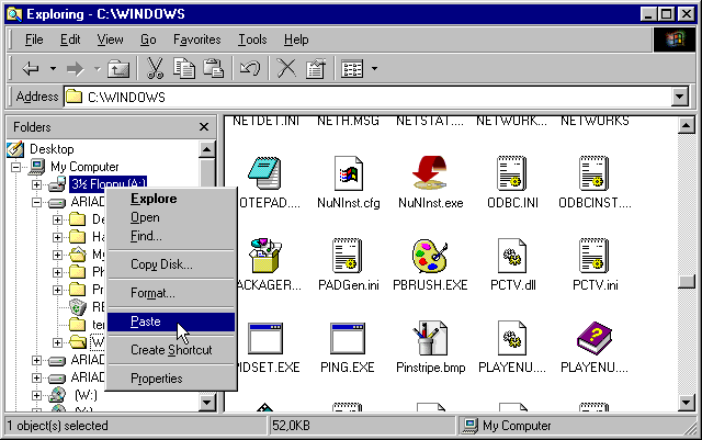
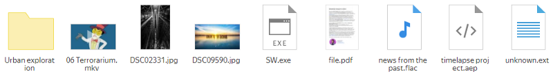
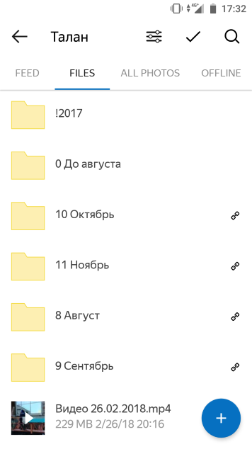
Let's start from the beginning and consider the most common manager - the Windows File Explorer .
Wait, is this the # 1 file manager in the world? It looks almost like an Explorer from the 90s!
The previews are very small, although there is plenty of space around. The aspect ratio of the images is taken into account, but it does not help much because of the size of the preview. No metadata.
As a photographer, I must state that the aspect ratio of the images must be taken into account.
Next comes Google Drive - the folders here look somehow stupid and completely uninformative. The aspect ratio of the images is not taken into account. Here it is possible without metadata.
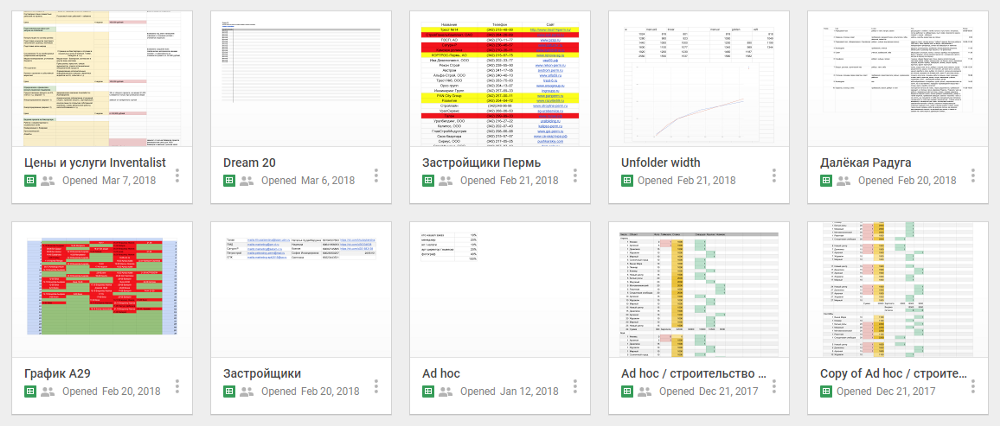
Let's look at Google Sheets - although this is not a file manager, but still a good example - here are good previews and metadata.
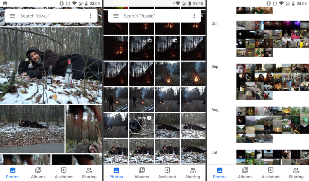
Another good example is Google Photos - the previews are correctly made here.

Yandex.Disk on the web just copies the old Explorer. Why did they do that? I think they just can not think of anything themselves.
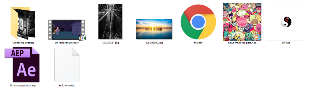
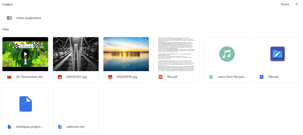
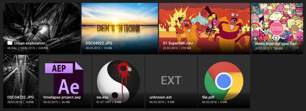
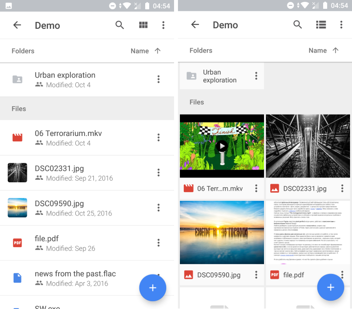
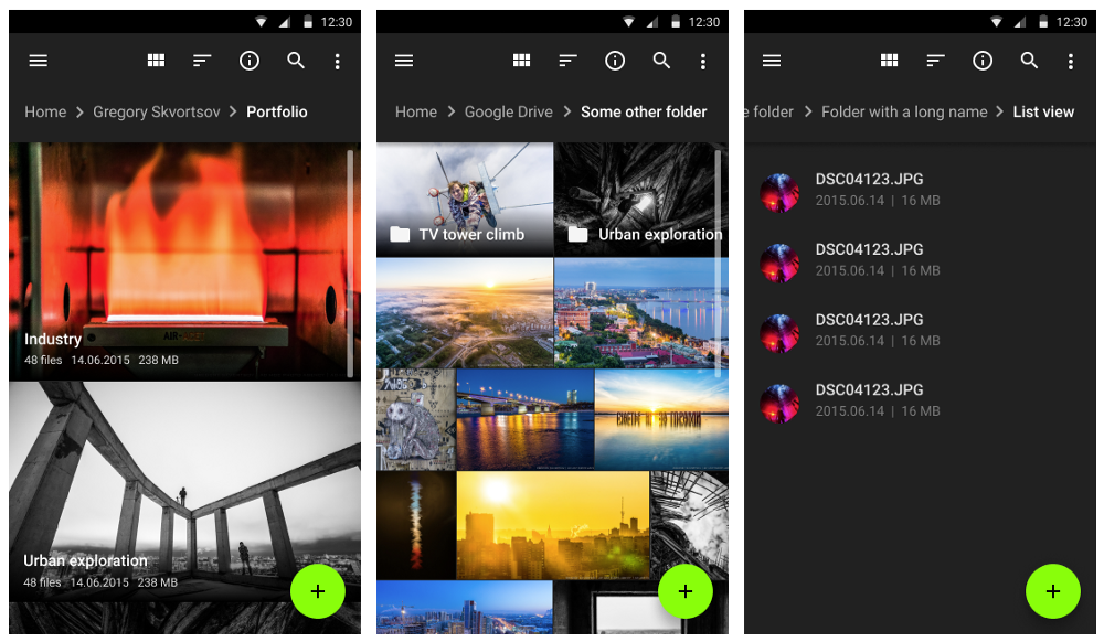
Considering the listed examples, their advantages and disadvantages, I designed my own version. I have lost the alphabetical order and the preview of the PDF, but I hope you understand the point.
List view
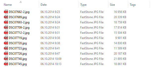
In folders with audio files, Explorer does not show either the size or the length of the track - very convenient.

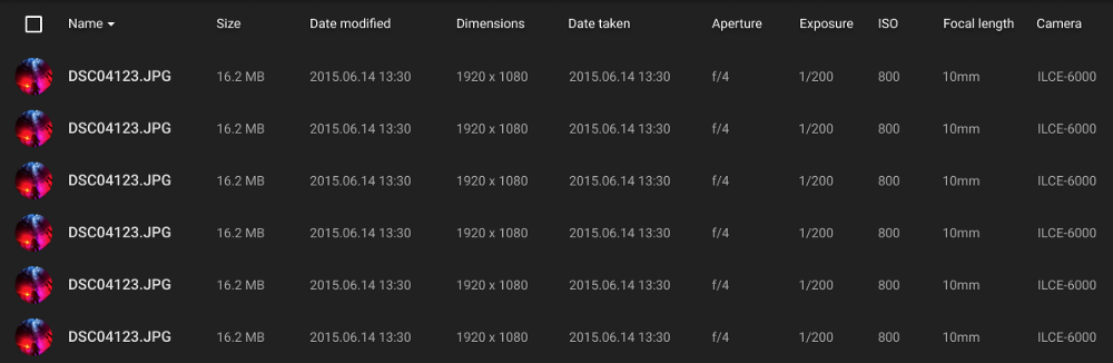
About folders with photos, I do not even want to write a comment, thank you, chela from Microsoft . I hope you wanted the best, but apparently you forgot to test it on real files. See my version.
Mobile applications
Google Drive has 2 versions - a list and tiles, both look OK, but again with strange folders and no respect for the aspect ratio of the photo. And there is no zoom, so it is difficult to find the necessary 10 files among 256.
Google Photos again they rule, they have zoom and metadata. By the way, the old Sony Album app was also cool.
I drew my version again - now from goat stumps, with (imaginary) zoom, list and tiles, so you can easily find your photos! I do not want to draw a grid of squares with 24 photos, so just imagine it, please.
Separate Client / Virtual Disk
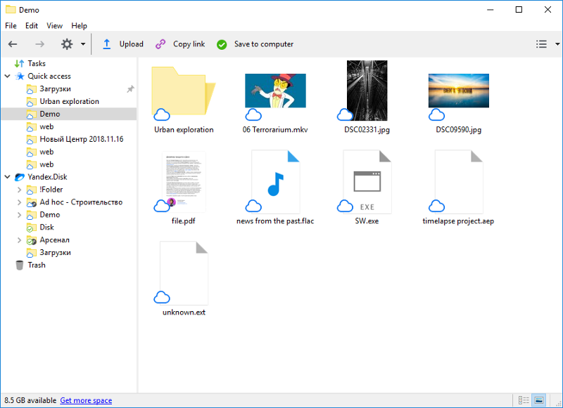
Yandex.Disk did something interesting - download-on-demand client, so that you can download files only when they are needed. But why a separate client? Why not virtual folder go drive? God knows. I do not remember other stand-clients. Maybe this is a cool customer? Not. He looks terrible and works terribly.
My Dad says he looks like Norton Commander, not at all like their landing page .
They just copied the old Explorer. Why didn't they do something really good ? Because they can not.
But I think that the idea of a virtual disk is good, for the first time I saw it at the late ZumoDrive . Today it implements Disk-O from Mail.ru (beware).
Problems with the alphabet
Heck! I just can not be silent about it. I saw a bunch of examples of this, but I don’t want to delve too much. Just a couple of examples:
File Explorer, Windows 10 - long names first.

Yandex.Disk on mobile is just a mess. The web is the same.
Download and preload data
File Explorer does not support HDD active, and when you try to enter the folder after idle time, it takes a few seconds to spin the disk. Why not keep it active or not open cached previews and metadata? HZ.
Loading preview photos in Explorer takes a lot of time, folders open very slowly. FastStone type photo viewers do this much faster and do not block the interface during download.
Search
Search in File Explorer on Windows 10 cannot find files. I don't know what's stopping him. They are there , but the search says no. The search is very slow , they take minutes. Search options are hidden so well that no one can find them. And look hellish.
The search results are not very informative, and when you try to navigate to the location of one of the files found, you can’t normally use the navbar, you can’t see the actual folder location and you can’t even go back to the search results - it will start again! Oh, how it infuriates.

I would like to show an example of a good search on the desktop, but I can not - they are not .
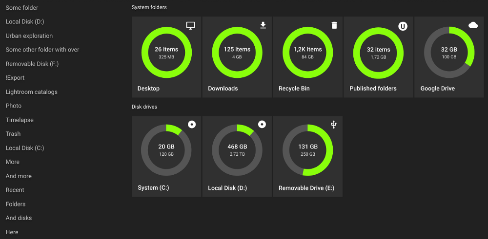
Home screen
When I open File Explorer , I see this:
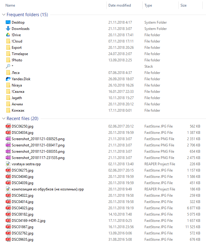
I have no idea why I should see it all here. Why " Frequent folders " and not " Recent folders "? For me, it's pretty pointless. The “ recent files ” in my case are also pretty useless.
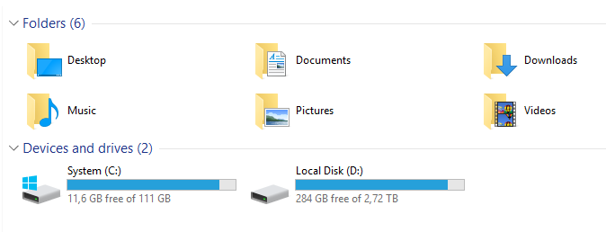
Why not make the “ This Computer ” screen more useful? I drew another sketch. "Recent folders" are always available on the left and individual folders can be pinned down (trust me).
That's all for today, but I still have a lot to say. I hope it will be a monthly release of hatred for file managers and the people who make them.
The next part will be my favorite - about context menus, file operations and resolution of file name conflicts - the most hell of a thing, just the Masterpiece of Shit - stay tuned!
')
Source: https://habr.com/ru/post/431088/
All Articles