The combination of cross-platform and native approach in the development of mobile applications
To release applications for only one mobile platform is not relevant and you need to take care of the development of two versions at once, for iOS and Android. And here you can choose two ways: work on “native” programming languages for each operating system or use cross-platform frameworks.
When developing one of the projects at DD Planet, I made a bet on the last option. And in this article I will talk about the experience of developing a cross-platform application, the problems we have encountered, and the solutions found.
To begin with, let's consider what approaches are used, when you need to get two applications at once: for iOS and Android.
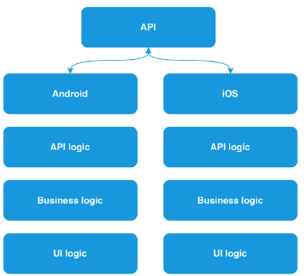
The first is the most costly, both in time and in resources: developing a separate application for each of the platforms. The complexity of this approach lies in the fact that each of the operating systems requires its own approach: this is expressed both in the language in which the development is carried out (for Android — Java or Kotlin, for iOS — Objective-C or Swift), and in the ways of describing the UI part applications (axml and xib or storyboard files, respectively).
')
This fact alone leads us to the fact that such an approach requires the formation of two development teams. In addition, it is necessary to duplicate the logic for each of the platforms: interaction with api and business logic.
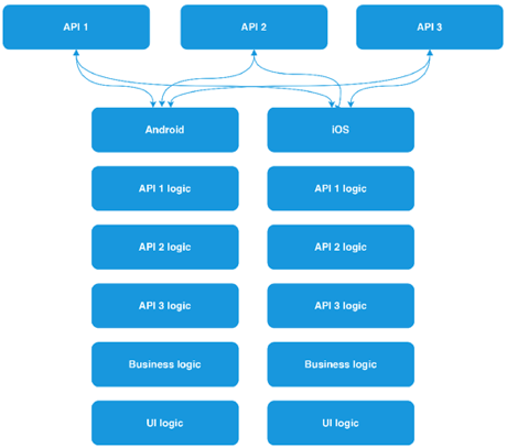
And what if the number of APIs used will grow?
This raises the question: how to reduce the required amount of human resources? Eliminate the need to duplicate code for each platform. There are enough frameworks and technologies to solve this problem.
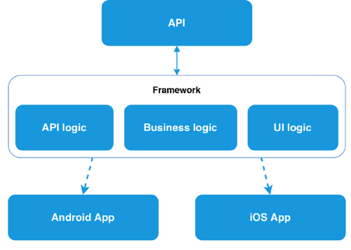
Using a cross-platform framework (Xamarin.Forms, for example) allows you to write code in one programming language and describe the data logic and UI logic once, in one place. Therefore, there is no need to use two development teams. And on the basis of the compilation of the project at the output we get two native applications. And this is the second approach.
Many, I think, know what Xamarin is, or at least have heard of it, but how does it work? Xamarin is based on the open-source implementation of the .NET platform - Mono. Mono includes its own C # compiler, runtime, and a number of libraries, including WinForms implementation and ASP.Net.
The goal of the project is to allow programs written in C # to run on non-Windows operating systems — Unix, Mac OS, and others. The Xamarin framework itself, in essence, is a class library that provides developers with access to the SDK platform and compilers for these. Xamarin.Forms, in turn, allows not only to write for both platforms in the same language, but also to design screen designs using XAML markup, familiar to those who have already had experience with WPF applications. As a result of the project build, we get an almost identical view on all platforms, since at the compilation stage all XF controls are converted to native for each platform.
The developer is forced to write code for each platform only if you need access to any platform features (for example, a fingerprint scanner or a battery charge level) or you need to fine-tune the control behavior. In some cases, when developing an application, it may be necessary to write platform-specific code, but even in this case, no one forbids taking platform functions to the interface and interacting further with it from the overall project.
One programming language, little code, and so on. It all sounds beautiful but, Xamarin.Forms is not a silver bullet, and all its beauty is broken against the stones of reality. As soon as a situation arises when the built-in XF controls do not respond to the demands made on them, the structure of the screens and controls becomes more and more complicated. To ensure comfortable work with screens from a common project, you have to write more and more custom renderers.
This will move on to the third approach, which we use when developing applications.
We have already figured out that using Xamarin Forms can complicate the work, and not simplify it. Therefore, for the implementation of architecturally complex screens, design elements and controls, radically different from the native, there was a compromise and the possibility of combining the first and second approaches.
We have all the same three projects: a common PCL project, but already without Xamarin Forms, and two projects Xamarin Android and Xamarin iOS. There is still an opportunity to write everything in one language, the general logic between two projects, but there are no restrictions for a single XAML markup. The UI component is controlled by each of the platforms and uses native tools, on Android - native AXML, on iOS - XIB files. Each platform has the ability to comply with its guidelines, as the connection between Core and platform projects is organized only at the data level.
To organize such a connection, you can use the MVVM design pattern and its rather popular implementation for Xamarin - MVVMCross. Its use allows you to keep a common ViewModel for each screen, which describes all the "business logic" of work, and entrust its rendering to the platform. It also allows two developers to work with the same screen (one with logic - the other with UI) and not interfere with each other. In addition to the implementation of the pattern, we obtain a sufficient number of tools for work: the implementation of DI and IoC. To raise the interaction with the platform to the level of a common code, the developer simply declares the interface and implements it on the platform. For typical things MvvmCross already provides a set of its own plug-ins. In the team, we use the messenger plugin to exchange messages between the platform and the common code and the plugin to work with files (selection of images from the gallery, etc.).
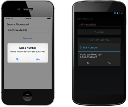
As mentioned earlier, when using complex views on the screen, the framework can make life more difficult than it makes it easier. But what to call a complex element? Since I am mainly engaged in iOS development, an example of this platform will be considered. For example, such a trivial thing as an input field can have several states and enough logic for switching and visualization.
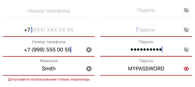
In the course of working with user input, such an input control was developed. He is able to raise his name over the input field, work with masks, set prefixes, postfixes, notify about the pressed CapsLock, validate information in two modes: prohibition of input and output of information about an error. The logic inside the control takes about ~ 1000 lines. And it would seem: what could be complicated in the design of the input field?
We saw a simple example of a complex control. And what about the screens?
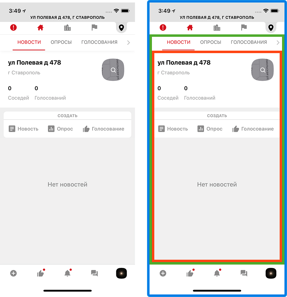
To begin, I will clarify that one application screen in most cases is one class - UIViewController, describing its behavior. During the development required the creation of multi-level navigation. The concept of the application being developed comes down to managing your real estate and interacting with your neighbors and municipal organizations. Therefore, three levels of navigation were built: property, presentation level (home, city, region) and content type. All switching is carried out within one screen.
This was done so that the user, wherever he was, understood what kind of content he sees. To organize such a navigation, the main screen of the application consists far from a single controller. Visually, it can be divided into 3 parts, but can anyone try to guess how many controllers are used here?

Fifteen main controllers. And that's just for the content.
Such a monster lives on the main screen and feels good. Fifteen controllers for one screen is, of course, a lot. This affects the speed of the entire application, and you need to somehow optimize it.
We have abandoned synchronous initialization: all the view models are initialized in the background and only when it is needed. To reduce the rendering time, they also abandoned the xib files for these screens: absolute positioning and math are always faster than miscalculation of dependencies between elements.
To keep track of so many controllers you need to understand:
To do this, I wrote a separate navigation processor that stores information about the user's location, the type of content that he views, the navigation history, etc. He also controls the order and the need for initialization.
Since each tab is a controller slider (in order to create a swipe transition on them), you need to understand: each of them can be in its own state (for example, the News is opened on one, the Voting is on the other). This is followed by the same navigation processor. Even changing the presentation level from home to region, we will stay on the same type of content.
Working with so much data in the application, you need to organize the delivery of relevant information on all sections in real time. To solve this problem, there are 3 ways:
Each approach has its pros and cons, so it's best to use all three, choosing only the strengths of each. We conditionally broke the content inside the application into several types: hot, regular and service. This is done in order to determine the allowable time between the event and the user notification. For example, we want to see the chat message immediately after we send it to us - this is hot content. Another option: a poll from the neighbors. It makes no difference when we see it, now or in a minute, because this is ordinary content. Minor notifications within the application (unread messages, commands, etc.) are service content that requires urgent delivery, but does not take up a large amount of data.
It turns out:
The most interesting thing is maintaining a permanent connection. Writing your own client to work with web sockets is a step down the rabbit hole, so you need to look for other solutions. As a result, we stopped at the SignalR library. Let's see what it is.
ASP.Net SignalR is a library from Microsoft that simplifies real-time client-server interaction by providing two-way communication between client and server. The server includes a full-fledged API for managing the connection, connection-disconnection events, a mechanism for uniting connected clients into groups, authorization.
SignalR can use both websockets, and LongPolling, and http requests as a transport. The type of transport can be specified forcibly or trust the library: if you can use websocket, then it will work through websocket, if this is not possible, then it will go down until you find an acceptable transport. This fact turned out to be very practical, considering that it is planned to use it on mobile devices.
Total, what benefit we get:
This, of course, does not satisfy all needs, but visibly makes life easier.
Inside the project, a wrapper is used on the SignalR library, which further simplifies working with it, namely:
Each of these wrappers (we call them clients) works in tandem with the caching system, and, in the event of a disconnection, can only request data that it could miss during this time. "Each" because at the same time keep several active connections. Inside the application there is a full-fledged instant messenger, and a separate client is used to service it.
The second client is responsible for receiving notifications. As I have already said, the content of the usual type is obtained through http-requests; in the future, its actualization falls on this client, who reports on all important changes in it (for example, voting has moved from one status to another, publishing a new news).
It's one thing to get data, another is to show. In real-time data updating there are some difficulties. At a minimum, it is necessary to decide how to present these updates to the user. In the application, we use three types of notifications:
The most familiar and mundane way to show that somewhere there is new content is to highlight the section icon. Thus, almost all the icons have the ability to show the unread content notifier as a red dot. More interesting things are with automatic updates.
You can automatically update the data only when the new content does not rearrange the screen and does not change the size of the controls. For example, on the survey screen: the information about the votes will only change the value of the progress bar and the percentages. Such changes will not entail any resizing, they can be applied instantly without problems.
Difficulties arise when it is necessary to add new content to the lists. All lists in the application, in fact, are ScrollView and have several characteristics: window size, content size and scroll position. All of them have a static beginning (top of the screen with coordinates 0; 0) and can expand downwards. Add a new content down the list, at the end, no problem, the list will last. But the new content should appear at the top, and it turns out this picture:
Being on the 3rd element, we will be on the 2nd - the scroll will bounce up. And since the new content can come all the time - the user will not be able to scroll normally. You might say: why not calculate the size of the new content and move the scroll down by this value? Yes, you can do that. But then you have to manually manage the position of the scroll, and if at this moment the user has scrolled in any direction, his action will be interrupted. That is why such screens can not be updated in real time without the consent of the user.
The optimal solution in this situation will be to inform the user that while he scrolled the tape, someone has published a new content. In our design, it looks like a red circle in the corner of the screen. Clicking on it, the user gives his conditional consent to the fact that we return it to the top of the screen and show fresh content.
With this approach, we, of course, avoided the problems of “slipping” content, but they still had to be addressed. Namely, on the chat screen, as in the course of communication and interaction with the screen, new content must be displayed in different places.
The difference from the usual chat lists is that fresh content is at the bottom of the screen. Since this is a “tail”, you can add content there without much difficulty. The user spends here 90% of the time, which means that you need to constantly hold the scroll position and shift it down while receiving and sending messages. In a lively conversation, such actions have to be done quite often.
The second point: loading the history when scrolling up. Just when uploading the story, we are in a situation where it is necessary to put messages above the level of the review (which will cause an offset) so that the scroll is smooth and continuous. And as we already know, in order not to interfere with the user, you cannot manually control the position of the scroll.
And we found a solution: we turned it over. The screen flip solved two problems at once:

This solution also helped to speed up the rendering, eliminating unnecessary operations with scrolling control.
Speaking of speed. In the first screen variants, noticeable drawdowns were found when scrolling messages. Since the content in “babla” is variegated - text, files, photos - it is necessary to constantly recalculate the size of the cell, add and delete elements in the bubble. Therefore, optimization of bablov needed. We did the same as with the main screen, partially drawing the bubble with absolute positioning.
When working with lists in iOS, before drawing a cell, you need to know its height. Therefore, before adding a new message to the list, you need to prepare in a separate stream all the necessary information for display, calculate the height of the cells, process the user data and only after we know and cache everything you need, add the cell to the list.
As a result, we get a smooth scroll and not overloaded UI stream.
When developing one of the projects at DD Planet, I made a bet on the last option. And in this article I will talk about the experience of developing a cross-platform application, the problems we have encountered, and the solutions found.
Three approaches in the development of cross-platform mobile applications
To begin with, let's consider what approaches are used, when you need to get two applications at once: for iOS and Android.
The first is the most costly, both in time and in resources: developing a separate application for each of the platforms. The complexity of this approach lies in the fact that each of the operating systems requires its own approach: this is expressed both in the language in which the development is carried out (for Android — Java or Kotlin, for iOS — Objective-C or Swift), and in the ways of describing the UI part applications (axml and xib or storyboard files, respectively).
')
This fact alone leads us to the fact that such an approach requires the formation of two development teams. In addition, it is necessary to duplicate the logic for each of the platforms: interaction with api and business logic.
And what if the number of APIs used will grow?
This raises the question: how to reduce the required amount of human resources? Eliminate the need to duplicate code for each platform. There are enough frameworks and technologies to solve this problem.
Using a cross-platform framework (Xamarin.Forms, for example) allows you to write code in one programming language and describe the data logic and UI logic once, in one place. Therefore, there is no need to use two development teams. And on the basis of the compilation of the project at the output we get two native applications. And this is the second approach.
Many, I think, know what Xamarin is, or at least have heard of it, but how does it work? Xamarin is based on the open-source implementation of the .NET platform - Mono. Mono includes its own C # compiler, runtime, and a number of libraries, including WinForms implementation and ASP.Net.
The goal of the project is to allow programs written in C # to run on non-Windows operating systems — Unix, Mac OS, and others. The Xamarin framework itself, in essence, is a class library that provides developers with access to the SDK platform and compilers for these. Xamarin.Forms, in turn, allows not only to write for both platforms in the same language, but also to design screen designs using XAML markup, familiar to those who have already had experience with WPF applications. As a result of the project build, we get an almost identical view on all platforms, since at the compilation stage all XF controls are converted to native for each platform.
The developer is forced to write code for each platform only if you need access to any platform features (for example, a fingerprint scanner or a battery charge level) or you need to fine-tune the control behavior. In some cases, when developing an application, it may be necessary to write platform-specific code, but even in this case, no one forbids taking platform functions to the interface and interacting further with it from the overall project.
One programming language, little code, and so on. It all sounds beautiful but, Xamarin.Forms is not a silver bullet, and all its beauty is broken against the stones of reality. As soon as a situation arises when the built-in XF controls do not respond to the demands made on them, the structure of the screens and controls becomes more and more complicated. To ensure comfortable work with screens from a common project, you have to write more and more custom renderers.
This will move on to the third approach, which we use when developing applications.
We have already figured out that using Xamarin Forms can complicate the work, and not simplify it. Therefore, for the implementation of architecturally complex screens, design elements and controls, radically different from the native, there was a compromise and the possibility of combining the first and second approaches.
We have all the same three projects: a common PCL project, but already without Xamarin Forms, and two projects Xamarin Android and Xamarin iOS. There is still an opportunity to write everything in one language, the general logic between two projects, but there are no restrictions for a single XAML markup. The UI component is controlled by each of the platforms and uses native tools, on Android - native AXML, on iOS - XIB files. Each platform has the ability to comply with its guidelines, as the connection between Core and platform projects is organized only at the data level.
To organize such a connection, you can use the MVVM design pattern and its rather popular implementation for Xamarin - MVVMCross. Its use allows you to keep a common ViewModel for each screen, which describes all the "business logic" of work, and entrust its rendering to the platform. It also allows two developers to work with the same screen (one with logic - the other with UI) and not interfere with each other. In addition to the implementation of the pattern, we obtain a sufficient number of tools for work: the implementation of DI and IoC. To raise the interaction with the platform to the level of a common code, the developer simply declares the interface and implements it on the platform. For typical things MvvmCross already provides a set of its own plug-ins. In the team, we use the messenger plugin to exchange messages between the platform and the common code and the plugin to work with files (selection of images from the gallery, etc.).
We solve the problems of complex design and multi-level navigation
As mentioned earlier, when using complex views on the screen, the framework can make life more difficult than it makes it easier. But what to call a complex element? Since I am mainly engaged in iOS development, an example of this platform will be considered. For example, such a trivial thing as an input field can have several states and enough logic for switching and visualization.
In the course of working with user input, such an input control was developed. He is able to raise his name over the input field, work with masks, set prefixes, postfixes, notify about the pressed CapsLock, validate information in two modes: prohibition of input and output of information about an error. The logic inside the control takes about ~ 1000 lines. And it would seem: what could be complicated in the design of the input field?
We saw a simple example of a complex control. And what about the screens?
To begin, I will clarify that one application screen in most cases is one class - UIViewController, describing its behavior. During the development required the creation of multi-level navigation. The concept of the application being developed comes down to managing your real estate and interacting with your neighbors and municipal organizations. Therefore, three levels of navigation were built: property, presentation level (home, city, region) and content type. All switching is carried out within one screen.
This was done so that the user, wherever he was, understood what kind of content he sees. To organize such a navigation, the main screen of the application consists far from a single controller. Visually, it can be divided into 3 parts, but can anyone try to guess how many controllers are used here?
Fifteen main controllers. And that's just for the content.
Such a monster lives on the main screen and feels good. Fifteen controllers for one screen is, of course, a lot. This affects the speed of the entire application, and you need to somehow optimize it.
We have abandoned synchronous initialization: all the view models are initialized in the background and only when it is needed. To reduce the rendering time, they also abandoned the xib files for these screens: absolute positioning and math are always faster than miscalculation of dependencies between elements.
To keep track of so many controllers you need to understand:
- In what condition is each of them;
- Where is the user;
- What he expects to see when moving to another controller.
To do this, I wrote a separate navigation processor that stores information about the user's location, the type of content that he views, the navigation history, etc. He also controls the order and the need for initialization.
Since each tab is a controller slider (in order to create a swipe transition on them), you need to understand: each of them can be in its own state (for example, the News is opened on one, the Voting is on the other). This is followed by the same navigation processor. Even changing the presentation level from home to region, we will stay on the same type of content.
We control the flow of data in real time
Working with so much data in the application, you need to organize the delivery of relevant information on all sections in real time. To solve this problem, there are 3 ways:
- Contact API By Timers or Triggers and re-request the actual content on the screens;
- Have a permanent connection to the server and receive changes in real time;
- Get push with changes in content.
Each approach has its pros and cons, so it's best to use all three, choosing only the strengths of each. We conditionally broke the content inside the application into several types: hot, regular and service. This is done in order to determine the allowable time between the event and the user notification. For example, we want to see the chat message immediately after we send it to us - this is hot content. Another option: a poll from the neighbors. It makes no difference when we see it, now or in a minute, because this is ordinary content. Minor notifications within the application (unread messages, commands, etc.) are service content that requires urgent delivery, but does not take up a large amount of data.
It turns out:
- Hot content - a permanent connection to the API;
- Normal content - http requests to the API;
- System content - push notifications.
The most interesting thing is maintaining a permanent connection. Writing your own client to work with web sockets is a step down the rabbit hole, so you need to look for other solutions. As a result, we stopped at the SignalR library. Let's see what it is.
ASP.Net SignalR is a library from Microsoft that simplifies real-time client-server interaction by providing two-way communication between client and server. The server includes a full-fledged API for managing the connection, connection-disconnection events, a mechanism for uniting connected clients into groups, authorization.
SignalR can use both websockets, and LongPolling, and http requests as a transport. The type of transport can be specified forcibly or trust the library: if you can use websocket, then it will work through websocket, if this is not possible, then it will go down until you find an acceptable transport. This fact turned out to be very practical, considering that it is planned to use it on mobile devices.
Total, what benefit we get:
- The ability to exchange messages of any type between the client and the server;
- The mechanism of automatic switching between web sockets, Long Pooling and Http requests;
- Information about the current connection status;
- The ability to unite customers in groups;
- Practical methods for manipulating the logic of sending messages in a group;
- The ability to scale the server.
This, of course, does not satisfy all needs, but visibly makes life easier.
Inside the project, a wrapper is used on the SignalR library, which further simplifies working with it, namely:
- Monitors the connection status, reconnects according to specified conditions and in the event of a break;
- Able to quickly replace or reopen the connection, asynchronously killing the old one and giving it to the garbage collector to be torn apart - as it turned out, the connection setup method works dozens of times faster than the closing method (Dispose or Stop), and this is the only way to close it;
- Takes a message queue so that reconnecting or re-opening the connection does not interrupt the sending;
- Transfers control to the appropriate delegates in case of unexpected errors.
Each of these wrappers (we call them clients) works in tandem with the caching system, and, in the event of a disconnection, can only request data that it could miss during this time. "Each" because at the same time keep several active connections. Inside the application there is a full-fledged instant messenger, and a separate client is used to service it.
The second client is responsible for receiving notifications. As I have already said, the content of the usual type is obtained through http-requests; in the future, its actualization falls on this client, who reports on all important changes in it (for example, voting has moved from one status to another, publishing a new news).
We visualize the data in the application.
It's one thing to get data, another is to show. In real-time data updating there are some difficulties. At a minimum, it is necessary to decide how to present these updates to the user. In the application, we use three types of notifications:
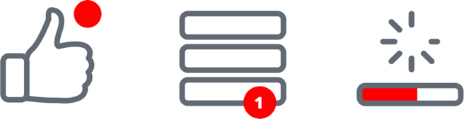
- Notice of unread content;
- Automatic update of data on the screen;
- Offer content.
The most familiar and mundane way to show that somewhere there is new content is to highlight the section icon. Thus, almost all the icons have the ability to show the unread content notifier as a red dot. More interesting things are with automatic updates.
You can automatically update the data only when the new content does not rearrange the screen and does not change the size of the controls. For example, on the survey screen: the information about the votes will only change the value of the progress bar and the percentages. Such changes will not entail any resizing, they can be applied instantly without problems.
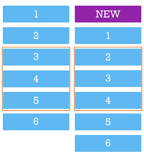
Difficulties arise when it is necessary to add new content to the lists. All lists in the application, in fact, are ScrollView and have several characteristics: window size, content size and scroll position. All of them have a static beginning (top of the screen with coordinates 0; 0) and can expand downwards. Add a new content down the list, at the end, no problem, the list will last. But the new content should appear at the top, and it turns out this picture:
Being on the 3rd element, we will be on the 2nd - the scroll will bounce up. And since the new content can come all the time - the user will not be able to scroll normally. You might say: why not calculate the size of the new content and move the scroll down by this value? Yes, you can do that. But then you have to manually manage the position of the scroll, and if at this moment the user has scrolled in any direction, his action will be interrupted. That is why such screens can not be updated in real time without the consent of the user.
The optimal solution in this situation will be to inform the user that while he scrolled the tape, someone has published a new content. In our design, it looks like a red circle in the corner of the screen. Clicking on it, the user gives his conditional consent to the fact that we return it to the top of the screen and show fresh content.
With this approach, we, of course, avoided the problems of “slipping” content, but they still had to be addressed. Namely, on the chat screen, as in the course of communication and interaction with the screen, new content must be displayed in different places.
The difference from the usual chat lists is that fresh content is at the bottom of the screen. Since this is a “tail”, you can add content there without much difficulty. The user spends here 90% of the time, which means that you need to constantly hold the scroll position and shift it down while receiving and sending messages. In a lively conversation, such actions have to be done quite often.
The second point: loading the history when scrolling up. Just when uploading the story, we are in a situation where it is necessary to put messages above the level of the review (which will cause an offset) so that the scroll is smooth and continuous. And as we already know, in order not to interfere with the user, you cannot manually control the position of the scroll.
And we found a solution: we turned it over. The screen flip solved two problems at once:
- The tail of the list is at the top, so we can seamlessly add history without interfering with the user scrolling;
- The last message is always at the top of the list and we do not need to scroll the screen before it.
This solution also helped to speed up the rendering, eliminating unnecessary operations with scrolling control.
Speaking of speed. In the first screen variants, noticeable drawdowns were found when scrolling messages. Since the content in “babla” is variegated - text, files, photos - it is necessary to constantly recalculate the size of the cell, add and delete elements in the bubble. Therefore, optimization of bablov needed. We did the same as with the main screen, partially drawing the bubble with absolute positioning.
When working with lists in iOS, before drawing a cell, you need to know its height. Therefore, before adding a new message to the list, you need to prepare in a separate stream all the necessary information for display, calculate the height of the cells, process the user data and only after we know and cache everything you need, add the cell to the list.
As a result, we get a smooth scroll and not overloaded UI stream.
To summarize:
- Cross-platform development saves time and money;
- Creating an application with a complex design is more convenient, describing it on the platform, and not in the general code;
- It is better to communicate the platform with the common code only at the data level, allowing each platform to follow its own guidelines;
- Absolute positioning and lazy initialization allow you to implement complex and resource-intensive screens;
- SignalR is a convenient solution for two-way client-server interaction in real time;
- When updating real-time data, you cannot prevent the user from interacting with the application;
- Looking at the problem from different angles allows you to find a successful, and sometimes unusual, solution;
- Use dozens of controllers on one screen, install multiple SignalR connections, flip screens, write code, optimize, experiment.
Source: https://habr.com/ru/post/430892/
All Articles