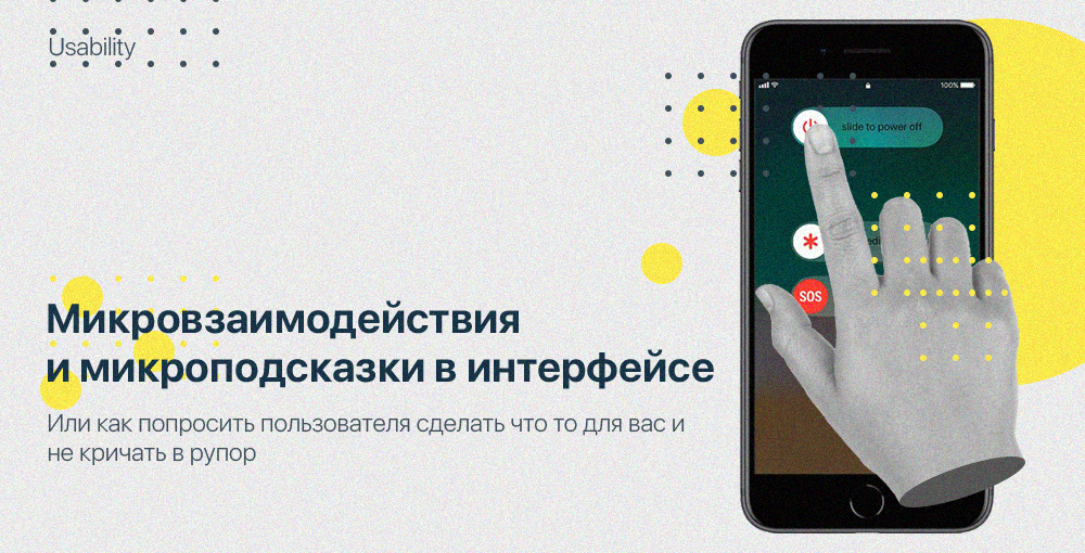
Micro-interactions and micro-prompts in the interface
The experience of using micro-interactions is introduced into our life with past experience and is developed throughout our life. We only replenish this piggy bank with new knowledge. Our business is to use these well-established rules and associations in our products and teach them how to use them.
Micro-interactions are elements that convey information and certain emotions to the end user.
Micro-interactions and micro-prompts are not details, it’s the design and the product itself, the quality product forms the details it possesses, and the details consist mostly of user experience that distinguish the competitors from the total mass and form a complete picture of the product.
')
To begin with, in the example we are considering, micro-interactions can look like a process, as well as a voice in a horn at your ear, screaming at your annoying slogans.
Micro-interactions should take the experience of user interaction and associations from the real world, the experience of a person and the time spent on other web resources, rules and patterns established during the use of the Internet resources.

Microinteractions in the interviews, should not be intrusive, should not force and blackmail, it should encourage actions that the client may have forgotten, which may be interesting to him or that he could not notice.
Instagram interactions
Instagram added a micro-interaction function, which reminds the user to perform an action in the form of commenting on posts of interest, it looks like a small animation of the appearance of a button from below attracting attention with its animation only at that moment when you became interested in the post, that is, stopped to consider it, this request is not intrusive and concise, the user can receive feedback from the person of interest to him, in turn this can be useful to the commentator on what and need to base the project microscopic interaction.
Also, the interest in the element of micro-interaction attracts the presence of the user's avatar, and as we know the familiar, it attracts attention and in turn likes it.
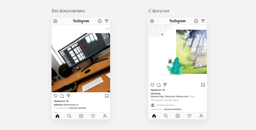
An example of a not very good decision of the user experience of interaction could be the appearance of this request at each post, regardless of your interest in the content, it is important to ask to make a small action, and not to force it to perform.
Pursuing the goal of asking the user to do an action, it is important to visually show how it will be useful specifically for him, to push the benefits without stretching the whole process, speak clearly, essentially, and briefly. As the information noise fills our consciousness all the time more and more, it becomes more difficult to sort out the important things that are not needed at all.
For example: The user is looking for services in writing his term paper. Often we see a picture when we go to the site and we see attractive sales titles and examples of good work, but the most important point is missed, we are unable to obtain all the important information, because there is none. You can get it only by sending a request, go through a consultation and only then find out the cost of the work.
It is much more efficient to provide the user with all the information he needs (prices, services, price cases) by filling in the site structure with elements for the end of the script, remind of the opportunity to contact in a convenient way and get advice, this is not an obtrusive approach. in skilled hands, becomes an effective group of microinteractions.
A good way is to help the user, and not limit it, it is important to push for a choice that will be clearly beneficial to the user.
Jumping callbacks, when this type of “Request” was effective, was only effective for those users who were not fully aware of the established experience of interaction on sites. Now this type of jumping, flashing or luminous elements helps in the interaction only to people who have little to do with the use of the Internet, I personally
This element on the site, causes a wild desire to drag the mouse to the close button of the tab and not to appear on the resource anymore.
If there is a thoughtless page scrolling without anchor elements or if a resource with an unstructured hierarchy of information, this functionality may be useful.
as a quick and easy way to get feedback. This element can be regarded as crutches, a little closer to the form of a functional site, but in turn are just fiction.
The clear segmentation structure and the correct distribution of information will make finding contact information much more efficient and more pleasant than actually poking your face at the monitor screen with the hope that the user will listen to commands without reading the information and leave the data.
Why “Requests” in quotes? Because this element is not a request, but the fact that I described above “In an obsessive voice to the mouthpiece under your ear.”
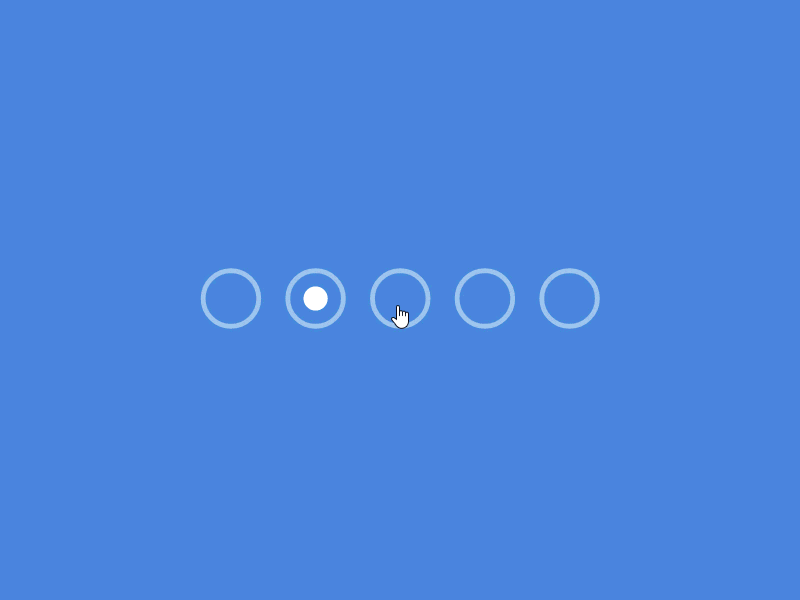
Micro-interaction visual dialogues
Microinteraction should be a small request, reminder, announcement, an element that attracts attention and has a certain meaning for the user.
In the interface below we see an example of this topic, after animated loading of the page focusing on the header of the header, we see micro-interaction with the trailer viewer, the video starts playing in the button area and attracts the user’s gaze to yourself, if you have a task to focus and create First of all, the transition on a specific button, this example is a constructive solution to this problem.

Shot dribbble Nathan Riley
Micro-interaction in humor through design and text
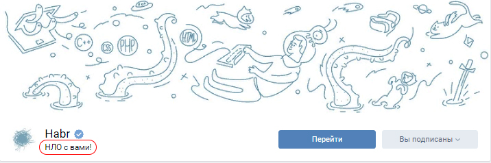
Our favorite habr uses this example, having readers to it, at the same time retaining all the serious and constructive meaning of the information conveyed.
In the screenshot below is the cap of the official community of Habr Vkontakte.
Just a separate delight is worthy of the habr test page before registration, which in turn is an excellent example of this technique.
YOTA has a tremendous interaction with customers, Yota does not put forward advantages, conditions, tariffs, they made a brilliant move based on the expectations of the client on their inner voice, reflecting their essence without offers. At the moment, instead of proposals and slogans, we see the inscription "Yota Advertising" or "Yota advertising here."
Yota played on the emotions of the humor of its viewers, so that advertising became memorable.

In turn, humor is a rather slippery path, it leads to a palace of trust and disposition, such interaction experience can be called quite successful and enchanting, but by playing notes of humor and fun, you can accidentally fake and give a composition that will be rejected by the company and impose a label of incompetence and not professionalism, God forbid to offend someone’s feelings, trying to break out on the waves of HYIP, interacting with customers in this way.
Visual micro-interactions and requests
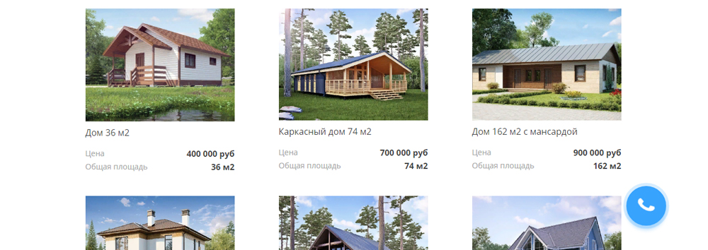
With a resource designed to sell a product or service, it is not uncommon to see an emphasis on conversion elements or animations that attract and attract attention, this example can be considered a good solution.
In turn, drawing attention to oneself throughout the entire time, constant flickering, long animation, or focusing only on oneself, excluding the possibility of switching attention to other elements in a painless way, can be considered as bad examples.
A successful animation should be barely noticeable, but at the same time attracting attention a second time, the duration of the animation should last no more than 0.4 sec and switch attention to other elements.
It is worth remembering the important rule of design: Design should solve problems, animation in turn should play functional roles and not visually aesthetic. Having elements of animation in the product that do not solve any specific problem, it makes sense to abandon their use without any hesitation.
Shot by Chris Gannon
Color micro-interaction due to associations and attention
The same color microinteraction can be called switching the lock button on the iphone, thanks to the appearance of an orange color inside the button, playing on associations
colors from the real world, looking at the experience of user interaction, we understand the association and conclude that now the phone is in silent mode.
The same move takes place in the color positioning of elements based on the user's attention and painting important elements, buttons, text in eye-catching colors with regard to user patterns, it is important to understand the general concept and stick to harmony in disposable elements, not scatter attention on all sides of the monitor. An important aspect in microinteraction in colors on the site is the meaning and emotional coloring used in the interface elements. It is also worth remembering about the cold and warm groups of secondary colors and the rules for their use.

Shot romain passelande
Micro-interactions and requests for usability relief
Microinteraction should help focus on the resource, suggest its functionality, and painlessly teach the new user experience. One of the most unimportant aspects is accelerating and simplifying previously long procedures to achieve certain actions, reducing the number and load of actions to achieve the same result.
Not all of us like to fill in the fields on the found resources to register or enter the site. Autofilling leads to a pleasant user experience making it easier and faster for everyday use. Autocomplete can be called microinteraction, and the button to use autocomplete by request, this request is one of the best examples, the user gets to meet their needs through a single button click.
A bit of gamification in micro-interactions
Micro-interactions showing the importance of the work done, this is one of the ways to improve usability by the gamification method. Having shown the importance of the done action, the resource makes it clear that he spends time and effort on carrying out some kind of action or calculations made by the user.
For example: on our beloved and idolized Habré, when sending an account confirmation email to the mail, the upload is loaded, indicating that the action
it is processed and done for the user, understanding the importance and effort of the performed user action plays an important role in shaping the opinion about the product.
Of course, we all understand that Ajax forms do not need time to download and send a message about the letter to the server.
In the example below, we see the same picture only on the “Configure the Key House” page.
On the portals that need to enter the necessary user information, you should ask the user to enter data by the appearance of non-intrusive message windows describing the improvements that the client will receive in using the product, whether it be the introduction of his geolocation to view the upcoming exhibitions of contemporary art.
This example is a request useful to the user. You should not force the user to enter information that he does not want and in no case does not cut off access to all or most of the functionality of the service. The realization that the client is not limited but they want to give more in exchange for a small service on his part will be a huge plus in forming an opinion about the resource. And as we know, the opinion does not depend on the length of time spent on the use of micro-interactions, and the number of good and bad experiences. Formation occurs from the highest point of ease of use of the resource and the least pleasant moment of using the resource, forming an average value of only 2 sensation parameter.
Habits of microinteraction
It is important to conduct micro-interactions, especially specific ones, through the thread of the entire design, and to solve similar problems with already developed interactions. Developing user habits through the more frequent use of certain micro-interactions favorably affects the user experience within your product.
Easy Animation and Expectations
Any perfect user action should be as clear and familiar as possible, as will the actions taken after the user performs it.
The benefit of not overloading the user's attention is that the reproduced animation should be more or less simple and clear, without unnecessary movements and incomprehensible actions for the user.
Quoting from the above, “A successful animation should be barely noticeable but attracting attention, the duration of the animation should not last more than 0.4 sec.”
An example of a good, understandable animation.

An example of a beautiful, aesthetically pleasing animation, but overloaded and not completely clear.

Animation Baptiste Briel
Conclusion
Play on the principles of construction, inherent in the associations and established principles of construction, actions and interactions with certain elements.
Each trifle is worthy of deep analytical and logical analysis in interaction with the user, the emotional load, the emotion of the information conveyed, the painlessness of the actions performed.
Repeating, I say, we like what we know and what we understand. No matter how beautiful the interface is, it is worth remembering that first of all it should be convenient, functional and solve problems. At the next level in the hierarchy of importance is the aesthetic component of the product.
Source: https://habr.com/ru/post/428590/
All Articles