Predictive data analytics - modeling and validation
I present to you the translation of the chapter from the book Hands-On Data Science with Anaconda
"Predictive data analytics - modeling and validation"

Our main goal in conducting various data analyzes is to look for patterns to predict what may happen in the future. For the stock market, researchers and specialists conduct various tests to understand the market mechanisms. In this case, you can ask a lot of questions. What will be the level of the market index in the next five years? What will be the next IBM price range? Will market volatility increase or decrease in the future? What could be the impact if governments change their tax policy? What is the potential profit and loss if one country starts a trade war with another? How do we predict consumer behavior by analyzing some related variables? Can we predict the likelihood of a graduate graduating successfully? Can we find a connection between the specific behavior of one particular disease?
')
Therefore, we consider the following topics:
People may have a lot of questions regarding future events.
For a better prediction, researchers should consider many questions. For example, is the sample data too small? How to remove missing variables? Is this dataset biased in terms of data collection procedures? How do we treat extreme values or outliers? What is the seasonality and how do we cope with it? What models should we use? This chapter will cover some of these issues. Let's start with a useful dataset.
One of the best data sources is the UCI Machine Learning Repository . Having visited the site we will see the following list:

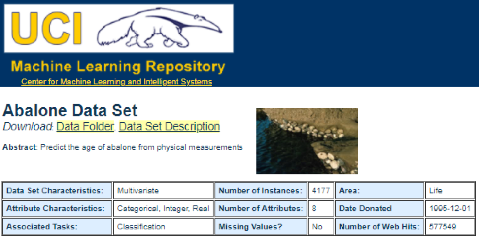
For example, if you select the first data set (Abalone), we will see the following. To save space, only the top part is displayed:
From here, users can download a dataset and find variable definitions. The following code can be used to load a dataset:
The corresponding output is shown here:
From the previous output, we know that there are 427 observations (data sets) in the data set. For each of these, we have 7 related functions, such as Name, Data_Types, Default_Task, Attribute_Types, N_Instances (number of instances), N_Attributes (number of attributes), and Year . A variable called Default_Task can be interpreted as the main use of each data set. For example, the first data set, called Abalone , can be used for Classification . The unique () function can be used to search for all possible Default_Task shown here:
This package includes many useful data sets that can be used for this chapter and others. The easiest way to find these datasets is using the help () function shown here:
Here we show some examples of loading these datasets. To load a single data set, we use the data () function. For the first data set, called abalone , we have the following code:
The output is as follows:

Sometimes, a large dataset includes several sub-datasets:
To load each data set, we could use the dim () , head () , tail (), and summary () functions.
Time series can be defined as a set of values obtained at successive times, often with equal intervals between them. There are different periods, such as annual, quarterly, monthly, weekly and daily. For time series GDP (gross domestic product), we usually use quarterly or annual. For quotes - annual, monthly and daily frequency. Using the following code, we can obtain US GDP data both quarterly and for an annual period:
However, we have many questions for analyzing time series. For example, in terms of macroeconomics, we have business or economic cycles. Industries or companies may have seasonality. For example, using the agricultural industry, farmers will spend more in the spring and autumn seasons and less for the winter. For retail, they would have a huge cash flow at the end of the year.
To manipulate time series, we could use many useful functions included in the R package, called timeSeries . In the example, we take the daily average data with a weekly frequency:
We could also use the head () function to see several observations:
There are many methods that we could use when trying to predict the future, such as moving average, regression, autoregression, etc. First, let's start with the simplest for the moving average:
In the previous code, the default value for the number of periods is 10. We could use a data set, called MSFT, included in the R package, called timeSeries (see the following code):
In manual mode, we find that the average of the first three x values coincides with the third value of y . In a sense, we could use a moving average to predict the future.
In the following example, we will show how to estimate the expected profitability of the market next year. Here we use the S & P500 index and historical average as our expected values. The first few commands are used to load a related dataset called .sp500monthly . The aim of the program is to estimate the average annual and 90 percent confidence interval:
As can be seen from the results, the historical average annual yield for the S & P500 is 9%. But we cannot say that next year the index yield will be equal to 9%, since it can be from 5% to 13%, and these are huge fluctuations.
In the following example, we will show the use of autocorrelation. First, we load the R package called astsa , which serves for an applied statistical analysis of time series. Then we load the US GDP at quarterly frequency:
In the above code, the diff () function accepts the difference, for example, the current value minus the previous value. The second input value indicates a delay. A function called acf2 () is used to build and print the ACF and PACF time series. ACF denotes the autocovariance function, and PACF denotes the partial autocorrelation function. The corresponding graphs are shown here:
It is clear that concepts and data sets would be much more comprehensible if we could use graphics. The first example shows the fluctuations in US GDP over the past five decades:
The corresponding chart is shown here:
If we used a logarithmic scale for GDP, we would have the following code and graph:
The following graph is close to a straight line:
This package is a linear predictive model based on the LIBLINEAR C / C ++ Library. Here is one example of using the iris dataset. The program tries to predict which category a plant belongs to using training data:
The conclusion is the following. BCR is a balanced classification rate. For this bet, the higher the better:
This package is a medium-oriented clustering for interpreted predictive models in high-dimensional data. First, let's look at a dataset named simdata that contains simulated data for a package:
The previous output shows that the data dimension is 100 by 502. Y is the continuous response vector, and E is the binary environment variable for the ECLUST method. E = 0 for unexposed (n = 50) and E = 1 for exposed (n = 50).
The following R program estimates Fisher's z-transform:
Define the Fisher z-transform. Assuming that we have a set of n pairs x i and y i , we could evaluate their correlation using the following formula:

Here p is the correlation between the two variables, and and
and  are sample averages for random variables x and y . The value of z is defined as:

ln is the natural logarithm function, and arctanh () is the inverse hyperbolic tangent function.
When finding a good model, sometimes we are faced with a lack / excess of data. The following example is borrowed from here . It demonstrates the challenges of working with this and how we can use linear regression with polynomial features to approximate nonlinear functions. The specified function:

In the next program, we try to use linear and polynomial models to approximate an equation. Slightly modified code is shown here. The program illustrates the effect of lack / excess of data on the model:
The resulting graphs are shown here:
An example can be found here .
The first few lines of code are shown here:
The corresponding output is shown here. To save space, only the upper part is presented:
Since sklearn is a very useful package, it is worthwhile to show more examples of using this package. The example here shows how to use a package to classify documents by topic using the bag-of-words approach.
This example uses the scipy.sparse matrix for storing objects and demonstrates various classifiers that can efficiently handle sparse matrices. This example uses a data set of 20 newsgroups. It will be automatically loaded and then cached. The zip file contains input files and can be downloaded here . The code is available here . To save space, only the first few lines are shown:
The corresponding output is shown here:
There are three indicators for each method: assessment, training time and testing time.
Take for example the use of Markov chains:
Result:
The purpose of the example is to see how a person transforms from one economic status into another in the future. First, let's look at the following chart:
Let's look at the leftmost oval with the status of "poor". 0.9 means that a person with this status has a 90% chance of remaining poor, and 10% goes into the middle class. It can be represented by the following matrix, the zeros are where there is no edge between the nodes:

It is said that the two states, x and y, are related to each other if there are positive integers j and k, such as:

A Markov chain P is called irreducible if all states are connected; that is, if x and y are reported for each (x, y). The following code will confirm this:
The following chart represents an extreme case, since the future status for a poor person will be 100% poor:
The following code will also confirm this, since the result will be false :
The Granger causality test is used to determine whether one time series is a factor and provides useful information for predicting the second. The following code uses a dataset named ChickEgg as an illustration. The data set has two columns, the number of chicks and the number of eggs, with a time stamp:
The question is, can we use the number of eggs this year to predict the number of chickens next year?
If so, the number of chickens will be caused by Granger for the number of eggs. If this is not the case, we say that the number of chickens is not the cause of the Granger for the number of eggs. Here is the corresponding code:
In model 1, we attempt to use chick lags plus egg lags to explain the number of chickens.
Since the value of P is quite small (it is significant at 0.01); we say that the number of eggs is the cause of the Granger for the number of chickens.
The following test shows that chick data cannot be used to predict the next period:
In the following example, we check the profitability of IBM and S & P500 in order to find out what their cause is the Granger reason for the other.
First we define the yield function:
The function can now be called with input values. The goal of the program is to check whether we can use market lags to explain IBM's profitability. Similarly, we check, explain IBM's backlog of market revenues:
The results show that the S & P500 can be used to explain IBM’s return over the next period, since it is statistically significant at 0.1%. The following code will check if the IBM lag explains the change to the S & P500:
The result suggests that during this period, IBM's profitability can be used to explain the S & P500 index of the next period.
"Predictive data analytics - modeling and validation"
Our main goal in conducting various data analyzes is to look for patterns to predict what may happen in the future. For the stock market, researchers and specialists conduct various tests to understand the market mechanisms. In this case, you can ask a lot of questions. What will be the level of the market index in the next five years? What will be the next IBM price range? Will market volatility increase or decrease in the future? What could be the impact if governments change their tax policy? What is the potential profit and loss if one country starts a trade war with another? How do we predict consumer behavior by analyzing some related variables? Can we predict the likelihood of a graduate graduating successfully? Can we find a connection between the specific behavior of one particular disease?
')
Therefore, we consider the following topics:
- Understanding Predictive Data Analysis
- Useful data sets
- Forecasting future events
- Model selection
- Granger causality test
Understanding Predictive Data Analysis
People may have a lot of questions regarding future events.
- An investor, if he can predict the future movement of the stock price, he can get a big profit.
- Companies, if they could predict the trend of their products, they could increase their stock price and market share.
- Governments, if they could predict the impact of an aging population on society and the economy, they would have more incentives to develop better policies in terms of the state budget and other relevant strategic decisions.
- Universities, if they could understand market demand well in terms of quality and skill sets for their graduates, they could develop a set of better programs or launch new programs to meet future needs in terms of labor.
For a better prediction, researchers should consider many questions. For example, is the sample data too small? How to remove missing variables? Is this dataset biased in terms of data collection procedures? How do we treat extreme values or outliers? What is the seasonality and how do we cope with it? What models should we use? This chapter will cover some of these issues. Let's start with a useful dataset.
Useful data sets
One of the best data sources is the UCI Machine Learning Repository . Having visited the site we will see the following list:
For example, if you select the first data set (Abalone), we will see the following. To save space, only the top part is displayed:
From here, users can download a dataset and find variable definitions. The following code can be used to load a dataset:
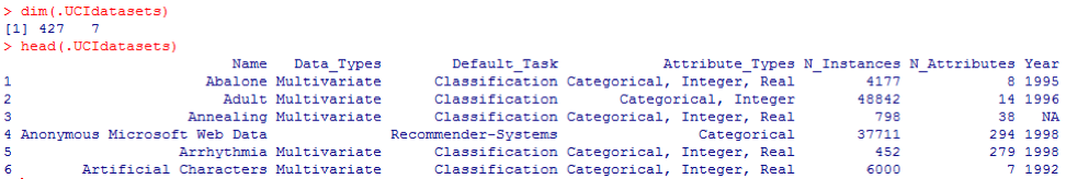
dataSet<-"UCIdatasets" path<-"http://canisius.edu/~yany/RData/" con<-paste(path,dataSet,".RData",sep='') load(url(con)) dim(.UCIdatasets) head(.UCIdatasets) The corresponding output is shown here:
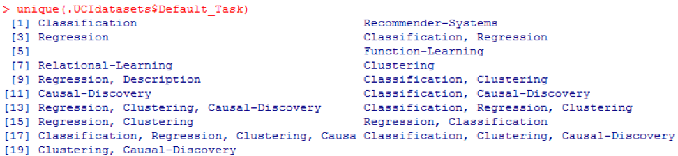
From the previous output, we know that there are 427 observations (data sets) in the data set. For each of these, we have 7 related functions, such as Name, Data_Types, Default_Task, Attribute_Types, N_Instances (number of instances), N_Attributes (number of attributes), and Year . A variable called Default_Task can be interpreted as the main use of each data set. For example, the first data set, called Abalone , can be used for Classification . The unique () function can be used to search for all possible Default_Task shown here:
R package AppliedPredictiveModeling
This package includes many useful data sets that can be used for this chapter and others. The easiest way to find these datasets is using the help () function shown here:
library(AppliedPredictiveModeling) help(package=AppliedPredictiveModeling) Here we show some examples of loading these datasets. To load a single data set, we use the data () function. For the first data set, called abalone , we have the following code:
library(AppliedPredictiveModeling) data(abalone) dim(abalone) head(abalone) The output is as follows:
Sometimes, a large dataset includes several sub-datasets:
library(AppliedPredictiveModeling) data(solubility) ls(pattern="sol") [1] "solTestX" "solTestXtrans" "solTestY" [4] "solTrainX" "solTrainXtrans" "solTrainY" To load each data set, we could use the dim () , head () , tail (), and summary () functions.
Time Series Analytics
Time series can be defined as a set of values obtained at successive times, often with equal intervals between them. There are different periods, such as annual, quarterly, monthly, weekly and daily. For time series GDP (gross domestic product), we usually use quarterly or annual. For quotes - annual, monthly and daily frequency. Using the following code, we can obtain US GDP data both quarterly and for an annual period:
ath<-"http://canisius.edu/~yany/RData/" dataSet<-"usGDPannual" con<-paste(path,dataSet,".RData",sep='') load(url(con)) head(.usGDPannual) YEAR GDP 1 1930 92.2 2 1931 77.4 3 1932 59.5 4 1933 57.2 5 1934 66.8 6 1935 74.3 dataSet<-"usGDPquarterly" con<-paste(path,dataSet,".RData",sep='') load(url(con)) head(.usGDPquarterly) DATE GDP_CURRENT GDP2009DOLLAR 1 1947Q1 243.1 1934.5 2 1947Q2 246.3 1932.3 3 1947Q3 250.1 1930.3 4 1947Q4 260.3 1960.7 5 1948Q1 266.2 1989.5 6 1948Q2 272.9 2021.9 However, we have many questions for analyzing time series. For example, in terms of macroeconomics, we have business or economic cycles. Industries or companies may have seasonality. For example, using the agricultural industry, farmers will spend more in the spring and autumn seasons and less for the winter. For retail, they would have a huge cash flow at the end of the year.
To manipulate time series, we could use many useful functions included in the R package, called timeSeries . In the example, we take the daily average data with a weekly frequency:
library(timeSeries) data(MSFT) x <- MSFT by <- timeSequence(from = start(x), to = end(x), by = "week") y<-aggregate(x,by,mean) We could also use the head () function to see several observations:
head(x) GMT Open High Low Close Volume 2000-09-27 63.4375 63.5625 59.8125 60.6250 53077800 2000-09-28 60.8125 61.8750 60.6250 61.3125 26180200 2000-09-29 61.0000 61.3125 58.6250 60.3125 37026800 2000-10-02 60.5000 60.8125 58.2500 59.1250 29281200 2000-10-03 59.5625 59.8125 56.5000 56.5625 42687000 2000-10-04 56.3750 56.5625 54.5000 55.4375 68226700 head(y) GMT Open High Low Close Volume 2000-09-27 63.4375 63.5625 59.8125 60.6250 53077800 2000-10-04 59.6500 60.0750 57.7000 58.5500 40680380 2000-10-11 54.9750 56.4500 54.1625 55.0875 36448900 2000-10-18 53.0375 54.2500 50.8375 52.1375 50631280 2000-10-25 61.7875 64.1875 60.0875 62.3875 86457340 2000-11-01 66.1375 68.7875 65.8500 67.9375 53496000 Forecasting future events
There are many methods that we could use when trying to predict the future, such as moving average, regression, autoregression, etc. First, let's start with the simplest for the moving average:
movingAverageFunction<- function(data,n=10){ out= data for(i in n:length(data)){ out[i] = mean(data[(i-n+1):i]) } return(out) } In the previous code, the default value for the number of periods is 10. We could use a data set, called MSFT, included in the R package, called timeSeries (see the following code):
library(timeSeries) data(MSFT) p<-MSFT$Close # ma<-movingAverageFunction(p,3) head(p) [1] 60.6250 61.3125 60.3125 59.1250 56.5625 55.4375 head(ma) [1] 60.62500 61.31250 60.75000 60.25000 58.66667 57.04167 mean(p[1:3]) [1] 60.75 mean(p[2:4]) [1] 60.25 In manual mode, we find that the average of the first three x values coincides with the third value of y . In a sense, we could use a moving average to predict the future.
In the following example, we will show how to estimate the expected profitability of the market next year. Here we use the S & P500 index and historical average as our expected values. The first few commands are used to load a related dataset called .sp500monthly . The aim of the program is to estimate the average annual and 90 percent confidence interval:
library(data.table) path<-'http://canisius.edu/~yany/RData/' dataSet<-'sp500monthly.RData' link<-paste(path,dataSet,sep='') load(url(link)) #head(.sp500monthly,2) p<-.sp500monthly$ADJ.CLOSE n<-length(p) logRet<-log(p[2:n]/p[1:(n-1)]) years<-format(.sp500monthly$DATE[2:n],"%Y") y<-data.frame(.sp500monthly$DATE[2:n],years,logRet) colnames(y)<-c("DATE","YEAR","LOGRET") y2<- data.table(y) z<-y2[,sum(LOGRET),by=YEAR] z2<-na.omit(z) annualRet<-data.frame(z2$YEAR,exp(z2[,2])-1) n<-nrow(annualRet) std<-sd(annualRet[,2]) stdErr<-std/sqrt(n) ourMean<-mean(annualRet[,2]) min2<-ourMean-2*stdErr max2<-ourMean+2*stdErr cat("[min mean max ]\n") [min mean max ] cat(min2,ourMean,max2,"\n") 0.05032956 0.09022369 0.1301178 As can be seen from the results, the historical average annual yield for the S & P500 is 9%. But we cannot say that next year the index yield will be equal to 9%, since it can be from 5% to 13%, and these are huge fluctuations.
Seasonality
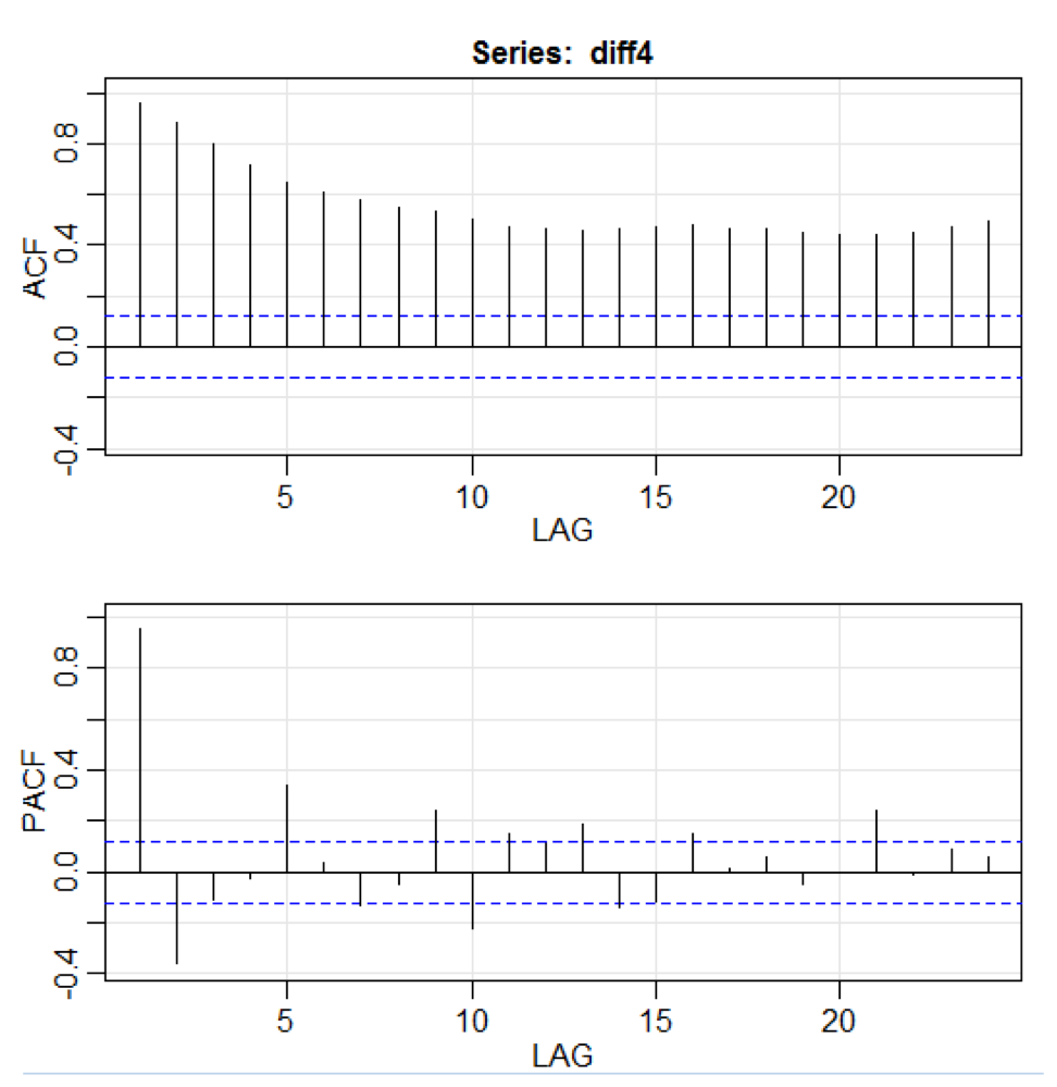
In the following example, we will show the use of autocorrelation. First, we load the R package called astsa , which serves for an applied statistical analysis of time series. Then we load the US GDP at quarterly frequency:
library(astsa) path<-"http://canisius.edu/~yany/RData/" dataSet<-"usGDPquarterly" con<-paste(path,dataSet,".RData",sep='') load(url(con)) x<-.usGDPquarterly$DATE y<-.usGDPquarterly$GDP_CURRENT plot(x,y) diff4 = diff(y,4) acf2(diff4,24) In the above code, the diff () function accepts the difference, for example, the current value minus the previous value. The second input value indicates a delay. A function called acf2 () is used to build and print the ACF and PACF time series. ACF denotes the autocovariance function, and PACF denotes the partial autocorrelation function. The corresponding graphs are shown here:
Component visualization
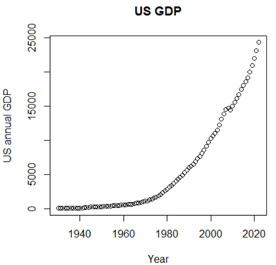
It is clear that concepts and data sets would be much more comprehensible if we could use graphics. The first example shows the fluctuations in US GDP over the past five decades:
path<-"http://canisius.edu/~yany/RData/" dataSet<-"usGDPannual" con<-paste(path,dataSet,".RData",sep='') load(url(con)) title<-"US GDP" xTitle<-"Year" yTitle<-"US annual GDP" x<-.usGDPannual$YEAR y<-.usGDPannual$GDP plot(x,y,main=title,xlab=xTitle,ylab=yTitle) The corresponding chart is shown here:
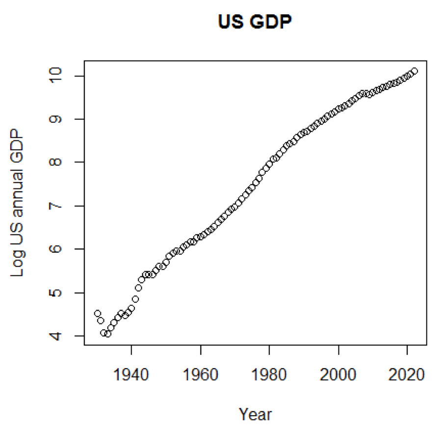
If we used a logarithmic scale for GDP, we would have the following code and graph:
yTitle<-"Log US annual GDP" plot(x,log(y),main=title,xlab=xTitle,ylab=yTitle) The following graph is close to a straight line:
R package - LiblineaR
This package is a linear predictive model based on the LIBLINEAR C / C ++ Library. Here is one example of using the iris dataset. The program tries to predict which category a plant belongs to using training data:
library(LiblineaR) data(iris) attach(iris) x=iris[,1:4] y=factor(iris[,5]) train=sample(1:dim(iris)[1],100) xTrain=x[train,];xTest=x[-train,] yTrain=y[train]; yTest=y[-train] s=scale(xTrain,center=TRUE,scale=TRUE) # tryTypes=c(0:7) tryCosts=c(1000,1,0.001) bestCost=NA bestAcc=0 bestType=NA # for(ty in tryTypes){ for(co in tryCosts){ acc=LiblineaR(data=s,target=yTrain,type=ty,cost=co,bias=1,cross=5,verbose=FALSE) cat("Results for C=",co,": ",acc," accuracy.\n",sep="") if(acc>bestAcc){ bestCost=co bestAcc=acc bestType=ty } } } cat("Best model type is:",bestType,"\n") cat("Best cost is:",bestCost,"\n") cat("Best accuracy is:",bestAcc,"\n") # Re-train best model with best cost value. m=LiblineaR(data=s,target=yTrain,type=bestType,cost=bestCost,bias=1,verbose=FALSE) # Scale the test data s2=scale(xTest,attr(s,"scaled:center"),attr(s,"scaled:scale")) pr=FALSE; # Make prediction if(bestType==0 || bestType==7) pr=TRUE p=predict(m,s2,proba=pr,decisionValues=TRUE) res=table(p$predictions,yTest) # Display confusion matrix print(res) # Compute Balanced Classification Rate BCR=mean(c(res[1,1]/sum(res[,1]),res[2,2]/sum(res[,2]),res[3,3]/sum(res[,3]))) print(BCR) The conclusion is the following. BCR is a balanced classification rate. For this bet, the higher the better:
cat("Best model type is:",bestType,"\n") Best model type is: 4 cat("Best cost is:",bestCost,"\n") Best cost is: 1 cat("Best accuracy is:",bestAcc,"\n") Best accuracy is: 0.98 print(res) yTest setosa versicolor virginica setosa 16 0 0 versicolor 0 17 0 virginica 0 3 14 print(BCR) [1] 0.95 R package - eclust
This package is a medium-oriented clustering for interpreted predictive models in high-dimensional data. First, let's look at a dataset named simdata that contains simulated data for a package:
library(eclust) data("simdata") dim(simdata) [1] 100 502 simdata[1:5, 1:6] YE Gene1 Gene2 Gene3 Gene4 [1,] -94.131497 0 -0.4821629 0.1298527 0.4228393 0.36643188 [2,] 7.134990 0 -1.5216289 -0.3304428 -0.4384459 1.57602830 [3,] 1.974194 0 0.7590055 -0.3600983 1.9006443 -1.47250061 [4,] -44.855010 0 0.6833635 1.8051352 0.1527713 -0.06442029 [5,] 23.547378 0 0.4587626 -0.3996984 -0.5727255 -1.75716775 table(simdata[,"E"]) 0 1 50 50 The previous output shows that the data dimension is 100 by 502. Y is the continuous response vector, and E is the binary environment variable for the ECLUST method. E = 0 for unexposed (n = 50) and E = 1 for exposed (n = 50).
The following R program estimates Fisher's z-transform:
library(eclust) data("simdata") X = simdata[,c(-1,-2)] firstCorr<-cor(X[1:50,]) secondCorr<-cor(X[51:100,]) score<-u_fisherZ(n0=100,cor0=firstCorr,n1=100,cor1=secondCorr) dim(score) [1] 500 500 score[1:5,1:5] Gene1 Gene2 Gene3 Gene4 Gene5 Gene1 1.000000 -8.062020 6.260050 -8.133437 -7.825391 Gene2 -8.062020 1.000000 9.162208 -7.431822 -7.814067 Gene3 6.260050 9.162208 1.000000 8.072412 6.529433 Gene4 -8.133437 -7.431822 8.072412 1.000000 -5.099261 Gene5 -7.825391 -7.814067 6.529433 -5.099261 1.000000 Define the Fisher z-transform. Assuming that we have a set of n pairs x i and y i , we could evaluate their correlation using the following formula:
Here p is the correlation between the two variables, and
ln is the natural logarithm function, and arctanh () is the inverse hyperbolic tangent function.
Model selection
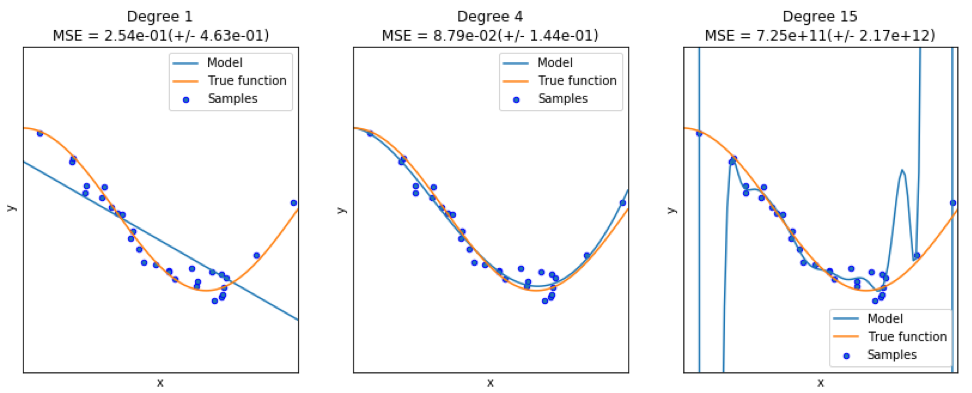
When finding a good model, sometimes we are faced with a lack / excess of data. The following example is borrowed from here . It demonstrates the challenges of working with this and how we can use linear regression with polynomial features to approximate nonlinear functions. The specified function:
In the next program, we try to use linear and polynomial models to approximate an equation. Slightly modified code is shown here. The program illustrates the effect of lack / excess of data on the model:
import sklearn import numpy as np import matplotlib.pyplot as plt from sklearn.pipeline import Pipeline from sklearn.preprocessing import PolynomialFeatures from sklearn.linear_model import LinearRegression from sklearn.model_selection import cross_val_score # np.random.seed(123) n= 30 # number of samples degrees = [1, 4, 15] def true_fun(x): return np.cos(1.5*np.pi*x) x = np.sort(np.random.rand(n)) y = true_fun(x) + np.random.randn(n) * 0.1 plt.figure(figsize=(14, 5)) title="Degree {}\nMSE = {:.2e}(+/- {:.2e})" name1="polynomial_features" name2="linear_regression" name3="neg_mean_squared_error" # for i in range(len(degrees)): ax=plt.subplot(1,len(degrees),i+1) plt.setp(ax, xticks=(), yticks=()) pFeatures=PolynomialFeatures(degree=degrees[i],include_bias=False) linear_regression = LinearRegression() pipeline=Pipeline([(name1,pFeatures),(name2,linear_regression)]) pipeline.fit(x[:,np.newaxis],y) scores=cross_val_score(pipeline,x[:,np.newaxis],y,scoring=name3,cv=10) xTest = np.linspace(0, 1, 100) plt.plot(xTest,pipeline.predict(xTest[:,np.newaxis]),label="Model") plt.plot(xTest,true_fun(xTest),label="True function") plt.scatter(x,y,edgecolor='b',s=20,label="Samples") plt.xlabel("x") plt.ylabel("y") plt.xlim((0,1)) plt.ylim((-2,2)) plt.legend(loc="best") plt.title(title.format(degrees[i],-scores.mean(),scores.std())) plt.show() The resulting graphs are shown here:
Python package - model-catwalk
An example can be found here .
The first few lines of code are shown here:
import datetime import pandas from sqlalchemy import create_engine from metta import metta_io as metta from catwalk.storage import FSModelStorageEngine, CSVMatrixStore from catwalk.model_trainers import ModelTrainer from catwalk.predictors import Predictor from catwalk.evaluation import ModelEvaluator from catwalk.utils import save_experiment_and_get_hash help(FSModelStorageEngine) The corresponding output is shown here. To save space, only the upper part is presented:
Help on class FSModelStorageEngine in module catwalk.storage: class FSModelStorageEngine(ModelStorageEngine) | Method resolution order: | FSModelStorageEngine | ModelStorageEngine | builtins.object | | Methods defined here: | | __init__(self, *args, **kwargs) | Initialize self. See help(type(self)) for accurate signature. | | get_store(self, model_hash) | | ---------------------------------------------------------------------- | Data descriptors inherited from ModelStorageEngine: | | __dict__ | dictionary for instance variables (if defined) | | __weakref__ | list of weak references to the object (if defined) Python package - sklearn
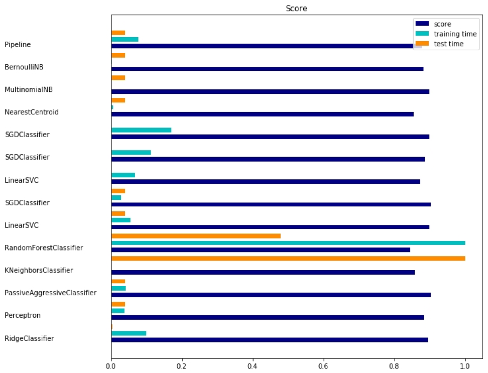
Since sklearn is a very useful package, it is worthwhile to show more examples of using this package. The example here shows how to use a package to classify documents by topic using the bag-of-words approach.
This example uses the scipy.sparse matrix for storing objects and demonstrates various classifiers that can efficiently handle sparse matrices. This example uses a data set of 20 newsgroups. It will be automatically loaded and then cached. The zip file contains input files and can be downloaded here . The code is available here . To save space, only the first few lines are shown:
import logging import numpy as np from optparse import OptionParser import sys from time import time import matplotlib.pyplot as plt from sklearn.datasets import fetch_20newsgroups from sklearn.feature_extraction.text import TfidfVectorizer from sklearn.feature_extraction.text import HashingVectorizer from sklearn.feature_selection import SelectFromModel The corresponding output is shown here:
There are three indicators for each method: assessment, training time and testing time.
Julia Package - QuantEcon
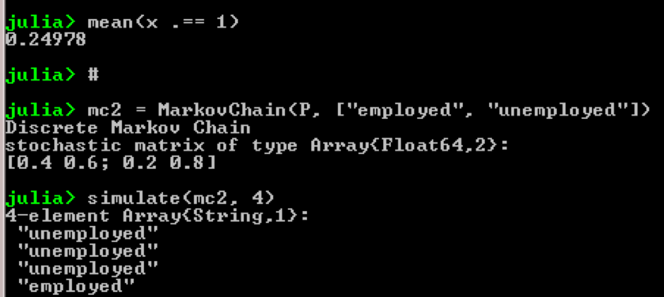
Take for example the use of Markov chains:
using QuantEcon P = [0.4 0.6; 0.2 0.8]; mc = MarkovChain(P) x = simulate(mc, 100000); mean(x .== 1) # mc2 = MarkovChain(P, ["employed", "unemployed"]) simulate(mc2, 4) Result:
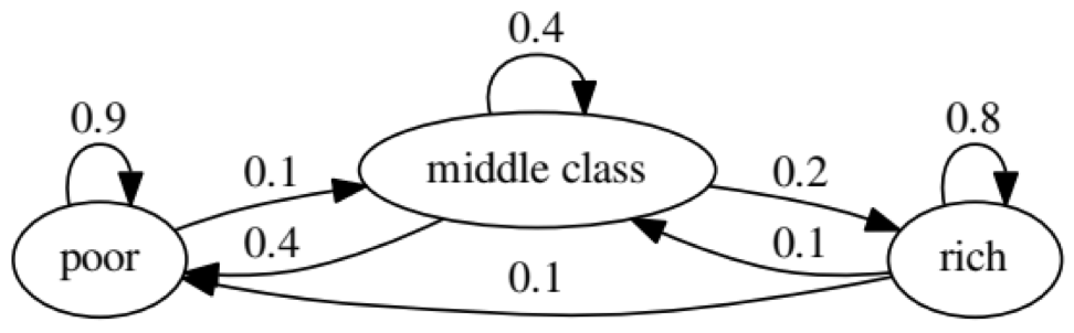
The purpose of the example is to see how a person transforms from one economic status into another in the future. First, let's look at the following chart:
Let's look at the leftmost oval with the status of "poor". 0.9 means that a person with this status has a 90% chance of remaining poor, and 10% goes into the middle class. It can be represented by the following matrix, the zeros are where there is no edge between the nodes:
It is said that the two states, x and y, are related to each other if there are positive integers j and k, such as:
A Markov chain P is called irreducible if all states are connected; that is, if x and y are reported for each (x, y). The following code will confirm this:
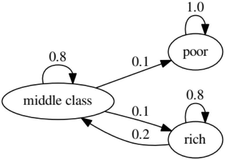
using QuantEcon P = [0.9 0.1 0.0; 0.4 0.4 0.2; 0.1 0.1 0.8]; mc = MarkovChain(P) is_irreducible(mc) The following chart represents an extreme case, since the future status for a poor person will be 100% poor:
The following code will also confirm this, since the result will be false :
using QuantEcon P2 = [1.0 0.0 0.0; 0.1 0.8 0.1; 0.0 0.2 0.8]; mc2 = MarkovChain(P2) is_irreducible(mc2) Granger causality test
The Granger causality test is used to determine whether one time series is a factor and provides useful information for predicting the second. The following code uses a dataset named ChickEgg as an illustration. The data set has two columns, the number of chicks and the number of eggs, with a time stamp:
library(lmtest) data(ChickEgg) dim(ChickEgg) [1] 54 2 ChickEgg[1:5,] chicken egg [1,] 468491 3581 [2,] 449743 3532 [3,] 436815 3327 [4,] 444523 3255 [5,] 433937 3156 The question is, can we use the number of eggs this year to predict the number of chickens next year?
If so, the number of chickens will be caused by Granger for the number of eggs. If this is not the case, we say that the number of chickens is not the cause of the Granger for the number of eggs. Here is the corresponding code:
library(lmtest) data(ChickEgg) grangertest(chicken~egg, order = 3, data = ChickEgg) Granger causality test Model 1: chicken ~ Lags(chicken, 1:3) + Lags(egg, 1:3) Model 2: chicken ~ Lags(chicken, 1:3) Res.Df Df F Pr(>F) 1 44 2 47 -3 5.405 0.002966 ** --- Signif. codes: 0 '***' 0.001 '**' 0.01 '*' 0.05 '.' 0.1 ' ' 1 In model 1, we attempt to use chick lags plus egg lags to explain the number of chickens.
Since the value of P is quite small (it is significant at 0.01); we say that the number of eggs is the cause of the Granger for the number of chickens.
The following test shows that chick data cannot be used to predict the next period:
grangertest(egg~chicken, order = 3, data = ChickEgg) Granger causality test Model 1: egg ~ Lags(egg, 1:3) + Lags(chicken, 1:3) Model 2: egg ~ Lags(egg, 1:3) Res.Df Df F Pr(>F) 1 44 2 47 -3 0.5916 0.6238 In the following example, we check the profitability of IBM and S & P500 in order to find out what their cause is the Granger reason for the other.
First we define the yield function:
ret_f<-function(x,ticker=""){ n<-nrow(x) p<-x[,6] ret<-p[2:n]/p[1:(n-1)]-1 output<-data.frame(x[2:n,1],ret) name<-paste("RET_",toupper(ticker),sep='') colnames(output)<-c("DATE",name) return(output) } >x<-read.csv("http://canisius.edu/~yany/data/ibmDaily.csv",header=T) ibmRet<-ret_f(x,"ibm") x<-read.csv("http://canisius.edu/~yany/data/^gspcDaily.csv",header=T) mktRet<-ret_f(x,"mkt") final<-merge(ibmRet,mktRet) head(final) DATE RET_IBM RET_MKT 1 1962-01-03 0.008742545 0.0023956877 2 1962-01-04 -0.009965497 -0.0068887673 3 1962-01-05 -0.019694350 -0.0138730891 4 1962-01-08 -0.018750380 -0.0077519519 5 1962-01-09 0.011829467 0.0004340133 6 1962-01-10 0.001798526 -0.0027476933 The function can now be called with input values. The goal of the program is to check whether we can use market lags to explain IBM's profitability. Similarly, we check, explain IBM's backlog of market revenues:
library(lmtest) grangertest(RET_IBM ~ RET_MKT, order = 1, data =final) Granger causality test Model 1: RET_IBM ~ Lags(RET_IBM, 1:1) + Lags(RET_MKT, 1:1) Model 2: RET_IBM ~ Lags(RET_IBM, 1:1) Res.Df Df F Pr(>F) 1 14149 2 14150 -1 24.002 9.729e-07 *** --- Signif. codes: 0 '***' 0.001 '**' 0.01 '*' 0.05 '.' 0.1 ' ' 1 The results show that the S & P500 can be used to explain IBM’s return over the next period, since it is statistically significant at 0.1%. The following code will check if the IBM lag explains the change to the S & P500:
grangertest(RET_MKT ~ RET_IBM, order = 1, data =final) Granger causality test Model 1: RET_MKT ~ Lags(RET_MKT, 1:1) + Lags(RET_IBM, 1:1) Model 2: RET_MKT ~ Lags(RET_MKT, 1:1) Res.Df Df F Pr(>F) 1 14149 2 14150 -1 7.5378 0.006049 ** --- Signif. codes: 0 '***' 0.001 '**' 0.01 '*' 0.05 '.' 0.1 ' ' 1 The result suggests that during this period, IBM's profitability can be used to explain the S & P500 index of the next period.
Source: https://habr.com/ru/post/428321/
All Articles