Tableau from the teapot or visualization of the analysis of PAMM accounts

Good day friends.
I have not written for a long time, and then subscribed to the Abvgd company newsletter. Beautiful letters are written by young :) Persuade to invest in a PAMM account. What it is I do not know. But it is clear how to analyze this data.
Terminology - there is a PAMM-account and it has a manager. I will use the term "PAMM-account" and "manager" - here they are synonyms.
On the topic I wanted to make a visualization in the Tableau Public tool. Articles about this "in an accessible form for me" did not find. She below.
Attack Plan:
- We formulate the task
- We collect data
- Combing
- We make some graphs,
- We reduce on one dashboard,
- We post on https://public.tableau.com
- Formulate a resume. Profit
Task
I work at work work. I get a salary, an advance payment there or something else. Let the money come weekly at night from Sunday to Monday. I want to invest in high-yielding assets, for example, in a PAMM account. And invest weekly little by little.
You need to understand when and where to invest. Yield is needed high, drawdowns should be minimal.
We collect data
We take the data from here https://goo.gl/mBJTPZ . I came every Monday morning, watched and saved:
- Top 10 managers by the number of accounts
- Top 10 profitability managers
Combing data
Forward, he was engaged in the research of “TOP-10 managers by the number of accounts”. He reduced all the counts into one table, where each row is a count by one manager for one date. Made the following steps in combing:
Removed rare managers
Completed with virtual data of managers present not on all dates,
Find out the weekly status of each manager
a. The column called "weekly status,%":
b. This is the ratio between "Yield for all time,%" on August 13 and on the selected date, in%,
c. Answers the question - what is the normalized deposit manager for each date, grew or fell.
d. Allows you to compare managers
- Found out the profitability of each manager for each week during the observation.
a. The column called "instant profitability (normalized) in%":
b. this is the difference between the total return on the date and the total return on the previous date divided by the total return on the date,
c. It gives an answer to the question - how much did the manager earn in a week.
d. Allows you to compare managers
- I found out the integral yield from a certain date until the last Monday
a. The column called the "integral yield,%":
b. this is the difference between the total return on the date and the total return on the previous date divided by the total return on the date,
c. It gives the answer to the question - how much interest would I earn now if I invested on a certain date,
d. Allows you to compare managers
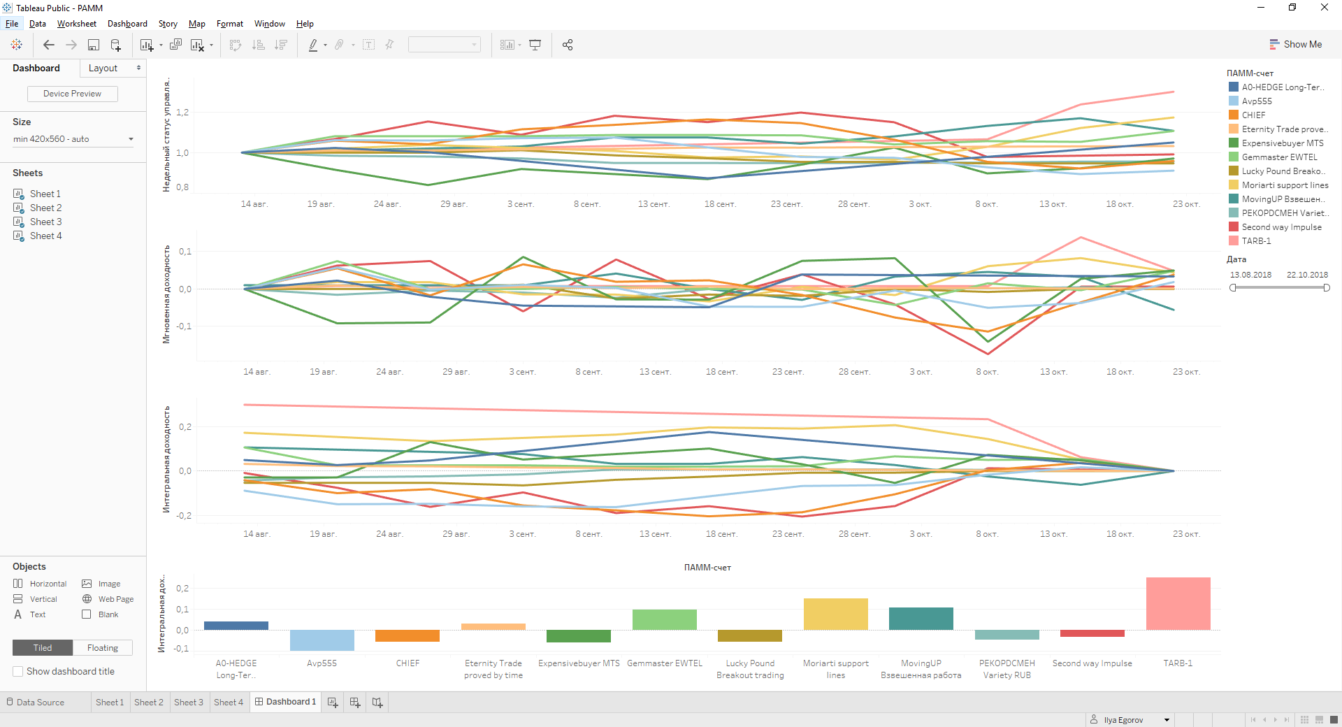
In total, we have planned TOP-10 managers by the number of accounts dashboards with 3 pictures.
About “TOP-10 managers by profitability” - made a general table. Let's make a separate visualization of “TOP-10 managers by profitability. Let's look at it - what are the maximum yields at all.
Data files need to be found and downloaded to the local computer first here and second here
Make some graphs
First, go to https://public.tableau.com/en-us/s/ ,
Secondly, we register there using the “Create your profile” button in the middle of the page below,
Thirdly, we download the Tableau.Public desktop application - the “Download the App” button in the middle of the page,
Fourth, install the downloaded application.
Open Tableau.Public. We see the picture:
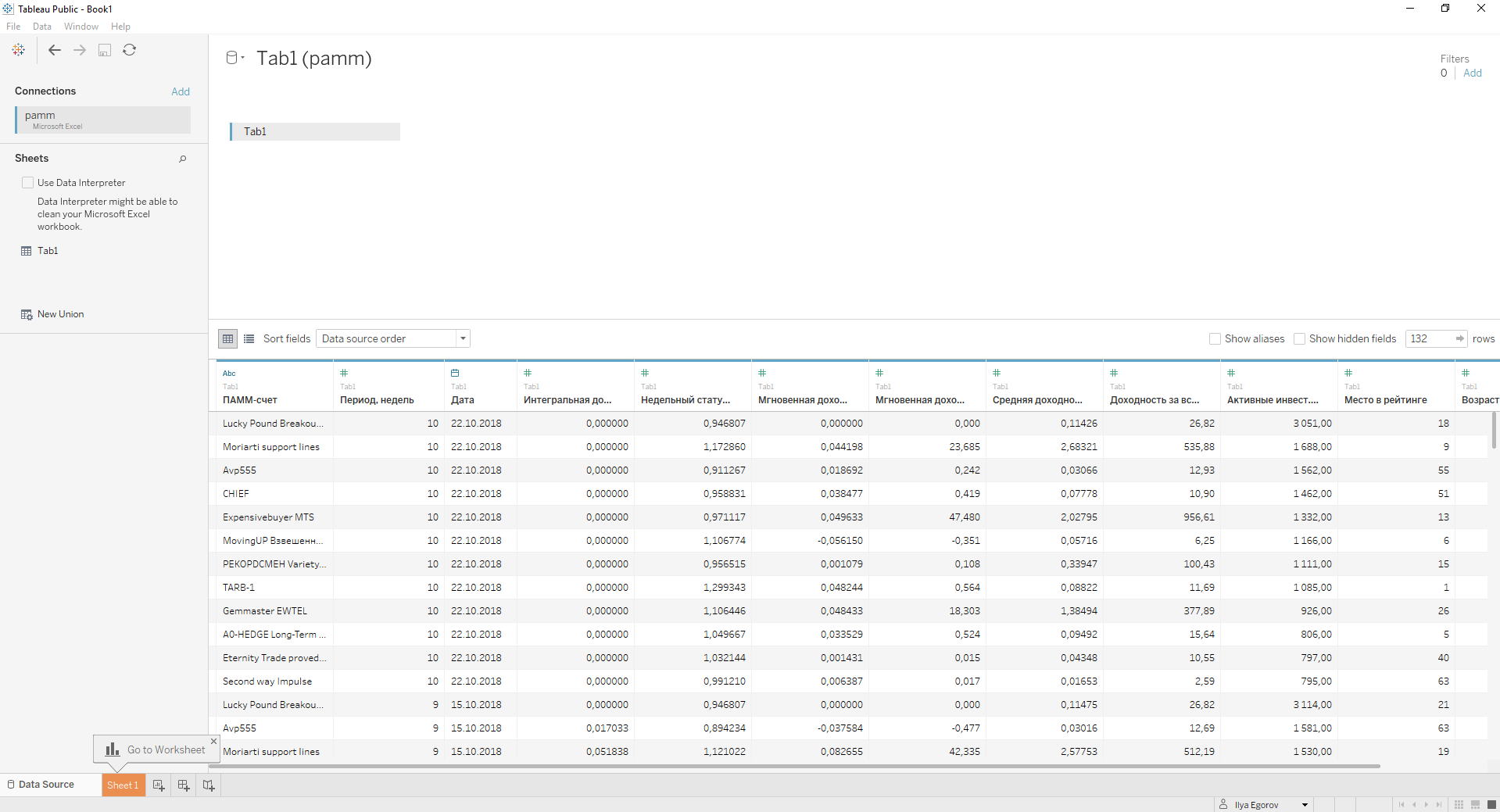
Join the first file: click the link "Microsoft Excel" in the left column at the top. Select the first downloaded file pamm.xls. We get:
We make the first visualization of the “weekly status”.
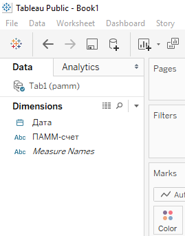
Go to the tab "Sheet1" - this is the bottom left.
Grab the “PAMM-account” object at the upper left and drag it to the right and below in “Marks” on the “Color” icon, see the screenshot below. We asked Tableau to use the color coloring of different “PAMM-account” on the chart.
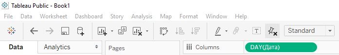
Then we double-click the Date object at the top left - it appears to the right in the “Columns” field. It turns out:
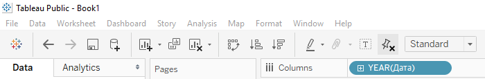
Such a date format is not suitable for us. Move the mouse to the right edge of the blue oval around "YEAR (Date)". Click the triangle of the pop-up menu and select the format "Day", the option that is lower. We ask Tableau to use the Date values in the columns. We get:
Then we double click on the “Weekly status,%” object - it appears to the right in the “Rows” field. We ask Tableau to use the “Weekly Status,%” in the lines:
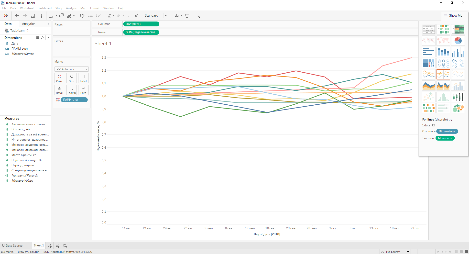
Already cool. We direct cosmetics:
- Remove% from “Weekly status,%”. Double-click on the label “Weekly status,%”. In the window that appears below, erase ",%".
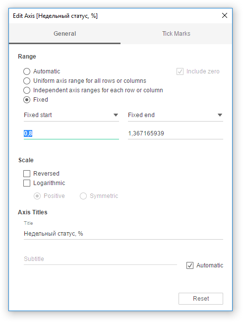
- Move the graph lines lower, removing the empty space, where “Weekly status,%” has a value of 0.0-0.7. It is done in the same place - in the middle of the window we put a dot in the “Fixed” field, select “Fixed start” under it and enter the value 0.8 below it. We are closing.
- Rename Sheet 1 to Weekly Status Manager.
We make the second visualization "Instant yield"
Add another page. Button on the bottom left:
We add the “Date” and “PAMM-account” in the same way.
“Instant yield per week (normalized),%” is added in the same way as “Weekly status,%”.
We direct cosmetics in the same way, except for item 2 - because the scale normally gets up automatically.
Making the third visualization "Integral Yield"
Add another page. Button on the bottom left:
We add the “Date” and “PAMM-account” in the same way.
“Integral yield,%” is added in the same way as “Weekly status,%”.
We direct cosmetics in the same way, except for item 2 - because the scale normally gets up automatically.
Quick analysis.
This is our target visualization - the third. Choosing any date on the X axis, we can see how much the manager would earn us from this date to now. If we compare the charts 1/2 and 3, we see that the maximum income is obtained when we enter the manager's PAMM account at the time of the fall. This was news to me.
Example: Moriarti support lines - he had the minimum instant yield on October 1, and if we entered his PAMM account on October 1, we would get the maximum yield.
Making the fourth visualization "Integral Yield 2.0"
Now creative. Add another page. Button on the bottom left:
“PAMM-account” is added to the columns!
"Integral Yield,%" is the amount of "Instant yield per week (normalized)." "Instant yield per week (normalized)" add to the line!
“Date” is added to “Filters”. Select the filter option:
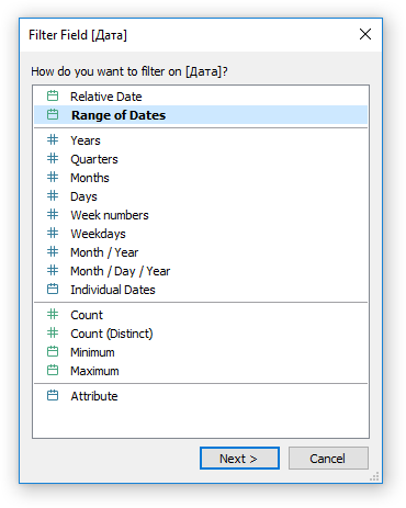
AND
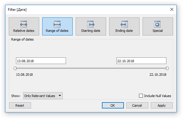
And click OK.
Further, in the right part of the green frame around the "Date", click the triangle and select "Show Filter".
This filter will allow you to select the period for which we add up instant returns. So we will answer the question - if I went to the PAMM account on the date of the beginning of the period - how much I would get on the date of the end of the period. For example, from 08/20/18. on 10.15.18
We direct cosmetics in the same way, except for item 2 - because the scale normally gets up automatically.
How to color the columns guess?
Making a dashboard.
Add a dashboard. Bottom left button
Get
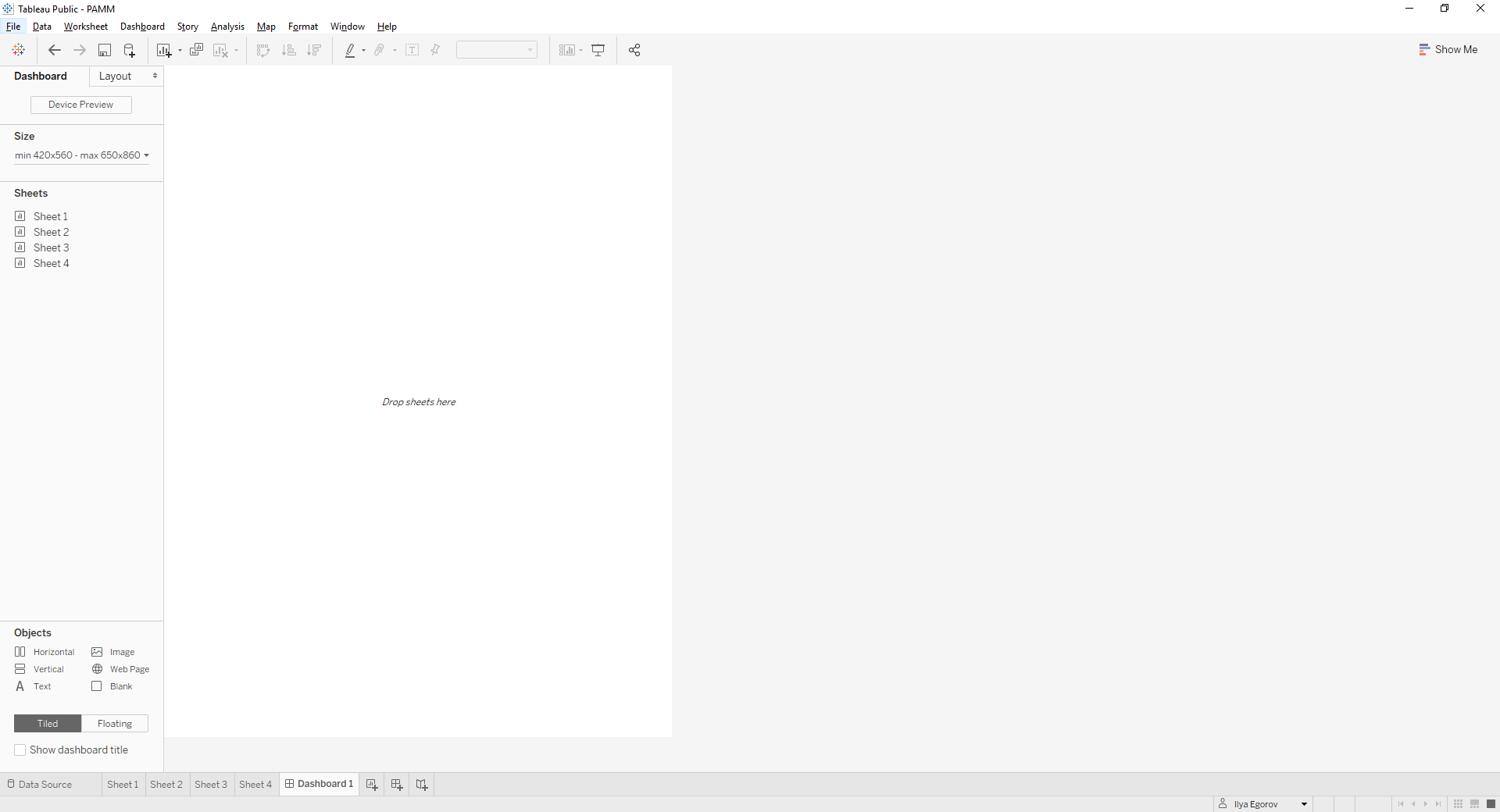
We consistently drag our Sheets from left to right to the white dashboard field.
First "Sheet1". We arrange them from top to bottom. Then "Sheet2" located under "Sheet1". Not at the bottom of the dashboard, but under “Sheet1”. How would we impose on the lower part of "Sheet1". Immediately may not work. Practice it. If something did not work out, then the Ctrl + Z combination works to undo the last action. Similar to "Sheet3" and "Sheet4". And here it turns out that they sit so tightly on the dashboards that you can not see the graphs and columns.
What are we doing:
- we increase the allowed sizes of dashboards: in the "Size" menu on the left, remove the checkbox "Maximum size",
- moving the page borders makes their vertical size about the same,
- erasing on "Sheet1", "Sheet2" and "Sheet3" the X-axis signature "Day of Date". We zhmykay on this inscription. In the appeared window at the bottom we erase the “Day of Date”,
- erase the name of all the Sheets. Click on the title and erase the text,
- edit the signature of the X axis so that it is clear what the schedule is.
We combine on the basis of our sense of beauty.
We post on https://public.tableau.com
Everything is simple - press the diskette in the menu on the left above:
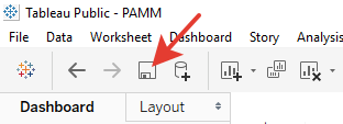
Name our “Workbook” and click “Save”.
We get https://goo.gl/T8GZaX
Summary
It turned out to make the coolest visualization.
You have noticed: if you select a manager in the filters on the right in the dashboard, then it is he who stands out on all the charts. Cool!
The tool the first million lines of source code allows you to visualize for free.
And about the choice of manager - use dashboard!
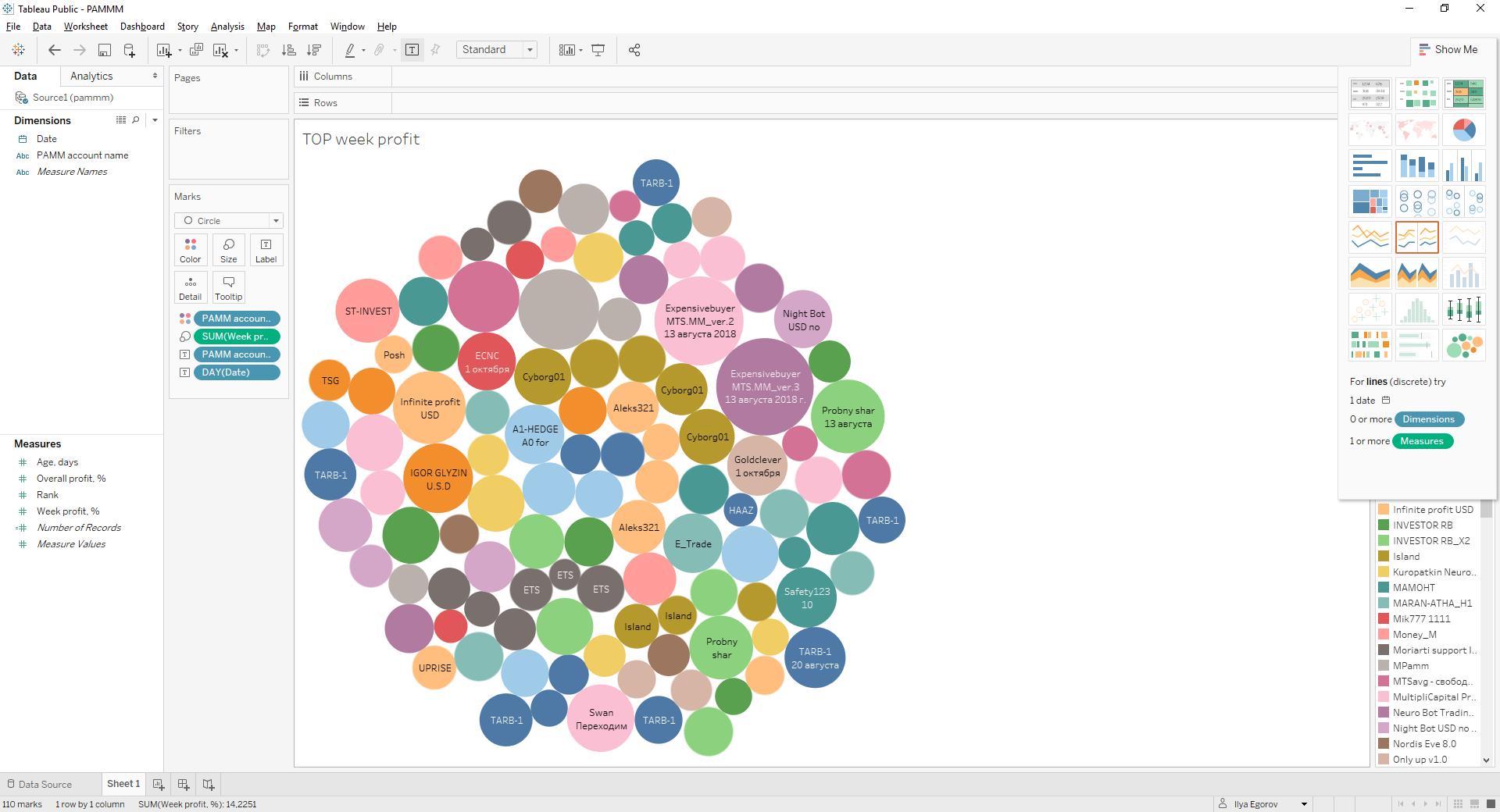
PS I almost forgot. But what about the visualization of "TOP-10 managers by profitability"
All close. Re-open. Join the second file. Create a page. How did you just.
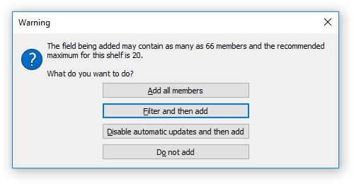
We look in the left column. Drag the “Week profit,%” field from “Dimensions” to “Measures”.
Double-click to add “Date” and “Week profit,%”. Such a date format is not suitable for us. Move the mouse to the right edge of the blue oval around "YEAR (Date)". We press the triangle of the pop-up menu and select the format "Day", the option that is lower.
Grab the “PAMM account name” object at the upper left and drag it to the right and below in the “Marks” icon on the “Color” icon, see the screenshot below. We asked Tableau to use the color coloring of different “PAMM-account” on the chart.
Select "Add all members"
Now the magic ... drum roll ... on the right side of the screen click on the icon with circles:
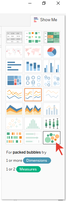
Drag the “PAMM account name” in the “Marks” to the “Color” icon again. And a miracle happens!
The largest circle on the chart is the maximum yield. We post a miracle on https://public.tableau.com as we have just done. We get https://goo.gl/JxmUjC
Thanks for reading! Waiting for constructive feedback!
We are great!
')
Source: https://habr.com/ru/post/428159/
All Articles