Web Analytics Influencing Matrix - Avinash Kosick's Strategic System
The web analytics universe seems cosmically complex.
It is so easy to get lost in the vast spaces of difficult topics or get stuck in your little world. You can wander aimlessly, experiencing a false sense of success or disappointment. As a result, we do not realize where we are, do we cope well, and whether the right direction points us to our compass.
Repeatedly encountered this myself. Even a trivial question: "How effective is our analyst?", Causes a mountain of complex explanations instead of a simple picture that the authorities can easily assimilate. And all this because we talk a lot about tools, about the process of work (collecting, processing, reporting, analyzing), how to organize everything, how to manage, how to bridge the gap in communication, how to show off success, and more and more. ..
Over time, the strategic web analytics system, which was supposed to point us to the correct path of analytics development, begins to look like this ...
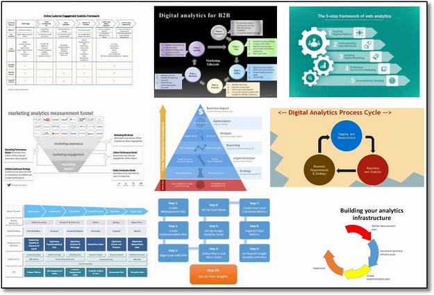
Each of these system approaches considers analytics in only one dimension! True, there is another estimated skeleton, which helps to understand how to bring the analyst to the cherished perfection, in whatever state it currently is.
Make a quick search query : "digital analytics maturity model", and you will see something like this.

It is worth noting that none of these systems is in a vacuum and affects many components of the business.
Both pictures frighten by their complexity. This is because the world of analytics that we inhabit is complex in itself. Recall only: analytics tools, company structure, management models, gaps in communication, stair metrics and much more.
The consequences of complication
If you follow the approaches, as in the pictures above (by the way, my works there are also represented), then you can come to two deeply painful situations.
1. Obvious situation:
None of the directors understands what story they want to convey to them and what they do in the analytics department, even if in the basics. Therefore, they continue to decide and act intuitively, and the analyst in the company is starving without the attention and material investments that it deserves.
2. Unobvious situation:
Managers of companies with a developed analytics system do not fully feel its unimaginable benefit or, on the contrary, the complete uselessness of their analytical work (people, processes, tools). You see, none of the strategies or models for assessing the maturity of analytics, about which I wrote above, does not give a true awareness of how analytics affects business profits. It turns out that web analytics is not fueled by information from the life of the business itself. She is elated with newfangled chips in analytic tools, advice from arbitrary experts and everything else that glitters with its coolness: “Oh! We need offline attribution! ”
If you imagine these two scenarios: blinded leaders, blinded analysts, then the heart simply breaks.
Simplify the complexity
The dilemma about how to simplify everything and give vision to management together with analysts did not let go of my thoughts for a long time. I intended to create a simple visualization that would include the scale of the business, its complexity and many driving components.
In this blog, you have already seen some of my attempts to find a cure for this disease. I’ll name a few: Digital Marketing & Measurement Model | Analytics Ecosystem | Web Analytics 2.0 .
Each of them had to solve the problem from a certain point of view, but none of them fully healed the pain.
This is especially true of the unobvious situation at number 2 above.
My hunger did not subside.
I wanted to create a visualization that would be a diagnostic tool and determine if we deviated from the goal, isolated, or simply act aimlessly. She would help to understand the extent to which analytics affect business profits and what it is worth to do in future plans.
Somehow a magical event occurred.
During the conversation, in which we considered the metrics system, my colleague ran into a whole set of unusual tasks. He asked me a few questions and, like a spark, an idea sparked in me.
I went up to the board and animatedly sketched a simple scheme that immediately presented all the difficulties from a different, more understandable angle and at the same time retained all the intellectual power.
Here is a drawing that I then sketched back:

Yes, he was born ugly. But, for me - a proud parent, he was beautiful.
After 16 hours of direct flight to Singapore, the clumsy sketch began to come to life in PowerPoint! Where else?
The result was just five slides. As they say: "It's not the ink, it's the think."
Today I want to share with you a fully completed, tried and tested version of these five slides. Together, they will help you to fundamentally rethink all analytical work: 1. you will understand how data actually affects your company now, 2. notice for yourself very precise and characteristic details that should be in your short-term and long-term plans.
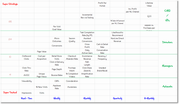
Influence matrix
To tell just about the big and complex world of web analytics, on the board shown above, a 2 × 2 matrix is used.
Each cell contains metrics (online, offline, nonline ).
Influence on business is postponed on the Y axis, from the super-tactical to the super-strategic level.
Time — data utility is plotted along the X axis, from real-time data to a period of 6 months.
Before we continue. Indeed, the fact that the X axis is divided into several segments gives us a 2 × 5 matrix, not 2 × 2. Let it be the price to make the circuit more efficient :)
Let us examine in more detail the Y axis. The super tactical level (Super Tactical) is the smallest impact on the business profit (share of cents). Super Strategic is the greatest impact on business income (tens of millions of dollars).
The scale of the Y axis is exponential. You will notice that the numbers of the light font between Super Tactical and Super Strategic grow from 4 to 10, from 24 to 68, and so on. This shows us that the influence does not increase stepwise - each step upwards gives a significantly greater increase in influence.

Let us examine the X axis in more detail. While most data can already be collected in real time, not all metrics are needed here and now.
For example, advertising banner impressions can be monitored online and this can be useful (if you act on the fly, they can exert a tactical influence of the order of a fraction of a cent).
Lifetime customer value (CLV), on the other hand, will only be useful after a few months (if you act correctly, the impact on your business will be super-strategic - tens of millions of dollars).
Here is how these ideas are presented on the influence matrix:

You can download the influence matrix in Excel format at the end of this post.
Advertisements can be used to make decisions in real time on advertising platforms: banners, videos and search (for example, through automation). You can report gross profit online, but nobody needs it. Profit should be deeply analyzed once a month to get valuable insights with higher impact. Finally, customer lifetime value (CLV) requires the most complex strategic analysis, and data is accumulated for months. It will take time for solutions to bring results, but they will be incredible.
Take a break. Think over the drawing above.
If it is clear to you why each metric is where it is, then the rest of this post will lead you to insane delight, comparable only to living hugs.
Influence Matrix: Long-awaited Detailed Analysis
In its final form, the Influence Matrix contains the 46 most common business metrics with an emphasis on sales and marketing. These metrics cover the Internet, television, retail stores, outdoor advertising, and any other well-known brand presence strategies. Digital metrics are more because digital technologies allow you to collect more data.
Some metrics use all marketing channels, for example, brand metrics: recognition, preference and willingness to buy. Note that business profitability indicators are also included, which are calculated within your ERP and CRM systems.
Each metric takes place depending on how it affects the business and how often you need to receive data. It also matters which metrics surround it.
Here is an enlarged image of the bottom left of the matrix:

Let's try to better understand the meaning of influence and time — usefulness on a specific example: The failure rate. Is on the line with a force of influence equal to four and in a column with the weekly urgency required. Although the bounce rate is available in real time, it only benefits if there is a significant amount of data, for example, in a week.
At first, it may seem strange that such a simple metric has an impact of four, while the GRP for TV and the% of new sessions are lower. This is due to the wider impact of the bounce rate.
To thoroughly analyze and make decisions based on the bounce rate, you must:
- Understand the company's advertising strategy: paid, free, own sources.
- To be able to identify entry points on the site, where we give “empty” promises to users and they leave.
- Understand the content of the site: the value and emotions that the site carries to the user.
- Have the opportunity to experiment and improve landing pages.
Imagine what can be changed if there is such knowledge. This goes far beyond the bounce rate metric itself. That is why the bounce rate has more weight than ad impressions, recognizability and other vague metrics.
When you think over your metrics and KPIs, you yourself assign them the depth of influence .
For a better understanding of the influence matrix, here is its full version:

You can download the influence matrix in Excel format at the end of this post.
While you are viewing the picture, note that I added a light, stimulating hue to the matrix.
For example, to calculate a metric for a living person with all its devices, you will have to rebuild a unique user definition technology (this is the approach I prefer: Implications Of Identity Systems On Incentives ). Why do you need to worry about it? Pay attention to how high these metrics are in terms of their impact on business!
Other hidden features
The metrics of pop-up polls on the site (Voice of Customer) are high along the Y axis and this reflects their value. Take a look, for example, where the usability metrics Task Completion Rate and the willingness metrics to recommend a product are located (Likelihood to Recommend). These indicators are high in the hierarchy, because they have a positive effect on income and on the company's culture. Thus, they provide a tangible and intangible advantage to the business.
Note also that the classic digital metrics from Adobe, Google Analytics live in the lower tactical area of influence. If you are busy with them day and night, then let it be a wake-up call for you. Perhaps you are making a small contribution to the business, and this is not good for your development.
In the upper right corner, it will be seen how fascinated I am with the profit and value of the product. This is the foundation of competitive advantage in 2018 (yes, and after). Based on these metrics, you can completely change the marketing strategy (these are tens of millions of dollars for large companies), the range of products, the strategy to attract customers and much more.
The matrix also includes the first widely available metric based on machine learning: Session quality . You will find it in the middle. For each session on the desktop or mobile version of the site, this metric estimates from 1 to 100 how close the visitor was to conversion. The score is computed by a machine learning algorithm that learns from user behavior and user conversion data.
Take a break. Download the full resolution image. Ponder.
I hope that the location of my 46 metrics will tell you how to place the metrics proper for your business. If there are metrics that I haven't covered, then share them in the comments below. Replenish collective knowledge.
Now that you understand the meaning of the matrix better, it's time to crush those two problems that were haunting us at the beginning of the post. Now we will do something incredibly cool, you do not even suspect that this is possible.
Action # 1: Diagnose Maturity Analytics Strategy
We finish with the theory, it's time for live, cool tasks ...
The main impulse that led me to create a matrix of influence was the non-obvious question number 2: How much do you and your analytical work matter for business money?
You matter if you are somehow influencing a business. You influence business if your analytical work is sufficiently developed to build metrics that matter. How do you think this cyclical thinking?
:)
In our case, we value maturity, not through people, processes, and many layers of technology. We estimate maturity by the result of all the listed dances with a tambourine.
Answer a simple question: What metrics are usually used to make decisions and really change something every week, month, etc.?
Forget the test metrics you built for practice nine months ago. Forget the metrics you need to float on the waves of nauseous “data for data” tables. Forget about the metrics you would like to analyze, but not yet.
Actuality. Evaluate what is now. It's pointless to fool yourself.
Take those metrics that always encourage action, change their font color to green in the influence matrix.
Such a matrix has turned out at a large European client with many channels to attract traffic after an honest study:

Many of the digital metrics are green, because in reality it is. You can see that the company's marketing strategy also extends to TV and other offline channels, including retail.
I think you will recognize many of these metrics, because you use them for analysis every day. They are the result of the hard work of company employees and external analytics contractors.
For this company, the greenest cluster of metrics is in the lower left quadrant, most have an impact of ten or less (on the Y axis on a 1: 1 scale). There is one clear emission (Nonline Direct Revenue - an indicator that is very difficult to calculate! This is good, hurray!)
Every good consultant knows that if you have a 2 * 2 matrix, then you can create four thematic quadrants.
In our case, four quadrants are called: reliable base, intermediate and advanced levels:

For our company, the maturity of analytics basically fits into an area that can be called "Reliable foundation".
Convenient thing, yes?
It all depends on how long the analytics has been in the company, how many analysts it works, how much money it invested in data technology, the size of the team, if it is an analytical agency, and so on.
If they have a team of 50 people, they invest 18 million dollars in analytics every year in the last decade, add to this 12 tools and 25 large studies each year ... Then it is clear that this is not a very good state of affairs.
Even without this, the influence matrix now clearly shows that the strongest metrics are not being used enough. These are such metrics that you need to think deeper, be patient and seriously study them in order to globally influence the total business performance.
Uno Recommendation:
Do this exercise in your company. Identify metrics that are constantly used for decision making. Which quadrant reflects the maturity of your analytics program? With investments in people, processes, tools, and consultants, you should be as close as possible to the upper quadrants with over strategic metrics. This is true?
Go
Dos recommendation:
Determine your target quadrant. In our case, the company could move from bottom to right, and then up. They could also move to the upper left corner, and then to the right. The choice depends on the current reality: business strategy, people, processes, analytics tools. It should be obvious, you always want to be in the advanced quadrant on the left above. But, you can't go from beginner to advanced directly diagonally. Evolution is smarter than revolution. If you have not yet mastered the main lower left quadrant, then do it first.
Go
Très recommendations:
Create a concrete plan of what to do to get to the next desired quadrant. Of course, you will need new employees, maybe even a new strong analyst leader with strategic thinking (less does, think more), you will need to launch new projects to implement these metrics, and you will definitely need funding. Divide the plan into semiannual periods to check with the benchmarks for reporting.
Go
The main thing is that now finally, it is clear where you are going and why you are going there. My congratulations!
Go
Cuatro recommendations:
Arrange a cultural shift. Share the results of your audit with the entire company: how things are now (green metrics) and how it should be (black). Inspire every marketer, analyst, financial analyst, staff from the logistics department, call center operator, and each deputy director. So you take a step to the right or left of the quadrants of the matrix. If they still measure AVOC, convince them to move aside in unique page views or CTR. This will be a challenge for you, but this way you can develop an analytics system, as seen in the matrix, and affect the business income.
Most companies are waiting for a wizard to arrive and implement a large-scale, revolutionary project overnight. This will never happen. Instead, each employee needs to move up and to the right in the matrix, while the analytics team pushes these changes. From small changes, the impact on business over time accumulates like a snowball.
So. What is your sector? Where will you go next: right or up?
Action # 2: Synchronize metrics and top management
When there is an opportunity to have data, I want to measure everything.
People usually believe that the more data, the better the results. The agency provides 40 report tabs with an 8th font size and a pile of numbers. Probably they have done a lot of work - which means it is more valuable in terms of money. The deputy director tries to squeeze in two more graphs with 7 metrics and measurements into a one-page dashboard.
If large amounts of data meant more balanced solutions, then there would be peace on earth.
The main part of our work, as analysts, is to ensure that the right data (metrics) gets to the right person at the right time.
To do this, we must take into account the "rank" of the metric (corresponds to the Y axis).
Rank - is the seriousness of authority and decisions. You also need to think about the frequency with which the data arrive, along with the depth of the findings that should accompany the data ( IABI FTW! ). Finally, the rank determines the amount of time allotted to discuss the results.
Ordinary managers have a lesser rank, they are obliged to make tactical decisions worth about tens of thousands of dollars. Top managers and more flight, they are paid much more salaries, bonuses and company shares, because they are responsible for making superstrategic decisions affecting tens of millions of dollars.
This problem now has a beautiful and elegant solution if you apply an influence matrix.
Divide the matrix horizontally and make sure that the metrics are communicated to each leader according to their position.
You can download the influence matrix in Excel format at the end of this post.
Top managers live in the ultra-strategic sphere according to our scale - approximately 40 and above, if we evaluate them by the level of decisions made. This set of metrics provides tough decisions that require a sufficient amount of business context, deep reflection and they entail broad changes. Analysts will need time to conduct proper analysis, obtain useful knowledge and recommendations.
You may also notice that almost all metrics are delivered to top managers monthly or less. This is a reflection of the fact that tasks that permeate the company's structure, the reward system and touch points with the user, etc. are solved at their level.
And so, do the metrics in dashboards or presentations for top managers correspond to a superstrategic level?
Perhaps your analytical work is designed so that your top managers spend their time on making tactical decisions?
Below the layer for top managers, you will see clusters of metrics of a slightly smaller strategic impact on the company's revenue, for example, for department managers. Utility time also differs on the X axis. Behind them is a layer for managers who make more tactical decisions.
The last layer is my favorite way to improve the decision process: we remove the person from the process. :)
The latest technologies allow you to automatically make decisions on the metrics of a hyper tactic level based on machine learning algorithms. For example, a person does not need to revise the viewability of advertisements , because advanced banner platforms automatically improve campaigns based on this metric. In truth, an expensive person who looks into reports with this metric will only slow down the work. It is impossible to win the share of cents that this metric can give.
Cinco recommendation:
Collect dashboards and important reports created during all the analytical work. Group them by rank (top managers, department heads ...). Make sure that the metrics for each of the levels of leadership are consistent with what the influence matrix recommends.
For example, does the latest report for CMO include earnings per person, or the percentage of additional profits from nonline sales channels? If yes, then - hurray! But, if it contains recognition metrics, brand preferences, intentions to buy, conversions, or a bounce rate. Then everything is bad. Why should your marketing director use his valuable time to make tactical decisions? Is this a problem of analytical culture? Maybe this is a trace of the fact that analysts lack intelligence? So why?
In fact, everything big and complex is not really that big and complex. Such a simple analysis helps to see the main obstacles that bury all the benefits of data for fast and intelligent business development.
Seis recommendation:
Take the initiative and try to automate everything that is possible. If the data is available and useful in real time, then there are algorithms that can make decisions for people. If there is a restriction, then they are from us (people, bureaucracy, communication, etc.).
For more strategic layers, the solution will vary from problem to problem. You may need a new team leader in an analytics team or a shift in company culture, or another interaction pattern in the management hierarchy (managers, department heads, top managers). But, something will definitely be needed to combine the necessary metrics with the levels of superiors: a change in how employees are financially encouraged.
As you noted above, the strength of the matrix is that it can simplify complexity. This does not mean that you will not have to deal with difficulties, but you will now be able to approach them more closely!
Action # 3: Strategic alignment of efforts in a team of analysts
Another exercise in which we will cut the influence matrix, this time exercise is for the team of analysts themselves.
, , .
, , - . , ! 24 ?
, , ?
X .

Excel .
, , . : , , , , CPA . . , AdWords, DoubleClick . . , .
, , , .
, . , , , .
, ( ), . , . , , , .
, -. , .
, . . , , - . , , , . , . , . , , ( , !).
— . , , . - . . BigQuery , -, R, (, random forest!), , .
, — , , . , , (. . ).
Siete:
-. , 30 . 4 : , , . , . ? ? ?
, . (, , ). .
— . : , -. , , .
2*2 ( 2*5)!
Excel , .
, .
If the marketing director asks: “What is the use of our analytics?”, What will you tell him? How easy is it for you to explain it to him? What do you consider when building short-term and long-term analytics development plans? If top managers get the most advanced metrics from the right-upper quadrant, how did you manage it? If you have already implemented pattern recognition and complex classification, then share your lessons with us?
Please share your opinion on the influence matrix, as well as answer the questions above in the comments. I look forward to our conversation.
')
Source: https://habr.com/ru/post/428083/
All Articles