120 dpi and em fonts
Fonts in Em /% are good for everyone - the ability of IE users to increase font size, caring for users, that they prefer to increase the default font size of the browser to better see the text, and simply are the norm for professional web designers.
Cons: ... they seem to be gone, but!
And what if the user screen resolution is not set to the standard 96 dpi, but 120?
A site with enlarged fonts does not look as beautiful as the designer drew - after all, only the fonts are scaled, not the whole site! A resolution of 120dpi is becoming more popular, especially on laptops! What to do? Go back to px?
')
Not!
ATTENTION! As of 2013, this article is outdated and its information is useful only for theoretical knowledge. Do not use the code from it in production! He is no longer needed.
* In Opera, there is no longer this bug, and in general it will soon be on another engine (Webkit).
* IE6 and 7 are already history and almost no one supports them.
* And in general there are very few people who impose in EM, most of them use PX again for the sake of style independence (BEM-method) in layout.
So, we specify the problem:
In Windows, with a screen resolution of more than 96 dpi, IE≤7 and Opera browsers proportionally increase the default font size.
This can cause unpleasant distortion of the design, usually on sites with a fixed width.
Firefox and Safari / hrome ignore screen dpi.
Rubber - as planned by the designer:

Rubber - 120dpi:

Fixed width - as the designer intended:

120dpi fixed width:
On rubber layouts, enlarged size usually does not cause problems, but on sites with a fixed width, enlarged letters may simply not fit into the narrow columns assigned to them. A large size may look ugly next to the remaining non-enlarged graphics.
What happens when you increase the font size:
As a rule, only the font is increased. The blocks into which the site is divided can also increase (if their sizes are also given in em /%), but the graphics do not increase !This does not mean that we should abandon the variable font sizes!
After all, on really large monitors, 120 dpi is not a fad, but a necessity - the small print is hard to see. Yes, and the user may just want to increase the font size - both on this particular page, and in general in the browser settings - so that it is larger on all sites.
We should notbreak the buzz on peopleto reduce the usability of the site. But the site should also look beautiful, as the designer intended, because they are met in clothing.
With CSS, we can check the user's resolution and proportionally reduce the font size!
html {font-size: 68.75%} /* 11px */ @media all and (min-resolution: 120dpi) { html {font-size: 55%} /* : 68.75/(120/96) */ } For IE6 / 7, you need this code:
#header { scrollbar-track-color:expression( this.runtimeStyle.scrollbarTrackColor = "#fff", ((screen.deviceXDPI/screen.logicalXDPI) == 1) ? (document.body.style.fontSize = 1/(screen.logicalYDPI/96) +'em') : false ); } This is a one-time 1 expression, it changes the base size in proportion to the dpi of the screen.Let us examine it in more detail:
#header - here can be the id of any block existing in the layout. We need it only to “catch on”, the expression itself changes the styles for the body.scrollbar-track-color - any property that is “not sorry”. I use the proprietary property of IE, from the family that defines the color of the scroll bars. If the element does not have scroll bars (i.e., the overflow value is visible (by default) or hidden), then this property does not affect the display of the block in any way.screen.deviceXDPI 2 is the actual screen dpi in the browser.screen.logicalXDPI 3 - standard screen dpi (as set in Windows, usually = 96)Typically screen.deviceXDPI == screen.logicalXDPI. But there are exceptions, about them below.
IE6 / 7 can proportionally zoom in on high resolution screens.
The property
HKEY_CURRENT_USER\Software\Microsoft\Internet Explorer\Main\
UseHR = dword:00000001
is responsible for this. HKEY_CURRENT_USER\Software\Microsoft\Internet Explorer\Main\
UseHR = dword:00000001MSDN 4 seems to tell us that manufacturers of high-resolution monitors can set this parameter.
It should look like this:
IE with zoom enabled (UseHR = 1):
IE with zoom off (UseHR = 0):

I did not manage to achieve scaling by turning on this option, however, I reinsure myself and check the scale factor IE and only if it is 1 (i.e., scaling is turned off) proportionally change the size for body:
document.body.style.fontSize = 1/(screen.logicalYDPI/96) +'em'Changing the font size for the body automatically (in cascade) changes the size of all other fonts.
IE 5, unfortunately, does not support screen.deviceXDPI / screen.logicalYDPI, so this code will not work in it.
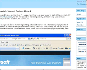
What about IE8?
In IE8, everything is done very beautifully and elegantly: the browser enlarges the entire content of the page in proportion to the screen dpi 5 .

| 96dpi | 120dpi | 144dpi |
|---|---|---|
 |  |  |
Lyrical digression about screen.deviceXDPI, screen.logicalXDPI and Page zoom
In IE8, when the Full-page zoom is enabled, the value of screen.deviceXDPI changes. At 125% zoom it = 120, at 150% - 144. At 100% (without scaling) screen.deviceXDPI returns to 96. At the same time, it does not matter what dpi is in Windows.
That's what we need to check for (screen.deviceXDPI == screen.logicalXDPI)!
This is the case - when the user in the lower right corner of IE8, clicks on the select Page zoom and changes it.
But screen.logicalYDPI in 8-ke seems to be a constant number, in my tests it was always 96.
In the 7-ke and 6-ke, both of these values, with the tests, changed only depending on the settings of Windows. Page zoom in IE7 did not change the value of either one or the other property.
I accidentally discovered this a year after writing the article, when I wrote a crutch to an ancient site :)
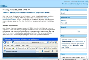
By the way Page zoom in IE8 is better than in IE7:
IE7 Full-page zoom:
IE8 Full-page zoom (Adaptive Zoom):
The horizontal scroll now appears only if the columns have a fixed width, line breaks are inserted into new places (after scaling), in general it is very similar to how it happens in FF and Opera.
The mechanism is called Adaptive Zoom, more information about it can be found in the blog of developers IE 6 .
In IE6 / 7, similar behavior can be achieved as follows:
div#header { scrollbar-track-color:expression( this.runtimeStyle.scrolbarTrackColor = "#fff", (((screen.deviceXDPI/screen.logicalXDPI) == 1) && (screen.deviceYDPI > 96)) ? ( document.body.style.fontSize = 1/(screen.logicalYDPI/96) +'em', document.body.style.zoom = screen.logicalYDPI/96 ) : false ); } 120 dpi css-zoom IE6 / 7:

This is not the same as 125% full-page-zoom IE7:

Full-page Zoom in IE7 increases all html (due to which a horizontal scroll appears), and through css we can set the css zoom only for the body.
With css-zoom, horizontal scrolling does not occur, which is in IE7 with full-page-zoom, but there are problems with flash objects: they can disappear and manifest partly when you hover the mouse cursor, rendered “crumpled”.

If you do not use flash objects, you can use this method.
Curiously, this is a rare case of applying the css zoom property for its intended purpose, and not for the task of Layout.
What about Firefox 3.1 that understands CSS3 Media Queries?
To reduce the size by 120dpi, we use the CSS3
min-resolution property.Firefox 3.1 will understand and apply it. But he does not increase the font size. So the font in it will be less than necessary:

We fix:
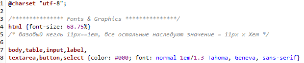
html {font-size: 68.75%} /* 11px==1em, = 11px x Xem */
@media all and (min-resolution: 120dpi) {
html {font-size: 55%}
html, x:-moz-any-link {font-size: 68.75%}
}
x:-moz-any-link is the choice of a non-existent element x with the -moz-any-link pseudo-class. Such a pseudo-class is understood only by Gecko-browsers, the rest will ignore the entire line 7 .Unusual bug in Opera 9 (<9.6)
After we added a fix for FF3.1, Opera began to ignore the css ad, immediately following the rule for min-resolution: 120dpi.Those. we have the following code:
html {font-size: 68.75%} @media all and (min-resolution: 120dpi) { html {font-size: 55%} html, x:-moz-any-link {font-size: 68.75%} } body,table,input,label,textarea,button,select {color: #000; font: normal 1em/1.3 Tahoma, Geneva, sans-serif} The rule starting with body will be ignored in Opera 9.And in Opera 8 and 9.6 - everything is fine.
We fix:
html {font-size: 68.75%} /* 11px==1em, = 11px x Xem */
@media all and (min-resolution: 120dpi) {
html {font-size: 55%}
html, x:-moz-any-link {font-size: 68.75%}
}
#for-opera927 {/* dont' remove! */}
To bring or not the appearance of the site at 120dpi to 96 - you decide
I repeat - talking about the starting form of the site.The user with a screen resolution of 120dpi sees most of the sites in the same way as at 96 (since most of them are fixed with fixed sizes). And folded in em - will see immediately enlarged. Moreover, there will only be increased font size, and the graphics will remain the same as it was. Agree - the site will not be as beautiful as it was originally conceived by the designer.
So why not show it to the user in the way he intended?
Increase the size of the font on it, he can at any second.
By the way, it’s not a fact that the user himself set 120dpi.
He could just buy a laptop, where such default settings are.
And if the user has increased the basic font size in FF or Safari (which dpi ignores), in order to see better?
Without fix, a site with em will have a huge font.
And only in IE8 the site will be beautifully and correctly scaled.
How about future proof? Will there be problems with future versions of browsers?
In the near future, the occurrence of problems is unlikely.
Corrections will be required only in the following cases:
- Safari will begin to understand the CSS3 min-resolution property, but will not increase the size depending on the screen dpi.
In this case, we supplement the code with a rule similar to what we wrote for FF3.1. - Internet Explorer 9 will begin to understand min-resolution, retaining the same scaling model (adaptive full-page zoom) as in IE8.
This is fixed by fix for IE≥9 through conditional comments 8 . - Opera, instead of increasing the font size at high dpi, will begin to use the full-page zoom.
Treated by a rule similar to what we wrote for FF3.1.
So here is a turnkey solution:
html {font-size: 68.75%} /* - */ @media all and (min-resolution: 120dpi) { html {font-size: 55%} /* : 68.75/(120/96) */ html, x:-moz-any-link {font-size: 68.75%} /* - */ } #for-opera927 {/* dont' remove! */} For IE6 / 7:
#header { scrollbar-track-color:expression( this.runtimeStyle.scrollbarTrackColor = "#fff", ((screen.deviceXDPI/screen.logicalXDPI) == 1) ? (document.body.style.fontSize = 1/(screen.logicalYDPI/96) +'em') : false ); } UPD: Opera 10.5+ for some reason does not respond to the rule
@media all and (min-resolution: 120dpi) { ... } although on the docks, on the contrary, it is written that only in presto 2.5 there was support for it , but it was not there before (as then worked before?). I tried various options, googled, searched the Opera forum, but found nothing / did not help. Judging by the specs , everything was correct in my code. After discussing with pepelsbey , we came to the conclusion that this was a bug, a bug report was sent. Now it remains to wait until Opera fix. Fortunately, in the west, where the 120dpi problem is common, almost no Opera, and we, where Opera is popular, have almost no 120dpi problem :)UPD2: According to pepelsbey Opera no longer supports min-resolution, so the code inside the main css is simply turned off. You can leave the code for IE6 / 7.
Notes:
- Pavel Kornilov: Thin CSS for Internet Explorer (expression)
- MSDN: deviceYDPI Property
- MSDN: logicalYDPI Property
- MSDN: Adjusting Scale for Higher DPI Screens
- MSDN: Making the Web Bigger: DPI Scaling and Internet Explorer 8
- MSDN: Internet Explorer 8 and Adaptive Zoom
- According to the CSS2 specification, the browser must ignore the style if something unfamiliar is found in the selector.
- MSDN: About Conditional Comments
Learn more about what dpi is:
Source: https://habr.com/ru/post/42794/
All Articles