Understandable dashboard design for complex advertising management system
Appodeal works with a challenging and rapidly growing market for monetization of mobile applications. Therefore, there are not so many freedoms in the interface solutions of our design team, and the functional requirements are pretty tough and they are constantly changing.
')
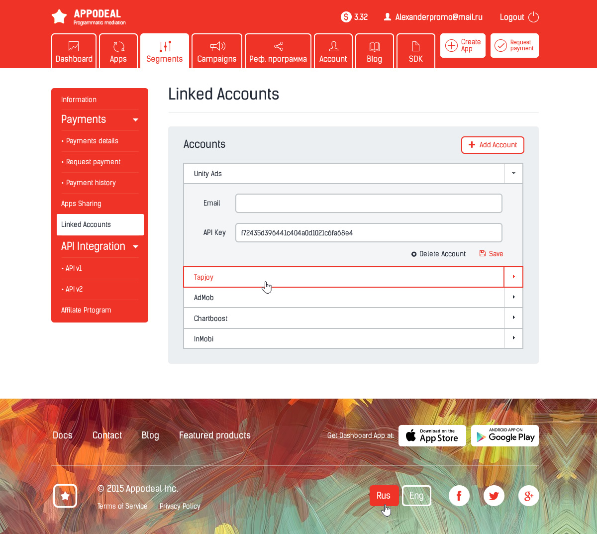
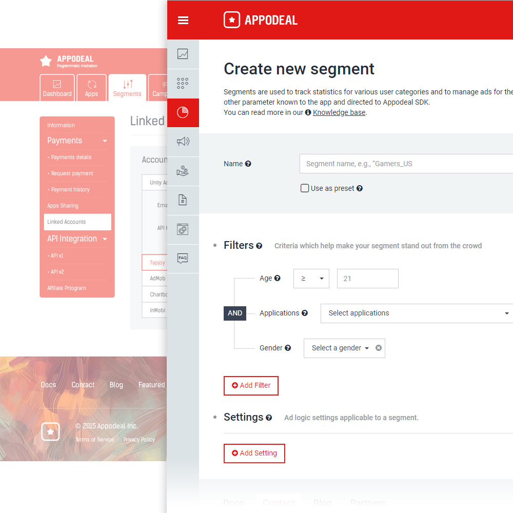
Appodeal Dashboard is a single toolbar for working with advertising in applications, which provides convenient analytical mechanisms and through which you can quickly make direct payments. In March 2018, dashboards were supplemented with two important tools in the new design: Segments (for separating parts of the audience) and Placements (for determining the places for advertising in mobile applications). And in October we launched the Demand Control Center (DCC), which allows you to manage networks and gain control over the waterfall. We decided to share our experience in the design of the dashboard and talk about the stages of its development.
In November 2015, with the development of the functional, dashboards have grown and no longer fit into the original page layout. Links and subsections confused users, navigation became inconvenient, it was necessary to search for space for new sections. Moreover, the additional functionality of the server command also demanded attention. Thus, the old design was not universal and was not suitable for scaling tasks.
What was in 2015
Around the same time, similar problems began to arise on the company's website, but we will not dive into the details of this story.
We did not seek to get another beautiful interface - it was important for us to lay the foundation for long-term development. The designers and designers conducted a detailed analysis of the dashboards sections and formulated several tasks that were supposed to be the starting points for the work:
An example of an overloaded old menu of subsections and easy navigation with subsections in the new design:
Notice the giant footer on the left, which echoed the design of the company's landing page, and visually overloaded the dashboard space.
The process of developing and implementing a new design was not cloudless. What at first seemed feasible in a couple of months stretched into quarters.
1. It was impossible to instantly redraw all the functionality. Working with product directors, designers, developers assumed the creation of many pages from scratch.
2. We needed a recognizable, but at the same time, light design style, so that users, working with both versions of the interface in the transition period, did not encounter big difficulties.
3. It was necessary to prepare a set of universal basic “bricks” so that even after several years it was possible to build interfaces from them. This applies to both design elements and code.
4. The corporate identity of the company continued to take shape, and we were not sure of its completeness. That is why it was important for us to create a flexible design that could be quickly and without enormous labor costs modified in the future.
5. Adaptive layout and, as a result, the availability of all functionality, even on the smartphone screen, greatly influenced both the modular page grid and the design as a whole.
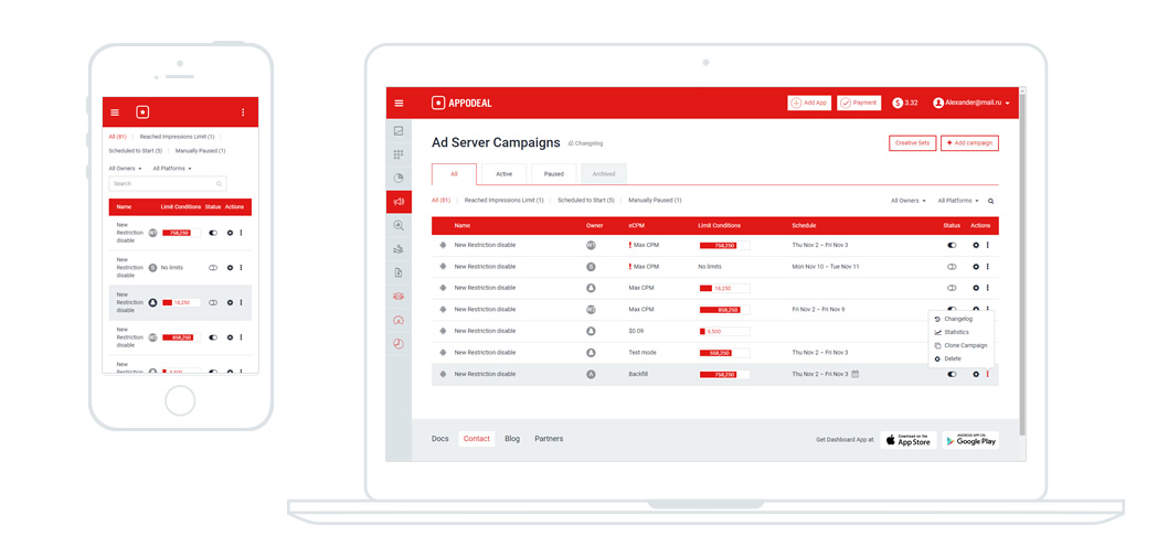
The same page on different screens.
After a clear presentation of the materials with the results of the initial analytics and design sketches, we were given a complete carte blanche to implement the plans within the framework of the requirements. At the same time, we did not yet know how much work we had expected, and evaluated the design on the basis of the existing sections. It often happens that today I plan the site menu into three sections, and tomorrow there will be three subsections in each of them. Since the staff developers were extremely busy, and we needed the layout of a new design using progressive techniques, we promptly found a layout designer, who became the link between the designer and the developer. Moreover, it has become easier to communicate on the topic of adaptability, minor changes, model units, since such elements are easier, faster and more vividly recreated in the code, rather than using design tools.
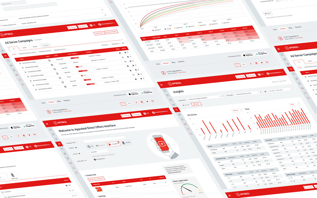
Dashboard screens in new design
For more than 2 years, we have created and processed 90+ layouts and variations of dashboard pages. At some point, it became easier to make decisions, because when designing a UI, we began to think with combinations of typical forms, blocks with buttons, switches, tabs, and sometimes even whole pages that were integrated and became new screens of the system.
We are moving towards creating a full-fledged design system, so initially the entire design exists in the form of a large list of relevant pages in html with a minimum of scripts. Such a section as references is available to all developers, it is easy to find and show the necessary elements.
So, for example, when developing a generic table page, the designer is no longer needed. Developers use the code in git, achieving almost one hundred percent compliance with the design, taking into account the adaptive layout.
Now in the process of preparation there is a complete set of all UI dashboards in the form of a file in Figma, which will help product directors and developers in initial prototyping - you can see all the properties of an object, symbol or group without source codes.

For context menus and situational icons use Fontawesome
The most important thing for an interface designer is feedback from users. Expanding the new Campaign interface, which was the last but one monster in an outdated design, we introduced a system for collecting quick reviews and ratings for the new functionality. Having received very high marks for the most part, we made several main conclusions for ourselves: first, we were convinced of the correctness of the chosen direction and scheme of work; secondly, after just a couple of months, the resulting interface was finalized according to the results of feedback and made it even more convenient; thirdly, they understood that testing and feedback, even for such a highly specialized interface, could lead to many new ideas.
Now we are working on a new visual style of the company, following the development strategies on the market, trends and competitors. In this situation, I am completely calm for the dashboard, because we do not have to repaint a single pixel in the design manually. Everything is consistently and easily updated in the code to match the company's brand book, which includes new color shades and a font typeface.
An updated mobile application will soon appear, allowing you to perform most of the dashboard tasks in a more native form for portable devices. Our website and blog are gradually changing, moving to new progressive platforms Divi Builder and Ghost.io. We are trying out new approaches to development, so this year we will abandon the classic approach to design processes by switching to Figma and using kanban boards in Jira.
As a result, we managed to create a simple and convenient base for the design of all interfaces, while retaining the unique features of vigor and confidence inherent in the Appodeal brand. I hope that this experience will help designers and developers of the company to develop in the right direction, and users - to earn more on mobile advertising.
Author: Pavel Savinsky, Design Team Lead @ Appodeal.
')
Appodeal Dashboard is a single toolbar for working with advertising in applications, which provides convenient analytical mechanisms and through which you can quickly make direct payments. In March 2018, dashboards were supplemented with two important tools in the new design: Segments (for separating parts of the audience) and Placements (for determining the places for advertising in mobile applications). And in October we launched the Demand Control Center (DCC), which allows you to manage networks and gain control over the waterfall. We decided to share our experience in the design of the dashboard and talk about the stages of its development.
Why do we need a new dashboard?
In November 2015, with the development of the functional, dashboards have grown and no longer fit into the original page layout. Links and subsections confused users, navigation became inconvenient, it was necessary to search for space for new sections. Moreover, the additional functionality of the server command also demanded attention. Thus, the old design was not universal and was not suitable for scaling tasks.
What was in 2015
Around the same time, similar problems began to arise on the company's website, but we will not dive into the details of this story.
What should be the new dashboard?
We did not seek to get another beautiful interface - it was important for us to lay the foundation for long-term development. The designers and designers conducted a detailed analysis of the dashboards sections and formulated several tasks that were supposed to be the starting points for the work:
- Bright design in the style of the company
- Scalability for several years ahead
- Adaptive approach to layout
- Simple elements that can be transformed into complex
- Complete rejection of raster graphics
- Using typical UI for similar tools
- Ease of interaction with developers
An example of an overloaded old menu of subsections and easy navigation with subsections in the new design:
Notice the giant footer on the left, which echoed the design of the company's landing page, and visually overloaded the dashboard space.
What were the difficulties?
The process of developing and implementing a new design was not cloudless. What at first seemed feasible in a couple of months stretched into quarters.
1. It was impossible to instantly redraw all the functionality. Working with product directors, designers, developers assumed the creation of many pages from scratch.
2. We needed a recognizable, but at the same time, light design style, so that users, working with both versions of the interface in the transition period, did not encounter big difficulties.
3. It was necessary to prepare a set of universal basic “bricks” so that even after several years it was possible to build interfaces from them. This applies to both design elements and code.
4. The corporate identity of the company continued to take shape, and we were not sure of its completeness. That is why it was important for us to create a flexible design that could be quickly and without enormous labor costs modified in the future.
5. Adaptive layout and, as a result, the availability of all functionality, even on the smartphone screen, greatly influenced both the modular page grid and the design as a whole.
The same page on different screens.
Team
After a clear presentation of the materials with the results of the initial analytics and design sketches, we were given a complete carte blanche to implement the plans within the framework of the requirements. At the same time, we did not yet know how much work we had expected, and evaluated the design on the basis of the existing sections. It often happens that today I plan the site menu into three sections, and tomorrow there will be three subsections in each of them. Since the staff developers were extremely busy, and we needed the layout of a new design using progressive techniques, we promptly found a layout designer, who became the link between the designer and the developer. Moreover, it has become easier to communicate on the topic of adaptability, minor changes, model units, since such elements are easier, faster and more vividly recreated in the code, rather than using design tools.
What is the result?
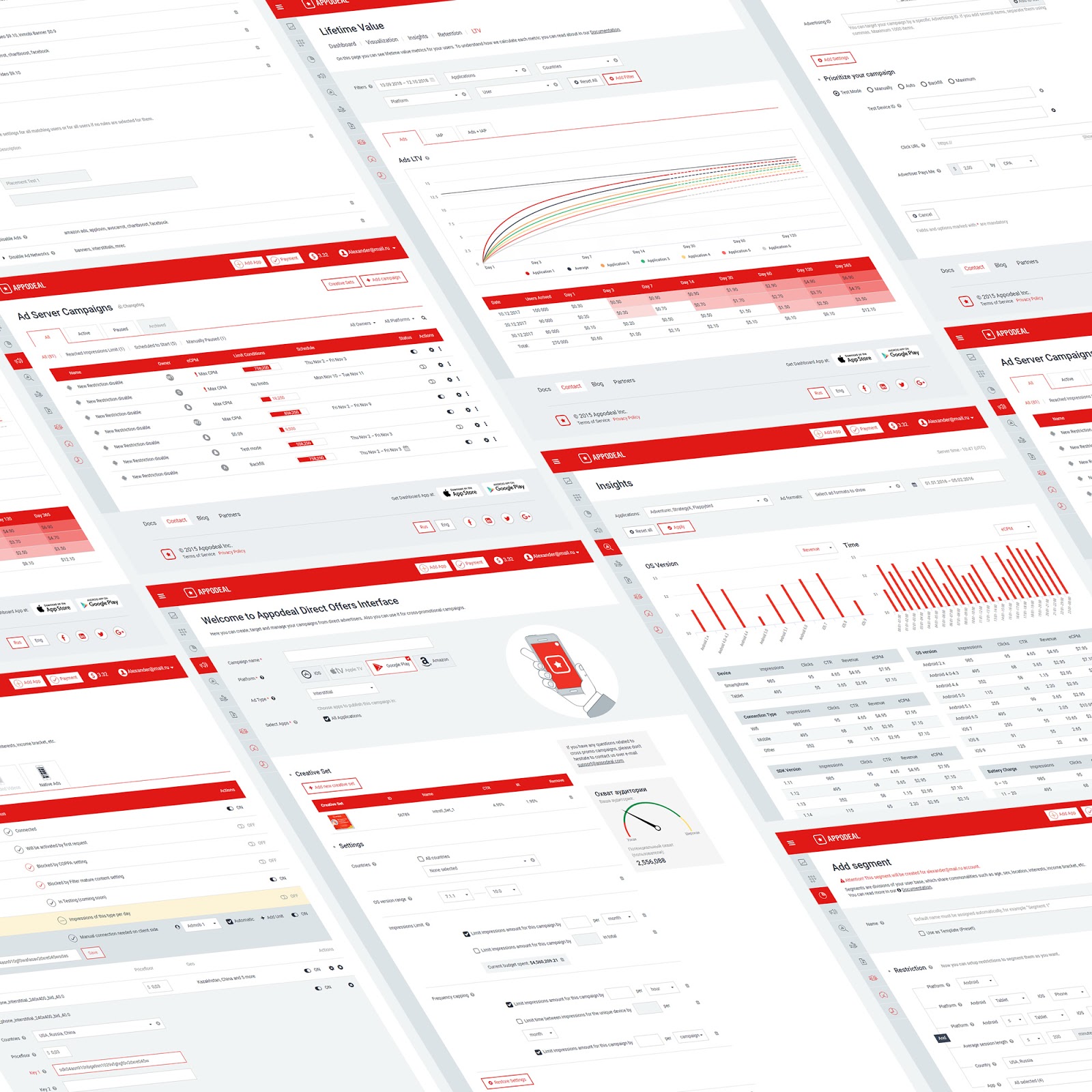
Dashboard screens in new design
For more than 2 years, we have created and processed 90+ layouts and variations of dashboard pages. At some point, it became easier to make decisions, because when designing a UI, we began to think with combinations of typical forms, blocks with buttons, switches, tabs, and sometimes even whole pages that were integrated and became new screens of the system.
We are moving towards creating a full-fledged design system, so initially the entire design exists in the form of a large list of relevant pages in html with a minimum of scripts. Such a section as references is available to all developers, it is easy to find and show the necessary elements.
So, for example, when developing a generic table page, the designer is no longer needed. Developers use the code in git, achieving almost one hundred percent compliance with the design, taking into account the adaptive layout.
Now in the process of preparation there is a complete set of all UI dashboards in the form of a file in Figma, which will help product directors and developers in initial prototyping - you can see all the properties of an object, symbol or group without source codes.
For context menus and situational icons use Fontawesome
Feedback
The most important thing for an interface designer is feedback from users. Expanding the new Campaign interface, which was the last but one monster in an outdated design, we introduced a system for collecting quick reviews and ratings for the new functionality. Having received very high marks for the most part, we made several main conclusions for ourselves: first, we were convinced of the correctness of the chosen direction and scheme of work; secondly, after just a couple of months, the resulting interface was finalized according to the results of feedback and made it even more convenient; thirdly, they understood that testing and feedback, even for such a highly specialized interface, could lead to many new ideas.
What's next
Now we are working on a new visual style of the company, following the development strategies on the market, trends and competitors. In this situation, I am completely calm for the dashboard, because we do not have to repaint a single pixel in the design manually. Everything is consistently and easily updated in the code to match the company's brand book, which includes new color shades and a font typeface.
An updated mobile application will soon appear, allowing you to perform most of the dashboard tasks in a more native form for portable devices. Our website and blog are gradually changing, moving to new progressive platforms Divi Builder and Ghost.io. We are trying out new approaches to development, so this year we will abandon the classic approach to design processes by switching to Figma and using kanban boards in Jira.
As a result, we managed to create a simple and convenient base for the design of all interfaces, while retaining the unique features of vigor and confidence inherent in the Appodeal brand. I hope that this experience will help designers and developers of the company to develop in the right direction, and users - to earn more on mobile advertising.
Author: Pavel Savinsky, Design Team Lead @ Appodeal.
Source: https://habr.com/ru/post/426865/
All Articles