CSS: interesting border-radius features
What can be done using CSS

We suggest to talk about the intricacies of using
This year, at Frontend Conference Zurich , Rachel Andrew gave a talk on the possibilities of CSS Grid technology. At the end of the speech, she said something about old CSS properties and her words hooked me. Namely, it sounded like this: “The image was made round exclusively using the well-supported
Some time after this speech, I had the idea that the circle is only a small part of what can be done with the help of
')
Let's start with the basics. I hope you are not bored by this example. You may be familiar with CSS, and with the
When using a single value for

Rounding of all corners of a square in accordance with a single border-radius value
As can be seen from the above example, you can set fixed values not only by specifying some units of measurement after the numbers, like
Rectangle rounding corners
Note that the corners of the right rectangle are not symmetrical and remember this. We need it a little later.
If you use more than one
Setting parameters for the four corners of the element
I think many of you have already tried everything that we talked about above. Now it’s time for some really interesting experiments. What happens if the values are separated by a slash and you can specify up to eight such values? First, take a look at the specification . It tells us that if the values are set before and after the slash, then the values before the slash indicate the horizontal radius, and the values after the vertical. If there is no slash, then both radii will be the same.
So, the values before the slash are responsible for the horizontal distances, and the values after the slash are for the vertical ones. All this is good, but then the logical question arises: “What is it all about?”. Remember the percentage of rounding values given for rectangular shapes? Different absolute values were used for vertical and horizontal distances, and asymmetrically rounded corners were present. This effect can be achieved using a slash when setting the
Let's compare the effects that give the following settings:

The symmetric corners of the left element are a quarter of a circle, and the asymmetric corners of the left element are parts of an ellipse.
To be honest, the figures obtained as a result of applying the above settings look weird. However, do not forget that the circles are created using the following parameters:

The shape obtained by applying 8 values separated by a slash
Four overlapping ellipses forming a shape
It took me some time to get used to it. Sometimes all these designs can be difficult to comprehend. If you are attracted by the complex shapes of elements that are customizable using
Now that you know that when setting
- Do not cross threads.
- Why?
- It will be bad.
The fact is that if you move the manipulators so that they intersect on one side of the figure, then it will begin to behave ... Let's just say that it will begin to behave unpredictably. What can I say - see for yourself. In the end, it will not lead to a universal catastrophe, but in doing so, remember that we warned you.
Dear readers! Do you use the border-radius CSS property?

border-radius properties? The author of the material, the translation of which we publish, says that more than it seems at first glance. In particular, we are talking about the fact that the angles of elements rounded with the help of this property can have a very interesting shape.We suggest to talk about the intricacies of using
border-radius .Older properties and modern web design
This year, at Frontend Conference Zurich , Rachel Andrew gave a talk on the possibilities of CSS Grid technology. At the end of the speech, she said something about old CSS properties and her words hooked me. Namely, it sounded like this: “The image was made round exclusively using the well-supported
border-radius property. Keep in mind that old CSS still exists and can still be useful. You don't have to always use something completely new to create any effects. ”Some time after this speech, I had the idea that the circle is only a small part of what can be done with the help of
border-radius . Fascinated by this idea, I decided how to deal with this property.')
Mastering the border-radius
▍The only value
Let's start with the basics. I hope you are not bored by this example. You may be familiar with CSS, and with the
border-radius property as well. It has existed for quite some time, and they are mainly used to indicate the only value. It looks like this: border-radius: 1em . Perhaps this was one of the most talked about features of CSS3 in 2010, when css3please.com was the designer’s best friend.When using a single value for
border-radius corners of the element are rounded according to this value.Rounding of all corners of a square in accordance with a single border-radius value
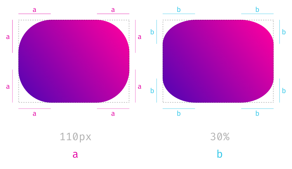
As can be seen from the above example, you can set fixed values not only by specifying some units of measurement after the numbers, like
px , rem or em , but also a percent sign. This is usually used to create square-based circles when the border-radius set to 50%. The percentage value is based on the width and height of the element. Therefore, when it is applied to rectangles, the resulting angles will not be symmetrical. Here is an example showing the difference between border-radius: 110px properties border-radius: 110px and border-radius: 30% applied to a rectangle.Rectangle rounding corners
Note that the corners of the right rectangle are not symmetrical and remember this. We need it a little later.
▍Four separate values
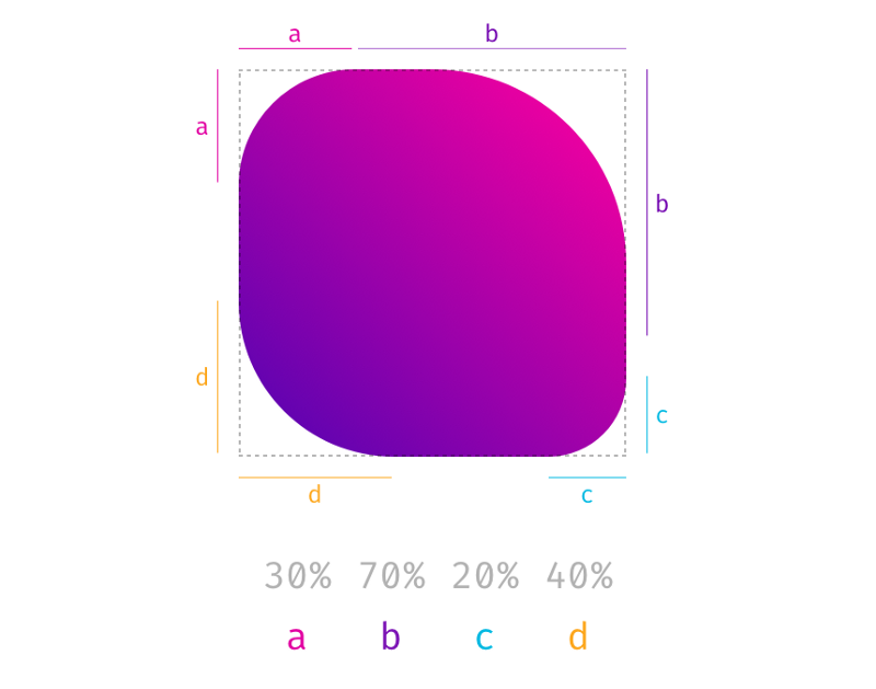
If you use more than one
border-radius value, you adjust the parameters for each corner, starting at the top left and moving clockwise. Here, again, you can use percentage values. They can also be mixed with fixed values.Setting parameters for the four corners of the element
Eight values separated by a slash
I think many of you have already tried everything that we talked about above. Now it’s time for some really interesting experiments. What happens if the values are separated by a slash and you can specify up to eight such values? First, take a look at the specification . It tells us that if the values are set before and after the slash, then the values before the slash indicate the horizontal radius, and the values after the vertical. If there is no slash, then both radii will be the same.
So, the values before the slash are responsible for the horizontal distances, and the values after the slash are for the vertical ones. All this is good, but then the logical question arises: “What is it all about?”. Remember the percentage of rounding values given for rectangular shapes? Different absolute values were used for vertical and horizontal distances, and asymmetrically rounded corners were present. This effect can be achieved using a slash when setting the
border-radius .Let's compare the effects that give the following settings:
border-radius: 4em 8em and border-radius: 4em / 8em . The results are very different.The symmetric corners of the left element are a quarter of a circle, and the asymmetric corners of the left element are parts of an ellipse.
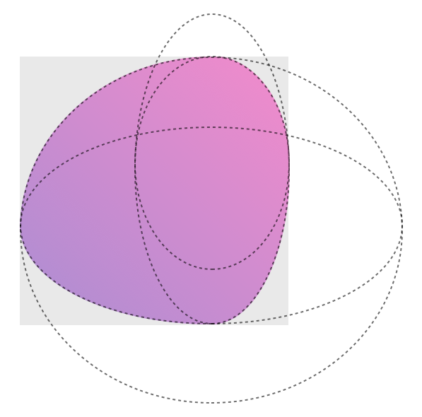
To be honest, the figures obtained as a result of applying the above settings look weird. However, do not forget that the circles are created using the following parameters:
border-radius: 50% . The circumference is obtained because the two values that specify one side are added up and it turns out 100% (50% + 50% = 100%) and there are no straight lines from the original square. If we speculate in the same vein about the eight values used in setting the border-radius property, it turns out that they can be used to describe a figure that looks like a guitar mediator or a cell of a living organism.The shape obtained by applying 8 values separated by a slash
Four overlapping ellipses forming a shape
It took me some time to get used to it. Sometimes all these designs can be difficult to comprehend. If you are attracted by the complex shapes of elements that are customizable using
border-radius , you can use this small tool.Results
Now that you know that when setting
border-radius you can use 8 values, then you, if you tried the above tool, can feel a slight disappointment, as it does not allow you to control each value independently. If this is so, then here , especially for you, is its version that supports the independent adjustment of all eight values. Before you use it - remember one conversation from the movie "Ghostbusters" of 1984:- Do not cross threads.
- Why?
- It will be bad.
The fact is that if you move the manipulators so that they intersect on one side of the figure, then it will begin to behave ... Let's just say that it will begin to behave unpredictably. What can I say - see for yourself. In the end, it will not lead to a universal catastrophe, but in doing so, remember that we warned you.
Dear readers! Do you use the border-radius CSS property?
Source: https://habr.com/ru/post/426731/
All Articles