[Micro-navigation (micro-nudging)] - micro-animation to change user behavior
Small, but in my opinion a very useful and interesting article)
Some do it better than others, revealing the psychology of micro-animation.

')
Micro-nudging is a timely little animation that encourages the user to perform a “small” task that they may have forgotten or not noticed.
Here is an example from Instagram:
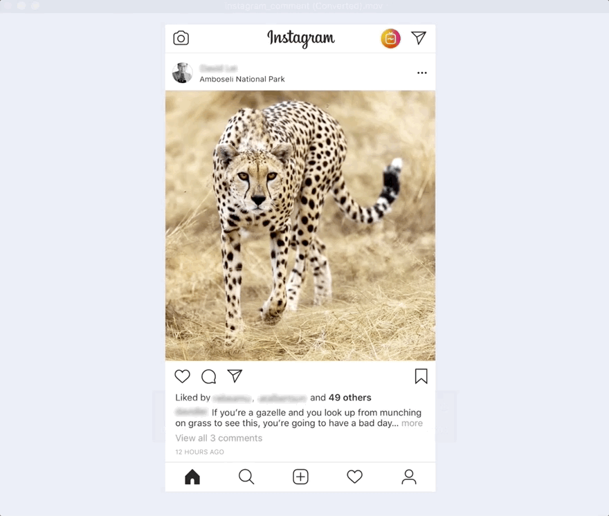
A sliding “comment” is a micro-nudge. It is not displayed by default, but as soon as the user seems interested in the post (since the user stopped scrolling to view the post), the animation of the slide pushes the user to the desired action: commenting. Commenting is a small action that is easy to forget, so pushing serves as a reminder.
"Commenting" is not displayed by default and is not displayed on each individual post. This would increase the visual noise, and its omnipresence would probably worsen the user's perception effect, so it would be better not to show this action.
Instead, the action is hidden by default. Comments are displayed only when the user is most likely to comment - when the user is interested in the post. Scrolling down captures the user's attention and reminds him to take action when he already intended to do so.
Here is another example from Instagram. The same concept - tags are displayed only when the user pauses and seems to be interested in the picture.

LinkedIn tried something similar with the animation "Be the first to comment." But, in my opinion, this was not implemented, as well as in the example of Instagram. *
Here is the animation:

And this is shown for all non-commented posts (and you probably even have to look for them):

The problem with this animation is that it happens for every post without comment, regardless of whether you are interested in this post or not. This inability to recognize the user's interest means that this particular animation is pushing for action more than just commenting.
When you are not interested in a post, the animation asks you: 1) pay attention to the post that you were not interested in initially, and 2) comment. Now it has become a much more “big” task. It no longer reminds the user to simply comment.
The main goal of micro navigation is to induce the user to perform a “small” task that they might forget or not pay attention to. If the user is already interested in the post, then ask for a comment - this will be a “small” request. And if the user is not interested in the post, then asking him to comment on this post will already be a “big” request.
I also noticed something else, this is the size and evidence of micro-navigation. In Instagram, everything is obvious - they are big or right in the center of the image, so when the user is really interested in the post, he is less likely to miss these tips. While LinkedIn is smaller. Even if a user is interested in a LinkedIn post, this micro-navigation can be missed by the user as a reminder.
In order to fix this micro-navigation problem, LinkedIn needs to be more selective in the use of animation. Show the animation only when the user is interested in the post, in this case the animation will push for further actions. And when pushing, make sure that it is obvious enough that the user does not miss the trigger.
In fact, micro-nudges work best when ...
By extending it to other areas where else can we use these micro-navigation, where else can we take the user to the desired action? What actions do you want your users to do?
These are just some of my initial ideas, as I still think about it, but if you have thoughts, ideas or suggestions, comment and join the dialogue.
—————————————————————————————————————————————————
* My thoughts on LinkedIn animation suggest that LinkedIn is trying to increase participation in its posts.
Of course, perhaps, with this specific implementation, they simply tried to increase their participation in new published posts, in which no one has yet taken part. If this is the case, then their animation is likely to attract attention, and interest in recently published posts is likely to be higher.
But they face a problem, then, when many posts have no comments, this animation potentially becomes annoying.
To avoid this situation, the animation should appear only in cases where the user is really interested in the post.
Who knows - perhaps LinkedIn has already tested this hypothesis, looked at the data and found that their current tactics are still more effective.
Or, if any of you have tried something similar and collected statistics, comment below!
Some do it better than others, revealing the psychology of micro-animation.
')
Micro-nudging is a timely little animation that encourages the user to perform a “small” task that they may have forgotten or not noticed.
Here is an example from Instagram:
A sliding “comment” is a micro-nudge. It is not displayed by default, but as soon as the user seems interested in the post (since the user stopped scrolling to view the post), the animation of the slide pushes the user to the desired action: commenting. Commenting is a small action that is easy to forget, so pushing serves as a reminder.
"Commenting" is not displayed by default and is not displayed on each individual post. This would increase the visual noise, and its omnipresence would probably worsen the user's perception effect, so it would be better not to show this action.
Instead, the action is hidden by default. Comments are displayed only when the user is most likely to comment - when the user is interested in the post. Scrolling down captures the user's attention and reminds him to take action when he already intended to do so.
Here is another example from Instagram. The same concept - tags are displayed only when the user pauses and seems to be interested in the picture.
LinkedIn tried something similar with the animation "Be the first to comment." But, in my opinion, this was not implemented, as well as in the example of Instagram. *
Here is the animation:
And this is shown for all non-commented posts (and you probably even have to look for them):
The problem with this animation is that it happens for every post without comment, regardless of whether you are interested in this post or not. This inability to recognize the user's interest means that this particular animation is pushing for action more than just commenting.
When you are not interested in a post, the animation asks you: 1) pay attention to the post that you were not interested in initially, and 2) comment. Now it has become a much more “big” task. It no longer reminds the user to simply comment.
The main goal of micro navigation is to induce the user to perform a “small” task that they might forget or not pay attention to. If the user is already interested in the post, then ask for a comment - this will be a “small” request. And if the user is not interested in the post, then asking him to comment on this post will already be a “big” request.
I also noticed something else, this is the size and evidence of micro-navigation. In Instagram, everything is obvious - they are big or right in the center of the image, so when the user is really interested in the post, he is less likely to miss these tips. While LinkedIn is smaller. Even if a user is interested in a LinkedIn post, this micro-navigation can be missed by the user as a reminder.
In order to fix this micro-navigation problem, LinkedIn needs to be more selective in the use of animation. Show the animation only when the user is interested in the post, in this case the animation will push for further actions. And when pushing, make sure that it is obvious enough that the user does not miss the trigger.
In fact, micro-nudges work best when ...
- The task is small, and the pushing serves as a reminder.
- Recognition of the user's intention is timely and is shown only when the user "showed" interest. If this is shown all the time, pushing can be distracting, forcing or just annoying.
- Micro-nudging should be easily noticeable, not hidden.
By extending it to other areas where else can we use these micro-navigation, where else can we take the user to the desired action? What actions do you want your users to do?
These are just some of my initial ideas, as I still think about it, but if you have thoughts, ideas or suggestions, comment and join the dialogue.
—————————————————————————————————————————————————
Note:
* My thoughts on LinkedIn animation suggest that LinkedIn is trying to increase participation in its posts.
Of course, perhaps, with this specific implementation, they simply tried to increase their participation in new published posts, in which no one has yet taken part. If this is the case, then their animation is likely to attract attention, and interest in recently published posts is likely to be higher.
But they face a problem, then, when many posts have no comments, this animation potentially becomes annoying.
To avoid this situation, the animation should appear only in cases where the user is really interested in the post.
Who knows - perhaps LinkedIn has already tested this hypothesis, looked at the data and found that their current tactics are still more effective.
Or, if any of you have tried something similar and collected statistics, comment below!
Source: https://habr.com/ru/post/426515/
All Articles