Design for frontend developers, part 1
When a designer sends mockups to a developer, there is always some misunderstanding between them. Graphic editor gives a lot of freedom, the designer may not know the technical limitations, something not to notice, or sweep away the problems under the carpet.
It comes to the implementation of the interface and the developer is faced with these imperfections.
A bad decision is to make it easier. Approximately as in a model, but taking into account technical limitations. It is done quickly, it looks horrible. The designer grumbles, QA gets a bunch of bugs.
Another bad decision is to make it in the layout. We sit till the night, polish the pixels, nail the tails through position: absolute. The designer is happy, the team leader is indignant at the style of porridge in the styles, the manager is not satisfied with the time spent.
A good solution is to discuss problem areas with the designer, to simplify or remove everything technically difficult, to assemble the lion's share of the layout from ready-made elements. All are satisfied, you are great.
I gathered a few principles that will help find these very problem areas and even come to the designer with a ready-made solution, and not with bare hands.
They all rely on scientific research and are easily verified. About combinations of fonts, colors, styles, cultural features, and the like, I will not write anything. The purpose of the article is not to teach each front design, but to give guidelines that will help in making decisions.
Principles are given in no particular order.
Grouping
Observation
The brain tends to combine things into groups , if they are closely spaced, similar or aligned with each other.
Principle
The grouping of elements reflects their links and position in the page hierarchy.
I will give an example. The spacing between letters in a word is less than the spaces between words. This allows the word to be recognized as an independent group. The same thing happens with strings - the space between them is a little more than the distance between words. The next level is a paragraph, then a page, and so on. With each step in the hierarchy, the distance increases.

Neat grouping of settings on the Mac
Indenting is the easiest, but not the only way to show the hierarchy. For example, on Habré the distance between paragraphs is greater than the distance between the page and the side menu. But it lies on the color plate, so its place in the hierarchy is still clear. Grouping with color and alignment outweighs not enough indenting.
The principle of grouping works against the designer. Random alignment or proximity can combine two components that should not be grouped at all and confuse the user.

Firefox settings. It's all very bad. Try, for example, to guess what are the three buttons on the right.
How to apply
This principle helps to find problems in the grouping of elements that the designer missed.

For example, in this menu, single-level blocks have different indents. This oversight is easily noticed and corrected at the layout stage.
Home reading
- Principles of grouping
- Principle in the wording of Artemy Lebedev
- Ilya Birman develops the theme . Interpretation of Gorbunov. And one more .
Sequence
Observation
Objects with which a person is already familiar are recognized faster and more accurately . Familiar context also simplifies recognition.
Principle
Standard site elements should follow established patterns.
These patterns are quite elastic - an elongated rectangle with a short text in the center is perceived as a button, even if it is without shadows or volume. If there is only a frame from the rectangle, and the text is shifted to the left edge, then this is a text field. If there is a triangle on the right - dropdown list. The screen is dark and in the center something is spinning - without words it is clear that you need to wait.

You can click on the button and what is written on it will happen. You can select something from the list, focus on the text field. Do not break the basic things and do not make the elements look like what they are not. It is bad if the button suddenly turns out to be a link or a drop-down list. It is very bad if the element cannot be said what will happen if you click on it. Hell itself, when it is not at all clear what is before us: an interactive element or not.
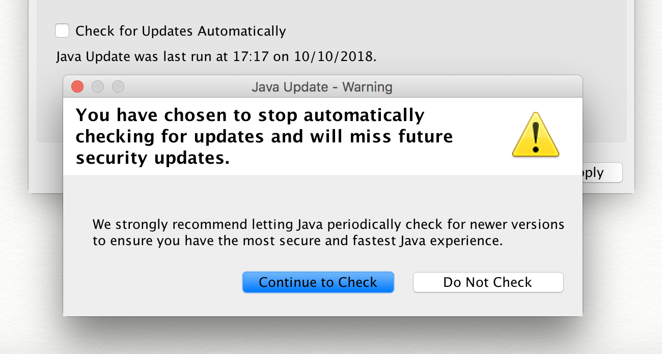
Incredible control from Java settings - checkbox with confirmation in a separate window. The big blue button, despite the name, means cancellation of the action.
How to apply
Use standard default and custom elements only if absolutely necessary. They are clearer and easier to implement.
Internal consistency is achieved by maximizing the reuse of everything. Bring everything to the component library - from inputs and buttons to colors, shadows, indents and animations.
Home reading
Influence of context and familiarity with the object on its recognition
Colors and contrast
Observation
Studies say that the differences in tone and saturation of the background and text have little effect on the readability, but the contrast in illumination directly. In addition, about 4% of people suffer from color disorders.
Principle
Always check the contrast of the text.
W3C considers normal contrast to 1: 4.5 for text of normal size and 1: 3 for text of 24px or more.
Especially often there are problems with white text on a colored background and gray on gray. The designer may not be aware that the combination of the problem, and users will strain.

White text looks worst on a yellow background, best on blue.
How to apply
The process can be automated with the ax utility. The easiest way to use the browser extension. CLI and integration with popular testing systems are also available.
For a quick check of the contrast of two colors, the contrast ratio service is suitable.
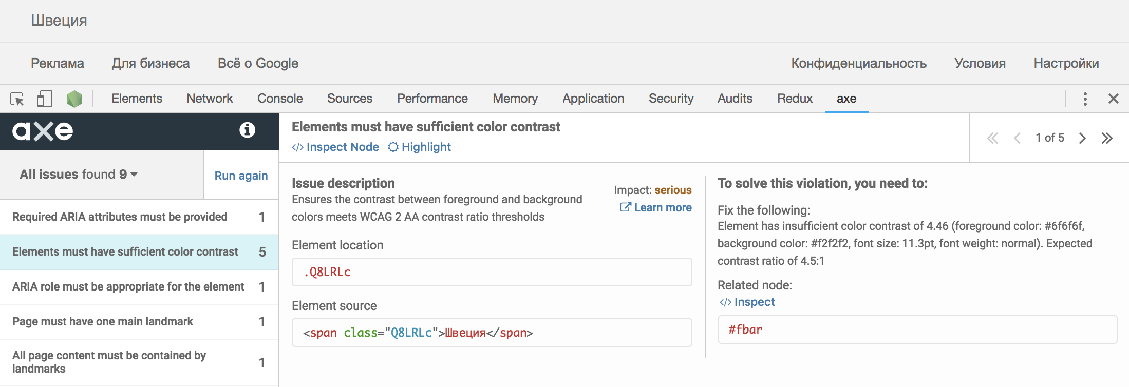
Google home page. The contrast almost falls short
Home reading
findings
- Discuss with the designer places that you think are problematic.
- Check that the distances between the elements correspond to their position in the hierarchy.
- Use standard controls in a standard way.
- Automate contrast checking.
In the second part I will tell you about the semantics, states, performance and size.
')
Source: https://habr.com/ru/post/426203/
All Articles