Qt: drawing based on vector graphics
 Qt provides the programmer with very rich features, but the set of widgets is limited. If none of the available is not suitable, you have to draw something of your own. The simplest way is to use ready-made images - it has serious drawbacks: the need to store images in a file or resources, problems with scalability, with portability of image formats. The following describes the use of the principles of vector graphics without using the actual vector images.
Preamble
It all started with the fact that once the indication of single-digit signs was needed. Some application receives some data on some port, the package must be disassembled and displayed on the screen. It would be nice to somehow simulate the usual dashboard front panel. To display digital data, Qt offers an out-of-the-box QLCDNumber class, similar to the familiar seven-segment indicators, but something is not visible in single light bulbs.
Using checkboxes (they are check boxes) and radio buttons (they are radio buttons) for this purpose is bad, and here is a list of reasons:
- This is wrong semantically. Buttons - they are buttons, and are intended to be entered by the user, and not to show him something.
- This implies the second: the user strives to poke into such buttons. If at the same time the update of information is not particularly fast, the display will lie, and the user will report a program’s malfunctioning, vile giggling.
- If you lock the button for pressing (setEnabled (false)), then it becomes ugly gray. I remember, in Delphi, in the area of version 6, there was such a feint with ears: you could put a flag on the panel and disable the accessibility of the panel, not the flag, then the flag was neither gray nor active. Here this trick does not work.
- Buttons have input focus. Accordingly, if there are input elements in the window, and the user walks through them using the Tab key, he will have to walk along the output elements, this is inconvenient and ugly.
- In the end, these buttons just look unaesthetic, especially next to the seven segment segments.
Conclusion: you need to draw the light bulb yourself.
Flour choice
At first I looked for ready-made solutions. At that distant time, when using Delphi, it was possible to find just a huge amount of finished components, both from serious firms and from amateur workmanship. In Qt, with this tension. QWT has some elements, but not that. Amateur did not see. Probably, if you competently dig on Githubʻe, then you can find something, but I, perhaps, will do it myself sooner.
The first thing that suggested itself from a homemade one was to use two image files with images of the light on and off. Poorly:
- We need to find good pictures (or draw, but I'm no artist);
- The fundamental question is: to grumble is not good, even pictures, even lying under your feet;
- We need to store them somewhere. The files are really bad: accidentally erased - and there are no buttons. The resources are better, but I also don’t want it if I can get by;
- No scalability;
- Customizability (colors, for example) is achieved only by adding files. That is, resource-intensive and inflexible.
The second thing that follows from the first is to use vector images instead of images. Moreover, Qt is able to render SVG. Here it is already a bit easier to search for the actual image: there are many lessons on vector graphics in the network, you can find something more or less suitable and adapt it to your needs. But there remains the issue of storage and customization, and rendering is not free in terms of resources. Penny, of course, but still ...
And the third follows from the second: you can use the principles of vector graphics when drawing an image yourself! The vector file in text form indicates what and how to draw. I can code it with the same code using vector tutorials. Fortunately, the QPainter object has the necessary tools: a pen, a brush, a gradient and drawing primitives, even a fill with texture. Yes, the tools are far from everything: there are no masks, no blend modes, but absolutely no photorealism is required.
Looked for some examples on the net. I took the first lesson I learned: “We are drawing a button in the graphic editor Inkscape” from the site “Drawing is easy”. The button from this lesson is much more like a light bulb than a button, which suits me perfectly. I make the stock: instead of Inkscape, the project in Qt.
Attempt at writing
Create a new project. I choose the project name rgbled (because I want to do something like an RGB LED) and the path to it. I choose the base class QWidget and the name RgbLed, I refuse to create a form file. The default project after launching makes an empty window, it is not yet interesting.
Preparation for drawing
There is a stock. Now we need to have private members of the class, which will determine the geometry of the picture. A significant advantage of vector graphics is its scalability, so the constant numbers should be at a minimum, and they only set the proportions. The dimensions will be recalculated in the resizeEvent () event, which will need to be overridden.
In the drawing lesson used, dimensions are set in pixels along the way. I also need to determine in advance what I will use and how to recalculate.
The drawing picture consists of the following elements:
- outer ring (tilted outward, part of the convex rim)
- inner ring (tilted inward)
- body of the light-emitting diode, "glass"
- shadow along the edge of the glass
- top flare
- bottom flare
Concentric circles, that is, everything except glare, is determined by the center position and radius. Glare is determined by the center, width and height, and the position X of the centers of the glare coincides with the position X of the center of the entire pattern.
To calculate the elements of the geometry, it will be necessary to determine which is larger — width or height, because the bulb is round and must fit into a square with a side equal to the smaller of the two dimensions. So, I add the corresponding closed members to the header file.
private: int height; int width; int minDim; int half; int centerX; int centerY; QRect drawingRect; int outerBorderWidth; int innerBorderWidth; int outerBorderRadius; int innerBorderRadius; int topReflexY; int bottomReflexY; int topReflexWidth; int topReflexHeight; int bottomReflexWidth; int bottomReflexHeight; Then I override the protected function called when the widget is resized.
protected: void resizeEvent(QResizeEvent *event); void RgbLed::resizeEvent(QResizeEvent *event) { QWidget::resizeEvent(event); this->height = this->size().height(); this->width = this->size().width(); this->minDim = (height > width) ? width : height; this->half = minDim / 2; this->centerX = width / 2; this->centerY = height / 2; this->outerBorderWidth = minDim / 10; this->innerBorderWidth = minDim / 14; this->outerBorderRadius = half - outerBorderWidth; this->innerBorderRadius = half - (outerBorderWidth + innerBorderWidth); this->topReflexY = centerY - (half - outerBorderWidth - innerBorderWidth) / 2; this->bottomReflexY = centerY + (half - outerBorderWidth - innerBorderWidth) / 2; this->topReflexHeight = half / 5; this->topReflexWidth = half / 3; this->bottomReflexHeight = half / 5; this->bottomReflexWidth = half / 3; drawingRect.setTop((height - minDim) / 2); drawingRect.setLeft((width - minDim) / 2); drawingRect.setHeight(minDim); drawingRect.setWidth(minDim); } Here we calculate the side of the square in which the lamp is inscribed, the center of this square, the radius of the rim occupying the maximum possible area, the width of the rim, the outer part of which is 1/10 of the diameter and the inner part is 1/14. Then the position of the highlights, which are located in the middle of the upper and lower radii, is calculated, the width and height are selected by eye.
In addition, in the protected fields immediately add a set of colors to be used.
QColor ledColor; QColor lightColor; QColor shadowColor; QColor ringShadowDarkColor; QColor ringShadowMedColor; QColor ringShadowLightColor; QColor topReflexUpColor; QColor topReflexDownColor; QColor bottomReflexCenterColor; QColor bottomReflexSideColor; By their names, it is clear that these are the colors of the light bulb, the light part of the shadow, the dark part of the shadow, the three colors of the ring shadow around the light bulb and the colors of the gradients of the highlights.
Colors need to be initialized, so I will add a blank design.
RgbLed::RgbLed(QWidget *parent) : QWidget(parent), ledColor(Qt::green), lightColor(QColor(0xE0, 0xE0, 0xE0)), shadowColor(QColor(0x70, 0x70, 0x70)), ringShadowDarkColor(QColor(0x50, 0x50, 0x50, 0xFF)), ringShadowMedColor(QColor(0x50, 0x50, 0x50, 0x20)), ringShadowLightColor(QColor(0xEE, 0xEE, 0xEE, 0x00)), topReflexUpColor(QColor(0xFF, 0xFF, 0xFF, 0xA0)), topReflexDownColor(QColor(0xFF, 0xFF, 0xFF, 0x00)), bottomReflexCenterColor(QColor(0xFF, 0xFF, 0xFF, 0x00)), bottomReflexSideColor(QColor(0xFF, 0xFF, 0xFF, 0x70)) { } You also need to remember to insert into the header file the classes that will be needed when drawing.
#include <QPainter> #include <QPen> #include <QBrush> #include <QColor> #include <QGradient> This code is compiled successfully, but nothing has changed in the widget window. It's time to start drawing.
Drawing
I enter the private function
void drawLed(const QColor &color); and override the protected function
void paintEvent(QPaintEvent *event); The event of redrawing will cause actual drawing, to which the color of “glass” is passed as a parameter.
void RgbLed::paintEvent(QPaintEvent *event) { QWidget::paintEvent(event); this->drawLed(ledColor); } Let it be for now. And we begin to fill the drawing function gradually.
void RgbLed::drawLed(const QColor &color) { QPainter p(this); QPen pen; pen.setStyle(Qt::NoPen); p.setPen(pen); } First, an artist object is created, which will be engaged in drawing. Then a pencil is created, which is needed so that there is no pencil: in this image, the stroke along the contour is not just not needed, but not needed at all.
Then the first circle is drawn in approximate accordance with the vector graphics lesson: a large circle filled with a radial gradient. The gradient has a light reference point at the top, but not at the very edge, but dark at the bottom, but also not at the very edge. A brush is created on the basis of the gradient, with this brush the painter paints a circle (that is, an ellipse that is inscribed in a square). Such code turns out
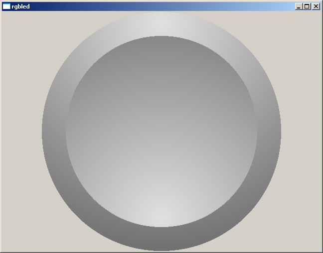
QRadialGradient outerRingGradient(QPoint(centerX, centerY - outerBorderRadius - (outerBorderWidth / 2)), minDim - (outerBorderWidth / 2)); outerRingGradient.setColorAt(0, lightColor); outerRingGradient.setColorAt(1, shadowColor); QBrush outerRingBrush(outerRingGradient); p.setBrush(outerRingBrush); p.drawEllipse(this->drawingRect); qDebug() << "draw"; The environment emphasizes the color parameter of the drawLed function, because it is not used. Let him tolerate, he is not needed yet, but he will be needed soon. The launched project produces the following result:

Add another piece of code.
QRadialGradient innerRingGradient(QPoint(centerX, centerY + innerBorderRadius + (innerBorderWidth / 2)), minDim - (innerBorderWidth / 2)); innerRingGradient.setColorAt(0, lightColor); innerRingGradient.setColorAt(1, shadowColor); QBrush innerRingBrush(innerRingGradient); p.setBrush(innerRingBrush); p.drawEllipse(QPoint(centerX, centerY), outerBorderRadius, outerBorderRadius); Almost the same circle, only smaller and upside down. We get this picture:
Then finally need the color of the glass:
QColor dark(color.darker(120)); QRadialGradient glassGradient(QPoint(centerX, centerY), innerBorderRadius); glassGradient.setColorAt(0, color); glassGradient.setColorAt(1, dark); QBrush glassBrush(glassGradient); p.setBrush(glassBrush); p.drawEllipse(QPoint(centerX, centerY), innerBorderRadius, innerBorderRadius); Here, using the darker function from the transmitted color, the same color is obtained, but darker for organizing the gradient. A coefficient of 120 matched by eye. Here is the result:

Add a ring shadow around the glass. This is done in the vector graphics lesson, and this should add volume and realism:
QRadialGradient shadowGradient(QPoint(centerX, centerY), innerBorderRadius); shadowGradient.setColorAt(0, ringShadowLightColor); shadowGradient.setColorAt(0.85, ringShadowMedColor); shadowGradient.setColorAt(1, ringShadowDarkColor); QBrush shadowBrush(shadowGradient); p.setBrush(shadowBrush); p.drawEllipse(QPoint(centerX, centerY), innerBorderRadius, innerBorderRadius); There is a three-step gradient, so that the shadow is thicker towards the edge and pale toward the center. It turns out like this:

I add highlights, both at once. The upper highlight, unlike the lower (and all other elements), is made by a linear gradient. The artist from me is so-so, I will take the word of the author of the lesson. Perhaps there is some truth in this, I will not experiment with different types of gradients.
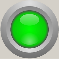
QLinearGradient topTeflexGradient(QPoint(centerX, (innerBorderWidth + outerBorderWidth)), QPoint(centerX, centerY)); topTeflexGradient.setColorAt(0, topReflexUpColor); topTeflexGradient.setColorAt(1, topReflexDownColor); QBrush topReflexbrush(topTeflexGradient); p.setBrush(topReflexbrush); p.drawEllipse(QPoint(centerX, topReflexY), topReflexWidth, topReflexHeight); QRadialGradient bottomReflexGradient(QPoint(centerX, bottomReflexY + (bottomReflexHeight / 2)), bottomReflexWidth); bottomReflexGradient.setColorAt(0, bottomReflexSideColor); bottomReflexGradient.setColorAt(1, bottomReflexCenterColor); QBrush bottomReflexBrush(bottomReflexGradient); p.setBrush(bottomReflexBrush); p.drawEllipse(QPoint(centerX, bottomReflexY), bottomReflexWidth, bottomReflexHeight); That is, in fact, everything, ready-made light bulb, as in the KDPV.
On the visibility of glare and convexity of the glass affects the color, more precisely, how dark it is. It may make sense to add adjusting the brightness of glare and the dimming factor in the darker function depending on the darkness, but this is perfectionism, I think.
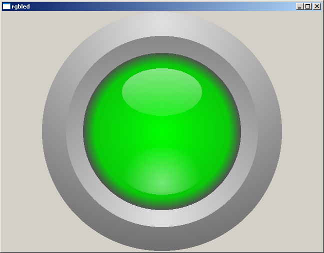
Below is an example of use in the program window.

Pampering
For fun, you can play around with flowers. For example, by overriding a protected mouse click event
void mousePressEvent(QMouseEvent *event); in this way:
void RgbLed::mousePressEvent(QMouseEvent *event) { static int count = 0; if (event->button() == Qt::LeftButton) { switch (count) { case 0: ledColor = Qt::red; count++; break; case 1: ledColor = Qt::green; count++; break; case 2: ledColor = Qt::blue; count++; break; case 3: ledColor = Qt::gray; count++; break; default: ledColor = QColor(220, 30, 200); count = 0; break; } this->repaint(); } QWidget::mousePressEvent(event); } not forgetting to add mouse events to the header:
#include <QMouseEvent> Now the mouse click on the component will switch the color of the light bulb: red, green, blue, gray and some kind of lantern at random.
Epilogue
As for drawing, that's all. And the widget should add functionality. In my case, the “use state” boolean field was added, another boolean field defining the “On” or “Off” state and the default colors for these states, as well as open getters and setters for all of this. These fields are used in paintEvent () functions to select the color passed to drawLed () as a parameter. As a result, you can turn off the use of states and set any color to a light bulb, or turn on states and light or dim a light by events. It’s especially convenient to make the state setter an open slot and connection be it with the signal which must be monitored.
Using mousePressEvent demonstrates that a widget can be made not only by an indicator, but also by a button, making it pressed, released, bent, twisted, painted and whichever you want by pointing, pressing and releasing events.
But this is not the point. The goal was to show where you can take role models when drawing your own widgets and how it is easy to implement this drawing without using raster or vector pictures, in resources or files.
')
Source: https://habr.com/ru/post/425547/
All Articles